Category: Development
There’s no Such Thing as Overtourism
A post by Michael Sweeney on Bluesky asking which cities have overtourism got me thinking about the concept. People in the thread named tourist hotspots like Venice or New Orleans or Las Vegas; the normally excellent Max Dubler said, “Venice is certainly too far gone (it’s basically a theme park these days).” In truth, people are thinking about the concept exactly backward. The biggest global tourist draws are also cities with plenty of other economic activity, like London and Paris. If a region has only tourism then it often has social problems associated with being too reliant on one low-wage industry, but then the comparison should be to regions that also don’t have tourism at all, and then it looks less bad.
Which places have the most tourism?
The most consistent on tourism count international travelers. Euromonitor periodically publishes rankings; the latest has Bangkok at #1 in the world, with 30 million arrivals in 2025. The rest of the top 10 are Hong Kong, London, Macau, Istanbul, Dubai, Mecca, Antalya, Paris, and Kuala Lumpur. Of the top 10, seven are large cities in their own right, one is a religious pilgrimage site, and only two have a tourism-dominant economy (Macau, Antalya).
In general, those dominant cities also outshine smaller places within the same country. France is #1 globally, with 102 million international arrivals; Ile-de-France is about even with its share of the national population. But then the UK only has 42 million, of which 23 million are to London. Antalya essentially splits Turkey’s tourism visits with Istanbul: Turkey has 61 million visits, with Istanbul taking 20 million of those and Antalya 19 million. Domestic tourism is harder to measure but follows the same pattern, with very large volumes to major cities like New York (not in the global top 10 by international arrivals because crossing a European border is counted but not crossing a US state line). San Francisco long had tourism as its largest industry, before tech overtook it this century.
Going down the list of cities by size, we start seeing ones like Barcelona, mentioned by Max in the same thread. But Barcelona, too, is not a purely tourist region, but also an industrial hub and one of the larger metropolitan areas in Europe; Catalonia has a partnership with Lombardy, Rhône-Alpes, and Baden-Württemberg, Four Motors for Europe, as these regions have extensive car manufacturing. Its industry is less famous than London and Paris’s in-your-face capital city wealth and (like all heavy manufacturing) does not agglomerate in city center, so tourists who visit Barcelona are less likely to see it than tourists who visit cities dominated by professional services, but it’s there and overall Catalonia remains an economic co-capital of Spain with the Community of Madrid.
It’s not a coincidence that tourism trips to cities usually involve cities with large non-tourist economies. The high-end shopping, the museums, the cultural attractions, and the famous squares of London, Paris, and New York were all built by local civil society, with the wealth that those cities generated from their broad economies, the first two due to their roles as dominant capitals, the last due to its industrial and professional services wealth. Going a few rungs down the wealth rankings, even countercultural centers are first built for locals, before tourists hear about them; Berghain and Kitkat exist because Berlin has had a large exhibitionist counterculture.
And in no case is there any real displacement. Places that develop tourism because their internal institutions are successful with foreigners – like the cultural attractions in every large city, or the historic and modern vistas, or the shopping – are still large cities with internal economies. Berghain and Kitkat are swarming with tourists, but beyond local disdain that something has become cringe, this isn’t displacing Berliners, who have plenty of clubs to go to with equally dodgy consent practices. At higher levels of prestige, museums are hardly displacing locals – New Yorkers go to the Met for regular outings if they want, and the place is crowded but not so crowded that city residents can’t get in.
What about places with only tourism?
There is still the issue of the truly tourism-dominated economies, the ones that aren’t just large cities that became famous among tourists. Antalya is the biggest one, globally; others are Orlando, Las Vegas, Hawaii, much of the Caribbean, Cancún, Phuket, various Greek islands, and Alicante. Venice and Nice are both very touristy, and can be put into this category as well, but caution is advised as both have industrial economies in their metropolitan areas away from the visited historic or coastal cores.
In some cases, this represents a transition from another economic activity. Venice was a shipbuilding and trading city that just never participated in the modern Industrial Revolution; people visit the Renaissance core. Phuket produced tin and rubber before it became a tourist economy. In other cases, the place owes its entire economic existence to tourism, like the Riviera, Las Vegas, or Florida, with various attempts to diversify not always succeeding.
Usually complaints about overtourism boil down to finding such places tacky. But economically, the locals aren’t necessarily hurting. Phuket had the highest human development index in Thailand earlier this century (it no longer does, which I think is corona-related), and is still one of the wealthiest provinces per capita. Florida is not the highest-opportunity part of the US, but other parts of the South without the same volume of tourism are worse.
Michael compares this situation with resource curse, the theory that natural resource wealth is negative for overall development. But the usual indicator for the resource curse, natural resources as a percentage of GDP, bakes in not just resource abundance but also poverty of the rest of the economy. After all, the US has plenty of resource wealth, which let it develop with lower land and energy prices and attract immigrants until it became a large industrial and tech economy, not really dependent on its farmland or oil wealth. It just isn’t seen as a high share of GDP because the rest of the economy has caught up. It’s the same with tourism: the regions that look bad because they’re dominated by tourism don’t have an overtourism problem but a problem with not enough economy in general.
Transit-Oriented Development and Rail Capacity
Hayden Clarkin, inspired by the ongoing YIMBYTown conference in New Haven, asks me about rail capacity on transit-oriented development, in a way that reminds me of Donald Shoup’s critique of trip generation tables from the 2000s, before he became an urbanist superstar. The prompt was,
Is it possible to measure or estimate the train capacity of a transit line? Ie: How do I find the capacity of the New Haven line based on daily train trips, etc? Trying to see how much housing can be built on existing rail lines without the need for adding more trains
To be clear, Hayden was not talking about the capacity of the line but about that of trains. So adding peak service beyond what exists and is programmed (with projects like Penn Station Access) is not part of the prompt. The answer is that,
- There isn’t really a single number (this is a trip generation question).
- Moreover, under the assumption of status quo service on commuter rail, development near stations would not be transit-oriented.
Trip generation refers to the formula connecting the expected car trips generated by new development. It, and its sibling parking generation, is used in transportation planning and zoning throughout the United States, to limit development based on what existing and planned highway capacity can carry. Shoup’s paper explains how the trip and parking generation formulas are fictional, fitting a linear curve between the size of new development and the induced number of car trips and parked cars out of extremely low correlations, sometimes with an R^2 of less than 0.1, in one case with a negative correlation between trip generation and development size.
I encourage urbanists and transportation advocates and analysts to read Shoup’s original paper. It’s this insight that led him to examine parking requirements in zoning codes more carefully, leading to his book The High Cost of Free Parking and then many years of advocacy for looser parking requirements.
I bring all of this up because Hayden is essentially asking a trip generation question but on trains, and the answer there cannot be any more definitive than for cars. It’s not really possible to control what proportion of residents of new housing in a suburb near a New York commuter rail stop will be taking the train. Under current commuter rail service, we should expect the overwhelming majority of new residents who work in Manhattan to take the train, and the overwhelming majority of new residents who work anywhere else to drive (essentially the only exception is short trips on commuter rail, for example people taking the train from suburbs past Stamford to Stamford; those are free from the point of view of train capacity). This is comparable mode choice to that in the trip and parking generation tables, driven by an assumption of no alternative to driving, which is correct in nearly all of the United States. However, figuring out the proportion of new residents who would be commuting to Manhattan and thus taking the train is a hard exercise, for all of the following reasons:
- The great majority of suburbanites do not work in the city. For example, in the Western Connecticut and Greater Bridgeport Planning Regions, more or less coterminous with Fairfield County, 59.5% of residents work within one of these two regions, and only 7.4% work in Manhattan as of 2022 (and far fewer work in the Outer Boroughs – the highest number, in Queens, is 0.7%). This means that every new housing unit in the suburbs, even if it is guaranteed the occupant works in Manhattan, generates demand for more destinations within the suburb, such as retail and schools.
- The decision of a city commuter to move to the suburbs is not driven by high city housing prices. The suburbs of New York are collectively more expensive to live in than the city, and usually the ones with good commuter rail service are more expensive than other suburbs. Rather, the decision is driven by preference for the suburbs. This means that it’s hard to control where the occupant of new suburban housing will work purely through TOD design characteristics such as proximity to the station, streets with sidewalks, or multifamily housing.
- Among public transportation users, what time of day they go to work isn’t controllable. Most likely they’d commute at rush hour, because commuter rail is marginally usable off-peak, but it’s not guaranteed, and just figuring the proportion of new users who’d be working in Manhattan at rush hour is another complication.
All of the above factors also conspire to ensure that, under the status quo commuter rail service assumption, TOD in the suburbs is impossible except perhaps ones adjacent to the city. In a suburb like Westport, everyone is rich enough to afford one car per adult, and adding more housing near the station won’t lower prices by enough to change that. The quality of service for any trip other than a rush hour trip to Manhattan ranges from low to unusable, and so the new residents would be driving everywhere except their Manhattan job, even if they got housing in a multifamily building within walking distance of the train station.
This is a frustrating answer, so perhaps it’s better to ask what could be modified to ensure that TOD in the suburbs of New York became possible. For this, I believe two changes are required:
- Improvements in commuter rail scheduling to appeal to the growing majority of off-peak commuters as well as to non-commute trips. I’ve written about this repeatedly as part of ETA but also the high-speed rail project for the Transit Costs Project.
- Town center development near the train station to colocate local service functions there, including retail, a doctor’s office and similar services, a library, and a school, with the residential TOD located behind these functions.
The point of commercial and local service TOD is to concentrate destinations near the train station. This permits trip chaining by transit, where today it is only viable by car in those suburbs. This also encourages running more connecting bus service to the train station, initially on the strength of low-income retail workers who can’t afford a car, but then as bus-rail connections improve also for bus-rail commuters. The average income of a bus rider would remain well below that of a driver, but better service with timed connections to the train would mean the ridership would comprise a broader section of the working class rather than just the poor. Similarly, people who don’t drive on ideological or personal disability grounds could live in a certain degree of comfort in the residential TOD and walk, and this would improve service quality so that others who can drive but sometimes choose not to could live a similar lifestyle.
But even in this scenario of stronger TOD, it’s not really possible to control train capacity through zoning. We should expect this scenario to lead to much higher ridership without straining capacity, since capacity is determined by the peak and the above outline leads to a community with much higher off-peak rail usage for work and non-work trips, with a much lower share of its ridership occurring at rush hour (New York commuter rail is 67-69%, the SNCF part of the RER and Transilien are about 46%, due to frequency and TOD quality). But we still have no good way of controlling the modal choice, which is driven by personal decisions depending on local conditions of the suburb, and by office growth in the city versus in the suburbs.
Meme Weeding: Embodied Carbon
The greenhouse gases emitted by the production of concrete, called embodied carbon, are occasionally used as a green-NIMBY argument against building new things. A Berlin Green spokesperson coauthored a study opposing U-Bahn construction on the grounds that the concrete used in construction would raise emissions. More recently, I’ve seen American opponents of transit-oriented development in Manhattan, of all places, talk about the high embodied carbon of new high-rise buildings. Katja Diehl calls for a moratorium on new buildings on anti-concrete grounds, and a petition for the EU to shift regulations to be against new buildings and in favor of reuse on embodied carbon grounds got written up favorably by Kate Wagner in the Nation. Against all of this, I’ve found some numbers on the actual emissions involved in concrete production for new buildings, and they are so low as to be insignificant, 1.5 orders of magnitude less than transportation emissions. A decarbonization strategy should largely ignore embodied carbon concerns and embrace pro-growth sentiments: big buildings, big subway systems, big cities.
What is embodied carbon?
Embodied (sometimes called embedded) carbon is the carbon content emitted by the production of materials. The production of concrete emits greenhouses gases, mainly through two mechanisms: the chemical process used to produce cement emits CO2 by itself, and the energy used for production adds to the emissions of the electric grid.
What are the embodied carbon emissions of new buildings?
The embodied carbon content of concrete depends heavily on the local electricity grid as well as on the required strength of the material, with stronger requirements leading to higher emissions. The Climate Group commissioned a report on this in the British context, finding a wide range, but the average is around 250 kg of CO2-equivalent per m^3 of concrete, the 75th percentile is about 300, and the upper bound is 450. This is a cradle-to-gate figure, taking into account the existing conditions of the carbon intensivity of where concrete is produced and of the logistics system for getting it to the construction site. This is already with some reductions from a previous baseline (EC100; the UK average is around EC60), and further reductions are possible, through decarbonizing the logistics and production; the goal of the report is not to bury the concept of embodied carbon as I do but to propose ways to reduce construction industry emissions.
The question is now how to convert cubic meters of concrete into square meters of built-up area. I have not seen European figures for this, but I did find a 2012 report by the Building and Construction Authority. In Singapore, the sustainability index used is the concrete usage index (CUI), measured in meters (cubic meters per square meter). The example projects given in the study, all around 15 years old, have a CUI of 0.4-0.5 m, and it was pointed out to me on social media that in Toronto the average is 0.55 m.
250 kg/m^3 times 0.4 m equals 0.1 t-CO2 per m^2 of built-up area. A 100 m^2 apartment thus has an embodied carbon content of around 10 t-CO2. This is relative to a baseline in which there is already some concern for reducing construction emissions, both the CUI and the carbon content of concrete per m^3, but this is largely without techniques like mass timber or infra-lightweight concrete (ILC). In Singapore the techniques highlighted in the BCA report are fully compatible with the city’s high-rise character, and the example building with gold but not platinum certification has 25 stories.
Should we worry about construction emissions?
No.
An aggressively YIMBY construction schedule, say with 10 dwellings built annually per 1,000 people, say averaging 100 m^2, emits around 0.1 t/capita annually: 0.1 t/m^2 * 100 m^2/unit * 0.01 unit/capita. All figures have ranges (and if anything, 100 is high for the places that build this much urban infill housing), but factor-of-1.5 ranges don’t erase an order of magnitude analysis. The emissions produced by construction, even if it were raised to some of the highest per capita rates found in the developed world – in fact higher rates than any national average I know of – would be about two orders of magnitude lower than present-day first-world emissions. They’d be 1.5 orders of magnitude lower than transportation emissions; in Germany, transport is 22% of national emissions and rising, as all other sources are in decline whereas transport is flat.
There’s a lot of confusion about this because some studies talk about buildings in general providing a high share of emissions. The Bloomberg-era PlaNYC spoke of buildings as the top source of emissions in New York, and likewise the Nation cites WeForum saying buildings are 37% of global emissions, citing a UN report that includes buildings’ operating emissions (its topline figure is 10 Gt in operating emissions, which is 27% of global emissions in 2022). But the construction emissions are insignificantly low. This means that aggressive replacement of older buildings by newer, more energy-efficient ones is an unmixed blessing, exactly the opposite of the conclusion of the green movement.
Instead of worrying about a source of emissions measured per capita in the tens of kilograms per year rather than in the tons, environmental advocates need to prioritize the most important source of greenhouse gases. The largest in developed countries is transportation, with electricity production usually coming second, always falling over the years while transport remains flat. In cold countries, heating is a significant source of emissions as well, to be reduced through building large, energy-efficient apartment buildings and through heat pump installation.
Regulations on new construction’s embodied carbon are likely a net negative for the environment. The most significant social policy concerning housing as far as environmental impact is concerned is to encourage people to live in urban apartment buildings near train stations. Any regulation that makes this harder – for example, making demolitions of small buildings to make room for big ones harder, or demanding that new buildings meet embodied carbon standards – makes this goal harder. This can be understandable occasionally if the goal of the regulation is not environmental, for example labor regulations for construction workers. It is not understandable if the goal is environmental, as the concern over embodied carbon is. People are entitled to their opinion that small is beautiful as a matter of aesthetic judgment, but they are not entitled to alternative facts that small is environmentally friendly.
YIMBY First, Building Reform Second
Last night I asked the American building reform advocates on Bluesky about different layouts and why developers don’t build them. I got different answers from different advocates about why the layout I’d just mocked of family-size apartments with two staircases isn’t being built in the US, some about regulations, but Mike Eliason said what I was most afraid of hearing: it’s doable but it’s more profitable to build small apartments. My conclusion from this is that while American and Canadian building regulations remain a problem and need to be realigned with European and Asian norms, they are a secondary issue, the primary one remaining how much housing is permitted to be built in the first place. Developers will keep building the most profitable apartment forms until they run out of the most profitable tenants.
The mockup
The following mockup has a scale of 1 meter = 20 pixels, so the building is overall 18 meters by 30. This is a point access block rather than a double-loaded corridor (see definitions here), but it also has two staircases, emanating from the central access block. Each floor has four apartments, each with three bedrooms and two bathrooms, the ellipses in the image denoting bathtubs. The windows are top and bottom, but not left and right; these are single-aspect apartments, not corner apartments.
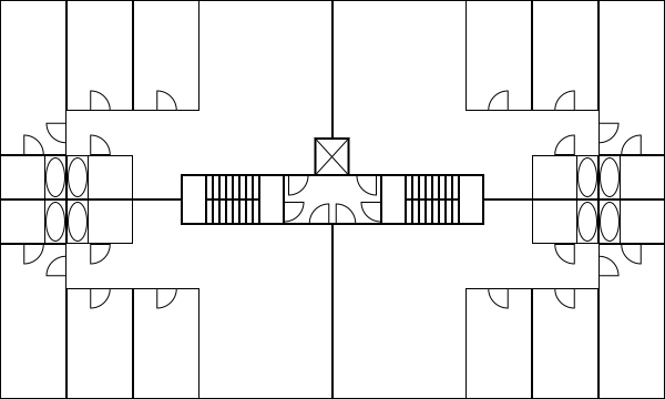
On Bluesky, I said the floorplate efficiency is 94%; this comes from assuming the step width and landing length are 1.1 meters each, a metrization of the International Building Code’s 44″, but to get to 94% assumes the staircase walls are included in the 1.1 meter width, so either it’s actually 90 cm width or, counting wall thickness, the efficiency is only 92.5%. The IBC allows 90 cm steps in buildings with an occupancy limit of up to 50, which this building would satisfy in practice at six stories (a three-bedroom apartment marketed to a middle-class clientele averages closer to two than four occupants due to empty nests, divorces, guest rooms, and home offices) but not as a legal limit. Regardless, 92.5% is average by the standards of European point access blocks, whose efficiency is reduced because the apartments are smaller, and very good by those of American double-loaded corridors.
Now, to be clear, this is still illegal in many American jurisdictions, as Alfred Twu pointed out in @-replies. The building mockup above has two means of egress, but the typical American code also requires minimum separation between the two staircases’ access points. This is an entirely useless addition – the main fire safety benefits of two staircases are that a single fire can’t interpose between residents and the stairs if the two staircases are at opposite ends of the building, but that’s not legally required (quarter-point staircases are routine), and that the fire department can vent smoke through one staircase while keeping the other safe, which does not require separation. Nonetheless, this is not the primary reason this isn’t getting built even where it is legal, for example in jurisdictions that permit scissor stairs or have a smaller minimum distance between the two staircases, like Canada.
I was hoping the answer I’d get would be about elevator costs. The elevator in the mockup is European, 1.6*1.75 meters in exterior dimensions; American codes require bigger elevators, which is by itself a second-order issue, but then installation costs rise to the point that developers prefer long buildings on corridors for the lower ratio of elevators to apartments. But nobody mentioned that as a reason.
The rent issue
Mike Eliason responded to my question about why buildings like the above mockup aren’t being built by talking about market conditions. The above building, with 540 m^2 of built-up area per floor, can host four three-bedroom apartments, each around 127 m^2, or it can host 16 studios, each around 29 m^2. In Seattle, the studio can rent for $1,500/month; the three-bedroom will struggle to earn the proportionate $6,000/month.
It’s worth unpacking what causes these market conditions. The three-bedroom is marketed to a family with children. The children do not earn money, and, until they reach kindergarten age, cost thousands of dollars a month each in daycare fees; if they don’t go to daycare then it means the family only has one income, which means it definitely can’t afford to compete for building space with four singles who’d take four studios, or it has parents in the immediate vicinity, which is rare in a large, internally mobile country. The family has options to outbid the four singles, but they’re limited and require the family to be rather wealthy – two incomes are obligatory, at high enough levels to be able to take the hit from taxes and daycare; the family would also need to be wedded to living in the city, since the suburbs’ housing is designed entirely for families, whereas the singles take a serious hit to living standards from suburbanizing (they’d have to get housemates). In effect, the broad middle and lower middle classes could afford the studios as singles, but only the uppermost reaches of the middle class can pay $6,000/month for the three-bedroom.
In economic statistics, imputation of living standards for different household sizes takes this degressivity of income – $6,000/month for a family of four is a struggle, $1,500/month for a single is affordable on the average US wage – and uses a hedonic adjustment for household sizes. example by taking the square root of household size as the number of true consumption units. To INSEE, a family of four has 2.1 equivalent consumption units; elsewhere, it’s a square root, so it has 2 consumption units. A rental system that maintains a 4:1 ratio has no way for the family to compete.
The upshot is that the developers need to run out of the tenants who can most easily afford rent before they build for the rest. Normally it’s treated as a matter of distribution of units among different social classes, but here it’s a matter of the physical size of the unit. This is why YIMBY first is so important: eventually developers will run out of singles and then have to build for families.
Building for Wealth, and Point Access Blocks
The biggest housing activism push in North America right now has moved on from YIMBYism to housing reforms to allow single-stair mid-rise buildings, called point access blocks. My off-hand reference to this last post ended up being the main issue debated in comments; this compounds a post by Matt Yglesias from November that I’ve been meaning to respond to, since he starts working off of some examples of double-stair buildings on corridors in an even older post of mine about the Kowloon Walled City in My Backward (KWCIMBY) meme. I strongly respect the main point access block activists pushing the issue, like Stephen Smith, so I’d like to revisit the KWCIMBY post and explain what I’m doing there, while also pushing back against some of the more iffy claims portraying point access blocks as not just more efficient but also inherently better for families. In short, both forms of housing are generally easier to build in a more affluent society with higher expectations, and some of the comparisons come from that.
What are the point access block and double-loaded corridor?
An apartment building can arrange its apartments on each floor in one of these ways. The KWCIMBY post assumes double-loaded corridors, as in the diagram below:

In each of these buildings, there are two staircases, as required by American and Canadian law; the first building has scissor stairs, forbidden in most of the US but allowed in New York, whereas the second separates the two staircases into opposite sides of the corridor. Apartments are on both sides of the corridor, with one aspect of windows except the corner units, hence the term double-loaded.
This building form is practically unheard of in European apartment buildings. Only one staircase is required per building, so architects instead slice the buildings into thinner pieces, with one staircase and an elevator and apartments radiating from the common area, called a point access block:

Each of the four access points has an elevator and a staircase; the first example has four apartments per floor, with one aspect per unit, whereas the second has two, with two aspects, both north and south. The result is more elevators and staircases per net floor area, but less corridor area; the floorplate efficiency is notably higher, 92.5% in the first case and 94% in the second case, compared with 89.5% in the first case of the double-loaded corridor and 86.67% in the second. This is one of the reasons Stephen is so focused on elevator costs.
All four buildings are 20 meters by 80, except the last, which is 14 by 80. 20 meter wide residential buildings are more or less unheard of in Central Europe – I see a few that are 18, in what look like higher-income neighborhoods to me. In contrast, 14 is standard in Central Europe, with some buildings looking like the above diagram, and others, almost always older ones, having wings that are still around 14 meters wide but end up with an area-to-external-width ratio of 8-9 meters, rather like a 16-18 meter wide building without wings. In practice, on a 100*100 block, we’d never have two buildings looking like an equal sign but rather an enclosed rectangle, with or without wings.
What about the single-loaded corridor?
A third housing typology puts all apartments on a corridor, but only in one direction. The corridor is then in the open air, and apartments have windows on both sides, to the corridor and in the opposite direction. I lived in such a place for a year in Berlin. This is not unheard of, but still rare. The width of such buildings is limited by the need for apartments to stretch all the way, limiting them to at most 14 meters and usually less.
The resulting floorplate efficiency is low, which turns this into a question of how much cheaper it is to build an external corridor than an internal one. When I asked on Bluesky, I was given ranges for the answer, from an external corridor being 25-50% cheaper to its being if anything more expensive. Temporary worker housing tends to use this form because it is built to lower standards, in which the external corridor is just some barred steel without protection from the elements above, which should reduce the cost of the corridor. This form still exists in permanent housing, with concrete corridors that offer protection from rain, but it’s less common than the other two.
Point access blocks and families
The biggest selling points of the point access block are that it has better floor plate efficiency and that it permits units with multiple aspects to allow for cross-ventilation and for strategic placement of rooms (living room facing the street, bedrooms facing the quieter internal courtyard of the euroblock). This is bundled with other issues, at the same time:
- In Europe, buildings are almost never built out of wood, and if they are, it’s usually mass timber. This means that the cost of construction is proportional to floor area, largely linear in the number of floors for a given footprint. North American construction uses light wood on a concrete podium, sharply limiting height to six to seven stories, hence the preference for thicker buildings to increase floor area. In turn, light wood is less safe in fires – but those codes don’t exempt concrete buildings from the two staircase requirement.
- The double-loaded corridor has units so deep that bedrooms come with their own bathrooms and walk-in closets. Absent these, the maximum usable depth of a bedroom is about 6 meters. Bathrooms cost more to build per square meter than bedrooms and living rooms, which drives up construction costs.
- The double-loaded corridor makes it easier to build units with fewer bedrooms – it’s just a matter of how much corridor width the apartment takes, so costs are linear in the floor area of units. The point access block instead prefers larger units, in square meters, since larger apartments have higher floorplate efficiency, and it’s routine to build a cheaper three-bedroom, one-bathroom unit.
The last two points have been used by some urbanists, especially more conservative ones, to argue that the point access block is inherently family-friendlier. The argument made by Mike Eliason (who’s not at all conservative) is that Seattle, where he’s based, builds multifamily housing rapidly but all of it is studios and one- and two-bedroom units, on the expectation that families with children should eventually move to the suburbs.
More conservative people even relate that with low urban American birthrates, which always comes off as strange to me given how low European birthrates are. The one developed country with above-replacement birthrates, Israel, doesn’t use any of these forms, but instead has independent buildings, some mid-rise and some tall – and there’s consensus among European and American urbanists that tall buildings are bad for families. At any rate, the Israeli sociologists I read on the subject, like Sergio Della Pergola, attribute Israeli birthrate exceptionalism to other issues than built form, just as Singapore’s Paulin Tay Straughan attributes the very low birthrates in rich Asia to other issues.
The difficulty of relating the issue of housing forms with that of apartment sizes is that housing a family requires a lot of apartment space to go to people who are not working, because they are children. If housing is expensive due to high construction costs, restrictions on building, or both, then housing will be built for the rich, which means not just high-income earners, but also households with a high income per person, which are almost always ones without children. A developer building a double-loaded corridor making a choice between a one-bedroom, say 6*9 meters, and a three-bedroom, say 12*9 meters, will choose the former if two independent households can outbid a family. This is getting to the point that in urban America, it’s normal for unmarried adults to live with housemates, because there are a lot more three- than one-bedroom apartments in cities that don’t build much housing, like New York or Boston.
The family could outbid the single person, but not in all circumstances. A two-income family can do well, and the working adults are likely to be older than the single person and thus higher earners. A landlord of a fixed apartment choosing who to rent to would also prefer the family to the group of three to four housemates – the family is more stable, divorce being far less common than housemates leaving with little prior notice. But not all families have two earners (and the social conservatives who are most anxious about family housing tend toward one income, not two), or two middle-class earners, and so far American developers haven’t yet run out of demand for single people and childless couples to build for.
Point access blocks and wealth
In a way, the point access block has benefits that aren’t yet unlocked in Europe. Higher wealth is spent on, among other things, bigger dwellings. The double-loaded corridor in a way bakes in assumptions of private bathrooms, essentially spending income on higher-cost elements. But it’s possible to do the same with a point access block. The point access block ends up more efficient when apartments are bigger, because it’s limited by number of units per floor, and the bigger the units, the smaller the proportion of the unrentable common areas.
Speaking of common areas, higher wealth doesn’t necessarily demand of them. If the expectation is that people should have a washing machine and a drier at home rather than in a common area, then the demand for such an area shrinks. Trash rooms take up more space, but then higher wealth, as opposed to higher inequality, means not just that the demand for trash rooms is higher but also that the supply of workers to staff them is scarcer, and at the end of the day people can just haul trash bags to a collection point in the courtyard or a side room on the ground floor. Trash chutes are an innovation that doesn’t take up common space (for one, they can be installed in-unit, especially if there are only two units per floor anyway). High-end condo amenities like private gyms are usually provided at the scale of an entire building rather than a floor, and a complex of interconnected buildings is likely to have just one either way.
In the examples I posted above, in a way I baked in a wealth assumption, in that the option with two units per access point assumes those units average 132 m^2, which is very high for Europe; the norm for high-end buildings here is three units, with slightly lower combined floor area than 264 m^2, and the same or a hair higher circulation area to allow for a third door, with the smaller apartment usually only having one aspect of exposure. A 132 m^2 unit, in effect 10*14 with slight recessing at one end, would generously have four bedrooms, likely configured as three actual bedrooms and a private office or guest room. The intended users would be families of means, but then again new housing tends to be built for this class, and over time, growth and abundance make the standards that today mark middle-class wealth more widespread across classes. The working class once didn’t have indoor plumbing.
Quick Note on Capital City Income Premiums
There’s a report by Sam Bowman, Samuel Hughes, and Ben Southwood, called Foundations, about flagging British growth, blaming among other things high construction costs for infrastructure and low housing production. The reaction on Bluesky seems uniformly negative, for reasons that I don’t think are fair (much of it boils to distaste for YIMBYism). I don’t want to address the construction cost parts of it for now, since it’s always more complicated and we do want to write a full case on London for the Transit Costs Project soon, but I do want to say something about the point about YIMBYism: dominant capitals and other rich cities (such as Munich or New York) have notable wage premiums over the rest of the country, but this seems to be the case in NIMBY environments more than in YIMBY ones. In fact, in South Korea and Japan, the premium seems rather low: the dominant capital attracts more domestic migration and becomes larger, but is not much richer than the rest of the country.
The data
In South Korea and Japan, what I have is Wikipedia’s lists of GDP per capita by province or prefecture. The capital city’s entire metro area is used throughout, comprising Seoul, Incheon, and Gyeonggi in Korea, and Tokyo, Kanagawa, Chiba, and Saitama in Japan. In South Korea, the capital region includes 52.5% of GDP and 50.3% of population, for a GDP per capita premium of 4.4% over the country writ large, and (since half the country is metro Seoul) 9.2% over the rest of the country. In Japan, on OECD numbers, the capital region, labeled as Southern Kanto, has a 14.5% premium over the entire country, rising to around 19% over the rest of the country.
In contrast, in France, Ile-de-France’s premium from the same OECD data is 63% over France, rising to about 90% over provincial France. In the UK, London’s premium is 71% over the entire country and 92% over the entire country excluding itself; if we throw in South East England into the mix, the combined region has a premium of 38% over the entire country, and 62% over the entire country excluding itself.
Now, GDP is not the best measure for this. It’s sensitive to commute volumes and the locations of corporate headquarters, for one. That said, British, French, Korean and Japanese firms all seem to prefer locating firms in their capitals: Tokyo and Seoul are in the top five in Fortune 500 headquarters (together with New York, Shanghai, and Beijing), and London and Paris are tied for sixth, with one company short of #5. Moreover, the metro area definitions are fairly loose – there’s still some long-range commuting from Ibaraki to Tokyo or from Oise to Paris, but the latter is too small a volume to materially change the conclusion regarding the GDP per capita premium. Per capita income would be better, but I can only find it for Europe and the United States (look for per capita net earnings for the comparable statistic to Eurostat’s primary balance), not East Asia; with per capita income, the Ile-de-France premium shrinks to 45%, while that of Upper Bavaria over Germany is 39%, not much lower, certainly nothing like the East Asian cases.
Inequality
Among the five countries discussed above – Japan, Korea, the UK, Germany, France – the level of place-independent inequality does not follow the same picture at all. The LIS has numbers for disposable income, and Japan and Korea both turn out slightly more unequal than the other three. Of course, the statistics in the above section are not about disposable income, so it’s better to look at market income inequality; there, Korea is indeed far more equal than the others, having faced so much capital destruction in the wars that it lacks the entrenched capital income of the others – but Japan has almost the same market income inequality as the three European examples (which, in turn, are nearly even with the US – the difference with the US is almost entirely redistribution).
So it does not follow, at least not at first pass, that YIMBYism reduces overall inequality. It can be argued that it does and Japan and South Korea have other mechanisms that increase market income inequality, such as weaker sectoral collective bargaining than in France and Germany; then again, the Japanese salaryman system keeps managers’ wages lower than in the US and UK and so should if anything produce lower market income inequality (which it does, but only by about three Gini points). But fundamentally, this should be viewed as an inequality-neutral policy.
Discussion
What aggressive construction of housing in and around the capital does appear to do is permit poor people to move to or stay in the capital. European (and American) NIMBYism creates spatial stratification: the middle class in the capital, the working class far away unless it is necessary for it to serve the middle class locally. Japanese and Korean YIMBYism eliminate this stratification: the working class keeps moving to (poor parts of) the capital region.
What it does, at macro level, is increase efficiency. It’s not obvious to see this, since neither Japan nor Korea is a particularly high-productivity economy; then again, the salaryman system, reminiscent of the US before the 1980s, has long been recognized as a drag on innovation, so YIMBYism in effect countermands to some extent the problems produced by a dead-end corporate culture. It also reduces interregional inequality, but this needs to be seen less as more opportunity for Northern England as a region and more as the working class of Northern England as people moving to become the working class of London and getting some higher wages while also producing higher value for the middle class so that inequality doesn’t change.
Militarized and Other New Capital Cities
The news of the ongoing construction of Nusantara, Indonesia’s new capital in Borneo to replace Jakarta, got me thinking about other moves by various countries to create new capitals from scratch, to avoid having to deal with the urbanity of the existing capital. On this issue, Nusantara joins Brasilia, Islamabad, (at the subnational level) Chandigarh, and, most ominously, Naypyidaw and Egypt’s New Administrative Capital (NAC). The last two, unlike Nusantara, are built for explicitly military purposes, with the military considering the people to be its main adversary rather than any external enemy. Such capitals always waste money that could be spent on improving literally anything else – health, education, transportation, water, electricity, business climate, anti-poverty grants. In the less militarized cases, like Brasilia, these are just waste; in the more militarized cases, these showcase that the state is run by parasites.
Non-militarized cases
The move to Nusantara is being justified on the grounds that Jakarta is sinking. In truth, it’s better to view this as a continuation of the Transmigrasi program that the state has engaged in for decades. The zeitgeist was one of concerns about overpopulation leading to either forced sterilization of the poor or a program of settlement by the core population in peripheral regions; in Indonesia, this took the form of encouraging Javans to settle elsewhere in the country, where in practice they formed an overclass and sidelined the preexisting population. Nusantara, in a mostly undeveloped part of Borneo, needs to be viewed within this program, rather than as a tragic response to climate change.
Brasilia, similarly, was built on developmentalist grounds: the Brazilian elite wanted to develop the interior of the country, viewing the rainforest and savanna as low-value land to be mined and farmed. As this process predates the military dictatorship (1964-85; Brasilia was founded 1960), this is not really a matter of militarization. Rather, it’s better viewed as developmental failure – the resources invested in the new city could have gone to more productive uses, and the value of that land for farming and mining turned out not to be much.
The environmental impacts of the program of developing the interior were wholly negative. In Brazil, half of the country’s greenhouse gas emissions are land use changes and another quarter are from the agriculture sector, leading Brazil to emit 10.7 t/capita in greenhouse gases. In Germany, the figure is 8.1 t/capita, with a large industrial sector and an infamously still substantial coal sector, and on these lower emissions, Germany produces close to four times Brazil’s GDP per capita. The environmental impact of Nusantara is likely to be the same in direction as Brazil’s program, and to the extent it’s likely to be smaller in magnitude, it’s because it’s a smaller endeavor than Brazil’s entire program of developing the interior, in which Brasilia was just one component.
Militarized cases
The worst are not Brasilia, or likely Nusantara, but rather Naypyidaw and the NAC. I’ve been asked to provide some resources on social media, going over what’s involved in both projects.
Naypyidaw
The military junta that ran Myanmar between 1962 and 2011 (with significant tightening in 1988) and has run it since 2021, and exercised significant power between 2011 and 2011, built the new capital, officially since 2005, unofficially since a few years earlier, at a remote location 320 kilometers from Yangon and 240 from Mandalay. After the 1988 protests and the crackdown establishing the military government that 1990s-2000s human rights advocates knew and hated, the regime made changes to Yangon to suppress future protests, evicting 500,000 people from city center in the process. Where normally such efforts mostly target poor people in order to create the illusion of a poverty-free city center and facilitate urban renewal, in Yangon the evictions targeted the middle class, which was sympathetic to the protest movement and had communities that had sheltered protesters. But even the new Yangon was not good enough for the generals, and so they shifted to Naypyidaw.
Part of the reason was that Yangon was too multiethnic, in a part of the country that was majority-Mon until the 20th century, while Naypyidaw could be more comfortably Bamar. But the main reason was security needs. The adversary in this case is not any foreign government – a city built in 2005 by a government that might worry about American-led regime change would look at what was going on in Iraq and opt to maintain its capital in a large, dense central city to facilitate insurgency and make it easy to hide among the civilian population. Naypyidaw instead does the exact opposite – it’s easy for a superior military force to take. Rather, its threat model is a popular uprising, and thus the modernist planning with separation of uses exists to prevent the broad public from being able to stage an insurgency. There is extensive regime propaganda in the city, such as national museums telling uncritical histories, but no major religious sites, since those might shelter protesters, as happened in 1988.
The urbanism of Naypyidaw is, essentially, a giant military camp. It is designed with strict separation of uses and large roads between different complexes for movement between them; people are not expected to walk between places. The Guardian calls it a post-apocalyptic suburbia, but I don’t think that’s quite right. In an auto-oriented American city, there’s nowhere to walk, but everyone owns a car and the development forms make it convenient to drive to one’s work and regular non-work destinations. Dubai, criticized vociferously among urbanists for its tackiness and auto-oriented character, is a place where one can drive or be driven to shopping malls and towers within a close distance. Naypyidaw doesn’t have any of this and doesn’t seem to even try; it’s a collection of sites, designed for no need but that of control by the military of a population that does not want to be controlled by it. It’s a monument not to modernist urbanism, though it tries to affect that, but rather to destruction of value by an unwanted government.
New Administrative Capital
The situation in Egypt, to be clear, is a lot less brutal than in Burma. At the same time, Egypt is several times richer, which creates more value that can be extracted and given over to cronies. This can be seen in the construction of the NAC, to replace Cairo.
The immediate history of the NAC is that in 2011, Egypt famously had the Arab Spring revolution overthrowing Hosni Mubarak; in the subsequent election, the only preexisting organized political force, the Muslim Brotherhood, won the election, leading Mohamed Morsi to take office as president starting in 2012. The election was free and the state of civil liberties improved, but the Muslim Brotherhood was making moves to consolidate power, leading to fears among human rights and democracy protesters of new authoritarianism, which led to a protest movement in 2013 called Tamarod, demanding new elections; later in the same year, the military reacted to the protests by launching a coup, removing Morsi from power and restoring the military elements of the prior regime, including a pardon of Mubarak, who was on trial for corruption. Eventually, the chief of the Egyptian Armed Forces, General Abdel Fattah al-Sisi, won a rigged presidential election in 2014, and has been president ever since. Much of the focus of the protest movements was street protests in Cairo, where Tahrir Square became a global metonym for democracy protests (for example, in Israel, where people basically never draw any positive inspiration from Arab political trends). This created a need among Sisi and his inner circle for a new capital in the desert, built to forestall any future Tahrir.
The capital could not even be named New Cairo, because there’s already a New Cairo, an eastern suburb of Cairo built expressly in order to decentralize the capital; Cairo is a huge, dense city. For a while, it was mocked as New New Cairo, for its location even farther east of New Cairo; by now, it has the formal name New Administrative Capital, with construction having begun in 2016.
The NAC is designed around digital surveillance of the population, and showcasing that Egypt can develop the desert, and maybe decongesting Cairo. It has pretenses of being the next Dubai, but where Dubai invites global starchitects to buy prestige, the NAC is instead giving contracts to domestic elites (as was also the case for Naypyidaw); the military directly owns 51% of the agency developing the NAC and the state ministry of housing only 49%, and the contracts are designed to enrich people who are politically connected to the government.
The violence levels involved are, again, much lower than in Burma. But precisely because Egypt’s economy is solidly middle-income, it’s frustrating to see vast sums wasted on a military prestige project. Cairo’s congestion and overcrowding have a well-known solution, in the form of building a rapid transit network to facilitate non-car commutes, and connect not just the existing built-up area to the urban core but also to-be-built areas adjacent to it. It’s a metro area of 22 million people, about the same size as New York, but only has a three-line, 100 km metro network. These 100 km should be closer to 1,000.
To be clear, there is some development of the Cairo Metro. Line 3 is being extended as we speak, with a new section having opened this month. Overall, the third phase of the line, 17 km long, cost 40.7 billion Egyptian pounds per a statement in 2012, which in contemporary dollars is $2.6 billion in exchange rate terms and $9 billion in 2021 PPP terms. On Google Earth, it looks like 9 km of the line are underground and 8 km are elevated or at-grade; this more than $500 million/km cost is not even fully-underground. This is a line where the main contractor is Orascom – this isn’t a case of outsourcing the state to Japan, China, or both, and therefore building at high costs, as is common in Bangladesh, Pakistan, and Southeast Asia. Rather, this is entirely domestic waste. Most likely, the same contractors that are profiteering off of public money through the construction of the NAC are also profiteering off of public money for what little infrastructure the military government deigns to build in the capital that people actually live in.
Worthless Canadian Initiative
Canada just announced a few days ago that it is capping the number of international student visas; the Times Higher Education and BBC both point out that the main argument used in favor of the cap is that there’s a housing shortage in Canada. Indeed, the way immigration politics plays out in Canada is such that the cap is hard to justify by other means: traditionally, the system there prioritized high-skill workers, to the point that there has been conservative criticism of the Trudeau cabinet for greatly expanding low-skill (namely, refugee) migration; capping student visas is not how one responds to such criticism.
The issue is that Canada builds a fair amount of housing, but not enough for population growth; the solution is to build more – in a fast-growing country like Canada, the finance sector expects housing demand to grow and therefore will readily build more if it is allowed to.
Vancouver deserves credit for the quality of its transit-oriented development and to a large extent also for the amount of absolute development it permits (about 10 units per 1,000 residents annually); but its ability to build is much greater than that, precisely because rapid immigration means that more housing is profitable, even at higher interest rates. The population growth coming from immigration sends a signal to the market, invest in long-term tangible goods like housing. Thus, Vancouver deserves less credit for its permissiveness of development – large swaths of the city are zoned for single-family housing with granny flats allowed, including in-demand West Side neighborhoods with good access to UBC and Downtown jobs by current buses and future SkyTrain.
The rub is that restricting student immigration is probably the worst possible way to deal with a housing shortage. Students live at high levels of crowding, and the marginal students, who the visa cap is excluding, live at higher levels of crowding than the rest because they tend to be at poorer universities and from poorer backgrounds. The reduction in present-day demand is limited. In Vancouver, an empty nester couple with 250 square meters of single-family housing in Shaughnessy is consuming far more housing, and sitting on far more land that could be redeveloped at high density, than four immigrants sharing a two-bedroom apartment in East Vancouver.
In contrast, the reduction in future demand is substantial, because those students then graduate and get work, and many of them get high-skill, high-wage jobs (the Canadian university graduate premium is declining but still large; the American one is larger, but the US is also a higher-inequality society in general); having fewer students, even fewer marginal students who might take jobs below their skill level, is still a reduction in both future population and future productivity. What this means is that capital owners deciding where to allocate assets are less likely to be financing construction.
The limiting factor on housing production is to a large extent NIMBYism, and there, in theory, immigration restrictions are neutral. (In practice, they can come out of a sense of national greatness developmental conservatism that wants to build a lot but restrict who can come in, or out of anti-developmental NIMBYism that feels empowered to build less as fewer people are coming; this situation is the latter.) However, it’s not entirely NIMBYism – private developmental still has to be profitable, and judging by the discourse I’m seeing on Canadian high-rise housing construction costs in Toronto and Vancouver, it’s not entirely a matter of permits. Even in an environment with extensive NIMBYism like the single-family areas of Vancouver and Toronto, costs and future profits matter.
The Need for Ample Zoning Capacity
An article by Vishaan Chakrabarti in last month’s New York Times about how to make room for a million more people in New York reminded me of something that YIMBY blogs a decade ago were talking about, regarding zoning capacity. Chakrabarti has an outline of where it’s possible to add housing under the constraints that it must be within walking distance of the subway, commuter rail, or Staten Island Railway, and that it must be of similar height to the preexisting character of the neighborhood. With these constraints, it’s possible to find empty lots, parking lots, disused industrial sites, and (in near-Midtown Manhattan) office buildings for conversion, allowing adding about half a million dwellings in the city. It’s a good exercise – and it’s a great explanation for why those constraints, together, make it impossible to add a meaningful quantity of housing. Transit-oriented development successes go far beyond these constraints and build to much higher density than is typical in their local areas, which can be mid-rise (in Europe) or high-rise (in Canada and Asia).
The issue with the proposal is that in practice, not all developable sites get developed. The reasons for this can include any of the following:
- The parcel owner can’t secure capital because of market conditions or because of the owner’s particular situation.
- The parcel is underdeveloped but not empty, and the owner chooses not to redevelop, for a personal or other reason.
- The area is not in demand, as is likely the case near the Staten Island Railway or commuter rail stations in Eastern Queens, or in much of the Bronx.
- The area is so auto-oriented, even if it is technically near a station, that prospective buyers (and banks) demand parking, reducing density.
New York has, on 2020 census numbers, 8.8 million people; 1 million additional New Yorkers is 11% more people. Cities that permit a lot of housing have an envelope for much more than 11% extra population. In New York’s history, it was computed in 1956 that under the then-current 1916 zoning code, the city’s zoned capacity was 55 million people, but under the proposed code that would be enacted in 1961, the zoned capacity would fall to 12 million. In Los Angeles, The Homeowner Revolution makes the point (on PDF-page 19) that in 1960, zoned capacity was 10 million in the city proper, four times the city’s population, but by 1990 it fell to 3.9 million, 11% more than the city’s population.

Technically, the same extra zoned capacity that Chakrabarti finds for New York has existed in Los Angeles for a generation. In practice, for all the above reasons why development never reaches 100% of capacity even in expensive areas, Los Angeles builds very little housing, and rents are very high, perhaps comparable to those of New York even as wages are much lower.
What this means is that the way forward for any transit-oriented development plan has to get out of the mentality that the buildings need to be of similar size to the existing character of the neighborhood. This constraint is too strict, and not at all observed in any successful example that I know of.
To Americans, the most accessible example of transit-oriented development success is Vancouver; some sections of the Washington suburbs (especially Arlington) qualify as well, but the extent there is much less than in Canada, and consequently ridership on Washington Metro has lagged that of its Canadian counterparts. In Vancouver, the rule that Chakrabarti imposes that the preexisting parcels must be empty or nonresidential is largely observed – as far as I can tell, the city has not upzoned low-density residential areas near SkyTrain, and even in Burnaby, the bulk of redevelopment has been in nonresidential areas.
The redevelopment in Vancouver proper looks like this:

And here is Metrotown, Burnaby:

The surface parking may look obnoxious to urbanists, but the area has more jobs, retail, and housing than the parking lots can admit, and the modal split is very high.
European transit-oriented development is squatter – the buildings are generally less tall, and they’re spread over a larger contiguous area, so that beyond the resolution of a few blocks the density is high as well. But it, too, often grows well beyond tradition. For example, here is Bercy, a redevelopment of the steam-era railyards at Gare de Lyon, no longer necessary with modern rail technology:
In the future, a New York that wants to make more room will need to do what Vancouver and Paris did. There is no other way.
Quick Note: Different Anti-Growth Green Advocacies
Jerusalem Demsas has been on a roll in the last two years, and her reporting on housing advocacy in Minneapolis (gift link) is a great example of how to combine original reporting with analysis coming from understanding of the issue at hand. In short, she talks to pro- and anti-development people in the area, both of which groups identify with environmentalism and environmental advocacy, and hears out their concerns. She has a long quote by Jake Anbinder, who wrote his thesis on postwar American left-NIMBYism and its origins, which are a lot more good-faith than mid-2010s YIMBYs assumed; he points out how they were reacting to postwar growth by embracing what today would be called degrowth ideology.
I bring this up because Germany is full of anti-growth left-NIMBYism, with similar ideology to what she describes from her reporting in Minneapolis, but it has different transportation politics, in ways that matter. The positioning of German left-NIMBYs is not pro-car; it has pro-car outcomes, but superficially they generally support transportation alternatives, and in some cases they do in substance as well.
In the US, the left-NIMBYs are drivers. Jerusalem cites them opposing bike lanes, complaining that bike lanes are only for young childless white gentrifiers, and saying that soon electric cars will solve all of the problems of decarbonizing transportation anyway. I saw some of this myself while advocating for rail improvements in certain quarters in New England: people who are every stereotype of traditional environmental left-NIMBYism were asking us about parking at train stations and were indifferent to any operating improvements, because they don’t even visit the city enough to think about train frequency and speed.
In Germany, many are drivers, especially outside the cities, but they don’t have pro-car politics. The Berlin Greens, a thoroughly NIMBY party, are best known in the city for supporting removal of parking and moving lanes to make room for bike lanes. This is not unique to Berlin or even to Germany – the same New Left urban mayors who do little to build more housing implement extensive road diets and dedicated lanes for buses, streetcars, and bikes.
These same European left-NIMBYs are not at all pro-public transportation in general. They generally oppose high-speed rail: the French greens, EELV, oppose the construction of new high-speed lines and call for reducing the speed on existing ones to 200 km/h, on the grounds that higher speeds require higher electricity consumption. In Germany, they usually also oppose the construction of new subway and S-Bahn tunnels. Their reasons include the embedded carbon emissions of tunneling, a belief that the public transport belongs on the street (where it also takes room away from cars) and not away from the street, and the undesirability (to them) of improving job access in city center in preference to the rest of the city. However, they usually consistently support more traditional forms of rail, especially the streetcar and improvements to regional rail outside major cities. For example, the NIMBYs in Munich who unsuccessfully fought the second S-Bahn trunk line, whence the expression Organisation vor Elektronic vor Beton (the Swiss original omits Organisation and also is very much “before” and not “instead of”), called for improvements in frequency on lines going around city center, in preference to more capacity toward city center.
I’m not sure why this difference works like this. I suspect it’s that American boomer middle-class environmental NIMBYism is rooted in people who suburbanized in the postwar era or grew up in postwar suburbs, and find the idea of driving natural. The same ideology in Europe centers urban neighborhood-scale activism more, perhaps because European cities retained the middle class much better than their American ones, perhaps because mass motorization came to Europe slightly later. It also centers small towns and cities, connected to one another by regional rail; the underlying quality of public transportation here is that environmentalists who can afford better do rely on it even when it’s not very good, which hourly regional trains are not, whereas in the United States it’s so far gone that public transportation ridership comprises New Yorkers, commuters bound for downtown jobs in various secondary cities, and paupers.
