Category: Shoddy Studies
IFP’s Transit Abundance Playbook
Two weeks ago, the Institute for Progress published a playbook called Transit Abundance, comprising 15 policy briefs about reducing construction costs. One of them was my own, about itemization of costs. Eric has a good one about phasing funding to prevent the situation of the Boston Green Line Extension in which the planning for the project was funded from the same grant that funded construction, leading to rushed pre-planning to get that money in the first place. And unfortunately, many of the rest are questionable. There’s a mix of good, meh, and downright counterproductive, and unfortunately, I’m seeing people I know and respect from elsewhere say things that are wrong or barely relevant.
My first filter for pieces like this is “is this even close to correct?”. There are some pieces that fail the test right there, praising projects that were extremely expensive as examples to emulate rather than avoid (for example, the reliably incompetent Stephanie Pollack is saying that of the Green Line Extension).
But beyond that, for things that at least get what the problem is, I look at what they cite. If they only cite the Transit Costs Project, then they don’t know enough to play. If they cite things I wasn’t aware of, then it’s more interesting. A positive highlight is Anthony Potts’ piece calling for technical scoring of proposals, which relies on literature about the exact weighting required for technical scoring to matter. We knew from interviews that California’s 30% technical score, 70% cost weighting produced identical results to lowest-bid. This piece actually went and found published results on this issue and found that if the cost is weighted at 57% or more then it’s the same as lowest-bid, and that this produces higher final costs both in general and in California case studies. This piece, I encourage everyone to read for a more complete discussion than we wrote of technical scoring and its merits.
And if this piece is a highlight, a lowlight is a piece on AI, by Lizzie Speed and Bennett Capozzi, panned across social media for calling for using more AI for transit planning, from a background of trying to sell AI technology rather than from that of transit planners; the authors cite the Transit Costs Project’s review of planning and other soft costs to argue the unique Anglosphere problem is data limitation (we say no such thing in our report) for which the solution is more AI, and seem not to know where those high costs come from. This compounds a criticism I’ve seen across social media for IFP’s use of generated images, to the point that the lead image for the playbook was noted for having errors in how the trains look (it’s hung on bus-like wheels rather than on bogies).
And regrettably, I’d like to also highlight Jackson Moore-Otto’s piece, which says that federal loans can stabilize transit funding to prevent a feast-or-famine problem. I respect Jackson and have seen him do and lead good work on matters of commuter rail and Boston-area advocacy, and am honestly surprised he’d write such a thing, which is just wrong.
The specific problem with Jackon’s argument is that it relies on a chain of citations, each introducing some errors to the point that the final claims are just wrong. A central claim is that the first electrification project costs more than subsequent ones, which is manifestly untrue (for example, compare Amtrak’s Northeast Corridor electrification in the 1990s with its struggles to install autotensioners now). This is based on a claim sourced to Momentum (which doesn’t quite say that), which sources it to the RIA Electrification Cost Challenge (which gets some Continental costs wrong); to get there, Jackson is saying the New Haven-Boston electrification was not a first line but a subsequent line, when in fact Amtrak had literally never electrified a railroad before and its forerunners on the Northeast Corridor had last done so in the Great Depression. The British costs are meanwhile compromised by repeated project cancellations that lead to sunk planning costs and make internal comparisons difficult, since the surviving lines are by definition the easiest ones. In truth, rather rapid electrification projects, without decade-by-decade continuity, exist outside the UK and are often quite reasonable in their costs, as in Denmark, Israel, and especially India.
The upshot is that because there is no feast-or-famine problem with electrification, any program to reduce its cost in the US (or UK) needs to understand what works and not talk about making it easier to apply for federal loans. On the Northeast Corridor, for example, a senior engineer since removed for incompetence and potential embezzlement of Amtrak funds unilaterally decided to tighten the required catenary pole spacing, driving up costs for reelectrification since the existing poles are not compatible with the new standard (but are compatible with high-speed electrification systems sold by international vendors). This is not a feast-or-famine problem, and to the extent there may be a specific federal policy solution, it’s to require planners to attend international industry fairs and conferences like InnoTrans and make it clear that ones who don’t will have stalled careers.
The RPA Publishes Bad Report Against Through-Running
The Regional Plan Association released a new report, called New York Penn Station: Constraints and Considerations for Meeting Future Demand. It argues against through-running on the grounds that it would reduce capacity, and asserts that any solution to station capacity after the Gateway tunnel, the Hudson Tunnel Project, opens in the late 2030s must include “station expansion or some other form of system expansion.” There’s something disappointing about this report, not because it’s wrong (although it is) but because it seems to just rehash past arguments without seriously addressing past criticisms of the $17 billion Penn expansion.
The lead author Rachel Weinberger and I talked about Penn Station capacity issues in 2024, after I wrote these two blog posts attacking Amtrak for its assumptions that imply additional tracks are required at Penn Station. Since then, the Effective Transit Alliance has done additional work, modeling the interfaces between the trains, the Penn Station platforms, and the concourses to arrive at feasible dwell times and capacities. Unfortunately, the RPA isn’t really engaging with any of that work, and retreats to just asserting that through-running would reduce capacity at Penn Station.
Capacity and dwell times
The most advanced technical work on the subject of capacity at Penn Station, the question being whether the bare Hudson Tunnel Project can perhaps with minor facelifts provide enough capacity to run 48 trains per hour between New Jersey and New York and the answer being yes, was done in the above-linked ETA report. We found the source of past claims by Amtrak that very long dwell times are necessary and deconstructed their assumptions, and modeled based on the current (post-Moynihan Station project) capacity of vertical circulation elements how long it would take passengers to clear each platform under rush hour assumptions.
The interface between the train and the platform itself is not the limiting factor; my two above linked blog posts from 2024 go over this and find a very short minimum dwell time, of 2 minutes or even less. The limiting factor is vertical circulation between the infamously narrow platforms and the concourses. Nonetheless, passengers can clear these in about 3 minutes. Notably, the narrowest of the platforms, platform 9, is compliant with NFPA 130 and its requirement that passengers be able to clear the platform in case of a fire in 4 minutes; the other platforms (except the wide platform 10) are not compliant, because they have two adjacent tracks and NFPA 130 assumes both tracks can be occupied, in which case the load doubles. Across all platforms, the one with the highest clearing time, platform 4, can clear a 1,620 passenger NJT bilevel in 4.83 minutes. Writing timetables to cycle trains between the platforms so that no platform comes close to having queuing between trains, is a routine exercise.
The report instead asserts that,
The time that the train dwells at the platform is 7 minutes in reasonable operating conditions: 5 minutes to unload passengers, 1 minute to check for stray passengers and then 1 minute for schedule recovery. There’s an additional 2.5 minutes to clear the interlockings and for train safety separations.
Accounting for all these aspects, under reasonable operating conditions, each track can accommodate 6 trains inbound per hour using drop-and-go service.
There is no citation for the model used, nor justification for either the 5 minute figure or for why an additional minute for schedule recovery is required. There is no explanation for why the 2.5 minutes to clear the interlockings matter to the capacity of each platform – once a train is past the platform, it’s gone and the capacity to measure is that of running track, not the platform. On outbound trains, it ominously says that,
The process of bringing an empty train into Penn Station, loading passengers and then departing takes 9 minutes in reasonable operating conditions during the PM peak period. This includes 7 minutes for passengers to hear the track announcement, descend to the platform and load into the train and 2 minutes for schedule recovery.
“Hear the track announcement” is an Americanism. In Germany, the track numbers are printed on one’s ticket, even on intercity trains, even at capacity-constrained stations with track shortages like Köln Hbf. The track for each fixed branch should be scheduled months in advance and known by regular passengers. Precisely because demand is asymmetric – toward Manhattan in the morning, away from Manhattan in the afternoon – the on and off peaks do not coincide at all, and encouraging passengers to get to the platform even before the train arrives would not overload the platform or the access and egress points.
The report completely missed the consequence of the asymmetry of demand when it finally asserted, based on modeling for which the report provides no details, that,
It would take an estimated 6 minutes for passengers to deboard, clear the platform and reach the concourse and another 4 minutes for passengers to descend to the platform and board the train during the AM peak. 2 additional minutes must be added to provide a buffer that ensures schedule adherence. The trains also require 2.5 minutes for clearing interlockings and safety separation, resulting in an hourly capacity of 4 trains per track and potentially 8 per platform.
A good rule of thumb here is that if Munich manages to slot 7 numbered branches, rising to 9 when one includes sub-branches, through one central trunk tunnel with 30 peak trains per hour, and comparable ridership to all three New York commuter rail systems combined, then nobody needs to add 2 minutes to the dwell time for schedule recovery, or 2.5 minutes for interlockings. The RPA is welcome to release its model for why it should take 10 minutes for passengers to board and alight; ours is open for inspection on GitHub and finds that the busier of the two can be done in 3 with a bit of buffer time and the less busy of the two is essentially free since so few passengers ride reverse-peak, and the train can leave even if some passengers that got off it are still on the platform on their way to the escalators.
The Parisian issue
The RPA report doesn’t talk about Paris. It doesn’t rebut the point that the RER is a good comparison case for New York commuter rail capacity, but it’s clearly lurking in the background. It does mention the RER as an ill comparison for the benefits of through-running (see section below), on the grounds that “trains follow each other along the same paths,” whereas in New York there is more and, measured by number of stations if not distance, earlier branching. But it doesn’t really address the point that if the RER can run 24-27 trains per hour per track in each direction, and the Munich S-Bahn can run 30, then so can through-running paths at Penn Station.
Reverse-engineering from what the report does say and from what the biggest points of contention have been when I talked to the RPA on this, they clearly think it matters that the European comparison cases have multiple city center stations to spread the load. Penn Station, in contrast, is the single central business district station, in a high-kurtosis city with far higher job density within walking distance of the station than can be found in any European city.
And yet, as I explained in my second original post from 2024, the effect coming from New York’s single city center station versus Paris’s multiplicity thereof largely cancels out the effect of much higher overall ridership on the RER than on New York commuter rail. Averaged over the peak four hours, the highest resolution I have for Paris, the sum of peak boardings and alightings per train is actually a bit higher on the RER E at Haussmann-Saint-Lazare, as of the 2010s when it was still a terminal, than it was at Penn Station in 2019 just before corona. The same sum at each of Gare du Nord and Gare de Lyon on the RER D is respectively 20% and 15% less than at Penn Station; on the RER B at Gare du Nord, it’s also 20% less. The Gare du Nord numbers are unlinked, so passengers interchanging across the platform between the RER B and D are counted in both trains’ ridership, but from the perspective of the train-to-platform interface, this is still a flow that the train and its doors and platforms must accommodate. If that’s doable in a 55 second dwell time, then trains at Penn Station can unload in 2 minutes at the peak and the rest is just a matter of counting platform-to-concourse vertical circulation elements and adding up their capacities as in the model described in the above section.
The benefits of through-running
Through-running works ideally when there are multiple city center stations, allowing the trains to function as urban rail as well as distribute passengers across multiple destinations. This is well-known to any group pushing through-running in New York, which is why so many such groups advocated for a tunnel connecting Penn Station with Grand Central, the so-called Alternative G in the ARC era in the 2000s, and why Tri-State’s proposal showcases a trunk line from Newark Penn Station to Sunnyside, and why ReThink heavily markets Secaucus and Sunnyside as secondary business centers. Here’s what ETA produced in 2023:
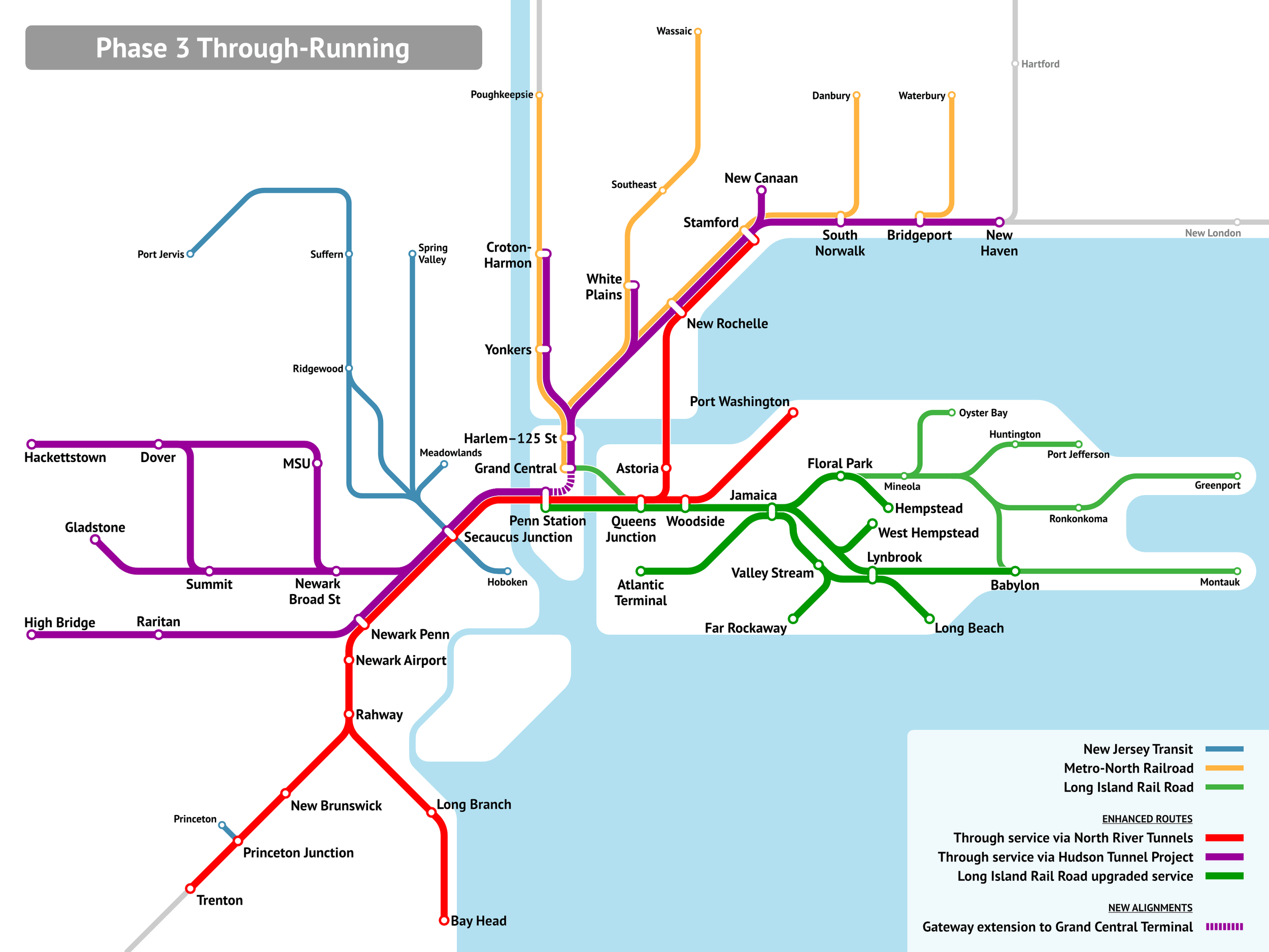
The upshot of this is that even with the dominance of Manhattan, any reasonable through-running system cobbled from existing and under construction infrastructure would unlock commutes from east of the Hudson to Downtown Newark, and from west of the Hudson to Long Island City (the station labeled Queens Junction is essentially Sunnyside Junction, walkable to a large fraction of Long Island City jobs), Flushing, and Jamaica.
It’s important context to understand why the RPA graphics denigrating through-running as limited in use don’t work:
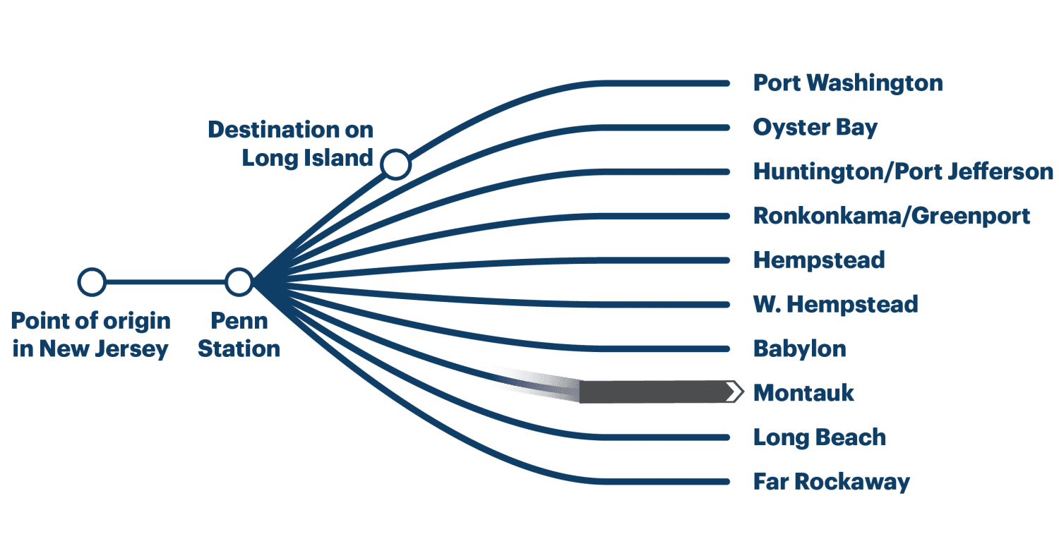
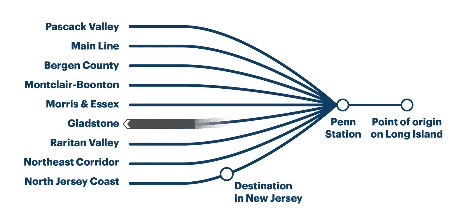
In truth, even setting aside a Penn-Grand Central tunnel (which is doable at MTA construction costs at a lower cost than Penn expansion), the destination in New Jersey is likely to be not just on the North Jersey Coast Line as depicted, but on any of the Northeast Corridor, North Jersey Coast, and Raritan Valley Lines. At present, the first two carry 14 trains per hour at the peak, and are decently likely to be one’s pair east of the Hudson. Similarly, one’s destination east of Penn Station is unlikely to be Long Island as commonly defined to exclude Brooklyn and Queens but rather to be on the trunk in Long Island City or on multiple branches within the city or perhaps on the New Haven Line.
The upshot is a hefty share of the total through-Manhattan market would in fact be served by a through-running system, usually with one-seat rides, or if not then with transfers at Sunnyside or Secaucus rather than New York. Through-running is not about those mythical trips from Oyster Bay to the Jersey Shore that Adirondacker in the comments section mocks, just as it isn’t about trips from Aulnay to IHES on the RER B or from the Marne-la-Vallée branch of the RER A to Saint-Germain-en-Laye. It’s about the overlapping near-center markets, individually small compared with commutes to the central business district and yet collectively significant.
Meme Weeding: Embodied Carbon
The greenhouse gases emitted by the production of concrete, called embodied carbon, are occasionally used as a green-NIMBY argument against building new things. A Berlin Green spokesperson coauthored a study opposing U-Bahn construction on the grounds that the concrete used in construction would raise emissions. More recently, I’ve seen American opponents of transit-oriented development in Manhattan, of all places, talk about the high embodied carbon of new high-rise buildings. Katja Diehl calls for a moratorium on new buildings on anti-concrete grounds, and a petition for the EU to shift regulations to be against new buildings and in favor of reuse on embodied carbon grounds got written up favorably by Kate Wagner in the Nation. Against all of this, I’ve found some numbers on the actual emissions involved in concrete production for new buildings, and they are so low as to be insignificant, 1.5 orders of magnitude less than transportation emissions. A decarbonization strategy should largely ignore embodied carbon concerns and embrace pro-growth sentiments: big buildings, big subway systems, big cities.
What is embodied carbon?
Embodied (sometimes called embedded) carbon is the carbon content emitted by the production of materials. The production of concrete emits greenhouses gases, mainly through two mechanisms: the chemical process used to produce cement emits CO2 by itself, and the energy used for production adds to the emissions of the electric grid.
What are the embodied carbon emissions of new buildings?
The embodied carbon content of concrete depends heavily on the local electricity grid as well as on the required strength of the material, with stronger requirements leading to higher emissions. The Climate Group commissioned a report on this in the British context, finding a wide range, but the average is around 250 kg of CO2-equivalent per m^3 of concrete, the 75th percentile is about 300, and the upper bound is 450. This is a cradle-to-gate figure, taking into account the existing conditions of the carbon intensivity of where concrete is produced and of the logistics system for getting it to the construction site. This is already with some reductions from a previous baseline (EC100; the UK average is around EC60), and further reductions are possible, through decarbonizing the logistics and production; the goal of the report is not to bury the concept of embodied carbon as I do but to propose ways to reduce construction industry emissions.
The question is now how to convert cubic meters of concrete into square meters of built-up area. I have not seen European figures for this, but I did find a 2012 report by the Building and Construction Authority. In Singapore, the sustainability index used is the concrete usage index (CUI), measured in meters (cubic meters per square meter). The example projects given in the study, all around 15 years old, have a CUI of 0.4-0.5 m, and it was pointed out to me on social media that in Toronto the average is 0.55 m.
250 kg/m^3 times 0.4 m equals 0.1 t-CO2 per m^2 of built-up area. A 100 m^2 apartment thus has an embodied carbon content of around 10 t-CO2. This is relative to a baseline in which there is already some concern for reducing construction emissions, both the CUI and the carbon content of concrete per m^3, but this is largely without techniques like mass timber or infra-lightweight concrete (ILC). In Singapore the techniques highlighted in the BCA report are fully compatible with the city’s high-rise character, and the example building with gold but not platinum certification has 25 stories.
Should we worry about construction emissions?
No.
An aggressively YIMBY construction schedule, say with 10 dwellings built annually per 1,000 people, say averaging 100 m^2, emits around 0.1 t/capita annually: 0.1 t/m^2 * 100 m^2/unit * 0.01 unit/capita. All figures have ranges (and if anything, 100 is high for the places that build this much urban infill housing), but factor-of-1.5 ranges don’t erase an order of magnitude analysis. The emissions produced by construction, even if it were raised to some of the highest per capita rates found in the developed world – in fact higher rates than any national average I know of – would be about two orders of magnitude lower than present-day first-world emissions. They’d be 1.5 orders of magnitude lower than transportation emissions; in Germany, transport is 22% of national emissions and rising, as all other sources are in decline whereas transport is flat.
There’s a lot of confusion about this because some studies talk about buildings in general providing a high share of emissions. The Bloomberg-era PlaNYC spoke of buildings as the top source of emissions in New York, and likewise the Nation cites WeForum saying buildings are 37% of global emissions, citing a UN report that includes buildings’ operating emissions (its topline figure is 10 Gt in operating emissions, which is 27% of global emissions in 2022). But the construction emissions are insignificantly low. This means that aggressive replacement of older buildings by newer, more energy-efficient ones is an unmixed blessing, exactly the opposite of the conclusion of the green movement.
Instead of worrying about a source of emissions measured per capita in the tens of kilograms per year rather than in the tons, environmental advocates need to prioritize the most important source of greenhouse gases. The largest in developed countries is transportation, with electricity production usually coming second, always falling over the years while transport remains flat. In cold countries, heating is a significant source of emissions as well, to be reduced through building large, energy-efficient apartment buildings and through heat pump installation.
Regulations on new construction’s embodied carbon are likely a net negative for the environment. The most significant social policy concerning housing as far as environmental impact is concerned is to encourage people to live in urban apartment buildings near train stations. Any regulation that makes this harder – for example, making demolitions of small buildings to make room for big ones harder, or demanding that new buildings meet embodied carbon standards – makes this goal harder. This can be understandable occasionally if the goal of the regulation is not environmental, for example labor regulations for construction workers. It is not understandable if the goal is environmental, as the concern over embodied carbon is. People are entitled to their opinion that small is beautiful as a matter of aesthetic judgment, but they are not entitled to alternative facts that small is environmentally friendly.
Quick Note: Rural Drivers Aren’t Being Oppressed
A new paper is making the round arguing that Spanish rural automobility is a response to peripheralization. It’s a mix of saying what is obvious – in rural areas there is no public transportation and therefore cars are required for basic mobility – and proposing this as a way of dealing with the general marginalization of people in rural areas. The more obvious parts are not so much wrong as underdeveloped – the paper is an ethnography of rural drivers who say they need to drive to get to work and to non-work destinations like child care. But then the parts talking about peripheralization are within a program of normalizing rural violence against the state and against urban dwellers, and deserves a certain degree of pushback.
The issue here is that while rural areas are poorer than urban ones, making them economically more peripheral, they are not at all socially peripheral. This can be seen in a number of both economic and non-economic issues:
- Rural areas are showered with place-based subsidies to deal with poverty, on top of the usual universal programs (like health care and pensions) that redistribute money from rich to poor regardless of location. This includes farm subsidies, like the Common Agricultural Policy, and infrastructure subsidies in which there’s more investment relative to usage in rural than in urban areas. The automobility of rural areas is itself part of this program: urban motorways can fund themselves from tolls where they need to, but national programs of road improvements end up improving the mobility options of rural areas out of almost exclusively urban taxes. In public transport, this includes considerable political entitlement, such as when Spanish regional governors made a botched train procurement into a national scandal and demanded that the chief of staff of the national transport ministry, Isabel Pardo de Vera Posada, resign over something she’d had nothing to do with.
- Rural poverty is culturally viewed as the fault of other people than the residents. Poor urban neighborhoods are called no-go zones; I am not familiar enough with Spanish discourse on this but I doubt it’s different from French, German, and Swedish discourses, in which poor rural areas are never so called. A German district with neo-Nazi groups and majority public sympathy with extremism is called a victim of globalization in media, even left-leaning media, and not a no-go zone.
- Rural areas, regardless of income, are socially treated as more authentic representatives of proper values, with expressions like Deep England or La France profonde contrasting with constant scorn for London, Paris, and Berlin.
- Rural violence is treated as almost respectable. Political and media reactions to farmer riots with tractors as of late have been to shower the rioters with understanding. In France, the government acceded to the demands, and then-minister of the interior Gérald Darmanin forced law enforcement to act with restraint. In contrast, urban riots by racial minorities lead to mass arrests, the occasional fatal shooting of a rioter, and a discourse that treats riots as fundamentally illegitimate, for example just a few months prior.
The paper denigrates rural policies formed with “barely any understanding of how they are conditioned” and says that “an understanding of socio-spatial cohesion needs to look beyond the traditional objectives of equalizing agricultural incomes to consider how these accessibility gaps affect depopulation, young people’s skills, unemployment and low incomes.” But the issue isn’t understanding. Rural areas are not misunderstood. They are dominant, capable of steering specific subsidies their way that are not available to urbanites at equal income levels.
More broadly, I think it’s difficult for critical urbanism to deal with this issue of the permission structure for rural violence, because the urban-rural dynamic is not the same as the classical dynamic between social classes, or between white and black Americans, in which the socioeconomically dominant group is also the politically dominant one. It’s instead better to analogize it in ethnic terms not to American anti-black racism, or to European anti-immigrant racism, but to anti-Semitism, in which the social acceptance of a base level of violence coexists with the fact that Jews are often a more educated and richer group, leading anti-Semites to promulgate conspiracy theories.
The permission structure for rural drivers to commit violence in demand of government subsidies and government protection from competition is the exact opposite of peripheralization. It’s not a periphery; it’s a political and cultural center that faces a fundamental challenge in that it provides no economic or social value and is in effect a rapacious mafia using violence to extract protection money from an urban society that, due to misplaced sentimental values, responds with further subventions rather than with the full force of law as used against urban and suburban rioters with migration background.
Consultant Slop and Europe’s Decision not to Build High-Speed Rail
I’m sitting on a series of three trains to Rome, totaling 14 hours of travel. If a high-speed rail network is built connecting those cities, the trip can be reduced to about 7.5 hours: 2.5 Berlin-Munich (currently 4), 2 Munich-Verona (currently 5.5), around 2.75 Verona-Rome (currently 3.5), around 0.25 changing time (currently 1). The slowest section is being bypassed with the under-construction Brenner Base Tunnel, but not all of the approaches to the tunnel are, and Germany is happy with its trains averaging slightly slower speeds than the 1960s express Shinkansen.
I bring this up because it’s useful background for a rather stupid report by Transport and Environment that was making the rounds on European social media, purporting to rank the different intercity rail operators of Europe, according to criteria that make it clear nobody involved in the process cares much about infrastructure construction or about what has made high-speed rail work at the member state level. It’s consultant slop, based on a McKinsey report that conflicts with the published literature on intercity rail ridership elasticity, which makes it clear that speed matters greatly. Astonishingly, even negative discourse about the study, by people who I respect, talks about the slop and about the problems of privatization, but not about the need to actually go ahead and build those high-speed connections, without which there are sharp limits to the quality of life available to the zero-carbon lifestyle, limits that make people avoid that lifestyle and instead fly and drive. In effect, Europe and its institutions have made a collective decision over the last 10 or so years not to build high-speed rail, to the point that activism suggesting it reverse course and do so is treated as self-evidently laughable.
The T&E study
The T&E study purports to rank the intercity rail operators of Europe. There are 27 operators so ranked, which do not exactly correspond to the 27 member states, but instead omit some peripheral states, include British and Swiss options, and have some private operators, including inexplicably treating OuiGo as separate from the rest of the TGV. The ranking is of operators rather than infrastructure systems; there is no attention given to planning infrastructure and operations together. Trenitalia comes first, followed by a near-tie between RegioJet and SBB; Eurostar is last. Jon Worth had to pour cold water on the conclusions and the stenography in various European newspapers about them.
In fact, the study fits so perfectly into my post about making up rankings that it is easy to think I wrote the post about T&E – but no, the post is from 2.5 years ago. The issue is that it came up with such bad weighting in judging railways that one is left to wonder if it specifically picked something that would sound truthy and put SBB at or near the top just to avoid raising too many questions. The criteria used are as follows:
- Ticket prices: 25%
- Special fares and reductions: 15%
- Reliability: 15%
- Booking experience: 15%
- Compensation policies: 10%
- Traveler experience (speed and comfort): 10%
- Night trains and bicycle policy: 5%
None of this is even remotely defensible, and none of this passes any sanity check. No, it is not 1.5 times as important to have special reductions in fares for advance bookings or other forms of price discrimination as to have a combination of speed and comfort. The Shinkansen has fixed fares and is doing fine, thank you very much; SNCF’s own explanations of its airline-style yield management system portray it as a positive but not essential feature – its reports from 2009 recommending high-speed rail development in the United States cite yield management as a 4% increase in revenue, which is good but not amazing.
But more broadly, it is daft to set a full 50% of the weight on fares and fare-related issues (i.e. compensation), and 15% on the booking experience, and relegate speed to part of an issue that is only 10%. That’s not how high-speed rail ridership works. Cascetta-Coppola find a ridership elasticity with respect to trip time of about -2, but only -0.37 with respect to fares. Börjesson finds a much narrower spread, -1.12 and -0.67 respectively, but still the same directionally. Speed matters.
And yet, T&E doesn’t seem to care. The best hints for the reason why are in the way it compares operators rather than national networks, and relies on a McKinsey report pitched at private entrants and not at member state policymakers, who do not normally outsource decisionmaking to international consultants. It doesn’t think in terms of systems or networks, because it isn’t trying to make a pitch at how a member state can improve its rail network, but rather at how a private competitor should aim to make a profit on infrastructure built previously by the state.
The need for state planning
Every intercity rail network worth its name was built and planned publicly, by a state empowered to do so. In East Asia, this comprises the high-speed rail networks of China, Japan, Korean, and Taiwan, all funded publicly, even if Japan subsequently privatized Shinkansen operation (though not construction) to regional monopolies that, while investor-owned, are too prestigious to fail. In Europe, some networks have high-speed rail at their core, like France, and others don’t, like Switzerland or the Netherlands, but the latter instead optimize state planning at lower speed, with tightly timed connections, strategic investments to speed up bottlenecks, and integration between rolling stock, the timetable, and infrastructure.
This feature of the main low-speed European rail network frustrates some attempts at disaggregating the effects of different inputs on ridership and revenue. At the level of a sanity check, there does not appear to be a noticeable malus to French rail ridership from its low frequency at outlying stations. But then France relies on one-seat rides from Paris to rather small cities, which do not have convenient airport access, and in its own way integrates this operating paradigm with rolling stock (bilevels optimized for seating capacity, not fast egress or acceleration) and infrastructure (bypasses around intermediate cities, even Lyon). Switzerland, in contrast, has these timed connections such that the effective frequency even on three-seat rides is hourly, with guaranteed short waits at the transfers, and this provides an alternative way to connect small cities with not just large ones but also each other.
But in both cases, the operating paradigm is connected with the infrastructure, and this was decided publicly by the state, based on governmental financial constraints, imposed in the 1970s in France (leading to extraordinarily low construction costs for the LGV Sud-Est) and the 1980s in Switzerland (leading to the hyper-optimized operations of Bahn 2000 in lieu of a high-speed rail system). A private operator can come in, imitate the same paradigm that the infrastructure was built for, and sometimes achieve lower operating costs by being more aggressive about eliminating redundant positions that a state operator may feel too constrained by unions to. But it cannot innovate in how to run trains. Even in Italy and Spain, where private competition has led to lower fares and higher ridership, all the private competitors have done is force service to look more like the TGV as it is and less like the TGV as SNCF management would like it to be internationally. Even there, they do not innovate, but merely imitate what the TGV already had purely publicly, on infrastructure that was designed for TGV or ICE service intensity all along.
The idea that the private sector can innovate in intercity rail comes from the same imitation of airline thinking that led to the failure of Eurostar, with its high fares and airline-style boarding and queuing. In the airline business, integration between infrastructure and operations is weak, and private airlines can innovate in aircraft utilization, fast boarding, no-frills service, and other aspects that led low-cost carriers to success. Business analysts drawn from that world keep trying to make this work for trains, and fail; the Spinetta Report mentions that OuiGo tanked TGV revenues, and ridership did not materially increase when it was introduced due to inconveniences imposed by the system of segmenting the market by fare.
Europe’s decision not to build high-speed rail
In the 2000s, there was semi-official crayon, such as the TEN-T system, for EU-wide high-speed rail, inspired by the success of the TGV. Little of it happened, and by the 2010s, it became more common to encounter criticism alleging that it could not be done, and it was more important to focus on other things – namely, private competition, the thing that cannot innovate in rail but could in airlines.
At no point was there a formal decision not to build high-speed rail at a European scale. Projects just fell aside, unless they were megaproject tunnels across mountains like the Brenner Base Tunnel or water like the Fehmarn Belt Tunnel, and then there is underinvestment in the approaches, so that the average speed remains shrug-worthy. The discourse shifted from building infrastructure to justifying not building it and pitching on-rail competition instead. This, I believe, is due to factors going back to the 1990s:
- The failure of Eurostar to produce high ridership. It underperformed expectations; it also underperforms domestic city pairs. SNCF is happy to collect monopoly profits from international travelers, and, in turn, potential travelers associate high-speed rail with high fares and inconvenience and look elsewhere. One failed prominent project can and does poison the technology, potentially indefinitely.
- The anti-state zeitgeist at the EU level. This can be described as neoliberalism, but the thoroughly neoliberal Blair/Brown and Cameron cabinets happily planned High Speed 2. The EU goes beyond that: it is too scared to act as a state on matters other than trade, and that leads people in EU policy to think in terms of government-by-nudge, rather like the Americans.
- SNCF and DB’s profiteering off of cross-border travelers in different ways turns them into Public Enemies #1 and #2 for people who travel between different member states by rail, who are then reluctant to see them as successes domestically.
For all of these reasons, it’s preferred at the level of EU policymaking and advocacy not to build infrastructure. Infrastructure requires there to be a public sector, and the EU only does that on matters of trade and regulatory harmonization.
Jon Worth has done a lot of work on getting a passenger rights clause into the agenda for the new EU Parliament, to deal with friction between DB and SNCF when each blames the other when a cross-border passenger is stranded (roughly: DB blames SNCF for running low frequencies so that if DB’s last train is delayed the passenger is stranded, SNCF blames DB for being so delayed in the first place). This is a good kind of regulatory harmonization. It reminds me of the EU’s role in health care: there’s reciprocity among the universal health care systems of Europe, for example allowing EU immigrants but not non-European ones to switch to the Kasse upon arrival; but at the same time, the EU has practically no role in designing or providing these universal health care system or even, as the divergent responses to corona showed in 2020, in coordinating non-pharmaceutical interventions for public health in a pandemic.
But health care does not require large coordinating bodies, and infrastructure does. Refugee camps tended to by UN agencies that have to pay bribes and protection fees to local gangs can have surprisingly good health care outcomes. Cox’s Bazar’s Rohingya camps have infant mortality rates comparable to those of Bangladesh and Burma; Gaza had good if worse-than-Israeli life expectancy and infant mortality until the war started. But nobody can build infrastructure this way. Top-down state action is needed to coordinate, which means actual infrastructure construction, not just passenger rights.
The thinking at the EU level is that greater on-rail competition can improve service quality. But that’s just a form of denial. The EU has no willingness to actually build the high-speed rail segments required to enable rail trips across borders, and so various anti-state actors, most on the center-to-center-right but not all, lie to themselves that it’s okay, that if the EU fails to act as a state then the private sector can step in if allowed to. That’s where the T&E study comes in: it rates operators on how to act like a competitive flight level-zero airline, going with this theory of private-sector innovation to cope with the fact that cross-border rail isn’t being built and try to salvage something out of it.
But it can’t be salvaged, not in this field; the best the private sector can do is provide equivalent service to a good state service on infrastructure that the state built. The alternative to the state is not greater private initiative. In infrastructure, the political alternative is that people who are not Green voters, which group comprises 92.6% of the European Parliament, are going to just drive and fly and associate low-carbon transportation with being contained to within biking distance of city center. The economic alternative is that ties between European cities will remain weak, to the detriment of the European economy and its ability to scale up.
Low Spanish Costs are not About Decentralization
An article by Ben Hopkinson at Works in Progress is talking about what Madrid has been doing right to build subways at such low costs, and is being widely cited. It sounds correct, attributing the success to four different factors, all contrasted with the high-cost UK. The first of these factors, decentralization in Spain compared with its opposite in England, is unfortunately completely wrong (the other three – fast construction, standardized designs, iterative in-house designs – are largely right, with quibbles). Even more unfortunately, it is this mistake that is being cited the most widely in the discussion that I’m following on social media. The mentality, emanating from the UK but also mirrored elsewhere in Europe and in much of the American discourse, is that decentralization is obviously good, so it must be paired with other good things like low Spanish costs. In truth, the UK shares high costs with more decentralized countries, and Spain shares low ones with more centralized ones. The emphasis on decentralization is a distraction, and people should not share such articles without extensive caveats.
The UK and centralization
The UK is simultaneously expensive to build infrastructure in and atypically centralized. There is extensive devolution in Scotland, Wales, and Northern Ireland, but it’s asymmetric, as 84% of the population lives in England. Attempts to create symmetric devolution to the Regions of England in the Blair era failed, as there is little identity attached to them, unlike Scotland, Wales, or Northern Ireland. Regional identities do exist in England, but are not neatly slotted at that level of the official regions – Cornwall has a rather strong one but is only a county, the North has a strong one but comprises three official regions, and the Home Counties stretch over parts of multiple regions. Much of this is historic – England was atypically centralized even in the High Middle Ages, with its noble magnates holding discontinuous lands; identities that could form the basis of later decentralization as in France and Spain were weaker.
People in the UK understand that their government isn’t working very well, and focus on this centralization as a culprit; they’re aware of the general discourse from the 1960s onward, associating decentralization with transparency and accountability. After the failure of Blair-era devolution, the Cameron cabinet floated the idea of doing devolution but at lower level, to the metropolitan counties, comprising the main provincial cities, like Greater Manchester or the West Midlands (the county surrounding Birmingham, not the larger official region). Such devolution would probably be good, but is not really the relevant reform, not when London, with its extreme construction costs, already has extensive devolved powers.
But in truth, the extreme construction costs of the UK are mirrored in the other English-speaking countries. In such countries, other than the US, even the cost history of similar, rising sharply in the 1990s and 2000s with the adoption of the more privatized, contractor-centric globalized system of procurement. The English story of devolution is of little importance there – Singapore and Hong Kong are city-states, New Zealand is small enough there is little reason to decentralize there, and Canada and Australia are both highly decentralized to the provinces and states respectively. The OECD fiscal decentralization database has the UK as one of the more centralized governments, with, as of 2022, subnational spending accounting for 9.21% of GDP and 19.7% of overall spending, compared with Spain’s 20.7% and 43.6% respectively – but in Australia the numbers are 17.22% and 46.2%, and in Canada they are 27.8% and 66.5%.
American construction costs have a different history from British ones. For one, London built for the same costs as German and Italian cities in the 1960s and 70s, whereas New York was already spending about four times as much per km at the time. But this, too, is an environment of decentralization of spending; the OECD database doesn’t mention local spending, but if what it includes in state spending is also local spending, then that is 19.07% of American GDP and 48.7% of American government spending.
In contrast, low-cost environments vary in centralization considerably. Spain is one of the most decentralized states in Europe, having implemented a more or less symmetric system in response to Catalan demands for autonomy, but Italy is fairly centralized (13.9% of GDP and 24.8% of government spending are subnational), and Greece and Portugal are very centralized and Chile even more so (2.77%/8.1%). The OECD doesn’t include numbers for Turkey and South Korea so we can merely speculate, but South Korea is centralized, and in Istanbul there are separate municipal and state projects, both cheap.
Centralization and decisionmaking
Centralization of spending is not the same thing as centralization of decisionmaking. This is important context for Nordic decentralization, which features high decentralization of the management of welfare spending and related programs, but more centralized decisionmaking on capital city megaprojects. In Stockholm, both Citybanan and Nya Tunnelbanan were decided by the state. Congestion pricing, in London and New York a purely subnational project, involved state decisions in Stockholm and a Riksdag vote; the Alliance victory in 2006 meant that the revenue would be spent on road construction rather than on public transport.
In a sense, the norm in unitary European states like the Nordic ones, or for that matter France, is that the dominant capital has less autonomy than the provinces, because the state can manage its affairs directly; thus, RATP is a state agency, and until 2021 all police in Paris was part of the state (and the municipal police today has fewer than 10% of the total strength of the force). In fact, on matters of big infrastructure projects, the state has to do so, since the budgets are so large they fall within state purview. Hopkinson’s article complaining that Crossrail and Underground extensions are state projects needs to be understood in that context: Grand Paris Express is a state project, debated nationally with the two main pre-Macron political parties both supporting it but having different ideas of what to do with it, not too different from Crossrail; the smaller capitals of the Nordic states have smaller absolute budgets, but those budgets are comparable relative to population or GDP, and there, again, state decisionmaking is as unavoidable as in London and Paris.
The purest example of local decisionmaking in spending is not Spain but the United States. Subway projects in American cities are driven by cities or occasionally state politicians (the latter especially in New York); the federal government isn’t involved, and FTA and FRA grants are competitive and decided by people who do not build but merely regulate and nudge. This does not create flexibility – to the contrary, the separation between builders and regulators means that the regulators are not informed about the biggest issues facing the builders and come up with ideas that make sense in their heads but not on the ground, while the builders are too timid to try to innovate because of the risk that the regulators won’t approve. With this system, the United States has not seen public-sector innovation in a long while, even before it became ideologically popular to run against the government.
In finding high American costs in the disconnect between those who do and those who oversee, at multiple levels – the agencies are run by an overclass of political appointees and directly-reporting staff rather than by engineers, states have a measure of disconnect from agencies, and the FTA and FRA practice government-by-nudge – we cannot endorse any explanation of high British costs that comes from centralization.
If the policy implications of such an explanation are to devolve further powers to London or a Southeast England agency, then they are likely to backfire, by removing the vestiges of expertise of doers from the British state; the budgets involves in London expansion are too high to be handled at subnational level. Moreover, reduction in costs – the article’s promise of a Crossrail 2, 3, and 4 if costs fall – has no chance of reducing the overall budget; the same budget would just be spent on further tunnels, in the same manner the lower French costs lead to a larger Grand Paris Express program. Germany and Italy in the same schema have less state-centric decisionmaking in their subway expansion, for the simple reason that both countries underbuild, which can be seen in the very low costs per rider – a Berlin with the willingness to build infrastructure of London or Paris would have extended U8 to Märkisches Viertel in the 1990s at the latest.
One possible way this can be done better is if it’s understood in England that decentralization only really works in the sense of metropolitanization in secondary cities, where the projects in question are generally below the pay grade of state ministers or high-level civil servants. In the case of England, this would mean devolution to the metropolitan counties, giving them the powers that Margaret Thatcher instead devolved to the municipalities. But that, by itself, is not going to reduce costs; those devolved governments would still need outside expertise, for which public-sector consultants, in the British case TfL, are necessary, using the unitariness of the state to ensure that the incentives of such public-sector consultants are to do good work and push back against bad ideas rather than to just profit off of the management fees.
The first-line effect
The article tries to argue for decentralization so much it ends up defending an American failure, using the following language:
But the American projects that are self-initiated, self-directed, self-funded, self-approved, and in politically competitive jurisdictions do better. For example, Portland, Oregon’s streetcar was very successful at regenerating the Pearl District’s abandoned warehouses while being cutting-edge in reducing costs. Its first section was built for only £39 million per mile (inflation adjusted), half as much as the global average for tram projects.
To be clear, everything in the above paragraph is wrong. The Portland Streetcar was built for $57 million/4 km in 1995-2001, which is $105.5 million/4 km in 2023 dollars, actually somewhat less than the article says. But $26.5 million/km was, in the 1990s, an unimpressive cost – certainly not half as much as the global average for tram projects. The average for tram projects in France and Germany is around 20 million euros/km right now; in 2000, it was lower. So Portland managed to build one very small line for fairly reasonable costs, but they were not cutting edge; this is a common pattern to Western US cities, in that the first line has reasonable costs and then things explode, even while staying self-funded and self-directed. Often this is a result of overall project size – a small pilot project can be overseen in-house, and then when it is perceived to succeed, the followup is too large for the agency’s scale and then things fall apart. Seattle was building the underground U-Link for $457 million/km in 2023 dollars; the West Seattle extension, with almost no tunneling, is budgeted at $6.7-7.1 billion/6.6 km, which would be a top 10 cost for an undeground line, let alone a mostly elevated one. What has changed in 15 years since the beginning of U-Link isn’t federal involvement, but rather the scope of the program, funded by regional referendum.
The truth is that there’s nothing that can be learned from American projects within living memory except what not to do. There’s always an impulse to look for the ones that aren’t so bad and then imitate them, but they are rare and come from a specific set of circumstances – again, first light rail lines used to be like this and then were invariably followed by cost increases. But the same first-line effect also exists in the reasonable-cost world: the three lowest-cost high-speed rail lines in our database built to full standards (double track, 300+ km/h) are all first lines, namely the Ankara-Konya HST ($8.1 million/km in 2023 PPPs), the LGV Sud-Est ($8.9 million/km), and the Madrid-Seville LAV ($15.4 million/km); Turkey, Spain, and France have subsequently built more high-speed lines at reasonable costs, but not replicated the low costs of their first respective lines.
On learning from everyone
I’ve grown weary of the single case study, in this case Madrid. A single case study can lead to overlearning from the peculiarities of one place, where the right thing to do is look at a number of successes and look at what is common to all of them. Spain is atypically decentralized for a European state and so the article overlearns from it, never mind that similarly cheap countries are much more centralized.
The same overall mistake also permeates the rest of the article. The other three lessons – time is money, trade-offs matter and need to be explicitly considered, and a pipeline of projects enables investment in state capacity, are not bad; much of what is said in them, for example the lack of NIMBY veto power, is also seen in other low-cost environments, and is variable in medium-cost ones like France and Germany. However, the details leave much to be desired.
In particular, one the tradeoffs mentioned is that of standardization of systems, which is then conflated with modernization of systems. The lack of CBTC in Madrid is cited as one way it kept construction costs down, unlike extravagant London; the standardized station designs are said to contrast with more opulent American and British ones. In fact, neither of these stories is correct. Manuel Melis Maynar spoke of Madrid’s lack of automation as one way to keep systems standard, but that was in 2003, and more recently, Madrid has begun automating Line 6, its busiest; for that matter, Northern Europe’s lowest-construction cost city, Nuremberg, has automated trains as well. And standardized stations are not at all spartan; the lack of standardization driving up costs is not about nice architecture, which can be retrofitted rather cheaply like the sculptures and murals that the article mentions positively, but behind-the-scenes designs for individual system components, placement of escalators and elevators, and so on.
The frustrating thing about the article, then, is that it is doing two things, each of which is suspect, the combination of which is just plain bad. The first is that it tries to overlearn from a single famous case. The second is that it isn’t deeply aware of this case; reading the article, I was stricken by how nearly everything it said about Madrid I already knew, whereas quite a lot of what it said about the UK I did not, as if the author was cribbing off the same few reports that everyone in this community has already read and then added original research not about the case study but about Britain.
And then the discourse, unfortunately, is not about the things in the article that are right – the introduction in lessons 2-4 into how the civil service in Madrid drives projects forward – but about the addition of the point about centralization, which is not right. Going forward, reformers in the UK need far better knowledge of how the low- and medium-construction cost world looks, both deeper and broader than is on display here.
Amtrak Doubles Down on False Claims About Regional Rail History to Attack Through-Running
Amtrak just released its report a week and a half ago, saying that Penn Expansion, the project to condemn the Manhattan block south of Penn Station to add new tracks, is necessary for new capacity. I criticized the Regional Plan Association presentation made in August in advance of the report for its wanton ignorance of best practices, covering both the history of commuter rail through-running in Europe and the issue of dwell times at Penn Station. The report surprised me by making even more elementary mistakes on the reality of how through-running works here than the ones made in the RPA presentation. The question of dwell times is even more important, but the Effective Transit Alliance is about to release a report addressing it, with simulations made by other members; this post, in contrast, goes over what I saw in the report myself, which is large enough errors about how through-running works that of course the report sandbags that alternative, less out of malice and more out of not knowing how it works.
Note on Penn Expansion and through-running
In the regional discourse on Penn Station, it is usually held that the existing station definitely does not have the capacity to add 24 peak trains per hour from New Jersey once the Gateway tunnel opens, unless there is through-running; thus, at least one of through-running and Penn Expansion is required. This common belief is incorrect, and we will get into some dwell time simulations at ETA.
That said, the two options can still be held as alternatives to each other, even as what I think is likeliest given agency turf battles and the extreme cost of Penn Expansion (currently $16 billion) is that neither will happen. This is for the following reasons:
- Through-running is good in and of itself, and any positive proposal for commuter rail improvements in the region should incorporate it where possible, even if no dedicated capital investment such as a Penn Station-Grand Central connection occurs. This includes the Northeast Corridor high-speed rail project, which aims to optimize everything to speed up intercity and commuter trains at minimal capital cost.
- The institutional obstacles to through-running are mainly extreme incuriosity about rest-of-world practices, which are generations ahead of American ones in mainline rail; the same extreme incuriosity also leads to the belief that Penn Expansion is necessary.
- While it is possible to turn 48 New Jersey Transit trains per hour within the current footprint of Penn Station with no loss of LIRR capacity, there are real constraints on turnaround times, and it is easier to institute through-running.
The errors in the history
The errors in the history are not new to me. My August post criticizing the RPA still stands. I was hoping that Amtrak and the consultants that prepared the report (WSP, FX) would not stick to the false claim that it took 46 years to build the Munich S-Bahn rather than seven, but they did. The purpose of this falsehood in the report is to make through-running look like a multigenerational effort, compared with the supposedly easier effort of digging up an entire Manhattan block for a project that can’t be completed until the mid-2030s at the earliest.
In truth, as the August post explains, the real difficulties with through-running in the comparison cases offered in the report, Paris and Munich, were with digging the tunnels. This was done fairly quickly, taking seven years in Munich and 16 in Paris; in Paris, the alignment, comprising 17 km of tunnel for the RER A and 2 for the initial section of the RER B, was not even finalized when construction began. The equivalent of these projects in New York is the Gateway tunnel itself, at far higher cost. The surface improvements required to make this work were completed simultaneously and inexpensively; most of the ones required for New York are already on the drawing board of New Jersey Transit, budgeted in the hundreds of millions rather than billions, and will be completed before the tunnel opens unless the federal government decides to defund the agency over several successive administrations.
The errors in present operations
The report lists, on printed-pp. 40-41, some characteristics of the through-running systems used in Paris, Munich, and London. Based on those characteristics, it concludes it is not possible to set up an equivalent system at Penn Station without adding tracks or rebuilding the entire track level with more platforms. Unfortunately for the reputation of the writers of the report, and fortunately for the taxpayers of New York and New Jersey, those characteristics include major mistakes. There’s little chance anyone in the loop understands the RER, any S-Bahn worth the name, or even Crossrail and Thameslink; some of the errors are obviously false to anyone who regularly commuted on any of these systems. Thus, they are incapable of adjusting the operations to the specifics of Penn Station and Gateway.
Timetabling
A key feature of S-Bahn systems is that the trains run on a schedule. Passengers riding on the central trunk do not look at the timetable, but passengers riding to a branch do. I memorized the 15-minute off-peak Takt on the RER B when I took it to IHES in late 2016, and the train was generally on time or only slightly delayed, never so delayed that it was early. Munich-area suburbanites memorize the 20-minute Takt on their S-Bahn branch line. Some Thameslink branches drop to half-hourly frequency, and passengers time themselves to the schedule while operators and dispatchers aim to make the schedule.
And yet, the report repeatedly claims that these systems run on headway management. The first claim, on p. 40, is ambiguous, but the second, on the table on p. 41, explicitly contrasts “headway-based” with “timetable-based” service and says that Crossrail, the RER, and the Munich S-Bahn are headway-based. In fact, none of them is.
This error is significant in two ways. First, timetable-based operations explain why S-Bahn systems are capable of what they do but not of what some metros do. The Munich S-Bahn peaks at 30 trains per hour, with one-of-a-kind signaling; major metros peak at 42 trains per hour with driverless operations, and some small operations with short trains (like Brescia) achieve even more. The difference is that commuter rail systems are not captive metro trains on which every train makes the same stops, with no differentiation among successive trains on the same line; metro lines that do branch, such as M7 and M13 in Paris, are still far less complex than even relatively simple and metro-like lines like the RER A and B. The main exception among world metros is the New York City Subway, which, due to its extensive interlining, must run as a scheduled railroad, benchmarking its on-time performance (OTP) to the schedule rather than to intervals between trains. In the 2000s and 10s, New York City Transit tried to transition away from end-station OTP and toward a metric that tried to approximate even intervals, called Wait Assessment (WA); a document leaked to Dan Rivoli and me went over how this was a failure, leading to even worse delays and train slowdowns, as managers would make the dispatchers hold trains if the trains behind them were delayed.
The second consequence of the error is that the report does not get how crucial timetable-infrastructure planning integration is on mainline rail. The Munich S-Bahn has outer branches that are single-track and some that share tracks with freight, regional, and intercity trains. The 30 tph trunk does no such thing and could not do such thing, but the branches do, because the trains run on a fixed timetable, and thus it is possible to have a mix of single and double track on some sporadic sections. The Zurich S-Bahn even runs trains every 15 minutes at rush hour on a short single-track section of the Right Bank of Lake Zurich Line. Recognizing what well-scheduled commuter trains can and can’t do influences infrastructure planning on the entire surface section, including rail-on-rail grade separations, extra tracks, yard expansions, and other projects that collectively make the difference between a rail network and crayon.
Separation between through- and terminating lines
Through-running systems vary in how much track sharing there is with the rest of the mainline rail network. As far as I can tell, there is always some; near-complete separation is provided on the RER A, but its Cergy branch also hosts Transilien trains running to Gare Saint-Lazare at rush hour, and the Berlin and Hamburg S-Bahn systems have very little track-sharing as well. Other systems have more extensive track sharing, including Thameslink, the RER C and D, and the Zurich S-Bahn; the RER E and the Munich S-Bahn are intermediate in level of separation between those two poles.
It is remarkable that, while the RER A, B, and E all feature new underground terminals for dedicated lines, the situation of the RER C and D is different. The RER C uses the preexisting Gare d’Austerlitz, and has taken over every commuter line in its network; the through-connection between Gare d’Orsay and Gare d’Invalides involved reconstructing the stations, but then everything was connected to it. The RER D uses prebuilt underground stations at Gare du Nord, Les Halles, and Gare de Lyon, but then takes over nearly all lines in the Gare de Lyon network, with the outermost station, Malesherbes, not even located in Ile-de-France. Thameslink uses through-infrastructure built in the 1860s and runs as far as Petersborough, 123 km from King’s Cross on the East Coast Main Line, and Brighton, the terminus of its line, 81 km from London Bridge.
And yet, the report’s authors seem convinced the only way to do through-running is with a handful of branches providing only local service, running to new platforms built separately from the intercity terminal; they’re even under the impression the RER D is like this, which it is not. There’s even a map on p. 45, suggesting a regional metro system running as far as Hicksville, Long Beach, Far Rockaway, JFK via the Rockaway Cutoff and Queenslink, Port Washington, Port Chester, Hackensack, Paterson, Summit, Plainfield, New Brunswick, and the Amboys. This is a severe misunderstanding of how such systems work: they do not arbitrarily slice lines this way into inner and outer zones, unless there is a large mismatch in demand, and then they often just cut the outer end to a shuttle with a forced transfer, as is the case for some branches in suburban Berlin connecting to S-Bahn outer ends. Among the above-mentioned outer ends, the only one where this exception holds is Summit, where the Gladstone Branch could be cut to a shuttle or to trains only running to Hoboken – but then trains on the main line to Morristown and Dover have no reason to be treated differently from trains to Summit.
Were the report’s authors more informed about just the specific lines they look at on p. 41, let alone the broader systems, they’d know that separation between inner and outer services is contingent on specifics of track infrastructure, including whether there are four-track lines with neat separation into terminating express trains and through locals. But even if the answer is yes, as at Gare de Lyon and Gare d’Austerlitz, infrastructure planners will attempt to shoehorn whatever they can into the system, just starting from the more important inner lines, which generate more all-day demand. There don’t even need to be terminating regional trains; the Austerlitz system doesn’t, and the Gare de Lyon and Gare de l’Est systems only do due to trunk capacity limitations. In that case, they’d recognize that there is no need to have two commuter rail systems, one through-running and one not. Penn Station’s infrastructure already lends itself to allowing through-running on anything entering via the existing North River Tunnels.
Branching
S-Bahn systems usually try to keep the branch-to-trunk ratio to a manageable number. Usually, more metro-like systems have fewer branches: Crossrail has two on each side, the RER A has two to the east and three to the west, the Berlin Stadtbahn has two to the west plus short-turns and five to the east, the Berlin North-South Tunnel has three on each side. The Munich S-Bahn has five to the east and nine to the west, and the combined RER B and D system has three to the north and five to the south, but the latter has more service patterns, including local and express trains on the branches. Zurich has so much interlining that it’s not useful to count branches, and better to count services: there are 21 S-numbered routes serving Hauptbahnhof, of which 13 run through one of the two tunnels, as do some intercity trains.
If there are too many branches, then they’re usually organized as sub-branches – for example, Munich has seven numbered routes through the central tunnel, of which two have two sub-branches each splitting far out. Zurich has fewer than 13 branches on each side, but rather there are several services using each line, with inconsistent through-pairing – for example, the three services going to the airport, S2, S24, and S16, respectively run through to two separate branches of the Left Bank Line and to the Right Bank Line.
The table on p. 41 gets the branch count mildly wrong, but the significant is less in what it gets wrong about Europe and more in what it gets wrong about New York. A post-Gateway service plan is one in which New Jersey has 12 branches, but some can be viewed as sub-branches (like Gladstone and the Morristown Line), and more to the point, there are going to be two trunk lines. The current plan at New Jersey Transit is to assign the Northeast Corridor and North Jersey Coast Lines to the North River Tunnels alongside Amtrak, which is technically two branches but realistically four or even five service patterns, and the Morris and Essex, Montclair-Boonton, and Raritan Valley Lines to Gateway, which is four branches but could even be pruned to three with M&E divided into two sub-branches. The Erie lines have no way of getting to Penn Station today; to get them there requires the construction of the Bergen Loop at Secaucus, with an estimated budget of $1.3 billion in 2020, comparable to the total cost of all yet-unfunded required surface improvements in New Jersey for non-Erie service combined.
If the study authors were more comfortably knowledgeable of European S-Bahn systems, they’d know that multi-line systems, while uncommon, do exist, and divide branches in a similar way. The multiline systems (Paris, Madrid, Berlin, Zurich, and London) all have some reverse-branching, in a similar manner to how New York is soon going to have the New Haven Line reverse-branch to Penn Station and Grand Central. The NJT plan is solid and stands to lead to a manageable branch-to-trunk ratio, even with every single line going to Penn Station via the existing tunnel running through.
The consequence of the errors
The lack of familiarity with through-running commuter rail is evident in how the report talks about this technology. It is intimately related to the fact that the way investment should be done is different from what American railroaders are used to. For one, there needs to be much tighter integration between infrastructure and scheduling. For two, the scheduling needs to be massively simplified, with fewer operating patterns per line – usually one, occasionally two, never 13 as on the New Haven Line today. The same ignorance that leads Amtrak and its consultants to assert that the S-Bahn runs on headway management rather than a fixed timetable also leads them not to even know how through-running commuter rail networks plan out their routes and services.
From my position of greater familiarity as both a regular user and a researcher, I can point out that the required investments to make through-running happen in New York are entirely in line with the cheap surface projects done in the comparison cases. New rolling stock is required, with the ability to run on the different voltages of the three networks – but multi-voltage commuter rolling stock is the norm wherever multiple legacy electrification systems coexist, including Paris, London, and Hamburg. Some extensions of electrification and high platform conversions are required – but these are not expensive, and the latter is already partly funded at reasonable unit costs. Some rail-on-rail grade separations are required – but those are already costed and very likely to be funded, potentially out of the Bipartisan Infrastructure Law.
Penn Station would be used as the universal station in this schema, without the separation into a surface terminal and a through- underground station seen in Munich and Paris. But then, Paris and Munich don’t even universally have this separation themselves; Ostbahnhof was reconstructed for the S-Bahn but is still a single station, and the same is true of the RER C. In a way, Penn Station already is the underground through-station, built generations before the modern S-Bahn concept, complementing and largely replacing surface terminals like Hoboken and Long Island City because those are not in Manhattan.
None of this is hard; the hard part is the Gateway tunnel and that’s already fully funded and under construction. But it does require understanding that the United States is so many decades behind best practices that none of what American railroaders think they know is at all relevant. It’s obligatory to understand how the systems that work, in Europe and rich Asia, do, because otherwise, it’s like expecting someone who has never learned to count beyond 10 to prove mathematical theorems. The people who wrote this report clearly don’t have this understanding, and don’t care to get it, which is why what they write is not worth the electrons that make up the PDF.
More on American Incuriosity, New York Regional Rail Edition, Part 2: Station Dwell Times
This is the second part of my series about the Regional Plan Association event about expanding capacity at Penn Station. Much of the presentation, at least in its first half, betrays wanton ignorance, with which area power brokers derive their belief that it is necessary to dig up an entire block south of Penn Station to add more station tracks, at a cost of $16.7 billion; one railroad source called the people insisting on Penn Expansion “hostage takers.” The first part covered casual ignorance about the history of commuter rail through-running in Europe, including cities that appear in the presentation. This part goes over the core claim made in the presentation regarding how fast trains can enter and exit Penn Station. More broadly, it goes over a core claim made in the source the presentation uses to derive its conclusion, a yet-unreleased consultant report detailing just how much space each train needs at Penn Station, getting it wrong by a factor of 5-10.
The issue is about the minimum time a train needs to berth at a station, called the dwell time. Dwell times vary by train type, service type, and peak traffic. Subways and nearly all commuter trains can keep to a dwell time of 30 seconds, with very few exceptions. City center stations like Penn Station are these exceptions; the RER and the Zurich S-Bahn both struggle with city center dwell times. The Berlin S-Bahn does not, but this is an artifact of Berlin’s atypically platykurtic job density, which isn’t reproducible in any American city. That said, even with very high turnover of passengers at central train stations, the dwell time is still usually measured in tens of seconds, and not minutes. In the limiting case, an American commuter train should be able to dump its entire load of passengers at one station in around two minutes.
The common belief among New York-area railroads is that Penn Station requires very long dwell times. This is not made explicit in the presentation; Foster Nichols’ otherwise sober part of the presentation alludes to “varying dwell times” on pp. 23 and 26, but documents produced by the railroads about their own perceived needs go back years and state precise times; for through-running, it was agreed that the dwell times would be set at 12 minutes in the Tri-Venture Council comprising Amtrak, the LIRR, and New Jersey Transit. The consultant report I reference below even thinks it takes 16 minutes. In truth, the number is closer to 2-3 minutes, and investments that would precede Penn Expansion, like Penn Reconstruction, would be guaranteed to reduce it below 2 minutes.
Dwell times in practice
Before going into what dwell times should be, it is important to sanity-check everything by looking at dwell times as they are. It is fortunate that examples of short dwell times abound.
As mentioned in my previous post, I have just returned from a trip to Brussels and London. My train going out of Berlin was late, so at Hauptbahnhof, the dwell time was just three minutes. The train, which had departed Ostbahnhof almost empty, filled almost to seated capacity at Hauptbahnhof, where there is no level boarding. DB routinely turns trains in four minutes at terminal stations that are located mid-line, like Frankfurt and Leipzig, but this time I observed such dwells at a station with almost complete seat turnover. In Japan, where there is level boarding and two door pairs per car rather than one, the dwell times on the Nozomi are a minute, even at Shin-Osaka, where through-trains transition from JR Central to JR West operation.
On commuter rail, dwell times are shorter, even though the trains are much more crowded at rush hour. The reason is a combination of higher toleration for standees, and higher toleration of mistakes – if passengers get on the wrong train or miss their stop, they will get off at the next stop in a few minutes rather than ending up in the wrong city.
As mentioned in the introduction, Penn Station is a limiting case on commuter rail, since it’s the only station in Manhattan for any possible through-trains today; a future tunnel to Grand Central, studied over 20 years ago as Alternative G and recurrently proposed since in various forms (for example, in the ETA writeup, or in this post of mine from last year), would still leave trains that use the preexisting North River Tunnels running through the East River Tunnels and not making a second Manhattan stop. Thus, the best comparison cases need to be themselves limiting cases, as far as possible.
For this, we need to go to Paris, especially its busiest lines, the RER A and B. The RER B has two central stations: Gare du Nord, Les Halles; Gare du Nord isn’t really in the central business district, but is such a large travel hub that its RER and Métro traffic levels are the highest in both systems. The theoretical dwell time (“stationnement”) is 30 seconds on the RER. In practice, at rush hour, it’s higher – but it’s still measured in tens of seconds. In the 2000s, the RER B reached 70-80 second dwell times at Gare du Nord at peak, before new work reduced the average to 55 seconds. I timed dwell times while living in Paris and riding the RER B regularly to IHES, and at rush hour, the two central stations and Saint-Michel-Notre-Dame were usually 50-60 seconds. This is optimized through signaling as well as wide platforms and single-level trains with four door pairs per car, though the internal configuration of the corridor of the RER B rolling stock still leaves something to be desired, especially if there are passengers with luggage (which there often are, as the line serves CDG Airport).
The RER A has four central business district stations: Les Halles, Auber, Etoile, La Défense; a fifth station, Gare de Lyon, is like Gare du Nord a transport hub with very high originating ridership. A report from the early 2010s lamenting that the theoretical throughput of 30 trains per hour was not achieved in practice blames a host of factors, including high dwell times due to traffic, reaching 50 seconds in the central section. The RER A rolling stock is bilevel with three triple-wide door pairs per car, and for a bilevel its internal circulation is good, but it’s still a bilevel train, and getting through a crowded rush hour car to disembark takes a lot of shuffling.
Is Paris a good comparison case?
Yes.
Part 1 of this series goes over the history of the RER, and points out that in 2019, the RER A had 1.4 million weekday trips, and the RER B 983,000. This compares with a combined LIRR and New Jersey Transit ridership of about 600,000 per weekday. About 67% of LIRR ridership is at rush hour; on SNCF-operated Transilien and RER lines, at the suburban stations, the figure is 46%, and my suspicion is that the RER B is somewhat lower than Transilien.
The higher peakiness in New York evens things up somewhat. But even then, peak hourly traffic into Penn Station from New Jersey was 27,223 passengers in 2019, per the Hub Bound report (Appendix III, Section C), and peak hourly traffic from the four-track East River Tunnels was 33,530; in contrast, the RER A’s peak hourly traffic last decade was 50,000.
Now, Paris does have multiple central stations, whereas there is only one in Manhattan on the LIRR and NJ Transit. That said, this only evens things up. My table on this only includes the SNCF-operated portion, and only includes boardings at a resolution of four hours, not one hour; thus, all central RER A stations are missing. From the table, we get the following maximum boarding counts between 4 and 8 pm and between 6 and 10 am on a work day:
| Station | Line | Trains/hour | Boardings (pm) | Boardings (am) |
| Penn Station | LIRR | 37 | 73,430 | 4,920 |
| Penn Station | NJ Transit | 20 | 56,664 | 7,838 |
| Gare du Nord | RER B (both directions) | 20 | 48,989 | 54,137 |
| Gare du Nord | RER D (both directions) | 12 | 34,512 | 28,073 |
| Châtelet-Les Halles | RER D (both directions) | 12 | 28,586 | 6,877 |
| Gare de Lyon | RER D (both directions) | 12 | 49,392 | 17,158 |
| Haussmann-Saint Lazare | RER E | 16 | 45,383 | 10,719 |
The numbers represent single-line trips, so people transferring cross-platform between the RER B and D at Gare du Nord count as boardings. The reason for including both morning and afternoon peak traffic is that afternoon boardings are largely symmetric with morning alightings and vice versa, and so the sum represents total on and off traffic on the train at the peak.
Peak traffic per train in a single direction occurs at Saint-Lazare on the RER E, which only began through-running in May of this year; the counts are from the mid-2010s, when the station was a four-track underground terminal. At the through-stations, total ons and offs per rush hour train are slightly lower than at Penn Station on NJ Transit and slightly higher than on the LIRR. Even taking into account that at Penn Station, 40% of the peak four hour traffic is at the peak hour, and the proportion should be somewhat smaller in Paris, the difference cannot be large. If Gare du Nord can support 60 second dwell times, Penn Station can support dwell times that are not much higher, at least as far as the train-platform interface is concerned.
Gantt charts
A yet unreleased consultant report for the Penn Station Capacity Improvement Project (PCIP) details the tasks that need to be done for a through-running train at Penn Station. This is shown as a pair of Gantt charts, both for a future baseline, the second one assuming dropback crews and station scheduling guaranteeing that trains do not berth on two tracks facing the same platform at the same time. All of this is extravagant and unnecessary, and could not be done by people who are familiar with best practices in Europe or Japan.

This is said to be turn time in the chart and dwell time in the description. But the limiting factor is the passenger path and not the crew path, and for that, it doesn’t matter if a train from New Jersey then goes to Long Island or Stamford and a train from Long Island or Stamford goes to New Jersey or if it’s the other way around.
To be clear, 16 minutes is insanely long as an unpadded turn time, let alone a through-dwell time. The MBTA can do it in 10; I think so can Metro-North at the outer ends. ICE trains turn in four minutes at pinch points like Frankfurt Hauptbahnhof, with extensive rail passenger turnover. So let’s go over how to get from 16 down to a more reasonable number.
Passenger alighting
Alighting does not take 6.5 minutes at Penn Station, even at rush hour, even on trains that are configured for maximum seats rather than fast egress. The limiting factor is not the train doors – the RER D runs bilevels with two door pairs per car and narrow passageways, and would not be too out of place on NJ Transit. Rather, it’s the narrow platforms, which have fewer egress points than they should and poor sight lines. This was studied for the Moynihan Station project, which opened in 2021. The project added new staircases and escalators, and now the minimum clearance time is at most 2.03 minutes, on platform 9, followed by 2.02 minutes on platforms 4 and 5. The expected clearance time, taking into account that passengers prefer to exit near the 7th Avenue end but the egress points are not weighted toward that end, peaks at 4.83 minutes on platform 4 – but passengers can walk along the platform while the train is moving, just as they do on the subway or on the RER.
What’s more, Penn Reconstruction, a project that may or may not happen, but that is sequentially prior to the Penn Expansion project that the slide deck is trying to sell, is required to install additional vertical circulation at all platforms, to reduce the egress times below 2 minutes even in emergency conditions (one escalator out). This is because NFPA 130 requires evacuation in 4 minutes assuming every track that can be occupied is, which given timetabling constraints means both tracks facing each platform other than the single-track platform 9. Responding to Christine Berthet’s questions about through-running, the agency even said that Penn Reconstruction is going to bring all platforms into compliance, but still said dwell times would need to be 8 minutes.
Passenger boarding
Alighting and boarding peak at different times of day. As the above table shows, reverse-peak traffic at Penn Station is only 12% of the combined peak and reverse-peak traffic on NJ Transit, and only 6% on the LIRR. In any circumstance in which the alighting time needs to be stretched to the maximum (again, only somewhat more than 2 minutes), the boarding time can be set at 30 seconds, and vice versa.
Moreover, because the access points to the platforms include escalators, not all running in the peak direction, and not just staircases, reverse-peak traffic consumes capacity that is otherwise wasted. Even the 30 seconds for additional boarding time in the morning rush are generous.
Conductor walk time for safety review
This is not done in Europe. Conductors’ safety review comprises checking whether passengers are stuck in the gap between the platform and the train, which is done after boarding, and takes seconds rather than minutes, using CCTV if the sight lines are obstructed.
Door opening and closing
These do not take 30 seconds each; the total amount of time is in the single digits.
Engineer operating position set-up, and engineer/conductor job briefing
Crews switch out in 1-2 minutes at boundaries between train operating companies in Paris and Shin-Osaka. The RER B is operated by SNCF north of Gare du Nord and by RATP south of it, and they used to switch crews there – and the operating position had to be changed, since the two companies’ engineers preferred different setups, one preferring to sit and the other to stand. It took until the early 2010s to run crews through, and even then it took a few years to unify the line’s dispatching. It does not take 3 minutes to brief the engineer on the job.
Total combined time
On a through-train, using alighting times in line with the current infrastructure at Penn Station, the minimum dwell time is 2-3 minutes, provided trains can be timetabled so that no two tracks facing the same platform have a train present at the same time. If there are four through-platforms, then commuter trains can run every 5 minutes to each platform, which is borderline from the perspective of egress capacity at 7th Avenue but does work.
Intercity trains make this easier to timetable: they have lower maximum capacity unless standing tickets are sold, which they currently are not, and even if Amtrak runs 16-car EMUs, they’ll still have fewer seats than there are seats plus standing spaces on a 10-car NJ Transit train, and not all of them turn over at Penn Station. Potentially, platform 6 can be dedicated to intercity trains in both directions, and then platforms 4 and 5 can run eastbound, alternating, and platforms 7 and 8 can run westbound. Using the timetable string diagram here, the local NJ Transit trains on the Northeast Corridor would have to share a platform, running every 5 minutes, while the express trains can get a dedicated platform running every 10; the local trains are likely to be less crowded and also have more through-passengers, first because usually through-service is more popular in inner suburbs than in outer ones, and second because the likely pairing in our Northeast Corridor plan connects those trains to Long Island City and Flushing while the express trains awkwardly turn into local Metro-North trains to Stamford.
Note that intercity trains can be scheduled to dwell for just 2-3 minutes too, and not just commuter trains. That’s actually longer than Shinkansen express dwell times (involving a crew change at Shin-Osaka), and in line with what I’ve seen with full turnover in Berlin. The Avelia Liberty has better circulation than the ICE 3, since it has level boarding, and any future trainset can be procured with two door pairs per car, like the Velaro Novo or Shinkansen, rather than just one, if dwell times are a concern.
The incuriosity of consultant-driven projects
I spoke to some of the people involved about my problems with the presentation, and got very good questions. One of them pointed out that I am talking about two- and three-minute dwell times in big European cities, and asked, how come experienced international consultants like Arup and LTK, which prepared the Gantt chart above, don’t know this? What’s missing here?
This is a question I’ve had to face with the construction cost comparisons before, and the answer is the same: consultants are familiar with projects that use consultants. Anglo consultants like Jacobs, AECOM, Arup, and WSP have extensive international experience, with the sort of projects that bring in international consulting firms to supervise the designs. The bigger Continental European and East Asian countries have enough in-house engineering expertise that they don’t really bring them in.
This can be readily seen in two ways. First, getting any detailed information about rail projects in France and Germany requires reading the local language. Practically nothing gets translated into English. I almost exclusively use French sources when writing about the RER, which can be readily seen in this post and in part 1. My German is a lot less fluent than my French, but here too I have to rely on reading technical German to be able to say anything about the Berlin or Munich S-Bahn or the ICE at greater depth than English Wikipedia (for one example, compare English and German on switches). A lot of the information isn’t even online and is in railfan books and magazines. This is not an especially globalized industry, and a consultancy that works in English will just not see things that are common knowledge to the experts in France or Germany, let alone Japan.
And second, the few Continental European projects that are more globalized turn into small reference pools for American agencies looking to compare themselves to others. Woody Allen portrays a Barcelona with the works of the only architect his American audience will have heard of. The MTA compares its per-rider costs to those of the not-fully-open Barcelona Metro L9/10, MassDOT uses L9/10 to benchmark the North-South Rail Link (again with the wrong denominator), and VTA uses L9/10 as a crutch with which to justify its decision to build a single-bore San Jose subway. L9/10 is an atypically large project, and atypically expensive for Spain; it also, uniquely, uses more privatization of planning than is the norm in Spain, including design-build project delivery, whence the line from the one of the consultants I’ve had to deal with in the US, “The standard approach to construction in most of Europe outside Russia is design-build” (design-build to a good approximation does not exist in Germany, Spain except L9/10, or Italy, and is uncommon in France and done with less privatization of expertise than in the US).
To take these two points together, then, the elements of foreign systems that are likeliest to be familiar to either American railroaders or English-primary consultants are the biggest and flashiest ones. This can even include elements that are not consultant-driven, if they’re so out there that they can’t be missed, like a high-speed rail network: rail consultants know the TGV exists, even if they’re not as familiar with how SNCF goes around planning and building lines, and can sometimes imitate design standards. Commuter rail infrastructure that’s similarly flashy gets noticed, so the presentation mentions the RER and Munich S-Bahn, even while getting their histories wrong and fixating on the new station caverns that even a tourist on a short trip can notice.
Commuter rail operations are not flashy. The map of RER or S-Bahn lines is neat, which is why rail activists talk about through-running so much – it’s right there posted at every station and on every railcar. But the speed at which people get on and off the train is not as obvious, and it requires looking into detailed reports to do an even rudimentary comparison, none of which in the case of Paris is available in English or easy to find on Google (the word “stationnement” usually means “parking,” in the same manner that the word “dwell” usually means “to live in a place”).
The upshot is that consultant reports written by serious people who absorb the knowledge of the railroaders of the Northeastern US with some British sanity checks can still say things that are so wrong to make the entire report useless. The same process that produces the whopper that the Munich S-Bahn, built 1965-72, took 46 years to build, can produce a Gantt chart that has a combined boarding and alighting time with conductor check that’s more than five times longer than what Penn Station in its current configuration is capable of and more than 10 times longer than what Gare du Nord achieves with similar peak ridership. Based on this false belief regarding dwell times, the agencies are then convinced that through-running is difficult and, separately, many additional tracks at Penn Station are required to fully use the capacity of the under-construction Gateway tunnel, building which would waste $16.7 billion.
Project 2025 and Public Transportation
The Republican Party’s Project 2025, outlining its governing agenda if it wins the election later this year, has been in the news lately, and I’ve wanted to poke around what it has to say about transportation policy, which hasn’t been covered in generalist news, unlike bigger issues. The answer is that, on public transportation at least, it doesn’t say much, and what it does say seems confused. The blogger Libertarian Developmentalism is more positive about it than I am but does point out that it seems to be written by people who don’t use public transit and therefore treat it as an afterthought – not so much as a negative thing to be defunded in favor of cars, but just as not a priority. What I’m seeing in the two pages the 922-page Project 2025 devotes to public transit is that the author of the transportation section, Diana Furchtgott-Roth, clearly read some interesting critiques but then applies them in a way that shows she didn’t really understand them, and in particular, the proposed solutions are completely unrelated to the problems she diagnoses.
What’s not in the report?
Project 2025 is notable not in what it says about public transit, but in what it doesn’t say. As I said in the lede, the 922-page Project 2025 only devotes slightly less than two pages to public transportation, starting from printed page 634. The next slightly more than one page is devoted to railroads, and doesn’t say anything beyond letting safety inspections be more automated with little detail. Additional general points about transportation that also apply to transit can be found on page 621 about grants to states and pp. 623-4 extolling the benefits of public-private partnerships (PPPs, or P3s). To my surprise, the word “Amtrak,” long a Republican privatization target, appears nowhere in the document.
There are no explicit funding cuts proposed. There are complaints that American transit systems need subsidies and that their post-pandemic ridership recovery has not been great. There is one concrete proposal, to stop using a portion of the federal gas tax revenue to pay for public transit, but then it’s not a proposal to use the money to fund roads instead in context of the rest of the transportation section. The current federal formula is that funds to roads and public transit are given in an 80:20 ratio between the two modes, which has long been the subject of complaints among both transit activists and anti-transit activists, and Project 2025 not only doesn’t side with the latter but also doesn’t even mention the formula or the possibility of changing it.
The love for P3s is just bad infrastructure construction; the analysis speaks highly of privatization of risk, which has turned entire parts of the world incapable of building anything. (Libertarian Developmentalism has specific criticism of that point.) But the section stops short of prescribing P3s or other mechanisms of privatization of risk. In this sense, it’s better than what I’ve heard from some apolitical career civil servants at DOT. In contrast, the Penn Station Reconstruction agreement among the agencies using the station explicitly states that the project must use an alternative procurement mechanism such as design-build, construction manager/general contractor, or progressive-design-build (which is what most of the world calls design-build), of which the last is illegal in New York but unfortunately there are attempts to legalize it. This way, Project 2025’s loose support for privatization of planning is significantly better than the actual privatization of planning seen in New York, ensuring it will stay incapable of building infrastructure.
This aspect of saying very little is not general to Project 2025, I don’t think. I picked a randomly-selected page, printed p. 346, which concerns education. There’s a title, “advance school choice policies,” which comprises a few paragraphs, but these clearly state what the party wants, which is to increase funding for school vouchers in Washington D.C., expanding the current program. Above that title is a title “protect parental rights in policy,” which is exclusively about opposing the rights of transgender children not to tell their parents they’re socially transitioning at school.
Okay, so what does Project 2025 say?
The public transit section of the report, as mentioned above, has little prescription, and instead complains about transit ridership. What it says is not even always true, regarding modal comparisons. For one, it gets the statistical definition of public transit in the United States wrong. Here is Project 2025 on how public transit is defined:
New micromobility solutions, ridesharing, and a possible future that includes autonomous vehicles mean that mobility options—particularly in urban areas—can alter the nature of public transit, making it more affordable and flexible for Americans. Unfortunately, DOT now defines public transit only as transit provided by municipal governments. This means that when individuals change their commutes from urban buses to rideshare or electric scooter, the use of public transit decreases. A better definition for public transit (which also would require congressional legislation) would be transit provided for the public rather than transit provided by a public municipality.
Leaving aside that the biggest public-sector transit agencies in the US are not municipal but state-run or occasionally county-run (in Los Angeles), the definition of public transit in federal statistics and funding is exactly what Project 2025 wants. There are private transit operators; the biggest single grouping is privately-operated buses in New Jersey running into Manhattan via the Lincoln Tunnel. These buses count as public transit in census commuting statistics; they have access to publicly-funded transit-only infrastructure including the Lincoln Tunnel’s peak-only Express Bus Lane (XBL) and Port Authority Bus Terminal.
What’s true is that rideshare vehicles aren’t counted as transit, but as taxis. Larger vanshare systems could count as public transit; the flashiest ones, like last decade’s Bridj in Boston and Chariot in San Francisco, were providing public transit privately, but went to great lengths to insist that they were doing something different.
Other complaints include waste, but as with the rest of this section, there isn’t a lot of detail. Project 2025 complains about the Capital Investment Grants (CIG) program, saying it leads to waste, but it treats canceling it as unrealistic and instead says “a new conservative Administration should ensure that each CIG project meets sound economic standards and a rigorous cost-benefit analysis.” In theory, I could read it as a demand that the FTA should demand benefit-cost analyses as a precondition of funding; current federal practices do not do so, and to an extent this can be blamed on changes in the early Obama administration. But the FTA is not even mentioned in this section, nor is there a specific complaint that American transit projects are federally funded based on vibes more than on benefit-cost analysis.
The two main asks as far as transit is concerned are about labor and grants to states.
On labor, the analysis is solid, and I can tell that the Project 2025 authors read some blue state right-wing thinktanks that do interface with the problems of transit agencies. Project 2025 correctly notes that transit worker compensation is driven by high fringe benefits and pensions but not wages; it’s loath to say “wages are well below competitive levels” but it does say “transit agencies have high compensation costs yet are struggling to attract workers.” So far, so good.
And then the prescribed solution, the only specific in the section, is to reinterpret a section of the Urban Mass Transportation Act of 1964 to permit transit agencies to reduce overall compensation, which is currently illegal. As a solution, it is unhinged: transit agencies are having trouble finding qualified hires, so reducing compensation is only going to make these problems worse. It doesn’t follow at all from Project 2025’s own analysis; what would follow is that agencies should shift compensation from benefits to cash pay, but that’s already legal, and at no point does Project 2025 say “we recommend that agencies shift to paying workers in cash and will legally and politically back agencies that do so against labor wishes,” perhaps with a mention that the Conservatives in the United Kingdom gave such support to rail operators to facilitate getting rid of conductors. There’s no mention of the problems of the seniority system. Furchtgott-Roth used to work at the Manhattan Institute, which talks about way more specific issues including backing management against labor during industrial disputes and how one could cut pensions, but this is nowhere in the report.
On grants to states, Project 2025 is on more solid grounds. It proposes on p. 621 that federal funding should be given to states by formula, to distribute as they see fit:
If funding must be federal, it would be more efficient for the U.S. Congress to send transportation grants to each of the 50 states and allow each state to purchase the transportation services that it thinks are best. Such an approach would enable states to prioritize different types of transportation according to the needs of their citizens. States that rely more on automotive transportation, for example, could use their funding to meet those needs.
American transit activists are going to hate this, because, as in Germany and perhaps everywhere else, they disproportionately use the public transit that most people don’t use. On pre-corona numbers, around 40% of transit commuters in the United States live in metropolitan New York, but among the activists, the New York share looks much lower than 40% – it’s lower than that in my social circle of American transit activists, and I lived in New York five years and founded a New York advocacy group. The advocates I know in Texas and Kentucky and Ohio are aware of their states’ problems and want ridership to be higher, but, at the end of the day, American transit ridership is not driven by these states. Texas is especially unfortunate in how, beyond Houston’s original Main Street light rail line, its investments have not been very good. Direct grants to states are likely going to defund such projects in the future, but such projects are invisible in overall US transit usage, unfortunately.
In the core states to US transit usage – New York, New Jersey, California, Massachusetts, Illinois, Washington, Pennsylvania – the outcome of such change would be to replace bad federal-state interactions with bad state politics. But then, to the extent that there’s a theme to the problems of Project 2025 beyond “they aren’t saying much,” it’s that it’s uninterested in solving competent governance problems in blue states, and essentially all of American public transit ridership today is about the poor quality of blue state governance.
What does this mean?
I’ve seen criticism of Project 2025 on left-wing social media (that is, Bluesky and Mastodon) that portrays it as evil. I haven’t read the document except for the transportation section and the aforementioned randomly-selected pair of pages, so I can’t judge fully, but on public transit, I’m not seeing any of this. I’m not seeing any clear defunding calls. I’m seeing a reference to anti-transit advocate Robert Poole, the director of transportation policy at Reason, but only on air traffic control; he’s written voluminously (and shoddily) about public transit, but Furchtgott-Roth isn’t referencing any of that.
What I am seeing is total passivity. Maybe it’s specific to Furchtgott-Roth, who I didn’t hear about before, and who just doesn’t seem to get transportation as an issue despite having served as a political appointee at USDOT. Or maybe, as Libertarian Developmentalism points out, it’s that the sort of people who’d write a Republican Party governing program don’t think about public transit very much and therefore resort to catechisms about reducing the role of the federal government and repealing a labor law that isn’t a binding constraint. Occasionally this can land on a proposal that isn’t uniformly bad, like granting money to states rather than projects; more commonly, it leads to misstating what the federal and state governments consider to be public transit. I’m not seeing anything nefarious here, but I am seeing a lot of ignorance and poor thinking about solutions.
Public Transit Subsidies and Efficiency
A few days ago, Streetsblog covered a new study about the impact of transit subsidies on efficiency. Transportation economics research is skeptical of operating subsidies to public transit, arguing that it incentivizes waste. In contrast, the new study argues, the opposite is the case: systems with more subsidies are more efficient. In reality, this is a bad study – trivially and uninterestingly wrong. The real question of interest is not whether it is saying something – it isn’t – but why it is getting any positive press among transit advocates. The context here is important: non-technical advocates, having given up on building good transit, instead just want more subsidies for operations, as the costs rise (bus service being labor-intensive), with scant interest in outcomes like ridership.
What’s in the study?
The study, by Funk, Higgins, and Newmark, is a regression among the top 15 American metro areas, using data from 2016-9. Among those regions, higher subsidies to public transit correlate with higher efficiency. Efficiency is measured as average vehicle occupancy, regardless of whether the vehicle is a train or bus (but trains are calculated on a per-car basis, following NTD norms). Subsidies are measured per capita.
By Funk-Higgins-Newmark, New York has by far the most transit subsidies in the United States: the region subsidized public transit operations across all agencies by $444.50/capita in 2019 dollars. In contrast, regions that have rounding-error ridership were stingier: Dallas averaged $124.20/capita, and Phoenix $97.20. New York has much higher efficiency measured by vehicle occupancy, and secondary transit cities like Boston and San Francisco have lower efficiency than New York and higher than the no-transit Sunbelt cities.
Except that all they’re proving is that cities with higher transit ridership have both higher vehicle occupancy (partly due to higher crowding, partly due to real efficiency, because they run more trains and not just buses) and higher subsidies per capita. To switch to raw 2019 NTD data just because it’s easier to explain: the MTA, across all sub-agencies recorded in the NTD’s top 50 database linked above, spent $12.381 billion on operations in 2019 and earned just $6.359 billion from fares, which works out to somewhat more than $400 per capita in the MTA service region – but those $6 billion of subsidies covered something like 30 billion p-km and 4.6 billion unlinked trips, working out to $1.3 per trip. Even taking into account that unlinked trips are fake news (they double-count people who transfer between subway lines, even within the system), the subsidy per ride is on the on the order of $2/trip. Dallas, in contrast, spent $568 million on operations, got $66 million in fare revenue, and carried 69 million unlinked trips and 706 million p-km. Far from stingy, Dallas spent $7.28 on subsidizing each unlinked bus or rail trip. Houston likewise spent $5.65/trip and Phoenix (buses only) $4.33.
At no point does the study try to establish that if Dallas quadruples its transit subsidies, it will be able to raise its transit ridership by the factor of 67 required to match New York per capita. A snapshot regression of 15 metro areas has no chance of having enough statistical power to establish anything on the margin. The literature review is negative on transit subsidies, finding that they are associated with higher labor spending (for example, through reluctance to innovate in labor-saving technology) and with spreading service-hours too thinly at too low a frequency. To the contrary, all available research suggests that an increase in Dallas’s transit subsidy to match New York will just get wasted; ridership will increase, but so far below the increase in subsidy that the per trip subsidy will skyrocket even more.
In other words, the higher subsidy in New York per capita just showcases that a larger share of people in the New York region ride public transit, and therefore even a relatively low per-rider subsidy can amount to a hefty subsidy per resident. This is not at all surprising; by the same token, polities with larger numbers of schoolchildren spend a larger proportion of their economy on education, which says nothing about how well-funded the schools are (for example, Israel has a rather high education spending as a percentage of GDP, but low spending per student). Thus the study is not just wrong but also boringly so.
So why is it getting any positive press?
American advocacy and subsidies
For years, American transit advocates have been looking into the idea of federal subsidies to transit operations. Traditionally, these are not allowed, except in very small cities with even less relevant public transit than the systems of Dallas or Phoenix; instead, federal funding only goes to capital construction. In the Streetsblog piece, Kea Wilson writes about this connection to advocacy for federal subsidies; I’ve seen it from talking to advocates, who kept complaining, essentially, that federal subsidies require some clear piece of infrastructure to be built and that’s too constraining.
As corona hit, these efforts grew dramatically, since in an emergency it was valuable to inject cash into the systems to prevent long-term closures; then, as ridership hasn’t quite returned (it looks like 70% of pre-pandemic levels as of late 2023; in Berlin, with large reductions in fares, it was 95%), advocates started agitating for more subsidies, without much of a clear goal, certainly nothing related to outcomes. Instead, the demand is to have buses and trains run just so that cities can say that they’re running them. When such advocates say what they’d like to do with the money, it’s, in my experience, always about inputs, never outputs; one said that light rail trains should have a second crew member working as a train attendant just to make passengers feel safer.
In contrast, when I see advocates demand subsidies for concrete ridership-related improvements, it’s not really connected to any demand for federal subsidies. I don’t know what Riders Alliance thinks about federal subsidies to operations, but in its Six-Minute Service campaign, which in its opinion requires some additional state subsidies (and in mine and in that of ETA pays for itself on the subway), it talks about how it’s such a small increase in subsidy relative to existing ones, and doesn’t directly ask for federal subsidies. When it’s for something this specific, advocacy organizations feel confident asking for money directly.
So the belief that subsidies to operations help efficiency, based on a boringly wrong regression, is there in support of something different – in support of wanting subsidies with no clear goal, other than “fund transit.” It’s not really about frequent service, the most valid use of additional operating funds. It’s certainly not about capital extensions that reduce future operating costs, which are favored under the current regime. It’s about spending for its own sake.
