Category: Uncategorized
Providence Should Use In-Motion Charging for Buses
The future of bus transit is in-motion charging. This technology, increasingly common in Central Europe, is a hybrid of the trolleybus and the battery-electric bus (BEB), offering significant off-wire range with no need for centralized recharge facilities. Moreover, the range of batteries is improving over time and so is the recharge rate; in the limit, a pure BEB system may work, but in the present and near future it is not yet reliable in cold weather and requires diesel or oil heaters when the temperature is below freezing.
My original post on IMC technology speaks largely of New York and Boston, but Providence is an excellent place for implementing this technology as well, at least as good as Boston and far better than New York. As Rhode Island is thinking of how to invest in urban transit, it should take this technology into consideration, in addition to proposals for light rail along its busiest route (the Rapid, formerly the 99 and 11 buses) or a diesel BRT.
Transit Forward RI 2040
The guiding program, adopted in 2020, is called Transit Forward, and aims for a statewide plan including regional connections as well as the core of a solid mass transit network in Providence. The Rapid route is to be turned to light rail, perhaps, and multiple other core routes are to be upgraded to BRT standards (including the Rapid if light rail is rejected). This can be viewed here or here. Here is the metropolitan bus map:
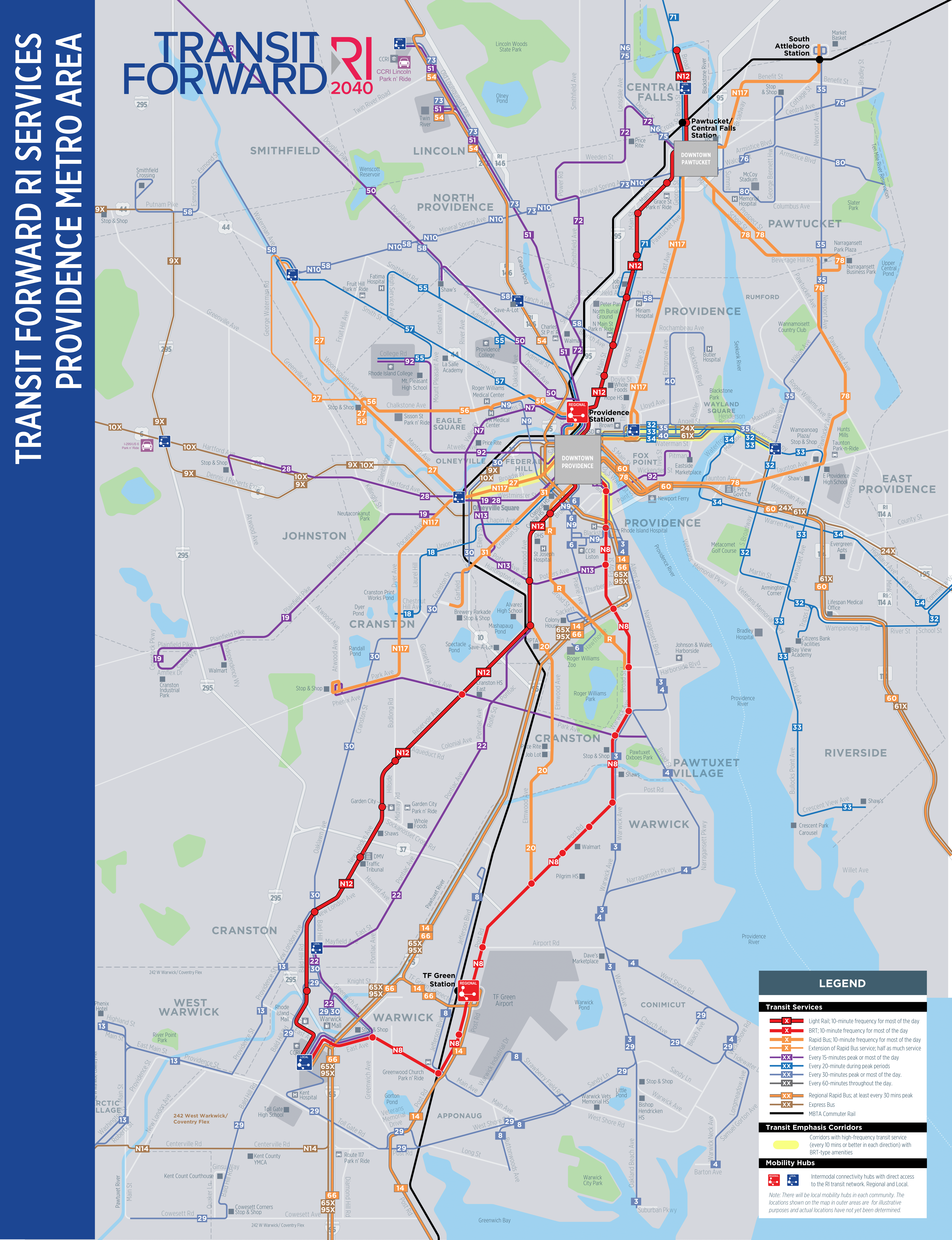
Observe that multiple trunks are designed to have very high all-day frequency. Already today, service on Broadway and Westminster from Downcity to Olneyville interlines to a bus every 7.5 minutes; the proposal is to boost this to a bus every 7.5 minutes on Westminster and also one every 5 on Broadway. Past Olneyville, the buses branch at lower frequency. South Main is to have a core trunk route every 10 minutes and also a less frequent regional bus. The Angell/Waterman one-way pair is to have three routes running every 20 minutes, two every 30, and two less frequent express buses; closer in, this one-way pair shares the bus tunnel between Downcity and College Hill with routes running on Hope, labeled N117 in the plan.
On net, this is a massive expansion of bus frequency available to people in and around Providence. Were it available when I lived there, I would have an easier time traveling to Pawtucket, East Providence, and other such locations, often for gaming purposes; with the network as it is (or as it was in 2012), I would walk 6 km from my home in Fox Point to a gaming store in Pawtucket and it would still be faster than waiting 40 minutes for the bus in the evening.
IMC and branching
IMC as a technology permits buses to run about 10 km off-wire; the current frontier of the technology is that a minimum of 20-30% of the route needs to be wired. UITP presents it as an advantage in that the wiring cost is only 20-30% of that of a traditional trolleybus, but in fact the wiring cost is much lower, because the trunks can be wired while the branches are left unwired.
This advantage is hard to realize in a city like Chicago or Toronto, with a relentlessly gridded bus network and little branching. Both cities rely on rapid transit for downtown access, and have a bus grid layered on top of their radial metro systems to provide everywhere-to-everywhere connectivity and feed the trains. In such an environment, IMC saves 70-80% of the cost of a trolleybus, minus the additional cost of procuring a bus with a backup battery. This may sound like a lot, but trolleybus expansion is rare globally, so reducing the cost by a factor of 4 does not necessarily turn it into an attractive investment.
But in Providence, there is no grid. About 4 km of wire in each direction, from Downcity to past Henderson Bridge, are enough to electrify nearly the entire bus network connecting the city with East Providence. Another 3 km along South Main and I-195 complete electrification to the east. The N117 may need a short stub on Thayer in addition to the bus tunnel; Broadway and Westminster, totally around 6 km, should be enough to electrify buses to and beyond Olneyville; the core of Broad is planned to carry the N12 and R, both at high frequency, and is therefore a prime target for wiring as well; Charles should be enough to wire most of the buses going due north or northwest.
This way, a core trolleybus network with maybe 30 km of wire in each direction can electrify most of the bus network in Providence, without having to deal with the teething problems of BEBs.
The issue of legibility
One minor benefit of wire in Providence is that it helps casual riders make sense of the public transportation network. A big disadvantage of bus networks over rail is their poor legibility: the map has too many routes and a user is expected to know them all over an area, and there is no indication on the street as to where the buses go. Marked bus lanes help solve the latter problem, as does wire.
Trolleybuses are not streetcars. Their ride quality is that of a bus – usually better, occasionally worse, depending on who I ask. Their network structure is usually like the core of an urban bus network, and not like that of a modern light rail network, which a casual user can get at a glance. The presence of wire makes the system easier to see on the ground, helping improve legibility.
This is especially important in cities without grid networks – precisely the environments in which on purely technical issues IMC is already strongest. In Vancouver, the buses are largely gridded, and so it is generally clear where they go: they run on major streets like Broadway, King Edward, 41st, Arbutus, and MacDonald. But in Providence, it’s not always clear, especially in the seams between two networks. Broadway has a few choices of street connections toward Kennedy Plaza – do buses go on Sabin? Or Fountain? Or Empire to Washington? Westminster has no clear connection – do buses turn left or right on Franklin/Dave Gavitt Way? Wire helps make it clear for the confused passenger who doesn’t live in town, or who lives on the East Side and isn’t familiar with the Federal Hill street network.
This can be better than light rail
RIPTA is interested in making its highest-intensity route, now the R and in the future the N12, into a light rail line. I get where it’s coming from, but I have some worries. Providence development is frustratingly almost linear, but not quite; the train station is in a street loop off Main, and on the map above, the N12 veers off the straight path to connect to it. I don’t know what the optimal way is of serving such a destination, and it’s likely the answer will change over time based on changes in the technology and in other connections.
IMC can be good precisely for this. If the route is partly wired, then small deviations based on changes in the plan are viable, albeit at the cost of legibility. The same goes for uncertainty over which routes connect to which: the R today interlines the old 99 on North Main to Pawtucket and the old 11 on Broad to South Providence, but the plan is to instead connect South Providence to Downcity via the Jewelry District using the N8, and instead have the N12 primary route continue southwest to Warwick via Elmwood and Reservoir. Such changes require a commitment to mode: swaps are fine as long as both routes use the same mode – if they’re both light rail then it is viable and the same is true if they’re both buses, but not if one is rail and the other is bus. IMC downgrades both to a bus, but in a way that permits higher ride quality to some extent and lower emissions at very low costs.
Quick Update on Where We are on New York Costs
The New York report is still a few months to go (the next ones to release on our list will be Istanbul and Italy), but from interviews, we can get a rough estimate of where the problems are. I want to stress rough and there are still extra sanity checks we need to do, both locally to New York and in comparisons. But a picture of the breakdown of what’s going wrong is starting to emerge.
Procurement
Procurement issues roughly double costs. This includes everything related to contracting, including the change order regime, the lack of competition between contractors for large projects, the qualify-to-bid system, risk compensation by contractors, and so on.
This is not quite the same as the change order problem seen in California, where Tutor Perini infamously bids low and overcharges on change orders; New York has regulations to prevent that, but the cure is sometimes worse than the disease. Overspecified contracts reduce flexibility and increase costs; normal design-bid-build systems let the building contractors make small modifications based on meter-scale geology and short-term changes in material prices, but New York is inflexible. The design-build solution is more flexible but removes a layer of public oversight and increases private-sector risk, so costs do not go down.
There is a blacklisting system, called disbarment, but it’s too onerous and goes further than just finding repeat offenders like Tutor and blacklisting them, so contractors bid higher to avoid the appearance of cost overrun. Some of this is not seen in Second Avenue Subway – disbarment is a Cuomo policy that was not present then, and must therefore be seen as part of the per-km cost increase from phase 1 to phase 2 even though phase 2 is easier.
Utilities
Roughly everyone involved in infrastructure construction in New York has told us some variation of the story that New York has complex underground utilities and getting around them is a challenge. This is not exactly what is going on – there’s stuff underground in Paris too – but is correct on the level of agency turf battles. All of the following problems are institutional, coming from our sources:
- Utilities such as Con Ed and DEP don’t maintain up-to-date databases of what’s precisely down there, so every time there’s a project, there’s a surprise, like an electric cable that was laid around the footprint of a car that was parked during construction rather than moving as it was supposed to.
- The knowledge that the utilities have is closely-guarded because who is the MTA to tell them to divulge secret information like where the pipes are?
- The MTA doesn’t run interference for its own contractors, so the contractors are on their own when dealing with the utilities, not just for underground work but also routine things like elevator installation and elevated station repairs.
- The utilities demand that their own workers supervise changes to their infrastructure. There is no state- or city-level coordination of infrastructure construction and maintenance.
- The utilities use subway capital money as OPM for their own wishlists for larger pipelines and upgraded infrastructure.
Finally, there is a fear-itself problem: dealing with utility relocation is so painful that the MTA avoids it even when doing so would be cheaper than digging deeper. I cannot give a precise estimate for the impact of utilities writ large, but a factor of 2, counting the fear-itself factor (which is large), is about reasonable.
Labor
Labor productivity in New York is low, and wages are elevated due to the use of local workers (in Stockholm the tunnel workers come from all over Sweden, and wages and benefits are high but somewhat less than in New York). This covers both blue- and white-collar labor: many different agencies, departments, and regulators demand to have their own supervisor down there looking at the work being done.
This is the part where I’m least certain of the impact. The reason is that labor productivity numbers beyond patterns that have been covered amply before are hidden behind layers of subcontracting – there is far less transparency on this in the US than in any other country we have looked at. Moreover, management-labor relations are so strained that planner interviews are not a perfectly reliable source; figuring out how much of the overstaffing problem was about too many white-collar supervisors and not just sandhogs took a while.
The impact of labor is best explained as, US infrastructure breaks down as 40-50% labor, vs. 20% in Turkey; I don’t have a breakdown in Sweden yet, where wages are high but labor efficiency is very high to reduce costs. In isolation, some labor costs scale with everything else. For example, contractor risk is added as an overhead on top of everything and is not part of the breakdown between labor, materials, and equipment. Likewise, delays induced by unexpected utilities require paying overtime during the wait, so labor costs scale to some extent. However, using the wrong material because the contract micromanaged what the contractors could use would be seen as material costs.
Design issues
Design is clearly an important factor but is even harder to quantify than labor. This does not include the preference for mined stations over cut-and-cover stations in SAS phase 1 – that was partly fear of utility work – and station costs were at a far larger premium than tunneling. It’s better to look at the project work for the 96th Street station, which was as expensive as the mined 72nd and 86th Street stations, and was an unusually large dig (7 blocks long) due to unusual but understandable geological issues. But even so, the station was costlier than it should have been based on dig volume.
Some design problems are defensive. Two notable ones:
- TBMs have to work 24/7 to avoid a cave-in. However, due to either real or predicted neighborhood complaints about noise, trucks did not remove the muck overnight. The overnight storage chamber for the muck cost $20 million. I do not know if this made things better; my personal experience in Berlin is that the worst time for truck noise is 6-9 am and this doesn’t help with sleeping.
- The MTA spent a lot of effort on shoring up a building that was damaged due to ground settlement in construction. The building was subsequently demolished anyway to make room for a taller building for transit-oriented development.
In addition, the speed of tunneling in New York is notably low. I do not know why, nor do I know the net cost impact of it, though at this point I suspect that by itself it’s a secondary issue to defensive design; we are investigating further.
The biggest question of the impact of design questions is to what extent the mined stations for SAS phase 1 were defensive against community impact (as mentioned by some of our sources) as opposed to utilities work. But, again, phase 2 stations are cut-and-cover except 125th Street, and costs are higher as procurement keeps getting worse.
Fire safety is another aspect. Contrary to what too many New Yorkers have told us, the American fire code in NFPA 130 is not unique to the United States. China uses the same code, as does Turkey; Spain uses a very similar code. However, the interpretation of the code leads to visible scope that does not exist elsewhere, including full-length mezzanines and obtrusive ventilation structures.
Everything together
Procurement and utilities together explain a factor of 4 cost difference. The rest is more hazily estimates; labor gets us to a factor of 5-6 (and it will get more precise in the next few months). Design is the big question mark of whether we can promise a factor of 7 or 15 reduction in costs.
Second Avenue Subway is a factor of 7-8 too expensive relative to the global average, but the global average isn’t necessarily the baseline – much of it includes Anglosphere subway with some of the same problems as New York, and non-Anglo examples near the average, such as Paris, have their own visible problems with costs by comparison with lower-cost examples. The baseline is not the lowest-cost places either – they tend to do unique things like building very short platforms (though Stockholm and some of the extensions in Italy clock at 140 meters to New York’s 180, and Istanbul has lines at 180). But a baseline around $150 million/km is reasonable to aim for. So a factor of 15 reduction relative to SAS phase 2 is exactly what we look for, and a factor of 7 still gets New York to be better than Germany and Japan and close to Paris.
So we’re getting close. Not quite there yet – but something that looks like an actionable recipe, provided reasonably competent political leadership looks achievable.
Metcalfe’s Law for High-Speed Rail, Redux
Americans are in big infrastructure spending mood, and my post from February using Metcalfe’s law to argue in favor of expansive high-speed rail in the eastern half of the United States has been attracting renewed attention. That post looked at how Metcalfe’s law that the value of a network rises in proportion to the square of the number of nodes implied that once a strong HSR corridor existed, for example the Northeast Corridor, extensions would be strong as well even if they connected much smaller cities. People have been asking me to extend that analysis to more lines that do not touch the Northeast Corridor, so here goes.
As a reminder, I’m using a simple gravity model, of the following level of sophistication:

The model is that the annual ridership in millions between two metropolitan areas A and B, with populations in the millions, is,

The theoretical reason for the 0.8 exponents is diseconomies of scale: the average person in Tokyo is farther from Tokyo Station than the average person in a small city is from their respective intercity rail station. Empirically, the best fit exponent for observed data in Japan and Europe is 0.8 – see sources in my previous post and in this post (sourced to since-rotted links) for France. The 500 km minimum is an artifact of the impact of station access time and the option of driving instead of taking the train.
Fares are set at typical Continental European levels rather than Japanese ones. As in the previous post, this means $0.135 per passenger-km, which breaks down as $0.07/p-km in operating expenses including rolling stock but excluding infrastructure and $0.065/p-km in profit, up to a total profit of $50/passenger. Beyond $50 in profit, which normally occurs at 770 km, fares only rise with operating expenses, to be more competitive with airlines. The goal is to find lines that have annual profits of more than 2-3% of construction costs.
A note of caution on the model
There are arguments to be made to refine the gravity model above in either direction. Ridership estimates in Britain are well above what the model predicts. High Speed 2 projects 3 trains per hour between London and Birmingham, running nonstop between the two cities so that no other city pairs can be added. The model gives an annual ridership equal to,

which fills around 1 train per hour in each direction to 50% of seated capacity. It’s possible the model does give higher ridership figures for very close-by cities – London and Birmingham are only 180 km apart – or it’s possible some unknown factor exists. Or HS2’s traffic estimates could be completely off.
In the case of the US, it’s likely any HSR will run faster than legacy 1960s Shinkansen. However, there’s a serious malus coming from higher car ownership, lower car traffic levels, and much weaker city centers. This is unlikely to be a problem for traffic to New York, but the last post dealt with that, whereas today we’re looking mostly at lines that aren’t about New York. Even Chicago is extremely auto-oriented by the standards of London or Paris, let alone Tokyo.
Metcalfe’s law for HSR in the Midwest: the initial line
The Midwest benefits from two things: it is flat, which reduces construction costs to $20-25 million per km if European norms are followed, and it has near-megacity Chicago in the middle. Unfortunately, Chicago is big but not big enough, and while the secondary cities are pretty big, there aren’t additional medium-size cities nearby the way Lyon has Saint-Etienne, Marseille has Toulon, etc. HSR can succeed, but the return on investment is for the most part marginal. The one exception is lines that can leverage the Northeastern network, including eventually not just the Northeast Corridor but also tie-ins to Pittsburgh and Cleveland, both of which are at reasonable HSR distance from New York.
By itself, the core Midwestern network would connect Chicago (10 million people) with Toledo (0.8, a distance of 370 km) and thence split toward Detroit (5 million, 100 km from Toledo) and Cleveland (3 million, 180 km). This leads to the following O&D ridership matrix, in millions:
| City W\City E | Toledo | Detroit | Cleveland |
| Chicago | 1.58 | 6.86 | 3.77 |
| Toledo | — | 0.91 | 0.6 |
| Detroit | — | — | 2.62 |
And in annual operating profits, in millions of dollars:
| City W\City E | Toledo | Detroit | Cleveland |
| Chicago | 38.08 | 209.56 | 134.68 |
| Toledo | — | 5.91 | 7.07 |
| Detroit | — | — | 47.65 |
This is not a lot of ROI. It’s $443 million a year, for a 650 km system, which should cost maybe $15 billion. It’s 3% by itself, which isn’t horrible, but compares poorly with Northeastern lines even though it connects the Midwest’s numbers 1, 2, and 4 metro regions.
In contrast, suppose a Northeastern system preexists, or perhaps is built at the same time, including a Pittsburgh-Cleveland connection. What then? Well, the question is really what the ROI is on connections from west of Cleveland to east of Cleveland. There are four metro areas east of Cleveland on the way to New York: Pittsburgh (2.5 million, 200 km from Cleveland), Harrisburg (0.7, 280 km from Pittsburgh), Philadelphia (7 million, 170 km from Harrisburg), New York (22 million, 140 km from Philadelphia). Washington has 10 million people and is 220 km from Philadelphia, but because a Washington-Philadelphia-Harrisburg route is circuitous, trains can only charge for 220 km, which is $29.70, and then earn the usual rate of $0.135/km farther west up to a maximum of $50 in profit, which is reached 730 km west of Harrisburg, or somewhat west of Toledo. With this in mind, we use the same pair of tables as above for the new city pairs, first ridership and then operating income:
| City W\City E | Pittsburgh | Harrisburg | Philadelphia | New York | Washington |
| Chicago | 1.75 | 0.34 | 1.56 | 3.12 | 1.48 |
| Toledo | 0.52 | 0.11 | 0.43 | 0.79 | 0.36 |
| Detroit | 2.26 | 0.35 | 1.49 | 2.81 | 1.3 |
| City W\City E | Pittsburgh | Harrisburg | Philadelphia | New York | Washington |
| Chicago | 85.36 | 16.77 | 77.94 | 156.23 | 74.03 |
| Toledo | 12.9 | 4.64 | 21.6 | 39.53 | 17.95 |
| Detroit | 70.6 | 17.47 | 74.53 | 140.73 | 64.84 |
The total operating income is $875 million a year, which combines with our internal $443 million to produce an 8.8% ROI. This relies on estimating HSR ridership at hefty distances – New York-Chicago is 1,340 km and around 5 hours, New York-Detroit is 1,070 km and around 4 hours. But we do have ridership estimates for city pairs of that magnitude in both Europe and Japan and they’re fine, except for airline-dominated Tokyo-Fukuoka. If anything, this is more robust than making assumptions on how many people are willing to travel by train between two cities without public transportation like Cleveland and Detroit.
Metcalfe’s law for the Midwest: further lines
Past plans for a Chicago-centered Midwestern HSR network called for four spokes: east toward Cleveland and Detroit, northwest toward Milwaukee and Minneapolis, southeast toward Indianapolis and Cincinnati, and southwest toward St. Louis and perhaps Kansas City. These spokes do pan out financially, but the ROI is not great. Even a line that doesn’t touch Chicago can work, namely HSR between Cleveland, Columbus, and Cincinnati – those three cities are too small and weak-centered to produce internal ridership, but New York-Columbus is in similar shape to New York-Detroit.
Milwaukee (2 million, 140 km from Chicago)
Milwaukee’s metro area touches Chicago’s. HSR between the two cities alone is not worth it, since at this distance, top speed isn’t as relevant as station access time. However, the addition of other cities makes this worthwhile. Since Milwaukee is just on city, we put ridership and operating income in the same table:
| City | Ridership | Operating income |
| Chicago | 3.3 | 29.99 |
| Toledo | 0.42 | 13.92 |
| Detroit | 1.27 | 50.42 |
| Cleveland | 0.66 | 29.62 |
| Pittsburgh | 0.34 | 17.16 |
| Harrisburg | 0.07 | 3.59 |
| Philadelphia | 0.34 | 17.25 |
| New York | 0.71 | 35.34 |
| Washington | 0.33 | 16.3 |
The ROI within the Midwest alone on what should be about $3 billion in construction is around 4% – higher than the bare Chicago-Cleveland/Detroit system. With Northeastern tie-ins, this rises to 7%, if one is confident in second-order but noticeable extra revenue from trains from New York, which would necessarily be a two-seat ride and take almost 6 hours with transfer time.
St. Louis (3 million, 460 km from Chicago) and Kansas City (2.5 million, 400 km from St. Louis)
The Chicago-St. Louis line has received some investments in the last 10 years that the state of Illinois pretends are high-speed rail. Those are expensive – there’s extensive surplus extraction by actors including politicians and the freight railroads – and perform exactly as one should expect trains that are slower than the legacy trains that the TGV replaced 40 years ago. However, this says nothing about whether trains that Europeans and East Asians would recognize as fast could succeed on that corridor. Could they?
A reasonable estimate for the Chicago-St. Louis construction cost is $10 billion; St. Louis-Kansas City would be another $10 billion, perhaps slightly costlier per km because Missouri’s terrain isn’t quite so flat as Illinois’s. Ignoring transfer penalties, we get the following ridership and operating income out of it:
| City N\City SW | St. Louis | Kansas City |
| Cleveland | 0.43 | 0.19 |
| Toledo | 0.22 | 0.09 |
| Detroit | 0.76 | 0.32 |
| Chicago | 4.56 | 1.33 |
| Milwaukee | 0.87 | 0.27 |
| St. Louis | — | 1.5 |
| City N\City SW | St. Louis | Kansas City |
| Cleveland | 21.32 | 9.45 |
| Toledo | 10.97 | 4.32 |
| Detroit | 37.84 | 15.99 |
| Chicago | 136.3 | 66.59 |
| Milwaukee | 34.07 | 13.59 |
| St. Louis | — | 39.1 |
St. Louis generates 6.84 million riders and $240 million in operating profit, which is above our 2% minimum but not by much. Moreover, 6.84 million riders means a train every hour, at which point there are real frequency artifacts for a service that shouldn’t take much longer than an hour and a half to Chicago. So it’s marginal, though still plausible. But if this is plausible, Kansas City isn’t: it generates $150 million. There are small intermediate stop locations like Springfield and Columbia, but they’re too small to make a difference.
The Ohio Hub
The four largest metro areas of Ohio are roughly collinear. Going southwest of Cleveland, one has Columbus (2.5 million, 220 km), then Dayton (1 million, 110 km), and finally Cincinnati (2.3 million, 90 km). Construction costs are likely to be low because of the terrain – only around Cincinnati are there significant hills. 420 km for $10 billion is plausible. What is the ridership, and what is the revenue?
| City E\City W | Columbus | Dayton | Cincinnati |
| New York | 1.81 | 0.71 | 1.18 |
| Philadelphia | 0.98 | 0.37 | 0.6 |
| Washington | 0.83 | 0.1 | 0.55 |
| Harrisburg | 0.24 | 0.09 | 0.14 |
| Pittsburgh | 1.3 | 0.56 | 0.79 |
| Cleveland | 1.5 | 0.72 | 1.41 |
| Columbus | — | 0.62 | 1.22 |
| Dayton | — | — | 0.58 |
| City E\City W | Columbus | Dayton | Cincinnati |
| New York | 90.71 | 35.44 | 59.13 |
| Philadelphia | 48.91 | 18.52 | 30.25 |
| Washington | 39.79 | 4.93 | 27.68 |
| Harrisburg | 10.9 | 4.3 | 6.78 |
| Pittsburgh | 35.48 | 19.14 | 31.87 |
| Cleveland | 21.5 | 15.5 | 38.4 |
| Columbus | — | 4.46 | 15.81 |
| Dayton | — | — | 3.42 |
The total operating income is $563 million a year, which is 5.6% ROI. The biggest cells – New York-Columbus, New York-Cincinnati, Philadelphia-Columbus, Washington-Columbus – are reasonably certain. The internal Midwestern numbers are more suspect, as are the numbers involving Pittsburgh – these are cities where car ownership approaches 100% and the remainder are carless out of poverty, and the destinations are fairly decentralized.
Indianapolis and points south
Indianapolis (2.5 million, 280 km from Chicago) is an attractive-looking target. By itself it’s not much, just like slightly-bigger St. Louis, but unlike St. Louis, it has cities behind it in Cincinnati (170 km) and Louisville (1.5 million, 180 km) that are not as far from everything as Kansas City is. Moreover, Indianapolis-Cincinnati also unlocks travel to Columbus, probably with a transfer because the bluffs around Cincinnati force trains from both Indianapolis and Columbus to enter from the north, without through-service.
South of Louisville, it’s attractive to go south to Nashville (2 million, 270 km from Louisville), Chattanooga (1 million, 200 km), and finally Atlanta (7 million, 180 km). But unlike the New York-Atlanta and the New York-Chicago legs of the triangle, the Chicago-Atlanta leg is decent but not amazing, since it omits the largest city.
| City S\City N | Milwaukee | Chicago | Indianapolis | Louisville | Nashville | Chattanooga |
| Indianapolis | 1.09 | 3.94 | — | — | — | — |
| Cincinnati | 0.73 | 3.69 | 1.22 | — | — | — |
| Dayton | 0.28 | 1.62 | 0.62 | — | — | — |
| Columbus | 0.44 | 2.33 | 1.3 | — | — | — |
| Louisville | 0.5 | 2.62 | 0.86 | — | — | — |
| Nashville | 0.3 | 1.55 | 1.09 | 0.72 | — | — |
| Chattanooga | 0.11 | 0.55 | 0.37 | 0.41 | 0.52 | — |
| Atlanta | 0.4 | 1.82 | 1.07 | 1.16 | 2.48 | 1.42 |
| City S\City N | Milwaukee | Chicago | Indianapolis | Louisville | Nashville | Chattanooga |
| Indianapolis | 29.68 | 71.7 | — | — | — | — |
| Cincinnati | 28.01 | 107.8 | 13.43 | — | — | — |
| Dayton | 12.48 | 56.96 | 10.55 | — | — | — |
| Columbus | 21.77 | 98.49 | 32.1 | — | — | — |
| Louisville | 19.57 | 78.28 | 10.1 | — | — | — |
| Nashville | 15 | 73.36 | 31.8 | 12.68 | — | — |
| Chattanooga | 5.7 | 27.36 | 15.61 | 12.68 | 6.79 | — |
| Atlanta | 19.82 | 91.1 | 53.74 | 49.21 | 61.2 | 16.65 |
Reasonable construction costs are $6 billion to Indianapolis, $4 billion to each of Cincinnati and Louisville, $7 billion to Nashville, $6 billion to Chattanooga, and $5 billion to Atlanta. Indianapolis itself doesn’t generate sufficient ROI, but with the addition of Cincinnati it is pretty strong, the combined system generating $483 million, or 4.8% ROI. Then Louisville generates $108 million, or 2.7%; Nashville generates $133 million, or 1.9%; and Chattanooga and Atlanta together generate $360 million, or 3.3%. Note that the last segment generates the highest ROI, and moreover it is not really possible to start from Atlanta and move north, since Chattanooga alone doesn’t generate significant ridership to cities northeast of Atlanta, as those cities are either small (Greenville, Charlotte) or far (Washington).
Update 12-21: Madison (0.9 million, 120 km from Milwaukee) and Minneapolis (4 million, 400 km from Madison)
The above calculations are for expansions from the first Midwestern core line connecting metro regions #1, 2, and 4 to on another. But what about the #3 region, Minneapolis? Minneapolis has a metro area of 4 million, and is by far the largest Midwestern region with population growth, having grown 9% between 2010 and 2019, whereas Chicago, Detroit, and St. Louis were flat and Cleveland declined.
It should not surprise that Chicago-Minneapolis traffic alone is insufficient to justify HSR, given that Chicago-Detroit alone is not and that line requires service to Cleveland as well as points east. Fortunately, Minneapolis’s location is such that through-service from much of the rest of the Midwest is plausible. Distances are long – this isn’t the Northeast or Western Europe – but trips between Minneapolis and secondary cities like Cleveland, Detroit, Cincinnati, and Indianapolis become much faster by rail than by car. Even St. Louis-Minneapolis is feasible, even though nowadays there’s a mostly direct all-freeway route that’s 900 km long vs. 1,120 by HSR. Midwestern travel today is dominated by the car and not the plane, since car ownership is universal and flying between two secondary cities is not necessarily convenient or cheap.
We get the following matrix of ridership:
| City S\City N | Madison | Minneapolis |
| Cleveland | 0.25 | 0.37 |
| Toledo | 0.15 | 0.18 |
| Detroit | 0.47 | 0.65 |
| Columbus | 0.17 | 0.28 |
| Dayton | 0.11 | 0.16 |
| Cincinnati | 0.27 | 0.36 |
| Louisville | 0.18 | 0.25 |
| Indianapolis | 0.49 | 0.54 |
| St. Louis | 0.32 | 0.44 |
| Chicago | 1.74 | 3.29 |
| Milwaukee | 0.48 | 1.46 |
| Madison | — | 0.84 |
And here is the matrix of operating income:
| City S\City N | Madison | Minneapolis |
| Cleveland | 12.65 | 18.7 |
| Toledo | 5.95 | 8.96 |
| Detroit | 22.24 | 32.26 |
| Columbus | 8.66 | 13.79 |
| Dayton | 5.39 | 7.89 |
| Cincinnati | 12.29 | 17.96 |
| Louisville | 8.61 | 12.53 |
| Indianapolis | 17.27 | 26.78 |
| St. Louis | 14.99 | 21.82 |
| Chicago | 29.4 | 141.28 |
| Milwaukee | 3.74 | 49.48 |
| Madison | — | 21.73 |
A reasonable construction cost for Milwaukee-Minneapolis is around $13 billion. Overall operating income is $514 million a year, so 4% ROI; one can even scratch a few fractions of 1% by including extra ridership from connections from points east of Cleveland, but I’m comfortable rounding New York-Minneapolis ridership over 2,000 km and a probably-untimed transfer in Chicago from 0.67 million to zero. At most, including East Coast-Minneapolis rail ridership provides cushion against unresolved questions such as whether people would take a 4.5-hour train between Detroit and Minneapolis or continue driving for 10 hours plus rest stops.
Metcalfe’s law in California
In California, the definition of a metro area is dicey. The combined statistical area for the Bay Area has 9.7 million people, but that includes Merced, Modesto, and Stockton, all of which are geographically in the Central Valley and would get dedicated HSR stations, some on a different branch from that going toward the Bay proper. In fact, we have 9.7^0.8 = 6.16, but if we sum each individual MSA component and raise its population to the 0.8th power, even omitting ones without planned HSR stations like Santa Cruz and Napa, we get a total of about 7. So we should use the higher figure. Likewise, in Los Angeles, taking the CSA population yields 18.7^0.8 = 10.41 whereas summing the constituent metro areas separately yields 11.3, and summing the counties, all of which are supposed to have stations, yields 12.8. We use the higher figure, 12.
Together we get 25 million intercity riders, before applying the distance penalty. The distance depends on which pair of stations we look at, since we’re summing over many different stations; it also depends on alignment choices, which don’t all have the same average speed, which means that trip time, whence the distance malus, is not perfectly congruent to distance. To simplify, we assume that LA-SF is 2:45, which at Shinkansen speed is 650 km; this is shorter than the actual LA-SF distance under most alignments, though not by much, and it’s longer than actual distances to subsidiary Northern California destinations.
With this in mind, our formula spits out 14.79 million intercity rail trips. This is a lot lower than California HSR estimates. Those estimates also include San Diego (3 million, 190 km from LA), Bakersfield (0.9 million, 180 km), Fresno (1.3 million, 170 km from Bakersfield), and Sacramento (2.6 million, 270 km from Fresno, 230 km from SF). None of these adds a lot, though. The reasons for the discrepancy include,
- California HSR assumed heavy HSR commuter traffic – Palmdale-Los Angeles was one of the top city pairs.
- California HSR assumed somewhat lower fares than the European norm, standing at $79 for LA-SF.
- California was projecting population into the future, and may have assumed less NIMBYism than the state presently has.
- The California HSR model may have had flaws; one such flaw was overestimating the impact of frequency at the LA-SF range, to the point that pruning branches such as to San Jose was said to increase ridership by improving frequency to the remaining destinations.
Not that the numbers coming out of my model are bad. The LA-SF numbers alone are worth $625 million in operating profits a year, and with Bakersfield and Fresno this grows to $875 million. The cost of the project without San Diego and Sacramento tie-ins should be on the order of $25-30 billion, in today’s money. Sacramento is maybe 90 extra km and $2 billion depending on alignment, and generates another $260 million or so; Metcalfe’s law is practically a free gift when you have a 90 km spur in flat geography. San Diego is probably something like $6 billion, the higher cost coming from the constrained urban environment and the need for some viaducts and one short tunnel, and adds around $240 million in operating profits.
I am of course aware that at no point was the cost of California HSR $25 billion in 2020 terms. In 2008 the state promised $33 billion in 2008 dollars. The discrepancy comes from some catastrophically bad decisions regarding scope at every stage of the planning phase and bad procurement. But if one looks at what the project needed rather than what has been built in the Central Valley and plugs in standardized costs, the answer is around $25 billion.
What Suburban Poverty? Redux
Earlier this week, I wrote about the incomes of commuters, looking at the incomes of people who commute to the central business districts of six American cities by distance from the center. Contrary to the story of drive-until-you-qualify, in which incomes drop as one moves farther out, in fact incomes tend to rise with commute distance. I was asked by many people in comments and on Twitter, what about the general public, and not just commuters?
The answer is that the answer changes but not by much. The model remains that of the poverty donut, in which people within a certain distance from city center, between 5 and 20 km depending on city size, are poorer than people in both the innermost radius and people who live in the suburbs farther out.
As before, we use data from OnTheMap, which slices jobs by income brackets, of which the highest is $40,000 or more per year in wages. This does not take unemployment or non-wage income into account, but usually these amplify existing inequalities in wages.
Here’s the same table as in the last post, with counts of employed residents and the share of $40,000+ workers within the same radii from the same point as before, without the restriction that people work in the CBD:
| City | New York | Los Angeles | Chicago | Washington | San Francisco | Boston |
| Point | Grand Central | 7th/Metro Center | Madison/State | Farragut | Market/2nd | DTX |
| 0-5 km | 680,133 | 203,820 | 176,979 | 177,312 | 222,134 | 219,045 |
| 40k+ % | 67.6% | 33% | 68.6% | 66.4% | 69.2% | 58.7% |
| 5-10 km | 1,123,426 | 506,084 | 342,255 | 297,723 | 239,994 | 379,292 |
| 40k+ % | 50.1% | 34.7% | 48% | 53% | 57.6% | 53.5% |
| 10-15 km | 1,335,294 | 627,797 | 468,107 | 342,649 | 261,568 | 274,212 |
| 40k+ % | 41.5% | 40.7% | 39.3% | 50.6% | 57.3% | 58.8% |
| 15-20 km | 1,114,743 | 736,561 | 368,022 | 306,101 | 248,715 | 223,600 |
| 40k+ % | 45.5% | 44.3% | 44.4% | 51.8% | 55.8% | 57.9% |
| 20-30 km | 1,289,364 | 1,220,414 | 539,332 | 485,355 | 367,591 | 384,671 |
| 40k+ % | 51.8% | 44.2% | 47.6% | 56.6% | 58.4% | 57.9% |
| 30-40 km | 905,254 | 1,020,080 | 630,250 | 551,093 | 469,556 | 387,372 |
| 40k+ % | 57.1% | 44.9% | 49.3% | 53.7% | 60.3% | 54.8% |
| 40-50 km | 753,040 | 754,717 | 633,381 | 478,307 | 377,010 | 377,544 |
| 40k+ % | 55.8% | 45.9% | 51.1% | 56.3% | 63.7% | 53.9% |
| 50-60 km | 623,786 | 632,476 | 554,520 | 435,857 | 405,328 | 421,248 |
| 40k+ % | 55.7% | 49.6% | 47.4% | 47.2% | 62.5% | 51.8% |
| 60-70 km | 535,991 | 405,516 | 399,769 | 410,554 | 498,840 | 434,048 |
| 40k+ % | 55.6% | 50.2% | 49.8% | 48.8% | 58.8% | 45.8% |
| 70-80 km | 484,356 | 518,270 | 189,540 | 232,985 | 410,047 | 402,805 |
| 40k+ % | 54.9% | 46.5% | 48.7% | 51.2% | 54.4% | 47.9% |
Notes
A few valuable footnotes to the table above:
- In Boston, the innermost 3 km radius, comprising such neighborhoods as Back Bay, there are 98,691 residents of whom 66.4% earn at least $40,000 a year, but the 5 km level of granularity doesn’t quite see that because the city is smaller than the others. So the swoosh model seen in New York and Washington still holds.
- The 50-60 km and 60-70 km annuli around Washington include most of Baltimore, so they are poor once we strip the requirement that people work in the District. They do not show suburban poverty, but urban poverty in a city that, far from getting the transportation investment Massachusetts is putting into the Gateway Cities, had a subway line canceled by a popular moderate Republican governor for what’s almost certainly racist reasons.
- The situation in the Bay Area is the reverse of that of Washington. The 40-50 km and 50-60km annuli are wealthy because they happen to include wealthy communities on the Peninsula whose suburban status is awkward, having been both wealthy commuter suburbs of San Francisco and more recently Silicon Valley edge cities with many tech jobs.
What’s going on in Los Angeles?
All other cities on the table have poverty donuts, poorer than both the city core and the suburbs. But in Los Angeles, the $40,000+ share grows nearly monotonically as distance from the CBD increases. The 5 km radius from the center, which in New York comprises the Upper East and West Sides and in Chicago comprises the North Side and the gentrifying parts of the Near South Side, is the poorest group in Los Angeles. It consists of neighborhoods that are not particularly wealthy, like Boyle Heights, Filipinotown, and Koreatown.
The broader question is, how come those neighborhoods have not gentrified the way their counterparts in other American cities did?
The answer to this question has to be that Los Angeles is very weak-centered. The other five cities all have strong CBDs, which means the middle class is willing to pay extra to live near their centers. In Los Angeles, employment in the CBD is weaker, so fewer people of means try to concentrate there.
Place-based policy for commuters
Despite the fact that people who live 50 km from city center are noticeably poorer than people who live 50 km and work at city center, there’s an impulse to focus on rush-hour commuter transportation at this range. This can include highway widening, or commuter rail that is so peak-focused it’s essentially a highway widening, interfacing with the suburban road and parking network but not with any urban public transportation.
Even though the people such policy helps are better-off than most, governments still sell it as a social justice measure that would promote equity. The error here is that while people in (say) New Bedford are poorer than average, the local notables who decide what the New Bedford agenda is are richer than average, and they want to be able to say that they steered spending to the area in order to feel more important.
It’s an awkward situation in which money is wasted on grounds of both efficiency and equality. The local notables are on the wealthy side, like the CBD-bound commuters, but they’re a distinct group with mostly local ties, so they understand the needs of regional rail even worse than 9-to-5 commuters as as class do. So the money is wasted, and it’s wasted in a way that increases inequality rather than decreasing it.
Job access for the working class
The best place for job access for the working class remains city center. In Los Angeles, this is direct from the data: for all the talk about drive-until-you-qualify exurbs in the Inland Empire, incomes there remain higher than in East LA or South Central. But this is true even in the other cities, for two distinct reasons.
In some cities, like Chicago, there is notable directionality – that is, there is a favored quarter (the North Side) and an ill-favored one (the South Side). Job suburbanization generally goes in the direction of the favored quarter because that is where corporate management lives. In Washington, Amazon decided to build HQ2 in the direction of the favored quarter, in Virginia, and offered the ill-favored quarter, the lower middle-class Prince George’s County, a lower-end warehousing job center. This situation seems universal or nearly so: in Paris most job suburbanization goes to the western favored quarter, in Tel Aviv it goes to the northern favored quarter, and so on.
But not all cities have much directionality. New York doesn’t – go in any direction outside the Manhattan core and you’ll find poverty, whether it’s in Harlem, Corona, Bed-Stuy, Jersey City, or Bergen Hill, and go further and you’ll find reasonable levels of comfort.
That said, in New York, off-center jobs are awfully inaccessible. Creating more jobs in Harlem would be great for working-class black and Hispanic job seekers in the area, but would not be very accessible from Brooklyn or Hudson County. Even access from the Bronx may be compromised by East Side vs. West Side divisions: how much access does the South Bronx get to Uptown Manhattan’s biggest job center, Columbia?
What’s more, plans for decentralizing jobs in the New York region don’t focus on Harlem or Jersey City, just as plans in Washington go to Fairfax County and not PG County. The PennDesign plan for high-speed rail, dubbed North Atlantic Rail, calls for a job center on Long Island called Nassau Center, in a homogeneously comfortable part of the region.
So in all cases, keeping jobs as concentrated in city center as possible, and allowing the CBD to organically expand into nearby areas, ensures the best job access for everyone, but this is disproportionately helpful for lower-income workers. There just isn’t enough suburban poverty writ large to justify any deurbanization of job geography on equity grounds.
Boston Construction Cost Webinar Tomorrow
Who: me, Eric Goldwyn, and Elif Ensari as the panelists, and Matt Yglesias as the moderator
What: a webinar in which we release our construction cost report on the Green Line Extension in Boston, which is the first of our six cases. We will also discuss our construction cost database, but the primary topic will bee why the construction costs of GLX were so high.
Where: online, click on the RSVP button in this link to register. And we’re already mildly overbooked, with a capacity of 500 against 600 online registrants – usually the yield for such events, like Modernizing Rail, is only 1/2-2/3, so I’m not too worried, but please show up on time.
When: tomorrow, 2020-12-09, at 17:00 Central Europe Time, or 11:00 Eastern Standard Time.
Why: because we’d like to promote our preliminary findings. This should be interesting to people interested in public transportation, state capacity, and project management.
Update 12-11: here is the video. And no, I am not sick, my sniffling was pretty random.
Little Things That Matter: Vertical Circulation
Chatelet-Les Halles has a problem with passenger circulation. It has exceedingly wide platforms – the main platforms, used by the RER A and B, are 17 meters wide – but getting between the platform level and the rest of the station runs into a bottleneck. There are not enough stairs and escalators between the platform and the mezzanine, and as a result, queues develop after every train arrival at rush hour. Similar queues are observed at the Gare du Nord RER platforms. The situation at Les Halles is especially frustrating, since it’s not a constrained station. The platforms are so wide they could very easily have four or even six escalators per access point flanking a wide staircase; instead, there are only two escalators, an acceptable situation at most stations but not at a station as important as Les Halles.
This is generally an underrated concern in the largest cities. In smaller cities, the minimum number of access points required for coverage (e.g. one per short subway platform, two per long platform) is enough even at rush hour. But once daily ridership at a station goes into the high five figures or the six figures, a crunch is unavoidable.
There are two degrees of crunch. The first, and worse, is when the capacity of the escalators and stairs is not enough to clear all passengers until the next train arrives. In practice, this forces trains to come less often, or to spread across more platforms than otherwise necessary; Penn Station’s New Jersey Transit platforms are that bad. The situation at Les Halles and Gare du Nord is a second, less bad degree of crunch: passengers clear the platform well before the next train arrives, but there’s nonetheless a significant queue at the bottom of the escalator pits. This adds 30-60 seconds to passenger trip times, a nontrivial proportion of total trip time (it’s a few percent for passengers within the city and inner suburbs). Avoiding even the less bad crunch thus has noticeable benefits to passengers.
The capacity of a horizontal walkway is 81 passengers per minute per meter of width (link, p. 7-10). This is for bidirectional travel. Unidirectional capacity is a little higher, multidirectional capacity a little lower. Subway platforms and passages are typically around 5 meters wide, so they can move 400 passengers per minute – maybe a little more since the big crunch is passengers heading out, so it’s unidirectional with a few salmons (passengers arrive at the station uniformly but leave in clumps when the train arrives). Busier stations often have exits at opposite ends of the platform, so it’s really 400*2 = 800. Queues are unlikely to form, since trains at best arrive 2 minutes apart, and it’s uncommon for a train to both be full and unload all passengers at one station.
An escalator step can be 60 cm, 80 cm, or 1 meter wide, with another 60 cm of handrail and gear space on both sides. On public transit, only the widest option is used, giving 1.6 meters of width. The theoretical capacity is 9,000 passengers per hour, but the practical capacity is 6,000-7,000 (link, p. 13), or 100-120 per minute. This is more than pedestrian walking capacity per unit of step width, but less per unit of escalator pit width. So a pedestrian walkway ending in a battery of escalators will have a queue, unless the width of the escalator bank is more than that of the walkway leading to it.
Moreover, escalators aren’t just at the end of the station. The busiest train stations have multiple access points per platform, to spread the alighting passengers across different sections of the platform. But mid-platform access points have inherently lower capacity, since they compete for scarce platform width with horizontal circulation. It appears that leaving around 2 meters on each side, and dedicating the rest to vertical circulation, is enough to guarantee convenient passenger access to the entire platform; in a crunch, most passengers take the first access point up, especially if there’s a mezzanine (which there is at Les Halles).
Should New York invest in better commuter rail operations, it will face a bigger risk of queues than Paris has. This is for two reasons. First, New York has much higher job density in Midtown than Paris has anywhere, about 200,000/km^2 vs. perhaps 100,000 around La Defense and the Opera (my figures for both areas in Paris have huge fudge factors; my figure for New York comes from OnTheMap and is exact). And second, Manhattan’s north-south orientation makes it difficult to spread demand across multiple CBD stations on many commuter rail lines. One of the underrated features of a Penn Station-Grand Central connection is that through-trains would have passengers spread across two CBD stops, but other through-running regional rail lines would not have even that – at best they’d serve multiple CBDs, with one Midtown stop (e.g. my line 4 here).
When I computed the needs for vertical circulation at a Fulton Street regional rail station in this post, I was just trying to avoid the worse kind of crunch, coming up with a way to include 16 platform-end escalators (12 up, 4 down in the morning peak) and 16 mid-platform escalators (8 up, 8 down) on a 300-meter long two-level station. It’s likely that the escalator requirement should be higher, to avoid delaying passengers by 1-1.5 minutes at a time. With four tracks (two on a Grand Central-Staten Island line, two on a Pavonia-Brooklyn line) and 12-car trains arriving every 2 minutes, in theory the station could see 240,000 incoming passengers per hour, or 4,000 per minute. In reality, splitting passengers between Grand Central and the Financial District on what I call line 4 means that a sizable majority of riders wouldn’t be getting off in Lower Manhattan. When I tried to compute capacity needs I used a limit passenger volume of 120,000 per hour, and given Midtown’s prominence over Lower Manhattan, even 90,000 is defensible.
90,000 per hour is still 1,500 per minute, or 3,000-4,000 if we are to avoid minute-long queues. A single up escalator is limited to about 100-120 people per minute, which means that twenty up escalators is too little; thirty or even forty are needed. This requires a wider platform, not for horizontal passenger circulation or for safety, but purely for escalator space, the limiting factor. I proposed an 8-meter platform, with space for four escalators per end (two ends per platform, two platforms on two different levels), but this suggests the tube diameter should be bigger, to allow 10-meter platforms and six escalators per end, giving four up escalators per end. This is 16 up escalators. Another 16-20 up escalators can be provided mid-platform: the plan for eight up escalators involved eight access points interspersed along the platform, and 10-meter platforms are wide enough width to include three escalators (two up, one down) per bank and on the border of allowing four (three up, one down).
The situation at the Midtown stations in New York is less constrained. Expected volumes are higher, but Grand Central and Penn Station both spread passengers among multiple platforms. In the near term, Penn Station needs to add more vertical circulation at the New Jersey Transit platforms. The LIRR remodeled its section of the station to add more access points in the 1990s (e.g. West End Concourse), but New Jersey Transit is only doing so now, as part of phase 1 of Moynihan Station, and it’s still not adding as many, since its platforms are shorter and don’t extend as far to the west.
Nonetheless, given the number of proposals out there for improving Penn Station, including ReThinkNYC and Penn Design’s plan, it’s important to think of longer-term plans for better vertical circulation. When I proposed eliminating Penn Station’s above-ground infrastructure, I came up with a design for six approach tracks (including a new Hudson tunnel connecting to Grand Central), each splitting into two platform tracks facing the same platform; the six platforms would each be 15 meters wide, but unlike Les Halles, each of six access points would have six escalators, four up and two down in the morning peak, or alternatively four escalators and a wide staircase (the climb is 13 meters, equivalent to a five-floor walkup). There would be ample capacity for anything; emptying a full 12-car train would take forty seconds, and it’s unlikely an entire 12-car train would empty.
New Hudson Tunnels
Traditionally, proposals for new mainline rail tunnels across the Hudson enter Penn Station’s southern tracks, which are used by New Jersey Transit. This includes the ARC incarnations that connected to Penn Station’s preexisting tracks, Amtrak’s Gateway, and the Institute for Rational Urban Mobility’s through-running counter plan to ARC. To my knowledge, ARC-North proposals, entering the northern tracks used by the LIRR, have not been investigated. I am not ready to sign off on ARC-North yet and in fact called it a troll proposal, but I believe it deserves more study and is probably superior to southern proposals except at high levels of investment.
While this in principle only concerns the configuration of the tunnels across the Hudson, it has implications about the configuration of Penn itself and the service plan supported by the infrastructure. The one element of the various Penn Station redesign ideas that isn’t relevant is the look of the station itself; this is also the least important element for passenger throughput. Penn Station’s failure to look like a cathedral is a lesser problem in a city that is full of multi-billion dollar starchitect-designed ugliness.
First, some principles for tunnel design. A good infrastructure proposal should have the following elements:
1. A through-running service plan. It matters which line at the New Jersey (or Hudson Line) end connects to which line at the Long Island or Connecticut end, since this influences the interlockings. It also matters where people are expected to transfer, since this influences platform crowding; ideally, transfers should be handled at Secaucus and Sunnyside.
2. Simple interlockings. Complex interlockings limit train speed, and switches especially do. It should be possible for trains to enter and exit Penn Station at speed. Avoiding slow zones in station throats is an underrated way of improving line haul time at relatively low cost, and the fancier the trains and more upgraded the tracks elsewhere are, the heavier the time penalty of slow throats is.
3. Adequate platforms. Penn Station has less bad platforms than people think – when I timed rush-hour LIRR trains, they emptied in about 90 seconds or a little more – but they’re still not good, especially if we’re assuming large increases in ridership coming from better service. The LIRR has better platforms than New Jersey Transit because it has more access points per platform, but the platforms are still narrow. In the worst case, a plan should consider paving over some tracks to widen the platforms, since Penn’s 21 tracks are more than enough for its traffic.
4. Adequate speed for intercity trains. The current tunnels are limited to 60 miles per hour (97 km/h) because of air resistance generated by non-aerodynamic trains in narrow tunnels. The cross-sectional area of the trains going through the tunnels is about half the cross-sectional area of the tunnels; in new high-speed rail tunnels, the corresponding ratio, called the obstruction ratio, is about 15%. It is possible to squeeze more speed out of the existing tunnels with better aerodynamics and sealing, but 200 km/h is probably impossible, and even slightly lower speeds are a problem if the tunnels are very busy and there is a speed mismatch with unsealed, non-aerodynamic commuter trains. So ideally, the larger-diameter new tunnels should be used by intercity trains. We can plan around one minute of travel time difference; this figure can in reality be anywhere between zero and 2.5 minutes.
5. Separation between intercity trains and Grand Central trains. If there is a Penn-Grand Central tunnel, it should be used exclusively by commuter trains because of the high local travel demand, and because to reduce real estate acquisition cost the curve radius should be low, possibly too low for Shinkansen equipment. This means that if a Hudson tunnel points toward the Penn-Grand Central tunnel, intercity trains should use the other one.
6. Two platform tracks per tunnel track. This improves capacity in two ways. First, rapid transit capacity is a combination of tunnel capacity and station dwell, and splitting each tunnel track between two platform tracks allows slightly higher capacity by deemphasizing the dwell since successive trains use different platform tracks. Paris is limited to 30 tph on the RER A with moving-block signaling, whose central segment has one platform track per tunnel track, but the shared RER B+D tunnel between Gare du Nord and Chatelet-Les Halles gets 32 tph with fixed blocks, where the B and D serve separate platforms at each station. And second, because each train can dwell at the platform for longer, this reduces the need for wider platforms, allowing violations of #3. Ideally, the two platform tracks would face the same platform to improve wayfinding and allow unscheduled track changes in case of train delays.
Now, Penn’s tracks are numbered 1-21, from south to north. There are platforms between tracks 20-21, 18-19, 17-18, 15-16, 13-14, 11-12, 9-10, 7-8, 5-6, 3-4, and 1-2; the 18-19 platform is wider than the rest, as if there was supposed to be another track immediately north of 18. The Hudson tunnels connect to tracks 1-19, the southern pair of the East River tunnels connects to 5-15, the northern pair connects to 15-21. The Hudson tunnels and the southern pair face each other, and trains on tracks 11 and 12 go straight through every switch; the northern pair offers no switch-free option, since the eastbound track faces track 21 and the westbound curves into the interlocking.
Since the Hudson tunnels face the southern pair, a simple proposal for new Hudson tunnels should face the northern pair. This would give 4 tracks between New Jersey and Sunnyside. Each of the two track pairs could point toward either Long Island or Connecticut, because of the Harold Interlocking, flawed as it is. This means intercity trains would use the northern pair and go to Connecticut, other regional trains would use either pair and go to either Connecticut or Long Island, and Harold would be superfluous. New Penn-Grand Central tunnels could be constructed branching from the southern East River tunnel pair. It is possible to also construct the tunnels around the southern pair, with trains from the southern pair either merging heading into the Hudson tunnels or terminating and reversing at Penn Station.
Under this plan, all of the numbered principles could be satisfied except #3, and to satisfy #3 every plan requires track paving or other platform modification. It’s also simple to construct: it’s just a new tunnel pair, and ideally also some work on the preexisting southern East River tunnel pair to construct a connection to Grand Central. The one drawback is that, unlike in ARC Alt G, Gateway, and the IRUM plan, the Penn-Grand Central tunnel shares approach tracks to Penn Station with the southern tunnels, reducing capacity. This becomes a problem if ridership from Grand Central, the LIRR, and points east grows to the point of overwhelming three tunnel pairs (the two heading into Penn, and East Side Access). The alternative with the Penn-Grand Central tunnels going around the southern tunnel pair and only merging heading into the Hudson tunnels has more capacity, but interferes with principles #3 and #6.
Track-paving for any plan is hard, because many of the straightest, longest-platform tracks have to be removed. To widen the platforms and improve throughput, there are two ways to pave over tracks, each of which gets rid of about half the station tracks. One is to pave over every other track, guaranteeing each track access to two medium-width platforms; trains could open both doors then, improving egress. The other is to pave every other pair of adjacent tracks lying between platforms, giving each track access to just one very wide platform. The former option is difficult at Penn because there are support columns between adjacent tracks, and a look at New Jersey Transit rolling stock suggests that each train would have 1-2 doors facing a column. We are left with the latter option, paving over, for example, tracks 20, 17, 16, 13, 12, 9, and 8. Each tunnel track would get two platform tracks facing the same platform, except for the westbound northern tunnel track, whose two tracks (21 and 19) would be split because of the aforementioned columns. The lowest-numbered tracks would not be used; the LIRR’s West Side Yard would not be used regularly but instead trains would run on the tracks more often off-peak. The now enlarged platform between tracks 7 and 10 would be lengthened to allow 16-car trains at track 7, which is currently 13 cars long.
Since principles #3 and #6 are both satisfied, the capacity per track can be quite high. The RER B+D achieves 32 tph, but this is split as 20 tph B and 12 tph D, which is suboptimal since two successive trains could both be B, making the dwell a problem. With even alternation between each platform’s two tracks and moving-block signaling, even higher capacity may be possible, reducing the capacity disadvantage of having just two tunnels coming into Penn from the east rather than three.
The IRUM plan, building on ARC Alt G, is quire different. It has three tunnels in each direction: the northern East River tunnels are paired with the Hudson Line via a new short tunnel linking the Empire Connection with the northern Penn Station tracks, the new Hudson tunnels come into the southern station tracks and then continue to Grand Central via new tunnels, and no tracks are paved. Intercity trains have to keep using the old tunnels, necessitating Harold, but that’s money already spent. Principle #3 is violated, or alternatively #6 is if tracks are paved, but there is more track capacity. The risk there is insufficient demand from the Empire Connection, which would leave the northern tunnels underused, reducing the system’s capacity advantage over a two-tunnel option to just a few tph. This plan has to route intercity trains through the old tunnels. Conversely, the advantage is that it easily shoehorns Empire Connection service, which ARC-North does not.
The main difference between ARC-North and IRUM is investment levels. ARC-North is cheaper; it’s more comparable to the bare-bones proposals for ARC(-South) and Gateway that are hinted at but never formally published. At the low investment levels of a bare-bones proposal, ARC-North is superior because it provides better capacity because of the relatively straight train paths through the station. If there’s no connection to Grand Central, then it is not at a capacity disadvantage since Long Island and Connecticut don’t have the demand, and barely have the capacity, to overwhelm three track pairs (including East Side Access again).
Conversely, ARC-North is harder to retrofit for somewhat higher investment. The best that can be done is tunneling to connect the Empire Connection to the southern tracks, digging new tunnels to Long Island as in Alt S, and running trains to just one line, probably Lower Montauk, which goes through serviceable neighborhoods but lacks a direct connection to the existing tunnels to Penn. This provides much better service coverage because of the Montauk connection, but at higher cost since there’s an additional underwater tunnel. It avoids the expensive components of Gateway and ARC, but so does IRUM, which becomes an intermediate level of investment between ARC-North proper and ARC-North with a Montauk tunnel.
