Category: Studies
IFP’s Transit Abundance Playbook
Two weeks ago, the Institute for Progress published a playbook called Transit Abundance, comprising 15 policy briefs about reducing construction costs. One of them was my own, about itemization of costs. Eric has a good one about phasing funding to prevent the situation of the Boston Green Line Extension in which the planning for the project was funded from the same grant that funded construction, leading to rushed pre-planning to get that money in the first place. And unfortunately, many of the rest are questionable. There’s a mix of good, meh, and downright counterproductive, and unfortunately, I’m seeing people I know and respect from elsewhere say things that are wrong or barely relevant.
My first filter for pieces like this is “is this even close to correct?”. There are some pieces that fail the test right there, praising projects that were extremely expensive as examples to emulate rather than avoid (for example, the reliably incompetent Stephanie Pollack is saying that of the Green Line Extension).
But beyond that, for things that at least get what the problem is, I look at what they cite. If they only cite the Transit Costs Project, then they don’t know enough to play. If they cite things I wasn’t aware of, then it’s more interesting. A positive highlight is Anthony Potts’ piece calling for technical scoring of proposals, which relies on literature about the exact weighting required for technical scoring to matter. We knew from interviews that California’s 30% technical score, 70% cost weighting produced identical results to lowest-bid. This piece actually went and found published results on this issue and found that if the cost is weighted at 57% or more then it’s the same as lowest-bid, and that this produces higher final costs both in general and in California case studies. This piece, I encourage everyone to read for a more complete discussion than we wrote of technical scoring and its merits.
And if this piece is a highlight, a lowlight is a piece on AI, by Lizzie Speed and Bennett Capozzi, panned across social media for calling for using more AI for transit planning, from a background of trying to sell AI technology rather than from that of transit planners; the authors cite the Transit Costs Project’s review of planning and other soft costs to argue the unique Anglosphere problem is data limitation (we say no such thing in our report) for which the solution is more AI, and seem not to know where those high costs come from. This compounds a criticism I’ve seen across social media for IFP’s use of generated images, to the point that the lead image for the playbook was noted for having errors in how the trains look (it’s hung on bus-like wheels rather than on bogies).
And regrettably, I’d like to also highlight Jackson Moore-Otto’s piece, which says that federal loans can stabilize transit funding to prevent a feast-or-famine problem. I respect Jackson and have seen him do and lead good work on matters of commuter rail and Boston-area advocacy, and am honestly surprised he’d write such a thing, which is just wrong.
The specific problem with Jackon’s argument is that it relies on a chain of citations, each introducing some errors to the point that the final claims are just wrong. A central claim is that the first electrification project costs more than subsequent ones, which is manifestly untrue (for example, compare Amtrak’s Northeast Corridor electrification in the 1990s with its struggles to install autotensioners now). This is based on a claim sourced to Momentum (which doesn’t quite say that), which sources it to the RIA Electrification Cost Challenge (which gets some Continental costs wrong); to get there, Jackson is saying the New Haven-Boston electrification was not a first line but a subsequent line, when in fact Amtrak had literally never electrified a railroad before and its forerunners on the Northeast Corridor had last done so in the Great Depression. The British costs are meanwhile compromised by repeated project cancellations that lead to sunk planning costs and make internal comparisons difficult, since the surviving lines are by definition the easiest ones. In truth, rather rapid electrification projects, without decade-by-decade continuity, exist outside the UK and are often quite reasonable in their costs, as in Denmark, Israel, and especially India.
The upshot is that because there is no feast-or-famine problem with electrification, any program to reduce its cost in the US (or UK) needs to understand what works and not talk about making it easier to apply for federal loans. On the Northeast Corridor, for example, a senior engineer since removed for incompetence and potential embezzlement of Amtrak funds unilaterally decided to tighten the required catenary pole spacing, driving up costs for reelectrification since the existing poles are not compatible with the new standard (but are compatible with high-speed electrification systems sold by international vendors). This is not a feast-or-famine problem, and to the extent there may be a specific federal policy solution, it’s to require planners to attend international industry fairs and conferences like InnoTrans and make it clear that ones who don’t will have stalled careers.
The RPA Publishes Bad Report Against Through-Running
The Regional Plan Association released a new report, called New York Penn Station: Constraints and Considerations for Meeting Future Demand. It argues against through-running on the grounds that it would reduce capacity, and asserts that any solution to station capacity after the Gateway tunnel, the Hudson Tunnel Project, opens in the late 2030s must include “station expansion or some other form of system expansion.” There’s something disappointing about this report, not because it’s wrong (although it is) but because it seems to just rehash past arguments without seriously addressing past criticisms of the $17 billion Penn expansion.
The lead author Rachel Weinberger and I talked about Penn Station capacity issues in 2024, after I wrote these two blog posts attacking Amtrak for its assumptions that imply additional tracks are required at Penn Station. Since then, the Effective Transit Alliance has done additional work, modeling the interfaces between the trains, the Penn Station platforms, and the concourses to arrive at feasible dwell times and capacities. Unfortunately, the RPA isn’t really engaging with any of that work, and retreats to just asserting that through-running would reduce capacity at Penn Station.
Capacity and dwell times
The most advanced technical work on the subject of capacity at Penn Station, the question being whether the bare Hudson Tunnel Project can perhaps with minor facelifts provide enough capacity to run 48 trains per hour between New Jersey and New York and the answer being yes, was done in the above-linked ETA report. We found the source of past claims by Amtrak that very long dwell times are necessary and deconstructed their assumptions, and modeled based on the current (post-Moynihan Station project) capacity of vertical circulation elements how long it would take passengers to clear each platform under rush hour assumptions.
The interface between the train and the platform itself is not the limiting factor; my two above linked blog posts from 2024 go over this and find a very short minimum dwell time, of 2 minutes or even less. The limiting factor is vertical circulation between the infamously narrow platforms and the concourses. Nonetheless, passengers can clear these in about 3 minutes. Notably, the narrowest of the platforms, platform 9, is compliant with NFPA 130 and its requirement that passengers be able to clear the platform in case of a fire in 4 minutes; the other platforms (except the wide platform 10) are not compliant, because they have two adjacent tracks and NFPA 130 assumes both tracks can be occupied, in which case the load doubles. Across all platforms, the one with the highest clearing time, platform 4, can clear a 1,620 passenger NJT bilevel in 4.83 minutes. Writing timetables to cycle trains between the platforms so that no platform comes close to having queuing between trains, is a routine exercise.
The report instead asserts that,
The time that the train dwells at the platform is 7 minutes in reasonable operating conditions: 5 minutes to unload passengers, 1 minute to check for stray passengers and then 1 minute for schedule recovery. There’s an additional 2.5 minutes to clear the interlockings and for train safety separations.
Accounting for all these aspects, under reasonable operating conditions, each track can accommodate 6 trains inbound per hour using drop-and-go service.
There is no citation for the model used, nor justification for either the 5 minute figure or for why an additional minute for schedule recovery is required. There is no explanation for why the 2.5 minutes to clear the interlockings matter to the capacity of each platform – once a train is past the platform, it’s gone and the capacity to measure is that of running track, not the platform. On outbound trains, it ominously says that,
The process of bringing an empty train into Penn Station, loading passengers and then departing takes 9 minutes in reasonable operating conditions during the PM peak period. This includes 7 minutes for passengers to hear the track announcement, descend to the platform and load into the train and 2 minutes for schedule recovery.
“Hear the track announcement” is an Americanism. In Germany, the track numbers are printed on one’s ticket, even on intercity trains, even at capacity-constrained stations with track shortages like Köln Hbf. The track for each fixed branch should be scheduled months in advance and known by regular passengers. Precisely because demand is asymmetric – toward Manhattan in the morning, away from Manhattan in the afternoon – the on and off peaks do not coincide at all, and encouraging passengers to get to the platform even before the train arrives would not overload the platform or the access and egress points.
The report completely missed the consequence of the asymmetry of demand when it finally asserted, based on modeling for which the report provides no details, that,
It would take an estimated 6 minutes for passengers to deboard, clear the platform and reach the concourse and another 4 minutes for passengers to descend to the platform and board the train during the AM peak. 2 additional minutes must be added to provide a buffer that ensures schedule adherence. The trains also require 2.5 minutes for clearing interlockings and safety separation, resulting in an hourly capacity of 4 trains per track and potentially 8 per platform.
A good rule of thumb here is that if Munich manages to slot 7 numbered branches, rising to 9 when one includes sub-branches, through one central trunk tunnel with 30 peak trains per hour, and comparable ridership to all three New York commuter rail systems combined, then nobody needs to add 2 minutes to the dwell time for schedule recovery, or 2.5 minutes for interlockings. The RPA is welcome to release its model for why it should take 10 minutes for passengers to board and alight; ours is open for inspection on GitHub and finds that the busier of the two can be done in 3 with a bit of buffer time and the less busy of the two is essentially free since so few passengers ride reverse-peak, and the train can leave even if some passengers that got off it are still on the platform on their way to the escalators.
The Parisian issue
The RPA report doesn’t talk about Paris. It doesn’t rebut the point that the RER is a good comparison case for New York commuter rail capacity, but it’s clearly lurking in the background. It does mention the RER as an ill comparison for the benefits of through-running (see section below), on the grounds that “trains follow each other along the same paths,” whereas in New York there is more and, measured by number of stations if not distance, earlier branching. But it doesn’t really address the point that if the RER can run 24-27 trains per hour per track in each direction, and the Munich S-Bahn can run 30, then so can through-running paths at Penn Station.
Reverse-engineering from what the report does say and from what the biggest points of contention have been when I talked to the RPA on this, they clearly think it matters that the European comparison cases have multiple city center stations to spread the load. Penn Station, in contrast, is the single central business district station, in a high-kurtosis city with far higher job density within walking distance of the station than can be found in any European city.
And yet, as I explained in my second original post from 2024, the effect coming from New York’s single city center station versus Paris’s multiplicity thereof largely cancels out the effect of much higher overall ridership on the RER than on New York commuter rail. Averaged over the peak four hours, the highest resolution I have for Paris, the sum of peak boardings and alightings per train is actually a bit higher on the RER E at Haussmann-Saint-Lazare, as of the 2010s when it was still a terminal, than it was at Penn Station in 2019 just before corona. The same sum at each of Gare du Nord and Gare de Lyon on the RER D is respectively 20% and 15% less than at Penn Station; on the RER B at Gare du Nord, it’s also 20% less. The Gare du Nord numbers are unlinked, so passengers interchanging across the platform between the RER B and D are counted in both trains’ ridership, but from the perspective of the train-to-platform interface, this is still a flow that the train and its doors and platforms must accommodate. If that’s doable in a 55 second dwell time, then trains at Penn Station can unload in 2 minutes at the peak and the rest is just a matter of counting platform-to-concourse vertical circulation elements and adding up their capacities as in the model described in the above section.
The benefits of through-running
Through-running works ideally when there are multiple city center stations, allowing the trains to function as urban rail as well as distribute passengers across multiple destinations. This is well-known to any group pushing through-running in New York, which is why so many such groups advocated for a tunnel connecting Penn Station with Grand Central, the so-called Alternative G in the ARC era in the 2000s, and why Tri-State’s proposal showcases a trunk line from Newark Penn Station to Sunnyside, and why ReThink heavily markets Secaucus and Sunnyside as secondary business centers. Here’s what ETA produced in 2023:
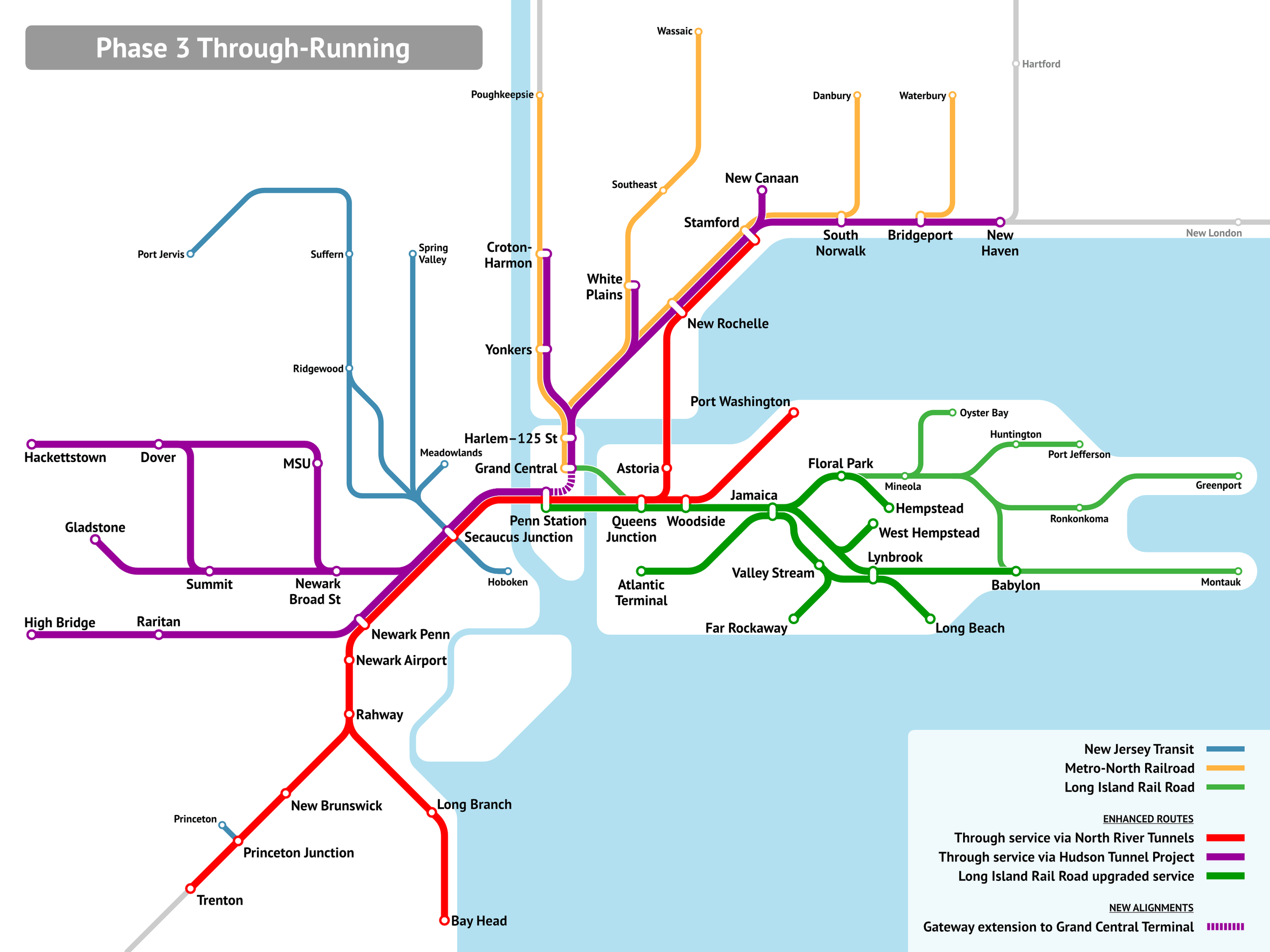
The upshot of this is that even with the dominance of Manhattan, any reasonable through-running system cobbled from existing and under construction infrastructure would unlock commutes from east of the Hudson to Downtown Newark, and from west of the Hudson to Long Island City (the station labeled Queens Junction is essentially Sunnyside Junction, walkable to a large fraction of Long Island City jobs), Flushing, and Jamaica.
It’s important context to understand why the RPA graphics denigrating through-running as limited in use don’t work:
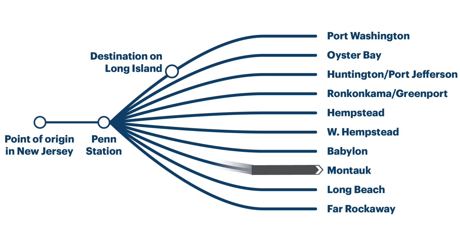
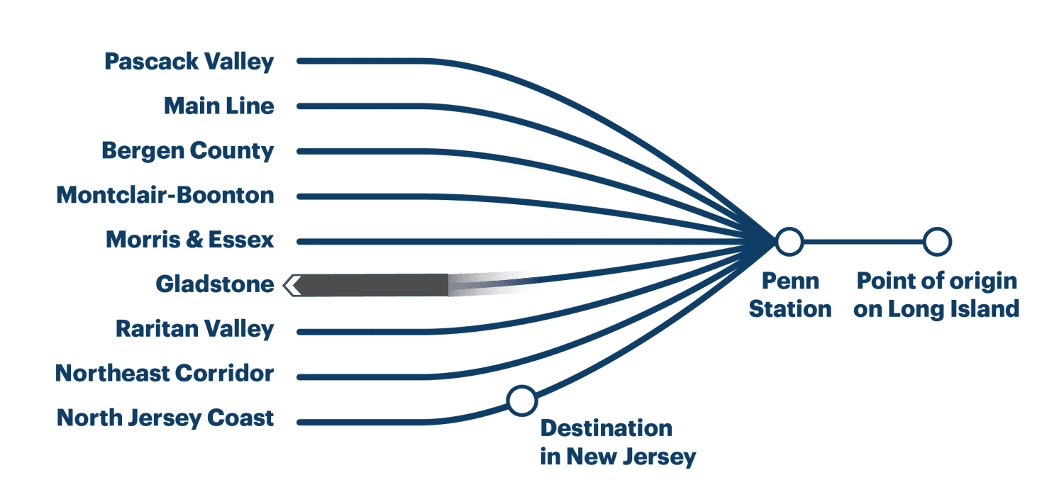
In truth, even setting aside a Penn-Grand Central tunnel (which is doable at MTA construction costs at a lower cost than Penn expansion), the destination in New Jersey is likely to be not just on the North Jersey Coast Line as depicted, but on any of the Northeast Corridor, North Jersey Coast, and Raritan Valley Lines. At present, the first two carry 14 trains per hour at the peak, and are decently likely to be one’s pair east of the Hudson. Similarly, one’s destination east of Penn Station is unlikely to be Long Island as commonly defined to exclude Brooklyn and Queens but rather to be on the trunk in Long Island City or on multiple branches within the city or perhaps on the New Haven Line.
The upshot is a hefty share of the total through-Manhattan market would in fact be served by a through-running system, usually with one-seat rides, or if not then with transfers at Sunnyside or Secaucus rather than New York. Through-running is not about those mythical trips from Oyster Bay to the Jersey Shore that Adirondacker in the comments section mocks, just as it isn’t about trips from Aulnay to IHES on the RER B or from the Marne-la-Vallée branch of the RER A to Saint-Germain-en-Laye. It’s about the overlapping near-center markets, individually small compared with commutes to the central business district and yet collectively significant.
A Better Billion and the Cost Model versus the 125th Street Subway Extension
We released a new report called A Better Billion. It was covered rather positively in the New York Times yesterday, with quotes from other transit advocacy groups. The idea for our report is that Zohran Mamdani promised free buses in his successful primary campaign, and promised free and fast buses in his successful general election campaign for mayor, so let’s take the $1 billion a year this could cost in forgone revenue and see how to spend it on subway expansion instead.
There’s been a lot of discussion in the article and on social media about the idea of free buses, but instead I want to talk about our proposal’s cost model, in the context of a rather incompetent plan the MTA released recently for a subway extension of Second Avenue Subway under 125th Street, at twice the per-km cost of Second Avenue Subway Phases 1 and 2, and twice the cost we project. Our model is not based on non-Anglo costs, but rather on real New York costs, modified to incorporate the one major cost saving coming from our previous reports, namely, shrinking station size. Based on everything combined, we came up with the following medium cost model:
| Item | Cost (2025 prices) |
| Tunnel (1 km) | $530 million |
| Tunnel, underwater (1 km) | $1,050 million |
| El or trench (1 km) | $260 million |
| Station, cut-and-cover | $510 million |
| Station, mined | $770 million |
| Station, el or trench | $240 million |
These costs include apportioned soft costs and not just hard costs. Altogether, an extension of Second Avenue Subway from Park Avenue to Broadway, a distance of 2 km with three mined stations at the intersections with the north-south subway lines, should cost $3.4 billion. This is not much less per kilometer than Second Avenue Subway Phases 1 and 2, which can be explained by the denser stop spacing and the need for mined stations at the undercrossings. If everything else were done in the right way rather than the American way, the low cost model would apply and costs would be reduced further by a factor of about 3, but the per-km cost would remain one of the highest outside the Anglosphere for those geotechnical reasons.
But the MTA and its consultants, in this case AECOM, project $7.7 billion, not $3.4 billion. Why?
Worse project delivery
We’ve assumed the existing project delivery systems the MTA is familiar with. However, what doesn’t move forward moves backward, and the procurement strategy at the MTA is moving backward rapidly, for which the primary culprit is Janno Lieber, first in his role at MTA Capital Construction (now Construction and Development), and then in his role as MTA head, pushing alternative delivery methods, especially design-build and increasingly progressive design-build (unfortunately legalized in New York last year). Such methods add to the procurement costs and especially to the soft costs. Second Avenue Subway Phase 1 had an overall soft cost multiplier of about 1.5: the total cost including soft costs was 1.5 times the hard costs (Italy: 1.2-1.25 times). This proposal, in contrast, has a multiplier of 1.75: the hard costs are estimated at $4.4 billion, and the total costs are 75% higher, technically including rolling stock except rolling stock at current New York costs is $80 million.
Contingency
The soft costs include a federally mandated 40% contingency. The FTA mandates excessive contingencies – the norm in low-cost countries is 10-20%, and anything more than that is just wasted. The contingency figure varies by phase of design and decreases as it advances, but in the earliest phase it is 40%, and it’s in that phase that budgeting is done. However, 40% is only required over hard costs based on standardized cost categories (SCCs), and not over past ex post costs that incorporated contingency themselves. In effect, the estimation method the MTA and AECOM prefer bakes in a 40% overrun at each stage, letting project delivery get worse over time as the globalized system of procurement takes deeper roots in New York.
Overdesign and overbuilding
Based on our recommendations, the MTA shrank the station overages in Second Avenue Subway Phase 2. Phase 1 had station digs 100% longer than the platforms, based on standards that were both extravagant to the taxpayer and spartan to the end user – the extra space is not usable by passengers but instead for unnecessary break rooms, separated by department. By Phase 2, this was reduced to a 50% overage, and we hoped that proactive design around best practices would reduce this further.
Unfortunately, the overages are still substantial, 50% at St. Nicholas and 25% at the other two stations (Italy, Sweden, France, Germany, China: 3-20%). Moreover, the stations still have full-length mezzanines. This a longstanding New York tradition, going back to the 1930s with the opening of the IND lines starting with the A on Eighth Avenue in 1933. And like all other New York subway building traditions that conflict with how things are done in more advanced, non-English speaking countries, it belongs in the ashbin of history. Mined stations’ costs are sensitive to dig volume, and there is little need for such additional circulation space, for passenger comfort or fire safety. Mezzanines are essentially free if the stations are built cut-and-cover, in which case they are used for back-of-the-house space in advanced countries, but not if the stations are mined, in which case the best place for break rooms is under stairs and escalators.
Moreover, as we will explain soon at the Effective Transit Alliance, mined stations and bored tunnel require a minimum spacing from the street and from other tunnels – but the proposal includes much more space than necessary, forcing the stations to be deeper, more expensive, and less convenient as it takes a full five minutes to transfer between platforms or to get from the platform to the street. It’s possible to ge even shallower with shoring techniques used in China to reduce tunnel and station depth in complex urban undergrounds.
Proactive and reactive cost control
When the MTA announced cost savings and station size shrinkage in Phase 2, we were excited. But on hindsight, costs in effect fell from $7 billion to $7 billion. The savings were entirely reactive, designed to limit further cost overruns, and are not proactively incorporated into further projects.
No doubt, if a $7.7 billion project is approved against any honest benefit-cost analysis (which is not required in American law), then shrinkage in station footprint and reduction in mezzanine length will be found to be saving money in 2032, and the successor of Lieber, hired from the same pipeline of people whose takes on other countries are “I had a kid who did a semester abroad in Stockholm,” will be proud of reducing costs from $7.7 billion to $7.7 billion.
The path forward must instead incorporate cost savings proactively. There’s a way of building subway stations cost-effectively, and instead of quarter-measures, the MTA should adopt it; we have blueprints from a growing selection of examples, all in places that have avoided the destruction of subway building capacity infecting the entire English-dominant world in the last 25 years. The MTA can even hire people with direct transport official-to-transport official communication with peers at other agencies (for example, through COMET) and with the language skills to read documents produced in lower-cost countries, instead of people whose best skill is giving interviews to softball interviewers and talking about sports.
New York Isn’t Special
A week ago, we published a short note on driver-only metro trains, known in New York as one-person train operation or OPTO. New York is nearly unique globally in running metro trains with both a driver and a conductor, and from time to time reformers have suggested switching to OPTO, so far only succeeding in edge cases such as a few short off-peak trains. A bill passed the state legislature banning OPTO nearly unanimously, but the governor has so far neither signed nor vetoed it. The New York Times covered our report rather favorably, and the usual suspects, in this case union leadership, are pissed. Transportation Workers Union head John Samuelsen made the usual argument, but highlighted how special New York is.
“Academics think working people are stupid,” [Samuelsen] said. “They can make data lie for them. They conducted a study of subway systems worldwide. But there’s no subway system in the world like the NYC subway system.”
Our report was short and didn’t go into all the ways New York isn’t special, so let me elaborate here:
- On pre-corona numbers, New York’s urban rail network ranked 12th in the world in ridership, and that’s with a lot of London commuter rail ridership excluded, including which would likely put London ahead and New York 13th.
- New York was among the first cities in the world to open its subway – but London, Budapest, Chicago (dating from the electrification and opening of the Loop in 1897), Boston, Paris, and Berlin all opened earlier.
- New York has some tight curves on its tracks, but the minimum curve radius on Paris Métro Line 1, 40 meters, is comparable to the New York City Subway’s.
- The trains on the New York City Subway are atypically long for a metro system, at 151 meters on most of the A division and 183 on most of the B division, but trains on some metro systems are even longer (Tokyo has some 200 m trains, Shanghai 180 m trains) and so are trains on commuter rail systems like the RER (204 m on the B, 220 m on the A), Munich S-Bahn (201 m), and Elizabeth line (205 m, extendable to 240).
- New York has crowded trains at rush hour, with pre-Second Avenue Subway trains peaking at 4 standees per square meter, but London peaks at 5/m^2 and trains in Tokyo and the bigger Chinese cities at more than that. Overall ridership, irrespective of crowding, peaked around 30,000 passengers per direction per hour on the 4 and 5 trains in New York, compared with 55,000 on the RER A.
New York is not special, not in 2025, when it’s one of many megacities with large subway systems. It’s just solipsistic, run by managers and labor leaders who are used to denigrating cities that are superior to New York in every way they run their metro systems as mere villages unworthy of their attention. Both groups are overpaid: management is hired from pipelines that expect master-of-the-universe pay and think Sweden is a lower-wage society, and labor faces such hurdles with the seniority system that new hires get bad shifts and to get enough workers New York City Transit has had to pay $85,000 at start, compared with, in PPP terms, around $63,000 in Munich after recent negotiations. The incentive in New York should be to automate aggressively, and look for ways to increase worker churn and not to turn people who earn 2050s wages for 1950s productivity be a veto point to anything.
Transit-Oriented Development and Rail Capacity
Hayden Clarkin, inspired by the ongoing YIMBYTown conference in New Haven, asks me about rail capacity on transit-oriented development, in a way that reminds me of Donald Shoup’s critique of trip generation tables from the 2000s, before he became an urbanist superstar. The prompt was,
Is it possible to measure or estimate the train capacity of a transit line? Ie: How do I find the capacity of the New Haven line based on daily train trips, etc? Trying to see how much housing can be built on existing rail lines without the need for adding more trains
To be clear, Hayden was not talking about the capacity of the line but about that of trains. So adding peak service beyond what exists and is programmed (with projects like Penn Station Access) is not part of the prompt. The answer is that,
- There isn’t really a single number (this is a trip generation question).
- Moreover, under the assumption of status quo service on commuter rail, development near stations would not be transit-oriented.
Trip generation refers to the formula connecting the expected car trips generated by new development. It, and its sibling parking generation, is used in transportation planning and zoning throughout the United States, to limit development based on what existing and planned highway capacity can carry. Shoup’s paper explains how the trip and parking generation formulas are fictional, fitting a linear curve between the size of new development and the induced number of car trips and parked cars out of extremely low correlations, sometimes with an R^2 of less than 0.1, in one case with a negative correlation between trip generation and development size.
I encourage urbanists and transportation advocates and analysts to read Shoup’s original paper. It’s this insight that led him to examine parking requirements in zoning codes more carefully, leading to his book The High Cost of Free Parking and then many years of advocacy for looser parking requirements.
I bring all of this up because Hayden is essentially asking a trip generation question but on trains, and the answer there cannot be any more definitive than for cars. It’s not really possible to control what proportion of residents of new housing in a suburb near a New York commuter rail stop will be taking the train. Under current commuter rail service, we should expect the overwhelming majority of new residents who work in Manhattan to take the train, and the overwhelming majority of new residents who work anywhere else to drive (essentially the only exception is short trips on commuter rail, for example people taking the train from suburbs past Stamford to Stamford; those are free from the point of view of train capacity). This is comparable mode choice to that in the trip and parking generation tables, driven by an assumption of no alternative to driving, which is correct in nearly all of the United States. However, figuring out the proportion of new residents who would be commuting to Manhattan and thus taking the train is a hard exercise, for all of the following reasons:
- The great majority of suburbanites do not work in the city. For example, in the Western Connecticut and Greater Bridgeport Planning Regions, more or less coterminous with Fairfield County, 59.5% of residents work within one of these two regions, and only 7.4% work in Manhattan as of 2022 (and far fewer work in the Outer Boroughs – the highest number, in Queens, is 0.7%). This means that every new housing unit in the suburbs, even if it is guaranteed the occupant works in Manhattan, generates demand for more destinations within the suburb, such as retail and schools.
- The decision of a city commuter to move to the suburbs is not driven by high city housing prices. The suburbs of New York are collectively more expensive to live in than the city, and usually the ones with good commuter rail service are more expensive than other suburbs. Rather, the decision is driven by preference for the suburbs. This means that it’s hard to control where the occupant of new suburban housing will work purely through TOD design characteristics such as proximity to the station, streets with sidewalks, or multifamily housing.
- Among public transportation users, what time of day they go to work isn’t controllable. Most likely they’d commute at rush hour, because commuter rail is marginally usable off-peak, but it’s not guaranteed, and just figuring the proportion of new users who’d be working in Manhattan at rush hour is another complication.
All of the above factors also conspire to ensure that, under the status quo commuter rail service assumption, TOD in the suburbs is impossible except perhaps ones adjacent to the city. In a suburb like Westport, everyone is rich enough to afford one car per adult, and adding more housing near the station won’t lower prices by enough to change that. The quality of service for any trip other than a rush hour trip to Manhattan ranges from low to unusable, and so the new residents would be driving everywhere except their Manhattan job, even if they got housing in a multifamily building within walking distance of the train station.
This is a frustrating answer, so perhaps it’s better to ask what could be modified to ensure that TOD in the suburbs of New York became possible. For this, I believe two changes are required:
- Improvements in commuter rail scheduling to appeal to the growing majority of off-peak commuters as well as to non-commute trips. I’ve written about this repeatedly as part of ETA but also the high-speed rail project for the Transit Costs Project.
- Town center development near the train station to colocate local service functions there, including retail, a doctor’s office and similar services, a library, and a school, with the residential TOD located behind these functions.
The point of commercial and local service TOD is to concentrate destinations near the train station. This permits trip chaining by transit, where today it is only viable by car in those suburbs. This also encourages running more connecting bus service to the train station, initially on the strength of low-income retail workers who can’t afford a car, but then as bus-rail connections improve also for bus-rail commuters. The average income of a bus rider would remain well below that of a driver, but better service with timed connections to the train would mean the ridership would comprise a broader section of the working class rather than just the poor. Similarly, people who don’t drive on ideological or personal disability grounds could live in a certain degree of comfort in the residential TOD and walk, and this would improve service quality so that others who can drive but sometimes choose not to could live a similar lifestyle.
But even in this scenario of stronger TOD, it’s not really possible to control train capacity through zoning. We should expect this scenario to lead to much higher ridership without straining capacity, since capacity is determined by the peak and the above outline leads to a community with much higher off-peak rail usage for work and non-work trips, with a much lower share of its ridership occurring at rush hour (New York commuter rail is 67-69%, the SNCF part of the RER and Transilien are about 46%, due to frequency and TOD quality). But we still have no good way of controlling the modal choice, which is driven by personal decisions depending on local conditions of the suburb, and by office growth in the city versus in the suburbs.
High-Speed Rail Ridership Estimator Applet
Thijs Niks made a web applet for calculating high-speed rail network ridership estimates. This is based on the gravity model that I’ve used to construct estimates. The applet lets one add graph nodes representing metro areas and edges representing connections between them. It estimates ridership based on the model, construction costs based on a given choice of national construction costs, and overall profitability after interest. It can also automate the exact distances and populations, using estimates of population within a radius of 30 km from a point, and estimates of line length based on great circle length. The documentation can be found here and I encourage people to read it.
This is a very good way of visualizing certain things both about high-speed rail networks and the implications of a pure gravity model. For one, Metcalfe’s law is in full swing, to the point that adding to a network improves its finances through adding more city pairs than just the new edges. The German network overall is deemed to have insufficient financial rate of return due to the high costs of construction (and due to a limitation in the applet, which is that it assumes all links cost like high-speed rail, even upgraded classical lines like Berlin-Hamburg). But if the network is augmented with international connections to Austria, Czechia, Poland, Belgium, the Netherlands, France, and Switzerland, then it moves into the black.
To be clear, this is not a conclusion of the applet. Rather, the applet is a good visualization that this is a conclusion of the model. The model, with the following formula,

is open to critique. The minimum distance d can be empirically derived from ridership along a line with intermediate stops; I use 500 km, or around a trip time of 2:15. The constant c is different in different geographies, and I don’t always have a good explanation for it. The TGV has a much higher constant than the Shinkansen (by a factor of 1.5), which can be explained by its much lower fares (a factor of about 1.7). But Taiwan HSR has a much higher constant than either, with no such obvious explanation. This is perilous, because Taiwan is a much smaller country than the others for which I’ve tested the model (Japan, South Korea, France, Germany, Spain, Italy). There may be reason to believe that at large scale, c should be lower for higher-population geographies, like the entirety of Europe; the reason is that if c is truly independent of population size, then the model implies that the propensity to travel per individual is not constant, but rather is larger in larger geographies, with an exponent of 0.6. This could to some extent be resolved if we have robust Chinese data – but China has other special elements that make a straight comparison uncertain, namely much lower incomes (reducing travel) and much higher average speeds (increasing travel).
The other issue is that the value of c used in the applet is much higher than the one I use. I use 75,000 for Shinkansen and 112,500 for Europe, with the populations of the metro areas stated in millions of people, the distance given in kilometers, and the ridership given in millions of riders per year. The applet uses 200,000, because its definition of metro area is not taken from national lists but from a flat applet giving the population in a 30 km radius from a point, which reduces Paris from 13 million people to 10.3 million people; it also omits many secondary cities in France that get direct TGVs to the capital, most notably Saint-Etienne and Valence, collectively dropping 12% of the modeled Paris-PACA ridership and 37% of the Paris-Rhône-Alpes ridership. (Conversely, the same method overestimates the size of metro Lille.)
Potentially, if the definition of a metro area is the population within a fixed radius, then the 0.8 exponent may need to be replaced with 1, since the fixed radius already drops many of the suburbs of the largest cities. The reason the gravity model has an exponent of 0.8 and not 1 is that larger metro areas have diseconomies of scale, as the distance from the average residence to the train station grows. Empirically, splitting combined statistical areas in the US into smaller metro areas and metropolitan divisions fits an exponent of 0.8 rather than 1, as some of those divisions (for example, Long Island) don’t have intercity train stations and have a longer trip time; it is fortunate that training the same model on Tokyo-to-secondary city Shinkansen ridership results in the same 0.8 exponent. However, if the definition of the metropolitan area is atypically unfair to New York and other megacities then the exponent is likely better converted to the theoretically simpler 1.
Reasons and Explanations
David Schleicher has a proposal for how Congress can speed up infrastructure construction and reduce costs for megaprojects. Writing about what further research needs to be done, he distinguishes reasons from explanations.
I have argued that many of the stories we tell about infrastructure costs involve explanations but not reasons. There are plenty of explanations for why projects cost so much, from too-deep train stations to out-of-control contractors, but they don’t help us understand why politicians often seem not to care about increasing costs. For that, we need to understand why there is insufficient political pressure to encourage politicians to do better.
I hope in this post to go over this distinction in more detail and suggest reasons. The key here is to look not just at costs per kilometer, but also costs per rider, or benefit-cost ratios in general. The American rail projects that are built tend to have very high benefits, to the point that at normal costs, their benefit-cost ratios would be so high that they’d raise the question of why it didn’t happen generations ago. (If New York’s construction costs had stayed the same as those of London and Paris in the 1930s, then Second Avenue Subway would have opened in the 1950s from Harlem to Lower Manhattan.) The upshot is that such projects have decent benefit-cost ratios even at very high costs, which leads to the opposite political pressure.
Those high benefit-cost ratios can be seen in low costs per rider, despite very high costs per kilometer. Second Avenue Subway Phase 1 cost $6 billion in today’s money and was projected to get 200,000 daily riders, which figure it came close to before the pandemic led to reductions in ridership. $30,000/rider is perfectly affordable in a developed country; Grand Paris Express, in 2024 prices, is estimated to cost 45 billion € and get 2 million daily riders, which at PPP conversion is if anything a little higher than for Second Avenue Subway. And the United States is wealthier than France.
I spoke to Michael Schabas in 2017 or 2018 about the Toronto rail electrification project, asking about its costs. He pointed out to me that when he was involved in the early 2010s studies for it, the costs were only mildly above European norms, but the benefits were so high that the benefit-cost ratio was estimated at 8. Such a project could only exist because Canada is even more of a laggard on passenger rail electrification than the United States – in Australia, Europe, Japan, or Latin America a system like GO Transit would have been electrified generations earlier, when the benefit-cost ratio would have been solid but not 8. The ratio of 8 seemed unbelievable, so Metrolinx included 100% contingency right from the start, and added scope instead of fighting it – the project was going to happen at a ratio of 2 or 8, and the extra costs bringing it down to 2 are someone else’s revenue.
The effect can look, on the surface, as one of inexperience: the US and Canada are inexperienced with projects like passenger rail electrification, and so they screw them up and costs go up, and surely they’ll go down with experience. But that’s not quite what’s happening. Costs are very high even for elements that are within the American (or Canadian) experience, such as subway and light rail lines, often built continuously in Canadian and Western US cities. Rather, what’s going on is that if a feature has been for any reason underrated (in this case, mainline rail electrification, due to technological conservatism), then by the time anyone bothers building it, its benefit-cost ratio at normal costs will be very high, creating pressure to add more costs to mollify interest groups that know they can make demands.
This effect even happens outside the English-speaking world, occasionally. Parisian construction costs for metro and RER tunnels are more or less the world median. Costs for light rail are high by French standards and low by Anglosphere ones. However, wheelchair accessibility is extremely expensive: Valérie Pécresse’s plan to retrofit the entire Métro with elevators, which are currently only installed on Line 14, is said to cost 15 to 20 billion euros. There are 300 stations excluding Line 14, so the cost per station, at 50-67 million € is even higher than in New York. In Madrid, a station is retrofit with four elevators for about 10 million €; in Berlin, they range between 2 and 6 million (with just one to two elevators needed; in Paris, three are needed); in London, a tranche of step-free access upgrades beginning in 2018 cost £200 million for 13 stations. This is not because France is somehow inexperienced in this – such projects happen in secondary cities at far lower costs. Moreover, when France is experimenting with cutting-edge technology, like automation of the Métro starting with Line 1, the costs are not at all high. Rather, what’s going on with accessibility costs is that Paris is so tardy with upgrading its system to be accessible that the benefits are enormous and there’s political pressure to spend a lot of money on it and not try saving much, not when only one line is accessible.
In theory, this reason should mean that once the projects with the highest benefit-cost ratios are built, the rest will have more cost control pressure. However, one shouldn’t be so optimistic. When a country or city starts out building expensive infrastructure, it gets used to building in a certain way, and costs stay high. Taiwanese MRT construction costs began high in the 1990s, and the result since then has not been cost control pressure as more marginal lines are built, but fewer lines built, and rather weak transit systems in the secondary cities.
Major reductions happen only in an environment of extreme political pressure. In Italy, the problem in the 1980s was extensive corruption, which was solved through mani pulite, a process that put half of parliament under indictment and destroyed all extant political parties, and reforms passed in its wake that increased transparency and professionalized project delivery. High costs by themselves do not guarantee such pressure – there is none in Taiwan or the United Kingdom. In the United States there is some pressure, in the sense that the thinktanks are aware of the problem and trying to solve it and there’s a decent degree of consensus across ideologies about how. But I don’t think there’s extreme political pressure – if anything the tendency for local activist groups is to work toward the same failed leadership that kept supervising higher costs, whereas mani pulite was a search-and-destroy operation.
Without such extreme pressure, what happens is that a very strong project like Caltrain or GO Transit electrification, the MBTA Green Line Extension, the Wilshire subway, or Second Avenue Subway is built, and then few to no similar things can be, because people got used to doing things a certain way. The project managers who made all the wrong decisions that let costs explode are hailed as heroes for finally completing the project and surmounting all of its problems, never mind that the problems were caused either by their own incompetence or that of predecessors who weren’t too different from them. The regulations are only tweaked or if anything tightened if a local political power broker feels not listened to. Countries and cities build to a certain benefit-cost ratio frontier, and accept the cost of doing business up to it; the result is just that fewer things are built in high cost per kilometer environments.
Meme Weeding: Embodied Carbon
The greenhouse gases emitted by the production of concrete, called embodied carbon, are occasionally used as a green-NIMBY argument against building new things. A Berlin Green spokesperson coauthored a study opposing U-Bahn construction on the grounds that the concrete used in construction would raise emissions. More recently, I’ve seen American opponents of transit-oriented development in Manhattan, of all places, talk about the high embodied carbon of new high-rise buildings. Katja Diehl calls for a moratorium on new buildings on anti-concrete grounds, and a petition for the EU to shift regulations to be against new buildings and in favor of reuse on embodied carbon grounds got written up favorably by Kate Wagner in the Nation. Against all of this, I’ve found some numbers on the actual emissions involved in concrete production for new buildings, and they are so low as to be insignificant, 1.5 orders of magnitude less than transportation emissions. A decarbonization strategy should largely ignore embodied carbon concerns and embrace pro-growth sentiments: big buildings, big subway systems, big cities.
What is embodied carbon?
Embodied (sometimes called embedded) carbon is the carbon content emitted by the production of materials. The production of concrete emits greenhouses gases, mainly through two mechanisms: the chemical process used to produce cement emits CO2 by itself, and the energy used for production adds to the emissions of the electric grid.
What are the embodied carbon emissions of new buildings?
The embodied carbon content of concrete depends heavily on the local electricity grid as well as on the required strength of the material, with stronger requirements leading to higher emissions. The Climate Group commissioned a report on this in the British context, finding a wide range, but the average is around 250 kg of CO2-equivalent per m^3 of concrete, the 75th percentile is about 300, and the upper bound is 450. This is a cradle-to-gate figure, taking into account the existing conditions of the carbon intensivity of where concrete is produced and of the logistics system for getting it to the construction site. This is already with some reductions from a previous baseline (EC100; the UK average is around EC60), and further reductions are possible, through decarbonizing the logistics and production; the goal of the report is not to bury the concept of embodied carbon as I do but to propose ways to reduce construction industry emissions.
The question is now how to convert cubic meters of concrete into square meters of built-up area. I have not seen European figures for this, but I did find a 2012 report by the Building and Construction Authority. In Singapore, the sustainability index used is the concrete usage index (CUI), measured in meters (cubic meters per square meter). The example projects given in the study, all around 15 years old, have a CUI of 0.4-0.5 m, and it was pointed out to me on social media that in Toronto the average is 0.55 m.
250 kg/m^3 times 0.4 m equals 0.1 t-CO2 per m^2 of built-up area. A 100 m^2 apartment thus has an embodied carbon content of around 10 t-CO2. This is relative to a baseline in which there is already some concern for reducing construction emissions, both the CUI and the carbon content of concrete per m^3, but this is largely without techniques like mass timber or infra-lightweight concrete (ILC). In Singapore the techniques highlighted in the BCA report are fully compatible with the city’s high-rise character, and the example building with gold but not platinum certification has 25 stories.
Should we worry about construction emissions?
No.
An aggressively YIMBY construction schedule, say with 10 dwellings built annually per 1,000 people, say averaging 100 m^2, emits around 0.1 t/capita annually: 0.1 t/m^2 * 100 m^2/unit * 0.01 unit/capita. All figures have ranges (and if anything, 100 is high for the places that build this much urban infill housing), but factor-of-1.5 ranges don’t erase an order of magnitude analysis. The emissions produced by construction, even if it were raised to some of the highest per capita rates found in the developed world – in fact higher rates than any national average I know of – would be about two orders of magnitude lower than present-day first-world emissions. They’d be 1.5 orders of magnitude lower than transportation emissions; in Germany, transport is 22% of national emissions and rising, as all other sources are in decline whereas transport is flat.
There’s a lot of confusion about this because some studies talk about buildings in general providing a high share of emissions. The Bloomberg-era PlaNYC spoke of buildings as the top source of emissions in New York, and likewise the Nation cites WeForum saying buildings are 37% of global emissions, citing a UN report that includes buildings’ operating emissions (its topline figure is 10 Gt in operating emissions, which is 27% of global emissions in 2022). But the construction emissions are insignificantly low. This means that aggressive replacement of older buildings by newer, more energy-efficient ones is an unmixed blessing, exactly the opposite of the conclusion of the green movement.
Instead of worrying about a source of emissions measured per capita in the tens of kilograms per year rather than in the tons, environmental advocates need to prioritize the most important source of greenhouse gases. The largest in developed countries is transportation, with electricity production usually coming second, always falling over the years while transport remains flat. In cold countries, heating is a significant source of emissions as well, to be reduced through building large, energy-efficient apartment buildings and through heat pump installation.
Regulations on new construction’s embodied carbon are likely a net negative for the environment. The most significant social policy concerning housing as far as environmental impact is concerned is to encourage people to live in urban apartment buildings near train stations. Any regulation that makes this harder – for example, making demolitions of small buildings to make room for big ones harder, or demanding that new buildings meet embodied carbon standards – makes this goal harder. This can be understandable occasionally if the goal of the regulation is not environmental, for example labor regulations for construction workers. It is not understandable if the goal is environmental, as the concern over embodied carbon is. People are entitled to their opinion that small is beautiful as a matter of aesthetic judgment, but they are not entitled to alternative facts that small is environmentally friendly.
Quick Note: Report on Electrification and Medium-Speed Rail Upgrades
Nolan Hicks has wrapped up nearly a year of work at Marron on a proposal called Momentum, to upgrade mainline rail in the United States with electrification, high platforms, and additional tracks where needed, short of high-speed rail. The aim is to build low- or perhaps medium-speed rail; the proposed trip times are New York-Albany in 2:05 (averaging 109 km/h) and New York-Buffalo in 5:38 to 5:46 (averaging 123 km/h). The concept is supposed to be used US-wide, but the greatest focus is on New York State, where the plan devotes a section to Network West, that is New York-Buffalo, and another to Network East, that is the LIRR, in anticipation of the upcoming state budget debate.
The costs of this plan are high. Nolan projects $33-35.6 billion for New York-Buffalo, entirely on existing track. The reasoning is that his cost estimation is based on looking at comparable American projects, and there aren’t a lot of such upgrades in the US, so he’s forced to use the few that do exist. A second track on single-track line is costed cheaply with references to various existing projects (in Michigan, Massachusetts, etc.), but third and fourth tracks on a double-track line like the Water Level Route are costed at $30 million/km, based on a proposal in the built-up area of Chicago to Michigan City.
In effect, the benefits are a good way of seeing what upgrades to best American industry practices would do. The idea, as with the costing, is to justify everything with current or past American plans, and the sections on the history of studies looking at electrification projects are indispensable. This covers both intercity and regional rail upgrades, and we’ve used some of the numbers in the drafts at ETA to argue, as Nolan does, against third rail extensions and in favor of catenary on the LIRR and Metro-North.
(Update 4-3: and now the full proposal is out, see here.)
Quick Note: Rural Drivers Aren’t Being Oppressed
A new paper is making the round arguing that Spanish rural automobility is a response to peripheralization. It’s a mix of saying what is obvious – in rural areas there is no public transportation and therefore cars are required for basic mobility – and proposing this as a way of dealing with the general marginalization of people in rural areas. The more obvious parts are not so much wrong as underdeveloped – the paper is an ethnography of rural drivers who say they need to drive to get to work and to non-work destinations like child care. But then the parts talking about peripheralization are within a program of normalizing rural violence against the state and against urban dwellers, and deserves a certain degree of pushback.
The issue here is that while rural areas are poorer than urban ones, making them economically more peripheral, they are not at all socially peripheral. This can be seen in a number of both economic and non-economic issues:
- Rural areas are showered with place-based subsidies to deal with poverty, on top of the usual universal programs (like health care and pensions) that redistribute money from rich to poor regardless of location. This includes farm subsidies, like the Common Agricultural Policy, and infrastructure subsidies in which there’s more investment relative to usage in rural than in urban areas. The automobility of rural areas is itself part of this program: urban motorways can fund themselves from tolls where they need to, but national programs of road improvements end up improving the mobility options of rural areas out of almost exclusively urban taxes. In public transport, this includes considerable political entitlement, such as when Spanish regional governors made a botched train procurement into a national scandal and demanded that the chief of staff of the national transport ministry, Isabel Pardo de Vera Posada, resign over something she’d had nothing to do with.
- Rural poverty is culturally viewed as the fault of other people than the residents. Poor urban neighborhoods are called no-go zones; I am not familiar enough with Spanish discourse on this but I doubt it’s different from French, German, and Swedish discourses, in which poor rural areas are never so called. A German district with neo-Nazi groups and majority public sympathy with extremism is called a victim of globalization in media, even left-leaning media, and not a no-go zone.
- Rural areas, regardless of income, are socially treated as more authentic representatives of proper values, with expressions like Deep England or La France profonde contrasting with constant scorn for London, Paris, and Berlin.
- Rural violence is treated as almost respectable. Political and media reactions to farmer riots with tractors as of late have been to shower the rioters with understanding. In France, the government acceded to the demands, and then-minister of the interior Gérald Darmanin forced law enforcement to act with restraint. In contrast, urban riots by racial minorities lead to mass arrests, the occasional fatal shooting of a rioter, and a discourse that treats riots as fundamentally illegitimate, for example just a few months prior.
The paper denigrates rural policies formed with “barely any understanding of how they are conditioned” and says that “an understanding of socio-spatial cohesion needs to look beyond the traditional objectives of equalizing agricultural incomes to consider how these accessibility gaps affect depopulation, young people’s skills, unemployment and low incomes.” But the issue isn’t understanding. Rural areas are not misunderstood. They are dominant, capable of steering specific subsidies their way that are not available to urbanites at equal income levels.
More broadly, I think it’s difficult for critical urbanism to deal with this issue of the permission structure for rural violence, because the urban-rural dynamic is not the same as the classical dynamic between social classes, or between white and black Americans, in which the socioeconomically dominant group is also the politically dominant one. It’s instead better to analogize it in ethnic terms not to American anti-black racism, or to European anti-immigrant racism, but to anti-Semitism, in which the social acceptance of a base level of violence coexists with the fact that Jews are often a more educated and richer group, leading anti-Semites to promulgate conspiracy theories.
The permission structure for rural drivers to commit violence in demand of government subsidies and government protection from competition is the exact opposite of peripheralization. It’s not a periphery; it’s a political and cultural center that faces a fundamental challenge in that it provides no economic or social value and is in effect a rapacious mafia using violence to extract protection money from an urban society that, due to misplaced sentimental values, responds with further subventions rather than with the full force of law as used against urban and suburban rioters with migration background.
