Category: Urban Transit
Quick Note on Ridership Estimation and the STOPS Model
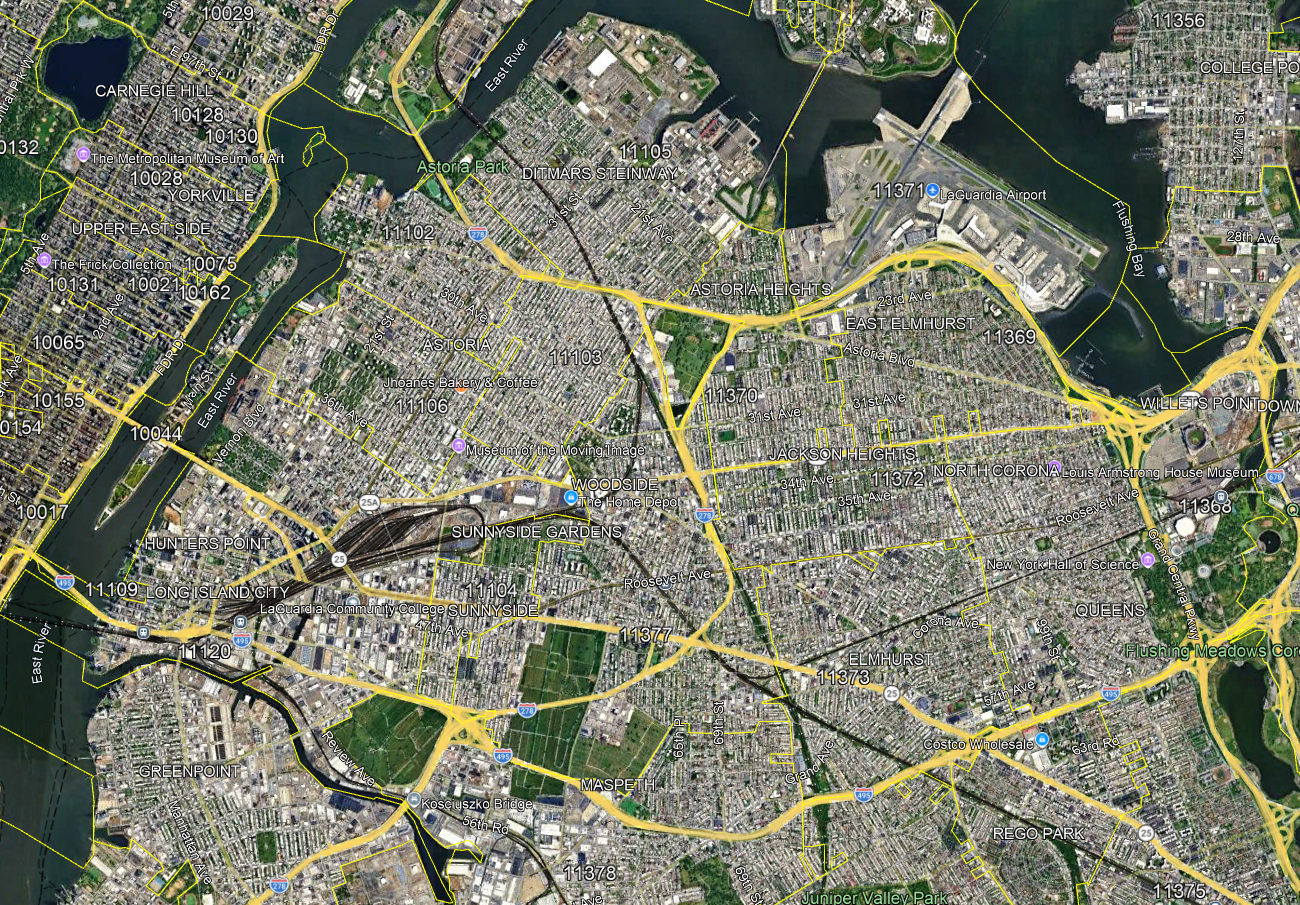
The Federal Transit Administration (FTA) has a model for ridership estimation for public transit lines, called STOPS. It’s designed to be simplified enough that transit agencies can compute rough projections with it without having a large permanent in-house team dedicated to it (the MTA has a team of about 12). At the Transit Costs Project, we’ve taken to using it to do estimates for potential extensions under various assumptions on speed, frequency, and service pattern. For example, the Effective Transit Alliance’s statement in support of QueensLink for the budget vote later today quotes a figure of 105,000 expected daily riders, with 75,000 of them new and 30,000 existing at the Rockaway stations. I’d like to both go over this figure in this post and explain why at the same time, STOPS must be used with caution, especially in New York.
The QueensLink ridership estimate
At the program, Franklin Tang is responsible for the use of STOPS. Using the tools of the model, he computed that under our assumptions of QueensLink service, total northbound boardings at all stations south of Rego Park-63rd Avenue, the branch point from the Queens Boulevard Line, are 52,634 per weekday. Every trip must be paired between north- and southbound travel, so this means a total of 105,268 trips using QueensLink. These numbers include stations that already have service on the A train, including Howard Beach and the Rockaways; one of the points of QueensLink is to give these areas faster service to Midtown than they get on the A, which takes the long way around via Downtown Brooklyn and Lower Manhattan. In a No Build scenario, we expect these preexisting stations to have about 30,000 total trips, taking into account some expected redevelopment around the Aqueduct.
The business case released by QueensLink, released using the same analysis, gives a total of 75,000 riders/day. This is not the net figure – the similarity is coincidental. Rather, it includes things it shouldn’t (namely, boardings at Rego Park, nearly all preexisting) and excludes things it should (namely, the southbound alightings), as it imitates MTA methodology, which for reasons I don’t quite get counted the Rego Park boardings in its estimate for QueensLink ridership.
The figure people should use in subsequent analysis is the higher one, which is the most comparable to how transit ridership of new projects is usually computed. Riders diverted from other lines still benefit from the project, especially in a case like QueensLink, where the diverted riders would enjoy an improvement in trip time to Midtown of about 10-15 minutes each way. Second Avenue Subway’s ridership, which we compare QueensLink’s favorably with in the ETA analysis, is based on estimates for total ridership, not just new trips, and includes diversions from the 4/5/6 and from crosstown buses in addition to new trips.
The problem of STOPS
STOPS is designed for quick-and-dirty calculations and is known to choke on New York. FTA intends for it to be used elsewhere in the United States, where I am told it gives more accurate numbers; the MTA’s in-house team can do more precise calculations by itself, without STOPS.
Case in point: we tried estimating the ridership of a Utica Avenue subway extension with STOPS, and got bad numbers. “Bad” here does not mean the numbers were low and I’d like them to be higher, but that the model gave nonsensical results. Total northbound boardings on the new stations amounted to 58,000; total southbound alightings only amounted to 25,000. In effect, the model thinks that if a Utica Avenue line opens, then 33,000 people will permanently emigrate from Southeast Brooklyn every day. We’ve rerun the numbers and at this point I don’t believe we made an error; rather, STOPS has some errors, perhaps with stations close to one another, that lead to random results that don’t quite average out correctly. Thus, I recommend caution when using it as it is still only good enough for a first-order estimate.
Quick Note: Cars and Suburbs Commoditize Location
Trains and big cities are more efficient on a typical cost basis than cars. The operating costs of trains are such that even the unsubsidized costs of big-city metros and bus networks are a fraction of those of cars. For example, New York City Transit, despite its high operating costs, manages to serve a linked trip for around $6, which works out to an annual cost per user of around $3,500, and if it had the cost structure of London or Berlin this would be $2,000 or a bit less than that; American cars average $7,000/car per year in private spending.
And yet, cars have one singular advantage: they commoditize location. Public transit ideally works in large cities at specific locations, based on historic contingencies like national capitals, religious significance, or river crossings and harbors that may no longer be relevant with modern technology. It’s decommoditized, in that there is only one New York, one Philadelphia, one Chicago, etc., and the cost of moving is high. Public transit itself doesn’t lend itself to competition, because it requires extensive scale to ensure connectivity and high frequency. This is why public provision is almost universal, and the exceptions either involve a high degree of public coordination such as the Verkehrsverbünde in the German-speaking world even if elements are contracted out or are Japanese cities with such large systems that competition between a JR and a private operator still leaves each competitor with much scale; even generally privatization-happy states like Singapore keep the systems broadly public in planning.
What this means is that cities and public transit require a public sector that can keep up without the discipline of market competition. This means public-sector innovation, with competition taking place in the political sphere as in European cities or in the technocratic one as in Singapore. If this doesn’t happen, then the system suffers. If, for example, the New York MTA folds to a strike by the LIRR train drivers in which the union demands are so unreasonable that even the left-wing city mayor Zohran Mamdani doesn’t side with the union, and gives the drivers large increases in pay while still allowing them to collect double pay for driving both a diesel and an electric train, then there’s no easy way to move to a competitor.
Cars and suburbs instead commoditize location. If the city can’t provide adequate public services, people can just leave. It’s particularly easy if the municipality that falters in providing services is not a large city but a small suburb of one, as in the boroughitis of New Jersey. Cars facilitate that, in that they scale down better. There’s no way to squeeze anything the size of Midtown Manhattan or even the center of Paris into one auto-oriented place (Los Angeles has a weak central business district), but that’s fine, a region can take the hit on income and still function with worse scale; Dallas is not a poor region. There are real problems in this setup with higher transportation costs and with job centers with worse scale, but sometimes it’s worth it to take the hit if it means not having to deal with unaccountable government that one can’t leave. If there’s no mechanism to improve governance – say, if there is such democratic deficit at the local level that it’s not possible for voters to coerce the city into improving education or public transit or housing or any other devolved issue – then that usually equally affects city and suburbs, but one can move from one suburb to another at relatively low economic and social cost, and this has a disciplining effect to some extent.
Quick Note on Subway Operating Costs
A London Underground benchmarking report using CoMET data from 2013 compared operating cost breakdowns and revenues between the Underground and its international peers. CoMET data is in principle anonymized, but it’s not hard to find which city is which, and in particular, whereas London, Paris, and Berlin all spent around $6/car-km on operations in 2013 costs, New York is the city labeled “Am” that spent $10/car-km.
More recently, I followed up on these costs by looking at 2020s data, finding little for Berlin and even less for Paris, but finding exact costs per car-km for New York and per train-km for London. London has seven cars per train, from which we can impute, in 2024 PPP prices, $6.2/car-km in London; New York’s exact costs are $11.58/car-km. BVG’s costs are bundled across modes, but the total costs for 2024 reported in the Lagebericht und Jahresabschluss 2025 are 1.6B€; if U-Bahn costs per car-km and bus costs per bus-km were as in New York and tram costs per tram-km were as in Boston, the two rail modes compared on a per train length basis (thus, a Berlin U-Bahn train of 100 meters is deemed to be six New York City Subway cars), the total would be exactly twice on a PPP basis. If the same comparison were made with an adjustment for bus speed (17.9 km/h here, 11.3 km/h in New York), make it 1.6B€ vs. 2.6B€. Either way, it’s very likely Berlin’s U-Bahn operating costs are in the $6-7/car-km range in 2024 prices.
All of this is remarkable, because prices between 2013 and 2024 rose, by a factor of 1.34 in the US. And yet, despite this inflation, London more or less kept its operating costs unchanged, New York had an increase of slightly less than half the inflation rate, and Berlin likely had a small increase like New York or even smaller.
Moreover, none of the three systems engaged in massive automation over this period, not even the incremental automation of Paris. Furthermore, New York’s subway costs in the short and medium runs tend to rise when ridership decreases and fall when it increases, as fixed costs are spread across more service; the number of employees per unit of service provided rose when ridership fell after WW2 and fell when it recovered. However, the period 2013-24 was not one of major service increases in any of the cities: all three opened new lines, but only short ones, and none of the three embarked on a scheme to massively increase service – London had some increases but New York if anything provides less service now than it did in the early 2010s. Thus, no short-term shock can explain the over-the-decade fall in real operating costs in all three cities.
This contrasts with buses, which are dominated by variable labor costs. In the United States, the cost of running a bus is the wage of the operator plus various overheads, of which the largest is the wage of the maintenance crew. In Europe, bus driver wages are lower, but buses are also cheaper to procure and more fuel-efficient, and overall the system is dominated by wages rising faster than inflation and by variable and not fixed costs.
Learning from Many Places is Better than Learning from One
An article from last week about a cost saving push in Seattle made me think again about how learning from lower-cost examples works. As the costs of the majority-above-ground Ballard extension are careening toward the $2 billion/km mark, the agency and civil society are looking for cost savings. Scott Kubly, the former head of the Seattle Department of Transportation, is proposing to reduce the costs of stations by shortening the platforms, citing Copenhagen’s combination of driverless operations and very short trains as a cost saver. Kubly says,
They built it at about a quarter cost. How they did that was shorter, more frequent trains, which leads to smaller stations, which leads to less excavation, which leads to faster delivery and a better passenger experience.
This, to be clear, is at best a second-order saving. The issue is that Copenhagen’s short trains and driverless operations are more or less unique to it, but its medium-low costs aren’t. An honest program of learning from Scandinavia ought to learn from all of the Nordic capitals at once, as much as possible, and focusing on what’s common to them and not on the differences. Stockholm in particular has lower construction costs than Copenhagen these days and has longer trains than Seattle: Stockholm T-bana trains are 140 m long (and Citybanan, with 200 m trains, cost $400 million/km in 2025 prices, less than a quarter as much as Ballard), Link trains are designed up to 116, Copenhagen Metro trains only 39. Nya Tunnelbanan manages lower construction costs than Copenhagen these days, so learning from low-ish Nordic costs should not center the combination of driverless trains and short platforms.
More broadly, this proposal by Kubly (and by the generally good Robert Cruickshank, formerly of California HSR Blog) is convincing me that the real strength of the Transit Costs Project is that we’ve done deep dives into more than one success case. We technically have three low-cost cases: Stockholm, Istanbul, and a selection of Italian cities. But in Stockholm, too, the case looked at trends common to the Nordic countries, namely, the unfortunate tendency in all four to privatize project planning to international design-build consortia. Our conclusion also uses some medium-cost Parisian examples to check itself as well as a few German and Spanish specifics, and we’ve increasingly looked at some Chinese examples, though well short of a full case like our main three. We’re blinder than we’d like to be in East Asia, especially low-cost Korea, but our coverage in Europe is fairly good and we have at least some idea of what’s going on in Latin America. Our ideology is always that it’s most important to look at the commonalities of the places that work when distilling the best practices, rather than on the differences.
This matters, because the average Continental European (or Chinese) just doesn’t think about the United States when doing transportation engineering. A Swede, asked about the features of their transportation program, will focus not on what makes the difference between Scandinavia and the United States, but on the differences between Sweden and the other Nordic countries. The literature I saw when I wrote the Sweden case was replete with intra-Nordic comparisons, on every conceivable measure. Most of the literature came from the country I was researching, but some came from the other three Nordic countries. All of them are like this. Ask a Swedish planner about what makes Nya Tunnelbana work and they’ll cite pertinent features like the drill-and-blast construction method and why it’s superior to tunnel-boring machines, where Copenhagen in fact uses TBMs just fine; ask a Danish one and they’ll talk about the driverless operations and extremely high frequencies.
And this generalizes. Italy has used very short stations and driverless operations to keep down the costs in very small cities like Brescia, and somewhat longer but still short stations in Milan, but Rome Metro Line B1 uses 110 m long trains and was built for $300 million/km in 2025 prices. While Italians talk about this as a cost saver, Manuel Melis Maynar wrote positively of Madrid’s rejection of driverless operations as an example of cost saving through technological conservatism. I don’t doubt that in both cases they were right under the circumstances (Melis having written of extensions built 25 years ago), but just as the medium-low costs of the Nordic countries have to be properly attributed to shared features, the even lower costs in Southern Europe have to be properly attributed.
Far more important than looking at a Copenhagen-specific feature is answering all of the following questions, in increasing order of abstraction:
- How large are the underground stations compared with the train length? How standardized are their designs?
- How standardized are the RFPs for station finishes, signals, and electrical and mechanical systems?
- Is there a single point of homologation for the system, or can a single suburban fire department demand construction in excess of code because the fire department head objects (as happened in Bellevue across Lake Washington)?
- Does contracting follow good practices (i.e. the traditional system as used in Scandinavia until about 15 years ago), or is everything done with layers of consultants managing other consultants with opaque design-build contracts? Are contracts itemized or fixed-price? Is there technical scoring to ensure contractors race to the top and not the bottom?
- How large is the in-house planning and supervision team? Does it have the capacity to manage a project the size of ST3, or even a single subway line like the combination of Ballard and West Seattle?
- Are priorities decided by professionals or by political appointees? Does funding follow the Acquis or possibly another similar system governed by rule of law? Is a cost-benefit analysis mandatory, and do project designers expect that a poor cost-benefit analysis will lead to project cancellation?
Each of these questions, by itself, represents a cost saving larger than anything that could come from shrinking the stations based on driverless operations, a tradeoff that reduces station dig costs but increases systems costs and works in many places but is never going to turn American costs into Southern European or Nordic costs. In contrast, relying on one simple trick like Copenhagen’s requires deep understanding of why each of Copenhagen and Stockholm does what it does, which understanding is unlikely to exist in anyone who doesn’t know that these cities have comparable costs, both a fraction of the United States’.
Quick Note: Commuter Rail and Urban Bus Hubs
I’d like to introduce the concept of bus hubs with commuter rail connections, but in an urban rather than suburban context. This comes from the project we’re working on to about Queens buses on the assumption that LIRR is modernized, but it should generalize. The suburban bus context is a town center that buses converge on from many directions; the urban one is embedded in a much larger street network that must have multiple stops, and therefore the hub must be planned around both bus and rail service at once, rather than in a rail-first hierarchy.
The importance of two-way planning here is that within an urban grid, there usually aren’t obvious town centers, unless they are built. The topic of this discussion is not city center but outer areas where the commuter trains provide walk-on service, or would if they ran at modern (i.e. non-American) frequencies and charged the same fares as the buses and subway. For example, take Eastern Queens in and east of Jamaica:
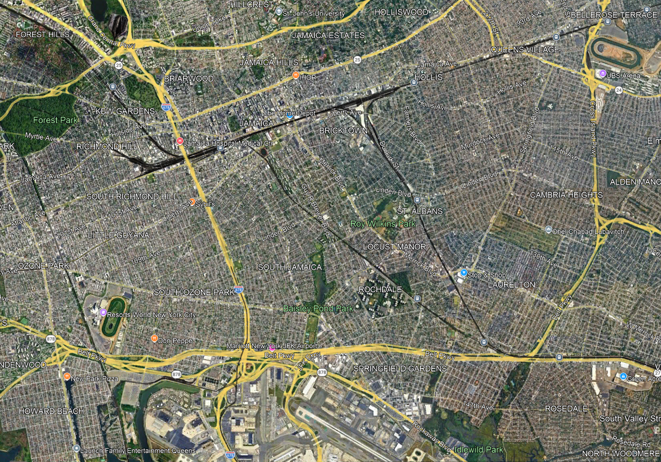
Jamaica is an obvious node, and nearly all LIRR trains already stop there and the rest should, but farther east, it’s a question of how to set up the LIRR to interact better with the city, including its buses. A lot of questions and tradeoffs have to be addressed all at once:
- Stop spacing, trading off station access time with trip times. The LIRR on the Main Line has four tracks through Floral Park so any infill station would be local-only, but that still matters for riders from points east like Floral Park and Hempstead. On the Atlantic Branch and the Montauk Line there are only two tracks, and extensive suburban ridership that would be slowed down by additional stops.
- Intersections with main arterial streets that make for natural bus connection points. The Queens Village LIRR station is at the intersection with Springfield Boulevard, but a little to its west Francis Lewis intersects the Main Line without an LIRR stop, while Hollis is not so well integrated with the street network (it’s near Farmers Boulevard, which more or less parallels the Monrauk Line). On the Montauk Line and Atlantic Branch, strong east-west bus connection points are useful; St. Albans is at the intersection with Linden, but the Atlantic Branch has no such stop at the intersection with Linden.
- Stops that permit buses to avoid congested nodes, in this case Jamaica; farther north, off-map, the same is true of Flushing. One of the goals of bus redesigns replacing traditional radial networks with grid is to get buses out of the areas where they are the slowest; this was explicit in the replacement of the radial network with the Nova Xarxa grid, increasing average speed even without any other interventions like bus lanes and stop consolidation.
- Some bus routes duplicate rail routes and could be removed or curtailed, if enough infill stops are built: for example, Merrick and Guy R. Brewer Boulevards are very closely parallel to the Montauk Line and Atlantic Branch respectively.
Without doing more detailed work yet, I suspect that the speed-access tradeoff encourages more infill stops on the Main Line and Atlantic Branches and fewer or even none on the Montauk Line, since the Atlantic Branch only continues to fairly close-in suburbs whereas Montauk carries the Babylon Branch on it, and that the buses can then be moved to a grid to connect with these stations. But the point is that this is not a decision that can be made rail-first, unlike timed connections in secondary cities and suburban town centers. The top-down hierarchy that for example Marco Chitti brings up when setting up a Takt system breaks down when one does coordinated bus-rail planning within the city.
Why IBX Shouldn’t Connect to LaGuardia
Benjamin Schneider has an interestingly wrong proposal for how to extend the Interborough Express, currently designed to run between Southern Brooklyn and Jackson Heights, toward LaGuardia Airport. I know he cares a lot about urbanist issues and public transportation, so I’d like to explain what’s in this proposal, how it errs, and how it is similar to other problematic proposals, for example by the Regional Plan Association in the Third and Fourth Regional Plans in how it tries to make one centerpiece do too many things. We considered a similar plan for inclusion in A Better Billion and chose not to, and instead connect to the airport via the Manhattan-facing Astoria Line carrying the N and W trains.
What’s the proposal?
The idea is to extend IBX to the airport, in the following way:
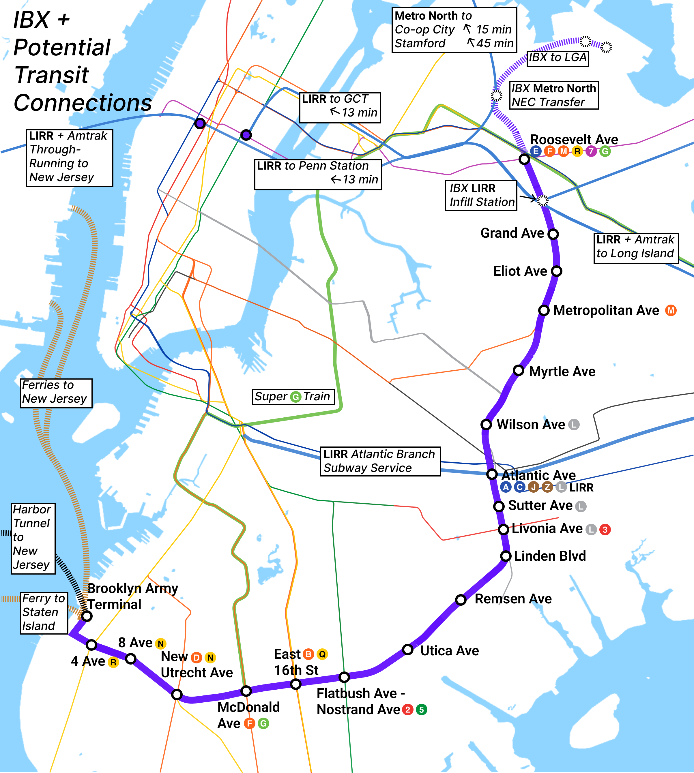
The plan adds an infill station for a transfer to the LIRR and extends the line in a slightly roundabout way to connect to an infill Northeast Corridor station before veering to the airport. This distinguishes it from early ideas that didn’t make it to A Better Billion, namely a Y from IBX to both the airport and Harlem. The point of this is not just to connect IBX with the airport but also create a hub by connecting IBX to more things, in this case a transfer station designed to connect people from the entirety of the New Haven Line to LaGuardia.
Why doesn’t this work?
The general answer is that subway lines should be radial or circumferential and not mixed, and this is a mix – IBX is circumferential, connecting stations at a fairly consistent distance from Manhattan, and the extension to the Northeast Corridor (or even Harlem, well north of Midtown) would maintain this character, but a tail veering to the airport would suddenly be radial. Such lines always underperform, because they fail at both the function of a radial line, namely connecting outlying areas to city center, and those of a circumferential, namely connecting lines to one another better and providing near-center neighborhoods with additional service orthogonal to the radial direction.
The more specific answer is that we know where passenger demand to LaGuardia is, and it’s nowhere on IBX or for that matter on the New Haven Line. Airport passenger demand is extremely Manhattan-centric, and within Manhattan it centers on Midtown and the Upper East Side:
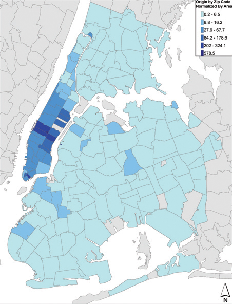
At the proposed IBX-NEC transfer point, just about every passenger from the airport would transfer to the commuter trains. The required infrastructure to build this might as well be used on a commuter rail branch, going to East Side Access as it is more central for air travelers than Penn Station based on the above map. IBX is more or less useless. Or, better yet, the Astoria Line can be extended as we propose, along an easier alignment that can be done largely above ground.
Now, what about airport workers? Those are usually mentioned, almost always as an afterthought, in various justifications for lines; I heard transit advocates use that line to argue for Andrew Cuomo’s backward air train idea back when he was still governor. Those are still poorly served by an IBX extension. On a map of airport employee residential density, it looks almost good:
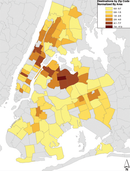
The highest-density zip code on the map above is 11372, whose southwest corner is Jackson Heights. But what’s unclear from the picture above is just how circuitous a swing from Jackson Heights to almost Astoria to LaGuardia is. The straight line distance from Jackson Heights to the nearest potential transfer station location to Terminal B is almost twice that of the direct straight line distance from Jackson Heights to Terminal B. The street grid isn’t straight but neither would an IBX extension be, needing to keep going northwest before turning 120 degrees to the east to get to the terminals. For most people in these neighborhoods, IBX would not provide a trip time improvement over buses.
But more conceptually than this, rail improvements aiming to serve airport workers are generally a bad idea, because airport workers never cluster in one residential place on which a line can be built. The paired density maps are at different scales, and the ratio between the densest and least dense colors is much higher for the air traveler density map than for the airport employee one. OnTheMap gives, as of 2023, 11,000-12,000 airport workers, depending on whether one counts hotel workers across the Grand Central Parkway from the airport in the total. Out of 11,666 on a more generous count, only 3,200 even live in Queens and only 1,182 live in Brooklyn. The blob of seven high-density zip codes of worker origin plus the medium-density one between them (11377, just west of Jackson Heights) only furnishes 1,000 airport workers from all eight zip codes combined.
How does this relate to previous proposals?
There’s a tendency in New York planning, at all levels of officialness from the RPA down, to take one big project that’s politically agreed on and hang everything on it. The Third Regional Plan tried to tie in everything to Second Avenue Subway, to the point of bloating it to a four-track line (by the 1990s all planning was for a two-track line). Even commuter rail, in this case a LIRR Atlantic Branch connection to Lower Manhattan, was shoehorned into it, with through-service onto the subway. The Fourth Plan did the same with its Triboro proposal running through to Metro-North in the Bronx and with commuter rail through-tunnels trying to work around Gateway.
The result of such schemes is proposals that try to have a single line do work it cannot possibly do and would be compromised to the point of unusability if it were forced. In Los Angeles, for example, this is leading to a squiggle of a subway extension of the K (Crenshaw light rail) Line through West Hollywood, 6 km longer than it needs to be. In New York, this is leading to taking IBX, as pure a circumferential as one can be, and lading it with tunnels to destinations for which it doesn’t make sense.
It’s important to resist this temptation. If rail service to LaGuardia is desired, it should use the subway line that already points in that direction, whose alignment allows for an elevated extension, just marginal enough to the residential parts of Astoria to avoid NIMBYs, just close enough to still serve the neighborhood well. The overall planning complexity of two good lines is less than that of one bad line – the cost doesn’t magically increase just because the rail link from Astoria to LaGuardia is categorized as “N/W extension” rather than “IBX extension,” and it’s easier to supervise more, smaller projects if they’re parallelizable.
Why Building Metros is Necessary for the Green Transition Away from Cars
There’s controversy in Germany over building U- and S-Bahn extensions, in which environmentalists argue against them on the grounds that people can just take trams and the environmental benefits of urban rail are not high. For example, the Ariadne project prefers push factors (green regulations and taxes) to pull factors (building better alternatives), BUND opposes U- and S-Bahn expansion, and a report endorsed by Green politicians argued based on shoddy analysis leading to retraction that the embodied carbon emissions of tunneling exceeded any savings, which it estimated at only 714 t-CO2 per underground km built. Against this, it’s important to sanity-check car and public transport ridership to arrive at more solid figures.
To start with, virtually everyone travels by car or by public transport. There’s a notable exception for cycling, but cycling is typically done at short ranges, and the metro expansions under discussion here (all outside the Ring) are beyond that range. In Berlin, the modal split for cycling peaks in the 1-3 km range and is small past 10 km. Beyond the scale of a neighborhood or maybe a college town, cars and mass transit are substitutes for each other.
Nor does public transport expansion lead to hypermobility, in which overall trips grow longer as people commute from farther away and car use doesn’t decline or only weakly declines. If anything, the ratio of substitution for passenger-km rather than trips is that a p-km by metro substitutes for more than one p-km by cars, because metro-oriented cities can be denser and allow for shorter commute trips. Berliners average 3.3 4.6-km trips per day, or 15 km/day; Germany-wide, it’s 35.5 km/day (see table 11 of MiD). If anything, the presence of a large city core also shortens the average car trip by reducing exurb-to-exurb driving at low density.
Nor does polycentricity solve the problem. Indeed, ridership in polycentric regions is weaker than in monocentric ones. MiD has data by state and Verkehrsverbund in Germany, with modal splits by trips (all trips, not just work trips) and passenger-km, the latter measure having far less in the way of cycling and walking. From this, we have the following table:
| Geography | Transit % (trips) | Car % (trips) | Transit % (p-km) | Car % (p-km) |
| Berlin | 27 | 24 | 47 | 40 |
| Brandenburg | 9 | 51 | 22 | 71 |
| Mecklenburg-Vorpommern | 7 | 52 | 14 | 80 |
| Saxony-Anhalt | 9 | 48 | 12 | 81 |
| Saxony | 11 | 56 | 16 | 77 |
| Thuringia | 9 | 55 | 16 | 79 |
| Hamburg | 22 | 29 | 43 | 47 |
| Bremen | 14 | 33 | 30 | 60 |
| Schleswig-Holstein | 8 | 56 | 14 | 79 |
| Lower Saxony | 8 | 53 | 15 | 77 |
| Nordrhein-Westfalen | 10 | 55 | 18 | 74 |
| Rheinland-Pfalz | 9 | 57 | 19 | 75 |
| Saarland | 10 | 65 | 15 | 79 |
| Hesse | 12 | 52 | 19 | 74 |
| Baden-Württemberg | 9 | 53 | 17 | 75 |
| Bavaria | 10 | 56 | 18 | 75 |
| Munich (city) | 25 | 29 | 39 | 51 |
| Frankfurt (city) | 24 | 29 | 38 | 52 |
| Stuttgart (city) | 23 | 36 | 33 | 60 |
| Munich (MVV) | 19 | 41 | 31 | 61 |
| Hamburg (HVV) | 16 | 33 | 29 | 63 |
| Hanover (Region) | 15 | 42 | 25 | 66 |
| Rhine-Main (RMV) | 13 | 49 | 22 | 71 |
| Rhine-Neckar (VRN) | 10 | 51 | 17 | 75 |
| Rhine-Ruhr (VRR) | 12 | 53 | 20 | 73 |
| Rhine-Sieg (VRS) | 12 | 49 | 22 | 70 |
Berlin is by all measures the most public transport-oriented and least car-oriented part of Germany. The source doesn’t explicitly break out VBB, but VBB comprises Berlin and Brandenburg, whose population ratio is 59:41, so we get a modal split by trips of 20% transit, 35% car; a similar computation for p-km is less certain since Brandenburgers, many of whom commute to Berlin, have longer trip lengths, but it’s likely Berlin and Brandenburg’s combined modal split is slightly better than those of MVV and HVV, both monocentric. Brandenburg, notably, has the highest modal split by p-km outside the city-states, owing to the Berlin commuters.
In contrast, the polycentric regions – Rhine-Neckar (Mannheim), Rhine-Ruhr (excluding Cologne), Rhine-Sieg (Cologne-Bonn), and to a large extent also Rhine-Main (Frankfurt) – all have weak modal splits. The cities themselves have healthy usage of public transport, judging by the data that’s available and by ridership on their Stadtbahn systems, but most of the Rhine-Ruhr’s population doesn’t live in Düsseldorf, Duisburg, Essen, Dortmund, or Wuppertal, and this population drives.
The upshot is that rail development that strengthens city center at the expense of suburban job clusters should be considered a positive development for transitioning from cars to public transport. Job clusters outside city center do not reduce commuting, but instead make commuting more auto-oriented.
This, in turn, creates serious estimation problems for the diversion rate, which is why environmental benefit-cost analyses underrate the effect of urban rail construction. An expansion of a north-south line like U8 would not just increase the residential connectivity of Märkisches Viertel but also, on the margins, increase the commercial connectivity of Alexanderplatz and other central stations served by the line. This, in turn, should induce additional ridership on lines nowhere near Märkisches Viertel, for example, east-west lines like U5 and U2. At the neighborhood level, the construction of the line would create a lot of induced trips and not have a high diversion rate from cars. But at the city level, little examples of diversion as more work and non-work destinations cluster in Mitte would multiply, never enough for an easy comparison, and yet enough that, as we see, more people would be living and working here without driving, where otherwise they’d be driving between two Kreise elsewhere in Germany.
Taken all together, the diversion rate at the level of trips should be considered 100%: at large enough scale, every trip by public transport is a trip not done by car, perhaps in the city, perhaps elsewhere in the country. Every p-km by public transport is multiple p-km not done by car, since dense cities allow for shorter trips without the traffic congestion problems caused by trying to fit high density and also a high modal split for driving.
With that in mind, a calculation of a first-order diversion rate is in order. A daily trip by rail is a daily trip not done by car. The average trip length in Germany by all modes is 12 km, but this is weighed down by short walking and biking trips; the average daily driving rate per car is 26 km (see table 21 of MiD) when the car is in use, and is 10,000 km/year per car. If we take 10,000 v-km to be the diversion rate per 3 public transport trips, we get that, at the emissions intensity of 2017, a daily public transport trip represents an annual emissions reduction of 0.43 t-CO2. The Märkisches Viertel extension of U8, estimated to get 25,000 trips/day, would reduce Germany-wide emissions by 10,000 t/year, which is nearly an order of magnitude more than the carbon critique of Berlin U-Bahn expansion got. At the current 670€/t cost used in German benefit-cost analyses this is around a 2% rate of return on cost purely from the carbon savings, never mind anything else – and usually green policy uses a low discount rate due to the long-term effects of greenhouse gas emissions, 1.4% in the Stern review.
Against Free Buses
Much of the public discussion over A Better Billion, our proposal to increase New York’s subway construction spending by $1 billion a year in lieu of Zohran Mamdani’s free bus plan, has taken it for granted that free buses are good, and it’s just a matter of arguing over spending priorities. Charlie Komanoff, who I deeply respect, proposes to combine subway construction with making the buses free. And yet, free buses remain a bad idea, regardless of funding, because of the effects of breaking fare integration between buses and the subway. If there is money for making the buses free, and it must go to fare reductions rather than to better service, then it should go to a broad reduction in fares, especially if it can also reduce the monthly rate in order to align with best practices.
Planning with fare integration
The current situation in New York is that buses and the subway have nearly perfect fare integration: the fares are the same, the fare-capped passes apply to both modes equally, and one free transfer (bus-bus or bus-subway) is allowed before the passenger hits the cap. Regular riders who would be taking multi-transfer trips are likely to be hitting the cap anyway so that restriction, while annoying, doesn’t change how passengers travel.
Under this regime of fare integration, buses and the subway are planned together. The bus network is not planned to connect every pair of points in the city, because the subway does that at 2.5 times the average speed. Instead, it’s designed to connect subway deserts to the subway, offer crosstown service where the subway only points radially toward the Manhattan core, and run service on streets with such high demand that buses get high ridership even with a nearby subway. The same kinds of riders use both modes.
The bus network has accumulated a lot of cruft in it over the generations and the redesigns are half-measures, but there’s very little duplication of service, if we define duplication as a bus that is adjacent to the subway and has middling or weak ridership. For example, the B25 runs on Fulton on top of the A/C, and the B37 and B63 run respectively on Third and Fifth Avenues a block away from the R, and all have middling traffic. In contrast, the Bx1/2 runs on Grand Concourse on top of the B/D but is one of the highest-ridership buses in the system. B25-type situations are rare, and most of the bus service that needs to be cut as part of system modernization is of a different form, for example routes in Williamsburg that function as circulators with maybe half the borough’s average ridership per service hour.
In this schema, the replacement of a bus with a train is an unalloyed good. The train is faster, more reliable, more comfortable. Owing to those factors, the train can also support higher ridership and thus frequency. If the train stops every 800 meters and averages 30 km/h and the bus stops every 400 and averages 15 (the current New York average is much lower; 15 is what is possible with stop consolidation from 200 to 400 meter interstations and other treatments), then it takes a 2.5 km trip for the replacement to be worth it on trip time even for a passenger living right on top of the deleted bus stop, and a 5 km one if we take into account the walk penalty – and that’s before we include all the bonuses for rail travel over bus travel, which fall under the rubric of rail bias.
The consequences of differentiated fares
All of the above planning goes out the window if there are large enough differences in fares that passengers of different classes or travel patterns take different modes. Commuter rail, not part of this system of fare integration in New York or anywhere else in the United States, is not planned in coordination with the subway or the buses, and fundamentally can’t be until the fares are fixed. Indeed, busy buses run in parallel to faster but more expensive and less frequent commuter lines in New York and other American cities, and when the buses happen to feed the stations, as at Jamaica Station on the LIRR or some Metro-North stations or at some Fairmount Line stations in Boston, interchange volumes are limited.
Commuter rail has many problems in addition to fares. But when the subway charges noticeably higher fares than the bus to the point that passengers sort by class, the same planning problems emerge. In Washington, the cheap, flat-fare bus and more expensive, distance-based fare on Metro led to two classes of users on two distinct classes of transit. When Metro finally extended to Anacostia with the opening of the Green Line in 1991, an attempt to redesign the buses to feed the station rather than competing with Metro by going all the way into Downtown Washington led to civil rights protests and lawsuits alleging that it was racist to force low-income black riders onto the more expensive product.
Whenever fares are heavily differentiated, any shift toward the higher-fare service involves such a fight. One of the factors behind the reluctance of the New York public transit advocacy sphere to come out in favor of commuter rail improvements is that those are white middle class-coded because that’s the profile of the LIRR and Metro-North ridership, caused by a combination of high fares and poor urban service. Fare integration is a fight as well, but it’s one fight per city region rather than one fight per rail project.
And more to the point, New York doesn’t even need to have that one fight at least as far as subway-bus integration is concerned, because the subways and buses are already fare integrated. What’s more, free bus supporters like Mamdani and Komanoff aren’t proposing this out of belief that fares should be disintegrated, but out of belief that it’s a stalking horse for free transit, a policy that Komanoff has backed for decades (he proposed to pair it with congestion pricing in the Bloomberg era) and that the Democratic Socialists of America have been in favor of. The latter is loosely inspired by 1960s movements and by reading many tourist-level descriptions in the American press of European cities with too weak a transit system for revenue to matter very much. Free buses in this schema are on the road to fully free transit, but then the argument for them involves the very small share of transit revenue contributed by buses rather than the subway. In effect, an attempt to make the system free led to a proposal that could only ever result in disintegrated fares, even though that is not the intent.
But good intent does not make for a good program. That free buses are not proposed with the intent of breaking fare integration is irrelevant; if the program is implemented, it will break fare integration, and turn every bus redesign into a new political fight and even create demand for buses that have no reason to exist except to parallel subway lines. The program should be rejected, not just because it costs money that can be better spent on other things, but because it is in itself bad.
Fare Practices
Here’s a table of urban public transport fares for various cities, covering the United States, Canada, parts of Europe, Turkey, and Japan. Included are single fares, multi-ride discounts, day passes, weeklies, and monthlies, with the last three shown with their ratios to single fares. As far as possible we’ve tried doing fares as of 2026, but it’s possible a few numbers are not updated and depict 2025 figures.
The thing to note is that in Continental Europe, there are steeply discounted monthlies – only two cities in the table charge for a monthly more than for 30 single-trips (Paris at 35.5, Bari at 35). Most Italian cities cluster around 20, and Barcelona, Lisbon, and especially Porto are even lower. Berlin used to have a multiplier of 32 before the 9€ monthly and the subsequent Deutschlandticket but the current multiplier is 15.75 within the city. Stockholm has a monthly multiplier of 24.7. Prague’s multiplier is 12.
Japanese monthly fares are strange by Western standards, in the sense that they are station-to-station, with subsegments allowed but no trips outside the segment; subject to this constraint the multiplier is 30-40, with small additional discount for buying 3-6 months in advance, but the unrestricted monthly fare is very high. London and Istanbul functionally do not have monthlies, in the sense that the multiplier is so high (78.5 Istanbul-wide, and it’s not truly unlimited but is capped at 180 trips/month) that except for trips within Central London it might as well not exist.
American and Canadian monthly fares are usually higher than in Continental Western Europe, with multipliers in the 30s. New York’s multiplier was especially high, about 46, and the MTA has just abolished the monthly fare entirely and phased out the MetroCard (as of the new year, starting in two hours), making people use the weekly cap with OMNY instead, which has a multiplier of 11.7 and, over a 30-day month, forces a monthly multiplier of 50. Toronto has a very high monthly multiplier as well, 46.6. This is bad practice: a high monthly discount functions as a technologically simple off-peak discount (indeed, London pairs its stingy monthly discount with a substantial off-peak discount), and OMNY itself is buggy to the point that fare inspectors on the buses can’t tell if someone has actually paid except by looking at debit card statements, which do not show one as having paid if one has a valid transfer or has reached the weekly cap (and not tapping in this case is still illegal fare dodging in New York law).
The practice of the cap, increasingly popular in the US under London influence, is rare as well. London’s fare cap originates in its complex zone system: the Underground has nine zones with zone 1 only covering Central London so that passengers taking multiple trips per day can expect to take trips across different zones that they may not be familiar with; there isn’t fare integration, but rather there’s a special surcharge on some commuter train trips and a discount on buses; peak and off-peak fares are different. Thus, the calculation for the passenger of whether to buy tickets one at a time or get a pass is difficult, so Oyster does this calculation automatically to give the most advantageous fare. In a Continental city where fares are either flat regionwide or have zones with limited granularity (often the entire metro is in the innermost zone) and monthly discounts are steep, the calculation is simple: an even semi-regular rider should always get a monthly.
American and Canadian cities typically have flat fares or a simple zone system, good fare integration between buses and the subway or light rail, and commuter rail that’s functionally unusable for urban trips rather than resembling the subway with a $2 surcharge. The use case of London does not apply to such cities. New York should not have a fare cap, but a heavily surcharged single trip, perhaps $5, and an attractive flat monthly fare, perhaps $130. This system ensures passengers are incentivized to pay and there is little opportunistic fare dodging as the user has already prepaid for the entire month, so it pairs well with proof-of-payment fare collection, common in many of the European examples (though metro systems outside Germany and its immediate vicinity do have faregates).
The overall level of the fare is determined by the willingness of the government at various levels to subsidize public transport; the table can be used to compare these at PPP rates as well. However, the distribution of fares across different products and distances is not a matter of subsidy but a matter of good and bad industry practices, and the best practice for simple fare collection is to offer a prepaid monthly at a heavy discount compared with the single ride.
New York Isn’t Special
A week ago, we published a short note on driver-only metro trains, known in New York as one-person train operation or OPTO. New York is nearly unique globally in running metro trains with both a driver and a conductor, and from time to time reformers have suggested switching to OPTO, so far only succeeding in edge cases such as a few short off-peak trains. A bill passed the state legislature banning OPTO nearly unanimously, but the governor has so far neither signed nor vetoed it. The New York Times covered our report rather favorably, and the usual suspects, in this case union leadership, are pissed. Transportation Workers Union head John Samuelsen made the usual argument, but highlighted how special New York is.
“Academics think working people are stupid,” [Samuelsen] said. “They can make data lie for them. They conducted a study of subway systems worldwide. But there’s no subway system in the world like the NYC subway system.”
Our report was short and didn’t go into all the ways New York isn’t special, so let me elaborate here:
- On pre-corona numbers, New York’s urban rail network ranked 12th in the world in ridership, and that’s with a lot of London commuter rail ridership excluded, including which would likely put London ahead and New York 13th.
- New York was among the first cities in the world to open its subway – but London, Budapest, Chicago (dating from the electrification and opening of the Loop in 1897), Boston, Paris, and Berlin all opened earlier.
- New York has some tight curves on its tracks, but the minimum curve radius on Paris Métro Line 1, 40 meters, is comparable to the New York City Subway’s.
- The trains on the New York City Subway are atypically long for a metro system, at 151 meters on most of the A division and 183 on most of the B division, but trains on some metro systems are even longer (Tokyo has some 200 m trains, Shanghai 180 m trains) and so are trains on commuter rail systems like the RER (204 m on the B, 220 m on the A), Munich S-Bahn (201 m), and Elizabeth line (205 m, extendable to 240).
- New York has crowded trains at rush hour, with pre-Second Avenue Subway trains peaking at 4 standees per square meter, but London peaks at 5/m^2 and trains in Tokyo and the bigger Chinese cities at more than that. Overall ridership, irrespective of crowding, peaked around 30,000 passengers per direction per hour on the 4 and 5 trains in New York, compared with 55,000 on the RER A.
New York is not special, not in 2025, when it’s one of many megacities with large subway systems. It’s just solipsistic, run by managers and labor leaders who are used to denigrating cities that are superior to New York in every way they run their metro systems as mere villages unworthy of their attention. Both groups are overpaid: management is hired from pipelines that expect master-of-the-universe pay and think Sweden is a lower-wage society, and labor faces such hurdles with the seniority system that new hires get bad shifts and to get enough workers New York City Transit has had to pay $85,000 at start, compared with, in PPP terms, around $63,000 in Munich after recent negotiations. The incentive in New York should be to automate aggressively, and look for ways to increase worker churn and not to turn people who earn 2050s wages for 1950s productivity be a veto point to anything.
