Is the United States Giving Up on Public Transportation?
In the last week or two, I have seen a worrying trend in multiple North American cities: transit managers and advocates who call for measures to reduce the number of people riding public transportation, all in the name of social distancing and safety from Covid-19. These ideas include limiting the number of people entering a bus, marking off seats on buses and trains to maintain a minimum distance between passengers, and using apps to limit the number of people entering a train station. Even transit activists openly say that it’s good to reduce occupancy per bus or train, they just use this as an argument for running more off-peak frequency and staggering shifts. The message from everyone is clear: public transit is dangerous, don’t ride it, especially if it is crowded.
Public transportation is not especially dangerous, but the danger that does exist is not ameliorated by any physical distancing. Trying to reduce the number of passengers on a bus or train is safety theater and non-English-speaking cities have reduced infection rates without this. Even Jarrett Walker has taken to saying that public transportation should not aim at getting high ridership, though to his credit he steers clear of saying that transit is dangerous in a pandemic.
I’ve already gone over why I don’t think the subway in New York, by a margin the dirtiest I have ridden, is the reason the city’s infection rate is so high. Instead of rehashing that, I want to focus on the converse: on cases in which people do get infected on transit. These clearly exist – my contention isn’t that trains and buses make one invulnerable to the virus, merely that they’re not any more dangerous than the places people might travel to, such as work. Does social distancing on such vehicles help?
There is an answer, in the form of a study out of China about infection on a bus. The answer is no. Here is the graphic of who was and was not infected on a bus that one infected person rode for a 100-minute roundtrip (passengers sat in the same seats on both legs of the trip):
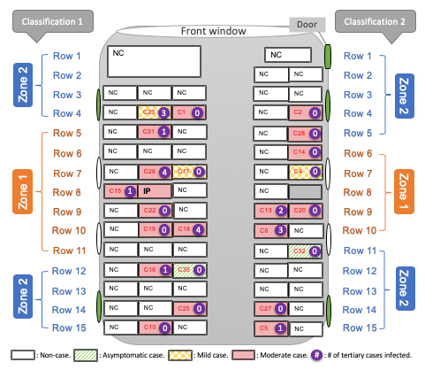
There were 67 passengers on the bus, including the index patient; the index patient infected 23 of them. Proximity to the patient – that is, the distinction between zones 1 and 2 – is not statistically significant. The window passengers on the left side of the bus did not get infected, except the one sitting next to the index patient, but on the right side of the bus, six window seat passengers got the virus.
American and Canadian attempts to limit bus occupancy do not prevent the spread of the virus. The safe occupancy, if people do not wear masks, is 1, or maybe 2 if passengers sit at opposite ends of the vehicle. Limitations on how many passengers can ride the bus at most reduce the number of people one patient can infect, but only if the bus is so crowded that the agency would otherwise add more service. If the bus would have had 20 passengers either way, spreading them around evenly would not help.
What does work is masks. In Taipei, masks are mandatory, and Alex Garcia of Taipei Urbanism tells me that there is universal compliance. In Berlin, I just observed an U-Bahn train in the evening rush hour, noticeably less full than the usual by a factor of perhaps 2, but still far too full for the tastes of the American transit manager, with nearly all seats occupied and a few people standing; about 85% of the passengers wore masks covering their noses and mouths and maybe 5% more incorrectly wore a mask so as only to cover their mouths. There was a mixture of cloth and surgical masks.
I hesitate to mention Taipei and Berlin in the same sentence. Germany, a country of 83 million people, considers itself a success because it has 170,000 cases and 8,000 deaths. But Taiwan, a country of 24 million people, has had 440 confirmed cases since the beginning of the outbreak. As of yesterday, it had had no new cases in eight days; excluding imports, it had had no new cases in 33 days. A month ago, sailors were erroneously allowed to roam the streets and only recalled to quarantine after three had tested positive; no civilians were infected, because masks were mandatory at the time even on the street.
That said, by solipsistic Western standards, Berlin is doing fairly well. Infection rates are noticeably below the German average, and while 181 people have died citywide, this is still low enough not to be detectable in the overall death rate (“excess mortality”). It joins a list of cities that had a plague but are getting it under control: it is nowhere near as good as Seoul, where train crowding is pretty extensive, but its trends seem cautiously positive.
Despite this optimistic picture painted by the success of places with high mask usage, to a large extent even if it isn’t universal, American transit managers and even advocates seem to be giving up. If the point of public transit is to exist but not get ridership, it’s much easier to push for nice-seeming networks, untethered from any passenger demand.
The general population is hearing the message loud and clear: public transit is dangerous, avoid it if at all possible. The New York Stock Exchange is therefore reopening its famously crowded indoor floor, where a superspreader event is likely if just one infected person comes in, but banning traders from getting there by public transportation. The MTA is already splurging on a McKinsey study saying it will need to spend $700-800 million to attract people back to the subway; so far, low-cost, high-impact measures like photo-ops in which the governor or the mayor wears a mask and rides the subway at rush hour surrounded by other masked riders, are not implemented, sending the same message, important people avoid public transit and so should you.
This ends in a national effort in the United States, and perhaps also Canada, to collectively give up on having any public transit. The advocates aren’t pushing back, the managers are happy with high-tech restrictions on usage, even Streetsblog talks about bike lanes instead of about getting more people on trains, and nobody stops to think, maybe there is a way to preserve transit ridership?
Take the fall in economic activity due to the demand-side recession induced by the virus. Now add the fall coming from the required mass abandonment of New York and to some extent San Francisco, Boston, Chicago, and Washington, all of which have centers with too many jobs to be served by cars, taxis, or bikes. Maybe it’s possible to get people to work from home, but it’s unclear if they can maintain productivity; I have heard many more people telling me they can’t than people telling me they can, especially among parents. I still don’t think it’s likely, but the US may well fall below Taiwanese GDP per capita, and in a true crisis coming from such mass abandonment it could even drop below Germany and Sweden, which are projecting something like a 7% contraction this year due to the virus’s effects.
This is not something Americans are ready for. They’re used to being on top of the world. Even when they describe social problems that they know other countries have solved, they do this in a kind of self-deprecating way that screams to the outsider, “Yeah, it’s a problem, but we’re so great we’re not that bothered about fixing it.” They’re used to a world whose economic and cultural capital is New York and not Shanghai or Tokyo; they’re used to not needing to learn a foreign language and acquire fluency in foreign cultures to be viewed literate. This solipsism is to some extent pan-Western and is why the West is hurting, but the geopolitical center of the West, the monolingual country that thinks it invented freedom, looks like it’s hurting the most.
