Category: Transportation
Meme Weeding: High Wages and Baumol’s Cost Disease
The Baumol effect is a mechanism for how the real costs of goods and services can rise over time: wages rise due to economy-wide productivity growth, including in sectors with no productivity growth, and this raises their overall real costs of production. The original example for Baumol was classical concerts – they use the same number of musicians as in the 19th century, but wages have increased from 19th-century levels. More generally, it’s also used to explain higher real costs of services as service productivity growth lags manufacturing productivity growth.
Unfortunately, I’ve also seen people use Baumol as a way of explaining rising infrastructure construction costs, for which it is not at all a good explanation. In fact, even though growth in average infrastructure costs over time is documented, there is very little cross-national correlation between GDP per capita and per-km subway construction costs. Notably, the Anglosphere’s very high construction costs affect not just very rich countries like the US and Singapore but also ones that are poorer than the Western European average, like New Zealand, Ireland (which has high GDP per capita due to corporate profits but unimpressive local wages), or increasingly the United Kingdom. Conversely, Nordic and Swiss wealth has not at all led to high construction costs, and until recently the Nordic countries and Switzerland had some of the world’s lowest tunneling costs.
Metro construction costs and GDP per capita
In an earlier version of the construction cost database, there was some positive correlation between GDP per capita and construction cost per km (about 0.23), but nearly all of it came from the fact that poorer countries tend to build more els and fewer subways; correcting for that, the correlation fell to about 0.04, and turned negative if New York and Singapore were dropped. We made a scattergram at the national level:

While looking at the scattergram, bear in mind that the poorest country as of 2020 on our list, Pakistan (the small gray circle touching the much larger gray circle of India), built an all-elevated line, and in general, substantially-elevated or even all-elevated lines are common in developing Asia, including Vietnam, Bangladesh, Indonesia, the Philippines, Thailand, and India. The only all-underground Indian line in our database, Mumbai Metro Line 3, cost $535 million/km in 2023 PPP dollars; Mumbai Line 11 and Chennai’s first-phase program are the only other two items that are majority-underground, both a bit more than $300 million/km.
At this point, even if we restrict our attention to Europe, the correlation between GDP per capita and construction costs per km isn’t clear. For example, Railway Gazette has just reported on the groundbreaking of the first metro line of Cluj-Napoca, to cost 13.7 billion lei/21 km, which is $8 billion in PPP terms, or $380 million/km. But then rounding up the bottom of the EU’s GDP per capita table is Bulgaria, with fairly low costs.
This is not supposed to happen if the Baumol effect is what’s going on. Grocery prices in developing countries are lower than at first-world discounters like Walmart or Aldi, even in PPP terms. Even at tourist traps, the prices are usually lower than where the tourists came from, not because retail and food service are atypically efficient in developing countries, but because these are labor-intensive industries and labor wages are lower in Thailand or China, let alone in India or Pakistan, than in the US or Germany.
The issue of the Anglosphere
The Anglosphere has atypically high construction costs. A dummy variable that takes the value 1 in the US, Canada, Australia, New Zealand, the United Kingdom, Singapore, Hong Kong, and (when it starts building) Ireland, and 0 elsewhere, has a correlation of 0.41 with per-km construction costs. In contrast, the tunnel percentage only has 0.15 correlation, due to the aforementioned effect of high-cost developing countries building els. I’ve heard the high Anglosphere costs blamed on a kind of areal Baumol effect: high pay in professional services drags the costs up, on the theory that the United Kingdom may be poorer than Germany and no richer than France, but at least it has productive London finance that drags engineering wages up, so Britain can’t just Germanize or Francize, right?
Well, no. British engineering wages are not at all high by Continental Western European standards. London finance pays a lot, but also has been stagnating for a while, and a number of professional service firms and regional HQs have left the country in response to Brexit to locate in the rump-EU, for which Amsterdam is a popular destination. British costs remain high, and if anything, they’re exploding again. The Bakerloo line extension is now projected to cost £5-8 billion in 2023 prices for what looks like 8 km, which is around $1.2 billion/km in PPP terms, somewhat more than the much more complex Crossrail and about twice as expensive as the comparably complex Northern line extension to Battersea.
Then-Singaporean minister of transport Khaw Boon Wan excused the meteoric growth in Singapore’s MRT construction costs on the grounds that the Singaporean economy had grown rapidly as well. But we’re seeing the same cost explosion in the slower-growing United Kingdom, and conversely we’re not seeing high costs in fast-growing South Korea. New Zealand, which has had okay growth but from low levels for a Western country and remains poorer than Italy, has these extreme costs as well. It’s not that the Anglosphere is rich; it’s that it’s the Anglosphere and builds inefficiently.
So why have costs grown?
While there is no correlation between subway tunneling costs and GDP per capita, there is an evident secular growth in costs over time. It’s not uniform everywhere – German costs are barely up compared with the 1970s and Italian costs are slightly down – but it’s huge in the Anglosphere and also evident elsewhere (for examples, in France and in the Nordic countries). So what’s going on?
Well, we’ve divided the New York cost premium into three tranches: labor (mostly overstaffing, not high wages), station and system design, and procurement and soft costs. All three show evidence of having gotten worse, the first in the Northeastern United States and the other two throughout the Anglosphere and sometimes also elsewhere.
Ad labor, staffing levels in New York are just higher than elsewhere. More workers are required to service a tunnel-boring machine in New York than in Istanbul, let alone richer European cities. This is, in theory, an eexample of the Baumol effect: higher wages raise the real cost in an industry without productivity growth. But in fact, there has been plenty of productivity growth in this industry, the Northeast just refuses to make use of it. Stockholm has been able to keep up and keep its labor share of the hard costs to the same 20-something% as Turkey and Italy; New York and other Northeastern US cities are in the 40-60% range instead. Swedish construction productivity has grown at slower rates than the overall Swedish economy, but American construction productivity has fallen.
Ad station and system design, we have pointed out that stations for Second Avenue Subway Phase 1 dug a cavern twice as long as necessary for the train, for the benefit of extensive back-of-the-house spaces, where in non-UK Europe and in China, the digs are typically a single-digit percent longer than the train. This is a general North American problem, also evident in Los Angeles and Vancouver, and I believe also in London. It’s also a new problem: in the 1980s, the overage in the United States was small, comparable to contemporary European levels. Then there’s the issue of poor standardization of materials, systems, and designs; we are uncertain whether this is a growing or longstanding problem, but it is smaller in magnitude than that of excessive station size, and in general, standardization is more important in a richer economy than a poorer one since the richer economy will have more reliance on big businesses with division of labor, which is also one of the speculated causes of the falling construction productivity (it’s a less standardized sector).
Finally, ad procurement, the invention of the globalized system in which state planning is outsourced to private consultancies, and with time even the supervision of the consultants is outsourced to consultants, is an Anglosphere special, dating from the 1990s onward. This system comprises design-build procurement (confusingly called progressive design-build in New York), very large contracts sometimes growing to $1 billion apiece, lump-sum rather than itemized contracts, and privatization of risk. It’s turned entire countries, like the United Kingdom, incapable of building more than about one line per generation. The Nordic countries have been affected as well, leading to sharp cost growth from very low levels to rather average ones. Canada went from fairly normal costs in the early 2000s to building the most expensive subway outside New York with the new Ontario Line cost overruns, and this can be traced to Toronto officials visiting Madrid, a city that sticks to traditional design-bid-build procurement, and coming back convinced that to imitate Madrid’s low costs Toronto should adopt design-build.
None of this is the Baumol effect or some general cost disease. When agency officials lose interest in building things and instead want to outsource their own jobs to consultants, it’s not Baumol; it’s experimenting with a new way of project delivery and then refusing to admit that it’s a failure. The same is true when nobody bothers to say no as each operating department demands more back-of-the-house space until half the station dig is about providing high-cost underground break rooms and storage rather than about providing space for trains and passenger circulation.
It’s a comforting story for Americans, Brits, and Singaporeans to tell themselves that their infrastructure costs are so high as a byproduct of their wealth. It happens to be entirely false. It’s not even interestingly wrong; it’s just plain wrong, ignorant of the explosion in station size, of the failures of the globalized system of project delivery, and (in New York) of labor productivity innovations elsewhere. The Anglosphere is not expensive because it’s ahead in anything, but rather because it’s behind. And as we see in the United Kingdom, it doesn’t even require American or Singaporean wealth to be totally incurious of Continental European success.
Standardizing the Right Way
Picking consistent standards in order to make use of economies of scale is an important part of good planning. In our construction costs report, we attribute a high cost premium on systems and finishes in New York to lack of standardization of station designs and parts, to the point that the three stations of Second Avenue Subway used two different escalator vendors. This point has appealed to a number of area activists, who reach to not just what we report cross-nationally but also American history. John Pegram, who comments here as BQRail and writes an excellent blog on Substack, gave the example of the PCC streetcars of interwar America a week ago, and I promised I’d follow up on this; the news of the cancellation of congestion pricing delayed this post somehow but it’s still important to discuss. The issue here is that good public transportation procurement requires not just consistent standards, but also good ones, which give international vendors a familiar environment and keep in touch with technological advances.
The starting point for me is that the rolling stock on American subways and commuter rail is fairly standardized. New York City Transit procured standard designs in the 1990s, dubbed the R110A and R110B, and for decades kept buying trains based on these designs. In the 1990s and 2000s, it worked, in the sense that the trains were of comparable quality and cost to rolling stock in other large cities (although they were on the heavy side). But over time, technology diverged, and by the 2010s, a cost premium started to appear. By now, NYCT subway car contracts have a noticeable premium over the European norm, even if this premium is far smaller than the infrastructure cost premium.
Commuter and intercity rail cars have a similar issue with what the standard is. American commuter rail cars follow a few standard designs – the EMU design (in either the LIRR/Metro-North version or the SEPTA one), and the unpowered car hauled by a diesel locomotive one. DMU designs are not at all standard, and do have cost premiums as a result, especially since these are also small orders. That said, nearly all American commuter rail ridership is on EMUs or locomotive-hauled trains (usually diesel, occasionally electric), and those, too, have their problems.
The most glaring problem is that those designs are not at all what the rest of the world does. A few of the changes are modular, including the platform height and the loading gauge. The others are not; the consultants who write the design specs do so without trying to fit themselves to common products made by the multinational vendors.
Then, those specs are extremely detailed; there’s little room for a vendor to try to pawn off a standard Coradia or FLIRT and make that fit with little modification. The RFPs run into the deep hundreds of pages; SEPTA had one with more than 500 pages, and Amtrak’s most recent one ran to, I believe, 1,000. They define even what a train is, as opposed to the looser RFPs common in Europe – Spanish RFPs are 50-70 pages and have single-digit summaries, detailing just how many cars are needed, what the loading gauge is, what electrification is required, and what the expected performance level is.
Designs exist that do dialog with the international vendors and aim at a comparable product – the FRA reform process that led to alt-compliance did exactly that. But then no American commuter rail operator has bothered to make use of alt-compliance; they still buy the heavy, low-performance, low-reliability equipment that they’re used to buying, even as technology marches on and vendors don’t specialize in making that anymore.
The original example of the PCC standard is well-taken in the sense that there need to be repeatable standards. However, it’s important to understand that technological advances in trains exist in East Asia and Europe, and not in North America. American standardization needs to be around what is sold on the other side of either the Atlantic or the Pacific, with no wheel reinvention, and no “we are familiar with this so we’ll keep buying this” excusemaking.
Quick Note on Respecting the Civil Service
The news about the congestion pricing cancellation in New York is slowing down. Governor Hochul is still trying to kill it, but her legal right to do so at this stage is murky and much depends on actors that are nominally independent even if they are politically appointed, especially New York State Department of Transportation Commissioner Marie Therese Dominguez. I blogged and vlogged about the news, and would like to dedicate this post to one issue that I haven’t developed and barely seen others do: the negative effect last-minute cancellations have on the cohesion of the civil service.
The problem with last-minute cancellations is that they send messages to various interest groups, all of which are negative. My previous blog post went over the message such caprice sends to contractors: “don’t do business with us, we’re an unreliable client.” But the same problem also occurs when politicians do this to the civil service, which spent years perfecting these plans. I previously wrote about the problem with Mayor Eric Adams last-minute canceling a bike lane in Brooklyn under pressure, but what Hochul is doing is worse, because there was no public pressure and the assumption until about 3.5 days ago was that congestion pricing was a done deal.
With the civil service, the issue is that people are remunerated in both money and the sense of accomplishment. Industries and companies with a social mission have been able to hire workers at lower pay, often to the point of exploitation, in which managers at NGOs tell workers that they should be happy to be earning retail worker wages while doing professional office work because it’s for the greater good. But even setting aside NGOs, a lot of workers do feel a sense of professional accomplishment even when what they do is in a field general society finds boring, like transportation. One civil servant in the industry, trying to encourage an activist to go into the public sector, said something to the effect that it takes a really long time to get a reform idea up the hierarchy but once it happens, the satisfaction is great; the activist in question now works for a public transit agency.
Below the threshold of pride in one’s accomplishments, there is the more basic issue of workplace dignity. Workers who don’t feel like what they do is a great accomplishment still expect not to be berated by their superiors, or have their work openly denigrated. This is visible in culture in a number of ways. For example, in Mad Men, the scene in which Don Draper won’t even show a junior copywriter’s idea to a client has led to the famous “I don’t think about you at all” meme. And in how customers deal with service workers, ostentatiously throwing the product away in front of the worker is a well-known and nasty form of Karenish disrespect.
What Hochul did – and to an extent what Adams did with the bike lane – was publicly throwing the product that the state’s workers had diligently made over 17 years on the floor. A no after years of open debate would be frustrating, but civil servants do understand that they work for elected leaders who have to satisfy different interest groups. A no that came out of nowhere showcases far worse disrespect. In the former case, civil servants can advocate for their own positions with their superiors; “If we’d played better we would have won” is a frustrating thing to come to believe in any conflict, from sports to politics, but it’s understandable. But in the latter case, the opacity and suddenness both communicate that there’s no point in coming up with long-term plans for New York, because the governor may snipe them at any moment. It’s turning working for a public agency into a rigged game; nobody enjoys playing that.
And if there’s no enjoyment or even basic respect, then the civil service will keep hemorrhaging talent. It’s already a serious problem in the United States: private-sector wages for office workers are extremely high (people earning $150,000 a year feel not-rich) and public-sector wages don’t match them, and there’s a longstanding practice by politicians and political appointees to scorn the professionals. It leaves the civil service with the dregs and the true nerds, and the latter group doesn’t always rise up in the hierarchy.
Such open contempt by the governor is going to make this problem a lot worse. If you want to work at a place where people don’t do the equivalent of customers taking the coffee you made for them and deliberately spilling it on the floor while saying “I want to speak to the manager,” you shouldn’t work for the New York public sector, not right now. I’ll revise my career recommendation if Dominguez and others show that the governor was merely bloviating but the state legislature had passed the law mandating congestion pricing and the governor had signed it. I expect this recommendation will be echoed by others as well, judging by the sheer scorn the entire transportation activist community is heaping on Hochul and her decision – even the congestion pricing opponents don’t trust her.
Hochul Suspends Congestion Pricing
New York Governor Kathy Hochul just announced that she’s putting congestion pricing on pause. The plan had gone through years of political and regulatory hell and finally passed the state legislature earlier this year, to go into effect on June 30th, in 25 days. There was some political criticism of it, and lawsuits by New Jersey, but all the expectations were that it would go into effect on schedule. Today, without prior warning, Hochul announced that she’s looking to pause the program, and then confirmed it was on hold. The future of the program is uncertain; activists across the region are mobilizing for a last-ditch effort, as are suppliers like Alstom. The future of the required $1 billion a year in congestion pricing revenue is uncertain as well, and Hochul floated a plan to instead raise taxes on businesses, which is not at all popular and very unlikely to happen.
So last-minute is the announcement that, as Clayton Guse points out, the MTA has already contracted with a firm to provide the digital and physical infrastructure for toll collection, for $507 million. If congestion pricing is canceled as the governor plans, the contract will need to be rescinded, cementing the MTA’s reputation as a nightmare client that nobody should want to work with unless they get paid in advance and with a risk premium. Much of the hardware is already in place, hardly a sign of long-term commitment not to enact congestion pricing.
Area advocates are generally livid. As it is, there are questions about whether it’s even legal for Hochul to do so – technically, only the MTA board can decide this. But then the governor appoints the MTA board, and the appointments are political. Eric is even asking about federal funding for Second Avenue Subway, since the MTA is relying on congestion pricing for its future capital plans.
The one local activist I know who opposes congestion pricing says “I wish” and “they’ll restart it the day after November elections.” If it’s a play for low-trust voters who drive and think the additional revenue for the MTA, by law at least $1 billion a year, will all be wasted, it’s not helping. The political analysts I’m seeing from within the transit advocacy community are portraying it as an unforced error, making Hochul look incompetent and waffling, rather than boldly blocking something that’s adverse to key groups of voters.
The issue here isn’t exactly that if Hochul sticks to her plan to cancel congestion pricing, there will not be congestion pricing in New York. Paris and Berlin don’t have congestion pricing either. In Paris, Anne Hidalgo is open about her antipathy to market-based solutions like congestion pricing, and prefers to reduce car traffic through taking away space from cars to give to public transportation, pedestrians, and cyclists. People who don’t like it are free to vote for more liberal (in the European sense) candidates. In Berlin, similarly, the Greens support congestion pricing (“City-Maut”), but the other parties on the left do not, and certainly not the pro-car parties on the right. If the Greens got more votes and had a stronger bargaining position in coalition negotiations, it might happen, and anyone who cares in either direction knows how to vote on this matter. In New York, there has never been such a political campaign. Rather, the machinations that led Hochul to do this, which people are speculating involve suburban representatives who feel politically vulnerable, have been entirely behind the scenes. There’s no transparency, and no commitment to providing people who are not political insiders with consistent policy that they can use to make personal, social, or business plans around.
Everything right now is speculation, precisely because there’s neither transparency nor certainty in state-level governance. Greg Shill is talking about this in the context of suburban members of the informal coalition of Democratic voters; but then it has to be informal, because were it formal, suburban politicians could have demanded and gotten disproportionately suburb-favoring public transit investments. Ben Kabak is saying that it was House Minority Leader Hakeem Jeffries who pressed Hochul for this; Jeffries himself said he supports the pause for further study (there was a 4,000 page study already).
The chaos of this process is what plays to the impression that the state can’t govern itself; Indignity mentions it alongside basic governance problems in the city and the state. This is how the governor is convincing anti-congestion pricing cynics that it will be back in November and pro-congestion pricing ones that it’s dead, the exact opposite of what she should be doing. Indecision is not popular with voters, and if Hochul doesn’t understand that, it makes it easy to understand why she won New York in 2022 by only 6.4%, a state that in a neutral environment like 2022 the Democrats usually win by 20%.
But it’s not about Hochul personally. Hochul is a piece of paper with “Democrat” written on it; the question is what process led to her elevation for governor, an office with dictatorial powers over policy as long as state agencies like the MTA are involved. This needs to be understood as the usual democratic deficit. Hochul acts like this because this signals to insiders that they are valued, as the only people capable of interpreting whatever is going on in state politics (or city politics – mayoral machinations are if anything worse). Transparency democratizes information, and what Hochul is doing right now does the exact opposite, in a game where everyone wins except the voters and the great majority of interests who are not political insiders.
Red Hook-Manhattan Buses
In 2018, Eric’s and my Brooklyn bus redesign proposal included a new route to run between Red Hook and Lower Manhattan using the Brooklyn-Battery Tunnel. This was not our idea; a junior planner we talked to suggested this. Our plan was not adopted, but in the formal process New York City Transit and consultancy Sam Schwartz engaged in, at community meetings riders proposed the same idea, and junior staff seemed to like it but it was still not adopted. Now, a coalition of neighborhood groups and city-wide transit advocacy groups is directly calling for such a bus to be included in the Brooklyn bus redesign, including ETA. My goal in this post is to look at some alignment possibilities, more carefully than we did in the 2018 proposal. On the Manhattan side, it is not too hard to hit Lower Manhattan jobs and subway transfers on a short bus loop, but on the Brooklyn side, the Red Hook street network and its connection to the tunnel force serious compromises.
Current conditions
There are express buses in the tunnel from points much farther out to Lower Manhattan, but they don’t make stops along the way. Red Hook is instead served exclusively within Brooklyn, in three directions: one north along Van Brunt to Downtown Brooklyn, one east along Lorraine to the Smith/9th Street subway station and Park Slope, and one also along Lorraine to Smith/9th but then going north to Downtown Brooklyn. The first two are together the B61 route, in an awkward C-shaped through-route; the third is the B57, which through-runs past Downtown Brooklyn to points northeast along Flushing Avenue.
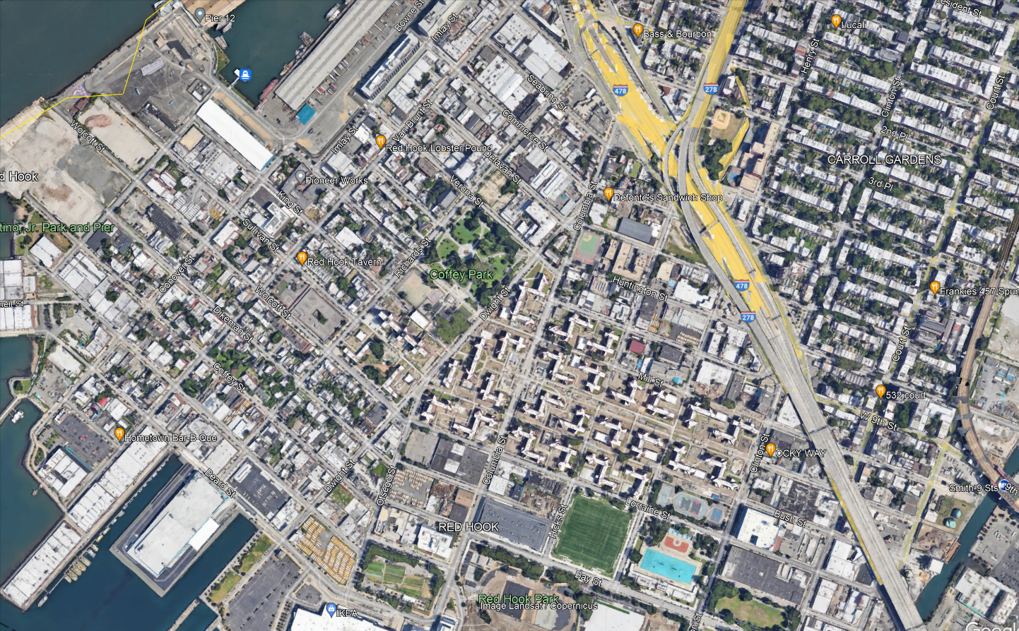
The neighborhood has roughly three major destinations to serve. Visible in the center-bottom of the map are the Red Hook Houses, with a total of 6,000 residents. At the very bottom of the map is Ikea, the main destination for people coming into the neighborhood from elsewhere. Then on the left there is Van Brunt, the local commercial drag.
Per OnTheMap, the entire neighborhood has 6,700 jobs and 5,000 employed residents as of 2019; it is not at all a bedroom community. Ikea is not even one of the main job centers – the biggest are elsewhere, such as the nearby Amazon warehouse. The neighborhood’s residents work about 40% in Manhattan, 40% in Brooklyn, and 20% elsewhere, while the workers are half from Brooklyn with no other origin having much concentration (the second biggest county origin, Queens, is 14%). Only 300 people both live and work in Red Hook, so a transit system connecting the neighborhood to the rest of the city, for both origins and destinations, is vital.
Why the tunnel?
Red Hook’s current bus connections are only with the rest of Brooklyn. This materially slows down travel for the 40% of residents who work in Manhattan and roughly 10% who work in places one accesses via Manhattan, such as the Bronx or Long Island City. The on-street bus connections are slow, and the neighborhood is not well-located relative to the Brooklyn subway network. The B57 only kind of hits Smith/9th southbound, since Smith is one-way northbound and the southbound trip is one block west on Court. Smith/9th itself is not accessible, and is the highest subway station in the system above the local street level as it was built with high clearance below for shipping through the Gowanus Canal.
Let’s look at how fast it is to get to 42nd Street. Via the B57 or B61, it’s about 10 minutes by bus from Ikea to Smith/9th; the B61 runs every 12 minutes and the B57 every 15 or 20, for maximum inconvenience. Then from Smith/9th to Bryant Park, it’s 27 minutes on the F. A bus in the tunnel would get to Fulton Street in 25 minutes and then it’s 12 minutes on the A. In theory, it’s the same trip time from Ikea, and around three minutes faster in relative terms from the Red Hook Houses depending on the route. In practice, being able to connect in Manhattan means having a much wider variety of destinations than just what’s on the F, which doesn’t even get to Lower Manhattan. The benefits for Red Hook-to-rest-of-city commuters would be noticeable.
The Manhattan street section would have variable traffic. On the other hand, the tunnel is less congested than its approaches, and congestion pricing stands to reduce traffic exactly there, as on other roads into the Manhattan core. With no bus stops in the tunnel, the average speed would be reasonable even with a short loop through Lower Manhattan. Diverting ridership from slower buses to Downtown Brooklyn would save revenue-hours, which could then be spent on higher frequency on all remaining routes.
Compromises on the route
The routing within the neighborhood for any bus route using the tunnel cannot be perfect; the neighborhood is not laid out for it. This is seen in how awkward the buses through Red Hook are today, as mentioned above; none of them even goes through the Red Hook Houses, which are the dominant origin. All of the following constraints require creating a single compromise bus route:
- The ridership potential is not there for more than one route. Whatever option is chosen, whether it’s a shuttle as I’m implying in this post or an extension of an existing route that goes deeper into Manhattan (or Brooklyn), that’s the only thing that can run. Even with one route, there may need to be compromises on frequency (by which I mean a bus every 8-10 minutes instead of 6, not 12).
- Van Brunt, Ikea plus the other waterfront jobs, and the Red Hook Houses are not at all collinear.
- The only place to get to the tunnel from Red Hook is the ramp from West 9th or Huntington, and West 9th is one-way west and may need to be converted to two-way. In particular, Van Brunt is too far, and the interface with the tunnel needs to be to and from the Red Hook Houses directly.
In effect, what all of the above implies is that a bus to Manhattan on Van Brunt is not likely to work. Here is one version of what could:

The circles along the path denote control points on Google Maps, and not stops. The western waterfront may have to just not be served; people could walk from Van Brunt across Coffey Park and it would be faster than taking the bus the long way around, down Van Brunt and then along Beard and up Columbia.
At the Manhattan end, the route would either loop just far enough north to hit the Fulton Street subway complex, or through-run. Fulton is necessary because the Wall Street stations are inaccessible, and is generally useful for the connection to World Trade Center. Beyond that, one option is to through-run to the M9, which hits more Manhattan destinations. That said, Manhattan bus speeds are so low that nearly all riders would switch to the subway; M9 frequencies are also low, every 15 minutes off-peak, and when there’s not much traffic this is almost unusably low for Red Hook Houses-Wall Street trips.
Scheduling Trains in New Jersey with the Gateway Project
Devin and I have draft timetables for intercity and commuter trains on every segment of the Northeast Corridor; what is left is to merge the segments together and see how they interact, tweak based on further constraints, and look at some alternatives. The good news is that in New Jersey, the last area we looked at, sharing tracks turns out to be easy. It’s a happy accident of how the Northeast Corridor has been designed that, with 21st-century train specs, the places where fast trains need to overtake slow ones already have long sections with additional tracks. Work is still required on grade-separating some junctions (chiefly Hunter Interlocking) and fixing some curves largely within the right-of-way, but it’s rather minor. The upshot is that local commuter trains can do New York-New Brunswick in 38 minutes and would do New York-Trenton in an hour, the express commuter trains can do New York-Trenton in 51 minutes, and the intercity trains can do New York-Philadelphia in 45 minutes, all with new rolling stock but few expensive investments in infrastructure beyond what’s already funded as part of the Hudson Tunnel Project for Gateway.
Three speed classes
The Northeast Corridor near New York presents two planning difficulties. First, there is a very large volume of peak commuter traffic into Manhattan, which forces agencies to build infrastructure at the limit of track capacity. And second, there is a long stretch of suburbia from Manhattan, which means that some express commuter rail service is unavoidable. This means that both the New Haven Line and the NJ Transit Northeast Corridor Line have to be planned around three speed classes: local commuter, express commuter, and intercity; moreover, the total volume of trains across these classes must be large, to accommodate peak demand, reaching 24 peak trains per hour. This is why the Hudson Tunnel Project is being built: the existing tunnels run 24 trains per hour already split across many different commuter rail branches, and all of the trains are crowded.
The difficulties in New Jersey and in Metro-North territory are different; for a taste of what is needed for Metro-North, see here. In New Jersey, the quality of the right-of-way is high, and the outer stretches are already cleared for a maximum speed of 160 mph, and with if the Federal Railroad Administration (FRA) had more faith in the quality of rolling stock windows they could run much faster than this. The inner stretches are slower but still straight enough for fairly high speed – there are long stretches straight enough for 250 km/h and one section where trains could even briefly reach 300 km/h. Thus, the express commuter trains are noticeably slower than the intercity trains on these segments despite running nonstop from Newark to Metropark.
All trains are significantly faster than today. Little of the speedup comes from any curve modification; rather, it comes from reduced timetable padding (down to Swiss-standard 7%), plus about 1.5 minutes of speedup in the Penn Station throat from better switch geometry.
Six-track overtakes
The Northeast Corridor is largely quad-track, but two sections have six tracks, both in New Jersey: around Newark Airport, and from just south of Elizabeth to just south of Rahway, where the North Jersey Coast Line branches off. The four-track section through Elizabeth is annoying, and I was hoping that it would not be necessary to delicately schedule around it. It is fortunate that my hopes have proved correct.
Below is a rough line chart. For one, it does not have any schedule padding. For two, there are still some additional slowdowns not coming from right-of-way geometry not incorporated into it, and in particular there’s a minute of Penn Station and tunnel delay not yet depicted for the intercity train and another 30 seconds of same for the commuter trains. For three, all station dwell times are set at 30 seconds, whereas the intercity needs a minute. In total, the last two factors delay the intercity by a minute relative to all commuter trains by when they depart Newark. All of these factors figure into the trip times above, but not the line chart below.
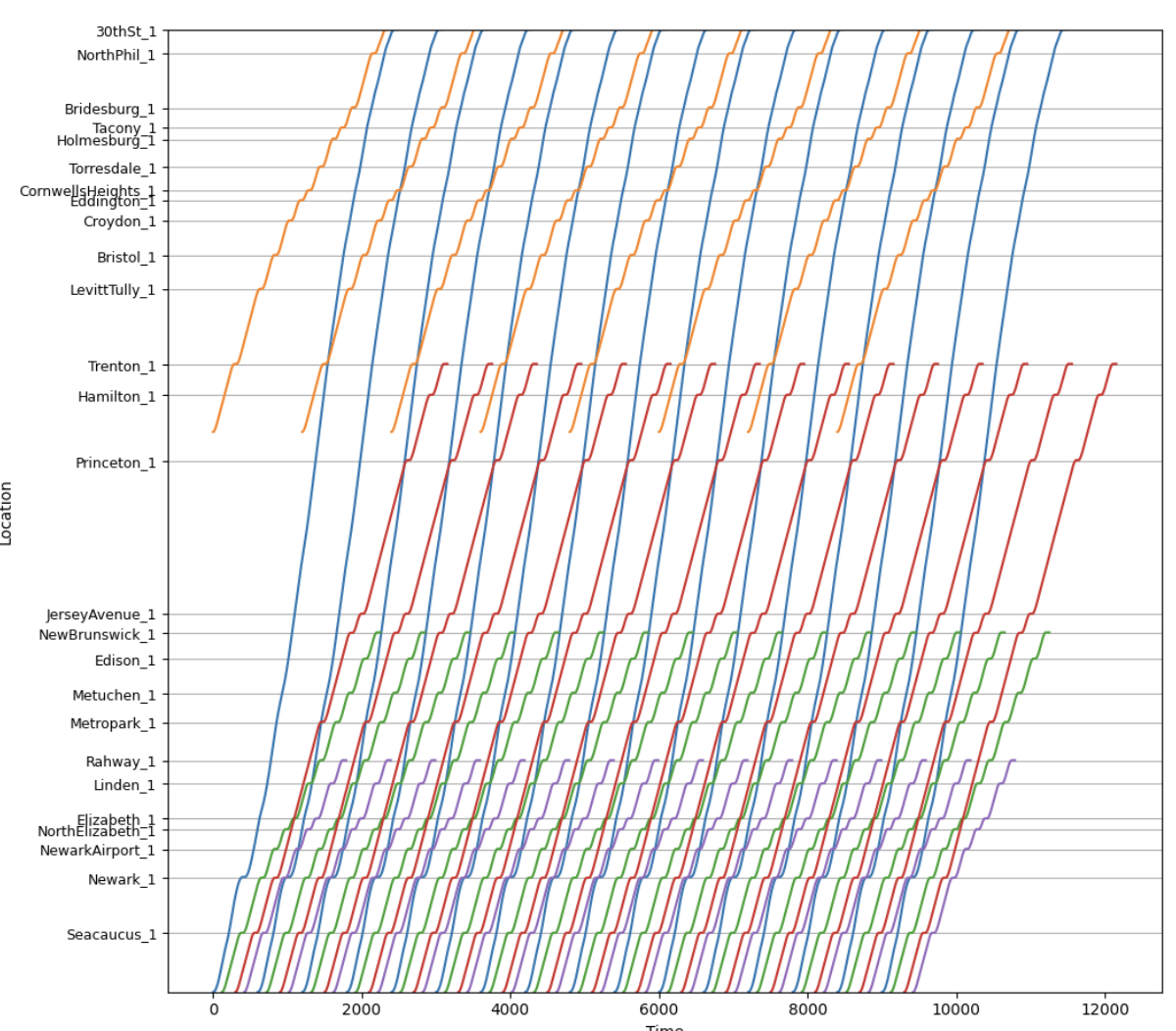
The blue lines are intercity trains, the red lines are express commuter trains, the green lines are local commuter trains to New Brunswick or Jersey Avenue, the purple lines are local commuter trains branching to the North Jersey Coast Line, and the gold lines are SEPTA trains.
Of note, the intercity trains do not share tracks with the local commuter trains except in the tunnel to Penn Station; the current plan after the Hudson Tunnel Project is finished is for the above-depicted trains to use the old tunnel and for other lines (Morris and Essex, Montclair-Boonton, Raritan Valley) to use the new tunnel. This provides just enough separation that there isn’t much interlining to worry about. The express commuter trains are the only ones with any surface track-sharing with trains of different speed classes.
As the line chart shows, the red/green overtake occurs at Elizabeth, where the express commuter trains then need to be on the inner express tracks. Just south of Elizabeth, the line widens to six tracks, and the express commuter trains can be kept separate from both local trains and intercity trains; all that’s required is installing switches to allow this, for a very small number of millions of dollars for high-speed switches or hundreds of thousands for slower switches. By the time the intercity and express commuter trains are within the signal system’s two-minute limit of each other, the express commuter trains don’t need to return to the inner tracks again. Past Rahway, the express and local commuter trains need to use the same tracks, but are adequately separated from each other.
Robustness check
We are still looking at options for how to match this segment with other segments, in particular how this could through-run east of Penn Station. Most likely, the local trains would run through to the Port Washington Branch of the LIRR and the express commuter trains would become local commuter trains to Stamford via Penn Station Access.
The upshot is that the train most likely to be delayed from the north is the express commuter train. It can afford to be about two minutes behind schedule before it messes up the order of trains using the tunnel; the schedule padding up to Elizabeth can recover one of these two minutes, and then, with the extra minute of slowdown of intercities not depicted in the line chart, the express commuter trains are still well clear of the intercities where they share tracks at Elizabeth.
Stop Spacing on Crosstown Routes
Two different issues in New York – the bus redesign process and the Interborough Express – are making me think about optimal stop spacing again. I blogged about it in general about buses a few days ago, but crosstown routes present their own special issues, and this is noticeable on rail more than on buses. Circumferential rail routes, in particular, can justify wider stop spacing than radial routes in certain circumstances. This can explain why, over the iterations of Triboro RX leading to the current IBX proposal, the stop spacing has widened: the Third Regional Plan-era effort in the 2000s had a stop every half mile in Brooklyn and Queens, but more recent efforts proposed fewer stops, and the current one if anything has too few and misses a transfer.
Density and isotropy
The tradeoff in stop spacing on both buses and trains is that more stops reduce the amount of walking to the station but increase the in-vehicle trip time for people going through the stop without getting on or off.
Density by itself does not affect this tradeoff. A uniform increase in density along a line equally increases the costs and benefits of changing the stop spacing. However, relative density matters: stop spacing should be tighter in areas with higher density and wider in areas with lower density, both relative to other areas along the same line. This is because higher relative density means passengers are disproportionately likely to have their origin or destination in this area, and disproportionately less likely to be traveling through it, both of which argue in favor of tighter stop spacing, and lower relative density means the opposite.
This then leads to the issue of isotropy. On an isotropic network, relative density is by definition always the same; spikes in relative density make travel less isotropic. As my previous post explains with bus stop spacing formulas, also valid on rail with different parameters, less isotropic density should mean not just that there should be more stops in some places and fewer in others, but also that there should be fewer stops overall. In the simplest case of non-isotropy, assume everyone is traveling to the same distinguished node, which on a rail line can be thought of as city center (let’s say there’s just one central transfer point) and on a bus can be thought of as the connection to the subway. Then, all passengers can be guaranteed to be going to a place with a station, and therefore the cost of widening the stop spacing is halved, since only the origin walk time is increased, not the destination walk time.
Isotropy and circumferential routes
Successful circumferential routes live off of their ability to connect to the rest of the network. Over time, those connection points may grow to become large destinations in their own right – this is the story of how Ikebukuro, Shinjuku, and Shibuya, all at the intersection of the Yamanote Line with radial rail links (JR, private, or subway), became large business districts. But the connections have to come first. If passengers can’t conveniently transfer, then the route has to live off of origin-and-destination traffic just on the line, and then, because it is circumferential and by definition doesn’t go to city center, traffic will be low. This principle is why the G train in New York is so weak: it may connect the two largest non-Manhattan job centers in the region, but that’s still neither Manhattan nor service to the entire city, and with poor transfers, it has to live off of the small number of people living in Williamsburg and Bedford-Stuyvesant working in Long Island City or Downtown Brooklyn.
But the same principle also means that non-transfer stops lose value. This doesn’t mean there shouldn’t be any of them, but it does mean that agencies can afford to be pickier about where to place them. They’re unlikely to be destinations, only origins, and even as origins their value is discounted since some passengers use the circumferential line as the second leg of a three-legged trip, between two radial lines.
The impact on IBX
I used to criticize the decision to build fewer stops on IBX. For example, here, when it was still an RPA proposal in what would later become the Fourth Regional Plan, I outlined several criticisms of the then-Triboro route. I think some of them stand, especially the section on the plan to have the route go into the Bronx and provide local commuter rail service to Coop City. However, on the matter of stop spacing, I must withdraw the criticism.
That said, a station at every connection with a radial rail line remains nonnegotiable. IBX errs in only stopping in East New York at Atlantic Avenue, connecting to the L and the LIRR, with no direct connection to Broadway Junction for the A/C and J. The distance between these two locations is only 350 meters, and it may be awkward to have two stops in short succession, but the meaning of high relative density is exactly that it’s okay to have more closely spaced stops. Alternatively, there could be one stop at a compromise location, with in-system connections at both ends, but then the walk times would be higher, which is less desirable.
Militarized and Other New Capital Cities
The news of the ongoing construction of Nusantara, Indonesia’s new capital in Borneo to replace Jakarta, got me thinking about other moves by various countries to create new capitals from scratch, to avoid having to deal with the urbanity of the existing capital. On this issue, Nusantara joins Brasilia, Islamabad, (at the subnational level) Chandigarh, and, most ominously, Naypyidaw and Egypt’s New Administrative Capital (NAC). The last two, unlike Nusantara, are built for explicitly military purposes, with the military considering the people to be its main adversary rather than any external enemy. Such capitals always waste money that could be spent on improving literally anything else – health, education, transportation, water, electricity, business climate, anti-poverty grants. In the less militarized cases, like Brasilia, these are just waste; in the more militarized cases, these showcase that the state is run by parasites.
Non-militarized cases
The move to Nusantara is being justified on the grounds that Jakarta is sinking. In truth, it’s better to view this as a continuation of the Transmigrasi program that the state has engaged in for decades. The zeitgeist was one of concerns about overpopulation leading to either forced sterilization of the poor or a program of settlement by the core population in peripheral regions; in Indonesia, this took the form of encouraging Javans to settle elsewhere in the country, where in practice they formed an overclass and sidelined the preexisting population. Nusantara, in a mostly undeveloped part of Borneo, needs to be viewed within this program, rather than as a tragic response to climate change.
Brasilia, similarly, was built on developmentalist grounds: the Brazilian elite wanted to develop the interior of the country, viewing the rainforest and savanna as low-value land to be mined and farmed. As this process predates the military dictatorship (1964-85; Brasilia was founded 1960), this is not really a matter of militarization. Rather, it’s better viewed as developmental failure – the resources invested in the new city could have gone to more productive uses, and the value of that land for farming and mining turned out not to be much.
The environmental impacts of the program of developing the interior were wholly negative. In Brazil, half of the country’s greenhouse gas emissions are land use changes and another quarter are from the agriculture sector, leading Brazil to emit 10.7 t/capita in greenhouse gases. In Germany, the figure is 8.1 t/capita, with a large industrial sector and an infamously still substantial coal sector, and on these lower emissions, Germany produces close to four times Brazil’s GDP per capita. The environmental impact of Nusantara is likely to be the same in direction as Brazil’s program, and to the extent it’s likely to be smaller in magnitude, it’s because it’s a smaller endeavor than Brazil’s entire program of developing the interior, in which Brasilia was just one component.
Militarized cases
The worst are not Brasilia, or likely Nusantara, but rather Naypyidaw and the NAC. I’ve been asked to provide some resources on social media, going over what’s involved in both projects.
Naypyidaw
The military junta that ran Myanmar between 1962 and 2011 (with significant tightening in 1988) and has run it since 2021, and exercised significant power between 2011 and 2011, built the new capital, officially since 2005, unofficially since a few years earlier, at a remote location 320 kilometers from Yangon and 240 from Mandalay. After the 1988 protests and the crackdown establishing the military government that 1990s-2000s human rights advocates knew and hated, the regime made changes to Yangon to suppress future protests, evicting 500,000 people from city center in the process. Where normally such efforts mostly target poor people in order to create the illusion of a poverty-free city center and facilitate urban renewal, in Yangon the evictions targeted the middle class, which was sympathetic to the protest movement and had communities that had sheltered protesters. But even the new Yangon was not good enough for the generals, and so they shifted to Naypyidaw.
Part of the reason was that Yangon was too multiethnic, in a part of the country that was majority-Mon until the 20th century, while Naypyidaw could be more comfortably Bamar. But the main reason was security needs. The adversary in this case is not any foreign government – a city built in 2005 by a government that might worry about American-led regime change would look at what was going on in Iraq and opt to maintain its capital in a large, dense central city to facilitate insurgency and make it easy to hide among the civilian population. Naypyidaw instead does the exact opposite – it’s easy for a superior military force to take. Rather, its threat model is a popular uprising, and thus the modernist planning with separation of uses exists to prevent the broad public from being able to stage an insurgency. There is extensive regime propaganda in the city, such as national museums telling uncritical histories, but no major religious sites, since those might shelter protesters, as happened in 1988.
The urbanism of Naypyidaw is, essentially, a giant military camp. It is designed with strict separation of uses and large roads between different complexes for movement between them; people are not expected to walk between places. The Guardian calls it a post-apocalyptic suburbia, but I don’t think that’s quite right. In an auto-oriented American city, there’s nowhere to walk, but everyone owns a car and the development forms make it convenient to drive to one’s work and regular non-work destinations. Dubai, criticized vociferously among urbanists for its tackiness and auto-oriented character, is a place where one can drive or be driven to shopping malls and towers within a close distance. Naypyidaw doesn’t have any of this and doesn’t seem to even try; it’s a collection of sites, designed for no need but that of control by the military of a population that does not want to be controlled by it. It’s a monument not to modernist urbanism, though it tries to affect that, but rather to destruction of value by an unwanted government.
New Administrative Capital
The situation in Egypt, to be clear, is a lot less brutal than in Burma. At the same time, Egypt is several times richer, which creates more value that can be extracted and given over to cronies. This can be seen in the construction of the NAC, to replace Cairo.
The immediate history of the NAC is that in 2011, Egypt famously had the Arab Spring revolution overthrowing Hosni Mubarak; in the subsequent election, the only preexisting organized political force, the Muslim Brotherhood, won the election, leading Mohamed Morsi to take office as president starting in 2012. The election was free and the state of civil liberties improved, but the Muslim Brotherhood was making moves to consolidate power, leading to fears among human rights and democracy protesters of new authoritarianism, which led to a protest movement in 2013 called Tamarod, demanding new elections; later in the same year, the military reacted to the protests by launching a coup, removing Morsi from power and restoring the military elements of the prior regime, including a pardon of Mubarak, who was on trial for corruption. Eventually, the chief of the Egyptian Armed Forces, General Abdel Fattah al-Sisi, won a rigged presidential election in 2014, and has been president ever since. Much of the focus of the protest movements was street protests in Cairo, where Tahrir Square became a global metonym for democracy protests (for example, in Israel, where people basically never draw any positive inspiration from Arab political trends). This created a need among Sisi and his inner circle for a new capital in the desert, built to forestall any future Tahrir.
The capital could not even be named New Cairo, because there’s already a New Cairo, an eastern suburb of Cairo built expressly in order to decentralize the capital; Cairo is a huge, dense city. For a while, it was mocked as New New Cairo, for its location even farther east of New Cairo; by now, it has the formal name New Administrative Capital, with construction having begun in 2016.
The NAC is designed around digital surveillance of the population, and showcasing that Egypt can develop the desert, and maybe decongesting Cairo. It has pretenses of being the next Dubai, but where Dubai invites global starchitects to buy prestige, the NAC is instead giving contracts to domestic elites (as was also the case for Naypyidaw); the military directly owns 51% of the agency developing the NAC and the state ministry of housing only 49%, and the contracts are designed to enrich people who are politically connected to the government.
The violence levels involved are, again, much lower than in Burma. But precisely because Egypt’s economy is solidly middle-income, it’s frustrating to see vast sums wasted on a military prestige project. Cairo’s congestion and overcrowding have a well-known solution, in the form of building a rapid transit network to facilitate non-car commutes, and connect not just the existing built-up area to the urban core but also to-be-built areas adjacent to it. It’s a metro area of 22 million people, about the same size as New York, but only has a three-line, 100 km metro network. These 100 km should be closer to 1,000.
To be clear, there is some development of the Cairo Metro. Line 3 is being extended as we speak, with a new section having opened this month. Overall, the third phase of the line, 17 km long, cost 40.7 billion Egyptian pounds per a statement in 2012, which in contemporary dollars is $2.6 billion in exchange rate terms and $9 billion in 2021 PPP terms. On Google Earth, it looks like 9 km of the line are underground and 8 km are elevated or at-grade; this more than $500 million/km cost is not even fully-underground. This is a line where the main contractor is Orascom – this isn’t a case of outsourcing the state to Japan, China, or both, and therefore building at high costs, as is common in Bangladesh, Pakistan, and Southeast Asia. Rather, this is entirely domestic waste. Most likely, the same contractors that are profiteering off of public money through the construction of the NAC are also profiteering off of public money for what little infrastructure the military government deigns to build in the capital that people actually live in.
Bus Stop Consolidation and Blocks
There are arguments over bus stop spacing in my Discord channel. As the Queens bus redesign process is being finalized, there’s a last round of community input, and as one may expect, community board members amplify the complaints of people who reject any stop consolidation on “they’re taking my stop, I’ll have to walk longer” grounds. I wrote about this in 2018, as Eric and I were releasing our proposed Brooklyn bus redesign, which included fairly aggressive consolidation, to an average interstation of almost 500 meters, up from the current value of about 260. I’d like to revisit this issue in this post, first because of its renewed relevance, and second because there’s a complication that I did not incorporate into my formula before, coming from the fact that the city comprises discrete blocks rather than perfectly isotropic distribution of residents along an avenue.
The formula for bus stop spacing
The tradeoff is that stop consolidation means people have to walk longer to the bus stop but then the bus is faster. In practice, this means the bus is also more frequent by a proportionate amount – the resources required to operate a bus depend on time rather than distance, chiefly the driver’s wage, but also maintenance and fuel, since stops incur acceleration and idling cycles that stress the engines and consume more fuel.
The time penalty of each stop can be modeled as the total of the amount of time the bus needs to pull into the stop, the minimum amount of time it takes to open and close the doors, and the time it takes to pull out. Passenger boardings are not included, because those are assumed to be redistributed to other stops if a stop is deleted. In New York and Vancouver, the difference in schedules between local and limited stop buses in the 2010s was consistent with a penalty of about 25 seconds per stop.
The optimum stop spacing can be expressed with the following formula:

To explain in more detail:
- d is a dimensionless factor indicating how far one must walk, based on the stop spacing; the more isotropic passenger travel is, the lower d is, to a minimum of 2. The specific meaning of d is that if the stop spacing is n, then the average walk is n/d. For example, if there is perfect isotropy, then passengers’ distance from the nearest bus stop is uniformly distributed between 0 and n/2, so the average is n/4, and this needs to be repeated at the destination end, summing to n/2.
- Walk speed and walk penalty take into account that passengers prefer spending time on a moving bus to walking to the bus. In the literature that I’ve seen, the penalty is 2. Usually the literature assumes the walk speed is around 5 km/h, or 1.4 m/s; able-bodied adults without luggage walk faster, especially in New York, but the speed for disabled people is lower, around 1 m/s for the most common cases.
- Stop penalty, as mentioned above, can be taken to be 25 s.
- Average trip length is unlinked; for New York City Transit in 2019, counting NYCT local buses including SBS but not express buses, the average was 3,421 meters.
- Average bus spacing is the headway between buses on the route measured in units of distance, not speed; it’s expressed this way since the resources available can be expressed in how many buses can circulate at a given time, and then the frequency is the product of this figure with speed. In Brooklyn in the 2010s, this average was 1,830 m; our proposed network, pruning weaker routes, cut it to 1,180. The Queens figure as of 2017 appears similar to the Brooklyn figure, maybe 1,860 m. Summing the average trip length and average bus spacing indicates that passengers treat wait time as a worst-case scenario, or, equivalently, that they treat it as an average case but with a wait penalty of 2, which is consistent with estimates in the papers I’ve read.
In the most isotropic case, with d = 2, plugging in the numbers gives,

However, isotropy is more complex than this. For one, if we’re guaranteed that all passengers are connecting to one distinguished stop, say a subway connection point, then consolidating stops will still make them walk longer at the other end, but it will not make them walk any longer at the guaranteed end, since that stop is retained. In that case, we need to set d = 4 (because the average distance to a bus stop if the interstation is n is n/4 and at the other end we’re guaranteed there’s no walk), and the same formula gives,

The Queens bus redesign recognizes this to an extent by setting up what it calls rush routes, designed to get passengers from outlying areas in Eastern Queens to the subway connection points of Flushing and Jamaica; those are supposed to have longer interstations, but in practice this difference has shrunk in more recent revisions.
That said, even then, there’s a complication.
City blocks and isotropy
The models above assume that passengers’ origins are equally distributed along a line. For example, here is Main Street through Kew Gardens Hills, the stretch I am most likely to use a New York bus on:
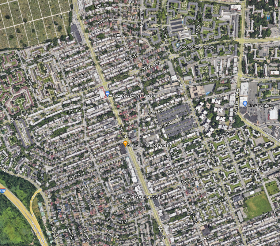
I always take the bus to connect to Flushing or Jamaica, but within Kew Gardens Hills, the assumption of isotropy means that passengers are equally likely to be getting on the bus at any point along Main Street.
And this assumption does not really work in any city with blocks. In practice, neighborhood residents travel to Main Street via the side streets, which are called avenues, roads, or drives, and numbered awkwardly as seen in the picture above (72nd Avenue, then 72nd Road, then 72nd Drive, then 73rd Avenue, then 75th Avenue…). The density along each of those side streets is fairly consistent, so passengers are equally likely to be originating from any of these streets, for the most part. But they are always going to originate from a side street, and not from a point between them.
The local bus along Main, the Q20, stops every three blocks for the most part, with some interstations of only two blocks. Let’s analyze what happens if the system consolidates from a stop every three blocks, which is 240 meters, to a stop every six, which is 480. Here, we assume isotropy among the side streets, but not continuous isotropy – in other words, we assume passengers all come from a street but are equally likely to be coming from any street.
With that in mind, take a six-block stretch, starting and ending with a stop that isn’t deleted. Let’s call this stretch 0th Street through 6th Street, to avoid having to deal with the weird block numbering in Kew Gardens Hills; we need to investigate the impact of deleting a stop on 3rd Street. With that in mind: passengers originating on 0th and 1st keep going to 0th Street and suffer no additional walk, passengers originating on 5th keep going to 6th and also suffer no additional walk, passengers originating on 2nd and 4th have to walk two blocks instead of one, and passengers originating on 3rd have to walk three blocks instead of zero. The average extra walk is 5/6 of a block. This is actually more than one quarter of the increase in the stop spacing; if there is a distinguished destination at the other end (and there is), then instead of d = 4, we need to use d = 3/(5/6) = 3.6. This shrinks the optimum a bit, but still to 576 m, which is about seven blocks.
The trick here is that if the stop spacing is an even number of blocks, then we can assume continuous isotropy – passengers are equally likely to be in the best circumstance (living on a street with a stop) and in the worst (living on a street midway between stops). If it’s an odd number of blocks, we get a very small bonus from the fact that passengers are not going to live on a street midway between stops, because there isn’t one. The average walk distance, in blocks, with stops every 1, 2, 3, … blocks, is 0, 0.5, 2/3, 1, 1.2, 1.5, 12/7, 2, … Thus, ever so slightly, planners should perhaps favor a stop every five or seven blocks and not every six, in marginal cases. To be clear, the stop spacing on each stretch should be uniform, so if there are 12 blocks between two distinguished destinations, there should be one intermediate stop at the exact midpoint, but, perhaps, if there are 30 blocks with no real internal structure of more or less important streets, a stop should be placed every five and not six blocks, especially if destinations are not too concentrated.
Fares on High-Speed Trains
American journalists sometimes ask me to discuss high-speed rail fares. I’ve written from time to time about how Northeast Corridor fares are significantly higher than French, German, and Japanese high-speed rail fares, but the links to this information are never in the same place. The purpose of this post is to collect all the links together for easy retrieval, with updates to the 2020s whenever possible. Unfortunately, international high-speed rail fares connecting to France are also much higher than domestic ones, which contributes to the poor ridership of those trains relative to city size.
France
ARAFER releases statistics annually. The most recent year for which there is data is 2022; here’s the report in French, and here’s a summary in English. The relevant information is in sections 5-6. The TGV system including international trains averages fare revenue of 6,213M€ for 61 billion passenger-km; in English this is called “non-PSO,” since these are the profitable trains that SNCF runs outside the passenger service obligation system for money-losing slow trains. This works out to 0.102€/p-km. The PPP rate these days is about 1€ = $1.45, making this about $0.15/p-km.
The split between domestic and international trains is large, and the French report has the domestic trains as just 0.093€/p-km, taking a weighted average from pp. 23 and 31. Nominal fares per p-km on domestic TGVs were down 4% from 2019 to 2022, despite 7.5% cumulative inflation over this period.
The international trains, in contrast, are much more expensive: the report doesn’t give exact numbers, but from some weighted averaging and graph eyeballing it looks like it’s around 0.17€/p-km. The all-high-speed international trains – Eurostar and Thalys – are more expensive than the trains running partly at low speed in Germany and Switzerland, like Lyria; this big difference in fares helps explain their disappointing ridership. Domestic TGVs run from Paris to Lyon 28 times on the 5th of June this year, counting only trains to Lyon Part-Dieu or Perrache, which do not continue onward, and not counting trains that stop at Saint-Exupéry on their way to points south, and those trains are rather full 16-car bilevels. In contrast, on the same day I only see 16 Eurostars from London to Paris. This is despite the fact that London is a far larger city than Lyon, and the in-vehicle travel time is only moderately longer.
Germany
Germany lacks France’s neat separation of low- and high-speed trains. The intercity rail network here is treated as a single system, and increasingly all trains are ICEs even if they spend the majority of the trip on legacy lines at a top speed of 200 km/h.
Overall intercity rail passenger revenue here was 5.1 billion € in 2022; the expression to look for is “SPFV.” Ridership was 42.9 billion p-km per a DB report of 2022-3, PDF-p. 7, averaging 0.119€/p-km, which is $0.17/p-km in PPP US dollars. 2022 was still slightly below 2019 levels, when ridership was 44.7 billion p-km and fares averaged 0.112€/p-km; the three-year increase was less than the cumulative inflation over this period, which was 10.3%.
Japan
Japanese fares are higher than European fares on high-speed rail. JR East’s presentation from 2021, showing depressed ridership during the pandemic (p. 50), reports ¥189.6 billion in Shinkansen revenue on 7.95 billion p-km, or ¥23.8/p-km, and projects recovery to ¥428.9 billion/17.313 billion p-km by 2022, or ¥24.8/p-km. JR Central’s 2020 report says (p. 37) that its Shinkansen service got ¥1.2613 trillion in revenue in the year ending March 2020 on 54.009 billion p-km, or ¥23.4/p-km. JR West’s 2020 factsheets for revenue and ridership show ¥457 billion/21.338 billion p-km in 2019, or ¥21.4/p-km.
The PPP rate for 2020-1 was $1 = ¥100. Taking 9% dollar inflation from 2020 to 2022 into account, this is, in 2022 prices, around $0.25/p-km.
Northeast Corridor
Amtrak publishes monthly performance reports; the fiscal year is October-September, so the September reports, covering an entire fiscal year, are to be preferred. Here are 2022 and 2023; 2022 still shows a considerable corona depression, unlike in France and Germany. The 2023 report shows that Northeast Corridor revenue splits as $495.9 million/581.1 million p-miles Acela, or $0.53/p-km, and $768.2 million/1.6269 billion p-miles Regional, or $0.293/p-km Regional. Altogether, this is $0.356/p-km, which is nearly 50% higher than the Shinkansen, 2.1 times as expensive as the ICE, and 2.4 times as expensive as the TGV.
Discussion
High operating costs on Amtrak are the primary reason for the premium fares. The mainland JRs are all highly profitable; DB Fernverkehr is profitable, as is the TGV network (though SNCF writ large isn’t, the slow intercities falling under the PSO rubric). All five companies pay track access charges for the construction of high-speed rail infrastructure; the ARAFER report goes over these charges in France and a selection of other European countries, designed to prevent state subsidies to intercity rail operations through underpriced track access, since track construction is always done by the state but operations may be done by a private operator or a foreign state railway. The Northeast Corridor is profitable as well – Amtrak doesn’t have to pay track access charges, but the access charges for legacy 19th-century lines would not be significant. However, if Amtrak charged European fares or even Japanese ones, it wouldn’t be. Northeast Corridor rail operations in fiscal 2023 earned $1.266 billion in passenger revenue plus $28.5 million in non-ticket revenue but spent $1.0917 billion, or $0.307/p-km.
A portion of the Amtrak cost premium also comes from adversarial profit maximization, also seen on Thalys and Eurostar. The domestic TGVs and ICEs aim at making a base rate of profit while providing a service for the general public; SNCF doesn’t apply the same logic to Thalys and Eurostar and instead aims at serving only business trips to avoid the possibility of extracting less than maximum fares from international travelers. On Amtrak, the need to subsidize the rest of the system has increased Northeast Corridor fares, though to be clear, in fiscal 2023 the operating margin was small enough that this is at most a secondary factor. Performance reports from the 2000s and 10s showed a larger operating margin, but criticism from advocacy groups centering non-Northeast Corridor passengers alleging that Amtrak accounting was making the Northeast Corridor look better and the night trains look worse led to a recalculation, used in the most recent reports, in which Northeast Corridor operations still turn out to be profitable but not by a large margin.
