Category: New York
The RPA’s Fourth Regional Plan
The RPA has just put up its Fourth Regional Plan, recommending many new subway and commuter rail lines in New York, ranging from good (125th Street subway, Brooklyn-Lower Manhattan regional rail) to terrible (Astoria Line extension to the west rather than to LaGuardia, which gets a people mover heading away from Manhattan). I have a poll for Patreon supporters for which aspects I should blog about; I expect to also pitch some other aspects – almost certainly not what I said in my poll – to media outlets. If you support me now you can participate in the poll (and if you give $5 or more you can see some good writings that ended up not getting published). If you want to be sneaky you can wait a day and then you’ll only be charged in January. But you shouldn’t be sneaky and you should pledge today and get charged tomorrow, in December.
It’s hard to really analyze the plan in one piece. It’s a long plan with many components, and the problems with it don’t really tell a coherent story. One coherent story is that the RPA seems to love incorporating existing political priorities into its plan, even if those priorities are bad: thus, it has the AirTrain LaGuardia, favored by Cuomo, and the Brooklyn-Queens Connector (BQX), favored by de Blasio, and even has tie-ins to these plans that don’t make sense otherwise. Some of the regional rail money wasters, such as Penn Station South and the new East River tunnels from Penn Station to the LIRR, come from this story (the LIRR is opposed to any Metro-North trains going to Penn Station under the belief that all slots from points east to Penn Station belong to Long Island by right). However, there remain so many big question marks in the plan that are not about this particular story that it’s hard to make one criticism. I could probably write 20,000 words about my reaction to the plan, which is about 15 published articles, and there are, charitably, 5 editors who will buy it, and I’m unlikely to write 10 posts.
I’ll wait to see how the poll on Patreon goes, and what editors may be interested in. There are interesting things to say about the plan – not all negative – in areas including rail extensions, transit-oriented development, and livable streets. But for now, I just want to zoom in on the crayon aspects. I previously put up my 5-line map (4 MB version, 44 MB version). The RPA proposal includes more tunnels, for future-proofing, and is perhaps comparable to a 7-line map I’ve been working on (4 MB version, 44 MB version):
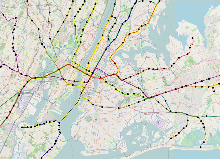
I was mildly embarrassed by how much crayon I was proposing, which is why what I put in my NYU presentation 3 weeks ago was the 5-line system, where Line 1 (red) is the Northeast Corridor and the Port Washington Branch, Line 2 (green) is much the same but through the new Hudson tunnels, Line 3 (orange) is the Empire Connection and the Hempstead Branch, Line 4 (blue) connects the Harlem Line and Staten Island, Line 5 (dark yellow) connects the Erie Lines with the Atlantic Branch and Babylon Branch, and Line 6 (purple) is just East Side Access. In the 7-line system, Line 6 gets extended to Hoboken and takes over the Morris and Essex Lines, and Line 7 (turquoise) connects the Montauk Line with the Northern Branch and West Shore Line via 43rd Street, to prune some of the Line 5 branches.
With all this extra tunneling, the map has 46 new double-track-km of tunnel. With just Lines 1-5, it has 30; these figures include Gateway and the other tunnels highlighted in yellow (but not the highlighted at-grade lines, like Lower Montauk), but exclude East Side Access. In contrast, here’s what the RPA is proposing:
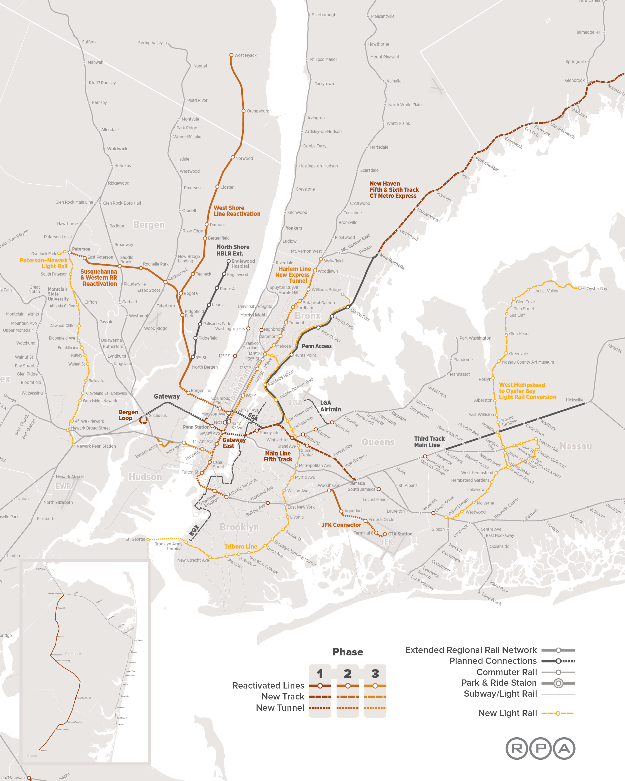
Counting the Triboro-Staten Island tunnel and Gateway starting from the portal (not at Secaucus as the map portrays), this is 58 route-km, and about 62 double-track-km of tunnel (the Third Avenue trunk line needs four tracks between 57th and Houston at a minimum), for substantially the same capacity. The difference is that the RPA thinks Metro-North needs two more tracks’ worth of capacity between Grand Central and 125th, plus another two-track tunnel in the Bronx; from Grand Central to Woodlawn, the Fourth Regional Plan has 19 km, slightly more than 100% of the difference between its tunnel length and mine. My plan has more underwater tunnel, courtesy of the tunnel to Staten Island, but conversely less complex junctions in Manhattan, and much more austere stations (i.e. no Penn Station South).
As I said, I don’t want to go into too much detail about what the RPA is doing, because that’s going to be a series of blog posts, most likely a series of Streetsblog posts, and possibly some pieces elsewhere. But I do want to draw a contrast between what the RPA wants for regional rail and what I want, because there are a lot of similarities (e.g. look at the infill on the Port Washington Branch in both plans), but some subtle differences.
What I look for when I think of regional rail map is an express subway. I’ve been involved in a volunteer effort to produce a regional rail plan for Boston, with TransitMatters, in which we start by saying that our plan could be a second subway for Boston. In New York, what’s needed is the same, just scaled up for the city’s greater size and complexity. This means that it’s critical to ensure that the decision of which lines go where is, for lack of a better word, coherent. There should be a north-south line, such as the Third Avenue trunk in the Fourth Regional Plan or my Line 4; there should be an east-west line, such as the lines inherited from the legacy Northeast Corridor and LIRR; and so on.
The one big incoherence in my plan is the lack of a transfer station between Line 4/6 and Line 1/3 at Madison and 33rd. This is on purpose. Line 2 connects Penn Station and Grand Central, Madison/33rd is well to the south of Midtown’s peak job density, and Lines 4 and 6 shouldn’t be making more stops than the 4 and 5 subway lines, which go nonstop between Grand Central and Union Square.
The other weirdness is that in the 7-line system, unlike the 5-line system, there is no way to get between the Northern Branch or the West Shore Line and the rest of New Jersey without going through Manhattan. In the first map of this system that I made on my computer, Line 7 has an awkward dip to serve the same Bergenline Avenue station as Line 2. But I think what I posted here, with two separate stations, is correct: Lines 6 and 7 are lower priorities than a subway under Bergenline Avenue, which would make intra-state connections much easier. It’s difficult to depict rail extensions at different scales on one geographically accurate map, and doing a schematic map like the London Underground isn’t useful for depicting new lines, which should make it clear to readers where they go. But the 7-line system must be accompanied by subway extensions, some covered by the RPA (Utica, Nostrand) and some not (Bergenline, again).
I recently had to give a short description of my program for good transit, and explained it as, all aspects of planning should be integrated: operations and capital planning, buses and light rail and subways and regional rail, infrastructure and rolling stock and scheduling, transit provision and development. When I make proposals for regional rail, they may look out there, but the assumption is always that there’s a single list of priorities; the reason I depict a 7-line map, or even a 9-line map (in progress!), is to be able to plan lines 1-3 optimally. Everything should work together, and if agencies refuse to do so, the best investment is to make sure those agencies make peace and cooperate. The RPA plan sometimes does that (it does propose some regional rail integration), but sometimes it’s a smörgåsbord of different politically-supported proposals, not all of which work together well.
Suburban Transit-Oriented Development
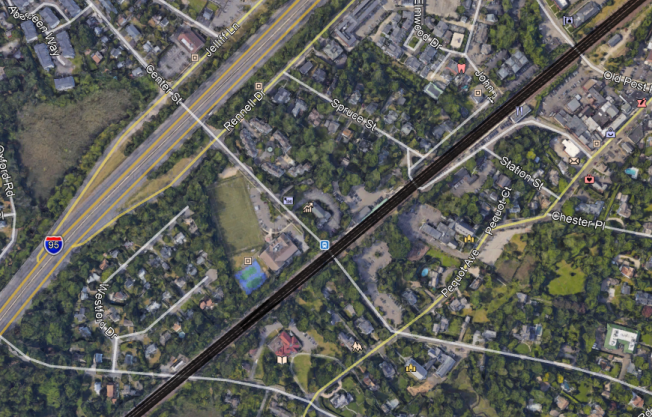
Here’s a Google Maps image of Southport, a section of Fairfield, Connecticut with its own Metro-North commuter rail station:
Here’s an image at the same scale of Bourg-la-Reine, an inner suburb of Paris on the RER B, at the junction between the line’s two southern branches:
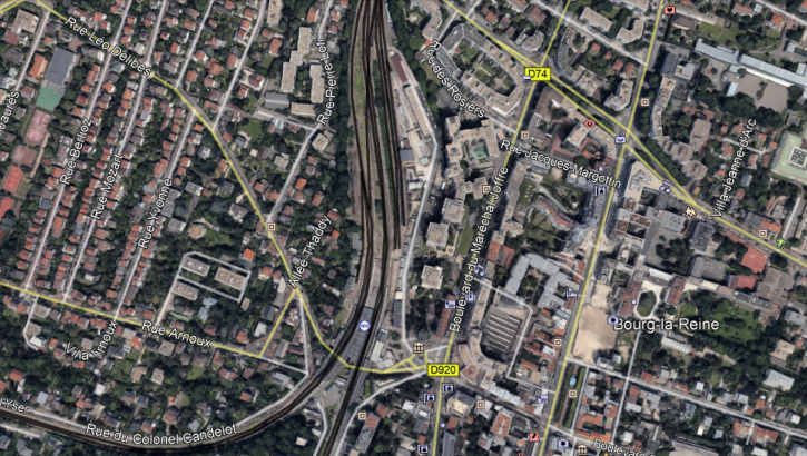
At Bourg-la-Reine, the buildings just east of the station are high-rise. There are local community amenities, including walkable schools, supermarkets, and pharmacies, and people can comfortably live in this suburb without a car. This generates significant RER traffic at all hours of day: outbound trains are often standing-room only until they reach this station even in midday, outside rush hour.
At Southport, there are a few townhouses near the station. But the roads are wide and hostile to pedestrians, and the nearest supermarket closes at 6 pm, too late for commuters returning from the city. Car ownership approaches 100%, and nobody rides the trains except to get to office jobs at the traditional peak hour in Manhattan (or perhaps Stamford).
The difference between the two places is so stark that they can barely be compared. Southport has 317 inbound boardings per weekday. Of those, 263, or 83%, are in the morning rush hour; the Metro-North-wide average is 63%, and the average on the SNCF-operated parts of the RER and Transilien is about 46%. Bourg-la-Reine has 4.5 million annual riders, about 16,000 on an ordinary working day.
A huge part of the difference is about service provision – Bourg-la-Reine has a train every five minutes midday, Southport a train every hour. But it’s not just about service. The RER has stations farther out, with somewhat less intense service, such as a train every 15 minutes, with comparable ridership. And the LIRR and Metro-North have little off-peak ridership even at stations with more frequent service, such as Mineola and Hicksville. Transit-oriented development (TOD) is as important as good service in such cases.
I bring up Southport because the RPA just dropped a study about suburban TOD that grades every New York commuter rail station between 0 and 3, and gives Southport the highest mark, 3. The RPA study looks at zoning within 800 meters of each station and considers whether there’s a parcel of land that permits multifamily housing with a floor are ratio higher than 1.25. Southport has such lots, supporting some townhouses, so according to the RPA it gets full marks, even though, by RER standards, it is like every other American car-oriented suburb.
Based on this methodology, the RPA identifies a number of good suburbs, and even comes to policy conclusions. It proposes more TOD in the mold of existing exurban New York examples, such as Patchogue. The model for the program is the real reason the RPA study is so weak: rather than calling into attention the big differences between land use at suburban stations in New York versus in Paris (or any number of big European cities with suburban rapid transit), it overfocuses on small differences within auto-oriented suburbia.
Some of the ultimate conclusions are not terrible. For example, the RPA is proposing linking federal infrastructure development to permitting more multifamily housing. This would improve things. However, the problem with this is twofold. First, it is unrealistic – the federal government gave up decades ago on enforcing fair housing laws, and has no interest in attempting to make exclusionary suburbs behave. Were I to propose this, hordes of American commenters would yell at me for not understanding American politics. And second, it misunderstands the nature of the problem, and ends up proposing something that, while unrealistic, is still low-impact.
The best way to understand the problem with the study is what author Moses Gates told me on Twitter when I started attacking it. He said that the RPA was looking at zoning rather than actual development. Since there is zoning permitting multifamily development within the prescribed radius at Southport, it gets full marks. With my understanding of what good TOD looks like, I would be able to say that this is clearly so bad the methodology must be changed; on Twitter I suggested looking at zoning within 300 meters of the station rather than 800, since the highest-intensity development should be right next to the station. I also suggested looking at supportive nonresidential uses, especially supermarkets. A development that isn’t walkable to retail at reasonable hours is not TOD.
The RPA does not think in this language. It thinks in terms of internal differences within the US. Occasionally it deigns to learn from London, but London’s suburban development is auto-oriented by European standards (transit mode share in the London commuter belt is at best in the teens, often in the single digits). Learning from anywhere else in the world, especially places that don’t speak English, is too difficult. This means that the RPA could not reach the correct conclusion, namely, that there is no such thing as an American suburb with TOD. The only exception I can come up with in the United States involves Arlington, on the Washington Metro, and Arlington is no longer considered a suburb, but really a full-fledged city in a different state, like Jersey City.
The other thing the RPA missed is that it drew too large a radius. TOD at a train station should include townhouses 800 meters out – but it’s more important to include high-rise residential construction next to the train station and mid-rise apartment buildings 500 meters out. Giving American suburbs latitude to place TOD so far from the station means they will act like Southport and allow small amounts of multifamily housing out of the way, while surrounding the station itself with parking, a tennis court, and large single-family houses with private swimming pools. This is not hypothetical: suburbs in New Jersey have reacted to court rulings mandating affordable housing by permitting apartments at the edge of town, far from supporting retail and jobs, and keeping the town core single-family.
Because the RPA missed the vast differences in outcomes between the US and France, it missed some useful lessons:
- States should centralize land use decisionmaking rather than give every small suburb full autonomy.
- TOD doesn’t need to be fully mixed-use, but there should be some local retail right next to housing.
- Housing should be high-density right next to the station. A floor area ratio of 1.25 is not enough.
- Publicly-funded social housing should be next to train stations, in the city as well as in the suburbs, and this is especially important in expensive suburbs, which aren’t building enough affordable housing.
Without suburban TOD, any regional rail system is incomplete. I wish I could have covered it at my talk, but I didn’t have time. Good service needs to run to dense suburbs, or at least suburbs with dense development within walking distance of the station. It needs to extend the transit city deep into suburbia, rather than using peak-only commuter rail to extend the auto-oriented suburbs into the city.
I Gave a Talk About Regional Rail
I expect there will be writeups about the talk (e.g. on Streetsblog). But meanwhile, here are my slides (warning: 17 MB, because of pictures). These are identical to what was shown at the talk, with two differences: I fixed one small mistake (Fordham Road vs. Pelham Parkway), and I consolidated the pauses, so each slide is a page, rather than a few pages, each page adding a line.
There were light fantasy maps in the talk. Because of size, I’m not embedding them in the post. But there are links:
- Infill stops without new tunnels: low-res/3.5 MB, high-res/20 MB
- The 3-line system (Gateway and realigned Empire Connection): low-res/4 MB, high-res/44 MB
- The 5-line system (the Lower Manhattan lines): low-res/4 MB, high-res/44 MB
Yellow highlights around a line indicate it’s new; Gateway is highlighted in one direction since it’s an existing two-track line to be four-tracked. On the infill map, solid circles are existing stations, gray circles are planned stations, white circles are my suggestions for additional infill.
Fix DeKalb Avenue
In New York, there are two dedicated subway tracks on the Manhattan Bridge offering a bypass of Lower Manhattan. Between DeKalb Avenue in Brooklyn and Canal Street in Chinatown in Manhattan, Q trains run nonstop for 3.5 km, while the R train goes the long way, taking 5.5 km and making 2 intermediate stops in Downtown Brooklyn and 4 in Lower Manhattan. The N skips DeKalb Avenue, with a 4.5 km nonstop segment between Canal Street and the Atlantic/Pacific/Barclays station complex.
The Q and N should be immense time savers. Instead, the Q does the trip in 8 minutes and the N in 10, both of which average 26-27 km/h. The subway’s overall average speed, weighed down by local trains stopping every 700 meters, is 29 km/h. The Q and N are still time savers, though, because the R does the 5.5 km in 18 minutes, an average speed of 16 km/h – far less than the systemwide average, and even less than the slowest Paris Metro line, Line 4 with its 500-meter interstations and 20 km/h average speed. Between DeKalb and Pacific, about 800 meters, the R takes 3 minutes. Unfortunately, New York City Transit is not taking any measures that would fix this, and when I asked about one possibility, I got excuses.
There are two reasons why this part of the subway is so slow. The first is something called signal timers. Timers are devices installed at frequent intervals on long interstations, such as the bridges and tunnels connecting Manhattan with Brooklyn and Queens, limiting train speed. These timers have always been around, but after fatal accidents in the 1990s, New York City Transit tightened them, reducing speed further; for some more background, see my Vox piece from last summer. The timers are more safety theater than safety. The biggest conclusion I reached from looking at the accident postmortem on the NTSB and some NYCT information was “make sure your trains’ brakes work as intended”; NYCT derated the trains’ service and emergency braking rates later in the 90s, which marginally reduces maintenance costs but is bad for safety and brutal for train speed.
The second reason is the switches at DeKalb Avenue. DeKalb is a six-track station, with four tracks feeding the Manhattan Bridge and two feeding the tunnel through Lower Manhattan. The two tunnel tracks then continue to the south as local tracks on the Fourth Avenue Line, carrying the R; this is the least used of all subway trunk lines into Manhattan, because the detour and low speed make it useless for most Midtown-bound passengers. The four bridge tracks include two express tracks at DeKalb going to the Brighton Line, and two super-express tracks skipping DeKalb continuing to the south as express Fourth Avenue tracks. Today, there is a splitting and recombining of branches. The B and D run together from Sixth Avenue to the Manhattan Bridge, and the N and Q run together from Broadway, but just north of DeKalb they recombine as B and Q running to Brighton, and D and N running super-express down Fourth Avenue.
This recombination at DeKalb slows down trains considerably, in two ways. First, the interlocking is complex. You can see it on this map on NYCSubway.org; in addition to splitting and recombining the B, D, N, and Q, it also has a non-revenue connection allowing R trains to serve the Brighton Line. Trains on diverging turnouts go at glacial speeds. And second, trains from four lines influence one another’s schedules, and delays propagate. Supervising train movements is thus difficult, and control center has to have a camera watching the trains enter the interlocking to ensure they adhere to schedule; timetables have to take the resulting delays into account.
When I first complained about reverse-branching in New York, I talked about capacity limits imposed by having more trunk lines than branches, a situation that is still to some extent true going north and east of Midtown. At DeKalb, there are six tracks going in and six going out, but the recombination makes things slower, and should be removed. NYCT should make a decision between having B and D trains run on the Brighton Line and the N and Q on Fourth Avenue, or the reverse. The interlocking permits either option, with entirely grade-separated junctions, allowing the trains on the two lines to no longer interfere with each other’s operations.
I in fact asked NYCT about it by proxy. NYCT dismissed the idea, on the grounds that transfer volumes between the B/D and N/Q would be too big. At Atlantic/Pacific, the Pacific side has a cross-platform transfer between the local R and express D/N, but going between the Pacific side and the Atlantic side (the B/Q, and separately the 2/3/4/5) involves a lot of walking. NYCT believes that passengers would flood the corridors looking for a train to their preferred destination, and the transfer volumes would require trains to have long dwell times. NYCT said nothing about whether the overall speed would actually fall, but I believe that based on the large transfer volumes NYCT predicts, passenger trip times (including transfer times) would rise. The only problem: I don’t believe NYCT’s prediction is true at all.
The B and D trains go express up Sixth Avenue, making stops at Grand Street in Chinatown, Broadway-Lafayette on Houston Street, West Fourth Street in the Village, and Herald Square. The N and Q trains go express up Broadway, serving Canal Street in Chinatown, Union Square, and Herald Square. North of Herald Square the two lines are never more than one long block apart until they leave Midtown. Passengers going toward Midtown are unlikely to have strong opinions about which of the two lines they would prefer.
Passengers going to destinations between Manhattan Bridge and Midtown might register stronger preferences. Union Square is the fourth busiest subway station in New York, and is quite far from the B and D. The closest alternative using the B and D is to change cross-platform to the M or F at West Fourth, and get off at 14th Street and Sixth Avenue, two long blocks from Union Square. Three more stations are potential concerns: Canal Street ranks 18th, West Fourth ranks 21st, and Broadway-Lafayette ranks 25th. Getting to Broadway-Lafayette from the N or Q is easy: the station and Canal Street are both on the 6, and passengers can transfer to the 6 at Canal.
West Fourth and Canal remain concerns, but they are not huge ones; they are secondary destinations. Canal is only a major destination for Chinese-New Yorkers, and in Brooklyn they cluster in Sunset Park along Fourth Avenue, suggesting that the Fourth Avenue express tracks should carry the N and Q and the Brighton tracks should carry the B and D. The urban geography of Chinese-New Yorkers is changing due to the combination of fast immigration and fast integration and migration to the suburbs, but this is a service decision, not an infrastructure investment; it can be reversed if demographics change.
Moreover, as a destination, West Fourth is predominantly used for NYU. The Village is a dense residential neighborhood, and West Fourth allows its residents to easily reach Lower Manhattan, Downtown Brooklyn, and two different four-track trunk lines through Midtown. But it has few jobs, outside NYU, which lies mostly between Sixth Avenue and Broadway. Union Square can adequately serve people going toward NYU, and stations on the R and 6 to the south can serve people going to NYU even better. The one problem is that the transfer between the R and the N/Q at Canal Street is not cross-platform; the cross-platform transfers start at Union Square. But with coverage of multiple stations walkable to NYU, the loss of the one-seat ride to West Fourth is not fatal. Even the transfer to the A, C, and E trains at West Fourth has alternative options: passengers from the N or Q going to the E can transfer to the F or M at Herald Square and reach the same stations, and passengers going to the A or C can transfer to the 1 at Times Square and to the A or C at Columbus Circle, both of which transfers are not much harder than climbing two flights of stairs at West Fourth.
With so many options, not many riders would be connecting at Atlantic/Pacific, and trains could keep dwell times short. If anything, dwell times might be shorter, because missing a train would be less fatal: the next train on the same track would serve the same destinations in Midtown, so riders would only need to wait about 3 minutes at rush hour, and 5 minutes off-peak. The gain in speed would be substantial, with the interlocking imposing fewer operational constraints.
NYCT might need to slightly rework the switches, to make sure the chosen matching of the lines in Manhattan and Brooklyn takes the straight and not the diverging direction at the turnouts; typically, the straight direction imposes no speed limit (up to full line speed on high-speed rail lines), but the diverging direction is slow. A matching in which the B and D go on Brighton and the N and Q on Fourth Avenue express to my understanding already involves only one diverging move, if I am reading the track map linked on NYCSubway.org correctly. At the same time, NYCT could fix the switches leading to the R: there was through-service from the Brighton Line to the tunnel tracks the R uses today, but there no longer is, so this out-of-service connection should get diverging and not straight moves. But even with the R, the capital investment involved is minimal.
I do not know the potential travel time gains between DeKalb and Canal Street (or Grand Street) with no timers or reverse-branching. With straight tracks across Manhattan Bridge, and wide curves toward Grand Street, 3.5-minute trips are aspirational, 4-minute trips are still possible, and 5-minute trips should be easy. From Pacific Street, add one more minute, corresponding to cruising at 50 km/h, a speed limit the subway routinely attains even on local tracks. This saves passengers from DeKalb about 4 minutes, and passengers from Pacific about 5. The average trip across the system is about 21 minutes, and the average delay (“excess journey time“) is 3 minutes. The saving would be immense, and contribute to both more casual ridership between Brooklyn and Manhattan, and lower operating costs coming from faster trips.
NYCT should not make excuses for this. The timers may have been originally justified as a safety improvement, but reducing train braking rates had the opposite effect. And, uniquely among the various reverse-branch points in New York, DeKalb feeds two Manhattan trunks that are very close to each other, especially in Midtown, to the point that one-seat rides to every stop have limited value. It should make a decision about whether to run the B/D together on Fourth Avenue and the N/Q on Brighton (switching the Q and D) or the reverse (switching the B and N), based on origin-and-destination data. Some passengers might bemoan the loss of one-seat rides, but most would cheer seeing their trips sped up by 4-5 minutes.
Little Things That Matter: Vertical Circulation
Chatelet-Les Halles has a problem with passenger circulation. It has exceedingly wide platforms – the main platforms, used by the RER A and B, are 17 meters wide – but getting between the platform level and the rest of the station runs into a bottleneck. There are not enough stairs and escalators between the platform and the mezzanine, and as a result, queues develop after every train arrival at rush hour. Similar queues are observed at the Gare du Nord RER platforms. The situation at Les Halles is especially frustrating, since it’s not a constrained station. The platforms are so wide they could very easily have four or even six escalators per access point flanking a wide staircase; instead, there are only two escalators, an acceptable situation at most stations but not at a station as important as Les Halles.
This is generally an underrated concern in the largest cities. In smaller cities, the minimum number of access points required for coverage (e.g. one per short subway platform, two per long platform) is enough even at rush hour. But once daily ridership at a station goes into the high five figures or the six figures, a crunch is unavoidable.
There are two degrees of crunch. The first, and worse, is when the capacity of the escalators and stairs is not enough to clear all passengers until the next train arrives. In practice, this forces trains to come less often, or to spread across more platforms than otherwise necessary; Penn Station’s New Jersey Transit platforms are that bad. The situation at Les Halles and Gare du Nord is a second, less bad degree of crunch: passengers clear the platform well before the next train arrives, but there’s nonetheless a significant queue at the bottom of the escalator pits. This adds 30-60 seconds to passenger trip times, a nontrivial proportion of total trip time (it’s a few percent for passengers within the city and inner suburbs). Avoiding even the less bad crunch thus has noticeable benefits to passengers.
The capacity of a horizontal walkway is 81 passengers per minute per meter of width (link, p. 7-10). This is for bidirectional travel. Unidirectional capacity is a little higher, multidirectional capacity a little lower. Subway platforms and passages are typically around 5 meters wide, so they can move 400 passengers per minute – maybe a little more since the big crunch is passengers heading out, so it’s unidirectional with a few salmons (passengers arrive at the station uniformly but leave in clumps when the train arrives). Busier stations often have exits at opposite ends of the platform, so it’s really 400*2 = 800. Queues are unlikely to form, since trains at best arrive 2 minutes apart, and it’s uncommon for a train to both be full and unload all passengers at one station.
An escalator step can be 60 cm, 80 cm, or 1 meter wide, with another 60 cm of handrail and gear space on both sides. On public transit, only the widest option is used, giving 1.6 meters of width. The theoretical capacity is 9,000 passengers per hour, but the practical capacity is 6,000-7,000 (link, p. 13), or 100-120 per minute. This is more than pedestrian walking capacity per unit of step width, but less per unit of escalator pit width. So a pedestrian walkway ending in a battery of escalators will have a queue, unless the width of the escalator bank is more than that of the walkway leading to it.
Moreover, escalators aren’t just at the end of the station. The busiest train stations have multiple access points per platform, to spread the alighting passengers across different sections of the platform. But mid-platform access points have inherently lower capacity, since they compete for scarce platform width with horizontal circulation. It appears that leaving around 2 meters on each side, and dedicating the rest to vertical circulation, is enough to guarantee convenient passenger access to the entire platform; in a crunch, most passengers take the first access point up, especially if there’s a mezzanine (which there is at Les Halles).
Should New York invest in better commuter rail operations, it will face a bigger risk of queues than Paris has. This is for two reasons. First, New York has much higher job density in Midtown than Paris has anywhere, about 200,000/km^2 vs. perhaps 100,000 around La Defense and the Opera (my figures for both areas in Paris have huge fudge factors; my figure for New York comes from OnTheMap and is exact). And second, Manhattan’s north-south orientation makes it difficult to spread demand across multiple CBD stations on many commuter rail lines. One of the underrated features of a Penn Station-Grand Central connection is that through-trains would have passengers spread across two CBD stops, but other through-running regional rail lines would not have even that – at best they’d serve multiple CBDs, with one Midtown stop (e.g. my line 4 here).
When I computed the needs for vertical circulation at a Fulton Street regional rail station in this post, I was just trying to avoid the worse kind of crunch, coming up with a way to include 16 platform-end escalators (12 up, 4 down in the morning peak) and 16 mid-platform escalators (8 up, 8 down) on a 300-meter long two-level station. It’s likely that the escalator requirement should be higher, to avoid delaying passengers by 1-1.5 minutes at a time. With four tracks (two on a Grand Central-Staten Island line, two on a Pavonia-Brooklyn line) and 12-car trains arriving every 2 minutes, in theory the station could see 240,000 incoming passengers per hour, or 4,000 per minute. In reality, splitting passengers between Grand Central and the Financial District on what I call line 4 means that a sizable majority of riders wouldn’t be getting off in Lower Manhattan. When I tried to compute capacity needs I used a limit passenger volume of 120,000 per hour, and given Midtown’s prominence over Lower Manhattan, even 90,000 is defensible.
90,000 per hour is still 1,500 per minute, or 3,000-4,000 if we are to avoid minute-long queues. A single up escalator is limited to about 100-120 people per minute, which means that twenty up escalators is too little; thirty or even forty are needed. This requires a wider platform, not for horizontal passenger circulation or for safety, but purely for escalator space, the limiting factor. I proposed an 8-meter platform, with space for four escalators per end (two ends per platform, two platforms on two different levels), but this suggests the tube diameter should be bigger, to allow 10-meter platforms and six escalators per end, giving four up escalators per end. This is 16 up escalators. Another 16-20 up escalators can be provided mid-platform: the plan for eight up escalators involved eight access points interspersed along the platform, and 10-meter platforms are wide enough width to include three escalators (two up, one down) per bank and on the border of allowing four (three up, one down).
The situation at the Midtown stations in New York is less constrained. Expected volumes are higher, but Grand Central and Penn Station both spread passengers among multiple platforms. In the near term, Penn Station needs to add more vertical circulation at the New Jersey Transit platforms. The LIRR remodeled its section of the station to add more access points in the 1990s (e.g. West End Concourse), but New Jersey Transit is only doing so now, as part of phase 1 of Moynihan Station, and it’s still not adding as many, since its platforms are shorter and don’t extend as far to the west.
Nonetheless, given the number of proposals out there for improving Penn Station, including ReThinkNYC and Penn Design’s plan, it’s important to think of longer-term plans for better vertical circulation. When I proposed eliminating Penn Station’s above-ground infrastructure, I came up with a design for six approach tracks (including a new Hudson tunnel connecting to Grand Central), each splitting into two platform tracks facing the same platform; the six platforms would each be 15 meters wide, but unlike Les Halles, each of six access points would have six escalators, four up and two down in the morning peak, or alternatively four escalators and a wide staircase (the climb is 13 meters, equivalent to a five-floor walkup). There would be ample capacity for anything; emptying a full 12-car train would take forty seconds, and it’s unlikely an entire 12-car train would empty.
Neighborhoods With Excess Capacity
In New York, the tech industry has clustered in the Meatpacking District, around 14th Street and 8th Avenue. Google’s building (the company’s largest office outside the Googleplex) is there, Samsung’s New York offices are there, startup incubators are there with co-working spaces. Stephen Smith has called for commercial upzoning there (on YIMBY three years ago, and on Twitter just now), despite NIMBY objections. He argues not only that there is pent-up demand for office space, but also that there is excess subway capacity there: “the L train’s capacity west of Union Square is essentially unlimited, after the hordes from Brooklyn headed to destinations east of Broadway change for the 4/5/6 and N/Q/R.” While his other arguments for upzoning are solid, this one is incorrect, and I’d like to explain which areas have excess capacity and which don’t.
Two years ago, I wrote this post about modeling transit crowding. The model is primitive – it assumes a one-dimensional city, 100% mode share, and independent job and residence distributions. For the purposes of this post, cities A, B, and C from the model are not relevant (they have perfect mixture of jobs and residences); cities D, E, and F, with separation of residences and jobs, are more relevant, with city F, with partial mixture, the most useful.
The results of the model are fairly predictable. In the morning peak, transit vehicles (or roads!) fill up toward the center as they pass through residential areas, and then empty in the commercial core. This means that more residences outward of the point of greatest congestion, and more jobs inward of it, add more crowding; more jobs outward of the point, and more residences inward of it, do not. More jobs on the other side of city center add to crowding, because people still ride through the point of greatest crowding.
On the L, the point of greatest crowding is between Bedford Avenue (the last stop in Brooklyn) and First Avenue (the first in Manhattan). This means that more residential development on the L in Brooklyn and more commercial development in Manhattan would add crowding – even commercial development on the West Side would attract riders living in Brooklyn, who would ride through the overcrowded segment under the East River. The other subway lines serving the Meatpacking District suffer from the same problem: those are the 2 and 3 at 7th Avenue and 14th Street, and the A, C, and E at 8th Avenue. With Second Avenue Subway having taken some crowds off the 4 and 5 on the East Side, it’s likely the 2, 3, and E are the most crowded subway lines in New York today (the A has more room). Yes, most riders on those lines get off in Midtown, but it doesn’t matter, because riders from the Upper West Side and Queens, attracted to new jobs in the Meatpacking District, would still ride through the most crowded point, at the entry to Midtown.
So if not the Meatpacking District, where is it better to add jobs, purely from the perspective of subway crowding? Superficially, the answer is to mix them across the residential parts of the city. But here, my model runs into problems with mode share. The model says that adding jobs in (say) Downtown Brooklyn increases subway crowding, because of riders from Uptown Manhattan riding to the south. Per the model, it’s best to add jobs on the side with more crowding, which is the north and Queens sectors, not the Brooklyn sector, where only the L is very crowded. This means, more jobs on the Upper East and West Sides, and maybe also in Long Island City, near Queensboro Plaza.
But in reality, there is some travel segmentation in New York. People who work on the Upper East and West Sides probably live in those neighborhoods or in Harlem and the Bronx, and people who work in Downtown Brooklyn probably live elsewhere in Brooklyn. Yes, it’s possible to commute between the Upper East Side and Downtown Brooklyn, but people would not ordinarily choose to do so – the commute is long and crowded (because of all the Midtown-bound workers), and there isn’t much saving on rent. People might still do it for various reasons, like a two-body problem or moving frequently between jobs – this is why through-running is important – but it’s much less common than living and working on the same side of city center.
So most likely, office development in Downtown Brooklyn would mainly attract ridership from within Brooklyn. Extra ridership from Uptown Manhattan and the Bronx is likely to be small. The upshot is that locations outside the most crowded point on each inbound subway line are likely to lead to large gains in subway ridership without much additional crowding.
I bring up Downtown Brooklyn and not just the Upper West and East Sides because it is better-connected to more bedroom communities by subway. These include the Lower East Side and Chinatown, Long Island City, and nearly all of Brooklyn. Long Island City is also highly accessible, from much of Queens and the parts of Brooklyn on the G train. But the Upper West and East Sides aren’t so accessible because of the lack of good east-west subway options.
Of course, the situation on the ground is different. New York is desperate to add tech jobs in Downtown Brooklyn, but the tech industry insists on clustering in the Meatpacking District. There’s only so much a city can force developers to site themselves in the areas most convenient for infrastructure. But from a long-term capacity standpoint, it’s in New York’s interest to encourage commercial development outside the Manhattan core, especially in areas that get decent subway service from multiple directions, like Long Island City, Downtown Brooklyn, and maybe Jamaica.
It would be easier if there were more service targeted at off-core destinations. This is part of why I harp on regional rail all the time – the LIRR would be able to serve Downtown Brooklyn and Jamaica better if it didn’t exist just for the benefit of suburban salarymen working in Midtown. But this also includes Triboro, which would give multidirectional service to nodes including Jackson Heights, the Bronx Hub, and Brooklyn College. This would encourage developers to build commercial at these nodes, which suffer from poor access to workers today.
Note that opening circumferential transit, in this model, has the opposite of the expected effect on radial lines. Normally, a new transit line reduces demand on parallel lines and increases demand on intersecting lines, which runs the risk of overloading them. But if a circumferential line encourages office development at intersection points with radials, it will still encourage more ridership on the radials, but this ridership will completely miss the congested inner portions of the radials.
Meme Weeding: Land Value Capture
Last month’s Patreon poll was about meme weeding – that is, which popular meme in public transit I should take apart. The options were fare caps on the model of London, popular among some US reformers; wait assessment, a schedule adherence metric for trains I briefly complained about on Vox as used in New York; and land value capture/tax increment financing/the Hong Kong model. The last option won.
Good public transit creates substantial value to its users, who get better commutes. It’s an amenity, much like good schools, access to good health care, and clean air. As such, it creates value in the surrounding community, even for non-users: store owners who get better sales when there’s better transportation access to their business, workers who can take local jobs created by commuters to city center, and landowners who can sell real estate at a higher price. All of these positive externalities give reason to subsidize public transit. But in the last case, the positive impact on property values, it’s tempting to directly use the higher land values to fund transit operations; in some cases, this is bundled into a deal creating transit-oriented development to boost ridership. In either case, this is a bad way of funding transit, offering easy opportunities for corruption.
Value capture comes in several flavors:
- In Japan, most urban private railroads develop the areas they serve, with department stores at the city end and housing at the suburban end.
- In Hong Kong, the government sells undeveloped land to the now-privatized subway operator, the MTR, for high-density redevelopment.
- In the US and increasingly Canada, local governments use tax increment funding (TIF), in which they build value-enhancing public infrastructure either by levying impact fees on development that benefits from it or by programming bonds against expected growth in property taxes.
In both Hong Kong and the major cities of Japan, urban rail operations are profitable. It is not the case that value capture subsidizes otherwise-money losing transit in either country, nor anywhere I know of; this did not prevent Jay Walder, then the head of New York’s MTA, from plugging the MTR model as a way of funding transit in New York. What’s true is that the real estate schemes have higher margins than rail operations, which is why JR East, the most urban of the remnants of Japan National Railways, aims to get into the game as well and develop shopping centers near its main stations. However, rail operations alone in these countries are profitable, due to a combination of high crowding levels and low operating costs.
The Japanese use case is entirely private, and does not to my knowledge involve corruption. But the Hong Kong use case is public, and does. For all the crowing about it in Anglo-American media (the Atlantic called it a “unique genius” and the Guardian said it supported subsidy-free operations), it’s a hidden subsidy. The state sells the land to the MTR, and the MTR alone, at the rate of undeveloped outlying land. Then the MTR develops it, raising its value. Other developers would be willing to pay much better, since they can expect to build high-density housing and have the MTR connect it to Central. This way, the government would pocket the profits coming from higher value on its land. Instead, it surreptitiously hands over these profits to the MTR.
While Western media crows about Hong Kong as an example of success, local media excoriates the corruption involves. Here’s the South China Morning Post on the MTR model:
The rail and property model was never anything but a delusion to which only Hong Kong bureaucrats could be subject. It traded on the odd notion that you cannot assign a value to property until you actually dispose of it.
Thus if you give the MTR the land above its stations, these sites suddenly and magically acquire value and the proceeds cover the cost of building the railway lines. Ain’t magic wonderful? We got the MTR for free.
Stephen Smith dealt with this issue in 2013, when he was still writing for NextCity. He explained the local corruption angle, the fact that MTR rail operations are profitable on their own, and the lack of undeveloped land for the state to sell in most first-world cities. (Conversely, one of his arguments, about construction costs, doesn’t seem too relevant: Hong Kong’s construction costs are probably similar to London’s and certainly higher than Paris’s, and doing value capture in Paris would be an urban renewal disaster.)
Stephen also tackles American examples of value capture. With no state-owned land to sell to the public transit agency at below-market prices, American cities instead rely on expected property taxes, or sometimes levy special fees on developers for letting them build TOD. Stephen talks about scale issues with the TIF-funded 7 extension in New York, but there are multiple other problems. For one, the 7 extension’s Hudson Yards terminus turned out to be less desirable than initially thought, requiring the city to give tax breaks. See for examples stories here, here, and here.
But there are more fundamental problems with the approach. The biggest one is the quality of governance. TIF is an attractive-looking option in American jurisdictions that recoil at raising direct taxes to pay for service. This means that as happened in New York, it is tempting for cities to promise property tax windfall, issue bonds, and then let successor governments raise taxes or cut services to pay interest. This opaqueness makes it easier to build bad projects. When the government promises especially high benefit-cost ratios, it can also keep issuing new bonds if there are budget overruns, which means there is no incentive for cost control.
TIF also requires the city to use zoning to create a shortage of land in order to entice developers to pay extra to build where it wants them to. Stephen complains that New York reamed problems on upzoning in Midtown East, one of the few locations in Manhattan where developers are willing to build supertall office towers without any tax breaks; the new zoning plan, in the works since he was writing for NextCity in 2013, only just passed. Another such location is probably the Meatpacking District, near the Google building at 14th and 8th, now the city’s tech hub – there is no tall office construction there due to the power of high-income residential NIMBYs. Were the city to loosen zoning in these areas and permit companies that need a prime location to set up offices in these areas, it would find it even harder to entice developers to build in a lower-demand area like Hudson Yards. Midtown East and the Meatpacking District are replete with subway lines, but there are no new plans for construction there, so the city wouldn’t do a TIF there.
The same problem, of TOD-reliant funding requiring the city to restrict development away from targeted investment areas, also works in reverse: it encourages development-oriented transit. In 2007, Dan Doctoroff, then a deputy mayor and now head of Google’s Sidewalk Labs, opposed Second Avenue Subway, on the grounds that the area is already developed. Second Avenue Subway was eventually built, but the 7 extension omitted a stop in an already-developed area amidst cost overruns, as Bloomberg prioritized Hudson Yards. This is not restricted to New York: San Francisco is more interested in a subway to Parkmerced than in a subway under Geary, the busiest bus route, busier than the subway-surface light rail branch serving Parkmerced today. Smaller American cities propose core connectors, aiming promoting redevelopment in and around city center. This in turn means ignoring low-income neighborhoods, where there is no developer interest in new buildings except as part of a gentrification process.
These problems are for targeted investments. But when there is more widespread TOD, TIF ends up being a tax on transit users. Cities build roads without levying special taxes on sprawling development, whether it sprawls by virtue of being near the highway or by virtue of being far from public transit. When they build transit, they sometimes tax TOD, which means they are giving developers and residents tax incentives to locate away from public transit.
Hong Kong is not the right model for any TOD scheme; its corruption problems are immense. It’s a shiny object for Americans (and other Anglophone Westerners), who are attracted to the allure of the exotic foreigner, like a premodern illiterate attributing magic to the written word. Instead of replicating its most questionable aspect, it’s better to look at models that are attractive even to local corruption watchdogs.
This means funding public transit and other services out of transparent, broad-based taxes. Paris uses a payroll tax, varying the rate so as to be higher in the city (2.95%) than in the outer suburbs (1.6%). Everyone will hate them, especially people who don’t use transit and don’t view it as directly necessary for their lives. This is why they work. They compel the transit agency to run efficient service, to stave off opposition from aggrieved center-right middle-class voters, and to run it well, to stave off opposition from populists (“why am I being taxed for trains that break down?”). They leave no room for waste, for cronyism, or for slush funds for favored causes, precisely because they’re hard to pass.
It’s easy to see why politicians avoid such funding sources. The democratic deficit of local governance in the US is immense, and that of Canada is only somewhat better. Nobody wants to lose an election over raising taxes, even in cities where the political spectrum runs from the center leftward. Value capture sounds like a good, innovative idea to fund government without hated taxation, and its abuses are hidden from sight. Even as it forces city residents to endure opaque fees (never call them taxes!), it wins accolades to politicians who propose it. No wonder it continues despite its failures.
Anti-Infill on Surface Transit
I wrote about infill stops on commuter rail two weeks ago, and said I cannot think of any example of anti-infill on that mode. But looking at Muni Metro reminded me that there is need for anti-infill on surface transit. This is called stop consolidation normally, and I only use the term anti-infill to contrast with the strategy of adding more stops on commuter trains.
The root of the problem is that in North America, transit agencies have standardized on 200-250 meters as the typical spacing between bus stops. In Europe, Australasia, and East Asia, the standard is instead 400-500 meters. Even without off-board fare collection, the difference in speed is noticeable. In Vancouver, the difference between the local 4 and the express 84 is substantial: on the shared segment between Burrard and Tolmie, a distance of 4.8 km, the 84 makes 5 stops and takes 10 minutes, the 4 makes 18 stops and takes 16 minutes. A bus with the normal first-world stop spacing would make 10-12 stops and take, linearly, 12-13 minutes. 23 km/h versus 18 km/h.
With off-board fare collection, the impact of stop spacing on speed grows. The reason is that a bus’s stop penalty consists of the time taken to stop and open its doors, plus the time it takes each passenger to board. The former time is independent of the fare collection method but depends on stop spacing. The latter time is the exact opposite: if the stop spacing widens, then there are more passengers per bus stop, and unless the change in stop spacing triggers changes in ridership, overall passenger boarding and alighting time remains the same. Another way to think about it is that judging by Vancouver data, there appears to be a 30-second stop penalty, independent of ridership. Off-board fare collection increases bus speed, so the 30-second stop penalty becomes more important relative to overall travel time; the same is true of other treatments that increase bus speed, such as dedicated lanes and signal priority.
In New York, there aren’t a lot of places with local and limited-stop buses side by side in which the limited-stop bus has on-board fare collection. One such example is the M4, meandering from Washington Heights down the 5th/Madison one-way-pair, over 15.3 km. At rush hour, the local takes 1:45, the limited-stop takes 1:30: 9 vs. 10 km/h. But the limited-stop bus runs local for 6 km, and over the other 9.3 km it skips 26 local stops if I’ve counted right. The B41 has a limited-stop version over 8.3 km (the rest is local), skipping about 17 stops; the time difference is 10 minutes.
One possible explanation for why the stop penalty in New York seems a little higher than in Vancouver is that the M4 and B41 routes are busier than the 4/84 in Vancouver, so every stop has at least one passenger, whereas the 4 in Vancouver often skips a few stops if there are no passengers waiting. Conversely, the higher passenger traffic on buses in New York comes from higher density and more traffic in general, which slows down the buses independently of stopping distance.
On subways, there’s reason to have more densely-spaced stops in denser areas, chief of which is the CBD. On surface transit, it’s less relevant. The reason is that absolute density doesn’t matter for stop spacing, except when expected ridership at once station is so high it would stress the egress points. What really matters is relative density. Putting more stops in an area means slowing down everyone riding through it in order to offer shorter station access times to people within it. On surface transit, relative density gradients aren’t likely to lead to variations in stop spacing, for the following reasons:
- Historically, surface transit stop spacing was always shorter than rapid transit stop spacing because of its lower top speed and the faster braking capabilities of horses vs. steam trains; often people could get off at any street corner they chose. So it induced linear development, of roughly constant density along the corridor, rather than clusters of high density near stations.
- If there is considerable variation in density along a surface transit line, then either density is medium with a few pockets of high density, which would probably make the line a good candidate for a subway, or density is low with a few pockets of higher density, and the bus would probably skip a lot of the low-density stops anyway.
Most importantly, the 400-meter standard is almost Pareto-faster than the 200-meter standard. In the worst case, it adds about 4 minutes of combined walking time at both the start and the end of the trip, for an able-bodied, healthy person not carrying obscene amounts of luggage. The breakeven time on 4 minutes is 8 skipped stops, so 3.2 km compared with the 200-meter standard. Bus trips tend to be longer than this, except in a few edge cases. In New York the average unlinked bus trip is 3.4 km (compare boardings and passenger-km on the NTD), but many trips involve a transfer to another bus or the subway, probably half judging by fare revenue, and transfer stations would never be deleted. If the destination is a subway station, guaranteed to have a stop, then the breakeven distance is 1.6 km.
This also suggests that different routes may have different stop spacing. Very short routes should have shorter stop spacing, for example the 5 and 6 buses in Vancouver. Those routes compete with walking anyway. This may create a spurious relationship with density: the 5 and 6 buses serve the very dense West End, but the real reason to keep stop spacing on them short is that they are short routes, about 2 km each. Of course, West End density over a longer stretch would justify a subway, so in a way there’s a reason short optimal stop spacing correlates with high bus stop density.
The situation on subways is murkier. The stop penalty is slightly higher, maybe 45 seconds away from CBD stations with long dwell times. But the range of stop distances is such that more people lose out from having fewer stops. Paris has a Metro stop every 600 meters, give or take. Some of the busiest systems in countries that were never communist, such as Tokyo, Mexico City, and London, average 1.2 km; in former communist bloc countries, including Russia and China, the average is higher, 1.7 km in Moscow. The difference between 600 meters and 1.2 km is, in the worst case, another 1.2 km of walking, about 12 minutes; breakeven is 16 deleted stops, or 20 km, on the long side for subway commutes.
One mitigating factor is that subway-oriented development clusters more, so the worst case is less likely to be realized, especially since stops are usually closer together in the CBD. But on the other hand, at 1.2 km between stations it’s easy for transfers to be awkward or for lines to cross without a transfer. London and Tokyo both have many locations where this happens, if not so many as New York; Mexico City doesn’t (it’s the biggest subway network in which every pair of intersecting lines has a transfer), but it has a less dense network in its center. Paris only has three such intersections, two of them involving the express Metro Line 14. Even when transfers do exist, they may be awkward in ways they wouldn’t have been if stop spacing had been closer (then again, Paris is notorious for long transfers at Chatelet and Montparnasse).
In all discussions of subway stop spacing, New York is sui generis since the lines have four tracks. On paper its subway lines stop every 600-700 meters when not crossing water, but many trains run express and stop every 2 km or even more. Average speed is almost the same as in Tokyo and London, which have very little express service, and it used to be on a par until recent subway slowdowns. This distinction, between longer stop spacing and shorter stop spacing with express runs, also ports to buses. Buses outside the US and Canada stop every 400-500 meters and have no need for limited-stop runs – they really split the difference between local and limited buses in North America.
On a subway, the main advantage of the international system over the New York system is obvious: only two tracks are required rather than four, reducing construction costs. On a bus line, the advantages are really the same, provided the city gives the buses enough space. A physically separated bus lane cannot easily accommodate buses of different speeds. In New York, this is the excuse I’ve heard in comments for why the bus lanes are only painted, not physically separated as in Paris. Mixing buses of different speeds also makes it hard to give buses signal priority: it is easy for buses to conflict, since the same intersection might see two buses spaced a minute apart.
Buses also benefit from having a single speed class because of the importance of frequency. In Vancouver, the off-peak weekday frequency on 4th Avenue is an 84 rapid bus every 12 minutes, a 44 rapid bus every 20 minutes, and a local 4 every 15 minutes. The 84 keeps going on 4th Avenue whereas the 4 and 44 divert to Downtown, but the 4 and 44 could still be consolidated into a bus coming every 10 minutes. If there were enough savings to boost the 84 to 10 minutes the three routes could vaguely be scheduled to come every 5 minutes on the common section, but without dedicated lanes it’s probably impossible to run a scheduled service at that frequency (pure headway management and branching don’t mix).
The example of 4th Avenue gets back to my original impetus for this post, Muni Metro. Only diesel buses can really run in regular surface mode mixing different speed classes. Trolleys can’t. Vancouver runs trolleys on the local routes and diesels on the limited routes. At UBC, it has different bus loops for diesels and trolleys, so people leaving campus have to choose which type of bus to take – they can’t stand at one stop and take whatever comes first.
On rail, this is of course completely impossible. As a result, American subway-surface trolleys – the Boston Green Line, SEPTA’s Subway-Surface Lines, and Muni Metro – all run at glacial speed on the surface, even when they have dedicated lanes as in Boston. In Boston there has been some effort toward stop consolidation on the Green Line’s busiest branch, the B, serving Boston University. This is bundled with accessibility – it costs money to make a trolley stop wheelchair-accessible and it’s cheaper to have fewer stops. Muni Metro instead makes one stop every 3-5 accessible (on paper), but keeps stopping at all the other stops. It would be better to just prune the surface stops down to one every 400-500 meters, which should be accessible.
If you view rail as inherently better than bus, which I do, then it fits into the general framework: anti-infill on surface transit has the highest impact on the routes with the best service quality. Higher speed makes the speed gain of stop consolidation more important relative to travel time; trolleywire makes it impossible to compensate for the low speed of routes with 200-meter interstations by running limited-stop service. Even on local buses, there is never a reason for such short stop spacing, and it’s important for North American cities to adopt best industry practice on this issue. But it’s the most important on the highest-end routes, where the gains are especially large.
Infrastructure for Mature Cities
A post by Aaron Renn just made me remember something I said in the Straphangers Campaign forum ten years ago. I complained that New York was building too little subway infrastructure – where were Second Avenue Subway, Utica, Nostrand, various outer extensions in Queens and the Bronx that we crayonistas liked? Shanghai, I told people in the forum, was building a lot of subway lines at once, so why couldn’t New York? The answer is not about construction costs. Ten years ago, China’s construction costs relative to local incomes were about the same as those of New York; even today, the difference is small. Rather, it is that China is a fast-growing economy that’s spending a lot of its resources on managing this growth, whereas the US is a mature economy without infrastructure problems as urgent as those of developing countries.
Aaron posits that American cities are too conservative, in the sense of being timid rather than in the sense of being on the political right. He gives examples of forward-looking infrastructure projects that New York engaged in from the early 19th century to the middle of the 20th century: the Manhattan grid, the Erie Canal, the Croton Aqueduct, the subway, the Robert Moses-era highways and parks. Today, nothing of the sort happens. Aaron of course recognizes that “New, rapidly growing cities need lots of new infrastructure and plans. Mature cities need less new infrastructure.” The difference is that for me, this is where this line of questioning ends. New York is a mature city, and doesn’t need grand plans; it needs to invest in infrastructure based on the assumption that it will never again grow quickly.
If not grand plans like building the Manhattan grid far beyond the city’s then-built up area, then what should a mature city do? Aaron talks about dreaming big, and there is something to that, but it would take a profoundly different approach from what New York did when its population grew by 50% every decade. I stress that, as with my last post critiquing another blog post, I agree with a substantial part of what Aaron says and imagine that Aaron will treat many of the solutions I posit here as positive examples of thinking big.
Rationalization of Government
Mature societies have accumulated a great deal of kludge at all levels, coming from social structures and government programs that served the needs of previous generations, often with political compromises that are hard to understand today. Welfare programs are usually a kludge of different social security programs (for the disabled, for retirees, for various classes of unemployed people, sometimes even for students), housing benefits, reduced tax rates for staple goods like food, child credit, and in the US food stamps. A good deal of the impetus for basic income is specifically about consolidating the kludge into a single cash benefit with a consistent effective marginal tax rate.
In transportation, bus networks have often evolved incrementally, with each change making sense in local context. When a new housing development opened, the nearest bus would be extended to serve it. In Israel, which grew late enough to grow around buses and not rail, this was also true of dedicated industrial zones. In cities that used to have streetcar networks, some buses just follow the old streetcar routes; the Washington bus system even today distinguishes between former streetcars (which have numbers) and routes that were never streetcars (which use letters). Jarrett Walker‘s bus network redesigns are partly about reorganizing such systems around modern needs, based on modern understanding of the principles behind transit ridership.
Governance often needs to be rationalized as well. In the early 20th century, it was important to connect outlying neighborhoods to city center, and connections between lines were less important. This led to excessively radial surface transit (rapid transit is always radial), but also to rail lines that don’t always connect to one another well. Sometimes due to historical contingency the lines are run by separate agencies and have uncoordinated schedules and different fare systems charging extra for transfers. Occasionally even the same agency charges for bus-rail transfers, often because of a history of separate private operators before the public takeover. In the US and Canada, the special status of commuter rail, with different unions, fares, schedules, and management is of particular concern, because several cities could use commuter rail to supplement the rest of the transit network.
In New York, this points toward the following agenda:
- Modernization of commuter rail, with full fare integration with the subway and buses, proof-of-payment fare collection to reduce operating costs, high off-peak frequency on the local lines, and through-running where there is infrastructure for it (i.e. Penn Station).
- Some bus service reorganization. New York already has extensive frequent buses, but some of its network is still questionable, for example some branches of the Third/Lexington and Madison/Fifth one-way pairs in Harlem.
- Subway reorganization. The subway branches too much, and at several places it could have higher capacity if it reduced the extent of reverse-branching; see discussion here and in comments here. Some elevated lines could also see their stops change to support better transfers, including the J/M/Z at Broadway and Manhattan to transfer to the G, and maybe even the 7 at 108th Street to enable a transfer to a straightened Q23 bus.
- Fare integration with PATH, and demolition of the false walls between the PATH and the F/M trains on Sixth Avenue, to enable cross-platform transfers.
Serve, Don’t Shape
There are two models for building new infrastructure: serve, and shape. Serve means focusing on present-day economic and demographic patterns. Shape means expecting the project to change these patterns, the “build it and they will come” approach. When New York built the 7 train to Flushing, Flushing already existed as a town center but much of the area between Long Island City and Flushing was open farmland. I’ve argued before that third-world cities should use the shape model. In contrast, mature cities, including the entire developed world except a few American Sunbelt cities and analogs in Canada and Australia, should use the serve model.
The serve model flies in the face of the belief that public transit can induce profound changes in urban layout. In reality, some local transit-oriented development is possible, but the main center of New York will remain Midtown; so far Hudson Yards seems like a flop. In the suburbs, more extensive redevelopment is possible, with apartment buildings and mixed uses near train stations. But these suburbs, built after WW2, are less mature than the city proper. In fast-growing cities in North America outside the traditional manufacturing belt the shape model still has validity – Vancouver, still a relatively new city region in the 1980s, got to shape itself using SkyTrain. But in New York, there is no chance.
This also has some ethnic implications. Jarrett likes to plan routes without much regard for social circumstances, except perhaps to give more bus service to a lower-income area with lower car ownership. But in reality, it is possible to see ethnic ties in origin-and-destination transit trips. This is why there are internal Chinatown buses connecting Chinatown, Flushing, and Sunset Park, and a bus connecting two different ultra-Orthodox neighborhoods in Brooklyn. In Washington, there is origin and destination data, and there are noticeable ties between black neighborhoods, such as Anacostia and Columbia Heights.
In a mature city with stable ethnic boundaries (Harlem has been black for ninety years), it is possible to plan infrastructure around ethnic travel patterns. This means that as New York disentangles subway lines to reduce branching, it should try choosing one-seat rides that facilitate known social ties, such as between Harlem and Bedford-Stuyvesant. While New York’s ethnic groups are generally integrated, this has special significance in areas with a mixture of linguistic or religious groups with very little intermarriage, such as Israel, which has two large unassimilated minorities (Arabs, and ultra-Orthodox Jews); Israeli transportation planning should whenever possible take into account special ultra-Orthodox travel needs (e.g. large families) and intra-ethnic connections such as between Bnei Brak and Jerusalem or between Jaffa and Nazareth.
Integrated Planning
A few years ago, I wrote a post I can no longer find talking about building the minimum rail infrastructure required for a given service plan. In comments, Keep Houston Houston replied that no, this makes it really difficult to add future capacity if demand grows. For example, a single-track line with meets optimized for half-hourly service requires total redesign if demand grows to justify 20-minute frequency. In a growing city, this means infrastructure should be planned for future-proofing, with double track everywhere, no reliance on timed overtakes, and so on. In a mature city, this isn’t a problem – growth is usually predictable.
It is relatively easy to integrate infrastructure planning and scheduling based on today’s travel patterns, and impossible to integrate them based on the future travel patterns of a fast-growing city such as Lagos or Nairobi. But in a slow-growing city like New York, future integration isn’t much harder than present-day integration. Alone among North American cities, New York has high transit mode share, making such integration even easier – transit usage could double with Herculean effort, but there is no chance that a real transit revival would quadruple it or more, unlike in cities that are relatively clean slates like Los Angeles.
Since the mature city does not need too much new infrastructure, it is useful to build infrastructure to primarily use existing infrastructure more efficiently. One example of this is S-Bahn tunnels connecting two stub-end lines; these are also useful in growing cities (Berlin built the Stadtbahn in the 1880s), but in mature cities their relative usefulness is higher, because they use preexisting infrastructure. This is not restricted to commuter rail: there is a perennial plan in New York to build a short tunnel between PATH at World Trade Center and the 6 train at City Hall and run through-service, using the fact that PATH’s loading gauge is similar to that of the numbered subway lines.
In New York, this suggests the following transit priorities:
- Open commuter rail lines and stations based on the quality of transfers to the subway and the key bus routes. For example, Penn Station Access for Metro-North should include a stop at Pelham Parkway for easy transfer to the Bx12 bus, and a stop at Astoria for easy transfer to the subway.
- Investigate whether a PATH-6 connection is feasible; it would require no new stations, but there would be construction difficulties since the existing World Trade Center PATH station platforms are in a loop.
- Change subway construction priorities to emphasize lines that reduce rather than add branching. In particular, Nostrand may be a higher priority than Utica, and both may be higher priorities than phases 3 and 4 of Second Avenue Subway. A subway line under Northern Boulevard in Queens may not be feasible without an entirely new Manhattan trunk line.
- Build commuter rail tunnels for through-running. The Gateway project should include a connection to Grand Central rather than Penn Station South, and should already bake in a choice of which commuter lines on each side match to which commuter lines on the other side. Plan for commuter rail lines through Lower Manhattan, connecting the LIRR in Brooklyn with New Jersey Transit’s Erie Lines, and, accordingly, do not connect any of the lines planned for this system to Penn Station (such as with the circuitous Secaucus Loop in the Gateway project).
Conclusion
New York still needs infrastructure investment, like every other city. Such investment requires thinking outside the box, and may look radical if it forces different agencies to cooperate or even amalgamate. But in reality the amount of construction required is not extensive. More deeply, New York will not look radically different in the future from how it looks today. Technological fantasies of driverless flying cars aside, New York’s future growth is necessarily slow and predictable, and cities in that situation need to invest in infrastructure accordingly.
In my post about third-world transit, I posited an epistemological principle that if the presence of a certain trait makes a certain solution more useful, then the absence of the trait should make the solution less useful. The shape vs. serve argument comes from this principle. The same is true of the emphasis on consolidating the kludge into a coherent whole and then building strategically to support this consolidation. A fast-growing city has no time to consolidate, and who’s to say that today’s consolidation won’t be a kludge in thirty years? A mature city has time, and has little to worry about rapid change obsoleting present-day methods.
But at the same time, the same epistemology means that these changes are less critical in a mature city. In the third world, everything is terrible; in the first world, most things are fine. New York’s transportation problems are painful for commuters, but ultimately, they will not paralyze the city. It will do well even if it doesn’t build a single kilometer of subway in the future. Nothing is indispensable; this means that, in the face of high costs, often the correct alternative may be No Build. This illustrates the importance of improving cost-effectiveness (equally important in the third world, but there the problem is the opposite – too many things are indispensable and there isn’t enough money for all of them).
I emphasize that this does not mean transportation is unimportant. That New York will not be destroyed if it stops building new infrastructure does not mean that new infrastructure is of no use for the city. The city needs to be able to facilitate future economic and demographic growth and solve lingering social problems, and better infrastructure, done right, can play a role in that. New York will most likely look similar in 2067 to how it looks in 2017, but it can still use better infrastructure to be a better and more developed city by then.
More Things that are not Why New York’s Construction Costs are High
The most annoying person I regularly deal with on social media is Walkable Princeton/YIMBY Princeton, a biology professor at Rutgers who constantly criticizes my writings on comparative construction costs, and usually raises good points. Dealing with zombie arguments (China, anything Elon Musk says, etc.) is so much easier. A few days ago, he put up a post summarizing 20 potential reasons why subway construction costs in New York (and in the US in general) are high. He’s also repeatedly made a separate argument on social media, not mentioned in the post, expressing skepticism that the construction cost differences are real, rather than just statistical artifacts.
In this post, I am going to purposely not talk about the two biggest criticisms – the claim about the statistical differences, and the argument from local expertise (points #7 and #8 in his post). Those require dedicated posts, and the argument from local expertise should really be tackled in two separate posts, one about project size (comparing cities that build long subway lines with ones that build many short subway extensions) and one about the undisputed negative correlation between construction costs and the extent of construction across cities. I will deal with this in the next few weeks or months, depending on publishing schedules elsewhere. In this post I’m instead going to deal with the weaker criticisms.
The first five points made in the post come from arguments I discussed here, saying that they are not real reasons why US construction costs are high. The sixth point concerns project size. Since the seventh and eighth point will be a dedicated post, I will start with the ninth point.
Of note, many of the explanations offered are serious and relevant, just not to the specific problem of high construction costs of urban rail. They are relevant to some construction costs problems for high-speed rail, and operating costs, and rolling stock procurement costs. But the explanation for expensive urban tunneling is most likely elsewhere. Only one point below, #13, begins to address that specific issue, and even it seems to me to be at most a partial explanation.
9. ‘Buy America’ provisions – Regulations requiring transit agencies to purchase equipment built in the US may drive up costs, as overseas manufacturers have to build a factory in the US to produce the needed kit. Other nations buy transit equipment more regularly, so have ready access to an efficient supply chain.
Buy America provisions indeed raise American costs for small orders – but only for rolling stock. Dedicated factories, often built in-state for added protectionism, make trains for $3-5 million per car (for example, compare Muni Metro’s $4 million/car order for 23-meter cars with Strasbourg’s $4 million/car order for 45-meter cars). Only the biggest orders, such as those for the New York City Subway, the LIRR, and Metro-North, have enough scale to control costs.
However, this is not an issue for infrastructure construction. The bulk of the cost of civil infrastructure is not specialized machinery, which American cities import anyway (the tunnel-boring machine for the 7 extension was made in Germany). It’s local labor and materials, and less specialized machinery for digging earthworks for stations.
10. Bad attitude – Call it a ‘New York state of mind’ – MTA old dogs may prefer to see a project fail than to be proven wrong or see praise go to an agency rival. Not clear that New Yorkers have a worse attitude than people from other big cities, but certainly worth considering.
11. Chaotic political environment – Transit projects must be agreed by too many agencies and personalities, some of whom may have conflicting priorities. For example, NY Governor Andrew Cuomo doesn’t seem to get on with Mayor Bill DiBlasio, and the less said about Governor Christie the better. Personality clashes and inter-state squabbling at the Port Authority board have frustrated long-term planning. Donald Trump controls federal funds that may be needed to fund new transit projects.
These are really the same criticism: agency turf battles. Those can make cities build the wrong project, or overbuild a tunnel in order to avoid sharing facilities with another agency. The bulk of the construction costs of high-speed rail on the Northeast Corridor, and a large fraction of those of California HSR, come from this. Readers who are familiar with debates about California HSR will know about the Altamont vs. Pacheco Pass controversy and about avoidable tunnels like Millbrae.
However, this isn’t really what’s happening in urban subways. The Gateway project has unnecessary scope like Penn Station South, but even the bare tunnel is estimated at $11 billion.
12. Lack of stable long-term funding – Long-term funding for transit projects is uncertain, and even part-built projects can be canceled at any moment (see Governor Christie, ARC tunnels). New York has a long track record of abandoning transit projects, and the Second Avenue Subway project took nearly 100 years to do.
Midway cancellations are really a symptom of high costs rather than a cause. At cancellation, ARC was projected to cost $10-13 billion, up from $3 billion in the major investment study from 2003. This is not unique to the United States: high costs and construction impact for Stuttgart 21 led to widespread opposition to the project from within Stuttgart, leading to the election of Germany’s first Green-led state government; the Green Party opposed Stuttgart 21 and proposed a cheaper, lower-impact project without tunneling. It did not cancel the project, but put it up to referendum, which failed – the majority of state voters, and even of Stuttgart voters, wanted the project to keep going. Going to a second referendum on canceling a project, rather than canceling it by executive fiat as in New Jersey, is not unique to Germany: in Florida, Governor Jeb Bush put a second referendum on the ballot in 2004, successfully killing high-speed rail.
13. Project bloat – Planners may over-do transit infrastructure, for example by hiring a superstar architect like Santiago Calatrava to design the Port Authority PATH station instead of ‘Joe Goodenough’. Cavernous two-level stations in the new Second Avenue Subway stations may not contribute substantially to function, and drive costs up a lot.
This is indeed a serious problem! New York has been overbuilding stations since the 1930s, when the IND subways had full-length mezzanines. I encourage the New York-based readers to compare the size of the stations on the IND, such as West 4th Street or 145th Street on the A/B/C/D, and that of the stations on the IRT and BMT, such as Union Square. The Calatrava-designed PATH terminal was massively expensive more recently, and Second Avenue Subway is expensive in part because of the large stations.
And yet. Even relatively utilitarian American projects aren’t always cheap – again, the bare Gateway tunnel. Moreover, some of the project bloat is not really about overdesign, but about wrong political choices. Second Avenue Subway had no cut-and-cover construction except at 96th Street to stage the tunnel boring. Second Avenue is wide and the entire line could be built cut-and-cover. Cut-and-cover is highly disruptive to street merchants, but a hybrid solution, with cut-and-cover stations and bored tunnels between them, is possible and widespread in several low- and medium-cost cities, such as Madrid and Copenhagen. But even the stations were bored, which limited surface disruption at each station to a few cross streets, but made construction take much longer; the corner of 72nd and 2nd was unpleasant to walk around for most of the duration of the ten-year project.
14. Fire safety regulations – Modern standards for smoke clearance and emergency evacuation may require larger two-level stations that appear bloated.
15. Environmental regulations – Disruption to fragile ecosystems may not be as tolerated in the New York area as in some other countries, driving up costs.
16. ADA standards – Transit stations in New York must comply with federal accessibility requirements, meaning many elevators that drive up costs.
These issues exist throughout the developed world. New subways are step-free even in cities that make no effort to retrofit the rest of the system for wheelchair accessibility, such as Paris. We also know how much it costs to add elevators to stations, and it is a rounding error: during construction, making five more Crossrail stations accessible costs £19 million. Even retrofitting an old subway station for accessibility after construction is $25-40 million in the US (source: article about New York, interview with an accessibility planner in Boston). And as for environmental regulations, I doubt there are endangered species on the Upper East Side under Second Avenue.
17. Americans don’t care about transit – Other nations may take pride in their fancy rail systems, but we’ve got aircraft carriers and don’t care if the subway looks pretty worn.
18. High levels of sprawl – Whereas NYC is dense at the core, the surrounding metro area is not very dense. The Los Angeles metro area is in fact denser than the New York metro area. Low housing density, especially in the areas where rich folks live, makes transit less efficient and undermines public support for expensive transit investments.
Suburban drivers may not want to spend money on subways, but that should not make subways more expensive to build. It should reduce cost per rider, in the sense of lowering the maximum cost per rider that the political system is willing to build; but the effect on cost per km should be neutral.
19. Corruption – Is the Mob siphoning off loads of the money that is supposed to go to build transit??
It probably is. And yet, corruption levels in Italy are far higher than in the United States, and yet costs are pretty low. Corruption levels in Spain and South Korea aren’t especially low. And Singapore, renowned for its clean government (below the level of the prime minister, at least, but he doesn’t decide on subway alignments), is a serious contender for most expensive subway outside the United States.
20. Terrible leadership – Ronnie Hakim, the current MTA Director, is supposedly seen as incompetent by many of her staff. Joe Lhota, the MTA Chair, doesn’t even work full-time at the job. The Port Authority Board is stuffed with Chris Christie stooges, some of whom may know nothing about transit.
Hakim is incompetent and I have sources within the MTA who are exasperated with her indifference to one of the most fundamental goals of rapid transit (namely, being rapid). Much like explanation #9, there is a serious problem here, but it doesn’t affect tunneling costs. It affects operating costs, which appear to be higher in New York than in any other city participating in CoMET (see PDF-p. 7 here: the highest-cost system on the right is in fact New York). But it is not about tunneling. Unlike Hakim, long-time MTA Capital Construction chief Michael Horodinceanu is not hated by the junior and mid-level planners who leak to the press, and unlike Lhota, he works the job full-time worked the job full-time until retiring earlier this year.

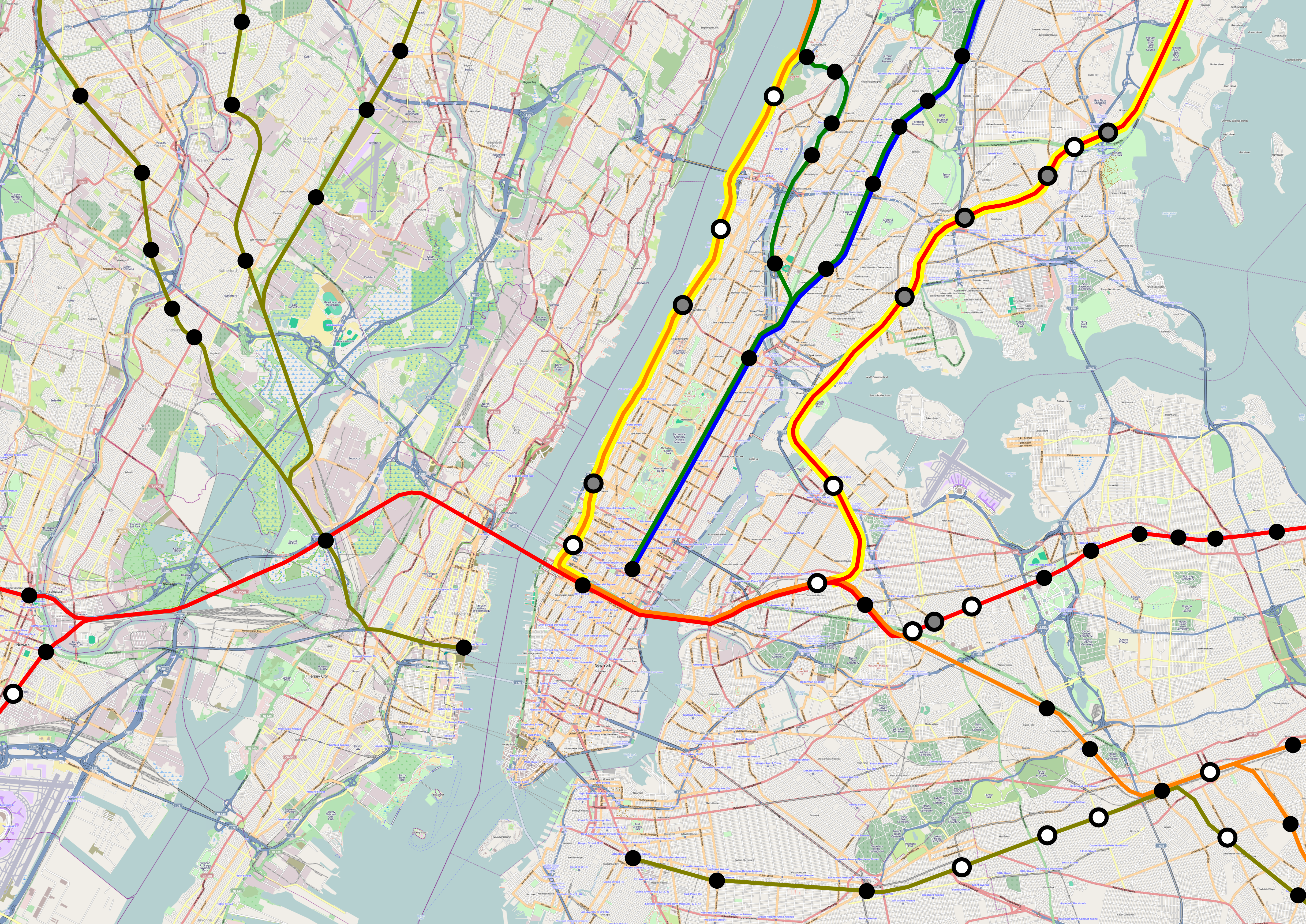
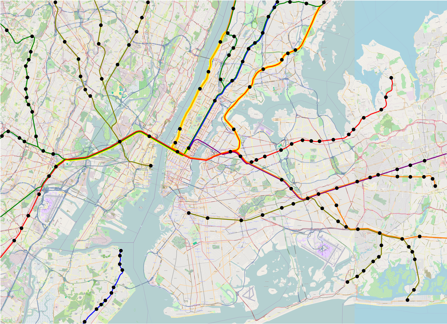