Category: Urban Transit
The G Train
The G train is bad. I say this, 16 years after I moved to New York, 11 years after I left, and I know it’s what every New Yorker knows. Tourists walk too slowly, rent is too high for small apartments, and the G train sucks. What I want to highlight in this post is how the subway’s scheduling paradigm is especially bad for the G train and leads to a vicious cycle making the train less frequent and less useful for passengers.
The role of the G train
The G train is the only mainline subway service in New York that does not enter Manhattan; see map here. It connects what are now the region’s two largest non-Manhattan business centers, Long Island City and Downtown Brooklyn, running vaguely parallel to the East River on the Queens and Brooklyn side of it. To the south of Downtown Brooklyn, it has a tail serving the wealthy neighborhoods collectively called South Brooklyn, such as Carroll Gardens and Park Slope.
I’ve criticized the G before for its poor construction. It misses critical transfers, like the other lines built in the IND program in the 1920s-30s. In Queens it misses Queensboro Plaza and the transfer to the N/W trains on the Astoria Line, and in Brooklyn it misses every single non-IND line except the L (and, at a suboptimal location, the R). This already makes it less useful as a circumferential line – such lines live on convenient transfers to radial lines, because direct O&D service is less valuable to secondary destinations than to primary ones.
But what I realized last week, commuting from Long Island City to Downtown Brooklyn, is more delicate. My hotel was near Queensboro Plaza, which the G doesn’t serve, but the station is served by the 7, which connects to the G one stop away at Court Square; Marron’s new office is in Downtown Brooklyn right on top of the Jay Street station, on the IND-built A/C and F trains, which is either a cross-platform connection or a short walk from the G. So for my trip, the connections worked. And yet, I was regularly facing 10-minute waits on the shoulders of rush hour, and on the subway countdown clock I saw a 15-minute gap.
To explain what went so wrong that the G should have such low frequency at 10 in the morning, it’s necessary to explain how New York City Transit decides the frequency of each service during each time of day.
New York City Subway frequency
In New York, the system for deciding the frequency of each subway service at each time of day is based on average peak crowding. This means that for all trains using the service in a given time period, the crowding level at the peak crowding point of the journey is averaged; frequency is adjusted so that off-peak the peak crowding level is 125% of seated capacity, and at rush hour it is based on published standing capacity per car that works out to about 300% of seated capacity depending on car design.
This system is done per numbered or lettered service. Thus, for example, the 2 and 3 trains run on the same track most of the way, but where they diverge, the 2 is considerably busier, and therefore the 2 runs slightly higher frequency (most ridership on the 2 and 3 is on the shared segment, not the tails). As a result, on the shared trunk, there cannot be perfect alternation of 2 and 3 trains; a few times an hour, a 2 train is followed by another 2 train, which means that on the tail, the frequency is uneven. When two 2 trains follow each other with no 3 between them, the leading 2 train is more crowded than the trailing one; this variation is averaged out in the guidelines – it is not the busiest train that sets the frequency guidelines.
These guidelines are not a good way to timetable trains. The above example of how it can create uneven crowding on the 2 is one problem with this system; if instead there were regular alternation of 2 and 3 trains then the 2 would be persistently slightly more crowded than the 3, just as today there is uneven crowding whenever two 2 trains run with no 3 in between, but the frequency on both the shared trunk and the branches would be more regular. This is especially important on more complexly interlined parts of the network, where the current system leads to large programmed gaps between trains occasionally.
The G is not very heavily interlined; the issue there relates to another criticism of the guidelines, which is that they assume travel demand is fixed. If the ridership on a train is independent of frequency, which it is if the headway between trains is very short compared to the trip time (say, if the trains run every 2-3 minutes), then the sole purpose of service is to provide the capacity the passengers need, and so the guidelines make sense as a way of rationing service convenience. However, in reality, the elasticity of ridership with respect to service provision is not zero. Three years ago I did some analysis of New York’s situation and the existing literature on ridership-frequency elasticity, suggesting it is equal to about 0.4. So the low frequency of the G deters ridership, which then appears to justify the low frequency.
But 0.4 < 1. And I believe that there are two reasons why on the G, and on circumferential lines in general, the elasticity of ridership with respect to frequency should be higher.
Trip length
Circumferential lines in general tend to have shorter average trip time. Between two nearby spokes, say between Downtown Brooklyn and Williamsburg, they are the only real option; between two farther away ones, a direct radial may be an alternative.
The G is different from (say) the Ringbahn in that it misses most transfers, but this should not impact this pattern too much. The missed transfers in Downtown Brooklyn weaken the G for short as well as long trips involving a connection there. In contrast, in the middle the G does make the most important transfer, that with the L, and only misses the weaker J/M/Z.
The 0.4 estimate for ridership elasticity with respect to frequency assumes average behavior for trip length. But if trips are shorter, then the impact of frequency is larger. The 0.4 estimate comes out of an estimate of about -0.8 of ridership with respect to generalized trip time, which includes in-vehicle time, walk time, and wait time, the latter two given extra weight to account for transfer penalty. If one of the three components of trip times is shortened, the other two grow in importance.
The role of options
The G is not usually passengers’ only choice for making the trip. They can connect in Manhattan, or, in some cases, go directly via Manhattan, for example taking the N or R from Downtown Brooklyn to Queens (in the opposite direction, they serve separate station so it’s a harder choice, leading to asymmetric demand). Going between Marron and the East Village, Eric Goldwyn could connect to the L via the A/C/F or the G; I never once saw him use the G, only the lines via Manhattan.
I have not seen the impact of different transit paths on demand elasticity in the literature. It is likely that the elasticity in such case must be higher, because it is standard in economics that demand is more elastic for goods sold on a competitive market than by a monopolist.
Note also that it is to the overall system’s benefit to convince passengers to switch from radial lines to the G. The G is less crowded, so such a switch distributes ridership better on the system. And the G starts out much less frequent, so that even on a fixed operating budget, the impact of a service increase on the G on ridership is larger than on an already frequent trunk.
Quick Note: the LaGuardia Transit Connector
It’s amazing how much good can happen when an obstacle like Andrew Cuomo is removed. In lieu of his backward air train proposal, hated by just about everyone not on his payroll, Governor Kathy Hochul is moving forward on a better set of alternatives for a mass transit connection to LaGuardia. It’s interesting to see what the process is looking at but also what it isn’t; so far this looks better than the alternatives analysis for Interborough Express (ex-Triboro).
So far I have not seen analysis, only drawings of 14 alternatives. As with the IBX study, the LGA plan distinguishes different modes of public transit – there are bus, light rail, subway, and even ferry options. But it doesn’t stop there. It looks at multiple alignments: the scope is how to connect LGA to the rest of the city the best, and this can be done from a number of different directions – even a backward train (as light rail) along an alignment similar to Cuomo’s is present, and will likely not advance further because of its circuitous route.
Among the 14 alternatives, I think the obviously best one is a subway extension (slide 12 above); another subway option, a branch following the Grand Central Parkway (slide 11), is inferior because of branching splits frequencies and ridership at the cut off Astoria-Ditmars Boulevard station is high. A subway extension promises a connection in around 30 minutes to Times Square, every 5 minutes all day, with good connections to other destinations via the transfers at Queensboro Plaza and in Midtown.
The one thing that I’m sad the analysis hasn’t looked at is intermediate stations. It’s around 4.5 km from Ditmars to the main LGA terminal along the proposed alignment, passing through redevelopable industrial land and through residential land in Astoria Heights awkwardly tucked between airport grounds and Astoria proper. The same quality of service that the airport could get, these neighborhoods could get as well, except a hair faster because they’re closer.
Extending the Astoria Line is especially useful since it is short and not especially crowded until it hits Queensboro Plaza and inherits the crowding of the 7 train and its riders. In the context of deinterlining the subway, this is especially valuable: right now 60th Street Tunnel carries the N and W from Astoria but also the R from Queens Boulevard, and under deinterlining the tunnel would carry only Astoria riders, and so to match the high demand to 60th Street it’s valuable to create as much ridership as possible on the Astoria Line past Queensboro Plaza.
I hope that the alternatives analysis considers multiple stopping patterns in the future – that is, not just a nonstop route from Ditmars to the airport, but also an option with intermediate stations. (This does not mean local and express trains – either all trains should run locals, or all should run nonstop.) The cost of those stations is not high as it’s an elevated line, and the stop penalty on the subway is less than a minute since the top speed is so low (it looks like 45 seconds in practice comparing local and express trains on the same line).
Leapfrogging
Eric Stoothoff is the chief engineer of the MBTA. Last month, he offered the following excuse for why the MBTA just deelectrified the trolleybuses in Cambridge, replacing them with diesel buses and hoping in a few years to obtain battery-electric buses (BEBs):
We want to leapfrog Europe, not play catch-up. If BEBs are the future, why not have the future now?
https://twitter.com/mbtaroc/status/1493768313154904073
Unfortunately for Stoothoff, BEB technology still does not work in freezing temperatures. The current state of it is buses that have diesel heaters – otherwise the battery drains too fast in winter, as it did three years ago when I reported it for CityLab.
The actual cutting edge of electric bus technology is in-motion charging (IMC), in which the bus spends part of the route under wire and then part under battery, with an off-wire range of about 10 km. IMC is especially valuable for Boston, which is unusual for an American city in having an unplanned street network in which the same trunk road splits into several farther out, and then the trunk can be wired. Cambridge’s now-defunct trolleybus network had a short trunk, but could still be an attractive IMC target. In Boston proper, Washington Street is a valuable trunk for wire, with routes splitting off-wire to destinations in Dorchester and Mattapan farther south.
Stoothoff seems unaware of this, because he is an insular, ignorant, incurious manager. He uses leapfrogging as an excuse not to learn. Other American agencies buy BEBs, and then find that they don’t work in winter without diesel heaters, and instead of seeing what Europe does, he talks of leapfrogging.
Leapfrogging means something completely different. It means skipping an intermediate tech that has been obsoleted by newer tech. A classic example of leapfrogging is China’s phone network: by the time China developed enough for mass use of phones, in the 2000s, cellular phones were ubiquitous and mature enough that China skipped wired phones entirely, and did not have to spend money on building phone cable infrastructure in rural areas. More recently, mobile payments are connecting rural areas in Africa between the Sahara and the Kalahari to banking without the need for physical branches.
On the level of infrastructure, it makes sense: there is no need to invest in intermediate technology if something better is available. In the realm of rail, there are a lot of technological dead-ends that nobody needs to develop anymore – superseded electrification standards, experimental jet- or nuclear-powered trains, obsolete track geometry standards, etc. Train stations today are designed differently from in the steam era: the train is not noxious to be nearby, so the train shed is integrated into the passenger concourse, and train turn times are short, permitting much smaller station footprints even in major cities.
But on the level of knowledge, it’s daft. Leapfrogging requires knowing what the cutting edge is. Chinese development experts know exactly what technology is used in developed countries and what they should imitate and what they can bypass. The PLA began its modernization process in 1991 after Desert Storm and only began innovating rather than implementing NATO standards a few years ago. African development experts are generally aware of trends in rich countries as well.
This knowledge is especially important in public transportation, because many legacy cities had higher ridership before WW2 than they do today and there’s a lot of nostalgia for that era. Understanding why the modern train station can be compact and platform-centric, without a waiting concourse and space for a telegraph operator and baggage handlers, is crucial in limiting the construction costs of stations on new lines. Without such understanding, it’s easy to imitate historic stations; even in Europe, where trains are integrated into train sheds without the separate waiting halls characteristic of North America, most major-city stations are historic and very big, because they’re inherited from when they needed to be and the land was at the edge of the city and therefore cheaper.
But what one does not do is tear up legacy infrastructure that is still useful. Europe’s great train terminals are almost all oversize, but there’s no point in blowing them up and shrinking them just because it’s more modern. Urban renewal projects at train stations are common, but they replace goods yards that left the cities alongside industry, not passenger circulation. And at least shrinking station footprints has redevelopment value in major city centers; deelectrifying trolleybuses has no such value.
So under no circumstances should cities with existing trolleys remove the tail electrification for IMC. This is not what IMC-using cities do – they use IMC to expand the network rather than shrink it. It may be too late for Boston, but San Francisco, Seattle, and Vancouver should keep what they have.
And it’s even worse, because Stoothoff wasn’t justifying deelectrifying on the way to the future. No: he misstated what the future is. His incuriosity is such that he assumes BEBs are the future, from a position of interacting with American agencies that think the same and find fixed wire infrastructure too hard. Peripheries that engage in leapfrogging are voracious consumer of the metropole’s learning in order to apply it to their own circumstances, but Stoothoff cannot even bring himself to admit that the United States is a periphery and needs to absorb this knowledge.
A better MBTA is one in which Stoothoff is replaced with a more competent chief engineer, perhaps hired from abroad. But it’s not just him. He’s a removable obstacle to progress, but there are many like him – many managers who assume the future is one thing when it’s the other, and use their wrong beliefs to justify not imitating best practices. They have an assortment of excuses, and misstating what technological leapfrogging is is among them.
What’s going on in Czechia?
Prague has one of Europe’s busiest metros, and what looks like the highest per capita rail ridership in not just Europe but also the non-Tokyo world. And yet, expansion is seeing exploding costs.
In our database, the past extensions in Prague are not especially expensive. The most recent expansion to open was that of Line A to Nemocnine Motol, built 2010-5. It cost 20.2 billion CZK for 6.1 km, or 3.3 billion CZK/km; in PPP dollars, this is around $250 million/km. This is just how much things in Czechia would cost. The previous extension was that of Line C to Letňany, built 2004-8; it cost 15 billion CZK/4.6 km, the same as the later Line A extension per km, and in the interim period, Czechia had practically no inflation. Both lines had a feature that should slightly suppress costs: the Line C extension was partly cut-and-cover and partly bored, and the Line A extension, otherwise fully underground, has a daylit terminus built into the side of a hill.
And now Prague is building Line D, at a far higher cost. The current estimate is 73 billion CZK/10.5 km. This is in PPP terms $540 million per km, making it the most expensive metro (not S-Bahn) line I know of in Continental Europe, and only marginally cheaper per km than the Battersea extension of the Northern line in London.
The map provided in the link shows the line not even going all the way to city center. Its northern terminus, Náměstí Míru, connects with Line A, is in the center, but is just outside the historic core where the three current lines meet; from there the line is to go south, intersecting Line C peripherally and Line B not at all. Nor is the line quite fully underground – like the Nemocnine Motol extension, it has minor daylit segments, including a river crossing, a station, and a depot; overall, it looks 90% underground, not 100%.
I do not know what’s going on there. The Czech economy is growing, but there’s no singular boom that should explain why the 2020s are so profoundly different from the 2000s and 10s. On my Twitch stream, a Czech commenter speculated that the contractor ecosystem is breaking, with only 5-6 contractors, all domestic, and reticence to hire foreign, whereas for example in Sweden there’s a steady influx of Turkish and Chinese contractors, and in the private sector Prague’s construction sites are full of immigrants from poorer countries. But then Skanska was one of the lead contractors for the extension to Letňany.
Radial Metro Design on Rivers
The most common and most useful design paradigm for an urban metro system is radial. Subway lines should be running across the city, passing through city center with transfers to other radial lines; larger cities can also support a circumferential line, or for the largest megacities (like Moscow) two, and unless there are multiple circumferentials, every pair of lines should intersect with a transfer. For example, here is Prague:

There are three lines, meeting in a Soviet triangle, running from one side of city center to the other. Together with an intact tramway network, this boosts Prague’s annual urban rail ridership to around 830 million a year, which is 310/capita, a figure that isn’t far lower than Tokyo’s and is higher than anywhere else I can think of.
But in some cities – but not Prague – there’s a kink in the radial design. For example, here’s Kyiv, with planned expansion:

The three existing lines form a perfect Soviet triangle. Line 4, Podilsko-Vyhurivska, is under construction and radial as well. And then there is the under-construction eastern extension of Line 3, Syretsko-Pecherska, looping back to meet Line 1 at Darnytsia. This is not standard radial design. But it’s fully understandable given the situation of Kyiv.
Kyiv has a division into left-bank and right-bank Kyiv. The Dnipro is, with islets included, 1-2 km wide, one of the widest rivers of Europe. There are few bridges. The main of the city is on the right bank, but left-bank Kyiv has its own independent center around Darnytsia, encouraged by the city’s development plan precisely because the river is such an obstacle.
The river division is not universal. Prague doesn’t quite have it – the Vltava is 160-200 m wide and there are many bridge crossings, so even though city center grew along the right bank, much of the near-center is on the left bank. The city is also hilly enough that there’s no coherent left- vs. right-bank identity, and the streetcar system is sufficient to connect left-bank neighborhoods with each other without passing through city center.
Conversely, London does have this division. Bank terms are not used there – one says North and South London – but the situation is the same, even though the Thames at 250 meters is not much wider than the Vltava, and has many crossings as well. Nonetheless, a South London identity exists, defined by paucity of river crossings to East London (but not to Central or West London), and by its own centers at Waterloo and London Bridge.
As a result, the radial Underground network forms a coherent sub-network in South London. Just as the Kyiv Metro is planned to feature a loop back on Line 3 in left-bank Kyiv starting 2023, London built the Victoria line to swerve east to cross each trunk of the Northern line twice, once in North London and once in South London, and the crossing with the main line at Stockwell is even cross-platform. Unfortunately, the South London crossing with the Battersea extension is without a transfer, a deliberate design decision made to reduce ridership and perhaps reduce crowding on the Vic.
Finally, New York should think explicitly in terms of right- and wrong-side parts of the city, the right side referring to city center, that is Manhattan. New York’s subway network is not radial, but the same principles apply just the same. There is a strong wrong-side identity for Brooklyn, and historically Downtown Brooklyn was a very large business center; today it remains near-tied with Long Island City for largest job center in the region outside Manhattan. Early-20th century designers did not think in such comparative terms but they understood that it was valuable to connect Brooklyn homes with Brooklyn jobs, and thus most subway lines in Brooklyn converge on Downtown Brooklyn, and only the J/M/Z and the L go directly from Williamsburg to Manhattan.
By a fluke, all four subway lines in Queens connect to Manhattan via Long Island City, the nearest neighborhood to Midtown. Thus, a business center emerged there, growing to rival Downtown Brooklyn; just as the city’s geography can create a subway network, the subway network can create the city’s geography.
Why is Princeton Trying to Downgrade the Dinky?
Regular users of the Northeast Corridor in New Jersey know that there is a short branch off the line serving Princeton. Mainline trains do not use it – they continue between New York and Trenton – but a two-car shuttle, affectionately called the Dinky, connects the city with the train station. Historically, this is because the Northeast Corridor in New Jersey is a then-high-speed rail cutoff from 1863, which cut off Princeton from the old line. Trains run back and forth, with timed connections between New York (but not Trenton) and Princeton.
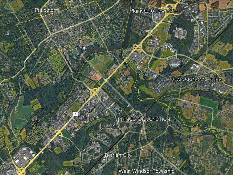
The Princeton stop on the Dinky, as can be seen in the satellite image, lies just outside the historic municipal limits of Princeton (since merged with the surrounding township). It serves the university fairly well, but is 800 meters at closest approach to the town’s main street, Nassau Street. So there has been a study for what to do to improve city access, in which a tram-train option was studied, looked good, and was dropped anyway. There are two options left: status quo, and a downgrade of the right-of-way to light rail with buses using the same corridor.
Unfortunately, transit advocates I respect, like Sandy Johnston, think the downgrade is an upgrade. So let me explain why in fact the light rail and bus option is inferior to current commuter rail operations.
The current use of the Dinky is as a connector to the Northeast Corridor. There is approximately nothing else at Princeton Junction: it’s one of the two busiest suburban stations in New Jersey, but like the other top station, Metropark, it’s a park-and-ride, designed exclusively for car-train interface. People who ride the Dinky do so to get to New York.
This means that the timed transfer with the mainline trains is critical. Frequency on the Dinky is irrelevant: all ridership from Princeton Junction into the town is going to be on the first train or bus after the mainline trains arrive, and almost all ridership to the junction is going to be on the last train that makes the connection. While frequency is not important except insofar as it matches that of the mainline, on-train capacity is important. My 2015 recollection is that off-peak ridership on the Dinky is maybe enough to fill an articulated bus (which New Jersey Transit only runs in Newark), maybe enough for a standard bus, depending on time of day – standees are likely, and standing on a bus is an awful passenger experience. At rush hour, the Dinky runs three-car trains (update 2022-2-18: no, it’s two-car trains) and they’re full.
The timed transfer is so important that the discussion of how to improve service must center how to make the transfer more efficient. The ideal improvement should be to regularize the timetable on the mainline commuter trains, and ensure that trains in opposite directions serve Princeton Junction around the same time (this is called a knot) so that the Dinky can connect to Trenton too, and even to Philadelphia with another timed transfer at Trenton or even through-service if that fits the New Jersey Transit and SEPTA schedules.
Sandy points out to me that while the Dinky only connects Princeton with the mainline, the right-of-way of the Dinky can serve more destinations – namely, the Route 1 job cluster, visible on the map as a line of office parks.
However, bus service from town to Route 1 is unlikely to succeed. It’s going to struggle to run sufficient frequency for what it needs, even as lower-frequency rail is sufficient for the Dinky’s current role:
- Route 1 is not on the way between town and the station – there would have to be separate buses to Route 1 from the service to the train station (which I presume will stay on rail even if the downgrade is picked). This means there’s no bundling of destinations – the buses to Route 1 have to live off of Princeton-Route 1 trips.
- Route 1 is a freeway with destinations located somewhat away, at automobile scale. Buses can stop on the side of the road but the walk is not great on the same side of the road and hostile and unsafe if crossing the road is required. A more pleasant experience is only possible if buses turn onto side roads, splitting frequency or increasing trip times.
- Route 1 is not a large job center. OnTheMap says that between the route of the Dinky and the junction with I-295 beyond the above satellite image, which ends at Quakerbridge Road, there are 21,000 jobs. The origins of those jobs are dispersed – only 5,000 come from within the county, and only 368 come from within Princeton.
- Conversely, the short distance traveled means that high frequency is crucial. A one-way trip from the townhouses just north of Nassau Street to the center of the Route 1 cluster along the right-of-way of the Dinky is 5.5 km, which at BRT and freeway speed is around 10 minutes one-way; a bus running less than once every 10 minutes might as well not run – but there is no chance for such a bus to fill at current demand.
Of course, the analysis of Route 1 assumes current development patterns stay with no or moderate change. A bigger change, such as greater development along Route 1 with sprawl repair, can make this option pencil out; O&D volumes need to rise by a factor of 3 assuming 100% transit modal split, or more if modal split is lower (which it invariably is, Route 1 is not Manhattan).
But then that raises the question – why engage in development in sprawl around a plan to downgrade a rail service?
If sprawl repair is plausible, then make Princeton more bikable and then set up bike lanes on Route 1 so that people can cycle to Route 1 jobs. The same bike lanes can also connect to the Dinky, with bike parking at the station, or even potentially at Princeton Junction if it’s faster to bike those 4 km than to ride a train and transfer. In the long run, all buses are going to have to be replaced by bikes anyway – bus operating costs are only going to go up.
And if redevelopment is plausible, look again at the satellite image and see what the land use at the existing train stations is like. Princeton is one of the most expensive places in the United States, and the Dinky station has a golf course on one side; that’s 0.5 km^2 of land, or, as I prefer to think of it, 50,000 housing units. Another 0.05 km^2 consists of parking lots right near the station, and can and should be redeveloped as a town center extension for a population that can swamp the existing town population by a factor of 4. The parking lots at Princeton Junction and the undeveloped land between them are another 0.4 km^2 of prime real estate.
In general, I cannot think of any railway where service would be improved by a downgrade from mainline rail to bus. But the Dinky has specific issues making such a downgrade especially deleterious for current users, namely the need for a timed connection, while the proposed source of new trips, namely Route 1, is too weak to be worth much. Thankfully, a no-build option keeping the status quo is still under consideration, and I hope that the region chooses it and invests in making the Dinky better rather than in replacing it.
How Tramway Networks Look
I’ve been thinking about trams today. The origin of this post is that yesterday’s post about modal versus other questions concerning public transport led to a conversation about how in some places, namely Vancouver, the light rail versus subway debate is big. And that got me thinking about how cities that do not have subways arrange their streetcar networks. These cities exist, mostly in Central and Eastern Europe, and often have very strong public transport – this is for example the Zurich model, based on a combination of streetcars and an S-Bahn system. Some such cities don’t even have an S-Bahn system. How do they arrange their tramway networks?
The top tram cities
I asked on Twitter what the busiest tramway network is in cities without a subway. Across all cities, including ones that have both streetcars and metro tunnels, the answer was Saint Petersburg at the beginning of the 21st century, and today is either still Saint Petersburg, where ridership has been in decline recently, or Budapest; Prague is the third. All have around 400 million annual riders, or somewhat less.
Among cities without subways, it’s harder to tell, because the information isn’t always out there; streetcars are not as well-studied as subways, a pattern of which I am guilty of contributing to with the focus of the Transit Costs Project (for now). Zurich, Brno, Zagreb, and Melbourne all have around 200 million annual passengers each, and Bratislava, Kraków, Łódź, an Belgrade are all plausible contenders except that I have not been able to find ridership figures for them.
Additional cities with strong ridership but not 200 million a year include the Upper Silesia complex with about 100 million, which is weak for its size with high car modal split for a Polish city, and smaller cities like Leipzig, Dresden, Linz, Basel, Geneva, Košice, Gothenburg and Lviv.
The pattern of tram cities
All of the high-ridership tram cities I’ve been able to find have historically maintained their systems. Cities that closed their streetcars in the postwar era and have since reopened them as modern light rail systems sometimes have very strong ridership, like Paris, but that’s in conjunction with a metro system; the Ile-de-France tram network is strikingly circumferential and barely penetrates city limits, where the Métro predominates. In the United States, the busiest modern light rail system is Los Angeles and the busiest without a subway is Portland, with 40 million annual trips, in a metro area of comparable size to Upper Silesia, which is much more auto-oriented than monocentric Polish city regions like those of Warsaw and Kraków.
Moreover, nearly all examples I know are in Central and Eastern Europe. Elsewhere, trams were shut down in the postwar era, or replaced with subway-surface Stadtbahn systems as in San Francisco and most West German cities. This is going to color the analysis, because just as there are American, Soviet, British, French, and German traditions of how to build rapid transit, there are national and areal traditions of how to build tramways, and with the exceptions of Melbourne and Gothenburg, all of the top systems in metro-free cities are in one or two macro-regions (Warsaw Pact and German), which means that shared features may be either the key to success or just a regional cultural feature.
The shape of strong tramway networks
I encourage readers to go to Alexander Rapp’s website with maps of rapid transit and tram networks around the world, and toggle the maps so that the top streetcar networks are visible.
For example, here is Zagreb:

Here is Melbourne, which doesn’t yet have a metro but is building one at very high costs:
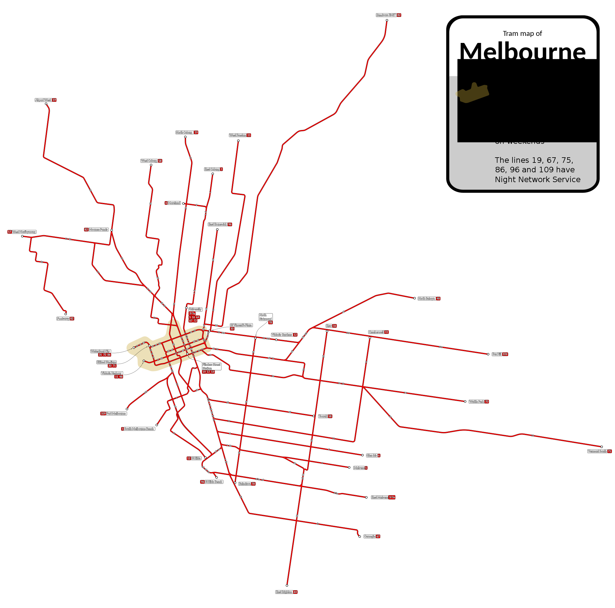
Here is Brno, which has around 200 million annual passengers in a metro area of 700,000:

The striking features of these networks and others without as good maps on Wikipedia (Gothenburg, Zurich), to me, are,
- The network design is radial – crosstown routes are rare and sporadic.
- The lines form something like a mesh in a small city center, perhaps the size of the historic premodern core, in which one can walk from one end to another; Melbourne, which does not have the history of a walled European city, shows convergent evolution with the same pattern.
- Owing to the long history of such systems, the ones I’ve used (Prague, Zurich, Basel, Leipzig, East Berlin) have basic stations with shelter and in Zurich’s case ticketing machines but no other facilities.
- There is extensive interlining and branching in all directions.
Moreover, as I should blog about soon in the future, Melbourne exhibits the same pattern even with a weak city center: the centralmost 100 km^2 of the city, which in Canada or Europe or the most centralized American cities should have 30-40% of metropolitan employment, only have 15%.
The Interborough Study
I was excited about the idea of Interborough Express (IBX) as announced by New York Governor Kathy Hochul, and then last week her office released a preliminary report about the alternatives for it, and I got less excited. But it’s not that the study is bad, or that Hochul is bad. Rather, the study is a by the numbers alternatives analysis, shorter than the usual in a good way; its shortcomings are the shortcomings of all American planning.
The main rub is that the report looks at various options for the IBX route, broken down by mode. There’s a commuter rail option, which bakes in the usual bad assumption about commuter rail operations, including heavier trains (lighter trains are legal on US tracks as of 2018) and longer dwell times that are explained as a product of the heavier trains (dwell times have nothing to do with train mass). That’s par for the course – as we saw yesterday, everything that touches mainline rail in North America becomes stupid even in an otherwise understandable report.
But even excluding commuter rail, the study classifies the options by mode, focusing on bus rapid transit and light rail (and no subway, for some reason). It compares those two options and commuter rail on various measures like expected ridership and trip times. This is normal for American alternatives analyses for new corridors like IBX: they look at different modes as the main decision point.
This is also extraordinarily bad governance. There are some fundamental questions that are treated as afterthoughts, either not studied at all or mentioned briefly as 1-2 sentences:
- How far north should the line go? The IBX plan is to only go from Jackson Heights to the south, in contrast with older Triboro proposals going into the Bronx.
- What should the stop spacing be? The stops can be widely spaced, as in the current proposal, which stops mainly at intersection points with other lines, or more closely spaced, like an ordinary subway line.
- Under a light rail option, should the line be elevated where the trench is too narrow or at-grade?
- Should freight service be retained? What are the benefits of retaining freight rail service on the Bay Ridge Branch and what are the incremental costs of keeping it versus taking over the right-of-way?
- How large should the stations be?
- How frequent should the trains be? If freight service is retained, what frequencies are compatible with running freight on the same tracks for part or all of the line?
A better study must focus on these questions. Some of them, moreover, must be decided early: urban planning depends on whether the line goes into the Bronx or not; and industrial planning depends on what is done with freight service along the corridor.
Those questions, moreover, are more difficult than the modal question. A BRT option on a rail corridor without closely parallel arterial roads should be dismissed with the same ease that the study dismisses options not studied, and then the question of what kind of rail service to run is much less important than the scope of the project.
But American planning is obsessed with comparing public transit by mode rather than by corridor, scope, or any other aspect. Canadian planning has the same misfeature – the studies for the Broadway SkyTrain extension looked at various BRT and light rail options throughout, even though it was clear the answer was going to be SkyTrain, and omitted more fundamental questions regarding the cost-construction disruption tradeoff or even the scope of the project (the original studies from 2012 did not look at truncating to Arbutus, an option that had been talked about before and that would eventually happen due to cost overruns).
So overall, the IBX study is bad. But it is interestingly bad. Andrew Cuomo was a despicable governor who belongs in prison for his crimes. Less criminal and yet similarly loathsome people exist in American public transit. And yet, Hochul and her office are not like that, at all. This is not a sandbag, or a corrupt deal. It’s utterly ordinary in its failure; with all the unique failures of the Cuomo era stripped, what is left is standard American practice, written more clearly than is usual, and it just isn’t up to par as an analysis.
Hochul has been moving on this project very quickly, and good transit advocates should laud this. It should not take long to publish a report comparing alternatives on more fundamental questions than mode, such as scope, the role of freight, and the extent of civil infrastructure to be used. The costs and benefits of IBX heavily depend on the decisions made on such matters; they should not be brushed aside.
New York Publishes a Bad Benchmarking Report
I’ve grown to intensely dislike benchmarking reports. It’s not that the idea of benchmarking bad. It’s that they omit crucial information – namely, the name of the system that one is compared with. The indicators always have a wide variety of values, and not being able to match them with systems makes it impossible to do sanity-checks, such as noticing if systems with high costs per car-km are consistently ones that run shorter trains. This way, those anonymized reports turn into tools of obfuscation and excusemongering.
The MTA in New York recently published such a report, including both US-wide and international benchmarking for the subway as well as commuter rail. The US benchmarking is with comparable American systems – exactly the ones I’d compare, with the systems listed by name as NTD data is wisely not anonymized. The international benchmarking for the subway is with CoMET, which includes most of the larger global systems as well as a handful of smaller ones, like Vancouver; for commuter rail, it’s with ISBeRG, which has an odd list of systems, omitting the RER (which is counted in CoMET), all of Japan except JR East, and any S-Bahn, skipping down to Australian systems, Cape Town, and Barcelona.
That, by itself, makes much of the international benchmarking worthless. The standard metric for operating costs is per car-km. This is covered in pp. 8-9, showing that New York has fairly average costs excluding maintenance, but the second highest maintenance costs. But here’s the problem: I’m seeing a comparison to an undifferentiated mass of other systems. One of them is an outlier in maintenance costs, even ahead of New York, but I do not know which it is, which means that I cannot look at it and see what it does wrong – perhaps it has an unusually old fleet, perhaps it is small and lacks scale, perhaps it is domestically viewed as scandal-ridden.
Far more useful is to look at complete data by name. For example, JICA has complete operating cost data for Japanese metro systems. Its tables are complete enough that we can see, for example, that overall operating costs are around $5/car-km for all systems, regardless of scale; so scale should not be too important, or perhaps Tokyo’s wealth exactly cancels out the scale effect. There are, on table 2.37 on PDF-p. 117, headcounts for most systems from which we can impute labor efficiency directly, using train-km data on PDF-p. 254; Yokohama gets 1,072 train-hours a year per driver at 35 km/h (the rough average speed I get from Hyperdia).
And here’s the thing: without the ability to fill in missing data like average speed, or to look at things the report didn’t emphasize, the report is not useful to me, or to other independent researchers. It’s a statement of excuses for New York’s elevated operating and maintenance cost, with officious proclamations and intimidating numbers.
For example, here’s the excuse for high maintenance costs:
High maintenance costs for NYCT are largely attributable to 24-hour service. Most COMET peer agencies shut down every night, allowing for four hours of continuous daily maintenance. In comparison, NYCT subway’s 24-hour service requires maintenance to occur within 20-minute windows between late night trains, reducing work efficiencies. Additionally, maintenance costs for NYCT have risen recently to support the improvements as part of the Subway Action Plan, which have led to a significant improvement to on-time performance year over year since inception.
Okay, so here we’re seeing what starts like a reasonable explanation – New York doesn’t have regular nighttime maintenance windows. But the other American systems studied do and they’d be above global average too; Boston has regular nighttime work windows but still can’t consign all track maintenance to them, and has almost the same maintenance cost per car-km as New York. Moreover, track maintenance costs per car-km should feature extensive scale effects – only at freight rail loads is the marginal track wear caused by each additional car significant – and New York runs long trains.
Then there is the Subway Action Plan line, which is a pure excuse. Other systems do preventive maintenance too, thank you very much. New York is not unusually reliable by global standards, and the benchmarking report doesn’t investigate questions like mean distance between failures or some measure of the presence of slow restrictions – and because it is anonymized, independent researchers can’t use what it does have and get answers from other sources.
The study has a section on labor costs, showing New York’s are much higher than those of some peer cities. Thankfully, that part is not anonymized, which means I can look at the cities with overall labor costs that are comparable to New York’s, like London, and ignore the rest; New York’s construction labor costs are higher than London’s by a factor of about 2, despite roughly even regionwide average wages. Unfortunately, a key attribute is missing: labor efficiency. The JICA study does better, by listing precise headcounts; but here the information is not given, which means that drawing any conclusion that is not within the purview of MTA’s endless cold war on its unions is not possible. As it happens, I know that New York is overstaffed, but only from other sources, never anonymized.
It’s worse with commuter rail. First of all, at the level of benchmarking, the study’s list of comparisons is so incomplete and so skewed (three Australian systems, again) that nothing it shows can be relevant. And second, commuter rail in North America comes with its own internal backward-looking culture of insularity and incompetence.
The report even kneecaps itself by saying,
While it is true that benchmarking provides useful insights, it is also important to acknowledge that significant differences exist among the railroads that pose challenges for drawing apples-to-apples conclusions, particularly when it comes to comparisons with international peers. Differing local economies, prevailing wages and collective bargaining agreement provisions can have dramatic impacts on respective labor costs. Government mandates, including safety regulations, vary widely, and each railroad exists in a unique operating environment, often with different service schedules, geographic layouts and protocols. Together these factors have also have a significant impact on relative cost structures.
To translate from bureaucratic to plain English, what they’re saying is that American (and Canadian) practices for commuter rail are uniquely bad, but controlling for them, everything is fine. The report then lists the following excuses, all of which are wrong:
• Hours of Operation: LIRR provides 24 hours of service 7 days per week, and MNR provides 20-22 hours of service 7 days a week
• Ungated System: Neither LIRR nor MNR operate gated systems, therefore they require onboard fare validation/collection
• Branch Service: Both LIRR and MNR run service to and from a central business district (New York City) and do not have ability to offer through-running service
• Electrification: Both LIRR and MNR operate over both electrified and non-electrified territory, thereby requiring both electric and diesel fleets
It’s impressive how much fraud – or, more likely, wanton indifference and incuriosity – can fit into just four bullet points. Metro-North’s hours of service are long, but so are those of the JR East commuter lines; the Yamanote Line runs 20 hours a day, which means the nighttime maintenance window is shorter. Ungated systems use proof-of-payment ticketing throughout Europe – I don’t know if Rodalies de Catalunya runs driver-only trains, but the partly-gated RER and the ungated S-Bahns in the German-speaking world do. Through-running is a nice efficiency but not all systems have it, and in particular Melbourne has a one-way loop system akin to that of the Chicago L instead of through-running. Finally, electrification on the LIRR and Metro-North is extensive and while their diesel tails are very expensive, they also sometimes exist in Europe, including in London on a line that’s partly shared with the Underground, though I don’t know if they do in the report’s comparison cases.
The report does not question any of the usual assumptions of American mainline rail: that it must run unusually heavy vehicles, that it run with ticket-punching conductors, etc.
For a much more useful benchmarking, without anonymization, let’s look at German S-Bahns briefly. There is a list of the five largest systems – Berlin, Munich, Hamburg, Frankfurt, Stuttgart – with ridership and headcounts; some more detail about Berlin can be found here. Those five systems total 6,200 employees; the LIRR has 7,671 and Metro-North 6,773. With 2,875 employees, the Berlin S-Bahn has more train-hours than the LIRR, Metro-North, and New Jersey Transit combined; about as many car-km pro-rated to car length as the LIRR times 1.5; and more ridership than all American commuter rail systems combined. The LIRR in other words has more workers than the largest five German S-Bahns combined while the Berlin S-Bahn has more riders than all American commuter rail systems combined.
The excuses in the report highlight some of the reasons why – the US sticks to ticket-punching and buys high-maintenance trains compliant with obsolete regulations – but omits many more, including poor maintenance practices and inefficient scheduling of both trains and crew. But those are not justifications; they are a list of core practices of North American commuter rail that need to be eliminated, and if the workers and managers cannot part with them, then they should be laid off immediately.
Platform Edge Doors
In New York, a well-publicized homicide by pushing the victim onto the subway tracks created a conversation about platform edge doors, or PEDs; A Train of Thought even mentions this New York context, with photos from Singapore.

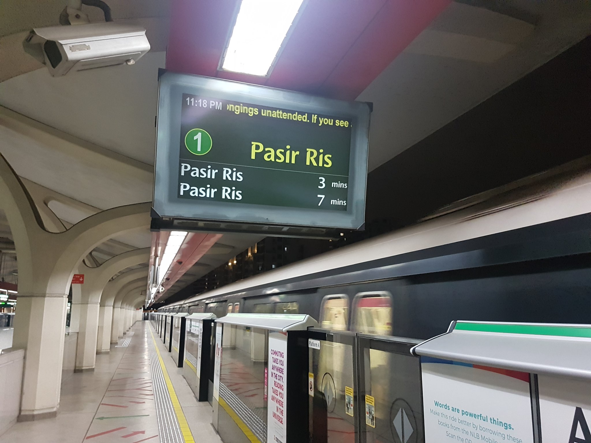
In Paris, the ongoing automation of the system involves installing PEDs. This is for a combination of safety and precision. For safety, unattended trains do not have drivers who would notice if a passenger fell onto the track. For precision, the same technology that lets trains run with a high level of automation, which includes driverless operations but not just, can also let the train arrive with meter-scale precision so that PEDs are viable. This means that we have a ready comparison for how much PEDs should cost.
The cost of M4 PEDs is 106 M€ for 29 stations, or 3.7M€ per station. The platforms are 90 meters long; New York’s are mostly twice as long, but some (on the 1-6) are only 70% longer. So, pro-rated to Parisian length, this should be around $10 million per station with two platform faces. Based on Vanshnook’s track map, there are 204 pairs of platform faces on the IRT, 187 on the IND (including the entire Culver Line), and 165 on the BMT (including Second Avenue Subway). So this should be about $5.5 billion, systemwide.
Here is what the MTA thinks it should cost. It projects $55 million per station – but the study is notable in looking for excuses not to do it. Instead of talking about PEDs, it talks about how they are infeasible, categorizing stations by what the excuse is. At the largest group, it is accessibility; PEDs improve accessibility, but such a big station project voids the grandfather clause in the Americans with Disabilities Act that permits New York to keep its system inaccessible (Berlin, of similar age, is approaching 100% accessible), and therefore the MTA does not do major station upgrades until it can extort ADA funding for them.
Then there is the excuse of pre-cast platforms. These are supposed to be structurally incapable of hosting PEDs; in reality, PEDs are present on a variety of platforms, including legacy ones that are similar to those of New York, for example in Paris. (Singapore was the first full-size heavy rail system to have PEDs – in fact it has full-height platform screen doors, or PSDs, at the underground stations – but there are later retrofits in Singapore, Paris, Shanghai, and other cities.)
The trains in New York do not have consistent door placement. The study surprisingly does not mention that as a major impediment, only a minor one – but at any rate, there are vertical doors for such situations.
So there is a solution to subway falls and suicides; it improves accessibility because of accidental falls, and full-height PSDs also reduce air cooling costs at stations. Unfortunately, for a combination of extreme construction costs and an agency that doesn’t really want to build things with its $50 billion capital plans, it will not happen while the agency and its political leaders remain as they are.

