Category: Vancouver
A Bigger City is a Better City
There’s a tendency among a number of important American YIMBYs that bothers me – they speak of development as a bad thing, a great burden that must be shared equally across neighborhoods. I’ve even seen this take regarding immigration, portraying it as such a terrible burden that Germany must undertake to redeem itself after the Holocaust. The underlying assumption is that growth is bad, and the ideal world is static and has people living in small communities.
But what if growth is good? What if more urban development is good? What if immigration is good, and immigrants are good people individually and collectively?
Growth is good
There’s a “growth for its own sake is the ideology of the cancer cell” meme out there. Well, no. Growth is not for its own sake. It’s for the sake of the things you can do in a society that produces more stuff: live longer, own refrigerators and other appliances, travel beyond walking range, communicate with people beyond travel range, get your own room, eat more interesting food than whatever scraps concentration camp prisoners fight over, wear more interesting clothes than concentration camp prisoner uniform, play interesting games, etc.
What is true is that no single element of these is in perfect correlation with wealth. You can even devise a large subset of these that aren’t, and focus on places that are exceptional relative to their income levels; Kerala is popular for its high literacy and life expectancy relative to its wealth. But usually these early investments then pay off in growth – this was the case in 1960s and 70s’ Korea, which was approaching universal literacy at the start of this period with astonishingly low incomes, and then used its advantage in relatively skilled, low-wage work to industrialize.
Urban development is good
The ability to access more stuff easily is a good thing and there’s a reason both employers and residents pay extra to have it. More and bigger buildings stimulate this kind of access. On the production side, this means thicker social networks for people who work in related industries and can come up with new innovations – this is why the tech industry sticks in San Francisco and environs, and not the bay view or the state of California’s public services. This, in turn, raises wages. On the consumption side, this means more variety in what to buy.
Moreover, this is true down to the neighborhood level. A denser neighborhood has more amenities, because more people is a good thing, because new people stimulate new social events, new consumption, and new opportunities for job access. If more people move to your neighborhood, that means first of all that employers are more likely to site jobs where convenient for you, and second of all that the city is likelier to want to build more subway lines in your direction.
A corollary of this is that private developers, as a class, are good, because they convert factors of production like labor and capital into finished, habitable apartments and offices. Yes, they can individually be terrible people. But collectively as a class their effect is good and the state needs to stop treating them as a source of loot to be doled to sympathetic neighborhood groups.
The most frustrating thing about it is that New York specifically likes to extol its own size as a reason for its supposed greatness. But then the idea that an even bigger city is a better city makes the political system there wince, and therefore the city permitted not many more than 20,000 housing units per year at the peak of the pre-virus economy, about one quarter the per capita rate of the Seoul metropolitan region or Tokyo (the city proper, but I think the suburbs have similar housing growth), and one third that of Ile-de-France.
Immigrants are good
Vancouver is a racist city, and I say this having lived in Israel. I somehow found myself in a room at a meetup where an all-white group of people were talking about black men’s penis size. Anti-Semitism, anti-black racism, Sinophobia, hate for indigenous people: you name it, I saw it there, used casually, by people who didn’t even think they were saying something controversial. The representatives of the people of that city have come across the realization that there is extensive immigration to their city and therefore it may be prudent to choke housing development because it’s all for immigrants anyway.
There’s a weird kind of defensiveness about immigration, even in societies where it’s fairly popular. Germany and Sweden both think they’re shouldering a great burden by taking in refugees, and even Germans who identify as left-wing and antiracist seem scared of diverse neighborhoods that immigrants of all social classes don’t find anything wrong with. But Germans at least have the excuse of not being used to diversity, and I think they’re slowly learning to be more tolerant. Vancouverites are used to diversity and decided they prefer racial purity to growth. Housing growth in Vancouver was healthy before the crisis but a lot of political forces in the city seem intent on making sure this doesn’t happen again, and with the transit-oriented development sites filling fast, the region will soon have to make tough decisions on upzoning single-family neighborhoods 600 meters from the train rather than 100 meters.
For the same reason a bigger city is a better city, the movement of immigrants into a country is an unalloyed good for the recipient country, unless perhaps that country is extremely dependent on primary resources, which Germany isn’t and even British Columbia isn’t.
Developers may be individually bad people but collectively good as a class; with immigrants, the good is both individual and collective. Immigrants as individuals are good, and it’s better for a country to have more of them (us, really): if anyone wants me to babble about all the statistics about employment (even for refugees in Germany), lower crime rates, cultural emphasis on skills and education, etc., I’ll be happy to do so in comments. Immigrants as a collective are likewise good, through introducing more cultural variety to a place and promoting cultural and social ties to parts of the world this place may not have thought to learn much from.
On Envying Canada
In England and Wales, 15.9% of workers get to work on public transport, and in France, 14.9% do. In Canada, the figure is close: 12.4%, and this is without a London or Paris to run up the score in. Vancouver is a metro region of 2.5 million people and 1.2 million workers, comparable in size to the metropolitan counties in England and to the metro area of Lyon; at 20.4%, it has a higher public transport modal share than all of them, though it is barely higher than Lyon with its 19.9% share. Calgary, Ottawa, Edmonton, and Winnipeg are likewise collectively respectable by the standards of similar-size French regions, such as the departments of Bouches-du-Rhône (Marseille), Alpes-Maritimes (Nice), Gironde (Bordeaux), Haute-Garonne (Toulouse), and Bas-Rhin (Strasbourg).
As a result, Jarrett Walker likes telling American cities and transit agencies to stop envying Europe and start envying Canada instead. Canada is nearby, speaks the same language, and has similar street layout, all of which contribute to its familiarity to Americans. If Europe has the exotic mystique of the foreign, let alone East Asia, Canada is familiar enough to Americans that the noticeable differences are a cultural uncanny valley.
And yet, I am of two minds on this. The most consistent transit revival in Canada has been in Vancouver, whose modal share went from 14.3% in 1996 to 20.4% in 2016 – and the 2016 census was taken before the Evergreen extension of the Millennium Line opened. TransLink has certainly been doing a lot of good things to get to this point. And yet, there’s a serious risk to Canadian public transport in the future: construction costs have exploded, going from Continental European 15 years ago to American today.
The five legs of good transit
I was asked earlier today what a good political agenda for public transportation would be. I gave four answers, like the four legs of a chair, and later realized that I missed a fifth point.
- Fuel taxes and other traffic suppression measures (such as Singapore and Israel’s car taxes). Petrol costs about €1.40/liter in Germany and France; diesel is cheaper but being phased out because of its outsize impact on pollution.
- Investment in new urban and intercity lines, such as the Madrid Metro expansion program since the 1990s or Grand Paris Express. This is measured in kilometers and not euros, so lower construction costs generally translate to more investment, hence Madrid’s huge metro network.
- Interagency cooperation within metropolitan regions and on intercity rail lines where appropriate. This includes fare integration, schedule integration, and timetable-infrastructure integration.
- Urban upzoning, including both residential densification in urban neighborhoods and commercialization in and around city center.
- Street space reallocation from cars toward pedestrians, bikes, and buses.
We can rate how Canada (by which I really mean Vancouver) does on this rubric:
- The fuel tax in Canada is much lower than in Europe, contributing to high driving rates. In Toronto, gasoline currently costs $1.19/liter, which is about €0.85/l. But Vancouver fuel taxes are higher, raising the price to about $1.53/l, around €1.06/l.
- Canadian construction costs are so high that investment in new lines is limited. Vancouver has been procrastinating building the Broadway subway to UBC until costs rose to the point that the budget is only enough to build the line halfway there.
- Vancouver and Toronto both have good bus-rapid transit integration, but there is no integration with commuter rail; Montreal even severed a key commuter line to build a private driverless rapid transit line. In Vancouver, bus and SkyTrain fares have decoupled due to political fallout from the botched smartcard implementation.
- Vancouver is arguably the YIMBYest Western city, building around 10 housing units per 1,000 people every year in the last few years. Toronto’s housing construction rate is lower but still respectable by European standards, let alone American ones.
- There are bike lanes but not on the major streets. If there are bus lanes, I didn’t see any of them when I lived in Vancouver, and I traveled a lot in the city as well as the suburbs.
Vancouver’s transit past and future
Looking at the above legs of what makes for good public transport, there is only one thing about Canada that truly shines: urban redevelopment. Toronto, a metro area of 6 million people, has two subway mainlines, and Montreal, with 4 million people, has 2.5. Vancouver has 1.5 lines – its three SkyTrain mainlines are one-tailed. By the same calculation, Berlin has 6.5 U- and 3 S-Bahn mainlines, and Madrid has 2 Cercanías lines and 7 metro lines. Moreover, high construction costs and political resistance from various GO Transit interests make it difficult for Canadian cities to add more rapid transit.
To the extent Vancouver has a sizable SkyTrain network, it’s that it was able to build elevated and cut-and-cover lines in the past. This is no longer possible for future expansion, except possibly toward Langley. The merchant lawsuits over the Canada Line’s construction impacts have ensured that the Broadway subway will be bored. Furthermore, the region’s politics make it impossible to just build Broadway all the way to the end: Surrey has insisted on some construction within its municipal area, so the region has had to pair half the Broadway subway with a SkyTrain extension to the Langley sprawl.
Put in other words, the growth in Vancouver transit ridership is not so much about building more of a network, but about adding housing and jobs around the network that has been around since the 1980s. The ridership on the Millennium and Canada Lines is growing but remains far below that on the Expo Line. There is potential for further increase in ridership as the neighborhoods along the Canada Line have finally been rezoned, but even that will hit a limit pretty quickly – the Canada Line was built with low capacity, and the Millennium Line doesn’t enter Downtown and will only serve near-Downtown job centers.
Potemkin bus networks
When Jarrett tells American cities to envy Canada, he generally talks about the urban bus networks. Toronto and Vancouver have strong bus grids, with buses coming at worst every 8 minutes during the daytime off-peak. Both cities have grids of major streets, as is normal for so many North American cities, and copying the apparent features of these grids is attractive to American transit managers.
And yet, trying to just set up a bus grid in your average American city yields Potemkin buses. Vancouver and Toronto have bus grids that rely on connections to rapid transit lines. In both cities, transit usage is disproportionately about commutes either to or from a city core defined by a 5 kilometer radius from city hall. Moreover, the growth in public transport commuting in both cities since 1996 has been almost exclusively about such commutes, and not about everywhere-to-everywhere commutes from outside this radius. Within this radius, public transportation is dominated by rail, not buses.
The buses in Toronto and Vancouver have several key roles to play. First, as noted above, they connect to rapid transit nodes or to SeaBus in North Vancouver. Second, they connect to job centers that exist because of rapid transit, for example Metrotown at the eastern end of Vancouver’s 49. And third, there is the sui generis case of UBC. All of these roles create strong ridership, supporting high enough frequency that people make untimed transfers.
But even then, there are problems common to all North American buses. The stop spacing is too tight – 200 meters rather than 400-500, with frequency-splitting rapid buses on a handful of very strong routes like 4th Avenue and Broadway. There is no all-door boarding except on a handful of specially-branded B-line buses. There are no bus lanes.
One American city has similar characteristics to Toronto and Vancouver when it comes to buses: Chicago. Elsewhere, just copying the bus grid of Vancouver will yield nothing, because ultimately nobody is going to connect between two mixed-traffic buses that run every 15 minutes, untimed, if they can afford any better. In Chicago, the situation is different, but what the city most needs is integration between Metra and CTA services, which requires looking at European rather than Canadian models.
Is Canada hopeless?
I don’t know. The meteoric rise in Canadian subway construction costs in the last 15 years has ensured expansion will soon grind to a halt. Much of this rise comes from reforms that the Anglosphere has convinced itself improve outcomes, like design-build and reliance on outside consultants; in that sense, the US hasn’t been copying Canada, but instead Canada has been copying the US and getting American results.
That said, two positive aspects are notable. The first is very high housing and commercial growth in the most desirable cities, if not in their most exclusive neighborhoods. Vancouver probably has another 10-20 years before its developable housing reserves near existing SkyTrain run out and it is forced to figure out how to affordably expand the network. Nowhere in Europe is housing growth as fast as in Metro Vancouver; among the cities for which I have data, only Stockholm comes close, growing at 7-8 net units per 1,000 people annually.
Moreover, with Downtown Vancouver increasingly built out, Vancouver seems to be successfully expanding the CBD outward: Central Broadway already has many jobs and will most likely have further commercial growth as the Millennium Line is extended there. Thus, employers that don’t fit into the Downtown Vancouver peninsula should find a home close enough for SkyTrain, rather than hopping to suburban office parks as in the US. Right now, the central blob of 100 km^2 – a metric I use purely because of limitations on French and Canadian data granularity – has a little more than 30% of area jobs in Vancouver, comparable to Paris, Lyon, New York, Boston, and San Francisco, and ahead of other American cities.
The second aspect is that Canadians are collectively a somewhat more internationally curious nation than Americans. They are more American than European, but the experience of living in a different country from the United States makes it easier for them to absorb foreign knowledge. The reaction to my and Jonathan English’s August article about Canadian costs has been sympathetic, with serious people with some power in Toronto contacting Jonathan to figure out how Canada can improve. The reaction I have received within the United States runs the gamut – some agencies are genuinely helpful and realize that they’ll be better off if we can come up with a recipe for reducing costs, others prefer to obstruct and stonewall.
My perception of Canadian politics is that even right-populists like Doug Ford are more serious about this than most American electeds. In that sense, Ford is much like Boris Johnson, who could move to Massachusetts to be viceroy and far improve governance in both Britain and Massachusetts. My suspicion is that this is linked to Canada’s relatively transit-oriented past and present: broad swaths of the Ontarian middle class ride trains, as is the case in Outer London and the suburbs of Paris. A large bloc of present-day swing voters who use public transport is a good political guarantee of positive attention to public transport in the future. American cities don’t have that – there are no competitive partisan elections anywhere with some semblance of public transportation.
These two points of hope are solid but still run against powerful currents. Toronto really is botching the RER project because of insider obstruction and timidity, and without a strong RER project there is no way to extend public transportation to the suburbs. Vancouver is incapable of concentrating resources where they do the most good. And all Canadian cities have seen an explosion in costs. Canadians increasingly understand the cost problem, but it remains to be seen whether they can fix it.
How Come Carbon Taxes are Good for the Economy?
Two of the cities I have lived in are in areas with a carbon tax regime: Vancouver and Stockholm. British Columbia implemented a carbon tax starting in 2008, at a level reaching C$30 per metric ton of CO2, under the right-wing BC Liberals, who favored the carbon tax as a market-friendlier approach than the left-wing NDP’s proposal for cap-and-trade. The tax was revenue-neutral, offsetting other taxes, and is seen as a success; the NDP has since won power and announced a hike in the tax to C$50/t by 2021.
Sweden’s carbon tax is higher and older. It was implemented by the Social Democrats in 1991, at a rate of €24/t for home use, such as fuel, and €6/t for industrial use; it has been subsequently hiked multiple times, reaching €88/t for home use by 2004, and Löfven’s coalition of Social Democrats and Greens has increased it to €114/t for both home and industrial use. Our World in Data cites it as a success too, linking it to high levels of political trust and low corruption levels in Sweden as well as in other European countries with carbon taxes, such as Switzerland.
The question of interest is, how come these carbon taxes are good not just for reducing greenhouse gas emissions, but also for the economy? British Columbia’s economy has grown somewhat faster than that of the rest of Canada. Sweden has had high economic growth since the 1990s as well – see for example World Bank data from 1990 to 2018, in which Sweden’s growth in GDP per capita only behind that of Norway and the Netherlands, both by very small margins. What gives? How come this is apparently good for raw economic growth, when it’s supposed to be an economic distortion that reduces living standards if one ignores long-term environmental benefits?
Negative carbon taxes
There is an array of policies that act as negative carbon taxes – that is, taxes on green activity, or subsidies to polluting activity. The construction of highways is one example – the negative effects of cars include not just climate change but also local air pollution, noise, and car accidents. There are various policies counteracting these effects, such as fuel taxes and mandatory insurance, but they are not enough. For example, in British Columbia the minimum insurance requirement is $200,000 in personal injury plus $300,000 in medical expenses and smaller sums for related torts like funeral costs, but the insurance value of human life is measured in the millions.
To the extent non-carbon taxes on cars are too low, the addition of a carbon tax should move the tax level closer to the true level of the negative externality even ignoring long-term climate change. Carbon taxes should not by themselves improve economic growth on a 30-year horizon, let alone a 10-year one, but lower levels of air pollution, fewer car crashes, and less traffic congestion would.
Another aspect is development. Various zoning laws, such as single-family residential zones in much of Vancouver and restrictions on high-rises in Central Stockholm, encourage people to live and work in lower-density areas. This is simultaneously a negative carbon tax of a sort and a drag on economic productivity. A carbon tax is no substitute for reforms making it easier to add housing – and thankfully, both Stockholm and Vancouver already have fast housing construction, unlike (say) New York – but it does help countermand the subsidies to suburbanization implicit in restrictive zoning.
Climate science vs. arbitrary rule
The economic reasoning behind why special fees on various activities are inferior to broad taxes on income, property, and consumption has to do with incentives and rule of law. Taxing a specific activity incentivizes people and corporations to find creative ways to shift apparent activity elsewhere, creating economic distortions. It also sends everyone a message, “spend more money on lobbying politicians to keep your sector’s taxes lower than those of other sectors.” Broad-based taxes don’t do that, first because the only way to avoid an income tax is to be poorer, and second because there are fewer moving parts to an income or sales tax.
However, carbon taxes are not your run-of-the-mill tax on an activity some politician does not like. Yes, there is a definitive political movement calling for restraining greenhouse gas emissions, but the reasoning behind it is telegraphed years and even decades in advance, and is based on a scientific consensus. Lobbyists can try to fight for exemptions, as they can from income taxes, but the tax itself is based on a process that is transparent to informed economic actors.
In green democracy as in social democracy, the role of the state is not to side with the interest groups that voted for the party in power, unlike in populism. Social democracy holds that the state has an expansive role to play in the economy, but this role is not based on arbitrary exceptions but rather on budgetary and regulatory priorities that have been largely stable for generations: income compression, labor unions, health care, education, child care, infrastructure, housing. It’s not a coincidence that the part of the world with the strongest social-democratic institutions, the Nordic countries, also has more or less the lowest corruption levels.
Green democracy has a different set of priorities from social democracy, but they too are well-known, especially when it comes to the transition away from greenhouse gases. There’s a lot of lobbying concerning specific spending priorities, but the point of a carbon tax is that it adjudicates how to prioritize different aspects of the transition apolitically.
Carbon taxes and good government
The World in Data’s praise of Sweden’s carbon tax regime talks about the necessity for low corruption and high trust levels for a carbon tax to work. But does the causation really run in that direction? What if the causation is different? It’s likely that a carbon tax could politically work in a wide variety of countries, but only in states with high levels of political transparency do politicians prefer it to opaque schemes that reward cronies and favored interest groups.
In other words, once British Columbia enacted its carbon tax the results were positive even without unusually low corruption for a rich country. But for the most part, governments without much transparency or rule of law such as much of the United States do not like the simplicity of a carbon tax. Politicians who call themselves green prefer schemes that either directly subsidize favored groups or at least politically empower them (“Green New Deal”), and that specifically ream difficulties on groups they do not favor (real estate developers, the nuclear industry, etc.).
But that American politicians do not like carbon taxation does not mean carbon taxation could not work in an American context. It does in a Canadian one, without any of the negative economic effects that people who take perverse joy in environmental destruction predicted. The private economy can and does adapt to changes in relative prices, as fuel becomes much more expensive and other products become cheaper to compensate – and judging by the experience of Sweden in particular, even a fairly high tax is compatible with fast economic growth for a mature economy. All it takes is someone willing to spend short-term political capital on the long-term green transition.
Overnight Public Transit
American cities try to aim for 24/7 rail service, imitating New York. European cities except Copenhagen do not, and instead have night bus networks. Both of these options have fascinated various transit reformers, but unfortunately sometimes the reformers propose the wrong option for the specific city. This post is intended to be a set of guidelines for night buses and the possibility of 24/7 urban rail.
Maintenance windows
The reason rail service does not run 24/7 is maintenance. Tracks require regular inspections and work, which are done in multi-hour windows. Over the last century or so, the big urban rail systems of the world have standardized on doing this maintenance at night. For example, in Paris there are about 4.5-5 hours every weeknight between the last train of the night and the first train of the morning, and one hour less every weekend night. In Berlin trains run all night on weekends and have 3.5-hour windows of closure on weeknights.
The regular windows may be supplemented by long-term closures, during which passengers are told to use alternatives. Berlin occasionally closes some S-Bahn segments for a few days, and (I believe much more rarely) U-Bahn segments. Paris does so very rarely, usually for an entire summer month during which many Parisians are away on vacation and systemwide ridership is lower, and usually when there are easy alternatives, such as the RER A and Metro Line 1 substituting for each other.
The English-speaking world tends to have extensive weekend shutdowns for maintenance. London has them quite often in addition to nighttime shutdowns. New York runs trains 24/7, using the express tracks on most of its trunk lines to provide service even when the local stations on some segment are closed for maintenance. As American cities have mostly copied New York, they do not know how to wrap up maintenance during their usual nighttime windows and seek weekend closures or shorter hours as well. Thus, for example, BART has claimed that it needs 7-hour windows during weekend nights, citing the example of Paris, whose weekend night closures actually last less than 4 hours.
Flagging
I know of one city that runs its subway 24/7 without interruptions: Copenhagen. Overnight, Copenhagen single-tracks around worksites – frequency is low enough that trains can be scheduled not to conflict. As the trains are driverless, wrong-way running is quite easy. Moreover, there is ample separation between the tracks thanks to the Copenhagen Metro’s twin bore construction; thus, trains do not need to slow down next to worksites, nor must work slow down when a train runs on an adjacent track.
In New York, tracks on each line are right next to each other, with little separation between them. Thus, there are rules that are collectively called flagging under which trains must slow down to a crawl (I believe 10 miles per hour, or 16 km/h) when next to a worksite, while work must pause next to a moving train. The flagging rules apply even when there is more substantial separation between adjacent tracks, such as columns and retaining walls, provided there is any opening allowing passage between the tracks. The safety margins have been made more generous over the last 20 years, which is part of the reasons trains have slowed down, as reported separately by myself, Dan Rivoli, and Aaron Gordon. At the other end, maintenance costs in New York are very high thanks to the constant interruptions.
If it is possible to single-track at night without onerous flagging rules, then cities should go in that direction, using automated rail signaling such as CBTC, even stopping short of driverless trains. In cities with twin-bored tunnels this works provided there are regularly-spaced crossovers between tracks in opposite directions. London is generally poor in such crossovers, and installing new ones may be prohibitively expensive if blasting new connections between tunnels is required. In contrast, on Line 14 in Paris, there are almost sufficient crossovers – the longest stretch is between Bibliotheque and Madelaine, at 14 minutes one-way, and single-direction switches exist at Chatelet and Gare de Lyon, just one of which needs to upgraded to a full diamond crossover. There, 24/7 operation is plausible, though perhaps not so useful as the rest of the system is not 24/7.
Even some cut-and-cover metros can have sufficient separation between tracks for nighttime single-tracking. In Berlin the distance is adequate, at least for some stretches – the tracks are not right next to each other. Even in New York, there are segments where it is feasible to construct partitions between tracks, provided the agency changes flagging rules to permit regular operations and maintenance on adjacent tracks if a partition has been constructed. The cut-and-cover nature of these systems should facilitate this pattern since the cost of building the required crossovers is not prohibitive, just high.
Night buses
Night buses are attractive for a number of reasons. The most important is that in the after hours there is so little surface traffic that buses can match the speed of rapid transit. Moreover, ridership is usually low enough that a bus has adequate capacity. Finally, surface transit can make small detours, for example to reach a common timed transfer, since transit is dependent on both scale and mode. During the day Vancouver has a bus grid, with most buses arriving every 8-10 minutes, but at night it has a half-hourly radial network with a timed transfer, and little relationship with the shape of the SkyTrain network.
Nevertheless, not every city can make appropriate use of night buses. The important factors to consider include the following:
- How much does the rapid transit network follow major streets? If it mostly runs on two-way streets, as in Berlin, then running buses that duplicate the metro is easy. But if there are major deviations, especially if there are water crossings involved, then this is harder; in New York, where there are far more crossings of the East River by subway than by road, a night bus network would be virtually useless. Shuttle buses substituting for weekend trackwork are likewise complete failures whenever the subway is more direct than the streets, e.g. the Boston Red Line between Charles-MGH and Park Street.
- What is the expected size of the network? A minimum number of lines is required for success, and unless they are very frequent, transfers have to be timed. The half-hourly night buses in Berlin do not work well if untimed, for example.
- How long are the routes? This has two aspects. First, very long routes are less competitive with taxis if there are motorways. And second, a half-hourly night bus had better take around an integer number of half-hours minus turnaround time per roundtrip, to avoid wasting service hours. A 25-minute one-way trip is excellent, a 32-minute one a disaster.
Growth and Environmentalism
I’ve been asked to write about the issue of growth versus no growth. This is in the context of planning, so broader questions of degrowth are not within this post’s main scope. Rather, it’s about whether planning for more growth is useful in combating pollution and greenhouse gas emissions. The answer is yes, though the reasoning is subtle. Smart growth is the key, and yet it’s not a straightforward question of transit construction and transit-oriented development helping the environment; it’s important to figure out what the baseline is, since a large urban apartment still emits more CO2 than the closets people end up living in in parts of San Francisco and New York.
The argument for growth specifically is that a high baseline level of growth is what enables smart growth and TOD policies. Vancouver’s secular increase in transit usage, and to a lesser extent the ongoing revival in Seattle and that of Washington in the 2000s, could not happen in a region with Midwestern population growth.
Smart growth vs. no growth
VTPI has many references to studies about smart growth here. The idea of smart growth is that through policies that encourage infill development and discourage sprawl, it’s possible to redirect the shape of urban areas in a greener direction. Here’s one specific VTPI paper making this comparison directly on PDF-p. 3.
Unfortunately, the reality is that there are at least three poles: in addition to sprawl and smart growth, there is no growth. And moreover, many of the bureaucratic rules intended to encourage smart growth, such as comprehensive zoning plans, in fact lead to no growth. The following table is a convenient summary of housing permitting rate vs. my qualitative impression of how smart the growth is.

The permitting rate is absolute, rather than relative to birth rates, immigration, and internal migration pressure as seen in average incomes. Tokyo’s permitting rate is similar to Vancouver’s – Tokyo Prefecture’s rate of 10 annual units per 1,000 people and so is Metro Vancouver’s, but Japan’s population is falling whereas Canada’s is rising. See also European rates linked here and American rates here.
The infill vs. sprawl dimension is qualitative, and combines how transit-oriented the construction is with whether the development is mostly in the city or in the suburbs. Berlin’s suburbs are shrinking due to the depopulation of East Germany, and growth in the suburbs of Tokyo and West Germany is weak as well, but city growth is going strong. Paris is building a lot of public transit and is very dense, but there’s more development per capita in the suburbs, and likewise in California most development is in exurbs rather than in central cities; Seattle is penalized for having bad transit, and Atlanta for having no transit, but in both there’s a lot more development in the city than in the suburbs. Stockholm and Vienna have growth all over and excellent public transit.
The significance of the diagram is that by the standards of European transit cities, California is not an example of smart growth, but of no growth.
Shaping growth
In the high-growth area of the diagram, the most interesting case is not Tokyo, but Vancouver and Seattle. In these cities, there is a transit revival. Metro Vancouver’s mode share went up from 13% in 1996 to 20% on the eve of the Evergreen extension’s opening. Moreover, for most of this period Vancouver saw car traffic decrease, despite high population growth. Metro Seattle’s transit revival is more recent but real, with the mode share rising from the “no transit” to “bad transit” category (it is 10% now).
Both cities invested heavily in transit, Vancouver much more so than Seattle, but it was specifically transit aimed at shaping growth. Before the Expo Line opened, Downtown had few skyscrapers, Metrotown did not yet exist, New Westminster had a low-rise city center, and the areas around Main Street-Science World, Joyce-Collingwood, and Edmonds were nonresidential and low-density. The combination of fast growth and rapid transit ensured that new development would add to transit ridership rather than to road traffic. Moreover, the strong transit spine and growing employment at transit-oriented centers meant existing residents could make use of the new network as well.
The same situation also exists in Europe, though not on the same transformative scale as in Vancouver, since the cities in question came into the new millennium with already high transit usage. Stockholm just opened a regional rail tunnel doubling cross-city capacity and is expanding its metro network in three directions. This program is not available to lower-growth cities. Berlin has grandiose plans for U-Bahn expansion and has even safeguarded routes, but it has no active plans to build anything beyond the U5-U55 connection and S21 – the city just isn’t growing enough.
Public transit without growth
By itself, growth is not necessary for the existence of a robust transit network. Vienna proper had more people on the eve of WW1 than it has today, though in the intervening generations there has been extensive housing construction, often publicly subsidized (“Red Vienna”), increasing the working class’s standard of living. However, in a modern auto-oriented city – say, anything in North America other than New York – it is essential.
This becomes clear if we look at the next tier of American cities in transit usage after New York, that is Chicago, San Francisco, Washington, and Boston. Washington is the odd one – it had a transit revival before the Metro collapse of this decade, and got there through TOD in choice locations like Arlington. The others inherited a prewar transit network and made some improvements (like the Transbay Tube replacing the Key System), but froze urban development in time. Essentially all postwar development in those cities has been sprawl. Chicago had big enough a core to maintain a strong city center, but outside the Loop the job geography is very sprawled out. Boston and the Bay Area sprouted suburban edge cities that became metonyms for their dominant industries, with a transit modal share of about 0%.
Chicago’s transportation situation is difficult. The city is losing population; some specific neighborhoods are desirable and some around them are gentrifying, but the most optimistic prognosis is that it’s akin to New York in the 1970s. If there’s no population to justify a public transit investment today, there won’t be the population to justify it tomorrow. Any investment has to rely on leveraging the city’s considerable legacy mainline network, potentially with strategic cut-and-cover tunneling to connect Metra lines to each other.
And if Chicago’s situation is difficult, that of poorer, smaller cities is most likely terminal. Detroit’s grandiose plans are for urban shrinkage, and even then they run into the problem that the most economically intact parts of the region are in low-density suburbs in Oakland County, where nobody is going to agree to abandonment; the shrinkage then intensifies sprawl by weakening the urban core. Even in European cities where the shrinkage is from the outside in, there’s no real hope for any kind of green revival. Chemnitz will never have rapid transit; its tram-train has 2.6 million annual passengers.
Idyll and environmentalism
The environmental movement has from the start had a strong sense of idyll. The conservationism that motivated John Muir and Teddy Roosevelt was about preserving exurban wilderness for rich adventurers to travel in. The green left of the 1960s dropped the explicit classism but substituted it for new prejudices, like the racism embedded in population control programs proposed by Westerners for the third world. Moreover, the romantic ideals of Roosevelt-era environmentalism transformed into small-is-beautiful romanticism. Even Jane Jacobs’ love for cities was tempered by a romanticism for old low-rise neighborhoods; she predicted the Upper West Side with its elevator buildings would never be attractive to the middle class.
But what’s idealized and what’s green are not always the same. Lord of the Rings has a strong WW1 allegory in which the hobbits (Tolkien) leave the Shire (the English Midlands) to go to war and come back to find it scoured by industrialization. But on the eve of WW1, Britain was already a coal-polluted hellscape. Per capita carbon emissions would remain the same until the 1970s and thence fall by half – and in the first three quarters of the 20th century the fuel source shifted from coal to oil, which is less polluting for the same carbon emissions. The era that Tolkien romanticized was one of periodic mass deaths from smog. The era in which he wrote was one in which public health efforts were undertaken to clean up the air.
Likewise, what passes for environmentalism in communities that openly oppose growth freezes the idyll of postwar America, where suburban roads were still uncongested and the middle class had midsize houses on large lots. But American greenhouse gas emissions per capita were the same in 1960 as today, and had been the same in good economic times going back to the eve of the Great Depression. Only centenarians remember any time in which Americans damaged the planet less than they do today, and “less” means 14 tons of CO2 per capita rather than 16.5.
The upshot is that in the developed world, environmentalism and conservation are opposing forces. Conservation means looking back to an era that had the same environmental problems as today, except often worse, and managed to be poorer on top of it all.
Growth and environmentalism
Strictly speaking, growth is not necessary to reduce emissions. The low-growth city could just as well close its road network, ban cars, and forbid people to use electricity or heating generated by fossil fuels – if they’re cold, they can put on sweaters. But in practice, low-emission developed countries got to be where they are today by channeling bouts of economic growth toward clean consumption of electricity as well as transportation. Regulatory coercion and taxes that inconvenience the middle class are both absolutely necessary to reduce emissions, and yet both are easier to swallow in areas that have new development that they can channel toward green consumption.
The environmentalist in the Parises and Stockholms has the easiest time. Those cities have functioning green economies. There are recalcitrant mostly right-wing voters who like driving and need to be forced to stop, but a lifestyle with essentially no greenhouse gas emissions except for air travel is normal across all socioeconomic classes. The Vancouvers are not there but could get there in a generation by ensuring future development reinforces high local density of jobs and residences. The pro-development policies of the Pacific Northwest are not in opposition to the region’s environmentalism but rather reinforce it, by giving green movements a future to look forward to.
The environmentalist in the Clevelands and Detroits has the hardest time. It’s even worse than in the Chemnitzes – Saxony may be a post-industrial wasteland with 10% fewer people now than it had in 1905, but it’s coming into the 21st century with German emissions rather than American ones. These are cities with American emissions and economies based substantially on producing polluting cars, propped by special government attention thanks to the American mythology of the Big Three.
But whereas the Rust Belt has genuine problems, NIMBYvilles’ low growth is entirely self-imposed. New York and Los Angeles have the same per capita metro housing growth as Detroit, but only because they choose stasis; where the price signal in Detroit screams at people to run away, that in New York and California screams to build more housing. Their political institutions decided to make it harder to build any green future not only for their current residents but also for tens of millions who’d like to move there.
Where Line 2 Should Go Depends on Where Line 1 Goes
A city that is building a rapid transit network piecemeal has to decide on priorities. There are tools for deciding where to build the first line, such as looking at the surface transit network and seeing what the busiest corridor is. These are relatively well-understood. In this post I’d like to focus on where to build the second line, because that question depends not only on the usual factors for where to build transit, but also on how the first line is expected to change the network. This is relevant not only to cities that are building a new rapid transit system, but also to cities that have such a network and are adding new lines one at a time: the usual tools can straightforwardly suggest where to build one line, but figuring out where to build a second line requires some additional work.
A toy model
Consider the following city, with its five busiest buses, labeled A-E from busiest to fifth busiest:

Let’s stipulate that there’s a wealth of arterial roads radiating in the right directions, and no motorways entering city center, so the exceptions to the rule that trains should go where the busiest buses are don’t apply. Let’s also stipulate that the other buses in the city don’t affect the internal ranking of the first five much – so if there are a bunch of north-south buses close to route C not depicted on the map, they’re not busy enough to make it busier than route A.
Clearly, based on the A > B > C > D > E ranking, the top priority for a first rapid transit line is A. Not only is it the busiest bus but also it is parallel to the second busiest.
But the second priority is not B, but C. The reason is that a rapid transit line on A captures east-west traffic, and then from the eastern and western neighborhoods people on route B are likely to walk south or ride a circumferential bus to get to the train. In the presence of a subway underneath the arterial carrying route A, the strongest bus corridor will almost certainly become C, and thus planners should aim to build a subway there as their second line, and begin design even before the first subway opens.
Fourth Avenue in Vancouver
Vancouver already has a rapid transit system, with three SkyTrain lines. However, the issue of the second line crops up when looking at remaining bus corridors and future subway plans. The strongest bus route is by far Broadway, which had higher ridership than the buses that became the Millennium and Canada Lines even when those lines were planned. The Millennium Line was only built first because it was easier, as it is elevated through the suburbs, and the Canada Line because Richmond demanded a SkyTrain connection.
Fortunately, Broadway is finally getting a subway, running from the Millennium Line’s current terminus at VCC-Clark to Arbutus, halfway toward the corridor’s natural end at UBC. The question is, what next? The second busiest bus corridor in Vancouver is Fourth Avenue, where the combined ridership of the 4, 44, and 84 buses and the part of the 7 that is on Fourth exceeds that of any corridor except Broadway; only Hastings, hosting the 95 and 160, comes close.
And yet, it is obviously wrong to plan any subway on Fourth Avenue. Fourth is half a kilometer away from Broadway; the 44 and 84 are relief for the 99 on Broadway. TransLink understands it and therefore there are no plans to do anything on Fourth – the next priority is extending the Expo Line farther out into Surrey or Langley, with the exact route to be determined based on political considerations.
Regional rail and subways in New York
In New York, two commonly-proposed subway extensions, down Nostrand and Utica, are closely parallel. The fact that they are so close to each other means that if one is built, the case for the other weakens. But these two corridors are so strong it is likely that if one is built, the second remains a very high priority. The only subway priority that is plausibly lower than the first of the two and higher than the second, regardless of which of Utica and Nostrand is built first, is a 125th Street crosstown extension of Second Avenue Subway.
But a more serious example of one future line weakening another occurs for regional rail. The top priority for regional rail in New York is four-tracking the tunnels to Penn Station under the Hudson; based on this priority, organizations that look beyond the next gubernatorial or congressional election have come up with farther-reaching proposals. Here, for example, is the map from the RPA’s Fourth Regional Plan:
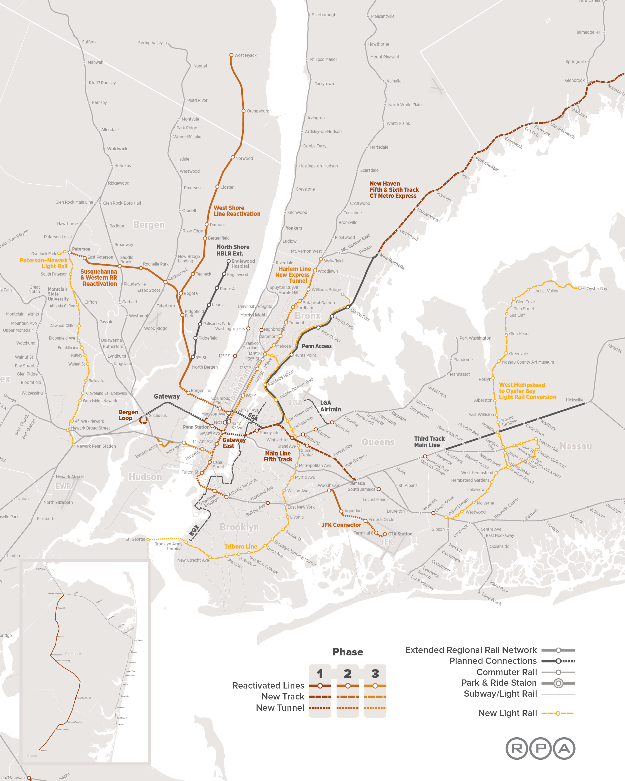
In addition to four-tracking the North River Tunnels under the aegis of the Gateway project, the RPA calls for two additional two-track tunnels under the Hudson, in phases 2 and 3 of its proposal. Both are to feed Midtown: the phase 2 tunnel is to connect regional rail lines to be reactivated with Columbus Circle, Grand Central, and other destinations in the city, and the phase 3 tunnel is to then carry the same line out of the city and back into New Jersey via Hoboken and the existing commuter lines serving southern and southwestern suburbs.
The logic, as I understand it, is that Midtown is the core of the New York region, and so it is the most important to connect there. I don’t know if this is what the RPA was thinking, but I asked at an IRUM meeting in 2010 why all plans involve connections to Midtown rather than Lower Manhattan and was told Lower Manhattan was not as important a business district.
The toy model has one fixed city center and varying outlying areas, the opposite of the situation here. Here, my criticism is of plans that serve the dominant city center while ignoring the second most important center. The total number of jobs in Midtown is 800,000 whereas Lower Manhattan has 250,000 – but Lower Manhattan is more compact, so a single station at Fulton with several exits can plausibly serve the entire area, whereas Midtown has areas that are too far from both Penn Station and Grand Central. The next pair of tracks should serve Midtown, but the pair after them should serve Lower Manhattan, to ensure good coverage to both business districts.
When Transit Serves the Poor Better Than the Rich
In major transit cities, rich areas have better access to public transportation than poor areas – in fact, what makes them valuable is precisely the easy access to high-paying jobs. Even in cities with bad transit, this is often the case: the transit systems of cities with mode shares in the 10-15% area, like Boston and Chicago, tend to be good at serving city center and little else, and city center workers tend to be richer because professional work tends to cluster whereas low-skill work tends to disperse.
However, there are exceptions to this rule. One, the French Riviera, occurs in a city region with a transit mode share of 13%, comparable to that of American city regions where transit commuters outearn solo drivers. Two more cities are would-be exceptions, for opposite reasons: Providence has no public transit to speak of, but if it invested in creating a transit network, the natural corridors would serve the poor better than the rich; and Vancouver currently has better SkyTrain service in working-class areas than in richer ones, but its current investment is in middle-class areas, and moreover its extensive transit-oriented development has been middle-class as well.
Moreover, all three cities have patterns that generalize. The situation in the Riviera arises because of the classed nature of work there, and generalizes to other places with extensive tourism. That in Providence arises because of the city’s industrial history, and may generalize to other deindustrialized small cities with underutilized legacy rail networks. In Vancouver, part of this situation is because easy rail corridors were more readily available in poorer areas for an essentially random reason, but another part is extensive transit-oriented development concentrating working-class jobs near train stations.
The Riviera: the casinos are walkable, the tech jobs aren’t
Before I go any further, I’d like to stress something important: my observation of the Riviera is largely based on qualitative observations. I don’t know of INSEE data comparable to the Census Bureau’s Means of Transportation to Work by Selected Characteristics table, which could allow me to test the theory that transit ridership in the Riviera skews poor. All I am going by is what I have seen riding trains and occasionally buses as well as what I know of the distribution of jobs.
What I’ve seen is that transit use in the Riviera skews working class. Middle-class Parisians sometimes drive and sometimes take the trains. In contrast, the rich people who I’ve met in the Riviera have as far as I can tell never set foot on the TER. This is despite the fact that the TER is competitive with driving on the area’s main arterial road, the Moyenne Corniche, and is even competitive with the A8 freeway over short distances because the A8 has difficult access time to the relevant exits. Not for nothing, train stations in rich areas have very little ridership: per SNCF’s ridership data, stations in rich areas like Cap d’Ail and Cap Martin-Roquebrune have around 60,000 boardings plus alightings per year, so around 100 weekday boardings, whereas in working- and lower-middle-class Menton the annual total is 1.4 million, or around 2,300 weekday boardings.
The train stations, too, signal poverty. They’re not neglected, but what I’ve seen of them reminded me of working-class suburbs of Paris like Boissy much more than middle-class ones like Bures-sur-Yvette. I was even warned off of spending too much time near Nice’s train station by people echoing local middle-class prejudices. The buses look even poorer: the main east-west bus on the Moyenne Corniche is full of migrant workers.
A key clue for what is happening can be found when selecting a destination station at the fare machines in Menton. As far as I remember, the first option given is not Nice, but Monaco. SNCF’s data table doesn’t include ridership for Monaco, but Wikipedia claims 5.5 million a year without citation, and SNCF’s own blurb claims more than 6 million. Either figure is narrowly behind Nice’s 6.9 million for second in the Riviera and well ahead of third-place Cannes’s 3.2 million – and Nice also has some intercity traffic.
While Monaco’s residents are rich, its commuters are not. There are no corporate jobs in Monaco, because its tax haven status does not extend to corporations with substantial sales outside the city-state, only to local businesses like restaurants and stores. The commuters work low-pay service jobs at hotels and casinos, which they access by train, or perhaps on foot if they live in Beausoleil, as many a domestic service worker in Monaco does.
In contrast, the mass of middle-class jobs cluster in a purpose-built edge city in Antibes, called Sophia-Antipolis. While Antibes itself has a decent transit mode share for residents (10.5%, cf. Menton’s 14.8% and Nice’s 25.4%), and its train station gets 1.6 million annual boardings and alightings, the edge city is unwalkable and far from the train. There’s some traffic in the Riviera, but not enough that middle-class people, who can afford cars, clamor for transit alternatives to their suburban jobs.
The main lesson here is that while the jobs most likely to cluster are usually middle-class city center jobs, working-class tourism jobs cluster as well in regions that have plenty of them. Tourism in the Riviera is the most intense in Monaco specifically and in other coastal cities generally, which encourages travel along the linear corridor, where rail shines. It’s usually hard to see, because for the most part the top tourist destinations are enormous like London, Paris, and New York, but in specialized tourist regions the separation is clearer.
Already we see some evidence of this in Las Vegas, where working-class jobs cluster along the Strip. The city has a monorail, serving the hotels and casinos rather than city center. Were it interested in improving public transportation, it could build an elevated railroad on the Strip itself for better service.
Orlando is another potential example. I named it as a specific example of a region that would be difficult to retrofit for public transit earlier this year, but Disney World remains a major clustering of working-class jobs as well as some middle-class leisure travel. The problem there is that Disney World is far from the train and, unlike the Riviera, does not lie on any line with other potential ridership draws; nonetheless, a train connecting the Orlando CBD, the airport, and Disney World could get some traffic.
Finally, picturesque mountain resorts that happen to lie near rail could see working-class travel on the train to their tourism jobs. Many of these resorts are where they are specifically because a legacy rail trunk happened to be there and the railroad developed the area to generate demand for its services; this is the case for Jasper, Lake Louise, and Banff, all on the Alberta side of the Continental Divide. Aspen is not on a railroad, but is on a road where buses carry working-class commuters displaced by the town’s high housing costs.
Providence: once upon a time, there were factories near the railroad
When I lived in Providence seven years ago, I discussed transit improvements with local urbanists who I met through Greater City: Providence. We talked about improvements to both bus and rail; we had little appetite for the proposed city center streetcar, which has since been downgraded to a proposed frequent bus, and instead talked about improvements to the busiest buses as well as rail service along the main spine of the Northeast Corridor.
The improvements to the busiest buses were already under discussion by the state, including signal priority on key routes and investment in queue jump lanes and shelter amenities. The two routes that were by far the state’s busiest, the 99 on North Main and 11 on Broad, were permanently combined to a single through-running service branded as the R bus, for rapid, with limited-stop service. These routes serve very poor parts of the built-up area, including Pawtucket on the 99 and South Providence on the 11. This is a consequence of the fact that transit in Rhode Island is so bad that only the poor use it, and thus the preexisting busy routes serve poor areas; the best physical bus infrastructure is a bus tunnel to College Hill, the richest neighborhood in the city, but ridership there is weak and therefore the routes were never high priorities for further investment.
The improvements to rail never went beyond blogging; we didn’t have the pull of Boston’s TransitMatters, which itself is better at proposing small improvements than big ones that go up against political obstruction. What we called for was frequent local rail within the urban area: Peter Brassard wrote up the initial proposal, and I added some refinements. The Northeast Corridor, where the service would run, is primarily an intercity rail corridor, but there is room for four tracks in the right-of-way, and while there is freight traffic, it runs at the same approximate speed of a local passenger train.
As we discussed this proposal, Greater City’s Jef Nickerson noted something: what the train would do if implemented is produce better transit service in working-class areas than in more comfortable ones. Unlike the situation with the buses, this was not an intentional process. We would like Rhode Island to improve rail service using an existing right-of-way, which happens to serve Central Falls, Pawtucket, Olneyville, Hartford, Cranston, and Warwick, and miss the East Side and the middle-class suburbs. We realized that the city and inner-suburbs like Pawtucket are poorer than the proper suburbs, but that the train would serve Olneyville but not the East Side seemed like a coincidence.
But is it really a coincidence? Providence developed from east to west. The city was initially founded on the western side of what is now the East Side, sloping down to the river. What is now Downcity was only the second part of the city to develop. It became the center of the city because, as the Northeast Corridor was constructed, it was not possible to provide through-service via the hilly historic core of the city, only via the flatter areas that are now Downcity. A tunnel across College Hill opened in 1908, but by then the city’s basic urban geography was set: the university and port jobs on the East Side, industrial jobs to the west near the rail mainline.
The industrial jobs are long gone now. New England was the first part of America to industrialize and the first to deindustrialize, the mills moving to lower-wage Southern states already in the middle of the 20th century. In very large cities, declining industrial jobs can be replaced with urban renewal serving the middle class: the West India Docks became Canary Wharf, the freight railyards of Gare de Lyon became Bercy, the industrial Manhattan and Brooklyn waterfronts became sites for condos with nice views. In Providence-size cities, no such urban renewal is possible: there is no large mass of middle-class people clamoring to live or work in Olneyville, so the neighborhood became impoverished.
While factories may seem like attractive targets for transit commuting, they’re so clustered, in reality they have not been walkable ever since electrification made open-plan single-story factories viable. Factories are land-intensive and have been since around the 1910s. Moreover, whereas hotels and retail have a reason to locate in walkable areas for their consumption amenities – tourists like walking around the city – factories do not, and if anything depress an area’s desirability through noise and pollution. Working industrial districts are not attractive for transit, but post-industrial ones are, even if they are not gentrified the way so much of London, Paris, and New York have.
A large number of cities share Providence’s history as a medium-size post-industrial city. Nearly every English city except London qualifies, as do the cities of the American Northeast and Midwest below the size class of Boston and Philadelphia. Moreover, all of these cities have undergone extensive middle-class flight, with the racial dimension of white flight in the US but even without it in Britain; thus, the relatively dense neighborhoods, where transit service is more viable, are disproportionately poor. However, the feasibility of mainline rail service to post-industrial neighborhoods is uneven, and depends on local idiosyncrasies.
One positive example I’m more familiar with that’s a lot like Providence is in New Haven. Its best potential local rail route, the Farmington Canal Trail, serves lower middle-class areas like Hamden, and fortunately parallels the busiest bus route, the D-Dixwell. While Hamden is not poor, such service would still lead to the inversion we discussed for Providence, since the rich live in thoroughly auto-oriented suburbs or within walking distance of Yale. The main drawbacks are that it would require replacing an active trail with rail service, and that either street running or brief tunneling would be needed in the final few hundred meters in Downtown New Haven.
Vancouver: easy corridors and TOD for the working class
With a modal share of 21%, Vancouver is in a somewhat higher class of transit quality than the Riviera, Boston, or Chicago. However, it remains a far cry from the numbers beginning with a 3, 4, and 5 seen in New York and in European and Asian transit cities. As with the Riviera, I am somewhat speculating from my own observations, lacking a table that clearly states transit usage by socioeconomic class. However, two factors make me believe that transit in Vancouver serves the working class better than it does the middle class.
The first factor is the corridors served by SkyTrain. The first to be built, the Expo Line, runs in a preexisting interurban right-of-way, with minor greenfield elevated and underground construction; even the downtown tunnel is repurposed from a disused mainline rail branch. It passes through a mixture of working-class and lower middle-class neighborhoods on its way to Surrey, which is working-class and very negatively stereotyped. The second, the Millennium Line, branches east, to lower middle-class suburbs, running on a greenfield el. The third, the Canada Line, is a partially tunneled, partially elevated route through the middle-class West Side to working-class Richmond. Only the fourth line to be built, the Evergreen extension of the Millennium Line, finally serves a comfortable area, as will the next line, the Broadway extension of the Millennium Line deeper into the West Side.
The second factor is the job distribution within Metro Vancouver. Usually, we see concentration of professional jobs in city centers and dispersal of working-class jobs among many stores. In the Riviera this relationship between job concentration and income is only inverted because the working-class jobs are disproportionately in tourism while the professional ones are in an edge city. In Vancouver I don’t believe there is any such inversion, but there is leveling: jobs of either type are concentrated in transit-rich areas. This leveling is the result of extensive commercial transit-oriented development, most notably Metrotown, which has many office jobs on top of Canada’s third largest shopping mall.
The first factor is idiosyncratic. The easy corridors happened to serve poorer areas, on a line from East Vancouver to Surrey. The rich live in North Vancouver, which has a ferry and doesn’t have enough population density for a SkyTrain tunnel; on the West Side, which is separated from downtown by False Creek and was thus late to get a rail connection; and in Port Moody and Coquitlam, which were only connected to SkyTrain recently via the Evergreen extension.
The second factor is more systemic. While American and European cities rarely have big urban shopping malls, Canadian cities are full of them. The Metropolis at Metrotown has 27 million annual visitors, not far behind the 37 million of the Forum des Halles, at the center of a metro area five times the size of Metro Vancouver – and the Metropolis has more than twice the total commercial floor area. In this, Canada is similar to Israel and Singapore, which like Canada have harsh climates, only hot instead of cold. Moreover, Vancouver has encouraged this centralization through TOD: Burnaby built Metrotown from scratch in the 1980s, simultaneously with the Expo Line.
It is difficult to engage in concerted residential TOD for the working class, since it requires extensive housing subsidies. Vancouver’s residential TOD near SkyTrain stations is thoroughly middle-class. However, concerted commercial TOD is easier: hospitals, universities, and shopping centers all employ armies of unskilled workers (the first two also employing many professional ones), the first two while satisfying general social goals for health care and education provision and the last while making the owners a profit on the open market.
Moreover, Vancouver’s TOD within downtown, too, has made it easier to provide transit service for the working and lower middle classes. Where constraints on office towers lead to high office rents, only the most critical jobs are in city centers, and those are typically high-end ones; in the US, it’s common for big corporations to site their top jobs in the center of New York or Chicago or another large city but outsource lower-end office jobs to cheaper cities. In Vancouver, as elsewhere in Canada, extensive downtown commercialization means that even semi-skilled office jobs like tech support can stay in the center rather than at suburban office parks.
Conclusion
Based on my own observations, I believe the Riviera provides better public transportation for the working class than for the middle class, and to some extent so does Vancouver. Providence provides uniformly poor transit service, but its lowest-hanging fruit are in working-class urban neighborhoods.
The reasons vary, but the unifying theme is that, in the Riviera and Vancouver, there is none of the typical big-city pattern in which the rich work in walkable city centers more than the poor (e.g. in New York). In Vancouver it’s the result of commercial TOD as well as a Canadian culture of urban shopping centers; in the Riviera it’s the result of unique dependence on tourism. In Providence the situation is not about job concentration but about residential concentration: lower-income neighborhoods are likelier to arise near rail because historically that’s where industry arose, and all that remains is for Providence to actually run local passenger trains on the mainline.
It is not possible to replicate culture. If your city does not have the tourism dependence of Monaco, or the shopping mall culture of Vancouver, or the post-industrial history of Providence, there’s little it can do to encourage better urban geography for working-class transit use. At best, can build up more office space in the center, as Vancouver did, and hope that this encourages firms to locate their entire operations there rather than splitting them between a high-end head office and lower-end outlying ones. Fortunately, there exist many cities that do have the special factors of the Riviera, Vancouver, or Providence. In such cities, transit planners should make note of how they can use existing urban geography to help improve transit service for the population that most depends on it.
In-Motion Charging
While electric cars remain a niche technology, electric buses are surging. Some are battery-electric (this is popular in China, and some North American agencies are also buying into this technology), but in Europe what’s growing is in-motion charging, or IMC. This is a hybrid of a trolleybus and a battery-electric bus (BEB): the bus runs under wire, but has enough battery to operate off-wire for a little while, and in addition has some mechanism to let the bus recharge during the portion of its trip that is electrified.
One vendor, Kiepe, lists recent orders. Esslingen is listed as having 10 km of off-wire capability and Geneva (from 2012) as having 7. Luzern recently bought double-articulated Kiepe buses with 5 km of off-wire range, and Linz bought buses with no range specified but of the same size and battery capacity as Luzern’s. Iveco does not specify what its range is, but says its buses can run on a route that’s 25-40% unwired.
Transit planning should be sensitive to new technology in order to best integrate equipment, infrastructure, and schedule. Usually this triangle is used for rail planning, but there’s every reason to also apply it to buses as appropriate. This has a particular implication to cities that already have large trolleybus networks, like Vancouver, but also to cities that do not. IMC works better in some geographies than others; where it works, it is beneficial for cities to add wire as appropriate for the deployment of IMC buses.
Vancouver: what to do when you’re already wired
Alert reader and blog supporter Alexander Rapp made a map of all trolleybus routes in North America. They run in eight cities: Boston, Philadelphia, Dayton, San Francisco, Seattle, Vancouver, Mexico City, Guadalajara.
Vancouver’s case is the most instructive, because, like other cities in North America, it runs both local and rapid buses on its trunk routes. The locals stop every about 200 meters, the rapids every kilometer. Because conventional trolleybuses cannot overtake other trolleybuses, the rapids run on diesel even on wired routes, including Broadway (99), 4th Avenue (44, 84), and Hastings (95, 160), which are in order the three strongest bus corridors in the area. Broadway has so much ridership that TransLink is beginning to dig a subway under its eastern half; however, the opening of the Broadway subway will not obviate the need for rapid buses, as it will create extreme demand for nonstop buses from the western end of the subway at Arbutus to the western end of the corridor at UBC.
IMC is a promising technology for Vancouver, then, because TransLink can buy such buses and then use their off-wire capability to overtake locals. Moreover, on 4th Avenue the locals and rapids take slightly different routes from the western margin of the city proper to campus center, so IMC can be used to let the 44 and 84 reach UBC on their current route off-wire. UBC has two separate bus loops, one for trolleys and one for diesel buses, and depending on capacity IMC buses could use either.
On Hastings the situation is more delicate. The 95 is not 25-40% unwired, but about 60% unwired – and, moreover, the unwired segment includes a steep mountain climb toward SFU campus. The climb is an attractive target for electrification because of the heavy energy consumption involved in going uphill: at 4 km, not electrifying it would brush up against the limit of Kiepe’s off-wire range, and may well exceed it given the terrain. In contrast, the 5 km in between the existing wire and the hill are mostly flat, affording the bus a good opportunity to use its battery.
Where to add wire
In a city without wires, IMC is the most useful when relatively small electrification projects can impact a large swath of bus routes. This, in turn, is most useful when one trunk splits into many branches. Iveco’s requirement that 60-75% of the route run under wire throws a snag, since it’s much more common to find trunks consisting of a short proportion of each bus route than ones consisting of a majority of route-length. Nonetheless, several instructive examples exist.
In Boston, the buses serving Dorchester, Mattapan, and Roxbury have the opportunity to converge to a single trunk on Washington Street, currently hosting the Silver Line. Some of these buses furthermore run on Warren Street farther south, including the 14, 19, 23, and 28, the latter two ranking among the MBTA’s top bus routes. The area has poor air quality and high rates of asthma, making electrification especially attractive.
Setting up wire on Washington and Warren Streets and running the Silver Live as open BRT, branching to the south, would create a perfect opportunity for IMC. On the 28 the off-wire length would be about 4.5 km each way, at the limit of Kiepe’s capability, and on the 19 and 23 it would be shorter; the 14 would be too long, but is a weaker, less frequent route. If the present-day service pattern is desired, the MBTA could still electrify to the northern terminus of these routes at Ruggles, but it would miss an opportunity to run smoother bus service.
In New York, there are examples of trunk-and-branch bus routes in Brooklyn and Queens. The present-day Brooklyn bus network has a long interlined segment on lower Fulton, carrying not just the B25 on Fulton but also the B26 on Halsey and B52 on Gates, and while Eric Goldwyn’s and my plan eliminates the B25, it keeps the other two. The snag is that the proportion of the system under wire is too short, and the B26 has too long of a tail (but the B52 and B25 don’t). The B26 could get wire near its outer terminal, purposely extended to the bus depot; as bus depots tend to be polluted, wire there is especially useful.
More New York examples are in Queens. Main Street and the Kissena-Parsons corridor, both connecting Flushing with Jamaica, are extremely strong, interlining multiple buses. Electrifying these two routes and letting buses run off-wire on tails to the north, reaching College Point and perhaps the Bronx on the Q44 with additional wiring, would improve service connecting two of Queens’ job centers. Moreover, beyond Jamaica, we see another strong trunk on Brewer Boulevard, and perhaps another on Merrick (interlining with Long Island’s NICE bus).
Finally, Providence has an example of extensive interlining to the north, on North Main and Charles, including various 5x routes (the map is hard to read, but there are several routes just west of the Rapid to the north).
IMC and grids
The examples in New York, Providence, and Boston are, not coincidentally, ungridded. This is because IMC interacts poorly with grids, and it is perhaps not a coincidence that the part of the world where it’s being adopted the most has ungridded street networks. A bus grid involves little to no interlining: there are north-south and east-west arterials, each carrying a bus. The bus networks of Toronto, Chicago, and Los Angeles have too little interlining for IMC to be as cost-effective as in New York or Boston.
In gridded cities, IMC is a solution mainly if there are problematic segments, in either direction. If there’s a historic core where wires would have adverse visual impact, it can be left unwired. If there’s a steep segment with high electricity consumption, it should be wired preferentially, since the cost of electrification does not depend on the street’s gradient.
Overall, this technology can be incorporated into cities’ bus design. Grids are still solid when appropriate, but in ungridded cities, trunks with branches are especially attractive, since a small amount of wire can convert an entire swath of the city into pollution-free bus operation.
Sometimes, Bus Stop Consolidation is Inappropriate
For the most part, the optimal average spacing between bus stops is 400-500 meters. North American transit agencies have standardized on a bus stop every 200-250 meters, so stop consolidation is usually a very good idea. But this is based on a model with specific inputs regarding travel behavior. In some circumstances, travel behavior is different, leading to different inputs, and then the model’s output will suggest a different optimum. In contrast with my and Eric’s proposal for harsh stop consolidation in Brooklyn, I would not recommend stop consolidation on the crosstown buses in Manhattan, and am skeptical of the utility of stop consolidation in Paris. In Vancouver I would recommend stop consolidation, but not on every route, not do we recommend equally sweeping changes on every single Brooklyn route.
The model for the optimal stop spacing
If demand along a line is isotropic, and the benefits of running buses more frequently due to higher in-vehicle speed are negligible, then the following formula holds:

The most important complicating assumption is that if demand is not isotropic, but instead every trip begins or ends at a distinguished location where there is certainly a stop, such as a subway connection, then the formula changes to,

The choice of which factor to use, 2 or 4, is not exogenous to the bus network. If the network encourages transferring, then connection points will become more prominent, making the higher factor more appropriate. Whether the network encourages interchanges depends on separate policies such as fare integration but also on the shape of the network, including bus frequency. Higher average bus speed permits higher frequency, which makes transferring easier. The model does not take the granularity of transfer ease into account, which would require a factor somewhere between 2 and 4 (and, really, additional factors for the impact of higher bus speed on frequency).
After the choice of factor, the most contentious variable is the walk speed and penalty. Models vary on both, and often they vary in directions that reinforce each other rather than canceling out (for example, certain disabilities reduce both walk speed and willingness to walk a minute longer to save a minute on a bus). In Carlos Daganzo’s textbook, the walk speed net of penalty is 1 m/s. For an able-bodied adult, the walk speed can exceed 1.5 m/s; penalties in models range from 1.75 (MTA) to 2 (a Dutch study) to 2.25 (MBTA). The lower end is probably more appropriate, since the penalty includes a wait penalty, and stop consolidation reduces waits even as it lengthens walk time.
Update 10/31: alert reader Colin Parker notes on social media that you can shoehorn the impact of walk time into the model relatively easily. The formula remains the same with one modification: the average trip distance is replaced with

The factor of 2 in the formula comes from computing average wait time; for worst-case wait time, remove the 2 (but then the wait penalty would need to be adjusted, since the wait penalty is partly an uncertainty penalty).
The average distance between buses is proportional to the number of service-hours, or fleet size: it obeys the formula

The factor of 2 in the formula comes from the fact that route-length is measured one-way whereas revenue hours are for a roundtrip.
If we incorporate wait time into the model this way, then the walk and wait penalties used should be higher, since we’re taking them into account; the Dutch study’s factor of 2 is more reasonable. The conclusions below are not really changed – the optima barely increase, and are unchanged even in the cases where stop consolidation is not recommended.
The situation in New York
The average unlinked New York City Transit bus trip is 3.35 km: compare passenger-miles and passenger trips as of 2016. In theory this number is endogenous to the transit network – longer interstations encourage passengers to take the bus more for long trips than for short trips – but in practice the SBS routes, denoted as bus rapid transit in the link, actually have slightly shorter average trip length than the rest. For all intents and purposes, this figure can be regarded as exogenous to stop spacing.
The stop penalty, judging by the difference between local and limited routes, is different for different routes. The range among the routes I have checked looks like 20-40 seconds. However, Eric tells me that in practice the B41, which on paper has a fairly large stop penalty, has little difference in trip times between the local and limited versions. The local-SBS schedule difference is consistent with a stop penalty of about 25 seconds, at least on the B44 and B46.
As a sanity check, in Vancouver the scheduled stop penalty on 4th Avenue is 22 seconds – the 84 makes 19 fewer stops than the 4 between Burrard and UBC and is 7 minutes faster – and the buses generally run on schedule. The actual penalty is a little higher, since the 4 has a lot of pro forma stops on the University Endowment Lands that almost never get any riders (and thus the bus doesn’t stop there). This is consistent with 25 seconds at a stop that the bus actually makes, or even a little more.
Plugging the numbers into the formula yields

if we assume everyone connects to the subway (or otherwise takes the bus to a distinguished stop), or

if we assume perfectly isotropic travel demand. In reality, a large share of bus riders are connecting to the subway, which can be seen in fare revenue, just $1.16 per unlinked bus trip compared with $1.91 per subway trip (linked or unlinked, only one swipe is needed). In Brooklyn, it appears that passengers not connecting to the subway disproportionately go to specific distinguished destinations, such as the hospitals, universities, and shopping centers, or Downtown Brooklyn, making the higher figure more justified. Thus, our proposed stop spacing, excluding the long nonstop segments across the Brooklyn-Battery Tunnel and between borough line and JFK, is 490 meters.
Update 10/31: if we incorporate wait time, then we need to figure out the average distance between buses. This, in turn, depends on network shape. Brooklyn today has 550 km of bus route in each direction, which we propose to cut to 350. With around 600 service hours per hour – more at the peak, less off-peak – we get an average distance between buses of 1,830 meters today or 1,180 under our proposal. Using our proposed network, and a wait and walk penalty of 2, we get

or

Short bus routes imply short stop spacing
Our analysis recommending 490 meter interstations in Brooklyn depends on the average features of New York’s bus network. The same analysis ports to most of the city. But in Manhattan, the situation is different in a key way: the crosstown buses are so short that the average trip length cannot possibly match city average.
Manhattan is not much wider than 3 km. Between First and West End Avenues the distance is 2.8 km. The likely average trip length is more than half the maximum, since the typical use case for the crosstown buses is travel between the Upper East Side and Upper West Side, but the dominant destinations are not at the ends of the line, but close to the middle. With Second Avenue Subway offering an attractive two-seat ride, there is less reason to take the crosstown buses to connect to the 1/2/3 (and indeed, the opening of the new line led to prominent drops in ridership on the M66, M72, M79, M86, and M96); the best subway connection point is now at Lexington Avenue, followed by Central Park West. On a long route, the location of the dominant stop is not too relevant, but on a short one, the average trip length is bounded by the distance between the dominant stop and the end of the line.
If we take the average trip length to be 1.6 km and plug it into the formula, we get

or

A crosstown bus stopping at First, Second, Third, Lex, Madison, Fifth, Central Park West, Columbus, Amsterdam, Broadway, and West End makes 10 stops in 2.8 km, for an average of 280 meters. There isn’t much room for stop consolidation. If the bus continues to Riverside, lengthening the trip to 3 km at the latitude of 96th Street, then it’s possible to drop West End. If the buses running up Third and down Lex are converted to two-way running, presumably on Lex for the subway connections, then Third could be dropped, but this would still leave the interstation at 330 meters, much tighter than anything we’re proposing in Brooklyn.
The only other places where avenues are too closely spaced are poor locations for stop removal. Amsterdam and Broadway are very close, but Amsterdam carries a northbound bus, and if the Columbus/Amsterdam one-way pair is turned into two two-way avenues, then Amsterdam is a better location for the bus than Columbus because it provides better service to the Far West Side. Fifth and Madison are very close as well, but the buses using them, the M1 through M4, are so busy (a total of 32 buses per hour at the peak) that if the two avenues are converted to two-way running then both should host frequent bus trunks. It’s not possible to skip either.
Within Brooklyn, there is one location in which the same issue of short bus routes applies: Coney Island. The B74 and B36 act as short-hop connectors from Coney Island the neighborhood to Coney Island the subway station. The routes we propose replacing them have 7 stops each from the subway connection west, over distances of 2.5 and 2.7 km respectively, for interstations of 360 and 390 meters.
Vancouver supplies two more examples of routes similar to the B74 and B36: the 5 and 6 buses, both connecting the West End with Downtown. The 6 is only 2 km between its western end and the Yaletown SkyTrain station, and the 5 is 2.3 km from the end to the Burrard station and 2.8 km to city center at Granville Street. The average trip length on these buses is necessarily short, which means that stop consolidation is not beneficial, unlike on the main grid routes outside Downtown.
Update 10/31: incorporating wait time into this calculation leads to the same general conclusion. The short routes in question – the Manhattan crosstowns, the B36 and B74, and the 5 and 6 in Vancouver – have high frequency, or in other words short distance between buses. For example, the M96 runs every 4 minutes peak, 6 off-peak, and takes 22-24 minutes one-way, for a total of 6 circulating buses per direction peak (which is 500 meters), or 4 off-peak (which is 750 meters). This yields

A network that discourages transferring should have more stops as well
In Paris the average interstation on buses in the city looks like 300 meters; this is not based on a citywide average but on looking at the few buses for which Wikipedia has data plus a few trunks on the map, which range from 250 to 370 meters between stations.
The short stop spacing in Paris is justified. First of all, the average bus trip in Paris is short: 2.33 km as of 2009 (source, PDF-p. 24). Parisian Metro coverage is so complete that the buses are not useful for long trips – Metro station access time is short enough that the trains overtake the buses on total trip time very quickly.
Second, there is little reason to transfer between buses here, or to transfer between buses and the Metro. The completeness of Metro coverage is such that buses are just not competitive unless they offer a one-seat ride where the Metro doesn’t. Another advantage of buses is that they are wheelchair-accessible, whereas the Metro is the single least accessible major urban rail network in the world, with nothing accessible to wheelchair users except Line 14 and the RER A and B. It goes without saying that people in wheelchairs are not transferring between the bus and the Metro (and even if they could, they’d have hefty transfer penalties). The New York City Subway has poor accessibility, but nearly all of the major stations are accessible, including the main bus transfer points, such as Brooklyn College and the Utica Avenue stop on the 3/4.
With little interchange and a mostly isotropic city density, the correct formula for the optimal bus stop spacing within Paris is

which is close to the midpoint of the range of interstations I have found looking at various routes.
Conclusion
The half-kilometer (or quarter-to-a-third-of-a-mile) rule for bus stop spacing is an empirical guideline. It is meant to describe average behavior in the average city. It is scale-invariant – the density of the city does not matter, only relative density does, and the size of the city only matters insofar as it may affect the average trip length. However, while scale itself does not lead to major changes from the guideline, special circumstances might.
If the geography of the city is such that bus trips are very short, then it’s correct to have closer stop spacing. This is the case for east-west travel in Manhattan. It is also common on buses that offer short-hop connections to the subway from a neighborhood just outside walking range, such as the B36 and B74 in Coney Island and the 5 and 6 in Vancouver’s West End.
Note that even in New York, with its 3.3 km average trip length, stop consolidation is still beneficial and necessary on most routes. North American transit agencies should not use this article as an excuse not to remove extraneous stops. But nor should they stick to a rigid stop spacing come what may; on some routes, encouraging very short trips (often 1.5 km or even less), closely spaced stations are correct, since passengers wouldn’t be riding for long enough for the gains from stop consolidation to accumulate.
Is Missing Middle Really Missing?
There’s en emerging concept within North American urbanism and planning called missing middle. This refers to housing density that’s higher than suburban single-family housing but lower than urban mid- and high-rise buildings. The context is that in some cities with rapid housing construction, especially Toronto, the zoning code is either single-family or high-density, with nothing in between. The idea of allowing more missing middle housing has become a mainstay of New Urbanism as well as most North American YIMBY movements, underpinning demands such as the abolition of single-family zoning in California and Seattle.
Unfortunately, it’s an overrated concept. It applies to Toronto, but not Vancouver or the most expensive American cities, which are replete with missing middle density. The most in-demand neighborhoods have far too many people who want to move in to make do with this density level. Moreover, missing middle density in its New Urbanist form is not even really transit-oriented: low-rise construction spread over a large area is unlikely to lead middle-class workers to take transit when cars are available. The density required to encourage transit ridership and reduce housing costs is much higher, including mid- and high-rise residences.
What’s missing middle density?
A website created by Opticos Design, an architecture firm specializing in this kind of housing, has a helpful graphical definition:
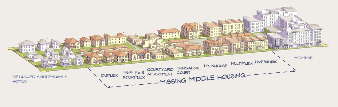
Many of the missing middle housing forms are part of the vernacular architecture of American cities. In New England, this is the triple-decker, a three-story building with an apartment per floor. In Chicago, this is the fourplex, a two-story building with two apartments per floor. In Los Angeles this is the dingbat, with two or three inhabited floors on top of ground floor parking. In Baltimore and Philadelphia (and in London) this is the rowhouse. This history makes it easier to accept such buildings as both part of the local culture and as affordable to the lower middle class.
The triple-deckers in the parts of Providence and Cambridge I am most familiar with have a floor area ratio of about 1-1.5: they have 2.5 to 3 floors (counting sloped roofs as half a floor) and build on one third to one half the lot. A quick look at some Philadelphia rowhouses suggests they, too, have a floor area ratio in that range. Somerville has a population density just short of 7,000 people per km^2, with little non-residential land and some mid-rise and single-family areas canceling out to missing middle density. Kew Gardens Hills has about 12,000 people per km^2, and has a mixture of missing middle and mid-rise housing.
In Continental Europe, the vernacular architecture is instead mid-rise. In Scandinavia and Central Europe the euroblock has 4-7 floors and a floor area ratio of 2.5-4; Urban Kchoze shows many examples with photos, mostly from Prague, and Old Urbanist finds a euroblock in Berlin with a floor area ratio of 4.3. Central Stockholm’s residential buildings are almost entirely euroblocks, and residential density is 17,000/km^2 in Södermalm, 21,000/km^2 in Vasastan, and 28,000/km^2 in Östermalm. Parisian density is even higher – the floor area ratio of the traditional buildings looks like 4-5, with about 30,000-40,000 people per km^2.
Is missing middle really missing?
In Europe the answer is obviously no: lower-density cities like London are largely missing middle in their inner areas, and higher-density ones like Paris have missing middle density in their outer areas. But even in North America, where the term is popular, the expensive cities where people call for abolishing single-family zoning have missing middle housing. In addition to the above-listed vernacular examples, New York has brownstones all over Brooklyn (the term Brownstone Brooklyn refers to the gentrified inner neighborhoods, but this density is also seen in outer neighborhoods like Bay Ridge and Sheepshead Bay).
Vancouver is an especially instructive example. English Canada’s big cities are fast-growing, and a zoning regime that’s historically been friendlier to developers than to local NIMBYs has encouraged high-rise growth. Moreover, the high-rises are built in the modern boxy style (earning the ire of people who hate modern architecture) and tend to target middle-class and high-skill immigrant buyers (earning the ire of people who blame high housing costs on new construction). In contrast, vast swaths of Toronto and Vancouver are zoned for single-family housing.
And yet, Vancouver has considerable missing middle housing, too. The population density in Mount Pleasant, Fairview, Kitsilano, and West Point Grey is similar to that of Somerville and Eastern Queens. Buildings there are in modern style, but the housing typologies are not modernist towers in a park, but rather mostly buildings with 2-4 floors with the medium lot coverage typical of missing middle. I lived in an eight-unit, three-story building. Across from me there was a high-rise, but it was atypical; for the most part, that part of Vancouver is low-rise.
Shaughnessy offends people in its extravagance and wealth. In one Twitter conversation, an interlocutor who blamed absent landlords and foreigners (read: Chinese people) for Vancouver’s high housing costs still agreed with me that Shaughnessy, a white Canadian-born single-family area, shares the blame with its low-density zoning and very high residential space per person. Legalizing accessory dwelling units (“granny flats”) and townhouses in such a neighborhood faces local political headwind from the neighbors (who are still nowhere near as empowered to block rezoning as they would south of the border), but not from citywide social movements.
And yet, the density in the inner Westside neighborhoods near Broadway and Fourth Avenue is insufficient, too. It’s of course much higher than in Shaughnessy – I never really missed not owning a car living in Kitsilano – but the price signal screams “build more housing in Kits and Point Grey.”
Is missing middle transit-oriented?
Not really. In Providence the answer is absolutely not: car ownership is expected of every person who can afford it. The nearby supermarket, East Side Market, has an enormous parking lot; I’d walk, but it was obvious to me that my mode choice was not the intended use case. Even some Brown grad students owned cars (though most didn’t); at Columbia, car ownership among people below tenure-track faculty rank approaches zero. Once they own cars, people use them to take trips they wouldn’t otherwise have made, reorienting their travel patterns accordingly.
In Cambridge, car use is lower, but still substantial. The same is true of Vancouver (where outside Downtown and the West End the entire region’s density is at most missing middle, even if the typology is towers in a park and not uniformly low-rise). In Kew Gardens Hills, people seem to mostly drive as well.
This is not a universal feature of the urban middle class. In Stockholm, my postdoc advisor as far as I can tell does not own a car, and commutes to work by bike. Both there and in Basel, biking and using transit are normal and expected even among people who earn tenured academic salaries. At 7,000 people per km^2, people can forgo driving if they really want to, but most people will not do so. Only at the higher mid-rise density will they do so.
