I was asked by Greg Stroud of SECoast to look at HSR between New Rochelle and Greens Farms. On this segment (and, separately, between Greens Farms and Milford), 300+ km/h HSR is not possible, but speedups and bypasses in the 200-250 area are. The NEC Future plan left the entire segment from New York to New Haven as a question mark, and an inside source told me it was for fear of stoking NIMBYism. Nonetheless, SECoast found a preliminary alignment sketched by NEC Future and sent it to me, which I uploaded here in Google Earth format – the file is too big to display on Google Maps, but you can save and view it on your own computer. Here’s my analysis of it, first published on SECoast, changed only on the copy edit level and on English vs. metric units.
The tl;dr version is that speeding up intercity trains (and to some extent regional trains too) on the New Haven Line is possible, and requires significant but not unconscionable takings. The target trip time between New York and New Haven is at the lower end of the international HSR range, but it’s still not much more than a third of today’s trip time, which is weighed down by Amtrak/Metro-North agency turf battles, low-quality trains, and sharp curves.
The New Haven Line was built in the 1840s in hilly terrain. Like most early American railroads, it was built to low standards, with tight curves and compromised designs. Many of these lines were later replaced with costlier but faster alignments (for example, the Northeast Corridor in New Jersey and Pennsylvania), but in New England this was not done. With today’s technology, the terrain is no problem: high-speed trains can climb 3.5-4% grades, which were unthinkable in the steam era. But in the 170 years since the line opened, many urban and suburban communities have grown along the railroad right of way, and new construction and faster alignments will necessarily require significant adverse impacts to communities built along the Northeast Corridor.
This analysis will explain some of the impacts and opportunities expanding and modernizing high-speed rail infrastructure on or near the New Haven Line—and whether such an investment is worthwhile in the first place. There are competing needs: low cost, high speed, limited environmental impact, good local service on Metro-North. High-speed rail can satisfy each of them, but not everywhere and not at the same time.
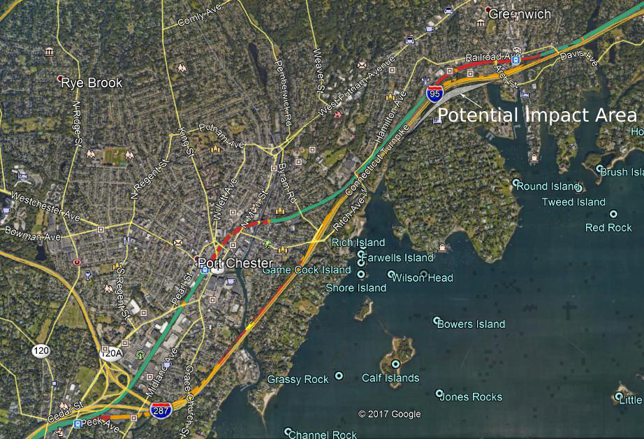
The Northeast Corridor Future (NEC Future) preferred alternative, a new plan by the Federal Railroad Administration to modernize and expand rail infrastructure between Washington and Boston, proposes a long bypass segment parallel to the New Haven Line, between Rye and Greens Farms. The entire segment is called the New Rochelle-Greens Farms bypass; other segments are beyond the scope of this document.
Structure and Assumptions
The structure of this write-up is as follows: first, technical explanations of the issues with curves, with scheduling commuter trains and high-speed trains on the same track, and with high-speed commuting. Then, a segment-by-segment description of the options:
- New Rochelle-Rye, the leadup to the bypass, where scheduling trains is the most difficult.
- Rye-Cos Cob, the first bypass.
- The Cos Cob Bridge, a decrepit bridge for which the replacement is worth discussing on its own.
- Cos Cob-Stamford, where the preferred alternative is a bypass, but a lower-impact option on legacy track is as fast and should be studied.
- Stamford-Darien, where another bypass is unavoidable, with significant residential takings, almost 100 houses in one possibility not studied in the preferred alternative.
- Norwalk-Greens Farms, a continuation of the Darien bypass in an easier environment.
The impacts in question are predominantly noise, and the effect of takings. The main reference for noise emissions is a document used for California High-Speed Rail planning, using calibrated noise levels provided by federal regulators. At 260 km/h, higher than trains could attain in most of the segment in question, trains from the mid-1990s 45 meters away would be comparable to a noisy urban residential street; more recent trains, on tracks with noise barriers, would be comparable to a quiet urban street. Within a 50-meter (technically 150 feet) zone, adverse impact would require some mitigation fees.
At higher speed than 260 km/h, the federal regime for measuring train noise changes: the dominant factor in noise emissions is now air resistance around the train rather than rolling friction at the wheels. This means two things: first, at higher speed, noise emissions climb much faster than before, and second, noise barriers are less effective, since the noise is generated at the nose and pantograph rather than the wheels. At only one place within the segment are speeds higher than about 260 km/h geometrically feasible, in Norwalk and Westport, and there, noise would need to be mitigated with tall trees and more modern, aerodynamic trains, rather than with low concrete barriers.
This analysis excludes impact produced by some legacy trains, such as the loud horns at grade crossings; these may well go away in a future regulatory reform, as the loud horns serve little purpose, and the other onerous federal regulations on train operations are being reformed. But in any case, the mainline and any high-speed bypass would be built to high standards, without level crossings. Thus noise impact is entirely a matter of loud trains passing by at high speed.
Apart from noise and takings, there are some visual impacts coming from high bridges and viaducts. For the most part, these are in areas where the view the aerials block is the traffic on I-95. Perhaps the biggest exception is the Mianus River, where raising the Cos Cob Bridge has substantial positive impact on commuter train operations and not just intercity trains.
Curves
The formula for the maximum speed on a curve is as follows:

If all units are metric, and speed is in meters per second, this formula requires no unit conversion. But as is common in metric countries, I will cite speed in kilometers per hour rather than meters per second; 1 m/s equals 3.6 km/h.
Lateral acceleration is the most important quantity to focus on. It measures centrifugal force, and has a maximum value for safety and passenger comfort. But railroads decompose it into two separate numbers, to be added up: superelevation (or cant), and cant deficiency (or unbalanced superelevation, or underbalance).
Superelevation means banking the tracks on a curve. There is an exact speed at which trains can run where the centrifugal force exactly cancels out the banking, but in practice trains tend to run faster, producing additional centrifugal force; this additional force is called cant deficiency, and is measured as the additional hypothetical cant required to exactly balance.
If a train sits still on superelevated track, or goes too slowly, then passengers will feel a downward force, toward the inside of the curve; this is called cant excess. On tracks with heavy freight traffic, superelevation is low, because slow freight trains would otherwise be at dangerous cant excess. But the New Haven Line has little freight traffic, all of which can be accommodated on local tracks in the off-hours, and thus superelevation can be quite high. Today’s value is 5” (around 130 mm), and sometimes even less, but the maximum regulatory value in the United States is 7” (around 180 mm), and in Japan the high-speed lines can do 200 mm, allowing tighter curves in constrained areas.
Cant deficiency in the United States has traditionally been very low, at most 3” (75 mm). But modern trains can routinely do 150 mm, and Metro-North should plan on that as well, to increase speed. The Acela has a tilting mechanism, allowing 7”; the next-generation Acelas are capable of 9” cant deficiency (230 mm) at 320 km/h; this document will assume the sum total of cant and cant deficiency is 375 mm (the new Acela trainsets could do 200 mm cant deficiency with 175 mm cant, or Japanese trainsets could do 175 mm cant deficiency with 200 mm cant). This change alone, up from about 200 mm today, enough to raise the maximum speed on every curve by 37%. At these higher values of superelevation and cant deficiency, a curve of radius 800 meters can support 160 km/h.
Scheduling and Speed
The introduction of high-speed rail between New York and New Haven requires making some changes to timetabling on the New Haven Line. In fact, on large stretches of track on this line, especially in New York State, the speed limit comes not from curves or the physical state of the track, but from Metro-North’s deliberately slowing Amtrak down to the speed of an express Metro-North train, to simplify scheduling and dispatching. This includes both the top speed (90 mph/145 km/h in New York State, 75 mph/120 km/h in Connecticut) and the maximum speed on curves (Metro-North forbids the Acela to run at more than 3”/75 mm cant deficiency on its territory).
The heart of the problem is that the corridor needs to run trains of three different speed classes: local commuter trains, express commuter trains, and intercity trains. Ideally, this would involve six tracks, two per speed class, much like the four-track mainlines with two speed classes on the subway in New York (local and express trains). However, there are only four tracks. This means that there are four options:
- Run only two speed classes, slowing down intercity trains to the speed of express commuter trains.
- Run only two speed classes, making all commuter trains local.
- Expand the corridor to six tracks.
- Schedule trains of three different speed classes on just four tracks, with timed overtakes allowing faster trains to get ahead of slower trains at prescribed locations.
The current regime on the line is option #1. Option #2 would slow down commuters from Stamford and points east too much; the New Haven Line is too long and too busy for all-local commuter trains. Option #3 is the preferred alternative; the problem there is the cost of adding tracks in constrained locations, which includes widening viaducts and rebuilding platforms.
Option #4 has not been investigated very thoroughly in official documents. The reason is that timed overtakes require trains to be at a specific point at a specific time. Amtrak’s current reliability is too poor for this. However, future high-speed rail is likely to be far more punctual, with more reliable equipment and infrastructure. Investing in this option would require making some targeted investments toward reliability, such as more regular track and train maintenance, and high platforms at all stations in order to reduce the variability of passenger boarding time.
Moreover, at some locations, there are tight curves on the legacy New Haven Line that are hard or impossible to straighten in any alignment without long tunnels. South of Stamford, this includes Rye-Greenwich.
This means that, with new infrastructure for high-speed rail, the bypass segments could let high-speed trains overtake express commuter trains. The Rye-Greenwich segment is especially notable. High-speed rail is likely to include a bypass of Greenwich station. Thus, express commuter trains could stop at Greenwich, whereas today they run nonstop between Stamford and Manhattan, in order to give intercity trains more time to overtake them. A southbound high-speed trains would be just behind an express Metro-North train at Stamford, but using the much greater speed on the bypass, it would emerge just ahead of it at Rye. This segment could be built separately from the rest of the segment, from Stamford to Greens Farms and beyond, because of its positive impact on train scheduling.
It is critical to plan infrastructure and timetable together. With a decision to make express trains stop at Greenwich, infrastructure design could be simpler: there wouldn’t be a need to add capacity by adding tracks to segments that are not bypassed.
High-Speed Commuting
A junior consultant working on NEC Future who spoke to me on condition of anonymity said that there was pressure not to discuss fares, and at any rate the ridership model was insensitive to fare.
However, this merits additional study, because of the interaction with commuter rail. If the pricing on high-speed rail is premium, as on Amtrak today, then it is unlikely there will be substantial high-speed commuting to New York from Stamford and New Haven. But if there are tickets with low or no premium over commuter rail, with unreserved seating, then many people would choose to ride the trains from Stamford to New York, which would be a trip of about 20 minutes, even if they would have to stand.
High-speed trains are typically longer than commuter trains: 16 cars on the busier lines in Japan, China, and France, rather than 8-12. This is because they serve so few stops that it is easier to lengthen every platform. This means that the trains have more capacity, and replacing a scheduled commuter train with a high-speed train would not compromise commuter rail capacity.
The drawback is that commuters are unlikely to ride the trains outside rush hour, which only lasts about 2 or 3 hours a day in each direction. In contrast, intercity passengers are relatively dispersed throughout the day. Capital investment, including infrastructure and train procurement, is based on the peak; reducing the ratio of peak to base travel reduces costs. The unreserved seat rule, in which there is a small premium over commuter rail for unreserved seats (as in Germany and Japan) and a larger one for reserved seats, is one potential compromise between these two needs (flat peak, and high-speed commuter service).
New Rochelle-Rye
The track between New Rochelle and Rye is for the most part straight. Trains go 145 km/h, and this is because Metro-North slows down intercity trains for easier dispatching. The right-of-way geometry is good for 180 km/h with tilting trains and high superelevation; minor curve modifications are possible, but save little time. The big item in this segment concerns the southern end: New Rochelle.
At New Rochelle, the mainline branches in two: toward Grand Central on the New Haven Line, and toward Penn Station on the Hell Gate Line, used by Amtrak and future Penn Station Access trains. This branching is called Shell Interlocking, a complex of track switches, all at grade, with conflicts between trains in opposite directions. All trains must slow down to 30 mph (less than 50 km/h), making this the worst speed restriction on the Northeast Corridor outside the immediate areas around major stations such as Penn Station and Philadelphia 30th Street Station, where all trains stop.
The proposed (and only feasible) solution to this problem involves grade-separating the rails using flyovers, a project discussed by the FRA at least going back to 1978 (PDF-p. 95). This may involve some visual impact, or not—there is room for trenching the grade-separation rather than building viaducts. It is unclear how much that would cost, but a flyover at Harold Interlocking in Queens for East Side Access, which the FRA discussed in the same report, cost $300 million dollars earlier this decade. Harold is more complex than Shell, since it has branches on both sides and is in a more constrained location; it is likely that Shell would cost less than Harold’s $300 million. Here is a photo of the preferred alignment:
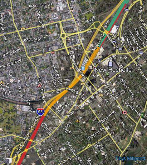
The color coding is, orange is viaducts (including grade separations), red is embankments, and teal is at-grade. This is the Northeast Corridor, continuing south on the Hell Gate Line to Penn Station, and not the Metro-North New Haven Line, continuing west (seen in natural color in the photo) to Grand Central.
A Shell fix could also straighten the approach from the south along the Hell Gate Line, which is curvy. The curve is a tight S, with individual curves not too tight, but the transition between them constraining speed. The preferred alignment proposes a fix with a kilometer of curve radius, good for 180 km/h, with impact to some industrial sites but almost no houses and no larger residential buildings. It is possible to have tighter curves, at slightly less cost and impact, or wider ones. Slicing a row of houses in New Rochelle, east of the southern side of the S, could permit cutting off the S-curve entirely, allowing 240 km/h; the cost and impact of this slice relative to the travel time benefit should be studied more carefully and compared with the cost per second saved from construction in Connecticut.
The main impact of high-speed rail here on ordinary commuters is the effect on scheduling. With four tracks, three train speed classes, and heavy commuter rail traffic, timetabling would need to be more precise, which in turn would require trains to be more punctual. In the context of a corridor-wide high-speed rail program, this is not so difficult, but it would still constrain the schedule.
Without additional tracks, except on the bypasses, there is capacity for 18 peak Metro-North trains per hour into New York (including Penn Station Access) and 6 high-speed trains. Today’s New Haven Line peak traffic is 20 trains per hour (8 south of Stamford, 12 north of which 10 run nonstop from Stamford to Manhattan), so this capacity pattern argues in favor of pricing trains to allow commuters to use the high-speed trains between Stamford and New York.
Rye-Greenwich

Rye is the first place, going from the south, where I-95 is straighter than the Northeast Corridor. This does not mean it is straight: it merely means that the curves on I-95 in that area are less sharp than those at Rye, Port Chester, and Greenwich. Each of these three stations sits at a sharp S-curve today; the speed zone today is 75 mph (120 km/h), with track geometry that could allow much more if Metro-North accepted a mix of trains of different speed, but Rye and Greenwich restrict trains to 60 mph/95 km/h, and Port Chester to 45 mph/70 km/h at the state line. The segment between the state line and Stamford in particular is one of the slowest in the corridor.
As a result, the NEC Future plan would bypass the legacy line there alongside the Interstate. Currently, the worst curve in the bypassed segment, at Port Chester, has radius about 650 meters, with maximum speed much less than today’s trains could do on such a curve because of the sharp S. At medium and high speed, it takes a few seconds of train travel time to reverse a curve, or else the train must go more slowly, to let the systems as well as passengers’ muscles adjust to the change in the direction of centrifugal force. At Rye, the new alignment has 1,200-meter curves, with gentle enough S to allow trains to fully reverse, without additional slowdowns; today’s tracks and trains could take it at 140 km/h, but a tilting train on tracks designed for higher-speed travel could go up to 195.
Within New York State, the bypass would require taking a large cosmetics store, and some houses adjacent to I-95 on the west; a few townhouses in Rye may require noise walls, as they would be right next to the right-of-way where trains would go about 200-210 km/h, but at this speed the noise levels with barriers are no higher than those of the freeway, so the houses would remain inhabitable.
In Connecticut, the situation is more delicate. When the tracks and I-95 are twinned, there is nothing in between, and thus the bypass is effectively just two extra tracks. To the south, just beyond the state line, the situation is similar to that of Rye: a few near-freeway houses would be acquired, but nothing else would, and overall noise levels would not be a problem.
But to the north, around Greenwich station, the proposed alignment follows the I-95 right-of-way, with no residential takings, and one possible commercial taking at Greenwich Plaza. This alignment comes at the cost of a sharp curve: 600 meters, comparable to the existing Greenwich curve. This would provide improvements in capacity, as intercity trains could overtake express commuter trains (which would also stop at Greenwich), but not much in speed.
Increasing speed requires a gentler curve than on I-95; eliminating the S-curve entirely would raise the radius to about 1,600 meters, permitting 225 km/h. This has some impact, as the inside of the curve would be too close to the houses just south of I-95, requiring taking about seven houses.
However, the biggest drawback of this gentler curve is cost: it would have to be on a viaduct crossing I-95 twice, raising the cost of the project. It is hard to say by exactly how much: either option, the preferred one or the 225 km/h option, would involve an aerial, costing about $100 million according to FRA cost items, so the difference is likely to be smaller than this. It is a political decision whether saving 30 seconds for express trains is worth what is likely to be in the low tens of millions of dollars.
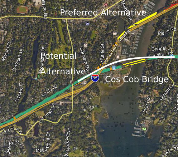
Cos Cob Bridge
The Cos Cob Bridge restricts the trains, in multiple ways. As a movable bridge, it is unpowered: trains on it do not get electric power, but must instead coast; regular Metro-North riders are familiar with the sight of train lights, air conditioning, and electric sockets briefly going out when the train is on the bridge. It is also old enough that the structure itself requires trains to go more slowly, 80 km/h in an otherwise 110 km/h zone.
Because of the bridge’s age and condition, it is a high priority for replacement. One cost estimate says that replacing the bridge would cost $800 million. The Regional Plan Association estimates the cost of replacing both this bridge and the Devon Bridge, at the boundary between Fairfield and New Haven Counties, at $1.8 billion. The new span would be a higher bridge, fully powered, without any speed limit except associated with curves; Cos Cob station has to be rebuilt as well, as it is directly on the approaches, and it may be possible to save money there (Metro-North station construction costs are very high—West Haven was $105 million, whereas Boston has built infill stations for costs in the teens).
In any high-speed rail program, the curves could be eased as well. There are two short, sharp curves next to the bridge, one just west to the Cos Cob station and the other between the bridge and Riverside. The replaced bridge would need long approaches for the deck to clear the Mianus River with enough room for boats to navigate, and it should not cost any more in engineering and construction to replace the two short curves with one long, much wider curve. There is scant information about the proposed clearance below and the grades leading up to the bridge, but both high-speed trains and the high-powered electric commuter trains used by Metro-North can climb steep grades, up to 3.5-4%, limiting the length of the approaches to about 400 meters on each side. This is the alternative depicted as the potential alternative below; the Cos Cob Bridge is the legacy bridge, and the preferred alignment is a different bypass (see below for the Riverside-Stamford segment):
The color coding is the same as before, but yellow means major bridge. White is my own drawing of an alternative.
The radius of the curve would be 1,700 meters. A tilting train could go at 235 km/h. Commuter rail would benefit from increased speed as well: express trains could run at their maximum speed, currently 160 km/h, continuing almost all the way east to Stamford. The cost of this in terms of impact is the townhouses just north of the Cos Cob station: the viaduct would move slightly north, and encroach on some, possibly all, of the ten buildings. Otherwise, the area immediately to the north of the station is a parking lot.
The longer, wider curve alternative can be widened even further. In that case, there would be more impact on the approaches, but less near the bridge itself, which would be much closer in location to the current bridge and station. This option may prove useful if one alignment for the wider curve turns out to be infeasible due to either unacceptable impact to historic buildings or engineering difficulties. The curve radius of this alternative rises to about 3,000 meters, at which point the speed limit is imposed entirely by neighboring curves in Greenwich and Stamford; trains could go 310 km/h on a 3,000-meter curve, but they wouldn’t have room to accelerate to that speed from Greenwich’s 225 km/h.
Riverside-Stamford
Between the Mianus River and Stamford, there are two possible alignments. The first is the legacy alignment; the second is a bypass alongside I-95, which would involve a new crossing of the Mianus River as well. The NEC Future alignment appears to prefer the I-95 option:

The main benefit of the I-95 option is that it offers additional bypass tracks for the New Haven Line. Under this option, there is no need for intercity trains and express commuter trains to share tracks anywhere between Rye and Westport.
However, the legacy alignment has multiple other benefits. First, it has practically no additional impact. Faster trains would emit slightly more noise, but high-speed trains designed for 360 km/h are fairly quiet at 210. In contrast, the I-95 alignment requires a bridge over the Greenwich Water Club, some residential takings in Cos Cob, and possibly a few commercial takings in Riverside.
Second, it is cheaper. There would need to be some track reconstruction, but no new right-of-way formation, and, most importantly, no new crossing of the Mianus River. The Cos Cob Bridge is in such poor shape that a replacement is most likely necessary even if intercity trains bypass it. The extra cost of the additional aerials, berms, and grade separations in Riverside is perhaps $150-200 million, and that of the second Mianus River crossing would run into many hundreds of millions. This also means somewhat more visual impact, because there would be two bridges over the river rather than just one, and because in parts of Riverside the aerials would be at a higher level than the freeway, which is sunken under the three westernmost overpasses
In either case, one additional investment in Stamford is likely necessary, benefiting both intercity and commuter rail travelers: grade-separating the junction between the New Canaan Branch and the mainline. Without at-grade conflicts between opposing trains on the mainline and the New Canaan Branch, scheduling would be simpler, and trains to and from New Canaan would not need to use the slow interlocking at Stamford station.
The existing route into Stamford already has the potential to be fast. The curves between the Mianus and Stamford station are gentle, and even the S-curve on the approach to Stamford looks like a kilometer in radius, good enough for 180 km/h on a tilting train with proper superelevation.
Stamford-Darien
Between New York and Stamford, the required infrastructure investments for high-speed rail are tame. Everything together except the Mianus crossing should be doable, based on FRA cost items, on a low 9-figure budget.
East of Stamford, the situation is completely different. There are sharp curves periodically, and several in Darien and Norwalk are too tight for high-speed trains. What’s more, I-95 is only available as a straight alternative right-of-way in Norwalk. In Darien, and in Stamford east of the station, there is no easy solution. Everything requires balancing cost, speed, and construction impact.
The one saving grace is that there is much less commuter rail traffic here than between New York and Stamford. With bypasses from Stamford until past Norwalk, only a small number of peak express Metro-North trains east of Greens Farms would ever need to share tracks with intercity trains. Thus the scheduling is at least no longer a problem.
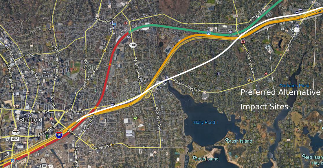
The official plan from NEC Future is to hew to I-95, with all of its curves, and compromise on speed. The curve radius appears to be about 700-750 meters through Stamford and most of Darien, good for about 95 mph over a stretch of 5.5 miles. This is a compromise meant to limit the extent of takings, at the cost of imposing one of the lowest speed limits outside major cities. While the official plan is feasible to construct, the sharp curves suggest that if Amtrak builds high-speed rail in this region, it will attempt a speedup, even at relatively high cost.
There is a possible speedup, involving a minimum curve radius of about 1,700-2,000 meters, good for 235-255 km/h. This would save 70-90 seconds, at similar construction cost to the preferred alignment. The drawback is that it would massively impact Darien, especially Noroton. It would involve carving a new route through Noroton for about a mile. In Stamford, it would require taking an office building or two, depending on precise alignment; in Noroton, the takings would amount to between 55 and 80 houses. The faster option, with 2,000-meter curves, does not necessarily require taking more houses in Noroton: the most difficult curves are farther east. In the picture, this speedup is in white, the preferred alternative is in orange, and the legacy line in teal:

Fortunately, east of Norton Avenue, there is not much commercial and almost no residential development immediately to the north of I-95, making things easier:

The preferred alignment stays to the south of the Turnpike. This is the residential side; even with tight curves, some residential takings are unavoidable, about 20 houses. Going north of I-95 instead requires a few commercial takings, including some auto shops, and one or two small office buildings east of Old Kings Highway, depending on curve radius. Construction costs here are slightly higher, because easing one curve would require elevated construction above I-95, as in one of the Greenwich options above, but this is probably a matter of a few tens of millions of dollars.
The main impact, beyond land acquisition cost, is splitting Noroton in half, at least for pedestrians and cyclists (drivers could drive in underpasses just as they do under highways). Conversely, the area would be close enough to Stamford, with its fast trains to New York, that it may become more desirable. This is especially true for takings within Stamford. However, Darien might benefit as well, near Noroton Heights and Darien stations, where people could take a train to Stamford and change to a high-speed train to New York or other cities.
As in Greenwich, it is a political decision how much a minute of travel time is worth. Darien houses are expensive; at the median price in Noroton, 60-80 houses would be $70-90 million, plus some extra for the office buildings. Against this extra cost, plus possible negative impact on the rest of Noroton, are positive impacts coming from access, and a speedup of 70-90 seconds for all travelers from New York or Stamford to points north.
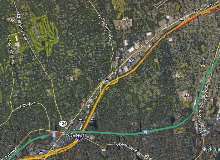
Norwalk-Greens Farms
In Norwalk, I-95 provides a straight right-of-way for trains. This is the high-speed rail racetrack: for about ten kilometers, until Greens Farms, it may be possible for trains to run at 270-290 km/h.
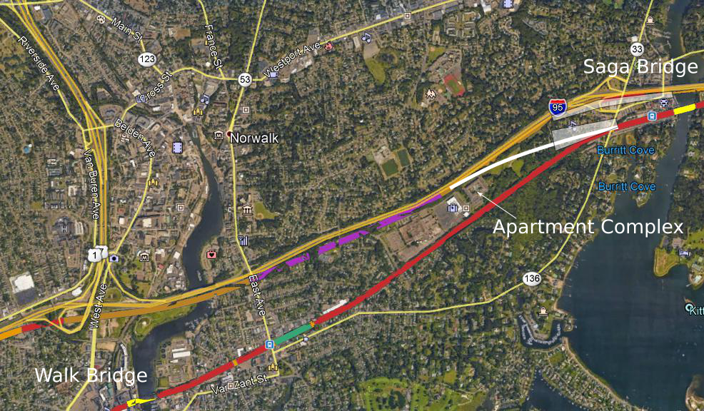
Here is a photo of Norwalk, with the Walk and Saga Bridges in yellow, a tunnel in the preferred alternative in purple, a possible different alignment in white, and impact zones highlighted:

Three question marks remain about the preferred alignment.
The first question is, which side of the Turnpike to use? The preferred alignment stays on the south side. This limits impact on the north side, which includes some retail where the Turnpike and U.S. 1 are closely parallel, near the Darien/Norwalk boundary; a north side option would have to take it. But the preferred alignment instead slices Oyster Shell Park. A third option is possible, transitioning from the north to the south side just east of the Norwalk River, preparing to rejoin the New Haven Line, which is to the south of I-95 here.
The second question is, why is the transition back to the New Haven Line so complex? The preferred alignment includes a tunnel in an area without any more impacted residences than nearby segments, including in Greenwich and Darien. It also includes a new Saga Bridge, bypassing Westport, with a new viaduct in Downtown Westport, taking some retail and about six houses. An alternative would be to leverage the upcoming Saga Bridge reconstruction, which the RPA plan mentions is relatively easy ($500 million for Saga plus Walk, on the Norwalk River, bypassed by any high-speed alignment), and transition to the legacy alignment somewhat to the west of Westport.
A complicating factor for transitioning west of Westport is that the optimal route, while empty eight years ago, has since gotten a new apartment complex with a few hundred units, marked on the map. Alternatives all involve impact to other places; the options are transitioning north of the complex, taking about twenty units in Westport south of the Turnpike and twenty in Norwalk just north of it.
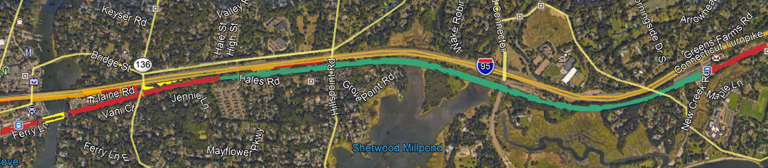
The third question, related to the second, is, why is Greens Farms so complicated? See photo below:

The area has a prominent S-curve, and some compromises on curve radius are needed. But the preferred alternative doesn’t seem to straighten it. Instead, it builds an interlocking there, with the bypass from Darien and points west. While that particular area has little impact (the preferred alignment transitions in the no man’s land between the New Haven Line and the Turnpike), the area is constrained and the interlocking would be expensive.
No matter what happens, the racetrack ends at Greens Farms. The existing curve seems to have a radius of about a kilometer or slightly more, good for about 190 km/h, and the best that can be done if it is straightened is 1,300-1,400 meters, good for about 200 km/h.
These questions may well have good answers. Unlike in Darien, where all options are bad, in Norwalk and Westport all options are at least understandable. But it’s useful to ask why go south of the Turnpike rather than north, and unless there is a clear-cut answer, both options should be studied in parallel.