Category: New York
Some Data on New York City Subway Ridership in the Covid-19 Crisis
The MTA has weekly data on ridership by train station, which it divides into fare data, i.e. data by what kind of fare it is (single-use, monthly, etc.), and turnstile data, i.e. data by what bank of turnstiles was used to enter the station. MTA chief communications officer Abbey Collins talked to me briefly when I was writing this New York Daily News op-ed, and told me that the turnstile data is less accurate, so I am using the fare data.
Here is the table I’m using, comparing ridership in mid-January and the fourth week of March. It’s not fully sanitized, so some stations appear twice, which reflects multiple major entrances, e.g. the Times Square and the Port Authority sides of a single complex with in-system transfers. The relevant column is column E, labeled ratio. The highest-ratio station is Alabama Avenue on the J/Z, which has kept 53.5% of its January ridership; the next proper subway station, Bay Parkway on the F, is just at 38.6%, and it goes down from there. Overall, the ratio is 14.1%.
The general pattern is that the Manhattan CBD stations got pummeled. Grand Central has kept 7.5% of its pre-crisis ridership, and the Times Square side of the Times Square-Port Authority complex has kept 7.2%. A couple of Midtown and Lower Manhattan stations, like Rockefeller Center, are at the 5% mark. Practically no non-CBD station is this low, but one notable exception is Bedford Avenue on the L, in the center of Williamsburg. A few additional notable areas are in the 8-10% area, including more stations in Williamsburg, stations in Downtown Brooklyn and South Brooklyn, most stations on Central Park West, and Columbia. It’s notable that Columbia is low even though it has a major hospital, but it’s even more of a university.
Despite the stereotype, much of the Upper West and East Sides are not in the single digits. The key express stations, like 86th on the 4/5/6 and 72nd and 96th on the 1/2/3, are around 13-14%. Harlem is much higher, especially the busiest Harlem stations, 125th Street on the A/B/C/D and on the 4/5/6, both express stops, which have maintained 19.5% and 27.2% of ridership, respectively. 168th Street on the 1/A/C in Washington Heights is at 23.8%.
In general, working-class and lower middle-class stations seem to have maintained the most ridership. Jamaica Center, a key bus connection point to much of Eastern Queens, is by far the busiest among the >30% stations, at 35.3%. Utica Avenue on the 3/4 in Crown Heights is at 28.7%, and 149th Street on the 4/5/6 in the South Bronx is at 29.2%. Bedford-Stuyvesant is all over the map – Nostrand Avenue on the A/C is at 17.5%, Utica Avenue on the A/C is at 21.7%, the two Flushing Avenue stations are at about 27%, the Broadway stations on the J/Z past Flushing are in the teens.
I give those descriptive statistics because it relates to the question of subway ridership and the Covid-19 crisis. The crisis has hit outer neighborhoods harder than inner ones and working-class neighborhoods harder than middle-class ones, but beyond that pattern there is not much correlation at the level of detail. Bed-Stuy and Central Harlem have low infection rates and have maintained much more of their subway ridership than the city average.
The patterns probably concern essential workers. There are essential workers in all social classes, but more in the working class – cleaners, transit workers, sanitation workers, nursing assistants. The middle class supplies doctors and registered nurses, but there are fewer of these on the list of essential workers than lower-income, lower-education workers. Thus, middle-class neighborhoods, like the Upper East and West Sides, Astoria, Williamsburg, Sunnyside, Forest Hills, and Bay Ridge have below-average ratios, that is they’ve kept less of their ridership than the rest of the city.
One final pattern, or rather non-pattern, is that I can’t really see the hospitals on the table. The stations on the 2/5 closest to the Kings County Hospital, Winthrop Street and Church Avenue, are at 22.4% and 22.8% respectively, not too different from the rest of the Nostrand Avenue Line. The two Flushing Avenue stations have similar ratios, even though one is on top of Woodnull Medical Center and the other isn’t. 96th and 103rd Streets on the 6, the closest to Mount Sinai, have similar ratios to 110th and 116th farther up in East Harlem.
Speed Zones on Railroads
I refined my train performance calculator to automatically compute trip times from speed zones. Open it in Python 3 IDLE and play with the functions for speed zones – so far it can’t input stations, only speed zones on running track, with stations assumed at the beginning and end of the line.
I’ve applied this to a Northeast Corridor alignment between New York and Boston. The technical trip times based on the code and the alignment I drew are 0:36:21 New York-New Haven, 0:34:17 New Haven-Providence, 0:20:40 Providence-Boston; with 1-minute dwell times, this is 1:33 New York-Boston, rising to maybe 1:40 with schedule contingency. This is noticeably longer than I got in previous attempts to draw alignments, where I had around 1:28 without pad or 1:35 with; the difference is mainly in New York State, where I am less aggressive about rebuilding entire curves than I was before.
I’m not uploading this alignment yet because I want to fiddle with some 10 meter-scale questions. The most difficult part of this is between New Rochelle and New Haven. Demolitions of high-price residential properties are unavoidable, especially in Darien, where there is no alternative to carving a new right-of-way through Noroton Heights.
The importance of speeding up the slowest segments
The above trip times are computed based on the assumption that trains depart Penn Station at 60 km/h as they go through the interlocking, and then speed up to 160 km/h across the East River, using the aerodynamic noses designed for 360 km/h to achieve medium speed through tunnels with very little free air. This require redoing the switches at the interlocking; this is fine, switches in the United States are literally 19th-century technology, and upgrading them to Germany’s 1925 technology would create extra speed on the slowest segment.
Another important place to speed up is Shell Interlocking. The current version of the alignment shaves it completely, demolishing some low-rise commercial property in the process, to allow for 220 km/h speeds through the city. Grade separation is obligatory – the interlocking today is at-grade, which imposes unreasonable dependency between northbound and southbound schedules on a busy commuter railroad (about 20 Metro-North trains per hour in the peak direction).
In general, bypasses west of New Haven prioritize the slowest segments of the Northeast Corridor: the curves around the New York/Connecticut state line, Darien, Bridgeport. East of New Haven the entire line should be bypassed until Kingston, even the somewhat less curvy segment between East Haven and Old Saybrook, just because it’s a relatively easy segment where the railroad can mostly twin with I-95 and not have any complex viaducts.
The maximum speed is set at 360 km/h, but even though trains can cruise at such speed on two segments totaling 130 km, the difference in trip time with 300 km/h is only about 3 minutes. Similarly, in southwestern Connecticut, the maximum speed on parts of the line, mostly bypasses, is 250 km/h, and if trains could run at 280 km/h on those segments, which isn’t even always possible given curvature, it would save just 1 minute. The big savings come from turning a 10 miles per hour interlocking into a modern 60 km/h (or, ideally, 90+ km/h) one, eliminating the blanket 120 km/h speed limit between the NY/CT state line and New Haven, and speeding up throats around intermediate stations.
Curve easements
Bypasses are easier to draw than curve modifications. Curves on the Northeast Corridor don’t always have consistent radii – for example, the curves flanking Pawtucket look like they have radius 600 meters, but no, they have a few radii of which the tightest are about 400 meters, constraining speed further. Modifying such curves mostly within right-of-way should be a priority.
Going outside the right-of-way is also plausible, at a few locations. The area just west of Green’s Farms is a good candidate; so is Boston Switch, a tight curve somewhat northeast of Pawtucket whose inside is mostly water. A few more speculative places could get some noticeable trip time improvements, especially in the Bronx, but the benefit-cost ratio is unlikely to be good.
Bush consulting on takings
In some situations, there’s a choice of which route to take – for example, which side of I-95 to go on east of New Haven (my alignment mostly stays on the north side). Some right-of-way deviations from I-95 offer additional choice about what to demolish in the way.
In that case, it’s useful to look for less valuable commercial properties, and try to avoid extensive residential takings if it’s possible (and often it isn’t). This leads to some bush consulting estimates of how valuable a strip mall or hotel or bank branch is. It’s especially valuable when there are many options, because then it’s harder for one holdout to demand unreasonable compensation or make political threats – the railroad can go around them and pay slightly more for an easier takings process.
How fast should trains run?
Swiss planners run trains as fast as necessary, not as fast as possible. This plan does the opposite, first in order to establish a baseline for what can be done on a significant but not insane budget, and second because the expected frequency is high enough that hourly knots are not really feasible.
At most, some local high-speed trains could be designated as knot trains, reaching major stations on the hour or half-hour for regional train connections to inland cities. For example, such a local train could do New York-Boston in 2 hours rather than 1:40, with such additional stops as New Rochelle, Stamford, New London (at I-95, slightly north of the current stop), and Route 128 or Back Bay.
But for the most part, the regional rail connections are minor. New York and Boston are both huge cities, so a train that connects them in 1:40 is mostly an end-to-end train, beefed up by onward connections to Philadelphia, Baltimore, and Washington. Intermediate stops at New Haven and Providence supply some ridership too, much more so than any outlying regional connections like Danbury and Westerly, first because those outlying regional connections are much smaller towns and second much of the trip to those towns is at low speed so the trip time is not as convenient as on an all-high-speed route.
This does not mean Swiss planning maxims can be abandoned. Internal traffic in New England, or in Pennsylvania and South Jersey, or other such regions outside the immediate suburbs of big cities, must hew to these principles. Even big-city regional trains often have tails where half-hourly frequency is all that is justified. However, the high-speed line between Boston and New York (and Washington) specifically should run fast and rely on trips between the big cities to fill trains.
How much does it cost?
My estimate remains unchanged – maybe $7 billion in infrastructure costs, closer to $9-10 billion with rolling stock. Only one tunnel is included, under Bridgeport; everywhere else I’ve made an effort to use viaducts and commercial takings to avoid tunneling to limit costs. The 120 km of greenfield track between New Haven and Kingston include three major viaducts, crossing the Quinnipiac, Connecticut, and Thames; otherwise there are barely any environmentally or topographically sensitive areas and not many areas with delicate balance of eminent domain versus civil infrastructure.
I repeat, in case it is somehow unclear: for $7 billion in infrastructure investment, maybe $8 billion in year-of-expenditure dollars deflated to the early 2020s rather than early 2010s, trains could connect New York and Boston in 1:40. A similar project producing similar trip times between New York and Washington should cost less, my guess is around $3 billion, consisting mostly of resurrecting the old two-track B&P replacement in lieu of the current scope creep hell, building a few at-grade bypasses in Delaware and Maryland, and replacing the variable-tension catenary with constant-tension catenary.
None of this has to be expensive. Other parts of the world profitably build high-speed rail between cities of which the largest is about the size of Boston or Philadelphia rather than the smallest; Sweden is seriously thinking about high-speed trains between cities all of which combined still have fewer people than metropolitan Boston. Better things are possible, on a budget, and not just in theory – it’s demonstrated every few years when a new high-speed rail line opens in a medium-size European or Asian country.
The Subway is Probably not Why New York is a Disaster Zone
New York is the capital of the coronavirus pandemic, with around 110,000 confirmed cases and 10,000 confirmed deaths citywide, and perhaps the same number across its suburbs. There must be many reasons why this is so; one possibility that people have raised is infection from crowded subways, so far without much evidence. Two days ago, MIT economist Jeffrey Harris wrote a paper claiming that the subways did in fact seed the Covid-19 epidemic in New York, but the paper cites no evidence. Sadly, some people have been citing the paper as a serious argument, which it isn’t; the purpose of this post is to explain what is wrong with the paper.
New York and other subways
In multiple other countries, one cannot see the transit cities in the virus infection rates. In Germany the rates in the largest cities are collectively the same as in the rest of the country. In South Korea, the infection is centered on Daegu; Seoul’s density and high transit usage are compatible with an infection rate of about 700 in a city of 9.5 million, about 1.5 orders of magnitude less per capita than in most Western countries and 2.5 orders of magnitude less than in New York. In Taipei, the MRT remains crowded, with weekday ridership in February and March down by 15-16%. In Italy, car usage is high outside a handful of very large cities like Milan, and Milan’s infection rate isn’t high by the standards of the rest of Lombardy.
However, rest-of-world evidence does not mean that the New York City Subway is safe. The Taipei MRT has mandatory mask usage and very frequent cleaning. German U- and S-Bahn networks are a lot dirtier than anything I’ve seen in Asia, but much cleaner than anything I’ve seen in New York, and also have much less peak crowding than New York. New York uniquely has turnstiles requiring pushing with one’s hands or bodies, and the only other city I know of with such fare barriers is Paris, whose infection rates are far below New York’s but still high by French standards.
So the question is not whether rapid transit systems are inherently unsafe for riders, which they are not. It’s whether New York, with all of its repeated failings killing tens of workers from exposure to the virus, has an unsafe rapid transit system. Nonetheless, the answer appears to be negative: no evidence exists that the subway is leading to higher infection rates, and the paper does not introduce any.
What’s in the paper?
A lot of rhetoric and a lot of lampshade hanging about the lack of natural experiments.
But when it comes to hard evidence, the paper makes two quantitative claims. The first is in figure 3: Manhattan had both the least increase in infections in the 3/13-4/7 period, equivalent to a doubling period of 20 days whereas the other boroughs ranged between 9.5 and 14, and also the largest decrease in subway entries in the 3/2-16 period, 65% whereas the other boroughs ranged between 33% and 56%.
The second is a series of maps showing per capita infection levels by zip code, similar to the one here. The paper also overlays a partial subway map and asserts that the map shows that there is correlation of infection rates along specific subway routes, for example the 7, as people spread the disease along the line.
I will address the second claim first, regarding line-level analysis, and then the first, regarding the borough-level difference-in-differences analysis; neither is even remotely correct.
Can you see the subway on an infection map?
Here is a static version of the infection map by zip code:
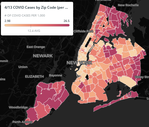
This is cases for 1,000 people – note that my post about Germany looks at rates per 10,000 people, so the range in New York is consistently about an order of magnitude worse than in Germany. The map shows high rates in Eastern Queens, the North Bronx, and Staten Island, hardly places with high public transportation ridership. The rates in Manhattan and the inner parts of Brooklyn are on the low side.
There are no ribbons of red matching any subway line – there are clumps and clusters, as in Southern Brooklyn in Orthodox Jewish neighborhoods, and in Central Queens around Corona and East Elmhurst. There is imperfect but noticeable correlation with income – working-class areas have higher infection rates, perhaps because they have higher rates at which people are required to still show up to work, where they can be infected. East Asian neighborhoods have lower rates, like Flushing and environs, or to some extent Sunset Park; Asians are infected at noticeably lower rates than others in New York and perhaps in the rest of the Western world, perhaps because they took news in China more seriously, began practicing social distancing earlier, and wear masks at higher rates. There are many correlates, none of which looks like it has anything to do with using the public transportation network.
What’s more, the paper is not making any quantitative argument why the graph shows correlation with subway usage. It shows the graph with some lines depicted, often misnamed, for example the Queens Boulevard Line is called Sixth Avenue Local, leading to a discussion about higher infection rates on local trains than on express trains where in fact the F runs express in Queens. But it does not engage in any analysis of rates of subway usage or changes therein, or in infection rates. The reader is supposed to eyeball the graph and immediately agree with the author’s conclusion, where there is no reason to do so.
Manhattan confounders
The claim about Manhattan is the only real quantitative claim in the paper. Unlike the zip code analysis, the borough analysis does make some statistical argument: Manhattan had larger reduction in subway usage than the rest of the city and also a slower infection rate. However, this argument relies on an N of 2. Among the other boroughs, there is no such correlation. The argument is then purely about Manhattan vs. the rest of the city. This is incorrect for so many reasons:
- Manhattan is the highest-income borough, with many people who can work from home. If they’re not getting infected, it could be from not commuting as much, but just as well from not getting the virus at work as much.
- The Manhattan subway stops are often job centers, so the decline in ridership there reflects a citywide decline. A Manhattanite who stops taking the subway is seen as two fewer turnstile entries in Manhattan, whereas a New Yorker from the rest of the city who does the same is likely to be seen as one fewer Outer Borough entry and one fewer Manhattan entry.
- Many Manhattanites left the city to shelter elsewhere, as seen in trash collection data.
- Manhattan’s per capita subway usage is probably higher than that of the rest of the city counting discretionary trips, so 65% off the usual ridership in Manhattan may still be higher per capita than 56% off in Brooklyn or 47% in Queens. (But this is false on the level of commuting, where Manhattan, the Bronx, and Brooklyn all have 60% mode share.)
Does the paper have any value?
No.
I have heard people on Twitter claim that correlation is not causation. This argument is too generous to the paper, which has not shown any correlation at all, since the only quantitative point it makes has an N of 2 and plenty of confounders.
For comparison, my analysis of metro construction costs has an effective N of about 40, since different subway projects in the same country tend to have similar costs with few exceptions (such as New York’s extreme-even-for-America costs), and I consider 40 to be low enough that Eric Goldwyn and I must use qualitative methods and delve deep into several case studies before we can confidently draw conclusions. The paper instead draws strong conclusions, even including detailed ones like the point the paper tries to make about local trains being more dangerous than express trains, from an N of 2; it’s irresponsible.
But what about the workers?
A large and growing number of New York City Transit workers have succumbed to the virus. The current count is close to the citywide death toll, but transportation workers are by definition all healthy enough to be working, whereas citywide (and worldwide) the dead are disproportionately old or have comorbidities like heart disease. Echoing the union’s demands for better protection, Andy Byford had unkind words to say about Governor Andrew Cuomo’s appointees in charge of the system, MTA chair Pat Foye and acting NYCT chair Sarah Feinberg.
However, this is not the same as infection among passengers. The dead include workers who are in close proximity to passengers on crowded vehicles, such as bus drivers, but also ones who are not, such as train operators, maintenance workers, and cleaners. Train cleaners have to remove contaminated trash from the platforms and vehicles without any protective equipment; NYCT not only didn’t supply workers with protective equipment, but also prohibited them from wearing masks on the job even if they’d procured them privately. Contamination at work is not the same as contamination during travel.
So, should people avoid public transportation in New York?
Absolutely not.
If the best attempt to provide evidence that riding the subway is a health hazard in a pandemic is this paper, then that by itself is evidence that there is no health hazard. This is true even given New York City Transit’s current level of dirt, though perhaps not given its pre-crisis peak crowding level. Social distancing is reducing overall travel and this is good, not necessarily because travel is hazardous, but mostly because the destination is often a crowded place with plenty of opportunity for person-to-person infection.
In preparation for going back to normal, the current level of cleanliness is not acceptable. The state should make sure people have access to masks, even if they’re ordinary ones rather than N95 ones, and mandate their usage in crowded places including the subway once they are available. It should invest far more in cleaning public spaces, including the subway, to the highest standards seen in the rich countries of Asia. It should certainly do much more to protect the workers, who face more serious hazards than the riders. But it should not discourage people who are traveling from doing so by train.
New York is Shrinking
The US Census Bureau has just released 2019 population estimates by county. Metro New York, after slowly rising for decades more than making up the 1970s losses, went down by 60,000 people, or 0.3% of the population. The city is down 53,000 people.
Why?
The city chooses stagnation and ignorance. In the 1970s, the city was losing an average of 80,000 people per year, but the situation now is profoundly different. Incomes are up: the metro area’s per capita income as a proportion of the US average went from 126% in 1970 to 118% in 1980; but more recently it went from 135% in 2010-5 to 141% in 2018, the last year for which the BEA has data. Crime is down, the murder rate falling below the national average starting in 2013. Rent is up, sending a strong signal: more people want to live here.
But the entire political constellation of the city chooses not to grow. Housing growth is anemic, permits averaging around 21,000 per year in 2010-9, maybe 2.6 per 1,000 New York residents. It accelerated over the decade but not by much, reaching 26,500 in 2019, or 3.2/1,000. In the in-state suburbs, growth is even lower, less than 1 unit per 1,000 in each of Nassau, Suffolk, and Westchester Counties. New Jersey has somewhat higher growth rate, around 4/1,000, thanks to the Mount Laurel doctrine requiring high-cost municipalities to approve some affordable housing, which they typically do in the most out-of-the-way place they can find. The metro area overall approves about the same amount of housing as the city proper, around 2.5/1,000.
The most recent data I have for Korea is from the first half of 2019. In six months, Seoul, a shrinking city of 9.5 million, approved 38,000 dwellings, and the metro area writ large approved 129,000 on a population of about 26 million, an annualized rate of 10/1,000 (less in the city, more in the suburbs). This is a suburbanizing region, but suburbanization often means moving to a planned new town built on top of a subway or commuter rail line, like Ilsan, Bundang, and Anyang.
It’s not Tokyo that has high housing growth. It’s Tokyo, and Seoul, and to a lesser extent the metro area of Taipei (more suburbs than city proper), and Paris. In the presence of a strong economy and a state that doesn’t choose stagnation the way rich American regions choose with local empowerment, housing growth in a large city should be high, as more people want to move there to take advantage of its higher incomes and opportunities.
But New York chose differently. It chose stagnation and eventually decline. It chose to be expensive.
Why are they like this?
The US has an unusual system of governance, in which not only is there a separation of federal and state governments, as in Germany or Canada or Australia or Switzerland, but also the states delegate unusual powers to local governments. Education, policing, and housing are largely local responsibilities. Even when states do get involved, there is usually no partisan competition (most states are safe), leading to empowerment of local representatives on what are considered local issues, and even when there is people vote based on national issues.
But even that raises questions. For example, why do locals consider new development bad? Even YIMBY activists let NIMBYs whip them into thinking this way – they talk about sharing the burden, as if new buildings and new people are a burden that everyone must endure for some grand moral reason.
What if the reason people take it for granted that growth is bad is that the people who are most locally empowered are a specific anti-growth lobby? People who work for a living don’t have time to go to a citizen engagement meeting at 3 in the afternoon. They work and socialize with people from other neighborhoods, so they have little interest in neighborhood rags that report individual counts of parking spaces lost to a bus lane. They are far more interested in job growth than in hobby community gardens. A political system that requires very high levels of local social capital for one’s opinions to count will naturally undervalue their opinions and overvalue those of idle people and professional intermediaries.
The high levels of Covid-19 infection in New York are part of this system. The specific cause is not hyperlocalism, but rather the murky authority of the state. The city is plagued by the feud between Mayor de Blasio and Governor Cuomo. Both enjoy unlimited executive power, I think Cuomo more so than de Blasio. Both need it for their higher political aspirations. But neither can have it while the other exists as an independent political entity, nor is there a clear delineation of state and local authority. Thus, they are obligated to sabotage each other’s ideas, to the detriment of the city that has the misfortune to be governed by them. The entire West delayed its reaction to the virus, but New York especially so, as Cuomo and de Blasio tried denying each other credit.
Professional ignorance
I’ve been writing a lot about the role of incuriosity in high construction costs in the English-speaking world in general, and New York in particular – see for example this recent coronavirus-tainted piece, or this more random piece about Metro-North’s executives’ ignorance.
But this can apply more generally, as it did to the virus. Americans are quite provincial when it comes to the rest of the world, and New Yorkers especially so – go ahead, try telling a New Yorker that some other city does something better than New York. The out-of-town comparison, a powerful tool that places that view themselves as more peripheral (like Israel) use to correct errors, dos not work in a place like New York. New York literally made the collective decision to die and not to learn from the rest of the world. Mass death is not making New Yorkers demand the immediate removal of their mass manslaughterers who are their governor and mayor; why would a dip in population?
Part of it is related to local empowerment. Acquiring local social capital comes at the expense of worldliness; those years one spends learning foreign languages, living abroad, and socializing with foreigners are dead years for most political ambitions, including all ambitions that start locally.
But an even greater part of it is that New York self-perceives as the center of the world, which is not true elsewhere. Korea self-flagellates all the time: about its legal system (it adopted a limited jury system in 2009), about its engineering (see e.g. here), about its elevated air pollution levels (it’s adopting EU standards). The United States instead views all variations with the rest of the world as evidence of America’s unique greatness, and New York does the same both internationally and domestically. The city brims with immigrants, and yet it tells them, your home country is deficient and you must become a real New Yorker, that is someone whose world does not extend past city limits, to be a whole person. Until that changes, the government of New York will remain managed by dregs and incompetents and housing, transportation, and as we see health care will earn the mockery of other big first-world cities.
This is not World War Two
Entrenched hierarchies do not like outside criticism, especially when it’s right. They fight off knowledge that they don’t have or can’t control. In a business setting, the main way out is to found a competing company and drive the one that won’t change out of business. But when it’s not possible, the way out involves a massive crisis – something like a total war, in which people can rapidly rise through the ranks through demonstrating success in battle.
I bring this up because the coronavirus crisis in not such a total war. Branko Milanovic compares it with World War Two, contrasting economists who view it purely as an economic crisis akin to the 2008 crisis or the Depression. That comparison is apt when it comes to looking at non-economic aspects of it, namely the need to centrally plan a public health response. But the scale of the crisis is much smaller, it seems. The rich countries of Asia are emerging only somewhat battered, and even in the West some places seem to be over the hump judging by growth rates in the last few days, especially the Nordic countries but possibly also France. This isn’t the next Spanish Flu, a crisis so big that it would force Westerners to reckon with the fact that the West needs to learn from other places. Even in the United States, where things look worse, the solipsistic population looks for internal comparisons (e.g. between blue and red states) more than international ones, let alone international ones with Asia.
A small crisis is not going to nudge the hierarchy in a more open direction. I see this often in public transportation – institutions that feel embattled respond by entrenching and refusing any reform. The standard excuse is “we’re too busy fighting fires,” often by people that fires seem to erupt around regularly. The virus seems to have the same effect so far – less openness, less sanity checking proposals by looking at what works elsewhere, more digging in around traditional social hierarchies.
American nationalists are saber-rattling with the Chinese government, as in the “Chinese virus” dysphemism and Tom Cotton’s blaming the entire death toll on the PRC. But they still do this on the usual American terms, that is without any assurance that Taiwan is a success story to learn from, or even South Korea and Japan, two American allies that unlike Taiwan the US formally recognizes. If a virus that demonstrates to starkly that Taiwan governs itself better than the PRC won’t get American nationalists to start speaking favorably of Taiwan, what will? To people like Cotton, a crisis is a perfect time to proclaim American superiority, no matter what reality is.
Domestically, too, the American response seems to be to repeat old wives’ tales – for example, traditional American hostility to big cities. Governor Andrew Cuomo went as far as saying that New York is too dense; Seoul, a bigger and denser city, has 700 infections as of 2020-3-22 out of a metro population of 26 million, maybe a factor of 20 better than New York. But he’s the governor and he keeps giving speeches and appearing on television, and a few hundred and even a few thousand dead New Yorkers is not enough to make people ask questions about his and Mayor Bill de Blasio’s squabbling. After all, when nearly 3,000 New Yorkers died on 9/11, few asked why Mayor Rudy Giuliani had put the city’s anti-terrorism response center at World Trade Center against the advice of security experts who pointed out the Twin Towers were a likely target; 9/11’s effect on Giuliani’s popularity was an unmixed blessing.
In an environment in which more national pundits say Cuomo is looking presidential than say he should resign in disgrace, it’s unlikely the crisis will lead Americans in a more open direction. The magnitude of the crisis isn’t enough to create a new crop of leaders. It’s a good thing in the sense that the death toll will not be apocalyptic, but it just underscores what I mean when I say this isn’t World War Two.
Budget-cutting administrations, demanding reform before revenue, have not produced any reform. American state building stalled in the middle of the 20th century when various white middle-class interests realized localism could protect them from too much racial and economic equality. Then around the 1980s and 90s it went into reverse, with a continued assault on state capacity through public-private partnerships, outsourcing planning to consultants, and impositions of managers whose experience was in the private sector in unrelated industries. American construction costs were already high beforehand, but in Canada and Singapore, both of which seem to have had the same trend, costs exploded in the 2000s and 2010s.
The question remains: how come the reform-before-revenue mentality never produced any reform?
I bring this up because I believe the answer is the same as what we are seeing right now with the response to the coronavirus crisis. Budget-cutting or timid politicians are not an existential crisis to the civil service. They can scare off ambitious people the way Cuomo ran Andy Byford out of New York City Transit leadership; they can create a hostile work environment; they can force managers to contend with scarcity; they can force the unions to agree to wage reductions for entering workers. But they do not have the power to close entire departments, to stop running schools or public transportation or firefighting entirely, and the managers and workers both know this.
Just as the Covid-19 crisis is not World War Two, all attempts at privatizing the state in the Anglosphere have amounted to much less than a total war of extermination. It’s a cold war. Like the original Cold War, it has the same stupefying effect as a hot war – hierarchs are all too happy to be unaccountable to the broad public and to pretend their cloak-and-dagger politics achieve any results. Unlike a hot war, it is too low-intensity for people who disagree with the hierarchy but are right to demonstrate competence – nor is the other side going to be destroyed at the end.
The construction cost crisis in the United States, particularly New York, might actually be a big enough crisis to have the same effect on the established order as a total war. It’s unclear, but before the virus came to the United States, there was a lot of genuine interest in making things better, though not in every city.
I suspect the mechanism for costs is that they are so high that there must be a significant enough reduction to make a career without screwing some politically necessary constituency. I don’t know; I don’t yet know the drivers of high New York costs in sufficient detail. But the magnitude and breadth of the problem point to many different explanations each increasing costs by a significant but not apocalyptic amount. Moreover, the fact that there must be many causes seems to be accepted in the local political ecosystem. Thus, people can afford to make reforms, perhaps focusing on the politically low-hanging fruits.
This is less cynical than it may sound. A small success story, such as if Ned Lamont had figured out a way to build 30-30-30 or if the MTA manages to noticeably reduce the cost of some project, creates a visible trail of success, creating more pressure to keep the reforms. Nothing succeeds like success.
A New York that can build subways even at $300 million per kilometer, let alone $100 million per kilometer, and builds housing at a pace befitting a rich global city with considerable immigration, is a completely different place from the failed city that it is today. That New York is a dynamic, rapidly growing city in which there is far more kvetching about how it’s sucking in jobs and people from more static places than kvetching about how it’s exporting jobs and people to cheaper places. I’m using analogy here because low costs by themselves do not protect a city from disease (Italy and Switzerland both have low costs and high coronavirus infection levels), but the same kind of public-sector resurgence can presumably be done for public health, ensuring New York will respond to the next pandemic like Seoul or Tokyo or Taipei.
Empire State High- and Low-Speed Rail
If Swiss planners were hired to design an intercity rail network for New York State, they might propose something that looks like this:

The trip times depicted on the map are a few minutes longer than intended, especially next to a terminus station like Niagara Falls, Watertown, and Ithaca. The depicted times are inclusive of turnaround time: the 45-minute Buffalo-Niagara Falls line is intended to take around 35 minutes in actual service, with 10-minute turnarounds.
Swiss planning is based on hourly and half-hourly timetables repeating all day on a clockface pattern: if a train leaves your station at 8:24 am, a train will leave your station at xx:24 all day, and if the line runs every half hour then also at xx:54. Moreover, at major nodes, trains are timetabled to arrive a few minutes before the hour and depart a few minutes after, letting passengers connect between different trains with minimal wait. To minimize transfer time and turn time, trains run as fast as necessary – that is, the state invests in higher-speed lines to ensure connections between major cities take a few minutes less than an hour. The Bahn 2000 program set up connections between Zurich, Basel, and Bern taking just less than an hour, with a few further connections elsewhere taking just less than an integer number of half-hours; the Bahn 2030 program aims to do the same with more cities all over the country.
The above map is an adaptation of the concept to New York State. I hope the explanation of how to adapt Switzerland to New York will be of interest to rail advocates elsewhere – the differences between the two geographies matter elsewhere, for example in Germany, France, or Sweden, or for that matter in California or New England.
High-speed rail
There is no high-speed rail in Switzerland, unless one counts the mixed passenger and freight rail tunnels through the Alps, which allow 250 km/h passenger trains. The Bahn 2030 planning calls for a 2-hour trip time between Zurich and Lugano, a distance of about 170 km, even with heavy tunneling under all significant mountains; with so much tunneling, 1.5-hour trips are easy and even 1-hour trips are feasible with a bypass around Zug. Clearly, even when higher speeds are allowed, Swiss planning sticks to low- and medium-speed rail, targeting an average speed of about 120 km/h.
This works for Switzerland, a small country in which even Geneva is only 2:45 from Zurich. In New York, it does not. At the speed of upgraded legacy rail, comparable to the Northeast Corridor, the links on the above map along the high-speed spine would take 2 hours each rather than an hour. New York-Buffalo trains would take 6 hours, too long for most travelers, and New York-Rochester would take 5 hours, which is marginal at best. Trains doing New York-Albany in 2 hours could get fairly popular, but even that is long enough that cutting it to just less than an hour is feasible.
Frequency
Trains are to run every half hour, with the exception of urban lines, namely Buffalo-Niagara Falls, Albany-Troy-Mechanicsville, and Utica-Rome, which run every 15 minutes. The reason for the half-hourly frequency is that all lines need it for either capacity or ridership. The lines either run to New York, which is so big it can easily fill a train every half hour and perhaps even every 15 minutes, or are quite short, so that running only every hour reduces ridership and it’s better to run shorter trains every 30 minutes.
With half-hourly timetables, a stub-end line can take an integer number of quarter-hours and not just half-hours. For example, Syracuse and Albany should have a pulse at :00 and :30 every hour. This in turn means that trains from Albany to Glens Falls can take 1:15, departing Albany just after :00 and :30, arriving at Glens Falls just before :15 and :45, turning back toward Albany just after :15 and :45, and then returning to Albany just before :00 and :30.
The only worry with quarter-hour trip times is that every cycle must sum up to an integer number of half-hours, not quarter-hours. Otherwise, some connections are broken, offset by 15 minutes. Thankfully, the only cycle on this map is New York-Albany-Syracuse-Binghamton-New York, which takes 7 hours.
Syracuse regional rail
Syracuse is depicted as having the most expansive regional rail network in the state, despite being the smallest of Upstate New York’s four major metropolitan areas. The reason is that the goal of the planned network is to provide intercity rather than local service. Rochester has some useful urban lines, for example to Freeport or northwest to the lakefront, but they are so short that they should run every 10 or 15 minutes and not every half hour. However, Rochester has no significant independent towns within an hour or so by rail, and thus there are no timed connections there. In contrast, Syracuse is located right between Watertown, Oswego, Auburn, and Cortland with its connection onward to Ithaca.
The Syracuse system is intended to be fully on the RegionalBahn side of the S-Bahn vs. RegionalBahn divide. The shared segment between Syracuse and the split between the lines to Oswego and Watertown is not meant to overlay to run frequent urban service. Instead, trains should tailgate, followed by a gap of nearly half an hour. Syracuse-bound trains may well call at Liverpool at :20 and :22, arriving at Syracuse at :25 and :27 to exchange passengers with other trains and then continue south, one of Oswego and Watertown paired with Cortland and Binghamton and the other terminating. If north-south S-Bahn service is desired, trains should be slotted in between the intercity trains.
New lines
The map depicts greenfield alignments for the high-speed line except on the approaches to New York and Toronto, and legacy alignments for the low-speed lines.
As in Switzerland, the low-speed lines do not necessarily slavishly adhere to legacy alignments. However, the deviations are not the same. Switzerland uses bypasses and tunnels to speed lines up. In New York, the main mechanisms to speed up lines are electrification, track renewal, and higher superelevation. Tunnels are too expensive for the population density of Upstate New York. I can see some bypasses, potentially getting Syracuse-Cortland and Cortland-Binghamton down to 30 minutes each, but none of the Upstate cities off the high-speed line is big enough to justify major civil works.
The one depicted bypass on a blue-colored line is the use of the Boonton Branch in New Jersey to offer an express bypass around the Morristown Line with its dense station spacing. This requires some additional tracks on busy urban regional lines as well as a short tunnel in Paterson, but New York is big enough that investing in faster service to Dover, Delaware Water Gap, and Scranton is worth it.
Upstate, the important deviations involve restoring old tracks, including between Cortland and Ithaca and within some town centers. Corning and Glens Falls both have disused rail alignments serving their centers better than the existing freight lines. But most importantly, Syracuse has an underused freeway running east-west through its center, which I am assuming replaced with a rail line. This is not a new idea – Syracuse is already removing a branch of the freeway, which should be used for a rail connection toward Binghamton, and even the mainline is a vestige of when midcentury planners thought Upstate cities would keep growing. The current Syracuse station is at an inconvenient location, making rail realignment a good use of the right-of-way.
Onward connections
New York State is much more integrated with its neighbors than Switzerland – it’s all the same country. There is extensive interstate travel, and rail planning must accommodate this. Forget the Deutschlandtakt – an Americatakt would be the most complex rail plan in a developed country out of sheer size. Thankfully, the connections depicted on the New York State plan accommodate interstate travel fairly well.
Going east, there are connections to Vermont, Massachusetts, and Connecticut. Albany-Boston can be done in around an hour, which makes for a half-hour takt connection between Albany and Springfield and 45 minutes minus turnaround between Springfield and Boston. Springfield-New Haven is 30 minutes by high-speed rail or 45 minutes by fast legacy rail, both with a stop at Hartford and few to no others; Springfield can then get its own small regional rail line toward Northampton (with some urban overlays for an S-Bahn) and Greenfield. Vermont can get a slow line to Rutland, and/or a fast line to Burlington continuing to Montreal; thence New York-Montreal and Boston-Toronto trains can be timed to connect at Albany, with New York-Toronto trains slotted in between, timed to connect only to the more frequent urban lines like Buffalo-Niagara Falls.
Going south, New York is separated from Pennsylvania by the northern reach of the Appalachians, called the Southern Tier in New York and the Northern Tier in Pennsylvania. This area had many coal mines in the 19th century and as a result has many legacy rail lines, but they are curvy and connect villages. But Scranton is a significant city on a nice line with Allentown and Philadelphia; unfortunately, the Philadelphia-Allentown line stretches via Reading and the Allentown-Scranton line is hilly and curvy, justifying some greenfield construction with some tunneling near the northern end.
Finally, going west, the I-90 route serves Erie and the Midwest. But this is a plausible high-speed rail connection toward Chicago, and so no low-speed interface is needed within the state. Erie could get a line to Youngstown and Pittsburgh, but it would be slower than connecting between high-speed trains in Cleveland; the largest city between Erie and Youngstown is Meadsville, population 13,000.
Costs
The cost of the high-speed spine is considerable, but if New York can keep it to the level of France (around $25 million/km), or even Germany (around $35 million/km), the benefits should exceed the costs. New York is huge, and even though nothing in Upstate New York is, the combined populations of Syracuse, Rochester, and Buffalo would add up to a big French or German city. And then there is Toronto at the other end, anchoring everything.
The low-speed lines should be quite cheap. Track renewal in Germany is around $1 million per single-track kilometer; at the frequency envisioned, all the low-speed lines can stay single-track with passing segments. Electrification is maybe $1.5 million per kilometer in Israel, despite a lawsuit that delayed the project by three years.
Is this feasible?
Technically, all of this is feasible. Good transit advocates in the Northeastern United States should push elected officials at the federal and state levels to quickly plan such a system and aim to begin construction early this decade. Bahn 2000 was supposed to take the 1990s to be built, but was delayed to 2004; this is a bigger program but can still happen by 2030 or so.
The trip times, frequencies, and coverage chosen for the map are deliberately conservative. It’s possible to squeeze higher speed at places, and add more branches to smaller towns, like Rochester-Niagara Falls or Buffalo-Jamestown. Bahn 2000 is followed up with Bahn 2030 or Bahn 2035, and likewise rail improvements can accrete in the United States. But as a starter system, this is a solid network connecting all large and nearly all small cities in New York State to one another with maximum convenience and minimum hassle. I hope state planners take heed and plan to invest soon.
Transfers from Infrequent to Frequent Vehicles
Imagine yourself taking a train somewhere, and imagine the train is big and infrequent. Let’s say it’s the commuter train from New York down the Northeast Corridor to Newark Airport, or perhaps a low-cost OuiGo TGV from Lyon to Paris. Now imagine that you change trains to a small, frequent train, like the AirTrain to Newark Airport, or the RER from the OuiGo stop in the suburbs to Paris itself. What do you think happens?
If your guess is “the train I’m connecting to will be overcrowded,” you are correct. Only a minority of a 200 meter long New Jersey Transit train’s ridership unloads at the Newark Airport station, but this minority is substantial enough to overwhelm the connection to the short AirTrain to the terminals. Normally, the AirTrain operates well below capacity. It uses driverless technology to run small vehicles every 3 minutes, which is more than enough for how many people connect between terminals or go to New York by train. But when a big train that runs every 20-30 minutes arrives, a quantity of passengers who would be easily accommodated if they arrived over 20 minutes all make their way to the monorail at once.
In Paris, the situation is similar, but the details differ. Until recently, OuiGo did not serve Paris at the usual terminal of Gare de Lyon but rather at an outlying station near Eurodisney, Marne-la-Vallée-Chessy, ostensibly to save money by avoiding the Gare de Lyon throat, in reality to immiserate passengers who don’t pay full TGV fare. There, passengers would connect from a 400-meter bilevel TGV on which the entire train ridership would get off to a 220-meter bilevel RER train running every 10 minutes. The worst congestion wasn’t even on the RER itself, but at the ticket machines: enough of the thousand passengers did not have Navigo monthly cards for the RER that long lines formed at the ticket machines, adding 20 minutes to the trip. With the RER connection and the line, the trips would be nearly 3.5 hours, 2 spent on the high-speed train and 1.5 at the Paris end.
I even saw something similar in Shanghai in 2009. I visited Jiaxing, an hour away at the time by train, and when I came back, a mass of people without the Shanghai Public Transportation Card overwhelmed the one working Shanghai Metro ticketing machine. There were three machines at the entrance, but two were out of service. With the 20 minutes of standing in line, I would have gotten back to my hotel faster if I’d walked.
This is a serious problem – the ticketing machine lines alone can add 20 minutes to an otherwise 2.5-hour door-to-door trip. To avoid this problem, railroads and transit agencies need a kit with a number of distinct tools, appropriate for different circumstances.
Run trains more frequently
Commuter trains have to run frequently enough to be useful for short-distance trips. If the RER A consistently fills a train every 10 minutes off-peak between Paris and Marne-la-Vallée, New Jersey Transit can consistently fill a local train every 10 minutes off-peak between Manhattan and New Brunswick. Extra frequency induces extra ridership, but fewer people are going to get off at the Newark Airport stop per train if trains run more often. There are some places where adding frequency induces extra ridership proportionately to the extra service, or even more, but they tend to be shorter-range traffic, for example between Newark and Elizabeth or between Newark and New York.
This tool is useful for urban, suburban, and regional service. A train over a 20 kilometer distance can run frequently enough that transfers to more frequent shuttles are not a problem. Even today, this is mostly a problem with airport connectors, because it’s otherwise uncommon for outlying services to run very frequently. The one non-airport example I am familiar with is in Boston on the Mattapan High-Speed Line, a light rail line that runs every 5 minutes, connecting Mattapan with Ashmont, the terminus of the Red Line subway, on a branch that runs every 8-9 minutes at rush hour and every 12-15 off-peak.
In contrast, this tool is less useful for intercity trains. France should be running TGVs more frequently off-peak, but this means every half hour, not every 10 minutes. The only long-distance European corridors that have any business running an intercity train every 10 minutes are Berlin-Hanover(-Dortmund) and Frankfurt-Cologne, and in both cases it comes from interlining many different branches connecting huge metropolitan areas onto a single trunk.
Eliminate unnecessary transfers
The problem only occurs if there is a transfer to begin with. In some cases, it is feasible to eliminate the transfer and offer a direct trip. SNCF has gradually shifted OuiGo traffic from suburban stations like Marne-la-Vallée and Massy to the regular urban terminals; nowadays, five daily OuiGo trains go from Lyon to Gare de Lyon and only two go to Marne-la-Vallée.
Gare de Lyon is few people’s final destination, but at a major urban station with multiple Métro and RER connections, the infrastructure can handle large crowds better. In that case, the transfer isn’t really from an infrequent vehicle, because a TGV, TER, or Transilien train unloads at Gare de Lyon every few minutes at rush hour. The Métro is still more frequent, but at the resolution of a mainline train every 5 minutes versus a Métro Line 1 or 14 train every 1.5 minutes, this is a non-issue: for one, passengers can easily take 5 minutes just to walk from the far end of the train to the concourse, so effectively they arrive at the Métro at a uniform rate rather than in a short burst.
Of note, Shanghai did this before the high-speed trains opened: the trains served Shanghai Railway Station. The capacity problems occurred mostly because two out of three ticketing machines were broken, a problem that plagued the Shanghai Metro in 2009. Perhaps things are better now, a decade of fast economic growth later; they certainly are better in all first-world cities I’ve taken trains in.
Eliminating unnecessary transfers is also relevant to two urban cases mentioned above: airport people movers, and the Mattapan High-Speed Line. Airport connectors are better when people do not need to take a landside people mover but rather can walk directly from the train station to the terminal. Direct service is more convenient in general, but this is especially true of airport connectors. Tourists are less familiar with the city and may be less willing to transfer; all passengers, tourists and locals, are likely to be traveling with luggage. The upshot is that if an airport connector can be done as an extension of a subway, light rail, or regional rail line, it should; positive examples include the Piccadilly line and soon to be Crossrail in London, the RER B in Paris, and the S-Bahn in Zurich.
The Mattapan High-Speed Line’s peculiar situation as an isolated tramway has likewise led to calls for eliminating the forced transfer. Forces at the MBTA that don’t like providing train service have proposed downgrading it to a bus; forces within the region that do have instead proposed making the necessary investments to turn it into an extension of the Red Line.
Simplify transfer interfaces
The capacity problem at the transfer from an infrequent service to a frequent one is not just inside the frequent but small vehicle, but also at the transfer interface. Permitting a gentler interface can go a long way toward solving the problem.
First, tear down the faregates. There should not be fare barriers between different public transport services, especially not ones where congestion at the transfer point can be expected. Even when everything else is done right, people can overwhelm the gates, as at the Newark Airport train station. The lines aren’t long, but they are stressful. Every mistake (say, if my ticket is invalid, or if someone else tries to ask the stressed station agent a question) slows down a large crowd of people.
And second, sell combined tickets. Intercity train tickets in Germany offer the option of bundling a single-ride city ticket at the destination for the usual price; for the benefit of visitors, this should be expanded to include a bundled multi-ride ticket or short-term pass. New Jersey Transit sells through-tickets to the airport that include the AirTrain transfer, and so there is no congestion at the ticketing machines, only at the faregates and on the train itself.
Both of these options require better integration between different service providers. That said, such integration is clearly possible – New Jersey Transit and Port Authority manage it despite having poor fare and schedule integration elsewhere. In France in particular, there exist sociétés de transport functioning like German Verkehrsverbünde in coordinating regional fares; SNCF and RATP have a long history of managing somehow to work together in and around Paris, so combined TGV + RER tickets, ideally with some kind of mechanism to avoid forcing visitors to deal with the cumbersome process of getting a Navigo pass, should not be a problem.
Cops on Public Transportation
I wrote a post about American moral panics about fare evasion two months ago, which was mirrored on Streetsblog. I made a mistake in that post that I’d like to correct – and yet the correction itself showcases something interesting about why there are armed police on trains. In talking about BART’s unique belts-and-suspenders system combining faregates with proof-of-payment fare inspections, I complained that BART uses armed police to conduct inspections, where the German-speaking world happily uses unarmed civilians. BART wrote me back to correct me – the inspections are done by unarmed civilians, called ambassadors. The armed cops on the trains are unrelated.
I’d have talked about my error earlier, but I got the correction at the end of November. The American Christmas season begins around Thanksgiving and ends after Sylvester, and in this period both labor productivity and news readership plummet; leave it to Americans to have five weeks a year of low productivity without giving workers those five weeks in vacation time. With that error out of the way – again, BART conducts inspections with unarmed ambassadors, not armed cops – it’s worth talking about why, then, there are armed cops on trains at all, and what it means for fare enforcement.
The answer to the “why armed cops on the train?” question is that among the broad American public, the police is popular. There are hefty differences by party identification, and in the Bay Area, the opinions of Republicans are mostly irrelevant, but even among Democrats; there are also hefty differences by race, but blacks are at their most anti-police divided on the issue. A Pew poll about trust in institutions asks a variety of questions about the police, none of which is “would you like to see more cops patrol the subway?”, but the crosstabs really don’t scream “no.” Vox cites a poll by Civis Analytics that directly asks about hiring more police officers, and even among black people the results are 60-18 in favor. In New York, NYPD Commissioner James O’Neill had positive net approval among all racial groups shortly before leaving office, the lowest rate being 43-28 among Hispanics.
The crosstabs only go so far, and it’s likely that among certain subgroups the police is much less popular, for example black millennials. It’s normal for a popular institution to still generate intense opposition from specific demographic, class-based, or ideological groups, and it’s even normal for a popular institution to be bad; I should know, Massachusetts’ Charlie Baker is one of America’s most popular governors and yet his do-nothing approach to infrastructure planning makes him unpopular at TransitMatters. But this doesn’t change the fact that, as a positive rather than normative statement, the police enjoys consensus support from the urban American public.
What this means is that there are cops on the subway in New York and on BART not because of an inherent necessity of the fare collection system, but because in the eyes of the people who run these systems, crime is a serious concern and having more cops around is the solution. Evidently, BART layers cops on top of two distinct fare enforcement mechanisms – fare barriers and the ambassadors. In New York, too, NYPD’s justification for arresting people for jumping the turnstiles is that a significant fraction of them have outstanding warrants (many of which are about low-level offenses like being behind on court payments).
I bring this up because there’s a growing argument on the American left that public transportation should be free because that way people won’t be arrested for fare-dodging. This argument slides in an assumption, all too common to socialists who are to the left of the mainline liberal or social democratic party, that there is a leftist majority among the public that is just waiting to be activated by a charismatic leader rejecting neoliberal or otherwise moderate political assumptions.
But in the real world, there is no such leftist majority. The median voter even in a very left-wing area like New York or San Francisco may not support the more violent aspects of tough-on-crime politics, but is mostly okay with more police presence. The average self-identified leftist may be more worried that having police patrols will lead to more brutality than that not having them will lead to more crime, but the average self-identified leftist is not the average voter even in the Bay Area.
In this reality, there are cops on the subway because a lot of people worry about crime on the subway and want to see more police presence. The cops themselves, who are well to the right of the average voter pretty much anywhere, may justify this in terms of fare beating, but what matters is what voters near the median think, and they worry about ordinary property and violent crime. Those worries may well be unfounded – for one, New York is very safe nowadays and has been getting steadily safer, so the recent binge of hiring more cops to patrol the subway is a waste of money – but so long as voters have them, there will be police patrols.
The upshot is twofold. First, fare enforcement and the politics of criminal justice have very little to do with each other. Cops patrol crowded public spaces that require payment to enter, like the subway, as they do crowded public spaces that do not, like city squares. If public transportation fares are abolished, cops will likely keep patrolling subway stations, just as they patrol pieces of transportation infrastructure that are fare-free, like the concourses of major train stations.
If the left succeeds in persuading more people that the police is hostile to their interests and the city is better off with less public police presence, then cops will not patrol either the subway or most city squares. In the future, this is not outside the realm of possibility – in fifteen years the popularity of same-sex marriage in the US went from about 2-to-1 against to 2-to-1 in favor, and the trend in other democracies is broadly similar. But in New York and San Francisco in 2020, this is not the situation.
And second, fare enforcement can be conducted with unarmed inspectors regardless of the political environment. Multiple Americans who express fear of crime have told me that inspections have to be done with armed police, because fare beaters are so dangerous they would never submit to an unarmed inspector. And yet, even in San Francisco, where a large fraction of the middle class is worried about being robbed, inspections are done without weapons.
I’ve recurrently told American cities to tear down the faregates. BART’s belts-and-suspenders fare enforcement is unnecessary, borne of a panic rather than of any calculation of costs and benefits to the system. But what BART should get rid of is not the ambassadors, but the faregates. The most successful transit city the rough size of San Francisco – Berlin – has no faregates and leaves most stations unstaffed to reduce costs. Berlin encourages compliance by making it easier to follow the law, for example by offering cheap monthly passes, rather than by hitting passengers in the face with head-level fare barriers.
If cops patrol the subway because most voters and most riders would prefer it this way, then there is no need to connect the politics of policing with the technical question of what the most efficient way to collect fares is. There is a clear best practice for the latter, and it does not involve faregates in a rapid transit system with fewer than multiple billions of annual riders. What the police does is a separate question, one that there is no reason to connect with how to raise money for good public transportation.
The Different Travel Markets for Regional Rail
At a meeting with other TransitMatters people, I had to explain various distinctions in what is called in American parlance regional rail or commuter rail. A few months ago I wrote about the distinction between S-Bahn and RegionalBahn, but made it clear that this distinction was about two different things: S-Bahns are shorter-distance and more urban than RegionalBahns, but they’re also more about service in a contiguous built-up area whereas RegionalBahns have the characteristics of interregional service. In this post I’d like to explore the different travel markets for regional rail not as a single spectrum between urban and long-range service, but rather as two distinct factors, one about urbanity or distance and one about whether the line connects independent centers (“interregional”) or a monocentric urban blob (“intraregional”).
This distinction represents a two-dimensional spectrum, but for simplicity, let’s start with a 2*2 table, so ubiquitous from the world of consulting:
| Connection \ Range | Short | Long |
| Intraregional | Urban rail, S-Bahn | Big-city suburban rail |
| Interregional | Polycentric regional rail | RegionalBahn |
The notions of mono- and polycentricity are relative. Downtown Providence, Newark, and San Jose all have around 60,000 jobs in 5 km^2. But Caltrain and the Providence Line are both firmly in the RegionalBahn category, the other end being Downtown San Francisco or Boston, 70-80 km away with 300,000-400,000 jobs in 5-6 km^2. Newark, in an essentially contiguous urban area with New York, 16 km from Midtown and its 1.2 million jobs in 6 km^2, is relatively weaker and does not fit into the interregional category; a New York-Newark line is an S-Bahn.
Size matters
On the 2*2 table, the appellations “big-city” and “polycentric” are necessary. This is because longer-range rail lines are likelier to get out of the city and its immediate suburbs and connect to independent urban centers. Exceptions mostly concern the size of the primary urban cluster. If it is large, like New York, it can cast a shadow for tens of kilometers in each direction: commuter volumes are high from deep into Long Island, as far up the Northeast Corridor as Westport, as far up the Hudson as northern Westchester, and so on. In Paris, I wouldn’t be comfortable describing any of the RER and Transilien lines as RegionalBahn. In London, the closest independent cities of reasonable size are Cambridge, Brighton, Oxford, and Portsmouth, the first two about 80 km away and the last two about 100.
Tokyo, about as big as New York and London combined, casts an even longer shadow. In my post on S-Bahns and RegionalBahns I called some of its outer regional rail branches RegionalBahn, giving the examples like the Chuo Line past Tachikawa. But even that line is not really interregional in any meaningful way. It stays within the Tokyo prefecture as far as Takao, 53 km from Tokyo Station, and commuter service continues until Otsuki at kp 88, but everything along the line is bedroom communities for Tokyo or outright rural. The branching and short-turns at Tachikawa mean that the Chuo Line through Tachikawa is a long S-Bahn, and past Tachikawa is really a suburban commuter line too long to be an S-Bahn but too monocentric and peaky to be Regionalbahn (the peak-to-base frequency ratio is about 2:1, whereas German RegionalBahn is more commonly 1:1).
At the other end, we can have regional rail that is short-range but connects two distinct centers. This occurs when relatively small cities are in proximity to each other. In a modern first-world economy, these cities would form a polycentric region, like the Rhine-Ruhr or Randstad. Smaller regions with these characteristics include the Research Triangle, where relatively equal-size Raleigh and Durham are 40 rail kilometers apart, and Nord, where Lille is 30-50 km from cities like Douai and Valenciennes. This may even occur in a region with a strong primary center, if the secondary center is strong enough, as is the case for Winterthur, 28 km from Zurich, which has Switzerland’s fourth highest rail ridership.
Size is measured in kilometers, not people. Stockholm is a medium-size city region, but Stockholm-Uppsala is firmly within RegionalBahn territory, as the two cities are 66 km apart. Randstad’s major cities are all closer to each other – Amsterdam-Rotterdam is about 60 km – and that’s a region of 8 million, not 3 million like Stockholm and the remainder of Uppland and Södermanland.
The issue of frequency
The importance of the 2*2 table is that distance and urban contiguity have opposite effects on frequency: high frequency is more important on short lines than on long lines, and matching off-peak frequency to peak frequency is more important on interregional than intraregional lines.
Jarrett Walker likes to say that frequency is freedom, but what frequency counts as freedom depends on how long passengers are expected to travel on the line. Frequency matters insofar as it affects door-to-door travel time including wait time, so it really ought to be measured as a fraction of in-vehicle travel time rather than as an absolute number. An urban bus with an average passenger trip time of 15 minutes should run every 5 minutes or not much longer; if it runs every half hour, it might as well not exist, unless it exists for timed connections to longer-range destinations. But an intercity rail line where major cities are 2 hours apart can easily run every half hour or even every hour.
The effect of regional contiguity is more subtle. The issue here is that an intraregional line is likely to be used mostly by commuters at the less dense end. The effect of distance can obscure this, but within a large urban area, a 45-minute train will be full of commuters traveling to the primary city in the morning and back to the suburbs in the afternoon or evening; the same train between two distinct cities, like Boston and Providence, will not have so many commuters. In contrast, the same 45-minute trip will get much more reverse-commute travel and slightly more non-commute travel if it connects two distinct cities, because the secondary city is likelier to have destinations that attract travelers.
In no case are the extreme peak-to-base ratios of American commuter lines justifiable. Lines with tidal commuter flows can run 2:1 peak-to-base ratios, as is common in Tokyo, but much larger ratios waste capacity. The marginal cost of service between the morning and afternoon peaks is so low until it matches peak service that having less midday than peak service at all is only justifiable in very peaky environments. The 45-minute suburbs of New York, Tokyo, and other huge cities can all live with a 2:1 ratio, but other lines should have lower ratios, and interregional lines should have a 1:1 ratio.
The implication is that just as peak-to-base ratios going as high as 2:1 are acceptable for long-range intraregional lines, short-range interregional lines must run a constant, high frequency all day. I would groan at the thought of even half-hourly frequency on a 40-km interregional line; the worst I’m comfortable with is 15-20 minutes all day. Of note, such lines are necessarily pretty fast, since by assumption they make few intermediate stops to speed up travel between the two main cities – if there are significant cities in the middle then the lines connect even shorter-range cities and should be even more frequent.
Urban, suburban, intercity
Individual lines may have the characteristics of multiple variants of regional rail. They pass through urban neighborhoods on their way to outlying areas, which may be suburbs or independent cities; they may also pass through multiple kinds of independent areas.
In practice, in big cities this leads to three tiers on the same line: urban at the inner end, suburban at the middle end, interregional at the outer end. Inversions, in which there are independent cities and then suburbs, are possible but extremely rare – I can’t think of any in Paris, London, or New York, and arguably only three in Tokyo (Chiba, Saitama, Yokohama); fundamentally, if there are suburbs of the primary city beyond your municipality, then your municipality is likely to itself be popular as a suburb of the primary city.
That regional lines have these three tiers of demand type does not mean that every single regional line does. Some lines don’t reach any significant independent city. Some don’t usefully serve close-in urban areas – for example, the Providence Line barely serves anything urban, since the stop spacing is wide in order to speed up travel to high-demand suburbs and to Providence and the closest-in urban neighborhoods have Orange Line subway service. In rare cases, the suburban tier may be skipped, because there just isn’t much tidal suburban commuter ridership; in Boston, the Newburyport Line is an example, since its inner area has unbroken working-class urban development almost all the way to Salem, and then there’s almost nothing between Salem and Newburyport.
This does not mean that suburbs are always in between urban areas and independent cities – this is just a specific feature of large metropolitan areas. In smaller ones, the middle tier between urban and long-range interregional service is occupied by short-range interregional service rather than suburban commuter rail. Skipping the suburban tier, which is rare enough in large cities that in the cities I think about most often the only example I can come up with is the Newburyport Line, is thus completely normal in smaller cities.
Conclusion
There are common best practices for commuter rail: electrification, level boarding, frequent clockface schedules, timed transfers, fare integration, proof of payment fare collection.
However, high frequency means different things on lines of different characteristics. An interregional line should be running consistent all-day frequency, and if it is long enough could make do with half-hourly trains with timed connections to suburban buses; an urban line should be running every few minutes as if it were a metro line. Regional rail lines with characteristics off the main diagonal of the S-Bahn to RegionalBahn spectrum have different needs – suburban lines can have high peak frequency to reduce road congestion, although they should still have useful off-peak frequency; short-range interregional lines should run every 10-20 minutes all day.
The distinctions between intraregional and interregional lines and between short- and long-range lines may also affect other aspects of planning: station spacing, connections to local surface transit, connections at the city center end, through-running, etc. Even when the best industry practices are the same in all cases, the relative importance of different aspects may change, which changes what is worth spending the most money on.
Since an individual line can serve multiple markets on its way from city center to a faraway outlying terminal, it may be useful to set up a timetable that works for all of these markets and their differing needs. For example, urban lines need higher frequency than suburban and interregional ones, so a regional line with significant urban service should either branch or run short-turn trains to beef up short-range frequency. If there is a suburban area in the middle with demand for high peak frequency but also a secondary city at the outer end, it may be useful to give the entire line high all-day frequency, overserving the line off-peak just because the cost of service is low.
Ultimately, regional rail is about using mainline rail to fulfill multiple functions; understanding how these functions works is critical for good public transportation.
Queens Bus Redesign
New York City Transit has just released its draft redesign for the Queens bus network. It’s a further-reaching reform than what was planned for the Bronx. I’m still seriously skeptical about a number of aspects, but this redesign is genuinely a step forward. The required changes are for the most part tweaks, with just one big change in concept.
What’s in the redesign?
The redesign goes over the local and express bus routes in Queens. I am not going to look at the changes to the express buses, which are not an important part of the network anyway; Queens has a total of 674,000 local bus passengers per weekday and only 15,000 express passengers.
The changes to the local buses include a from-scratch redesign of the network; four new color-coded brands for the local buses; stop consolidation depending on color coding, of which the tightest spacing proposed is 400 meters; and a list of priority corridors where buses are to get dedicated lanes. The scope is only the Queens buses, but there are some new Brooklyn connections: the Metropolitan and Flushing Avenue routes (the new QT3, QT4) keep running through, as they do today, but the Myrtle Avenue route, the current Q55 and new QT55, stops at Ridgewood with a forced transfer to the Brooklyn Myrtle Avenue route.
The four color-coded brands are an unusual, though not unheard of, system. There are four distinct brands among the redesigned Queens buses: blue, red, purple, green. Blue is essentially select bus service, retaining the long stop spacing (“over a mile”), potentially intersecting some bus routes without a transfer; the point is to connect high-demand areas like Flushing with Jamaica. The other three are for various regular local routes. Red routes are distinguished exclusively in having slightly wider stop spacing, 660 meters versus 450 for purple and 400 for green, but otherwise look similar on the network map. Purple and green routes are distinguished in that purple routes are branded for neighborhoods far from the subway and intended to get people from outlying points to subway stations.
What’s good about it?
Stop consolidation is important and I’m glad to see it get play in New York. The choice of interstation across the non-blue routes is solid and close enough to the theoretical optimum that the exact value should depend on ensuring every intersection has an interchange rather than on squeezing a few extra seconds of door-to-door trip time for non-transfer passengers.
The same goes for the decision to designate 21 corridors as top priorities for dedicated bus lanes. The plan does not promise bus lanes on all of them, since the ultimate decision is in the hands of NYCDOT and not the state-owned MTA/NYCT. But it does the best it can, by putting the proposal front and center and announcing that these corridors should be studied as candidates for bus priority. Most of the important streets in Queens are on the list; the only glaring omissions are Union Turnpike, Myrtle, and Metropolitan.
The above two points are not strictly about the redesign. This is fine. When Eric Goldwyn and I tried estimating the benefits of our Brooklyn bus redesign plan, we found that, taking speed, access time, and frequency into account, the redesign itself only contributed 30% of the overall improvement. Stop consolidation and bus lanes contributed 30% each, and off-board fare collection 10%. The Queens plan at the very least has stop consolidation, off-board fare collection as planned when the OMNY smartcard is fully rolled out, and partial use of bus lanes.
But the bus network as redesigned has notable positive features as well. There’s greater reliance on the full network, for one. The JFK AirTrain is free for passengers boarding at Lefferts Avenue or Federal Circle rather than at the subway connection points at Jamaica and Howard Beach, and so the Lefferts Avenue route to JFK, the current Q10 and future QT14, stops at the AirTrain station instead of going all the way to the terminals.
Elsewhere, the bus network is more regular, with fewer bends. The network does not assume away the borough’s important nodes: you can still figure out where Flushing and Jamaica are purely from looking at the map. But it does offer some routes that bypass these nodes for crosstown traffic, for example the redesigned QT65, straightening the current Q65.
What’s bad about it?
The four-color system is just bad. The blue routes are understandable but still bad: they split frequency, so that passengers living next to the local stations on shared routes like Main Street get poor service. The red-purple-green distinction is superfluous – the map really does not make it clear how a red route differs from the others, and the purple and green routes are really the same kind of local bus, just one with a distinguished node at a subway stop and one where there may be multiple distinguished nodes.
The frequencies offered are also weak. Some routes are proposed to run every 8 minutes all day, namely QT route numbers 6, 10, 11, 14, 15, 16, 17, 19, 20, 32, 52, 55, 58, 66, 69, 70. Exactly one is proposed to run more frequently, the QT44 every 5 minutes. The rest run every 10-12 minutes or worse. On weekends, even the 8-minute routes drop to 10-15 minutes. Many routes are quite peaky and there’s no easy distinction between routes for which the report proposes an all-day headway (including all the 8-minute ones above) and ones for which the report proposes separate peak and base headways; the purple routes in general look somewhat peakier than the others, but it’s not a consistent distinction.
If the frequencies are weak, then it means that either the buses are too slow, or there are too many route-km to split a fixed service-hours budget across. NYCT mistakenly thinks that bus costs scale with service-km rather than service-hours, so the planned speedups can in fact be spent on more frequency, but it’s not enough to create a vigorous frequent network. Some pruning is needed; overall the network seems very dense to me, even in areas with decent subway coverage.
A few individual routes are weak too – I don’t think the QT1 idea, paralleling the Astoria Line on 21st Street and then the G train to Downtown Brooklyn, is a good idea. There are two more north-south routes running through to Williamsburg, where the relevant buses are pretty weak and pruning is advisable in order to redeploy service-hours to areas with more demand. If there’s somehow money that can only be spent on north-south service through Williamsburg, it’s better to increase frequency on the G train, which is faster than any bus could ever be.
Is this redesign valuable, then?
Yes! Between the stop consolidation, partial installation of bus lanes, and some of the aspects of the new network, the proposal looks like a two-thirds measure, at worst. It can’t be a full measure because there are serious drawbacks to the plan, not just on the level of details (i.e. too much service to Williamsburg) but also on the conceptual level of the four distinct brands. But it is a noticeable improvement over the current system, and I expect that if it is implemented, even with its many current flaws, then Queens will see a serious increase in bus patronage.
Moreover, the flaws in the plan are not inherent to it. If someone showed me the bus map without the color coding, just with stops and frequencies, I would not even notice the red-green-purple distinction. The blue routes I would notice, and suggest be reduced to the usual stop spacing of everything else; but the others, I wouldn’t. So even the most fundamentally bad part of the plan can be jettisoned while retaining all the good. Everything else is a tweak, and I expect that tweaks will happen one way or another.
Right now comes the community meetings stage, in which existing riders who have too much time will yell, and potential riders who don’t currently take the bus because it’s too slow don’t show up at all. The plan will be tweaked, and the tweaks may well make it worse rather than better. But what good transit activists in New York say matters, and so far the reaction should be positive, demanding certain changes but keeping the gist of the redesign.
 Pedestrian Observations