Category: Providence
Small is not Resilient
I wrote about how the future is not retro, and Daniel Herriges Strong Towns just responded, saying that traditional development is timeless. I urge all readers to click the last link and read the article, which makes some good points about how cars hollowed out what both Daniel and I call the traditional prewar Midwestern town. There are really two big flaws in the piece. First, it makes some claims about inequality and segregation that are true in American cities but false in the example I give for spiky development, Vancouver. And second, it brings up the resilience of the traditional small town. It’s the second point that I wish to contest: small is not resilient, and moreover, as the economy and society evolve, the minimum size required for resilience rises.
Small cities in the 2010s
In the premodern era, a city of 50,000 was a bustling metropolis. In 1900, it was still a sizable city. In 2019, it is small. The difference is partly relative: a migrant to the big city had the option of moving to a few 200,000 cities in 1900 and one of about ten 1,000,000+ cities, whereas today the same migrant can move to many metro areas with millions of people. But part of it has to do with changes in the economy.
In Adam Smith’s day, big businesses were rare. If you had five employees, you were a big employer. Then came the factory system and firm size grew, but even then companies were small by the standards of today’s specialized economy. A city of 50,000 might well specialize in a single product, as was common in the American manufacturing belt (Krugman mentions this on pp. 11-12 here), but there would be many factories each with a few hundred employees.
But as the economy grows more complex, firm size grows, and so does the interdependence between different firms in the same supply chain. Moreover, the support functions within a city grow in complexity: schools, a hospital, logistics, retail, and so on. The proportion of the population employed in the core factory is lower, as the factory’s high productivity supports more non-manufacturing employees. The upshot is that it’s easy for a town of 50,000 to live off of a single firm and its supply chain. This is not resilient: if the firm fails, the town dies.
Occasionally, cities of that size can have more resilience. Perhaps they’re suburbs of a larger city, in which case they live off of commuting to a more diverse economic center. Perhaps they happen to live off of an industry that cannot die so easily, such as a state capital or a university. On social media one of my followers brought up farming as an example of an activity whose towns have held up in the Midwest better than manufacturing towns; farming is in fact extremely risky, but it has been subsidized since the 1930s, so it has some resilience thanks to subsidies from more internally resilient parts of the country.
Large cities and resilience
I read Ed Glaeser not so much for his observations about the housing market – he’s a lot of things but he’s not a housing economist – as for his economic history. He has a pair of excellent papers describing the economic histories of Boston and New York respectively. Boston, he argues, has reinvented itself three times in the last 200 years after declining, using its high education levels to move up the value chain. New York was never in decline except in the 1970s, and has resiled from its 1980 low as well.
These as well as other large cities have economic diversity that small cities could never hope to have. At the time Glaeser wrote his paper about New York, in 2005, the city seemed dominated by finance and related industries. And yet in the 2007-9 recession, which disproportionately hit finance, the metro area’s per capita income relative to the national average barely budged, falling from 135.3% to 133.8%; in 2017 it was up to 137.5%. The New York region is a center of finance, yes, but it’s also a center of media, academic research, biotech, and increasingly software.
New York is extremely large, and has large clusters in many industries, as do London, Paris, Tokyo, and other megacities. But even medium-size cities often have several clusters, if not so many. This is especially evident in Germany, where Munich, Hamburg, Stuttgart, and Frankfurt are not particularly large. Munich is the center of conglomerates in a variety of industries, including cars (BMW, far and away the largest employer, but also MAN), general industry (Siemens), chemicals (Linde), and finance (Allianz).
What’s true is that these large cities have much more knowledge work than menial work – yes, even Munich, much more a center of engineering than of menial production. But the future is not retro in the mix of jobs any more than it is in its urban layout. The nostalgics of the middle of the 20th century taxed productive industrial cities to subsidize farmers, treating industrial work as the domain of socialists, Jews, immigrants, and other weirdos; the nostalgics of the early 21st century propose to tax productive knowledge economies to subsidize menial workers, and in some specific cases, like American protection of its auto industry, this has been the case for decades.
Small cities as suburbs
In Germany, Switzerland, and the Netherlands, unlike in the United States or France, there is a vigorous tradition of historic small cities becoming suburbs of larger cities while retaining their identity. This doesn’t really involve any of Strong Towns’ bêtes noires about roads and streets – in fact pretty much all of these cities have extensive sprawl with big box retail and near-universal car ownership. Rather, they have tight links with larger urban cores via regional rail networks, and German zoning is less strict about commercialization of near-center residential areas than American zoning. There was also no history of white flight in these areas – the white flight in Germany is in the cores of very large cities, like Berlin, which can replace fleeing whites one to one with immigrants.
In this sense, various Rhineland cities like Worms and Speyer do better than Midwestern cities of the same size. But even though they maintain their historic identities, they are not truly economically independent. In that sense, a better American analogy would be various cities in New England and the mid-Atlantic that have fallen into the megalopolis’s orbit, such as Salem, Worcester, Providence, Worcester, New Brunswick, and Wilmington. Many of these are poor because of the legacy of suburbanization and white flight, but their built-up areas aren’t so poor.
However, the most important link between such small cities and larger urban core, the regional railway, heavily encourages spiky development. In Providence, developers readily build mid-rise housing right next to Providence Station. If the quality of regional rail to Boston improves, they will presumably be willing to build even more, potentially going taller, or slightly farther from the station. Elsewhere in the city, rents are not high enough to justify much new construction, and Downcity is so weak that the tallest building, the Superman Building, is empty. In effect, Providence’s future economic value is as part of the Boston region.
The relatively even development of past generations is of less use in such a city. The economy of a Providence or a Wilmington is not strong enough that everyone can work in the city and earn a good wage. If the most important destination is a distant core like Boston or Philadelphia, then people will seek locations right near the train station. Driving is not by itself useful – why drive an hour from Rhode Island when cheaper suburbs are available within half an hour? Connecting from local transit would be feasible if the interchange were as tightly timed and integrated as in Germany, but even then this system would be oriented around one dot – the train station – rather than a larger walkable downtown area.
A bigger city is a better city
Resilience in the sense of being able to withstand economic shocks requires a measure of economic diversity. This has always been easier in larger cities than in smaller ones. Moreover, over time there is size category creep: the size that would classify a city a hundred years ago as large barely qualifies it to be medium-size today, especially in a large continental superpower like the US. As global economic complexity increases, the size of businesses and their dedicated supply chains as well as local multipliers rises. The city size that was perfectly resilient in an economy with a GDP per capita of $15,000 is fragile in an economy with a GDP per capita of $60,000.
Usually, the absolute richest or more successful places may not be so big. There are hundreds of American metro areas, so a priori there is no reason for New York to be at the top, just as there is no reason for it to be at the bottom. Nonetheless, the fact that larger cities are consistently richer as well as at less risk of decline than smaller cities – New York is one of the richest metro areas, just not the single richest – should give people who think small is beautiful pause.
Whatever one’s aesthetic judgment about the beauty of the upper Mississippi versus that of the lower Hudson, the economic and social system of very large places weathers crises better, and produces more consistent prosperity. Economically and socially, a bigger city is a better city, and national development policy should reject nostalgia and make it possible for developers to build where there is demand – that is, in the richest, most populated metro areas, enabling these regions to grow further by infill as well as accretion. Just as 50,000 was fine in 1900 but isn’t today, a million is fine today but may not be in 2100, and it’s important to enable larger cities to form where people want to live and open businesses.
Megaregions, Redux
Remember how ten years ago the American urbanist conversation was all about carving the country up into megaregions? The America 2050 project drew some lines connecting metro areas into regions, designed to imitate the Boston-Washington corridor in concept, and asserted that this would be the future of American growth. The concept seems to have dropped off the discourse, and for good reason, but it may be useful to have a second look. The Boston-Washington megalopolis is a genuine megaregion, and it’s useful to see which regions elsewhere in the world share its characteristics.
The key takeaway is that rich cities do not have to be in megaregions. The Northeast Corridor is a rich megaregion, and San Francisco, Los Angeles, and Chicago anchor smaller megaregions of their own; but in Europe, among the richest cities only Frankfurt and Amsterdam are in megaregions, while London, Paris, Hamburg, and Munich are not. Megaregions are areas of high population density and interlinked social networks. Their size may give them economic advantage, but it doesn’t have to; urbanists and urban geographers must avoid overselling their importance.
What is a megaregion?
The original Boston-Washington megalopolis was defined in the 1960s, as a linear region with continuous suburban sprawl. The core comes from New York and Philadelphia, which share some suburbs in Central Jersey, their regional rails meeting at Trenton. However, continuous sprawl goes north to New Haven, Hartford, and Springfield, with only a few tens of km of separation from Providence and Worcester on the way to Boston; and southwest to Baltimore and Washington, with suburbs spaced closely together along the I-95 corridor.
There are extensive academic connections. Academics are generally hypermobile, but form especially thick metropolitan connections. Living in Boston and reverse-commuting to Brown is normal, and people at Brown would sometimes go up to Harvard or MIT for seminars when sufficiently important or interesting people gave talks. Connections up and down the central part of the corridor are extensive as well, stretching from Yale down to Penn. There is a gap between New Haven and Providence, as Hartford and Springfield aren’t academic centers; perhaps for academics the megaregion only stretches from New Haven to Washington, but even so, at least two-thirds of the megaregion remains intact.
Socially, there are strong connections along the corridor as well. They’re rarely end-to-end, but people in fandom routinely go a state or two over for conventions, so conventions in Connecticut and Rhode Island draw from New York and Boston, conventions in New Jersey draw from Philadelphia and New Haven, and conventions in Maryland draw from Philadelphia and Northern Virginia. On some stretches, weekend trips are normal, like the Columbia students who’d go back to visit parents in suburban Philadelphia every weekend, or people in New York who dated people in New Haven and didn’t even really think of it as a long-distance relationship.
Which regions qualify as megaregions?
Outside the Northeast, it is difficult for me to judge the extent of social connections, with a few key exceptions. However, I can judge how continuous urbanization is and, using American survey data on commuting, whether two adjacent core urban areas share suburbs. In Europe, I do not have commuting data, but it is easy to look at regional rail maps and see when S-Bahn networks touch.
Asymmetric megaregions
In the United States, the three largest core metropolitan areas outside the Northeast – Los Angeles, Chicago, and San Francisco – all anchor megaregions. However, in all three cases, the big core metro area dominates the broader region. Los Angeles has continuous sprawl down the coast to San Diego, and the two metro areas’ commuter rail networks touch; Chicago similarly has continuous sprawl up to Milwaukee, and if Milwaukee bothered to run regional trains then they would probably go down to Kenosha and connect to Metra; the Bay Area’s high housing costs have driven many people to the San Joaquin Delta, most of the way to Sacramento, and the Amtrak route connecting San Jose and Oakland with Sacramento is largely planned as regional rail nowadays.
New York is of course much larger than the other core regions of the megalopolis, but its metro area has at most half the population of the region, and even that requires making the broadest assumptions on what counts as part of the metro area and the narrowest ones on what counts as part of the megalopolis. If metro New York excludes mostly economically independent areas like New Haven and Central Jersey, and the megalopolis includes some inland areas like Albany and Harrisburg, then New York is only one third of the megalopolis. In contrast, the five-county Los Angeles metro area has three quarters of Southern California’s population, the Bay Area has about two thirds of its megaregion’s population, and metro Chicago has about 85% of the combined population of Chicago and Milwaukee.
Suburb sharing in smaller megaregions
High population density and suburban sprawl can lead some core urban areas to share suburbs, forming a megaregion with much lower population than the megalopolis. Florida supplies at least one such example: out of 237,000 employed residents in Polk County, 26,000 commute to Orlando’s Orange County and 29,000 commute to Tampa’s Hillsborough County and St. Petersburg’s Pinellas County; the western parts of Polk County have a higher density of Tampa-bound commuters and the eastern parts have a higher density of Orlando-bound commuters, but there is a fair amount of mixing, as well as anywhere-to-anywhere commuting within the county. By all accounts, Orlando and Tampa should be placed into one megaregion.
South Florida is arguably a megaregion as well. It is treated as a metro area stretching from Miami or even Key West north to West Palm Beach, but its northern, central, and southern areas have distinct urban cores. Miami-Dade County has 982,000 employed residents, of whom only 28,000 work in Palm Beach County; in the other direction, 29,000 workers from Palm Beach commute to Miami-Dade out of 513,000. This megaregion stretches even further north – St. Lucie County has 13,000 out of 100,000 workers commuting to Palm Beach County – but there is a gap in both population density and commuting zones between Port St. Lucie and Space Coast. Socially, too, the people I know on Space Coast don’t have ties to South Florida, and barely have any to Orlando. So the bulk of Florida is really two linear megaregions, one north-south and one southwest-northeast, which may be close but do not merge.
Finally, crossing the Pond, Northern England features a megaregion out of core metro areas of similar size to those of Central Florida. Liverpool and Manchester are two historic cores and are formally two distinct metro areas, but are so interlinked they are arguably a single metro area, and are certainly a single multicore megaregion. There is contiguous suburban sprawl connecting the two cities with small gaps, and were British regional rail services better, their frequent urban rail networks would have touched. There are even some ties crossing the Pennines to Leeds; Britain has attempted to improve infrastructure between historic Lancashire and Yorkshire, using the language of megaregions to argue that this would boost the area’s economic profile.
Leapfrog urban connections
Western Germany and the Netherlands do not have contiguous sprawl in the same way that most developed countries do. On a satellite photo, the commuting zone of New York, Paris, Madrid, Toronto, or any other major city in their respective countries looks largely as a single blob of gray. The population density of this gray blob is higher in France than in the United States, but in both countries, a metropolitan area is made out of a single contiguous built-up area plus a handful of surrounding low-density exurbs.
In contrast, in Germany and the Netherlands there are undeveloped areas between adjacent cities. Most definitions of metropolitan agglomeration in Europe recognize that Cologne and Bonn are one metro area, but the two cities’ built-up areas barely touch and have farmland in between. The metro area of Frankfurt similarly contains multiple core cities with recognizable centers and some rural gaps between them, such as Darmstadt and Mainz. Urban areas with slightly bigger gaps do not necessarily fall into one metro area, but certainly comprise a single megaregion, including Germany’s largest, the Rhine-Ruhr with its roughly 11 million people and extensive internal S-Bahn connections.
Randstad is likewise a megaregion. The Netherlands zealously protects its high-yield farmland from urban sprawl, so suburbs are usually not contiguous with the cities they serve as bedroom communities for. There are agricultural gaps between Amsterdam, the cities of Flevoland, Utrecht, Rotterdam, and the Hague, and not too much commuting between the southern and northern edges of the combined region, and yet intermediate commuting and tight economic links mean it must be viewed as more than two or three disparate metro areas.
More controversially, I claim that the lower reaches of the Upper Rhine, from Frankfurt and Mainz up to Karlsruhe, form a single megaregion, and may even stretch farther up all the way into Basel. The gaps in urbanization between Frankfurt and Mannheim are not large – there is a city every few kilometers on both rail lines connecting the two cities. Moreover, the Frankfurt and Rhine-Neckar regions’ S-Bahns touch at Mainz, the Mainz-Mannheim line having recently been designated as S-Bahn quality and appearing on the regional schedules. The Rhine-Neckar S-Bahn in turn serves Karlsruhe. South of Karlsruhe the population density is high but less so, and the gaps between the cities are larger. But even without Baden south of Karlsruhe, the combined region has nearly 10 million people, and certainly has the highest GDP in Germany, as it is much richer than the Rhine-Ruhr.
Remember the Blue Banana?
In 1989, a group of French geographers led by Roger Brunet coined the term blue banana for a European megalopolis. As defined, it stretched from London or even Liverpool and Manchester in the north, across the Channel to the Low Countries, up the Rhine to Switzerland, and then across the Alps to Milan. The original definition deliberately omitted Paris from this zone, arguing that French urban geography was dominated by internal national links centered around the capital rather than the polycentrism of the Low Countries, western Germany, Switzerland, and Italy.
The last 30 years have not been kind to the Blue Banana. Much of Continental Europe was beset by a period of slow growth in the 1990s, sometimes called eurosclerosis; parts of it have slowly recovered in the 2000s and 2010s, most notably Germany, while others have stagnated, most notably Italy. In the 1990s, it was plausible to view Milan as more like Northern Europe than like Southern Italy. Today, it is no longer tenable. Before the 2008 crisis, Lombardy was as rich as Hamburg and southern Hesse and much richer than Stockholm and Copenhagen; today it is slightly behind Stockholm and slightly ahead of Copenhagen, and well behind Hamburg and southern Hesse.
The story of growth in the last generation has mostly been one of states, not regions. Northern Italy is much richer than Southern Italy, just as it has always been, but the entire country has equally stagnated. French growth has not been spectacular over this period, but it’s been better than Italian growth. Belgium, within the Blue Banana, has done better than France in the last generation, but not by much. In this entire period, the most notable subnational per capita income changes have been that London has pulled ahead while Northern England has stagnated, and that East Germany has grown faster than West Germany.
Megaregions and wealth
In the United States, the big megaregions have been loci of wealth, particularly the megalopolis. This has intensified in the current century. According to BEA data, since 2000, economic growth in the four core Northeast combined metro areas has exceeded the national average, gaining about 4 percentage points relative to the rest of the country in terms of both per capita income (from all sources) and net earnings (i.e. income from work). But even there, this is not the whole story, since Seattle, which is not in any megaregion, has had even faster growth.
Moreover, in Europe, there is no real correlation between megaregions and growth. The largest single megaregion in Europe, the Rhine-Ruhr, has slower economic growth than both the surging cities of southern Germany and the converging ones of the East. Paris and London are doing just fine as independent metro areas, Munich is still the richest city region in the EU, and Berlin is steadily converging to West German income levels.
Of course, no correlation and negative correlation are two different things. Just as the Rhine-Ruhr is slowly stagnating, the Frankfurt-Mannheim megaregion is growing, and Randstad has managed to recover from the recession alongside the rest of the Netherlands.
To the extent that there’s a link between megaregions and wealth, it’s that in developing countries, or even in midcentury America, poorer regions are mostly rural, and their cities tend to be small and less likely to interlink to form large metro areas. Thus, Eastern China has three megaregions with tens of millions of people each – Beijing-Tianjin, the Yangtze Delta, and the Pearl River Delta – underlying the wealth and urbanization of these regions; in contrast, the Indo-Gangetic Plain’s lower level of economic development means that even though population density from Bangladesh up the Ganges toward Delhi is as high as in southern Jiangsu, the cities are too small and too separated to form a Bangladeshi or West Bengali or Doabi megaregion.
But in a first-world context, the urbanization rate is about 100%. Even on-paper rural areas are within city regions and just happen to be small municipalities whose residents can drive in half an hour to a larger number of people than any premodern village pedestrian could interact with over a lifetime.
What this suggests is that the right way to think of first-world megaregions is not in terms of economic output, but in terms of density. In dense areas like the Netherlands, western Germany, England, and the Northeastern US, megaregions are likely to form out of links between adjacent cities. Not for nothing, the only part of the American Sunbelt where I’m comfortable describing metro areas as linking to form megaregions, Florida, also has the highest population density. The economies of Atlanta, Dallas, and Houston are a lot stronger than that of Central Florida, which is frankly a basket case, but cities in Texas and the Deep South are too far apart to function as megaregions.
Does high background density lead to higher incomes? Maybe. Strong urban networks really do allow for more economic specialization. But then these networks can be global, untethered from where one can travel by regional rail or urban highways. It’s an interesting question of economic geography, but on the level of a sanity check, some of the richest cities in Europe are doing just fine without the polycentric megaregional links going up and down the Rhine.
S-Bahn and RegionalBahn
The American rail activist term regional rail refers to any mainline rail service short of intercity, which lumps two distinct service patterns. In some German cities, these patterns are called S-Bahn and RegionalBahn, with S-Bahn referring to urban rail running on mainline tracks and RegionalBahn to longer-range service in the 50-100 km range and sometimes even beyond. It’s useful to distinguish the two whenever a city wishes to invest in its regional rail network, because the key infrastructure for the two patterns is different.
As with many this-or-that posts of mine, the distinction is not always clear in practice. For one, in smaller cities, systems that are labeled S-Bahns often work more like RegionalBahn, for example in Hanover. Moreover, some systems have hybrid features, like the Zurich S-Bahn – and what I’ve advocated in American contexts is a hybrid as well. That said, it’s worth understanding the two different ends of this spectrum to figure out what the priority for rail service should be in each given city.
S-Bahn as urban rail
The key feature of the S-Bahn (or the Paris RER) is that it has a trunk that acts like a conventional urban rapid transit line. There are 6-14 stations on the trunks in the examples to keep in mind, often spaced toward the high end for rapid transit so as to provide express service through city center, and all trains make all stops, running every 3-5 minutes all day. Even if the individual branches run on a clockface schedule, people do not use the trunk as a scheduled railroad but rather show up and go continuously.
Moreover, the network layout is usually complementary with existing urban rail. The Munich S-Bahn was built simultaneously with the U-Bahn, and there is only one missed connection between them, The Berlin S-Bahn and U-Bahn were built separately as patchworks, but they too have one true missed connection and one possible miss that depends on which side of the station one considers the crossing point to be on. The RER has more missed connections with the Metro, especially on the RER B, but the RER A’s station choice was designed to maximize connections to the most important lines while maintaining the desired express stop spacing.
Urban rail lines rarely terminate at city center, and the same is true for S-Bahn lines. In cities whose rail stations are terminals, such as Paris, Munich, Frankfurt, and Stuttgart, there are dedicated tunnels for through-service; London is building such a tunnel in Crossrail, and built one for Thameslink, which has the characteristics of a hybrid. In Japan, too, the first priority for through-running is the most local S-Bahn-like lines – when there were only six tracks between Tokyo and Ueno, the Yamanote and Keihin-Tohoku Lines ran through, as did the Shinkansen, whereas the longer-range regional lines terminated at the two ends until the recent through-line opened.
The difference between an S-Bahn and a subway is merely that the subway is self-contained, whereas the S-Bahn connects to suburban branches. In Tokyo even this distinction is blurred, as most subway lines connect to commuter rail lines at their ends, often branching out.
RegionalBahn as intercity rail
Many regional lines descend from intercity lines that retooled to serve local traffic. Nearly every trunk line entering London from the north was built as a long-range intercity line, most commuter rail mainlines in New York are inner segments of lines that go to other cities or used to (even the LIRR was originally built to go to Boston, with a ferry connection), and so on.
In Germany, it’s quite common for such lines to maintain an intercity characteristic. The metropolitan layout of Germany is different from that of the English-speaking world or France. Single-core metro regions are rather small, except for Berlin. Instead, there are networks of independent metropolitan cores, of which the largest, the Rhine-Ruhr, forms an urban complex almost as large as the built-up areas of Paris and London. Even nominally single-core metro regions often have significant independent centers with long separate histories. I blogged about the Rhine-Neckar six months ago as one such example; Frankfurt is another, as the city is ringed by old cities including Darmstadt and Mainz.
But this is not a purely German situation. Caltrain connects what used to be two independent urban areas in San Francisco and San Jose, and many outer ends of Northeastern American commuter lines are sizable cities, such as New Haven, Trenton, Providence, and Worcester.
The intercity characteristic of such lines means that there is less need to make them into useful urban rail; going express within the city is more justifiable if people are traveling from 100 km away, and through-running is a lower priority. Frequency can be lower as well, since the impact of frequency is less if the in-vehicle travel time is longer; an hourly or half-hourly takt can work.
S-Bahn and RegionalBahn combinations
The S-Bahn and RegionalBahn concepts are distinct in history and service plan, but they do not have to be distinct in branding. In Paris, the distinction between Transilien and the RER is about whether there is through-running, and thus some lines that are RegionalBahn-like are branded as RER, for example the entire RER C. Moreover, with future extension plans, the RER brand will eventually take over increasingly long-distance regional service, for example going east to Meaux. Building additional tunnels to relieve the worst bottlenecks in the city’s transport network could open the door to connecting every Transilien line to the RER.
Zurich maintains separate brands for the S-Bahn and longer-distance regional trains, but as in Paris, the distinction is largely about whether trains terminate on the surface or run through either of the tunnels underneath Hauptbahnhof. Individual S-Bahn branches run every half hour, making extensive use of interlining to provide high frequency to urban stations like Oerlikon, and many of these branches go quite far out of the city. It’s not the same as the RER A and B or most of the Berlin S-Bahn, with their 10- and 15-minute branch frequencies and focus on the city and innermost suburbs.
But perhaps the best example of a regional rail network that really takes on lines of both types is that of Tokyo. In branding, the JR East network is considered a single Kanto-area commuter rail network, without distinctions between shorter- and longer-range lines. And yet, the rapid transit services running on the Yamanote, Keihin-Tohoku, and Chuo-Sobu Lines are not the same as the highly-branched network of faster, longer-range lines like Chuo Rapid, Yokosuka, Sobu Rapid, and so on.
The upshot is that cities do not need to neatly separate their commuter rail networks into two separate brands as Berlin does. The distinction is not one of branding for passengers, but one of planning: should a specific piece of infrastructure be S-Bahn or RegionalBahn?
Highest and best use for infrastructure
Ordinarily, the two sides of the spectrum – an S-Bahn stopping every kilometer within the city, and a RegionalBahn connecting Berlin with Magdeburg or New York with New Haven – are so different that there’s no real tradeoff between them, just as there is no tradeoff between building subways and light rail in a city and building intercity rail. However, they have one key characteristic leading to conflict: they run on mainline track. This means that transportation planners have to decide whether to use existing mainline tracks for S-Bahn or RegionalBahn service.
Using different language, I talked about this dilemma in Boston’s context in 2012. The situation of Boston is instructive even in other cities, even outside the United States, purely because its commuter rail service is so bad that it can almost be viewed as blank slate service on existing infrastructure. On each of the different lines in Boston, it’s worth asking what the highest and best use for the line is. This really boils down to two questions:
- Would the line fill a service need for intra-urban travel?
- Does the line connect to important outlying destinations for which high speed would be especially beneficial?
In Boston, the answer to question 1 is for the most part no. Thirty to forty years ago the answer would have been yes for a number of lines, but since then the state has built subway lines in the same rights-of-way, ignorant of the development of the S-Bahn concept across the Pond. The biggest exceptions are the Fairmount Line through Dorchester and the inner Fitchburg Line through suburbs of Cambridge toward Brandeis.
On the Fairmount Line the answer to question 2 is negative as well, as the line terminates within Boston, which helps explain why the state is trying to invest in making it a useful S-Bahn with more stops, just without electrification, high frequency, fare integration, or through-service north of Downtown Boston. But on the Fitchburg Line the answer to question 2 is positive, as there is quite a lot of demand from suburbs farther northwest and a decent anchor in Fitchburg itself.
The opposite situation to that of Fairmount is that of the Providence Line. Downtown Providence is the largest job center served by the MBTA outside Boston; the city ranks third in New England in number of jobs, behind Boston and Cambridge and ahead of Worcester and Hartford. Fast service between Providence and Boston is obligatory. However, Providence benefits from lying on the Northeast Corridor, which can provide such service if the regional trains are somewhat slower; this is the main justification for adding a handful of infill stops on the Providence Line.
In New York, the situation is the most complicated, befitting the city’s large size and constrained location. On most lines, the answers to both questions is yes: there is an urban rail service need, either because there is no subway service (as in New Jersey) or because there is subway service and it’s overcrowded (as on the 4/5 trains paralleling the Metro-North trunk and on the Queens Boulevard trains paralleling the LIRR trunk); but at the same time, there are key stations located quite far from the dense city, which can be either suburban centers 40 km out or, in the case of New Haven, an independent city more than 100 km out.
Normally, in a situation like New York’s, the solution should be to interline the local lines and keep the express lines at surface terminals; London is implementing this approach line by line with the Crossrail concept. Unfortunately, New York’s surface terminals are all outside Manhattan, with the exception of Grand Central. Penn Station has the infrastructure for through-running because already in the 1880s and 90s, the ferry transfers out of New Jersey and Brooklyn were onerous, so the Pennsylvania Railroad invested in building a Manhattan station fed by east-west tunnels.
I call for complete through-running in New York, sometimes with the exception of East Side Access, because of the island geography, which makes terminating at the equivalent of Gare du Nord or Gare de Lyon too inconvenient. In other cities, I might come to different conclusions – for example, I don’t think through-running intercity trains in Chicago is a priority. But in New York, this is the only way to guarantee good regional rail service; anything else would involve short- and long-range trains getting in each other’s way at Penn Station.
Little Things That Matter: Bus Shelter
Many years ago, probably even before I started this blog, I visited family in Hamden, a suburb of New Haven. I took the bus from Union Station. When it was time to go back to New York, I timed myself to get to the bus that would make my train, but it rained really hard and there was no shelter. The time passed and as the bus didn’t come, I sought refuge from the rain under a ceiling overhang at a store just behind the bus stop, in full view of the road. A few minutes later, the bus went through the station at full speed, not even slowing down to see if anyone wanted to get on, and to get to my train I had to hitchhike, getting a ride from people who saw that I was a carless New Yorker.
Fast forward to 2018. My Brooklyn bus redesign plan with Eric Goldwyn calls for installing shelter everywhere, which I gather is a long-term plan for New York but one that the city outsourced to a private advertising firm, with little public oversight over how fast the process is to take. When I asked about the possibility of reducing costs by consolidating stops I was told there is no money for shelter, period. It was not a big priority for us in the plan so we didn’t have costs off-hand, but afterward I went to check and found just how cheap this is.
Streetsblog lists some costs in peripheral American cities, finding a range of $6,000-12,000 per stop for shelter. Here‘s an example from Florida for $10,000 including a bench. In Providence I asked and was told “$10,000-20,000.” In Southern California a recent installation cost $33,000 apiece. I can’t find European costs for new installation, but in London replacing an existing shelter with a new one is £5,700, or $8,000.
So let’s say the costs are even somewhat on the high American side, $15,000. What are the benefits?
I’ve found one paper on the subject, by Yingling Fan, Andrew Guthrie, and David Levinson, entitled Perception of Waiting Time at Transit Stops and Stations. The key graph is reproduced below:
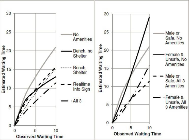
The gender breakdown comes from the fact that in unsafe neighborhoods, women perceive waits as even longer than the usual penalty, whereas in safe ones there is no difference between women and men.
The upshot is that if the wait time is 10 minutes, then passengers at a stop with a bench and shelter perceive the wait as 15 minutes, and if there’s also real-time information then this shrinks to 11 minutes. If there are no amenities, then passengers perceive a 15-minute wait when they’ve waited just 6.5 minutes and an 11-minute wait when they’ve waited just 4. In other words, to estimate the impact of shelter we can look at the impact of reducing waits from 10 minutes to 6.5, and if there’s also real-time info then it’s like reducing waits to 4 minutes.
If the wait is 5 minutes then the impact is similar. With bench and shelter the perceived wait is 8.5 minutes, equivalent to a 3-minute wait without any amenities; with real-time information, the perceived wait is 6.5 minutes, equivalent to a 2-minute wait without amenities. There is some scale-dependence, but not too much, so we can model the impact of shelter as equivalent to that of increasing frequency from every 10 minutes to every 6.5 minutes (without real-time displays) or every 4 minutes (with real-time displays).
I have some lit review of ridership-frequency elasticity here. On frequent buses it is about 0.4, but this is based on the assumption that frequency is 7.5-12 minutes, not 4-6 minutes. At the low end this is perhaps just 0.3, the lowest found in the literature I’ve seen. To avoid too much extrapolation, let’s take the elasticity to be 0.3. Fan-Guthrie-Levinson suggests shelter alone is equivalent to a 50-66% increase in frequency, say 60%; thus, it should raise ridership by 15%. With real-time info, make this increase 30%.
What I think of as the upper limit to acceptable cost of capital construction for rail is $40,000-50,000 per weekday rider; this is based on what makes activists in Paris groan and not on first principles. But we can try to derive an equivalent figure for buses. On the one hand, we should not accept such high costs for bus projects, since buses have higher operating expenses than rail. But this is not relevant to shelter, since it doesn’t increase bus expenses (which are mostly driver labor) and can fund its ongoing maintenance from ads. On the other hand, a $40,000/rider rail project costs somewhat more per new rider – there’s usually some cannibalization from buses and other trains.
But taking $40,000/rider as a given, it follows that a bus stop should be provided with shelter if it has at least ($15,000/$40,000)/0.15 = 2.5 weekday boardings. If the shelter installation includes real-time info then the denominator grows to 0.3 and the result falls to 1.25 weekday boardings.
In New York, there are 13,000 bus stops, so on average there are around 180 boardings per stop. Even in Rhode Island, where apparently the standard is that a bus stop gets shelter at 50 boardings (and thus there is very little shelter because apparently it’s more important to brand a downtown trunk as a frequent bus), there are 45,000 weekday riders and 3,000 stops, so at 15 riders per stop it should be fine too put up shelter everywhere.
The only type of stop where I can see an exception to this rule is alighting-only stops. If a route is only used in a peak direction, for example toward city center or away from city center, then the outbound stops may be consistently less used to the point of not justifying shelter. But even that notion is suspicious, as American cities with low transit usage tend to have weak centers and a lot of job and retail sprawl. It’s likely that a large majority of bus stops in Rhode Island and all stops within Providence proper pass the 2.5 boardings rule, and it’s almost guaranteed that all pass the 1.25 boardings rule. And that’s even before consolidating stops, which should be done to improve bus speed either way.
At least based on the estimates I’ve found, installing bus shelter everywhere is a low-hanging fruit in cities where this is not already done. In the situation of New York, this is equivalent to spending around $550 per new weekday rider on transit – maybe somewhat more if the busier stops already have shelter, but not too much more (and actually less if there’s stop consolidation, which there should be). Even in that of Providence, the spending is equivalent to about $6,600 per rider without stop consolidation, or maybe $3,000 with, which is much better than anything the state will be able to come up with through the usual channels of capital expansion.
If it’s not done, the only reason for it is that transit agencies just don’t care. They think of buses as a mode of transportation of last resort, with a punishing user experience. Cities, states, and transit agencies can to a large extent decide what they have money for, and letting people sit and not get drenched is just not a high priority, hence the “we don’t have money” excuse. The bosses don’t use the buses they’re managing and think of shelter as a luxury they can’t afford, never mind what published transportation research on this question says.
When Transit Serves the Poor Better Than the Rich
In major transit cities, rich areas have better access to public transportation than poor areas – in fact, what makes them valuable is precisely the easy access to high-paying jobs. Even in cities with bad transit, this is often the case: the transit systems of cities with mode shares in the 10-15% area, like Boston and Chicago, tend to be good at serving city center and little else, and city center workers tend to be richer because professional work tends to cluster whereas low-skill work tends to disperse.
However, there are exceptions to this rule. One, the French Riviera, occurs in a city region with a transit mode share of 13%, comparable to that of American city regions where transit commuters outearn solo drivers. Two more cities are would-be exceptions, for opposite reasons: Providence has no public transit to speak of, but if it invested in creating a transit network, the natural corridors would serve the poor better than the rich; and Vancouver currently has better SkyTrain service in working-class areas than in richer ones, but its current investment is in middle-class areas, and moreover its extensive transit-oriented development has been middle-class as well.
Moreover, all three cities have patterns that generalize. The situation in the Riviera arises because of the classed nature of work there, and generalizes to other places with extensive tourism. That in Providence arises because of the city’s industrial history, and may generalize to other deindustrialized small cities with underutilized legacy rail networks. In Vancouver, part of this situation is because easy rail corridors were more readily available in poorer areas for an essentially random reason, but another part is extensive transit-oriented development concentrating working-class jobs near train stations.
The Riviera: the casinos are walkable, the tech jobs aren’t
Before I go any further, I’d like to stress something important: my observation of the Riviera is largely based on qualitative observations. I don’t know of INSEE data comparable to the Census Bureau’s Means of Transportation to Work by Selected Characteristics table, which could allow me to test the theory that transit ridership in the Riviera skews poor. All I am going by is what I have seen riding trains and occasionally buses as well as what I know of the distribution of jobs.
What I’ve seen is that transit use in the Riviera skews working class. Middle-class Parisians sometimes drive and sometimes take the trains. In contrast, the rich people who I’ve met in the Riviera have as far as I can tell never set foot on the TER. This is despite the fact that the TER is competitive with driving on the area’s main arterial road, the Moyenne Corniche, and is even competitive with the A8 freeway over short distances because the A8 has difficult access time to the relevant exits. Not for nothing, train stations in rich areas have very little ridership: per SNCF’s ridership data, stations in rich areas like Cap d’Ail and Cap Martin-Roquebrune have around 60,000 boardings plus alightings per year, so around 100 weekday boardings, whereas in working- and lower-middle-class Menton the annual total is 1.4 million, or around 2,300 weekday boardings.
The train stations, too, signal poverty. They’re not neglected, but what I’ve seen of them reminded me of working-class suburbs of Paris like Boissy much more than middle-class ones like Bures-sur-Yvette. I was even warned off of spending too much time near Nice’s train station by people echoing local middle-class prejudices. The buses look even poorer: the main east-west bus on the Moyenne Corniche is full of migrant workers.
A key clue for what is happening can be found when selecting a destination station at the fare machines in Menton. As far as I remember, the first option given is not Nice, but Monaco. SNCF’s data table doesn’t include ridership for Monaco, but Wikipedia claims 5.5 million a year without citation, and SNCF’s own blurb claims more than 6 million. Either figure is narrowly behind Nice’s 6.9 million for second in the Riviera and well ahead of third-place Cannes’s 3.2 million – and Nice also has some intercity traffic.
While Monaco’s residents are rich, its commuters are not. There are no corporate jobs in Monaco, because its tax haven status does not extend to corporations with substantial sales outside the city-state, only to local businesses like restaurants and stores. The commuters work low-pay service jobs at hotels and casinos, which they access by train, or perhaps on foot if they live in Beausoleil, as many a domestic service worker in Monaco does.
In contrast, the mass of middle-class jobs cluster in a purpose-built edge city in Antibes, called Sophia-Antipolis. While Antibes itself has a decent transit mode share for residents (10.5%, cf. Menton’s 14.8% and Nice’s 25.4%), and its train station gets 1.6 million annual boardings and alightings, the edge city is unwalkable and far from the train. There’s some traffic in the Riviera, but not enough that middle-class people, who can afford cars, clamor for transit alternatives to their suburban jobs.
The main lesson here is that while the jobs most likely to cluster are usually middle-class city center jobs, working-class tourism jobs cluster as well in regions that have plenty of them. Tourism in the Riviera is the most intense in Monaco specifically and in other coastal cities generally, which encourages travel along the linear corridor, where rail shines. It’s usually hard to see, because for the most part the top tourist destinations are enormous like London, Paris, and New York, but in specialized tourist regions the separation is clearer.
Already we see some evidence of this in Las Vegas, where working-class jobs cluster along the Strip. The city has a monorail, serving the hotels and casinos rather than city center. Were it interested in improving public transportation, it could build an elevated railroad on the Strip itself for better service.
Orlando is another potential example. I named it as a specific example of a region that would be difficult to retrofit for public transit earlier this year, but Disney World remains a major clustering of working-class jobs as well as some middle-class leisure travel. The problem there is that Disney World is far from the train and, unlike the Riviera, does not lie on any line with other potential ridership draws; nonetheless, a train connecting the Orlando CBD, the airport, and Disney World could get some traffic.
Finally, picturesque mountain resorts that happen to lie near rail could see working-class travel on the train to their tourism jobs. Many of these resorts are where they are specifically because a legacy rail trunk happened to be there and the railroad developed the area to generate demand for its services; this is the case for Jasper, Lake Louise, and Banff, all on the Alberta side of the Continental Divide. Aspen is not on a railroad, but is on a road where buses carry working-class commuters displaced by the town’s high housing costs.
Providence: once upon a time, there were factories near the railroad
When I lived in Providence seven years ago, I discussed transit improvements with local urbanists who I met through Greater City: Providence. We talked about improvements to both bus and rail; we had little appetite for the proposed city center streetcar, which has since been downgraded to a proposed frequent bus, and instead talked about improvements to the busiest buses as well as rail service along the main spine of the Northeast Corridor.
The improvements to the busiest buses were already under discussion by the state, including signal priority on key routes and investment in queue jump lanes and shelter amenities. The two routes that were by far the state’s busiest, the 99 on North Main and 11 on Broad, were permanently combined to a single through-running service branded as the R bus, for rapid, with limited-stop service. These routes serve very poor parts of the built-up area, including Pawtucket on the 99 and South Providence on the 11. This is a consequence of the fact that transit in Rhode Island is so bad that only the poor use it, and thus the preexisting busy routes serve poor areas; the best physical bus infrastructure is a bus tunnel to College Hill, the richest neighborhood in the city, but ridership there is weak and therefore the routes were never high priorities for further investment.
The improvements to rail never went beyond blogging; we didn’t have the pull of Boston’s TransitMatters, which itself is better at proposing small improvements than big ones that go up against political obstruction. What we called for was frequent local rail within the urban area: Peter Brassard wrote up the initial proposal, and I added some refinements. The Northeast Corridor, where the service would run, is primarily an intercity rail corridor, but there is room for four tracks in the right-of-way, and while there is freight traffic, it runs at the same approximate speed of a local passenger train.
As we discussed this proposal, Greater City’s Jef Nickerson noted something: what the train would do if implemented is produce better transit service in working-class areas than in more comfortable ones. Unlike the situation with the buses, this was not an intentional process. We would like Rhode Island to improve rail service using an existing right-of-way, which happens to serve Central Falls, Pawtucket, Olneyville, Hartford, Cranston, and Warwick, and miss the East Side and the middle-class suburbs. We realized that the city and inner-suburbs like Pawtucket are poorer than the proper suburbs, but that the train would serve Olneyville but not the East Side seemed like a coincidence.
But is it really a coincidence? Providence developed from east to west. The city was initially founded on the western side of what is now the East Side, sloping down to the river. What is now Downcity was only the second part of the city to develop. It became the center of the city because, as the Northeast Corridor was constructed, it was not possible to provide through-service via the hilly historic core of the city, only via the flatter areas that are now Downcity. A tunnel across College Hill opened in 1908, but by then the city’s basic urban geography was set: the university and port jobs on the East Side, industrial jobs to the west near the rail mainline.
The industrial jobs are long gone now. New England was the first part of America to industrialize and the first to deindustrialize, the mills moving to lower-wage Southern states already in the middle of the 20th century. In very large cities, declining industrial jobs can be replaced with urban renewal serving the middle class: the West India Docks became Canary Wharf, the freight railyards of Gare de Lyon became Bercy, the industrial Manhattan and Brooklyn waterfronts became sites for condos with nice views. In Providence-size cities, no such urban renewal is possible: there is no large mass of middle-class people clamoring to live or work in Olneyville, so the neighborhood became impoverished.
While factories may seem like attractive targets for transit commuting, they’re so clustered, in reality they have not been walkable ever since electrification made open-plan single-story factories viable. Factories are land-intensive and have been since around the 1910s. Moreover, whereas hotels and retail have a reason to locate in walkable areas for their consumption amenities – tourists like walking around the city – factories do not, and if anything depress an area’s desirability through noise and pollution. Working industrial districts are not attractive for transit, but post-industrial ones are, even if they are not gentrified the way so much of London, Paris, and New York have.
A large number of cities share Providence’s history as a medium-size post-industrial city. Nearly every English city except London qualifies, as do the cities of the American Northeast and Midwest below the size class of Boston and Philadelphia. Moreover, all of these cities have undergone extensive middle-class flight, with the racial dimension of white flight in the US but even without it in Britain; thus, the relatively dense neighborhoods, where transit service is more viable, are disproportionately poor. However, the feasibility of mainline rail service to post-industrial neighborhoods is uneven, and depends on local idiosyncrasies.
One positive example I’m more familiar with that’s a lot like Providence is in New Haven. Its best potential local rail route, the Farmington Canal Trail, serves lower middle-class areas like Hamden, and fortunately parallels the busiest bus route, the D-Dixwell. While Hamden is not poor, such service would still lead to the inversion we discussed for Providence, since the rich live in thoroughly auto-oriented suburbs or within walking distance of Yale. The main drawbacks are that it would require replacing an active trail with rail service, and that either street running or brief tunneling would be needed in the final few hundred meters in Downtown New Haven.
Vancouver: easy corridors and TOD for the working class
With a modal share of 21%, Vancouver is in a somewhat higher class of transit quality than the Riviera, Boston, or Chicago. However, it remains a far cry from the numbers beginning with a 3, 4, and 5 seen in New York and in European and Asian transit cities. As with the Riviera, I am somewhat speculating from my own observations, lacking a table that clearly states transit usage by socioeconomic class. However, two factors make me believe that transit in Vancouver serves the working class better than it does the middle class.
The first factor is the corridors served by SkyTrain. The first to be built, the Expo Line, runs in a preexisting interurban right-of-way, with minor greenfield elevated and underground construction; even the downtown tunnel is repurposed from a disused mainline rail branch. It passes through a mixture of working-class and lower middle-class neighborhoods on its way to Surrey, which is working-class and very negatively stereotyped. The second, the Millennium Line, branches east, to lower middle-class suburbs, running on a greenfield el. The third, the Canada Line, is a partially tunneled, partially elevated route through the middle-class West Side to working-class Richmond. Only the fourth line to be built, the Evergreen extension of the Millennium Line, finally serves a comfortable area, as will the next line, the Broadway extension of the Millennium Line deeper into the West Side.
The second factor is the job distribution within Metro Vancouver. Usually, we see concentration of professional jobs in city centers and dispersal of working-class jobs among many stores. In the Riviera this relationship between job concentration and income is only inverted because the working-class jobs are disproportionately in tourism while the professional ones are in an edge city. In Vancouver I don’t believe there is any such inversion, but there is leveling: jobs of either type are concentrated in transit-rich areas. This leveling is the result of extensive commercial transit-oriented development, most notably Metrotown, which has many office jobs on top of Canada’s third largest shopping mall.
The first factor is idiosyncratic. The easy corridors happened to serve poorer areas, on a line from East Vancouver to Surrey. The rich live in North Vancouver, which has a ferry and doesn’t have enough population density for a SkyTrain tunnel; on the West Side, which is separated from downtown by False Creek and was thus late to get a rail connection; and in Port Moody and Coquitlam, which were only connected to SkyTrain recently via the Evergreen extension.
The second factor is more systemic. While American and European cities rarely have big urban shopping malls, Canadian cities are full of them. The Metropolis at Metrotown has 27 million annual visitors, not far behind the 37 million of the Forum des Halles, at the center of a metro area five times the size of Metro Vancouver – and the Metropolis has more than twice the total commercial floor area. In this, Canada is similar to Israel and Singapore, which like Canada have harsh climates, only hot instead of cold. Moreover, Vancouver has encouraged this centralization through TOD: Burnaby built Metrotown from scratch in the 1980s, simultaneously with the Expo Line.
It is difficult to engage in concerted residential TOD for the working class, since it requires extensive housing subsidies. Vancouver’s residential TOD near SkyTrain stations is thoroughly middle-class. However, concerted commercial TOD is easier: hospitals, universities, and shopping centers all employ armies of unskilled workers (the first two also employing many professional ones), the first two while satisfying general social goals for health care and education provision and the last while making the owners a profit on the open market.
Moreover, Vancouver’s TOD within downtown, too, has made it easier to provide transit service for the working and lower middle classes. Where constraints on office towers lead to high office rents, only the most critical jobs are in city centers, and those are typically high-end ones; in the US, it’s common for big corporations to site their top jobs in the center of New York or Chicago or another large city but outsource lower-end office jobs to cheaper cities. In Vancouver, as elsewhere in Canada, extensive downtown commercialization means that even semi-skilled office jobs like tech support can stay in the center rather than at suburban office parks.
Conclusion
Based on my own observations, I believe the Riviera provides better public transportation for the working class than for the middle class, and to some extent so does Vancouver. Providence provides uniformly poor transit service, but its lowest-hanging fruit are in working-class urban neighborhoods.
The reasons vary, but the unifying theme is that, in the Riviera and Vancouver, there is none of the typical big-city pattern in which the rich work in walkable city centers more than the poor (e.g. in New York). In Vancouver it’s the result of commercial TOD as well as a Canadian culture of urban shopping centers; in the Riviera it’s the result of unique dependence on tourism. In Providence the situation is not about job concentration but about residential concentration: lower-income neighborhoods are likelier to arise near rail because historically that’s where industry arose, and all that remains is for Providence to actually run local passenger trains on the mainline.
It is not possible to replicate culture. If your city does not have the tourism dependence of Monaco, or the shopping mall culture of Vancouver, or the post-industrial history of Providence, there’s little it can do to encourage better urban geography for working-class transit use. At best, can build up more office space in the center, as Vancouver did, and hope that this encourages firms to locate their entire operations there rather than splitting them between a high-end head office and lower-end outlying ones. Fortunately, there exist many cities that do have the special factors of the Riviera, Vancouver, or Providence. In such cities, transit planners should make note of how they can use existing urban geography to help improve transit service for the population that most depends on it.
In-Motion Charging
While electric cars remain a niche technology, electric buses are surging. Some are battery-electric (this is popular in China, and some North American agencies are also buying into this technology), but in Europe what’s growing is in-motion charging, or IMC. This is a hybrid of a trolleybus and a battery-electric bus (BEB): the bus runs under wire, but has enough battery to operate off-wire for a little while, and in addition has some mechanism to let the bus recharge during the portion of its trip that is electrified.
One vendor, Kiepe, lists recent orders. Esslingen is listed as having 10 km of off-wire capability and Geneva (from 2012) as having 7. Luzern recently bought double-articulated Kiepe buses with 5 km of off-wire range, and Linz bought buses with no range specified but of the same size and battery capacity as Luzern’s. Iveco does not specify what its range is, but says its buses can run on a route that’s 25-40% unwired.
Transit planning should be sensitive to new technology in order to best integrate equipment, infrastructure, and schedule. Usually this triangle is used for rail planning, but there’s every reason to also apply it to buses as appropriate. This has a particular implication to cities that already have large trolleybus networks, like Vancouver, but also to cities that do not. IMC works better in some geographies than others; where it works, it is beneficial for cities to add wire as appropriate for the deployment of IMC buses.
Vancouver: what to do when you’re already wired
Alert reader and blog supporter Alexander Rapp made a map of all trolleybus routes in North America. They run in eight cities: Boston, Philadelphia, Dayton, San Francisco, Seattle, Vancouver, Mexico City, Guadalajara.
Vancouver’s case is the most instructive, because, like other cities in North America, it runs both local and rapid buses on its trunk routes. The locals stop every about 200 meters, the rapids every kilometer. Because conventional trolleybuses cannot overtake other trolleybuses, the rapids run on diesel even on wired routes, including Broadway (99), 4th Avenue (44, 84), and Hastings (95, 160), which are in order the three strongest bus corridors in the area. Broadway has so much ridership that TransLink is beginning to dig a subway under its eastern half; however, the opening of the Broadway subway will not obviate the need for rapid buses, as it will create extreme demand for nonstop buses from the western end of the subway at Arbutus to the western end of the corridor at UBC.
IMC is a promising technology for Vancouver, then, because TransLink can buy such buses and then use their off-wire capability to overtake locals. Moreover, on 4th Avenue the locals and rapids take slightly different routes from the western margin of the city proper to campus center, so IMC can be used to let the 44 and 84 reach UBC on their current route off-wire. UBC has two separate bus loops, one for trolleys and one for diesel buses, and depending on capacity IMC buses could use either.
On Hastings the situation is more delicate. The 95 is not 25-40% unwired, but about 60% unwired – and, moreover, the unwired segment includes a steep mountain climb toward SFU campus. The climb is an attractive target for electrification because of the heavy energy consumption involved in going uphill: at 4 km, not electrifying it would brush up against the limit of Kiepe’s off-wire range, and may well exceed it given the terrain. In contrast, the 5 km in between the existing wire and the hill are mostly flat, affording the bus a good opportunity to use its battery.
Where to add wire
In a city without wires, IMC is the most useful when relatively small electrification projects can impact a large swath of bus routes. This, in turn, is most useful when one trunk splits into many branches. Iveco’s requirement that 60-75% of the route run under wire throws a snag, since it’s much more common to find trunks consisting of a short proportion of each bus route than ones consisting of a majority of route-length. Nonetheless, several instructive examples exist.
In Boston, the buses serving Dorchester, Mattapan, and Roxbury have the opportunity to converge to a single trunk on Washington Street, currently hosting the Silver Line. Some of these buses furthermore run on Warren Street farther south, including the 14, 19, 23, and 28, the latter two ranking among the MBTA’s top bus routes. The area has poor air quality and high rates of asthma, making electrification especially attractive.
Setting up wire on Washington and Warren Streets and running the Silver Live as open BRT, branching to the south, would create a perfect opportunity for IMC. On the 28 the off-wire length would be about 4.5 km each way, at the limit of Kiepe’s capability, and on the 19 and 23 it would be shorter; the 14 would be too long, but is a weaker, less frequent route. If the present-day service pattern is desired, the MBTA could still electrify to the northern terminus of these routes at Ruggles, but it would miss an opportunity to run smoother bus service.
In New York, there are examples of trunk-and-branch bus routes in Brooklyn and Queens. The present-day Brooklyn bus network has a long interlined segment on lower Fulton, carrying not just the B25 on Fulton but also the B26 on Halsey and B52 on Gates, and while Eric Goldwyn’s and my plan eliminates the B25, it keeps the other two. The snag is that the proportion of the system under wire is too short, and the B26 has too long of a tail (but the B52 and B25 don’t). The B26 could get wire near its outer terminal, purposely extended to the bus depot; as bus depots tend to be polluted, wire there is especially useful.
More New York examples are in Queens. Main Street and the Kissena-Parsons corridor, both connecting Flushing with Jamaica, are extremely strong, interlining multiple buses. Electrifying these two routes and letting buses run off-wire on tails to the north, reaching College Point and perhaps the Bronx on the Q44 with additional wiring, would improve service connecting two of Queens’ job centers. Moreover, beyond Jamaica, we see another strong trunk on Brewer Boulevard, and perhaps another on Merrick (interlining with Long Island’s NICE bus).
Finally, Providence has an example of extensive interlining to the north, on North Main and Charles, including various 5x routes (the map is hard to read, but there are several routes just west of the Rapid to the north).
IMC and grids
The examples in New York, Providence, and Boston are, not coincidentally, ungridded. This is because IMC interacts poorly with grids, and it is perhaps not a coincidence that the part of the world where it’s being adopted the most has ungridded street networks. A bus grid involves little to no interlining: there are north-south and east-west arterials, each carrying a bus. The bus networks of Toronto, Chicago, and Los Angeles have too little interlining for IMC to be as cost-effective as in New York or Boston.
In gridded cities, IMC is a solution mainly if there are problematic segments, in either direction. If there’s a historic core where wires would have adverse visual impact, it can be left unwired. If there’s a steep segment with high electricity consumption, it should be wired preferentially, since the cost of electrification does not depend on the street’s gradient.
Overall, this technology can be incorporated into cities’ bus design. Grids are still solid when appropriate, but in ungridded cities, trunks with branches are especially attractive, since a small amount of wire can convert an entire swath of the city into pollution-free bus operation.
Is Missing Middle Really Missing?
There’s en emerging concept within North American urbanism and planning called missing middle. This refers to housing density that’s higher than suburban single-family housing but lower than urban mid- and high-rise buildings. The context is that in some cities with rapid housing construction, especially Toronto, the zoning code is either single-family or high-density, with nothing in between. The idea of allowing more missing middle housing has become a mainstay of New Urbanism as well as most North American YIMBY movements, underpinning demands such as the abolition of single-family zoning in California and Seattle.
Unfortunately, it’s an overrated concept. It applies to Toronto, but not Vancouver or the most expensive American cities, which are replete with missing middle density. The most in-demand neighborhoods have far too many people who want to move in to make do with this density level. Moreover, missing middle density in its New Urbanist form is not even really transit-oriented: low-rise construction spread over a large area is unlikely to lead middle-class workers to take transit when cars are available. The density required to encourage transit ridership and reduce housing costs is much higher, including mid- and high-rise residences.
What’s missing middle density?
A website created by Opticos Design, an architecture firm specializing in this kind of housing, has a helpful graphical definition:
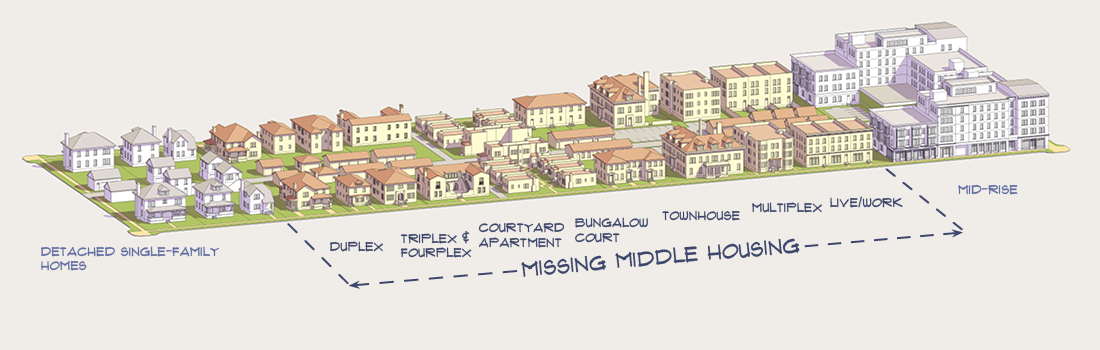
Many of the missing middle housing forms are part of the vernacular architecture of American cities. In New England, this is the triple-decker, a three-story building with an apartment per floor. In Chicago, this is the fourplex, a two-story building with two apartments per floor. In Los Angeles this is the dingbat, with two or three inhabited floors on top of ground floor parking. In Baltimore and Philadelphia (and in London) this is the rowhouse. This history makes it easier to accept such buildings as both part of the local culture and as affordable to the lower middle class.
The triple-deckers in the parts of Providence and Cambridge I am most familiar with have a floor area ratio of about 1-1.5: they have 2.5 to 3 floors (counting sloped roofs as half a floor) and build on one third to one half the lot. A quick look at some Philadelphia rowhouses suggests they, too, have a floor area ratio in that range. Somerville has a population density just short of 7,000 people per km^2, with little non-residential land and some mid-rise and single-family areas canceling out to missing middle density. Kew Gardens Hills has about 12,000 people per km^2, and has a mixture of missing middle and mid-rise housing.
In Continental Europe, the vernacular architecture is instead mid-rise. In Scandinavia and Central Europe the euroblock has 4-7 floors and a floor area ratio of 2.5-4; Urban Kchoze shows many examples with photos, mostly from Prague, and Old Urbanist finds a euroblock in Berlin with a floor area ratio of 4.3. Central Stockholm’s residential buildings are almost entirely euroblocks, and residential density is 17,000/km^2 in Södermalm, 21,000/km^2 in Vasastan, and 28,000/km^2 in Östermalm. Parisian density is even higher – the floor area ratio of the traditional buildings looks like 4-5, with about 30,000-40,000 people per km^2.
Is missing middle really missing?
In Europe the answer is obviously no: lower-density cities like London are largely missing middle in their inner areas, and higher-density ones like Paris have missing middle density in their outer areas. But even in North America, where the term is popular, the expensive cities where people call for abolishing single-family zoning have missing middle housing. In addition to the above-listed vernacular examples, New York has brownstones all over Brooklyn (the term Brownstone Brooklyn refers to the gentrified inner neighborhoods, but this density is also seen in outer neighborhoods like Bay Ridge and Sheepshead Bay).
Vancouver is an especially instructive example. English Canada’s big cities are fast-growing, and a zoning regime that’s historically been friendlier to developers than to local NIMBYs has encouraged high-rise growth. Moreover, the high-rises are built in the modern boxy style (earning the ire of people who hate modern architecture) and tend to target middle-class and high-skill immigrant buyers (earning the ire of people who blame high housing costs on new construction). In contrast, vast swaths of Toronto and Vancouver are zoned for single-family housing.
And yet, Vancouver has considerable missing middle housing, too. The population density in Mount Pleasant, Fairview, Kitsilano, and West Point Grey is similar to that of Somerville and Eastern Queens. Buildings there are in modern style, but the housing typologies are not modernist towers in a park, but rather mostly buildings with 2-4 floors with the medium lot coverage typical of missing middle. I lived in an eight-unit, three-story building. Across from me there was a high-rise, but it was atypical; for the most part, that part of Vancouver is low-rise.
Shaughnessy offends people in its extravagance and wealth. In one Twitter conversation, an interlocutor who blamed absent landlords and foreigners (read: Chinese people) for Vancouver’s high housing costs still agreed with me that Shaughnessy, a white Canadian-born single-family area, shares the blame with its low-density zoning and very high residential space per person. Legalizing accessory dwelling units (“granny flats”) and townhouses in such a neighborhood faces local political headwind from the neighbors (who are still nowhere near as empowered to block rezoning as they would south of the border), but not from citywide social movements.
And yet, the density in the inner Westside neighborhoods near Broadway and Fourth Avenue is insufficient, too. It’s of course much higher than in Shaughnessy – I never really missed not owning a car living in Kitsilano – but the price signal screams “build more housing in Kits and Point Grey.”
Is missing middle transit-oriented?
Not really. In Providence the answer is absolutely not: car ownership is expected of every person who can afford it. The nearby supermarket, East Side Market, has an enormous parking lot; I’d walk, but it was obvious to me that my mode choice was not the intended use case. Even some Brown grad students owned cars (though most didn’t); at Columbia, car ownership among people below tenure-track faculty rank approaches zero. Once they own cars, people use them to take trips they wouldn’t otherwise have made, reorienting their travel patterns accordingly.
In Cambridge, car use is lower, but still substantial. The same is true of Vancouver (where outside Downtown and the West End the entire region’s density is at most missing middle, even if the typology is towers in a park and not uniformly low-rise). In Kew Gardens Hills, people seem to mostly drive as well.
This is not a universal feature of the urban middle class. In Stockholm, my postdoc advisor as far as I can tell does not own a car, and commutes to work by bike. Both there and in Basel, biking and using transit are normal and expected even among people who earn tenured academic salaries. At 7,000 people per km^2, people can forgo driving if they really want to, but most people will not do so. Only at the higher mid-rise density will they do so.
Bus Branching
There are two standard reasons why public transit should limit branching. The first is that it reduces frequency on the branches; this is Jarrett Walker’s reason, and distantly the reason why New York doesn’t interline more than two subway services anywhere except 60th Street Tunnel. The second is that it makes schedules more fragile, first because services have to be scheduled more precisely to alternate among branches, and second because delays on one branch propagate to the others. And yet, rail and bus networks still employ branching, due to benefits including better coverage and focusing frequency where demand is the highest. This is especially common on regional rail, where all services are scheduled and often interact with the mainline network, so the second problem of branching is present no matter what. Metro systems instead have less branching, often because they only serve dense areas so that the main benefits of branching are absent. But what about buses?
I posit that bus branching is more valuable in low-density areas than in high-density areas. If an area only has demand for a bus every 30 minutes, and some farther-out places only have demand for an hourly bus, then it’s fine to branch the route in two. The bus would only be useful with some timed transfers at the inner end – maybe it’s feeding a regional train station with a train every half hour – but the Zurich suburbs have half-hourly clockface schedules with timed bus/rail connections and maintain high mode share for how low their density is.
In the other direction, look at Manhattan specifically. I’ve been looking at its bus network even though I’m only supposed to redesign Brooklyn’s. I’ve mentioned before that my epistemology is that if the presence of factor A makes solution B better, then the absence of factor A should make solution B worse. I noticed that the Brooklyn bus network has very little branching: the only route numbers that branch are the B41 and B38, and the only routes with different numbers that share the majority of their lengths are the B67 and B69 (which reverse-branch). However, Manhattan has extensive branching: the M1/2/3/4 share the Madison and Fifth Avenue one-way pair, and the M101/102/103 share the Third and Lexington one-way pair. Understanding why would be useful even if I only care about Brooklyn: if there is a good reason for Manhattan buses to branch then I should consider adding branching in Brooklyn where appropriate, and even if it’s inappropriate, it’s useful to understand what special circumstances make branching good in Manhattan but not in Brooklyn.
As it is, I don’t believe the branching in Manhattan is useful for Brooklyn. This comes from several reasons, at least one of which implies it’s not really useful for Manhattan either, and by extension for other high-density regions.
Base frequency
You can run a bus that comes every half hour on a schedule, making it possible to interline two hourly routes evenly. With some discipline you can go down to 15 minutes, or possibly even 10: Vancouver runs 12-minute limited buses on 4th Avenue on a clockface schedule with on-board fare collection and shared lanes, but there is signal priority at nearly all intersections and relatively little car traffic since the West Side’s street network is rich in arterial roads and distributes cars across other routes (i.e. Broadway, 12th, and 16th Avenues).
In contrast, it’s not really feasible to run buses on a schedule when they come every 5 minutes. There can be a printed schedule, but buses won’t follow it reliably. Once frequency hits about once every 3 minutes, regular street buses bunch so much that adding more buses doesn’t increase passenger capacity, but even in the 5-10 minute range, schedules are less important than headway management, unless the bus has extensive BRT treatments reducing schedule variance. This means that if a bus comes every 10 minutes and is scheduled on headway management, then branching the route means each branch gets service every 20 minutes scheduled on headway management as well. Few passengers would want to ride such a route. This is the worst region for branching, the 7.5-15 minute range in which branches force passengers to use buses that are both infrequent and irregular.
The highest-frequency routes can branch with less risk. If a 5-minute bus branches in two, then each branch gets 10-minute service, at which point reliable schedules are still desirable but not absolutely necessary. How much service do the Manhattan bus trunks run? In the following scheme, peak means the busiest hour in the morning in the peak direction, and off-peak means the lowest frequency between the morning and afternoon peaks, which is usually around 11 am.
M1: 13 buses per hour peak (8 limited, 5 local), 5 off-peak (all local)
M2: 9 peak, 4 off-peak
M3: 6 peak, 6 off-peak
M4: 12 peak (5 limited, 7 local), 6 off-peak (all local)
M101: 6 peak, 6 off-peak (8 in the busiest off-peak hour, 2-3 pm)
M102: 5 peak, 4 off-peak
M103: 5 peak, 4 off-peak
What we see is that Manhattan branches precisely in the worst frequency range. The buses are frequent enough that it’s not possible to run them on a timetable without either much better segregation from traffic than is feasible (even waving away politics) or massive schedule padding, but they still require passengers in Upper Manhattan to wait 10-15 minutes for their specific branch. One might expect that Bus Time would make it easier on passengers by telling them where the bus is, but no, ridership has actually fallen since apps were introduced (and this fall predates the entry of app-hailed TNCs into the city). It turns out passengers like being able to rely on easily memorable clockface schedules, or else on frequencies so high that they only need to wait 5 minutes, not 15.
The street network
Even one-time visitors to New York notice that the avenues in Manhattan are all one-way. This features prominently in the Manhattan bus network, which employs consistent one-way pairs on First/Second, Third/Lex, Madison/Fifth, and Ninth/Tenth. Moreover, again as every visitor to New York knows, Central Park occupies a large blob of land in the middle, interrupting Sixth and Seventh Avenues.
The upshot is that there are more north-south routes north of 110th Street than south of it. This is roughly the branch point on the three trunks that branch (First/Second only carries the M15). In Harlem, there’s demand for buses on Lenox (i.e. Sixth) and Seventh, both of which are two-way there. There’s also commerce on an interpolating route, Manhattan/St. Nicholas, which is effectively 8.5th Avenue in most of Harlem. Farther west, Ninth/Columbus is no longer a useful through-route north of 110th, but instead Tenth/Amsterdam is two-way, and one of the two buses using the Columbus/Amsterdam one-way pair on the Upper West Side, the M11, indeed goes two-way on Amsterdam north of 110th.
This situation occurs very frequently in cities without gridded street networks. One trunk route will split in two, heading to different former villages that were incorporated into the city as it industrialized and grew. Manhattan is unusual among gridded cities in that its avenues are one-way, forcing buses into one-way pairs south of Harlem that, together with Central Park, ensure there are more useful routes north of 110th than south of it. But among cities without a planned street network this is typical.
As a check, let’s look at the bus networks in two ungridded American cities: Boston and Providence. Do they have a lot of interlining, involving one trunk route splitting in two farther out? Yes, they do!
Here is Providence. Going west of Downcity, there are two major routes to Olneyville, Westminster and Broadway, but beyond Olneyville there are four main streets, so each of the two inner corridors carries two bus routes, and one of these four routes even splits in two farther out. Going north, Charles Street carries four routes, branching off at various locations. Going east there’s a bus tunnel to College Hill carrying many routes, but even outside the tunnel, the one-way pair on Angell and Waterman carries three buses, which split in East Providence. And going south and southwest, Broad Street carries multiple routes, and one of its branches, Elmwood, carries two, splitting farther south.
Here is Boston. Unlike in Providence, buses don’t converge on city center, but on subway stations, so the map is much less clean. However, we see the same pattern of trunk routes splitting into branches. For example, going south of Ruggles, many routes go southeast to Dudley and then south on Warren Street, splitting to various destinations in Dorchester, Mattapan, and Hyde Park on the way. Going southwest of Forest Hills we see many routes use Washington Street, some staying on it and branching in Dedham and some veering west to West Roxbury and branching there. Elsewhere in the system we see the same pattern going north of Maverick and Oak Grove, northeast of Malden, west of Harvard (briefly on Mount Auburn), and northwest of Alewife.
One-seat rides and reverse-branching
I have repeatedly criticized the practice of reverse-branching on subway networks, especially New York, in which two train routes share tracks in an outlying area (such as Queens Boulevard) and then split heading into the center (such as Eighth Avenue on the E versus Sixth Avenue on the F). I did so on the same grounds that any branching is suspect: it reduces frequency on specific routes, and makes the schedule more fragile as delays propagate to more of the network. Moreover, the issue of schedule fragility gets worse if many routes share tracks at some point during their journey, whereas with conventional branching there are only two or three branches per trunk and the trunks form self-contained systems. Finally, reverse-branching lacks the main benefit of conventional branching, as it does not concentrate traffic in the core, where there’s most demand.
These issues are present on bus networks, with two modifications:
- The value of one-seat rides is somewhat higher. Transferring between buses is less nice than transferring between subways: in a Dutch study about location decisions, people’s disutility of out-of-vehicle time on buses was 1.5 times as high as on trains.
- Buses can overtake each other and, even without overtakes, run much closer together than trains. The limiting factor to capacity on buses is schedule fragility and bunching and not stopping distances. This means that reverse-branching is less likely to lead to cascading delays – buses do not have a 2-minute exclusion zone behind them in which no buses may enter.
This means that reverse-branching is more defensible on buses than on trains. However, even then, I don’t think it’s a good idea. At least in Manhattan, reverse-branching consists of avenues in Upper Manhattan that have buses going to both the East Side and the West Side: the M7 (serving the Ninth/Tenth pair) and the M102 both run on Lenox, and the M4 and M104 (running on Broadway to Midtown) both run on Broadway in Morningside Heights. These splits both reduce the frequency available to bus riders and should be eliminated. East-west service should be provided with high-quality bus routes on the main streets, especially 125th (which needs a full subway) but also 116th, 135th, 145th, and 155th.
The snag is that grids don’t work well unless they are complete. The Manhattan grid isn’t complete through Upper Manhattan, because 116th and 135th are discontinuous, without a direct connection from Central Harlem to Morningside Heights and West Harlem. However, the M7 route duplicates the 2 and 3 trains, so it’s not necessary for east-west connectivity. The M4 route doesn’t duplicate the subway, but does duplicate the M101, which runs on 125th Street and Amsterdam (and isn’t a reverse-branch because the M11 terminates shortly after 125th), so it’s not useful by itself.
Should buses branch?
There is one solid reason for buses to branch: if the street network has more major routes closer to the center than in outlying areas, then buses running on the outer arterials should come together close to the core. This is common enough on cities with haphazard street networks. It may also be reinforced if there are weak circumferential streets (Sydney is one such example). In contrast, cities with gridded street plans, even broken grids like those of Brooklyn and Tel Aviv, should have little to no bus branching.
If a bus does branch, it should ideally be extremely frequent on the trunk, so that even the branches have decent headway-based service. I’m not willing to commit to a maximum headway, but Barcelona and Toronto both have at worst 8-minute headways on their bus grids, so if that is indeed the maximum then a bus shouldn’t branch if its off-peak frequency is worse than every 4 minutes and better than every 10-20 (the more reliable the timetable is, the lower the upper limit is, since it’s possible to run on a timetable at higher frequency). In my case of interest, Brooklyn, there is exactly one bus route that comes at least every 4 minutes off-peak: the B46 on Utica runs 16 buses per hour in each direction, counting both local and limited (SBS) routes.
The area in which buses absolutely should not branch – strong interconnected networks of arterials (not necessarily grids – Paris’s network counts too), running buses every 5-15 minutes off-peak – is exactly where most strong bus networks are. It’s rare to have a bus that has extremely high frequency all day, because in most functional city such a bus would be a subway already; as it is, Utica has long been New York’s second priority for subway service, after Second Avenue. So for the most part, the places where buses are the strongest are precisely those where branching is the most deleterious. Low-frequency networks, perhaps connecting to a suburban train station with a timed transfer, should add bus branching to their planning toolkit, but high-frequency urban networks should not.
Massachusetts Sandbags the North-South Rail Link
Boston has two main train stations: South Station, and North Station. Both are terminals, about 2 km apart, each serving its own set of suburbs; as a result, over the last few decades there have been calls to unify the system with a regional rail tunnel connecting the two systems. This tunnel, called the North-South Rail Link, or NSRL, would have been part of the Big Dig if its costs hadn’t run over; as it were, the Big Dig reserved space deep underground for two large bores, in which there is clean dirt with no archeological or geotechnical surprises. The NSRL project had languished due to Massachusetts’ unwillingness to spend the money on it, always understood to be in the billions, but in the last few years the pressure to build it intensified, and the state agreed to fund a small feasibility study.
A presentation of the draft study came out two days ago, and is hogwash. It claims on flimsy pretext that NSRL would cost $17 billion for the tunnel alone. It also makes assumptions on service patterns (such as manual door opening) that are decades out of date not just in Europe and East Asia but also in New York. The Fiscal and Management Control Board, or FMCB, discusses it here; there’s a livestream as well as a link to a presentation of the draft study.
The content of the study is so weak that it has to have been deliberate. The governor does not want it built because of its complexity, no matter how high its benefits. Thus, the state produced a report that sandbags a project it doesn’t want to build. People should be fired over this, starting with planners at the state’s Office of Transportation Planning, which was responsible for the study. The way forward remains full regional rail modernization. As for the cost estimate, an independent study by researchers at Harvard’s Kennedy School of Government estimates it at about $5 billion in today’s money; the new study provides no evidence it would be higher. I urge good transit activists in Massachusetts, Rhode Island, and New Hampshire to demand better of their civil servants.
Tunneling costs
The study says that the cost of a four-track NSRL tunnel under the Big Dig would be $17 billion in 2028 dollars. In today’s money, this is $12 billion (the study assumes 3.5% annual cost escalation rather than inflation-rate cost escalation). It claims to be based on best practices, listing several comparable tunnels, both proposed and existing:
- California High-Speed Rail tunnels (average estimated cost about $125 million per km, not including overheads and contingency)
- Crossrail (see below on costs)
- The M-30 highway tunnel in Madrid (average cost about $125 million per km of bored tunnel in the mid-2000s, or around $150 million/km in today’s money)
- The canceled I-710 tunnel in California (at 7.2 km and $5.6 billion, $780 million per km
- The Spoortunnel Pannerdensch Kanaal (around $200 million in today’s money for 1.6 km of bore, or $125 million per km)
Unlike the other tunnels on the list, Crossrail has stations frustrating any simple per km cost analysis. The headline cost of Crossrail is £15 billion; however, I received data from a freedom of information request showing that the central (i.e. underground) portion is only £11.6 billion and the rest is surface improvements, and of this cost the big items are £2.2 billion for tunneling, £4.1 billion for stations, £1 billion for tracks and systems, and £2.7 billion for overheads and land acquisition. The tunneling itself is thus around $150 million per km, exclusive of overheads and land (which add 30% to the rest of the project). All of this is consistent with what I’ve found in New York: tunneling is for the most part cheap.
With the exception of Crossrail, the above projects consist of two large-diameter bores. The mainline rail tunnels (California HSR and Pannerdensch Kanaal) are sized to provide plenty of free air around the train in order to improve aerodynamics, a feature that is desirable at high speed but is a luxury in a constrained, low-speed urban rail tunnel. The highway tunnels have two large-diameter bores in order to permit many lanes in each direction. The plan for NSRL has always been two 12-meter bores, allowing four tracks; at the per-km boring cost of the above projects, this 5 kilometer project should cost perhaps a billion dollars for tunneling alone.
The stations are typically the hard part. However, NSRL has always been intended to use large-diameter tunnels, which can incorporate the platforms within the bore, reducing their cost. Frequent commenter Ant6n describes how Barcelona used such a tunnel to build Metro Lines 9 and 10, going underneath the older lines; the cost of the entire project is around $170 million per km, including a cost overrun by a factor of more than 3. Vertical access is likely to be more difficult in Boston under the Big Dig than in Barcelona, but slant shafts for escalators are still possible. At the worst case scenario, Crossrail’s station costs are of an order of magnitude of many hundreds of millions of dollars each, and two especially complex ones on Crossrail 2 are £1.4 billion each; this cost may be reasonable for Central Station at Aquarium, but not at South Station or North Station, where there is room for vertical and slant shafts.
It’s possible that the study made a factor-of-two error, assuming that since the mainline rail comparison projects have two tracks, their infrastructure is sized for two urban rail tracks, where in reality a small increase in tunnel diameter would permit four.
Researchers at the Harvard Kennedy School of Government came up with an estimate of $5.9 billion in 2025 dollars for a four-track, three-station NSRL option, which is about $5 billion today. Their methodology involves looking at comparable tunneling projects around the world, and averaging several averages, one coming from American cost methodology plus 50% contingency, and two coming from looking at real-world cost ranges (one American, one incorporating American as well as rest-of-world tunnels). Their list of comparable projects includes some high-cost ones such as Second Avenue Subway, but also cheaper ones like Citybanan, which goes deep underneath Central Stockholm with mined tunnels under T-Centralen and Odenplan, at $350 million per km in today’s money.
But the MassDOT study disregarded the expertise of the Kennedy School researchers, saying,
Note: The Harvard Study did not include cost for the tunnel boring machine launch pit and only accounted for 2.7 miles of tunneling (the MassDOT studies both accounted for 5 miles of tunneling), and no contingency for risk.
This claim is fraudulent. The Kennedy School study looks at real-world costs (thus, including contingency and launch pit costs) as well as at itemized costs plus 50% contingency. Moreover, the length of the NSRL tunnel, just under 5 km, is the same either way; the MassDOT study seems to be doubling the cost because the project has four tracks, an assumption that is already taken into account in the Kennedy School study. This, again, is consistent with a factor-of-two error.
Moreover, the brazenness of the claim that a study that explicitly includes contingency does not do so suggests that MassDOT deliberately sabotaged NSRL, making it look more expensive than it is, since the top political brass does not want it. Governor Baker said NSRL looks expensive, and Secretary of Transportation Stephanie Pollack is hostile as well; most likely, facing implicit pressure from above, MassDOT’s overburdened Office of Transportation Planning scrubbed the bottom of the barrel to find evidence of absurdly high costs.
Electrification costs
Massachusetts really does not want or understand electrification. Even some NSRL supporters believe electrification to be an expensive frill that would sink the entire project and think that dual-mode locomotives are an acceptable way to run trains in a developed country in the 2010s.
In fact, dual-mode locomotives’ weak performance serves to raise tunneling costs. Struggling to accelerate at 0.3 m/s^2 (or 0.03 g), they cannot climb steep grades: both the Kennedy School and MassDOT studies assume maximum 3% grades, whereas electric multiple units, with initial acceleration of 1.2 m/s^2, can easily climb 4% and even steeper grades (in theory even 10%, in practice the highest I know of is 7%, and even 5% is rare), permitting shorter and less constrained tunnels.
As a result of its allergy to electrification, MassDOT is only proposing wiring between North Station and the next station on each of the four North Side lines, a total of 22.5 route-km. This choice of which inner segments to electrify excludes the Fairmount Line, an 8-stop 15 km mostly self-contained line through low-income, asthma-riven city neighborhoods (source, PDF-pp. 182 and 230). Even the electrification the study does agree to, consisting of about 30 km of the above surface lines plus the tunnels themselves, is projected to cost $600 million. Nowhere in the world is electrification so expensive; the only projects I know of that are even half as expensive are a pair of disasters, one coming from a botched automation attempt on the Great Western Main Line and one coming from poor industry practices on Caltrain.
A more reasonable American budget, based on Amtrak electrification costs from the 1990s, would be somewhat less than $2 billion for the entire MBTA excluding the already-wired Providence Line; this is the most familiar electrification scheme to the Bostonian reader or planner. At French or Israeli costs, the entire MBTA commuter rail system could be wired for less than a billion dollars.
Another necessary element is conversion to an all-EMU fleet, to increase performance and reduce operating costs. Railway Gazette reports that a Dutch benchmarking study found that the lifecycle costs of EMUs are half as high as those of diesel multiple units. As the MBTA needs to replace its fleet soon anyway, the incremental cost of electrification of rolling stock is negative, and yet the study tacks in $2.4 billion on top of the $17 billion for tunneling for vehicles.
A miscellany of incompetence
In addition to the sandbagged costs, the study indicates that the people involved in the process do not understand modern railroad operations in several other ways.
First, door opening. While practically everywhere else in the first world doors are automatic and opened with the push of a button, the MBTA insists on manual door opening. The MassDOT study gives no thought to high platforms and automatic doors (indeed, the Old Colony Lines are already entirely high-platform, but some of their rolling stock still employs manual door opening), and assumes manual door opening will persist even through the NSRL tunnels. Each train would need a squad of conductors to unload in Downtown Boston, and the labor costs would frustrate any attempt to run frequently (the study itself suggests hourly off-peak frequency; in Paris, RER lines run every 10-20 minutes off-peak).
Second, capacity. The study says a two-track NSRL would permit 17 trains per hour in each direction at the peak, and a four-track NSRL would permit 21. The MBTA commuter rail network is highly branched, but not more so than the Munich S-Bahn (which runs 30 at the peak on two tracks) and less so than the Zurich S-Bahn (which before the Durchmesserlinie opened ran either 20 or 24 tph through the two-track tunnel, I’m not sure which).
Worse, the FMCB itself is dumbfounded by the proposed peak frequency – in the wrong direction. While FMCB chair Joe Aiello tried explaining how modern regional rail in Tokyo works, other members didn’t get it; one member dared ask whether 17 tph is even possible on positive train control-equipped tracks. My expectations of Americans are low enough that I am not surprised they are unaware that many lines here and in Japan have automatic train protection systems (ETCS here, various flavors of ATC in Japan) that meet American PTC standards and have shorter minimum headways than every 3-4 minutes. But the North River Tunnels run 24-25 peak tph into Manhattan, using ASCES signaling, the PTC system Amtrak uses on the Northeast Corridor; the capacity problems at Penn Station are well-known to even casual observers of American infrastructure politics.
A state in which the FMCB members didn’t really get what their chair was saying about modern operations is going to propose poor operating practices going forward. MassDOT’s study assumes low frequency, and, because there is no line-wide electrification except on the Providence Line and eventually South Coast Rail (where electrification is required for wetland remediation), very low performance. MassDOT’s conception of NSRL has no infill stops, and thus no service to the bulk of the contiguous built-up area of Boston. Without electrification or high platforms, it cannot achieve high enough speeds to beat cars except in rush hour traffic. Limiting the stop penalty is paramount on urban rail, and level boarding, wide doors, and EMU acceleration combine to a stop penalty of about 55 seconds at 100 km/h and 75 seconds at 160 km/h; in contrast, the MBTA’s lumbering diesel locomotives, tugging coaches with narrow car-end doors with several steps, have a stop penalty of about 2.5 minutes at 100 km/h.
Going forward
The presentation makes it very clear what the value of MassDOT’s NSRL study is: at best none, at worst negative value through muddying the conversation with fraudulent numbers. The Office of Transportation Planning is swamped and could not produce a good study. The actual control was political: Governor Baker and Secretary of Transportation Pollack do not want NSRL, and both the private consultant that produced the study and the staff that oversaw it did what the politicians expected of them.
Heads have to roll if Massachusetts is to plan good public transportation. The most important person good transit activists should fight to remove is the governor; however, he is going to be easily reelected, and replacing the secretary of transportation with someone who does not lie to the public about costs is an uphill fight as well. Replacing incompetent civil servants elsewhere is desirable, but the fish rots from the head.
Activists in Rhode Island may have an easier time, as the state is less hostile to rail, despite the flop of Wickford Junction; they may wish to demand the state take lead on improving service levels on the Providence Line, with an eye toward forcing future NSRL plans to incorporate good regional rail practices. In New Hampshire, provided the state government became less hostile to public investment, activists could likewise demand high-quality commuter rail service, with an eye toward later connecting a North Station-Nashua-Manchester line to the South Side lines.
But no matter what, good transit activists cannot take the study seriously as a planning study. It is a political document, designed to sandbag a rail project that has high costs and even higher benefits that the governor does not wish to manage. Its cost estimates are not only outlandish but brazenly so, and its insistence that the Kennedy School study does not include contingency is so obviously incorrect that it must be considered fraud rather than a mistake. Nothing it says has any merit, not should it be taken seriously. It does not represent the world of transportation planning, but rather the fantasies of a political system that does not understand public transportation.
Boston Regional Rail
At TransitMatters, we have finally released our regional rail paper, recommending improvements to the MBTA that regular readers of this blog are probably familiar with. Alert readers might even want to probe which parts were written by me and which by others; the main document underwent several edits but some stylistic differences might persist, and the appendices were mostly written individually. We are suggesting the following two-step process:
1. Modernize the system based on best industry practices. This includes full electrification and fleet replacement with electric multiple units (and not electric locomotives), high platforms at all stations, and high frequency all day, every half hour on every branch interlining to support a train every 10-15 minutes on urban trunk lines. In some areas, such as Revere, there should also be infill stops. The capital cost, excluding fleet replacement, should be on the order of $2-3 billion, but the first priority, the Providence Line, is maybe $100 million excluding rolling stock, mostly going to high platforms.
2. Build the North-South Rail Link, with four tracks connecting the South Station and North Station systems. This takes longer than electrification, so planning should start immediately, with the intention of opening somewhat after the entire system is wired. The capital cost should be $4-6 billion, per a study that we’re referencing in our report.
In my mind, regional rail serves three main markets:
1. Local trips on trunk lines, connecting to urban neighborhoods and subway transfer points. The main benefit of regional rail is that it provides an express subway at very high frequency, just as I use the RER to get to Western Paris faster than I would on the Metro. In Boston, areas that would benefit include Forest Hills, Allston and Brighton, Hyde Park, Dorchester and Mattapan along the Fairmount Line, Chelsea, Revere, and Porter Square. Residents of these neighborhoods are likely to travel to other neighborhoods and not just to Downtown Boston.
2. Suburban trips, which are dominated by peak commutes; I complained here that US commuter rail demand is peaky, with 67-69% of suburban trips on the LIRR and Metro-North and 80% on the MBTA occurring in the morning peak compared with around 47% on Transilien, but this is in large part about land use and not just frequency. We’re calling for replacing park-and-rides with town center stations in the report, but absent extensive transit-oriented development, suburban trips are likely to remain peaky and CBD-bound. This is the only market North American commuter rail serves, and its users are territorial about what they view as their trains. However, electrification would speed up these trips materially (the Sharon-South Station trip time would go from 35 to 23 minutes), and the North-South Rail Link would offer North Side suburbs access to the CBD, which is too far from North Station.
3. Intercity trips, which are not peaky except insofar as some people commute. Those tend to dominate off-peak ridership today: per a CTPS study from 2012, about half of the Providence Line’s off-peak ridership originates in Providence itself, which also accords with my observations taking the line on weekends. These trips gain less from high frequency, but need a consistent frequency all day, every day, at worst every 30 minutes, ideally every 15 or 20. Regional rail modernization also speeds these trips the most.
Bear in mind that even though the report just came out, the actual writing was for the most part done in November. This means that the technical aspects of scheduling reflect my thinking in November and not now. At the time, I hadn’t thought about peak-to-base ratios systematically, so my sample schedule for the Providence Line has a train every 15 minutes on each branch (Providence and Stoughton) at the peak and a train every 30 minutes off-peak. I had been assuming a peak-to-base ratio of 2 would be appropriate, by comparison with schedules in Tokyo and on the RER here in Paris. I knew that the ratio was lower in some other places I think highly of, including London and the German-speaking world, but my assumption had been that demand would be so peaky that the maximum acceptable peak-to-base ratio was the correct one.
I’ve argued before that the peak-to-reverse-peak ratio must be 1 or as close to it as practical, in order to avoid parking trains in city center midday. The capacity problems at South Station, which averages a train arrival per platform track per 35 minutes at the peak even though the system is capable of 10-minute turnaround times, come from trains going from the platform tracks to the layover yard during the peak, crossing the station throat at-grade and delaying peak arrivals.
But recently, I started thinking more carefully about operating costs, and wrote this post about peak-to-base ratios. I no longer think peak-to-base frequency ratios higher than 1 are supportable. The marginal labor cost of midday service when there’s a prominent peak is very low, since the railroad would be replacing split shifts with regular shifts, and this encourages running the same frequency during rush hour and midday, if not during the evening and on weekends. And as I explain in the linked post, the cost of rolling stock purchase and maintenance encourages running trains as often as possible. Only energy costs scale linearly with service-km, and those are low: at New England’s current electricity rates, it costs $180 to run a 320-ton 8-car EMU between Providence and Boston each way, and at current fares, inducing 16 extra passengers from the extra frequency is enough to make this pay.
In the report, we talk about American commuter rail operating costs, mostly because that’s what’s available. SEPTA’s are $311/car-hour, whereas those of the LIRR, Metro-North, New Jersey Transit, Metra, and the MBTA are $500-600/car-hour. Per car-km, SEPTA costs about $9 to operate. But a system built around cost minimization, with a peak-to-base ratio of 1 (thus, relatively empty off-peak trains), can get this down to about $2/car-km, or about $180/car-hour.
The reason I think the MBTA could run modern regional rail for $2/car-km, where the RER costs $6/car-km and the Singapore MRT $4-5/car-km, is that the schedule is faster. The costs of rolling stock and labor are based on time rather than distance, and the regional rail system we’re proposing has aggressive schedules, averaging 90 km/h between Boston and Providence. Even energy costs can be contained, since a fast schedule implies relatively few stops. For the same reason it’s easier to make a profit on high-speed rail averaging 200 km/h than on low-speed rail, it’s easier to make a profit on a 90 km/h train at the boundary between regional and intercity scale than on a 40 km/h local train.
In general, I believe that transit planning has to be opportunistic: no city is perfect, so it’s always necessary to find workarounds for some local misfeatures, or ways to turn them into positives. In Boston, the misfeature is very low suburban density, making intense regional service modeled after the RER less useful. The opportunity lies in retooling lines that serve low-density suburbs as intercity lines, connecting Boston with Worcester, Providence, Lowell, Nashua, and Hyannis. With the exception of Worcester, which is on a curvy line, these cities can be connected to Boston at an average speed of 90 km/h or so: the stop spacing is so sparse, and the lines are so straight, that long stretches of 160 km/h are feasible.
But none of this can happen under the present-day operating paradigm. The opportunity I’m describing relies on postwar travel patterns and to some extent even on 21st-century ones (namely, university travel between Providence and Cambridge), which requires reforming frequencies, rolling stock, and infrastructure decisions to incorporate best industry practices that emerged from the 1970s onward. The MBTA can offer a fast, affordable, frequent regional transportation system from as far north as Manchester to as far south as Providence, but for this it needs to implement the regional rail improvements we’re proposing.
