Category: Good Transit
Mass Transit on Orbital Boulevards
Herbert in comments has been asking me about urban rail on ring roads; Nuremberg has such a road with an active debate about what to do with it. Ring roads are attractive targets for urban rail, since they tend to be wide commercial throughfares. The one in Nuremberg is especially attractive for a tramway, or possibly a medium-capacity metro if one can be built cheaply; this is an artifact of its circumference (18 km) and the city’s size, reminiscent of the Boulevards of the Marshals hosting Paris Tramway Line 3, and the Cologne Gürtel, most of whose length has a tramway as well. Significantly closer-in ring roads, often delineating the medieval or Early Modern walls, are too small for this.

The history of such rings tends to be that they were built based on the extent of the industrial city. Cologne’s was built in the 19th century to connect growing bedroom communities to one another, where they previously only extended along the radial boulevards connecting them to the historic center. The Boulevards of the Marshals delineated the inner end of the Thiers wall from the 1840s; the Périphérique motorway is where the outer end had been. The upshot is that the construction standards are rather modern – for one, the roads are wide. Another upshot is that those roads are often destinations in and of themselves, so that radial rail lines have stops at them; the Métro has stops at every intersection with the Boulevards of the Marshals, generally named after the nearby gate (for example, I lived near Porte de Vincennes, due east along Métro Line 1).
This contrasts with older rings, including one visible on the screenshot above. Those older rings come from premodern city walls, and may not always have enough width to make it easy to build two tram lanes in the center or to do cheap cut-and-cover without disturbing the residences and businesses too much. Even when they do, they’re so close to the center the time savings from a ring at that radius are moderate. Jarrett Walker has long pointed out that people don’t travel in circles, giving the example of the Vienna Ring Road, which has two U-Bahn lines on different sections of it but no continuous ring, as a 5.3 km circle is too small to have viable long relatively linear sections. In Paris, old boulevards closer in than the ring forming Métro Lines 2 and 6 generally have Métro stops but it’s inconsistent, and there’s no coherent circular route to be built.
The modal question – tram or metro – is complicated by special elements of orbital boulevards, which sometimes cancel out, and can work differently in different cities.
In favor of light rail, there’s the issue of speed. Normally, the advantage of subways over tramways is that they’re faster. However, on a circumferential route, the importance of speed is reduced, since people are likely to only travel a relatively short arc, connecting between different radials or from a radial to an off-radial destination. What are more important than speed on such a route are easy transfers and high frequency. Easy transfers could go either way: if the radial routes are underground then it may be possible to construct underground interchanges with short walking, but it isn’t guaranteed, and if there are any difficulties, it’s better to keep it on the surface to shorten the walk time. This has in general been an argument used by pro-tram, anti-subway advocates in Germany, but on routes that rely on multiple transfers, potentially three-legged trips, it is a stronger argument than on a radial line from a suburban housing project to city center.
Frequency is especially delicate. It can be high regardless of mode. Driverless metros can reach 90-second headways or even less, but those are achieved on very busy lines, which need that frequency for throughput more than anything, like Lines 1 and 14 in Paris with their 85-second peak headways. In practice, an orbital tram, especially one in a smaller city than Paris, needs to be prioritizing frequency in order to shorten the trip, not to provide very high throughput, which means that the vehicles could be made smaller than full-size metros, to support frequency in the 3-6 minute range. This could be done at-grade with light rail, or underground with very small-profile metros akin to those used in small Italian cities like Brescia, or even some larger ones like Turin.
In favor of metro, there is the cost issue. The same factors that make speed less important and frequency more important also make it easier to build a metro. If the road is wide enough, which I think the one in Nuremberg is, then cut-and-cover is more feasible, reducing costs. The low required capacity permits intermediate-capacity metros (again, as in Brescia or some smaller French cities), with stations of perhaps 40-50 meters, reducing their construction costs. Nuremberg in particular has had some very low U-Bahn construction costs, so its ability to build an orbital U-Bahn should not be discounted. That said, even at Nuremberg costs – around $100 million/km in 2023 PPPs for U3 extensions – the extra speed provided by such a line, say half an hour to do a full orbit compared with a little less than an hour on a tram, may not be worth it necessarily, whereas such a speedup on a line that passengers may ride for 10 km unlinked would be extremely beneficial.
Quick Note: Flushing’s Growth and Through-Running
One of the dirty secrets of my (and ETA’s) New York commuter rail through-running proposal is that it barely connects Long Island to New Jersey. The later lines with the longer greenfield tunnels do, but the base proposal only through-runs the Port Washington Branch to New Jersey, and with some work it can also through-run some branches to the Hudson Line via Penn Station.

Credit: Kara Fischer, ETA; Flushing is not depicted on the map and is on the Port Washington Branch
It’s long been a criticism of the plan in comments and on social media that it doesn’t do anything to connect Newark with Jamaica. I’d like to address this briefly, since changes in work geography over the last decade have made the Port Washington connection more valuable relative to the Jamaica connection.
Job counts
For the main secondary centers that are or could be on this system, here are the job counts within 1 km of the station, in the business cycle peak years of 2007 and 2019:
| Station | 2007 jobs | 2019 jobs |
| Newark Penn Station | 57,944 | 44,171 |
| Sunnyside – Queens Boulevard | 40,092 | 63,096 |
| Flushing | 17,026 | 42,961 |
| Jamaica | 11,880 | 20,130 |
| Stamford | 25,189 | 25,141 |
Source: OnTheMap
Jamaica and Flushing both grew rapidly in the 2007-19 business cycle, but Flushing both started bigger and grew faster, to the point of approaching the job count near Newark Penn Station.
Long Island City has seen booming development, as the only near-center neighborhood in New York with significant construction rates; the number of residents has grown even faster, from 4,502 to 12,183 employed residents over the same period, but with a jobs-to-employed-residents ratio higher than 5, it is a business district first. Plans for an infill station at Queens Boulevard are on the MTA’s wishlist in the 20 Year Needs Assessment, at typically extreme MTA costs; this is separate from Sunnyside Junction, somewhat to the east, which has less development but could be a cross-platform transfer with East Side Access-bound trains.
Non-work trips
Flushing is a booming ethnic center for Chinese-New Yorkers. Jobs there serve the community wherever its members live, and so do non-work destinations, including cultural centers and well-regarded Chinese restaurants. This generates not only work trips, but also consumption trips. Without fast transit to Flushing, it’s a special occasion to go there for food, especially if one does not live on the subway; with fast transit, Flushing restaurants are capable of outcompeting more local alternatives for people arriving from inner New Jersey, and people from suburbs farther out may choose to take a more frequent LIRR than to drive.
Jamaica is not a regional center of much. There is one big trip generator there, other than the growing job center: JFK, via the AirTrain. Airport connections are valuable, but also overrated. The unlinked (likely total) ridership on the AirTrain in the first three months of 2024 was 1.924 million, or 21,143/day (not weekday), slightly higher than in 2019. This is not a high modal split, but airport arrivals are disproportionately going to Manhattan already, and the frequency between Penn Station and Jamaica is high enough that through-running and other modernization elements would only mildly increase this figure.
I can’t quite compare the two figures, since leisure trips, especially routine ones like going out to restaurants, are hard to measure. But Jamaica’s airport trips coming from better commuter rail are just not going to be significant in volume by the standards of the work trips of Long Island City or Flushing.
Through-running schemas
The reason I’ve advocated for through-running from New Jersey to the Port Washington Branch and no other LIRR line is operational. There is only enough capacity for at most 12 trains per hour, because the trains have to share tracks with Penn Station Access local trains to Stamford and with intercity trains. Connecting to an LIRR branch serving Jamaica would create complex branching, with the same line in Queens reverse-branching to different destinations, reducing reliability. It was hard enough to timetable the reverse-branched New Haven Line in our Northeast Corridor project. The Port Washington Branch, running completely separately from the rest of the system, sharing tracks only on the approach to and within Penn Station, is an ideal candidate.
It is a happy coincidence that the through-running schema for the LIRR that is easiest to implement also happens to serve the larger Queens business center between the two traditional ones. It would also be a great opportunity to build infill in Long Island City, which has emerged in the last few decades to be a much larger center. Another happy coincidence is that, while New Haven Line timetabling has been difficult, there is room in the schedule for two infill stations in Queens without upsetting the delicate track sharing between Penn Station Access local commuter trains and intercity trains within the East River Tunnels to Penn Station. Anything involving mainline rail through legacy cities is necessarily going to have to rely on tricks, waivers, and happy coincidences like this to cobble together a good system out of a region that had no reason to be built in 1900-30 around the commuter rail technology of the 1970s-2020s.
New York Has Too Few Subway Countdown Clocks
When I was visiting New York in June-July, I was stricken by how hard it was to figure out when the next train would come. Every subway station is equipped with countdown clocks, the A Division (numbered lines) and L trains having older installations than the rest of the B Division (lettered lines). However, the B Division stations that I used did not have many countdown clocks, and I found myself having to walk long distances along hot platforms to figure out which train to take. I counted the number of clocks at a few stations, and asked ETA members to do the same; now back in Berlin, I’ve done some counts here as well, confirming that it’s not just me – New York’s B Division platforms have fewer and harder to find countdown clocks than the standard on the Berlin U- and S-Bahn platforms, even though New York’s more complex subway network requires if anything more clocks as passengers have multiple options. Based on what I’ve seen in Berlin, I recommend that New York install a minimum of four overhead clocks per B Division platform, with the screen going in both directions.
The situation in Berlin
The U-Bahn platforms seem standardized to me. The traditional norm was that stations were built cut-and-cover, right underneath a major street, with an entrance at each end of the central island platform. Nowadays almost all stations have elevators and there are plans for retrofitting the rest, which BVG estimates will be completed in 2028, the date having been pushed later over the years I’ve lived in the city. The elevators always connect two levels, with opposite side doors for the two levels, so that wheelchair users don’t have to turn.
There are, at the stations I use, two overhead countdown clocks for each platform face. Nearly all platforms are islands, and each direction has separate countdown clocks. The clocks display the times on both sides, and are typically located at the quarter points of the station, so that passengers are never more than a quarter of the platform length from a clock, with good sight lines; the platforms are 100-110 meters long.
The S-Bahn is less standardized. A full-length eight-car train is 150 meters is long. The countdown clocks are double-sided and overhead as on the U-Bahn, and each platform face has a separate clock even when the tracks are in the same direction (as at Ostbahnhof), but the number is inconsistent; there are stations with just one, but Friedrichstraße on the North-South Tunnel has three.
The situation in New York
The A Division has overhead countdown clocks, connected to the train control system (automated train supervision, or ATS), installed in the early 2010s; the L has countdown clocks of the same provenance. The number of clocks per station is not fixed, but ranges between two and four per track. The B Division’s train control system let the control center know where trains were but not which train was which – that is, which train on the same track is an A, which is a D, and so on – and therefore the same system was not installed at the time. Years later, a different system was installed, with nicer graphics and a different connection to the control center, which is sometimes less accurate.
This newer system on the B Division has a combination of overhead clocks, often single- rather than double-sided, and floor-mounted clocks facing sideways, toward the tracks rather than toward the front and back of the platforms. The floor-mounted clocks are difficult to read unless I’m standing right there. The platforms are obstructed so it’s hard to tell from a distance where the clock is. Worse, many floor-mounted installations look identical from a distance to the clocks, but instead display advertisements or service changes but no information about the next train.
What’s more, there just aren’t a lot of these clocks. At 2nd Avenue on the F, heading downtown toward Marron, I counted a single clock, but six boards displaying system maps or ads. ETA’s Alex Sramek checked several stations in Lower Manhattan, including Chambers on the A/C/E and on the J/Z, Fulton Street, Cortlandt Street on the R/W, and Broad Street, and found one to three clocks, always a mix of overhead and floor-mounted – and the floor-mounted clocks sometimes would only show the next train and not the subsequent ones, even for platforms serving multiple routes.
There should be more clocks in New York than in Berlin. The platforms are much longer – the A Division platforms are 155 meters, the L and J/Z platforms are 145 meters, the other B Division platforms are 185 meters. The extensive branching means that even while waiting on the platform, regardless of what information is displayed outside the station, it is important to know when each service using the station will come, to plan out which line to take. I made mistakes on trips from Brooklyn to Queens just because I wasn’t sure what to do when transferring at West 4th, where, having just missed the E, I needed to make a decision on whether to wait for a delayed F or try to make the B/D and transfer to the E at 53rd, opted for the latter, and missed the E at 53rd.
If a Berlin U-Bahn station has two double-sided clocks, and a major S-Bahn station has three, then New York should have four per B Division platform. These should be overhead and double-sided – the floor-mounted screens are difficult to see from a distance along the direction relevant to most passengers, and easily confused with ads, ensuring that their utility is marginal.
The Meaning of Construction Costs Per Rider
I’ve written a lot about urban rail construction costs per kilometer, but from time to time, my colleagues and I have been asked about what happens if we compare costs, not per kilometer, but per rider. There’s an intuition among people in transportation advocacy (including anti-transit activists who prefer cars) that the construction costs of urban rail lines per rider are a meaningful measure of cost-effectiveness. This intuition is true, and yet, it must be interpreted delicately.
First, modes of transit with different operating cost structures should tolerate different levels of capital costs; in particular, the current practice in which subways are built at higher cost per rider than light rail, which in turn is built at higher cost than bus lanes, reflects real differences in operating costs and does not mean there is overinvestment in subways and underinvestment in buses. And second, costs per rider can be too low, in a sense – if a city’s construction costs per rider are very low, indicating a very high benefit-cost ratio, then it shouldn’t be lauded for its fiscal prudence but scolded for not having built these lines long ago and for not building more today. In truth, places with healthy decisionmaking about infrastructure expand their networks to the limit of cost-effectiveness, which means that costs per rider averaged over an entire region vary less than costs per kilometer, and this just reflects that cities build what they can, so low-cost cities can afford to build lines to lower-ridership areas, which higher-cost cities would reject as too expensive for the benefit. This way, costs per rider are not too different in New York and in cities that build for an order of magnitude lower cost per km than New York.
The meaning of cost per rider
In the remainder of this post, the meaning of “cost per rider” is “cost divided by the ridership on a working day.” In Europe, workers get around six weeks of paid vacation, and tend to take them in the summer, leading to depressed ridership around July or August, depending on the city; daily counts usually avoid this period, so for example Stockholm specifies that daily ridership figures are taken in winter. This, as I will explain shortly, does not unduly make European lines look more cost-effective than they actually are.
The cost per rider is best understood as a cost-benefit measurement. All benefits of public transportation scale with ridership, generally linearly: higher ridership indicates tighter economic and social ties if it comes from more travel, and better environmental outcomes if it is at the expense of car travel. What’s more, raw ridership measured in trips is better at capturing these benefits than passenger-km. The issue is that focusing on p-km overrates the success of extremely suburban systems, which have low environmental benefits for their p-km (the users are typically park-and-riders and therefore drive extensively, just not to their city center jobs) and usually also high net operating costs since they are peaky and tend to charge low per-p-km fares. Conversely, the short-hop trip is a net profit to the system – even subways with distance-based fares charge degressive rather than linear fares – and comes from dense networks that cut out car-based travel entirely. These effects roughly cancel out to the point that ridership is a good proxy for actual benefits.
That said, all outcomes need to be scaled to regional or even national incomes. Economic benefits are usually measured relative to worker wages anyway; in some business case analyses, such as that of the United Kingdom, the economic benefit is even scaled to rider income rather than regional or national income, which favors lines built to rich neighborhoods over lines built to poor ones, and isn’t really how cities need to think about their public transit networks. Social benefits are usually taken on a willingness-to-pay basis, and the same is true of health benefits including reduced air and noise pollution from cars and reduced car accidents.
The next step is then to compare the cost per rider with GDP per capita, which is not perfect but is good enough as a proxy for incomes. This also takes care of the issue of Europe’s synchronized summer troughs in local travel: those six weeks of paid vacation are visible in reduced GDP per capita, so the apparent bonus to the European system of using cost per daily trip where “day” means “workday outside the summer vacation season” rather than cost per annual trip cancels out with reduced annual GDP per capita.
The rough rule of thumb I use is that the absolute limit of cost-effectiveness for a subway or commuter rail line is when the cost per rider is equal to GDP per capita. This is a coincidence: a one-time cost has no reason to be equal to an annual income – this just follows from Börjesson-Jonsson-Lundberg’s estimate of the Stockholm Metro’s benefit-cost ratio compared with its cost per rider relative to the GDP per capita of 1960s’ Sweden. In practice, infrastructure is never built down to a benefit-cost ratio of 1, due to construction risks; in countries that make decisions based on benefit-cost analyses, the minimum is usually 1.2 or 1.3. In this schema, the United States can afford to build up to an envelope of $85,373/1.3 to $85,373, which is $65,000-70,000/rider in 2024 prices. The frontier lines, like the Interborough Express, are fairly close to this limit already; in practice, there’s a range, with some lines in the same city built well over the limit for political reasons (often airport connectors) and others built far below it.
Cost per rider by mode
The above analysis works for subways and commuter rail. It does not work for trams or buses. The reason is that surface transit never achieves the same low operating costs as metros, so in practice, the total cost to be truly comparable needs to be incremented by the additional operating costs.
To be clear, this is just a rule of thumb. There are different metro lines, even with the exact same technology in the same city, with different projected operating cost profiles; for example, in Vancouver, the Broadway extension of SkyTrain toward UBC was projected in the 2010s to reduce net operating costs as many buses would be replaced by fewer, larger trains, but the outward extension of the same system deeper into Surrey and Langley is projected to increase net operating costs. There are different ways to interpret this – for example, the Surrey extension is in a more auto-oriented area, with more likely car-to-train switchers (this is still much denser than an American park-and-ride); on net, though, I think the differences are not huge and could to an extent even be folded into the notion of cost per rider, which is substantially better on Broadway than in Surrey and Langley.
That said, metros consistently have much lower operating costs than light rail and buses in the same city; here are American cost profiles. As far as I can tell from CoMET data, most European and Asian metros cluster toward the bottom end of the American cost profile (such as the Chicago L; the New York City Subway is the top end among the big systems); bus operating costs are more or less proportional to driver wages times operating hours throughout the developed world. Here we need to briefly switch to cost per p-km, since mature urban rail networks use buses as short-hop feeders – the counterfactual to a bus-based network for New York isn’t people riding the same bus routes as today but at higher intensity, but people riding longer bus routes, so the cost would roughly scale to cost per p-km, not per passenger.
In rich Asia, metros are profitable. In Europe, it depends – the London Underground operationally broke even in the early 2010s, and the Berlin U-Bahn was said to do the same in the late 2010s. In healthy European systems, it’s never reported directly, since there’s fare integration across the region, so financial data are reported at metropolitan scale without much breakdown between the modes, but the farebox operating ratios in at least Germany and Scandinavia, and probably also Paris (which has much higher ridership density than London or Berlin, comparable costs per car-km, and higher fares than pre-2022 Berlin), suggest that metros and the inner sections of commuter rail systems can break even, and then the subsidies go to the buses and to suburban extensions.
Individual bus systems can be profitable, but never at metropolitan scale, not in the first-world cities I’m aware of. In New York, the buses between New Jersey and Manhattan are profitable and run by private companies, but that’s one specific section of the system, and on net the bus system in New Jersey, including not just these cross-tunnel buses but also internal buses within the state, loses money, covered by New Jersey Transit subsidies, and the financial performance of buses within New York is, frankly, terrible.
One potential complication is that BRT infrastructure is usually installed on the highest-performing individual routes, and those can have rather low operating costs. But then, the operating costs of the buses on Broadway in Vancouver are extraordinarily low, and still the projections are for the SkyTrain extension that would replace them to, on net, reduce systemwide operating subsidies. If your city has a bus corridor so strong that ordinary BRT would be profitable, the corridor has high enough ridership for a subway.
Light rail is essentially a via media between metros and buses: higher operating costs than metros, in theory lower ones than buses. I say in theory, because in the United States, light rail as a mode comprises different things, some behaving like lower-efficiency subways with shorter cars like the Boston Green Lines, and others running as mostly grade-separated urban rail in cities like the Los Angeles and Portland cities with extremely low ridership and high resulting operating costs. But a light rail system with serious ridership should comfortably obtain better operating outcomes than buses, if worse ones than metros.
Costs per rider can be too low
In New York, as mentioned above, the current urban rail extensions under construction (Second Avenue Subway Phase 2) or discussion (Interborough Express) have costs not far from the frontier relative to American incomes. In Berlin, the extensions instead are far cheaper; U8 to Märkisches Viertel was projected to cost 13,160€ per daily rider in 2021, which is a fraction of Germany’s GDP per capita.
This does not mean Berlin builds cost-effectively. It means Berlin builds too little. A line that costs less than one third the country’s GDP per capita should have been built when the GDP per capita was one third what it is now. If there are a lot of such possibilities in the city, it means there was a crisis it’s only now recovering from or there has been too much austerity, or both, in the case of Berlin.
Healthy construction environments – that is, not Germany, which has normal costs per kilometer and chooses to barely build intercity or urban rail – will instead build to the frontier of what’s cost-effective. In New York, it’s Second Avenue Subway; in Madrid, it’s extensions into deep suburbia making the system almost as long as that of New York, on one third the metro area population. Rational yes/no decisions on whether to build at all can coexist with good construction practices or with deeply irrational ones.
Northeast Corridor Realignment Webtool
Here is an interactive webtool for the Northeast Corridor alignment options we’re timetabling. All credit for the data visualization goes to Devin Wilkins; my contribution is to draw the options in a more static format.
There are still some tweaks to the system, but the physical location of the tracks should be considered secure, and the same is true of the curve database. The units are mixed; curves use the formula 1° = 1,746 meter radius, and speeds are in metric units, with lateral acceleration in the horizontal plane of 2.2 m/s^2 (330 mm total equivalent cant) at low and medium speed and 2.07 at high speed (310), both of which are limit values but do exist in this part of the world and are a rounding error away from American limit values. If there is any discrepancy between the listed speed and the curve radius, the curve radius is correct, and corresponds to the correct speed in our timetable spreadsheets.
Deviations from the current alignment are marked with yellow triangles. The bigger ones are presented as alternatives: it’s possible to build the deviation or stay on the present course. This is especially notable in Connecticut, with many build-or-no-build choices for New Haven Line bypasses as well as for the longer New Haven-Kingston bypass; at one place, Milford, there are two build options, a bypass along I-95 and a straightening of the route close to its current alignment.
I believe but am not completely certain the choice alignment we’ll present will include the bypasses east of New Haven but few to none west of it, of which the likeliest is the one in Greenwich and Cos Cob, where the bypass would provide a six-track section where there are three speed classes (commuter local, commuter express, intercity). South of New York, the curve easement in Metuchen is not currently part of our timetables – it’s too much property acquisition for too little speed gain – but the deviations in Frankford Junction and northeast Maryland are, and the Douglass Tunnel in Baltimore is already funded and in the design phase before physical construction.
Reports on High-Speed Rail and the Northeast Corridor
Two reports that I’ve collaborated on are out now, one about high-speed rail planning for Marron and one about Northeast Corridor maintenance for ETA. A third piece is out, not by me but by Nolan Hicks, about constant-tension catenary and its impact on speed and reliability. The context for the latter two pieces is that the Northeast Corridor has been in a recurrent state of failure in the last three weeks, featuring wire failures, circuit breaker failures, track fires, and transformer fires. The high-speed rail planning piece is of different origin – Eric interviewed officials involved in California High-Speed Rail and other American projects that may or may not happen and this led to synthesizing five planning recommendations, which aren’t really about the Northeast Corridor but should be kept in mind for any plan there as well.
The broader context is that we’re going to release another report specific to the Northeast Corridor, one that’s much more synthetic in the sense of proposing an integrated infrastructure and service planning program to cut trip times to about 1:53 New York-Washington and 2:00 New York-Boston, informed by all of these insights. Nolan’s piece already includes one key piece of information that’s come out of this work, about the benefits of constant-tension catenary upgrades: 1:53 requires constant-tension catenary, and if it is not installed, the trip time is 2:04 instead, making this the single biggest piece of physical infrastructure installation the Northeast Corridor needs.
The catenary issue
Trying to go to Philadelphia, I was treated to a train stuck at Penn Station without air conditioning, until finally, after maybe 45 minutes of announcements by the conductor that it would be a while and they’d make announcements if the train was about to move, I and the other passengers got out to the station, waiting for anything to change, eventually giving up as the train and several subsequent ones were canceled. My post from three days ago about Germany has to be read with this context – while publishing I was waiting for all three pieces above to appear.
I encourage people to read the ETA report for more detail about the catenary. In brief, overhead wires can be tensioned by connecting them to fixed places at intervals along the tracks, which leads to variable tension as the wires expand in the heat and contract in the cold; alternatively, they can be tensioned with spring wires or counterweights, which automatically provide constant tension. The ETA report explains more, with diagrams, some taken from Garry Keenor’s book on rail electrification, some made by Kara Fischer (the one who made the New Mexico public transit maps and others I’ll credit upon request, not the USDOT deputy chief of staff). The catenary on the Northeast Corridor has constant tension north of New York, and for a short stretch in New Jersey, but not on the vast majority of the New York-Washington half of the line.
Variable-tension catenary is generally unreliable in the heat, and is replaced with constant-tension catenary on main lines even in Europe, where the annual temperature range is narrower than in the United States. But it also sets a blanket speed limit; on the Northeast Corridor, it is 135 mph, or 217 km/h – the precision in metric units is because 217 km/h is the limiting speed of a non-tilting train on a curve of radius 1,746 meters, a common radius in the United States as it is a round number in American units (it’s 1°, the degree being the inverse of curve radius). This blanket speed limit slows trains by 11 minutes between New York and Washington, subject to the following assumptions:
- The tracks otherwise permit the maximum possible speed based on curvature, up to 320 km/h; in practice, there are few opportunities to go faster than 300 south of New York. There is an FRA rule with little justification limiting trains to 160 mph, or a little less than 260 km/h, on any shared track; the rule is assumed removed, and if it isn’t, the cost is about one minute.
- Trains have the performance of the Velaro Novo, which trainset is being introduced to the United States with Brightline West. Other trainsets may have slightly better or worse performance; the defective Avelia Liberty sets are capable of tilt and therefore the impact of maximum speed is larger.
- Intercity trains make one stop per state, counting the District of Columbia as a state.
- Intercity and regional trains are timetabled together, on a clockface schedule with few variations. If a train cannot meet these requirements, it stays off the corridor, with a forced transfer at Philadelphia or Washington. All train schedules are uniformly padded by 7%, regardless of the type of catenary. If variable-tension catenary requires more padding, then the impact of constant-tension catenary is increased.
The bulk of the difference between 1:53 and the current trip time of about 2:50 is about timetabling, not infrastructure – when the trains are running smoothly, there is extensive schedule padding, in one case rising to 35 minutes south of New York on a fast Regional. Rolling stock quality provides a boost as well, to both reliability and acceleration rates. Faster speeds on curves even without tilt matter too – American standards on this are too conservative, and on a built-out line like the Northeast Corridor, being able to run with 180 mm of cant and 130 mm of cant deficiency (see explanation here) is valuable. But once the regulatory and organizational issues are fixed, the biggest single piece of infrastructure investment required is constant-tension catenary, simultaneously reducing trip times and improving reliability.
Nolan’s piece goes more into costs for catenary repair, and those are brutal. The Northeast Corridor Project Inventory includes $611 million to just replace the catenary between Newark and New Brunswick, without constant-tension upgrades. This is 36.5 route-km, some four- and some six-track; the $16.7 million/cost electrifies a new line from scratch around six times over in non-English-speaking countries, and while the comparison is mostly to double-track lines, around half the cost of electrification is the substations and transformers, and those aren’t part of the project in New Jersey.
State of Good Repair projects always end up as black holes of money, because if half the money is spent and there’s no visible improvement, it’s easy for Amtrak to demand even more money, without having to show anything for it. An improvement project would be visible in higher speeds, better ride quality, higher reliability, and so on, but this is free money in which the cost is treated as a positive (jobs, the appearance of work, etc.) and not something to be minimized in pursuit of another goal. One conclusion of this is that no money should be given to catenary renewal. Money can be spent on upgrades with visible results, in this case constant-tension catenary. On all else, Amtrak cannot be trusted.
High-speed rail planning
The report we wrote on high-speed rail planning at Marron is longer than the ETA report, but I encourage people to read it as well, especially anyone who wishes to comment here. In brief, we give five broad recommendations, based on a combination of reviewing the literature on high-speed rail, cost overruns, and public infrastructure management, and interviewing American sources in the field.
- The federal government needs to nurture local experimentation and support it with in-house federal expertise, dependable funding, and long-term commitment.
- The FRA or another federal entity should have consistent technical standards to ensure scale and a clear operating environment for contractors.
- The federal government should work with universities to develop the technology further, which in this case means importing standards that work elsewhere – high-speed rail in 2024 is a mature technology, not requiring the inventions of new systems that underlay the Japanese, French, and German networks.
- Agencies building high-speed rail should have good project delivery, following the recommendations we gave in the subway construction costs report. Using consultants is unavoidable, but there needs to be in-house expertise, and agencies should avoid being too reliant on consultants or using consultants to manage other consultants.
- Agencies and states should engage in project planning before environmental reviews and before making the decision whether to build; the use of environmental reviews as a substitute for planning leads to rushed designs, which lead to mistakes that often prove fatal to the project.
Currently, all American high-speed rail plans should be treated as case studies of what to avoid. However, this does not mean that all of them fail on all five criteria. For one, California High-Speed Rail largely used pan-European technical standards in its planning; Caltrain did not in related planning including the electrification project and the associated resignaling (originally intended to be the bespoke CBOSS). The criterion on technical standards becomes more important as different projects interact – for example, Brightline West is inconsistent about what it’s using. Then there’s Texas Central, which uses turnkey Shinkansen standards, but as it’s turned over to Amtrak is bound to get modifications that conflict with what Japan Railways considers essential to the Shinkansen, such as total lack of any infrastructure mixing with legacy trains.
Notably, none of this is about the Northeast Corridor directly. My own interpretation of the report’s recommendations points out to other problems. For example, the Northeast Corridor’s technical standards are consistent but also bad, coming from an unbroken legacy of American railroader traditions whose succors can barely find Germany on a map, let alone bother to learn from it or any other foreign country. This way, the New Haven Line, which with modern trainsets and associated standards has few curves limiting trains to less than 150 km/h, is on a blanket speed limit of 75 mph, or 121 km/h, in Connecticut, with several further slowdowns for curves. There’s long-term planning for the corridor, and it’s bipartisan, but this long-term planning involves agencies that fight turf wars and mostly want to get the others out of what they perceive as their own turfs. There is lush funding, but it goes to the wrong things – Moynihan Train Hall but no improvements at the track level of Penn Station, extensive track renewal at 1.5 orders of magnitude higher cost than in Germany, in-place bridge replacements on curvy track instead of nearby bypasses.
The current planning does use too many consultants – in fact, Penn Reconstruction’s interagency agreement stipulates that they use consultant-centric project delivery methods, with one possibility, progressive design-build (what most of the world calls design-build; what New York calls design-build is different and better), not even legal in New York state law, but the local power brokers are trying to legalize it and break their own construction cost records. But it’s not quite the same as not bothering to develop in-house talent – there is some, and sometimes it isn’t bad, but poor project management and lack of interagency coordination has caused the budgets for the big-ticket items that Amtrak wants to explode beyond anyone’s ability to manage. The five recommendations, applied to the Northeast, mostly speak to the low quality of the existing agencies, rather than to a hodgepodge of standards as is happening at the interface between California High-Speed Rail and Caltrain or Brightline West.
The ultimate problem on the Northeast Corridor is that it is held together with duct tape, by people who do not know how to use more advanced tools than duct tape. They constantly fight fires, sometimes literally, and never ask why fires always erupt when they’re around; it’s not the heat, because the Northeast isn’t any warmer than Japan or South Korea or Italy, and it’s not underinvestment 30+ years ago, because Germany has that history too. Nolan points out the electric traction backlog on the Northeast Corridor grew from less than $100 million in 2018 to $829 million today; the people in charge are substantially the same ones who deferred this much maintenance over the six-year period that included the Bipartisan Infrastructure Law. I didn’t get into this project in order to study other people’s failures again, as we did with the construction costs report. But everything I’m seeing on the Northeast Corridor, even more than in California or Texas, points to what may be the worst intercity rail planning of any even vaguely modern country.
Red Hook-Manhattan Buses
In 2018, Eric’s and my Brooklyn bus redesign proposal included a new route to run between Red Hook and Lower Manhattan using the Brooklyn-Battery Tunnel. This was not our idea; a junior planner we talked to suggested this. Our plan was not adopted, but in the formal process New York City Transit and consultancy Sam Schwartz engaged in, at community meetings riders proposed the same idea, and junior staff seemed to like it but it was still not adopted. Now, a coalition of neighborhood groups and city-wide transit advocacy groups is directly calling for such a bus to be included in the Brooklyn bus redesign, including ETA. My goal in this post is to look at some alignment possibilities, more carefully than we did in the 2018 proposal. On the Manhattan side, it is not too hard to hit Lower Manhattan jobs and subway transfers on a short bus loop, but on the Brooklyn side, the Red Hook street network and its connection to the tunnel force serious compromises.
Current conditions
There are express buses in the tunnel from points much farther out to Lower Manhattan, but they don’t make stops along the way. Red Hook is instead served exclusively within Brooklyn, in three directions: one north along Van Brunt to Downtown Brooklyn, one east along Lorraine to the Smith/9th Street subway station and Park Slope, and one also along Lorraine to Smith/9th but then going north to Downtown Brooklyn. The first two are together the B61 route, in an awkward C-shaped through-route; the third is the B57, which through-runs past Downtown Brooklyn to points northeast along Flushing Avenue.
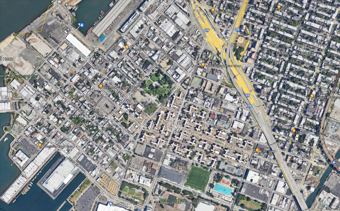
The neighborhood has roughly three major destinations to serve. Visible in the center-bottom of the map are the Red Hook Houses, with a total of 6,000 residents. At the very bottom of the map is Ikea, the main destination for people coming into the neighborhood from elsewhere. Then on the left there is Van Brunt, the local commercial drag.
Per OnTheMap, the entire neighborhood has 6,700 jobs and 5,000 employed residents as of 2019; it is not at all a bedroom community. Ikea is not even one of the main job centers – the biggest are elsewhere, such as the nearby Amazon warehouse. The neighborhood’s residents work about 40% in Manhattan, 40% in Brooklyn, and 20% elsewhere, while the workers are half from Brooklyn with no other origin having much concentration (the second biggest county origin, Queens, is 14%). Only 300 people both live and work in Red Hook, so a transit system connecting the neighborhood to the rest of the city, for both origins and destinations, is vital.
Why the tunnel?
Red Hook’s current bus connections are only with the rest of Brooklyn. This materially slows down travel for the 40% of residents who work in Manhattan and roughly 10% who work in places one accesses via Manhattan, such as the Bronx or Long Island City. The on-street bus connections are slow, and the neighborhood is not well-located relative to the Brooklyn subway network. The B57 only kind of hits Smith/9th southbound, since Smith is one-way northbound and the southbound trip is one block west on Court. Smith/9th itself is not accessible, and is the highest subway station in the system above the local street level as it was built with high clearance below for shipping through the Gowanus Canal.
Let’s look at how fast it is to get to 42nd Street. Via the B57 or B61, it’s about 10 minutes by bus from Ikea to Smith/9th; the B61 runs every 12 minutes and the B57 every 15 or 20, for maximum inconvenience. Then from Smith/9th to Bryant Park, it’s 27 minutes on the F. A bus in the tunnel would get to Fulton Street in 25 minutes and then it’s 12 minutes on the A. In theory, it’s the same trip time from Ikea, and around three minutes faster in relative terms from the Red Hook Houses depending on the route. In practice, being able to connect in Manhattan means having a much wider variety of destinations than just what’s on the F, which doesn’t even get to Lower Manhattan. The benefits for Red Hook-to-rest-of-city commuters would be noticeable.
The Manhattan street section would have variable traffic. On the other hand, the tunnel is less congested than its approaches, and congestion pricing stands to reduce traffic exactly there, as on other roads into the Manhattan core. With no bus stops in the tunnel, the average speed would be reasonable even with a short loop through Lower Manhattan. Diverting ridership from slower buses to Downtown Brooklyn would save revenue-hours, which could then be spent on higher frequency on all remaining routes.
Compromises on the route
The routing within the neighborhood for any bus route using the tunnel cannot be perfect; the neighborhood is not laid out for it. This is seen in how awkward the buses through Red Hook are today, as mentioned above; none of them even goes through the Red Hook Houses, which are the dominant origin. All of the following constraints require creating a single compromise bus route:
- The ridership potential is not there for more than one route. Whatever option is chosen, whether it’s a shuttle as I’m implying in this post or an extension of an existing route that goes deeper into Manhattan (or Brooklyn), that’s the only thing that can run. Even with one route, there may need to be compromises on frequency (by which I mean a bus every 8-10 minutes instead of 6, not 12).
- Van Brunt, Ikea plus the other waterfront jobs, and the Red Hook Houses are not at all collinear.
- The only place to get to the tunnel from Red Hook is the ramp from West 9th or Huntington, and West 9th is one-way west and may need to be converted to two-way. In particular, Van Brunt is too far, and the interface with the tunnel needs to be to and from the Red Hook Houses directly.
In effect, what all of the above implies is that a bus to Manhattan on Van Brunt is not likely to work. Here is one version of what could:

The circles along the path denote control points on Google Maps, and not stops. The western waterfront may have to just not be served; people could walk from Van Brunt across Coffey Park and it would be faster than taking the bus the long way around, down Van Brunt and then along Beard and up Columbia.
At the Manhattan end, the route would either loop just far enough north to hit the Fulton Street subway complex, or through-run. Fulton is necessary because the Wall Street stations are inaccessible, and is generally useful for the connection to World Trade Center. Beyond that, one option is to through-run to the M9, which hits more Manhattan destinations. That said, Manhattan bus speeds are so low that nearly all riders would switch to the subway; M9 frequencies are also low, every 15 minutes off-peak, and when there’s not much traffic this is almost unusably low for Red Hook Houses-Wall Street trips.
Scheduling Trains in New Jersey with the Gateway Project
Devin and I have draft timetables for intercity and commuter trains on every segment of the Northeast Corridor; what is left is to merge the segments together and see how they interact, tweak based on further constraints, and look at some alternatives. The good news is that in New Jersey, the last area we looked at, sharing tracks turns out to be easy. It’s a happy accident of how the Northeast Corridor has been designed that, with 21st-century train specs, the places where fast trains need to overtake slow ones already have long sections with additional tracks. Work is still required on grade-separating some junctions (chiefly Hunter Interlocking) and fixing some curves largely within the right-of-way, but it’s rather minor. The upshot is that local commuter trains can do New York-New Brunswick in 38 minutes and would do New York-Trenton in an hour, the express commuter trains can do New York-Trenton in 51 minutes, and the intercity trains can do New York-Philadelphia in 45 minutes, all with new rolling stock but few expensive investments in infrastructure beyond what’s already funded as part of the Hudson Tunnel Project for Gateway.
Three speed classes
The Northeast Corridor near New York presents two planning difficulties. First, there is a very large volume of peak commuter traffic into Manhattan, which forces agencies to build infrastructure at the limit of track capacity. And second, there is a long stretch of suburbia from Manhattan, which means that some express commuter rail service is unavoidable. This means that both the New Haven Line and the NJ Transit Northeast Corridor Line have to be planned around three speed classes: local commuter, express commuter, and intercity; moreover, the total volume of trains across these classes must be large, to accommodate peak demand, reaching 24 peak trains per hour. This is why the Hudson Tunnel Project is being built: the existing tunnels run 24 trains per hour already split across many different commuter rail branches, and all of the trains are crowded.
The difficulties in New Jersey and in Metro-North territory are different; for a taste of what is needed for Metro-North, see here. In New Jersey, the quality of the right-of-way is high, and the outer stretches are already cleared for a maximum speed of 160 mph, and with if the Federal Railroad Administration (FRA) had more faith in the quality of rolling stock windows they could run much faster than this. The inner stretches are slower but still straight enough for fairly high speed – there are long stretches straight enough for 250 km/h and one section where trains could even briefly reach 300 km/h. Thus, the express commuter trains are noticeably slower than the intercity trains on these segments despite running nonstop from Newark to Metropark.
All trains are significantly faster than today. Little of the speedup comes from any curve modification; rather, it comes from reduced timetable padding (down to Swiss-standard 7%), plus about 1.5 minutes of speedup in the Penn Station throat from better switch geometry.
Six-track overtakes
The Northeast Corridor is largely quad-track, but two sections have six tracks, both in New Jersey: around Newark Airport, and from just south of Elizabeth to just south of Rahway, where the North Jersey Coast Line branches off. The four-track section through Elizabeth is annoying, and I was hoping that it would not be necessary to delicately schedule around it. It is fortunate that my hopes have proved correct.
Below is a rough line chart. For one, it does not have any schedule padding. For two, there are still some additional slowdowns not coming from right-of-way geometry not incorporated into it, and in particular there’s a minute of Penn Station and tunnel delay not yet depicted for the intercity train and another 30 seconds of same for the commuter trains. For three, all station dwell times are set at 30 seconds, whereas the intercity needs a minute. In total, the last two factors delay the intercity by a minute relative to all commuter trains by when they depart Newark. All of these factors figure into the trip times above, but not the line chart below.
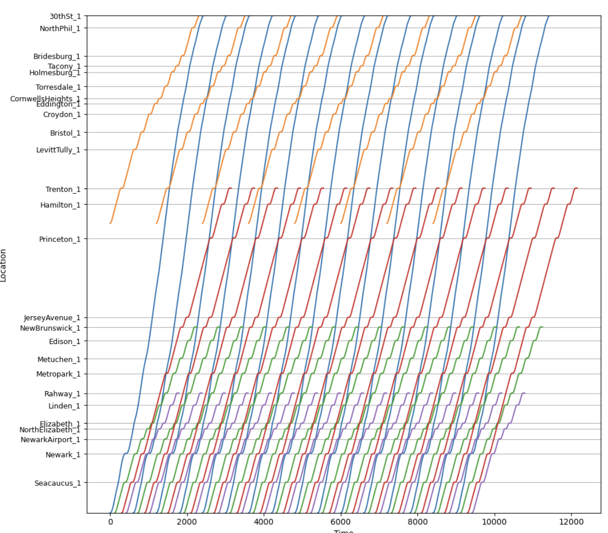
The blue lines are intercity trains, the red lines are express commuter trains, the green lines are local commuter trains to New Brunswick or Jersey Avenue, the purple lines are local commuter trains branching to the North Jersey Coast Line, and the gold lines are SEPTA trains.
Of note, the intercity trains do not share tracks with the local commuter trains except in the tunnel to Penn Station; the current plan after the Hudson Tunnel Project is finished is for the above-depicted trains to use the old tunnel and for other lines (Morris and Essex, Montclair-Boonton, Raritan Valley) to use the new tunnel. This provides just enough separation that there isn’t much interlining to worry about. The express commuter trains are the only ones with any surface track-sharing with trains of different speed classes.
As the line chart shows, the red/green overtake occurs at Elizabeth, where the express commuter trains then need to be on the inner express tracks. Just south of Elizabeth, the line widens to six tracks, and the express commuter trains can be kept separate from both local trains and intercity trains; all that’s required is installing switches to allow this, for a very small number of millions of dollars for high-speed switches or hundreds of thousands for slower switches. By the time the intercity and express commuter trains are within the signal system’s two-minute limit of each other, the express commuter trains don’t need to return to the inner tracks again. Past Rahway, the express and local commuter trains need to use the same tracks, but are adequately separated from each other.
Robustness check
We are still looking at options for how to match this segment with other segments, in particular how this could through-run east of Penn Station. Most likely, the local trains would run through to the Port Washington Branch of the LIRR and the express commuter trains would become local commuter trains to Stamford via Penn Station Access.
The upshot is that the train most likely to be delayed from the north is the express commuter train. It can afford to be about two minutes behind schedule before it messes up the order of trains using the tunnel; the schedule padding up to Elizabeth can recover one of these two minutes, and then, with the extra minute of slowdown of intercities not depicted in the line chart, the express commuter trains are still well clear of the intercities where they share tracks at Elizabeth.
Stop Spacing on Crosstown Routes
Two different issues in New York – the bus redesign process and the Interborough Express – are making me think about optimal stop spacing again. I blogged about it in general about buses a few days ago, but crosstown routes present their own special issues, and this is noticeable on rail more than on buses. Circumferential rail routes, in particular, can justify wider stop spacing than radial routes in certain circumstances. This can explain why, over the iterations of Triboro RX leading to the current IBX proposal, the stop spacing has widened: the Third Regional Plan-era effort in the 2000s had a stop every half mile in Brooklyn and Queens, but more recent efforts proposed fewer stops, and the current one if anything has too few and misses a transfer.
Density and isotropy
The tradeoff in stop spacing on both buses and trains is that more stops reduce the amount of walking to the station but increase the in-vehicle trip time for people going through the stop without getting on or off.
Density by itself does not affect this tradeoff. A uniform increase in density along a line equally increases the costs and benefits of changing the stop spacing. However, relative density matters: stop spacing should be tighter in areas with higher density and wider in areas with lower density, both relative to other areas along the same line. This is because higher relative density means passengers are disproportionately likely to have their origin or destination in this area, and disproportionately less likely to be traveling through it, both of which argue in favor of tighter stop spacing, and lower relative density means the opposite.
This then leads to the issue of isotropy. On an isotropic network, relative density is by definition always the same; spikes in relative density make travel less isotropic. As my previous post explains with bus stop spacing formulas, also valid on rail with different parameters, less isotropic density should mean not just that there should be more stops in some places and fewer in others, but also that there should be fewer stops overall. In the simplest case of non-isotropy, assume everyone is traveling to the same distinguished node, which on a rail line can be thought of as city center (let’s say there’s just one central transfer point) and on a bus can be thought of as the connection to the subway. Then, all passengers can be guaranteed to be going to a place with a station, and therefore the cost of widening the stop spacing is halved, since only the origin walk time is increased, not the destination walk time.
Isotropy and circumferential routes
Successful circumferential routes live off of their ability to connect to the rest of the network. Over time, those connection points may grow to become large destinations in their own right – this is the story of how Ikebukuro, Shinjuku, and Shibuya, all at the intersection of the Yamanote Line with radial rail links (JR, private, or subway), became large business districts. But the connections have to come first. If passengers can’t conveniently transfer, then the route has to live off of origin-and-destination traffic just on the line, and then, because it is circumferential and by definition doesn’t go to city center, traffic will be low. This principle is why the G train in New York is so weak: it may connect the two largest non-Manhattan job centers in the region, but that’s still neither Manhattan nor service to the entire city, and with poor transfers, it has to live off of the small number of people living in Williamsburg and Bedford-Stuyvesant working in Long Island City or Downtown Brooklyn.
But the same principle also means that non-transfer stops lose value. This doesn’t mean there shouldn’t be any of them, but it does mean that agencies can afford to be pickier about where to place them. They’re unlikely to be destinations, only origins, and even as origins their value is discounted since some passengers use the circumferential line as the second leg of a three-legged trip, between two radial lines.
The impact on IBX
I used to criticize the decision to build fewer stops on IBX. For example, here, when it was still an RPA proposal in what would later become the Fourth Regional Plan, I outlined several criticisms of the then-Triboro route. I think some of them stand, especially the section on the plan to have the route go into the Bronx and provide local commuter rail service to Coop City. However, on the matter of stop spacing, I must withdraw the criticism.
That said, a station at every connection with a radial rail line remains nonnegotiable. IBX errs in only stopping in East New York at Atlantic Avenue, connecting to the L and the LIRR, with no direct connection to Broadway Junction for the A/C and J. The distance between these two locations is only 350 meters, and it may be awkward to have two stops in short succession, but the meaning of high relative density is exactly that it’s okay to have more closely spaced stops. Alternatively, there could be one stop at a compromise location, with in-system connections at both ends, but then the walk times would be higher, which is less desirable.
Bus Stop Consolidation and Blocks
There are arguments over bus stop spacing in my Discord channel. As the Queens bus redesign process is being finalized, there’s a last round of community input, and as one may expect, community board members amplify the complaints of people who reject any stop consolidation on “they’re taking my stop, I’ll have to walk longer” grounds. I wrote about this in 2018, as Eric and I were releasing our proposed Brooklyn bus redesign, which included fairly aggressive consolidation, to an average interstation of almost 500 meters, up from the current value of about 260. I’d like to revisit this issue in this post, first because of its renewed relevance, and second because there’s a complication that I did not incorporate into my formula before, coming from the fact that the city comprises discrete blocks rather than perfectly isotropic distribution of residents along an avenue.
The formula for bus stop spacing
The tradeoff is that stop consolidation means people have to walk longer to the bus stop but then the bus is faster. In practice, this means the bus is also more frequent by a proportionate amount – the resources required to operate a bus depend on time rather than distance, chiefly the driver’s wage, but also maintenance and fuel, since stops incur acceleration and idling cycles that stress the engines and consume more fuel.
The time penalty of each stop can be modeled as the total of the amount of time the bus needs to pull into the stop, the minimum amount of time it takes to open and close the doors, and the time it takes to pull out. Passenger boardings are not included, because those are assumed to be redistributed to other stops if a stop is deleted. In New York and Vancouver, the difference in schedules between local and limited stop buses in the 2010s was consistent with a penalty of about 25 seconds per stop.
The optimum stop spacing can be expressed with the following formula:

To explain in more detail:
- d is a dimensionless factor indicating how far one must walk, based on the stop spacing; the more isotropic passenger travel is, the lower d is, to a minimum of 2. The specific meaning of d is that if the stop spacing is n, then the average walk is n/d. For example, if there is perfect isotropy, then passengers’ distance from the nearest bus stop is uniformly distributed between 0 and n/2, so the average is n/4, and this needs to be repeated at the destination end, summing to n/2.
- Walk speed and walk penalty take into account that passengers prefer spending time on a moving bus to walking to the bus. In the literature that I’ve seen, the penalty is 2. Usually the literature assumes the walk speed is around 5 km/h, or 1.4 m/s; able-bodied adults without luggage walk faster, especially in New York, but the speed for disabled people is lower, around 1 m/s for the most common cases.
- Stop penalty, as mentioned above, can be taken to be 25 s.
- Average trip length is unlinked; for New York City Transit in 2019, counting NYCT local buses including SBS but not express buses, the average was 3,421 meters.
- Average bus spacing is the headway between buses on the route measured in units of distance, not speed; it’s expressed this way since the resources available can be expressed in how many buses can circulate at a given time, and then the frequency is the product of this figure with speed. In Brooklyn in the 2010s, this average was 1,830 m; our proposed network, pruning weaker routes, cut it to 1,180. The Queens figure as of 2017 appears similar to the Brooklyn figure, maybe 1,860 m. Summing the average trip length and average bus spacing indicates that passengers treat wait time as a worst-case scenario, or, equivalently, that they treat it as an average case but with a wait penalty of 2, which is consistent with estimates in the papers I’ve read.
In the most isotropic case, with d = 2, plugging in the numbers gives,

However, isotropy is more complex than this. For one, if we’re guaranteed that all passengers are connecting to one distinguished stop, say a subway connection point, then consolidating stops will still make them walk longer at the other end, but it will not make them walk any longer at the guaranteed end, since that stop is retained. In that case, we need to set d = 4 (because the average distance to a bus stop if the interstation is n is n/4 and at the other end we’re guaranteed there’s no walk), and the same formula gives,

The Queens bus redesign recognizes this to an extent by setting up what it calls rush routes, designed to get passengers from outlying areas in Eastern Queens to the subway connection points of Flushing and Jamaica; those are supposed to have longer interstations, but in practice this difference has shrunk in more recent revisions.
That said, even then, there’s a complication.
City blocks and isotropy
The models above assume that passengers’ origins are equally distributed along a line. For example, here is Main Street through Kew Gardens Hills, the stretch I am most likely to use a New York bus on:
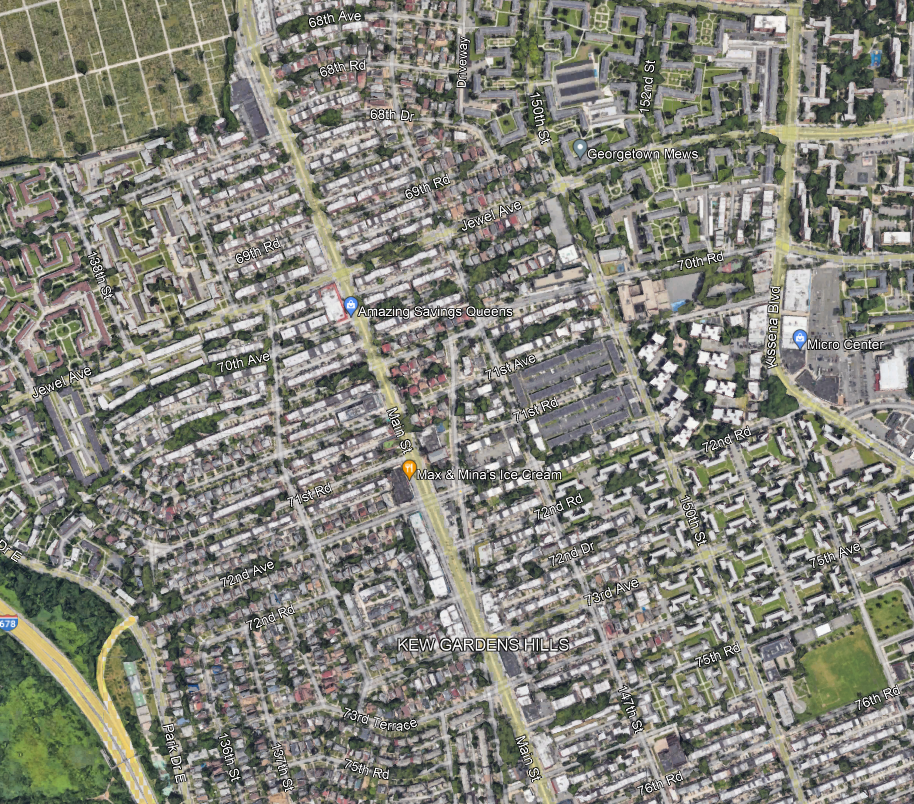
I always take the bus to connect to Flushing or Jamaica, but within Kew Gardens Hills, the assumption of isotropy means that passengers are equally likely to be getting on the bus at any point along Main Street.
And this assumption does not really work in any city with blocks. In practice, neighborhood residents travel to Main Street via the side streets, which are called avenues, roads, or drives, and numbered awkwardly as seen in the picture above (72nd Avenue, then 72nd Road, then 72nd Drive, then 73rd Avenue, then 75th Avenue…). The density along each of those side streets is fairly consistent, so passengers are equally likely to be originating from any of these streets, for the most part. But they are always going to originate from a side street, and not from a point between them.
The local bus along Main, the Q20, stops every three blocks for the most part, with some interstations of only two blocks. Let’s analyze what happens if the system consolidates from a stop every three blocks, which is 240 meters, to a stop every six, which is 480. Here, we assume isotropy among the side streets, but not continuous isotropy – in other words, we assume passengers all come from a street but are equally likely to be coming from any street.
With that in mind, take a six-block stretch, starting and ending with a stop that isn’t deleted. Let’s call this stretch 0th Street through 6th Street, to avoid having to deal with the weird block numbering in Kew Gardens Hills; we need to investigate the impact of deleting a stop on 3rd Street. With that in mind: passengers originating on 0th and 1st keep going to 0th Street and suffer no additional walk, passengers originating on 5th keep going to 6th and also suffer no additional walk, passengers originating on 2nd and 4th have to walk two blocks instead of one, and passengers originating on 3rd have to walk three blocks instead of zero. The average extra walk is 5/6 of a block. This is actually more than one quarter of the increase in the stop spacing; if there is a distinguished destination at the other end (and there is), then instead of d = 4, we need to use d = 3/(5/6) = 3.6. This shrinks the optimum a bit, but still to 576 m, which is about seven blocks.
The trick here is that if the stop spacing is an even number of blocks, then we can assume continuous isotropy – passengers are equally likely to be in the best circumstance (living on a street with a stop) and in the worst (living on a street midway between stops). If it’s an odd number of blocks, we get a very small bonus from the fact that passengers are not going to live on a street midway between stops, because there isn’t one. The average walk distance, in blocks, with stops every 1, 2, 3, … blocks, is 0, 0.5, 2/3, 1, 1.2, 1.5, 12/7, 2, … Thus, ever so slightly, planners should perhaps favor a stop every five or seven blocks and not every six, in marginal cases. To be clear, the stop spacing on each stretch should be uniform, so if there are 12 blocks between two distinguished destinations, there should be one intermediate stop at the exact midpoint, but, perhaps, if there are 30 blocks with no real internal structure of more or less important streets, a stop should be placed every five and not six blocks, especially if destinations are not too concentrated.
