Category: Good Transit
Red Hook-Manhattan Buses
In 2018, Eric’s and my Brooklyn bus redesign proposal included a new route to run between Red Hook and Lower Manhattan using the Brooklyn-Battery Tunnel. This was not our idea; a junior planner we talked to suggested this. Our plan was not adopted, but in the formal process New York City Transit and consultancy Sam Schwartz engaged in, at community meetings riders proposed the same idea, and junior staff seemed to like it but it was still not adopted. Now, a coalition of neighborhood groups and city-wide transit advocacy groups is directly calling for such a bus to be included in the Brooklyn bus redesign, including ETA. My goal in this post is to look at some alignment possibilities, more carefully than we did in the 2018 proposal. On the Manhattan side, it is not too hard to hit Lower Manhattan jobs and subway transfers on a short bus loop, but on the Brooklyn side, the Red Hook street network and its connection to the tunnel force serious compromises.
Current conditions
There are express buses in the tunnel from points much farther out to Lower Manhattan, but they don’t make stops along the way. Red Hook is instead served exclusively within Brooklyn, in three directions: one north along Van Brunt to Downtown Brooklyn, one east along Lorraine to the Smith/9th Street subway station and Park Slope, and one also along Lorraine to Smith/9th but then going north to Downtown Brooklyn. The first two are together the B61 route, in an awkward C-shaped through-route; the third is the B57, which through-runs past Downtown Brooklyn to points northeast along Flushing Avenue.
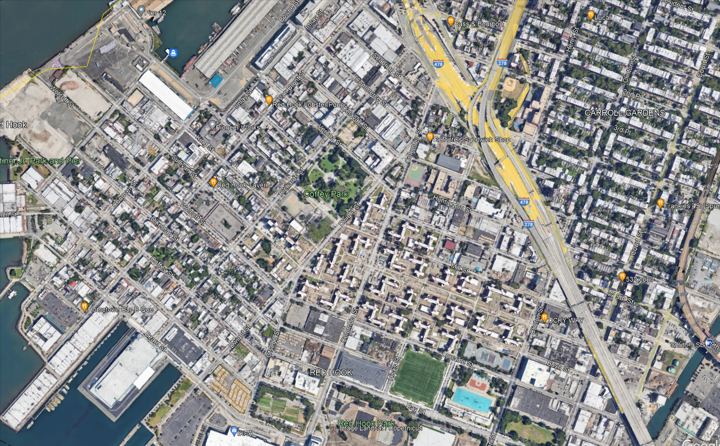
The neighborhood has roughly three major destinations to serve. Visible in the center-bottom of the map are the Red Hook Houses, with a total of 6,000 residents. At the very bottom of the map is Ikea, the main destination for people coming into the neighborhood from elsewhere. Then on the left there is Van Brunt, the local commercial drag.
Per OnTheMap, the entire neighborhood has 6,700 jobs and 5,000 employed residents as of 2019; it is not at all a bedroom community. Ikea is not even one of the main job centers – the biggest are elsewhere, such as the nearby Amazon warehouse. The neighborhood’s residents work about 40% in Manhattan, 40% in Brooklyn, and 20% elsewhere, while the workers are half from Brooklyn with no other origin having much concentration (the second biggest county origin, Queens, is 14%). Only 300 people both live and work in Red Hook, so a transit system connecting the neighborhood to the rest of the city, for both origins and destinations, is vital.
Why the tunnel?
Red Hook’s current bus connections are only with the rest of Brooklyn. This materially slows down travel for the 40% of residents who work in Manhattan and roughly 10% who work in places one accesses via Manhattan, such as the Bronx or Long Island City. The on-street bus connections are slow, and the neighborhood is not well-located relative to the Brooklyn subway network. The B57 only kind of hits Smith/9th southbound, since Smith is one-way northbound and the southbound trip is one block west on Court. Smith/9th itself is not accessible, and is the highest subway station in the system above the local street level as it was built with high clearance below for shipping through the Gowanus Canal.
Let’s look at how fast it is to get to 42nd Street. Via the B57 or B61, it’s about 10 minutes by bus from Ikea to Smith/9th; the B61 runs every 12 minutes and the B57 every 15 or 20, for maximum inconvenience. Then from Smith/9th to Bryant Park, it’s 27 minutes on the F. A bus in the tunnel would get to Fulton Street in 25 minutes and then it’s 12 minutes on the A. In theory, it’s the same trip time from Ikea, and around three minutes faster in relative terms from the Red Hook Houses depending on the route. In practice, being able to connect in Manhattan means having a much wider variety of destinations than just what’s on the F, which doesn’t even get to Lower Manhattan. The benefits for Red Hook-to-rest-of-city commuters would be noticeable.
The Manhattan street section would have variable traffic. On the other hand, the tunnel is less congested than its approaches, and congestion pricing stands to reduce traffic exactly there, as on other roads into the Manhattan core. With no bus stops in the tunnel, the average speed would be reasonable even with a short loop through Lower Manhattan. Diverting ridership from slower buses to Downtown Brooklyn would save revenue-hours, which could then be spent on higher frequency on all remaining routes.
Compromises on the route
The routing within the neighborhood for any bus route using the tunnel cannot be perfect; the neighborhood is not laid out for it. This is seen in how awkward the buses through Red Hook are today, as mentioned above; none of them even goes through the Red Hook Houses, which are the dominant origin. All of the following constraints require creating a single compromise bus route:
- The ridership potential is not there for more than one route. Whatever option is chosen, whether it’s a shuttle as I’m implying in this post or an extension of an existing route that goes deeper into Manhattan (or Brooklyn), that’s the only thing that can run. Even with one route, there may need to be compromises on frequency (by which I mean a bus every 8-10 minutes instead of 6, not 12).
- Van Brunt, Ikea plus the other waterfront jobs, and the Red Hook Houses are not at all collinear.
- The only place to get to the tunnel from Red Hook is the ramp from West 9th or Huntington, and West 9th is one-way west and may need to be converted to two-way. In particular, Van Brunt is too far, and the interface with the tunnel needs to be to and from the Red Hook Houses directly.
In effect, what all of the above implies is that a bus to Manhattan on Van Brunt is not likely to work. Here is one version of what could:

The circles along the path denote control points on Google Maps, and not stops. The western waterfront may have to just not be served; people could walk from Van Brunt across Coffey Park and it would be faster than taking the bus the long way around, down Van Brunt and then along Beard and up Columbia.
At the Manhattan end, the route would either loop just far enough north to hit the Fulton Street subway complex, or through-run. Fulton is necessary because the Wall Street stations are inaccessible, and is generally useful for the connection to World Trade Center. Beyond that, one option is to through-run to the M9, which hits more Manhattan destinations. That said, Manhattan bus speeds are so low that nearly all riders would switch to the subway; M9 frequencies are also low, every 15 minutes off-peak, and when there’s not much traffic this is almost unusably low for Red Hook Houses-Wall Street trips.
Scheduling Trains in New Jersey with the Gateway Project
Devin and I have draft timetables for intercity and commuter trains on every segment of the Northeast Corridor; what is left is to merge the segments together and see how they interact, tweak based on further constraints, and look at some alternatives. The good news is that in New Jersey, the last area we looked at, sharing tracks turns out to be easy. It’s a happy accident of how the Northeast Corridor has been designed that, with 21st-century train specs, the places where fast trains need to overtake slow ones already have long sections with additional tracks. Work is still required on grade-separating some junctions (chiefly Hunter Interlocking) and fixing some curves largely within the right-of-way, but it’s rather minor. The upshot is that local commuter trains can do New York-New Brunswick in 38 minutes and would do New York-Trenton in an hour, the express commuter trains can do New York-Trenton in 51 minutes, and the intercity trains can do New York-Philadelphia in 45 minutes, all with new rolling stock but few expensive investments in infrastructure beyond what’s already funded as part of the Hudson Tunnel Project for Gateway.
Three speed classes
The Northeast Corridor near New York presents two planning difficulties. First, there is a very large volume of peak commuter traffic into Manhattan, which forces agencies to build infrastructure at the limit of track capacity. And second, there is a long stretch of suburbia from Manhattan, which means that some express commuter rail service is unavoidable. This means that both the New Haven Line and the NJ Transit Northeast Corridor Line have to be planned around three speed classes: local commuter, express commuter, and intercity; moreover, the total volume of trains across these classes must be large, to accommodate peak demand, reaching 24 peak trains per hour. This is why the Hudson Tunnel Project is being built: the existing tunnels run 24 trains per hour already split across many different commuter rail branches, and all of the trains are crowded.
The difficulties in New Jersey and in Metro-North territory are different; for a taste of what is needed for Metro-North, see here. In New Jersey, the quality of the right-of-way is high, and the outer stretches are already cleared for a maximum speed of 160 mph, and with if the Federal Railroad Administration (FRA) had more faith in the quality of rolling stock windows they could run much faster than this. The inner stretches are slower but still straight enough for fairly high speed – there are long stretches straight enough for 250 km/h and one section where trains could even briefly reach 300 km/h. Thus, the express commuter trains are noticeably slower than the intercity trains on these segments despite running nonstop from Newark to Metropark.
All trains are significantly faster than today. Little of the speedup comes from any curve modification; rather, it comes from reduced timetable padding (down to Swiss-standard 7%), plus about 1.5 minutes of speedup in the Penn Station throat from better switch geometry.
Six-track overtakes
The Northeast Corridor is largely quad-track, but two sections have six tracks, both in New Jersey: around Newark Airport, and from just south of Elizabeth to just south of Rahway, where the North Jersey Coast Line branches off. The four-track section through Elizabeth is annoying, and I was hoping that it would not be necessary to delicately schedule around it. It is fortunate that my hopes have proved correct.
Below is a rough line chart. For one, it does not have any schedule padding. For two, there are still some additional slowdowns not coming from right-of-way geometry not incorporated into it, and in particular there’s a minute of Penn Station and tunnel delay not yet depicted for the intercity train and another 30 seconds of same for the commuter trains. For three, all station dwell times are set at 30 seconds, whereas the intercity needs a minute. In total, the last two factors delay the intercity by a minute relative to all commuter trains by when they depart Newark. All of these factors figure into the trip times above, but not the line chart below.
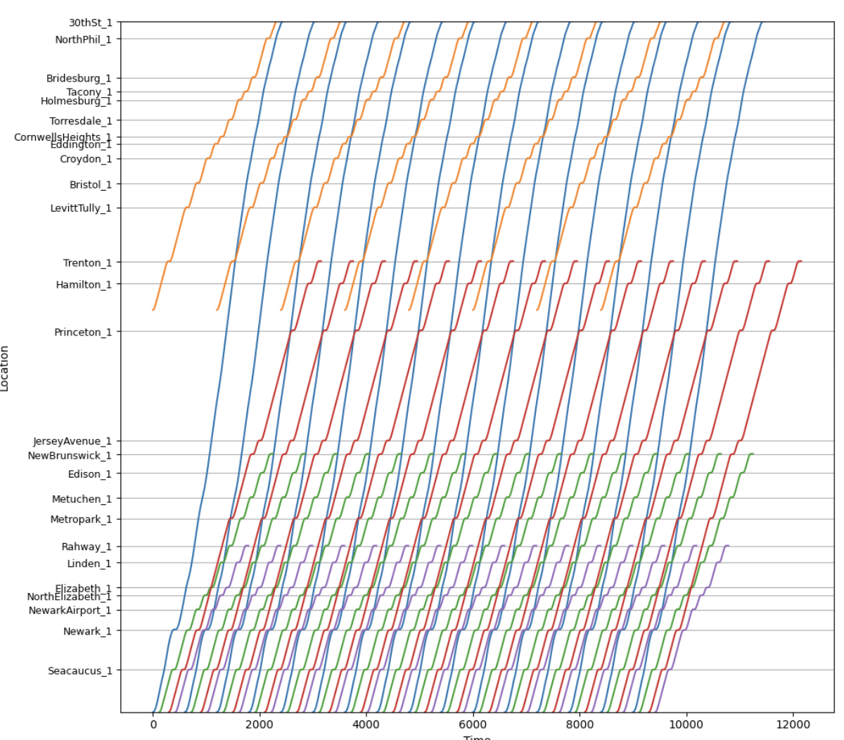
The blue lines are intercity trains, the red lines are express commuter trains, the green lines are local commuter trains to New Brunswick or Jersey Avenue, the purple lines are local commuter trains branching to the North Jersey Coast Line, and the gold lines are SEPTA trains.
Of note, the intercity trains do not share tracks with the local commuter trains except in the tunnel to Penn Station; the current plan after the Hudson Tunnel Project is finished is for the above-depicted trains to use the old tunnel and for other lines (Morris and Essex, Montclair-Boonton, Raritan Valley) to use the new tunnel. This provides just enough separation that there isn’t much interlining to worry about. The express commuter trains are the only ones with any surface track-sharing with trains of different speed classes.
As the line chart shows, the red/green overtake occurs at Elizabeth, where the express commuter trains then need to be on the inner express tracks. Just south of Elizabeth, the line widens to six tracks, and the express commuter trains can be kept separate from both local trains and intercity trains; all that’s required is installing switches to allow this, for a very small number of millions of dollars for high-speed switches or hundreds of thousands for slower switches. By the time the intercity and express commuter trains are within the signal system’s two-minute limit of each other, the express commuter trains don’t need to return to the inner tracks again. Past Rahway, the express and local commuter trains need to use the same tracks, but are adequately separated from each other.
Robustness check
We are still looking at options for how to match this segment with other segments, in particular how this could through-run east of Penn Station. Most likely, the local trains would run through to the Port Washington Branch of the LIRR and the express commuter trains would become local commuter trains to Stamford via Penn Station Access.
The upshot is that the train most likely to be delayed from the north is the express commuter train. It can afford to be about two minutes behind schedule before it messes up the order of trains using the tunnel; the schedule padding up to Elizabeth can recover one of these two minutes, and then, with the extra minute of slowdown of intercities not depicted in the line chart, the express commuter trains are still well clear of the intercities where they share tracks at Elizabeth.
Stop Spacing on Crosstown Routes
Two different issues in New York – the bus redesign process and the Interborough Express – are making me think about optimal stop spacing again. I blogged about it in general about buses a few days ago, but crosstown routes present their own special issues, and this is noticeable on rail more than on buses. Circumferential rail routes, in particular, can justify wider stop spacing than radial routes in certain circumstances. This can explain why, over the iterations of Triboro RX leading to the current IBX proposal, the stop spacing has widened: the Third Regional Plan-era effort in the 2000s had a stop every half mile in Brooklyn and Queens, but more recent efforts proposed fewer stops, and the current one if anything has too few and misses a transfer.
Density and isotropy
The tradeoff in stop spacing on both buses and trains is that more stops reduce the amount of walking to the station but increase the in-vehicle trip time for people going through the stop without getting on or off.
Density by itself does not affect this tradeoff. A uniform increase in density along a line equally increases the costs and benefits of changing the stop spacing. However, relative density matters: stop spacing should be tighter in areas with higher density and wider in areas with lower density, both relative to other areas along the same line. This is because higher relative density means passengers are disproportionately likely to have their origin or destination in this area, and disproportionately less likely to be traveling through it, both of which argue in favor of tighter stop spacing, and lower relative density means the opposite.
This then leads to the issue of isotropy. On an isotropic network, relative density is by definition always the same; spikes in relative density make travel less isotropic. As my previous post explains with bus stop spacing formulas, also valid on rail with different parameters, less isotropic density should mean not just that there should be more stops in some places and fewer in others, but also that there should be fewer stops overall. In the simplest case of non-isotropy, assume everyone is traveling to the same distinguished node, which on a rail line can be thought of as city center (let’s say there’s just one central transfer point) and on a bus can be thought of as the connection to the subway. Then, all passengers can be guaranteed to be going to a place with a station, and therefore the cost of widening the stop spacing is halved, since only the origin walk time is increased, not the destination walk time.
Isotropy and circumferential routes
Successful circumferential routes live off of their ability to connect to the rest of the network. Over time, those connection points may grow to become large destinations in their own right – this is the story of how Ikebukuro, Shinjuku, and Shibuya, all at the intersection of the Yamanote Line with radial rail links (JR, private, or subway), became large business districts. But the connections have to come first. If passengers can’t conveniently transfer, then the route has to live off of origin-and-destination traffic just on the line, and then, because it is circumferential and by definition doesn’t go to city center, traffic will be low. This principle is why the G train in New York is so weak: it may connect the two largest non-Manhattan job centers in the region, but that’s still neither Manhattan nor service to the entire city, and with poor transfers, it has to live off of the small number of people living in Williamsburg and Bedford-Stuyvesant working in Long Island City or Downtown Brooklyn.
But the same principle also means that non-transfer stops lose value. This doesn’t mean there shouldn’t be any of them, but it does mean that agencies can afford to be pickier about where to place them. They’re unlikely to be destinations, only origins, and even as origins their value is discounted since some passengers use the circumferential line as the second leg of a three-legged trip, between two radial lines.
The impact on IBX
I used to criticize the decision to build fewer stops on IBX. For example, here, when it was still an RPA proposal in what would later become the Fourth Regional Plan, I outlined several criticisms of the then-Triboro route. I think some of them stand, especially the section on the plan to have the route go into the Bronx and provide local commuter rail service to Coop City. However, on the matter of stop spacing, I must withdraw the criticism.
That said, a station at every connection with a radial rail line remains nonnegotiable. IBX errs in only stopping in East New York at Atlantic Avenue, connecting to the L and the LIRR, with no direct connection to Broadway Junction for the A/C and J. The distance between these two locations is only 350 meters, and it may be awkward to have two stops in short succession, but the meaning of high relative density is exactly that it’s okay to have more closely spaced stops. Alternatively, there could be one stop at a compromise location, with in-system connections at both ends, but then the walk times would be higher, which is less desirable.
Bus Stop Consolidation and Blocks
There are arguments over bus stop spacing in my Discord channel. As the Queens bus redesign process is being finalized, there’s a last round of community input, and as one may expect, community board members amplify the complaints of people who reject any stop consolidation on “they’re taking my stop, I’ll have to walk longer” grounds. I wrote about this in 2018, as Eric and I were releasing our proposed Brooklyn bus redesign, which included fairly aggressive consolidation, to an average interstation of almost 500 meters, up from the current value of about 260. I’d like to revisit this issue in this post, first because of its renewed relevance, and second because there’s a complication that I did not incorporate into my formula before, coming from the fact that the city comprises discrete blocks rather than perfectly isotropic distribution of residents along an avenue.
The formula for bus stop spacing
The tradeoff is that stop consolidation means people have to walk longer to the bus stop but then the bus is faster. In practice, this means the bus is also more frequent by a proportionate amount – the resources required to operate a bus depend on time rather than distance, chiefly the driver’s wage, but also maintenance and fuel, since stops incur acceleration and idling cycles that stress the engines and consume more fuel.
The time penalty of each stop can be modeled as the total of the amount of time the bus needs to pull into the stop, the minimum amount of time it takes to open and close the doors, and the time it takes to pull out. Passenger boardings are not included, because those are assumed to be redistributed to other stops if a stop is deleted. In New York and Vancouver, the difference in schedules between local and limited stop buses in the 2010s was consistent with a penalty of about 25 seconds per stop.
The optimum stop spacing can be expressed with the following formula:

To explain in more detail:
- d is a dimensionless factor indicating how far one must walk, based on the stop spacing; the more isotropic passenger travel is, the lower d is, to a minimum of 2. The specific meaning of d is that if the stop spacing is n, then the average walk is n/d. For example, if there is perfect isotropy, then passengers’ distance from the nearest bus stop is uniformly distributed between 0 and n/2, so the average is n/4, and this needs to be repeated at the destination end, summing to n/2.
- Walk speed and walk penalty take into account that passengers prefer spending time on a moving bus to walking to the bus. In the literature that I’ve seen, the penalty is 2. Usually the literature assumes the walk speed is around 5 km/h, or 1.4 m/s; able-bodied adults without luggage walk faster, especially in New York, but the speed for disabled people is lower, around 1 m/s for the most common cases.
- Stop penalty, as mentioned above, can be taken to be 25 s.
- Average trip length is unlinked; for New York City Transit in 2019, counting NYCT local buses including SBS but not express buses, the average was 3,421 meters.
- Average bus spacing is the headway between buses on the route measured in units of distance, not speed; it’s expressed this way since the resources available can be expressed in how many buses can circulate at a given time, and then the frequency is the product of this figure with speed. In Brooklyn in the 2010s, this average was 1,830 m; our proposed network, pruning weaker routes, cut it to 1,180. The Queens figure as of 2017 appears similar to the Brooklyn figure, maybe 1,860 m. Summing the average trip length and average bus spacing indicates that passengers treat wait time as a worst-case scenario, or, equivalently, that they treat it as an average case but with a wait penalty of 2, which is consistent with estimates in the papers I’ve read.
In the most isotropic case, with d = 2, plugging in the numbers gives,

However, isotropy is more complex than this. For one, if we’re guaranteed that all passengers are connecting to one distinguished stop, say a subway connection point, then consolidating stops will still make them walk longer at the other end, but it will not make them walk any longer at the guaranteed end, since that stop is retained. In that case, we need to set d = 4 (because the average distance to a bus stop if the interstation is n is n/4 and at the other end we’re guaranteed there’s no walk), and the same formula gives,

The Queens bus redesign recognizes this to an extent by setting up what it calls rush routes, designed to get passengers from outlying areas in Eastern Queens to the subway connection points of Flushing and Jamaica; those are supposed to have longer interstations, but in practice this difference has shrunk in more recent revisions.
That said, even then, there’s a complication.
City blocks and isotropy
The models above assume that passengers’ origins are equally distributed along a line. For example, here is Main Street through Kew Gardens Hills, the stretch I am most likely to use a New York bus on:
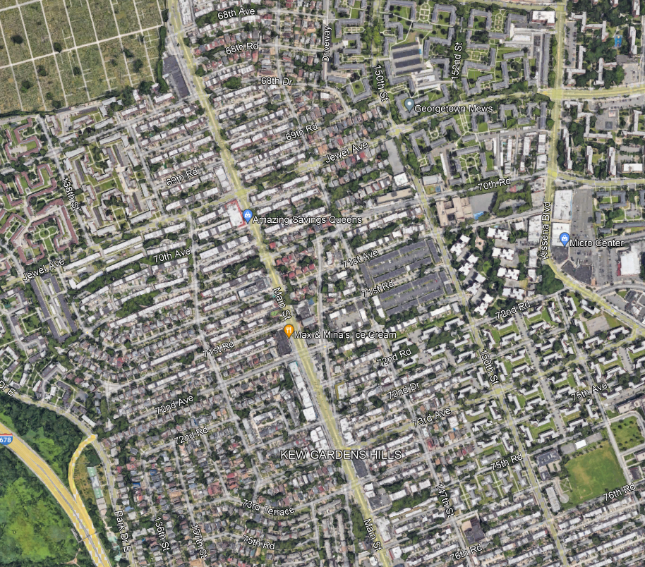
I always take the bus to connect to Flushing or Jamaica, but within Kew Gardens Hills, the assumption of isotropy means that passengers are equally likely to be getting on the bus at any point along Main Street.
And this assumption does not really work in any city with blocks. In practice, neighborhood residents travel to Main Street via the side streets, which are called avenues, roads, or drives, and numbered awkwardly as seen in the picture above (72nd Avenue, then 72nd Road, then 72nd Drive, then 73rd Avenue, then 75th Avenue…). The density along each of those side streets is fairly consistent, so passengers are equally likely to be originating from any of these streets, for the most part. But they are always going to originate from a side street, and not from a point between them.
The local bus along Main, the Q20, stops every three blocks for the most part, with some interstations of only two blocks. Let’s analyze what happens if the system consolidates from a stop every three blocks, which is 240 meters, to a stop every six, which is 480. Here, we assume isotropy among the side streets, but not continuous isotropy – in other words, we assume passengers all come from a street but are equally likely to be coming from any street.
With that in mind, take a six-block stretch, starting and ending with a stop that isn’t deleted. Let’s call this stretch 0th Street through 6th Street, to avoid having to deal with the weird block numbering in Kew Gardens Hills; we need to investigate the impact of deleting a stop on 3rd Street. With that in mind: passengers originating on 0th and 1st keep going to 0th Street and suffer no additional walk, passengers originating on 5th keep going to 6th and also suffer no additional walk, passengers originating on 2nd and 4th have to walk two blocks instead of one, and passengers originating on 3rd have to walk three blocks instead of zero. The average extra walk is 5/6 of a block. This is actually more than one quarter of the increase in the stop spacing; if there is a distinguished destination at the other end (and there is), then instead of d = 4, we need to use d = 3/(5/6) = 3.6. This shrinks the optimum a bit, but still to 576 m, which is about seven blocks.
The trick here is that if the stop spacing is an even number of blocks, then we can assume continuous isotropy – passengers are equally likely to be in the best circumstance (living on a street with a stop) and in the worst (living on a street midway between stops). If it’s an odd number of blocks, we get a very small bonus from the fact that passengers are not going to live on a street midway between stops, because there isn’t one. The average walk distance, in blocks, with stops every 1, 2, 3, … blocks, is 0, 0.5, 2/3, 1, 1.2, 1.5, 12/7, 2, … Thus, ever so slightly, planners should perhaps favor a stop every five or seven blocks and not every six, in marginal cases. To be clear, the stop spacing on each stretch should be uniform, so if there are 12 blocks between two distinguished destinations, there should be one intermediate stop at the exact midpoint, but, perhaps, if there are 30 blocks with no real internal structure of more or less important streets, a stop should be placed every five and not six blocks, especially if destinations are not too concentrated.
Subway Expansion and Bus Redesign
The ongoing designs for the Interborough Express are making me think about bus redesign again. Before the Transit Costs Project, Eric and I worked on a proposal for a bus redesign in Brooklyn, which sadly was not adopted. The redesign was based on the reality of 2017 – the ridership patterns, the bus speeds, the extent of the system, etc. Since then the subway map has not changed, but IBX stands to change the map, and with it, the buses should change as well.
With our program having produced both the bus redesign proposal and soon a comprehensive proposal for how to change the city’s built-up layout to take advantage of the new line, I should probably say something about how the buses should change. I say I and not we, because so far we don’t have a project under our program for this; for now, this is just a blog post, though one informed by past work on the subject.

Parallel and orthogonal buses
In general, when a new line opens, it reduces demand on parallel bus routes, which it outcompetes, and increases it on orthogonal ones, which feed it. However, what counts as parallel and what counts as orthogonal are not always obvious.
Case in point: when Second Avenue Subway opened at the end of 2016, ridership on the east-west buses between the Upper East and West Sides fell. The new line in theory runs north-south, but it undulates from the Upper East Side to Times Square, where passengers can connect to trains to the Upper West Side and points north; when I lived at 72nd and York and commuted to Columbia by bus and subway in 2009-10, I calculated that if Second Avenue Subway had been open already, a two-seat subway ride with a Times Square connection would have cut my one-way commute from 50 to 37 minutes.
This means that to understand how a new rail line will impact buses, it’s necessary to look beyond just the line itself, and think what it connects to.
For example, note on the above map that the increase in job access at the Flatbush Avenue station, intersecting the Nostrand Avenue Line, is relatively small, and doesn’t have a big north-south footprint along Nostrand. This is because the location already has subway service connecting to Manhattan, a much larger job center than anything IBX would connect to; the buses at the station, the B41 on Flatbush and B44 on Nostrand, already function as connectors to the subway at this point, and are unlikely to acquire more ridership as a result.
In contrast, the stations at Myrtle and Metropolitan are both seen to have a large increase in job access, and in particular a large increase in job access along those two avenues even somewhat away from the stations. On Myrtle, the current buses are the B54 and Q55; the B54 connects to the M train, but it’s one branch, and then the bus continues to Downtown Brooklyn, to which there’s no good subway connection from the future IBX station. The B54 is likely to lose ridership to Downtown Brooklyn but gain it to the new IBX station, and the Q55 is likely to gain in general, as they ferry passengers to a station where they can quickly and with one change go to any number of express lines. Metropolitan has a similar issue – the Q54 already connects to the M, but at least from points west, nobody has any reason to make that connection since it would just double back, whereas with IBX, the Q54 would efficiently connect people to Jackson Heights, and with an additional change to anywhere on the Queens Boulevard and Flushing Lines.
New nodes
Public transit lines serve two functions: to run along a corridor, and to connect nodes. New York usually thinks in terms of corridors, and indeed names nearly all subway lines after the streets they run on (such as a Manhattan avenue) rather than after where they go. But nodes are important as well. Some of that is reflected in the above analysis of the Flatbush-Nostrand Avenue station, currently Brooklyn College on the Nostrand Avenue Line: it really needs to be thought of as a node, and IBX will strengthen it, but not by enough to require running more B41 and B44 buses. In contrast, other nodes will be strengthened enough that bus service increases are warranted.
East New York/Broadway Junction is the biggest standout. East New York’s bus network today is not much of a grid – instead, buses connect outlying areas to the nearest subway station; the bus redesign we did for Brooklyn would make it more of a grid but still follow the logic of feeding the subway wherever it is closest. However, IBX makes Broadway Junction and the Atlantic Avenue station more interesting, which should leads to some changes, turning the new station into more of a node for buses. Buses avoiding this node should instead make sure to stop not just at the subway but also at a new IBX stop, such as Linden.
Jackson Heights is the other. It is a node to some extent today, served by the Q32, Q33, Q47, Q49, Q53, and Q70. But in that general area, the intersection of Woodhaven and Queens Boulevard is an even larger node, and in Queens writ large, the ends of the subway in Jamaica and Flushing are far and away the biggest ones. With IBX, more buses should run to Jackson Heights; for example, all Woodhaven buses, and not just the Q53, should continue along Queens Boulevard and Broadway to reach the station.
Substitutions
In Queens, the street network connecting Jackson Heights with the neighborhoods near the borough line with Brooklyn is not at all conducive for good transit. Buses are usually a good indicator of relative demand along a corridor, but sometimes they aren’t; the situation of IBX is generally one in which they are not, but this is especially bad in Queens. This means that the question of which buses would see demand fall as IBX substitutes for them is even harder than on Second Avenue Subway, the north-south line that efficiently substitutes for east-west buses.
In Brooklyn, I think the answer is relatively straightforward, in that the main crosstown routes, like the B35 on Church, exhibit substitutability. In Queens, it’s harder, and I don’t have concrete answers, only general thoughts that we can turn into a report if there turns out to be demand for it:
- If a bus has sections along the corridor but also away from it, like the Q18 or Q47, then it should be cut to just connect to the line, in these two case at Jackson Heights.
- If a bus runs directly between two nodes that could get faster service via a subway-IBX connection, and it doesn’t serve much along the way, then it’s likely to be analogous to the east-west buses across Central Park, and see reduced ridership demand.
- In general, the routes in Central Queens zigzag so much that IBX is likely to represent a massive improvement in trip times, making such buses less useful.
Frequency in Units of Distance
I have annoying commenters. They nitpick what I say and point out errors in my thinking – or if there are no errors, they take it beyond where I thought it could be taken and find new ways of looking at it. After I wrote about frequency relative to trip length last week, Colin Parker pointed out on the Fediverse that this can be simplified into thinking about frequency not in units of time (trains or buses per hour), but in units of distance (trains or buses per km of route). This post is dedicated to developing this idea on various kinds of transit service, including buses and trains.
The key unit throughout, as Colin points out, is the number of buses available per route, the assumption being that the average trip length is proportional to the average route length. However, this is not a perfect assumption, because then the introduction of network effects changes things – generally in the direction of shorter average trip length, as passengers are likelier to transfer, in turn forcing agencies to run more vehicles on a given route to remain useful. Conversely, timed transfers permit running fewer vehicles, or by the same token more routes with the same resources – but the network had better have a strong node to connect to after a series of vehicle changes, more like the Swiss rail network than like a small American city’s bus network.
Frequency and resources
On a bus network with even frequency across all routes, the following formula governs frequency, as I discussed six years ago:
Daily service hours * average speed per hour = daily trips * network length
When Eric and I proposed our Brooklyn bus redesign, we were working with a service-hour budget of about 10,800 per weekday; status quo as of 2017-8 was 11 km/h, 550 km, and thus 216 daily trips (108 per direction), averaging around a bus per 11 minutes during the daytime, while we were proposing speed up treatments and a redesign to change these figures to 15 km/h, 355 km, and thus 456 daily trips (228 per direction). The six-minute service ideal over 16 hours requires 188 trips per direction; the difference between 188 and 228 is due to higher frequencies on the busiest routes, which need the capacity.
To express this in units of length, we essentially eliminate time from the above dimensional analysis. Daily service hours is a dimensionless quantity: 10,800 hours per weekday means 450 buses circulating at a given time on average, in practice about 570 during the daytime but not many more than 100 buses circulating overnight. If there are 570 buses circulating at a given time, then a 550 km network will average a bus every 1.9 km and a 355 km one will average a bus every 1.25 km. With pre-corona New York bus trips averaging 3.4 km unlinked, a bus every 1.9 km means the maximum headway is a little higher than half the trip time, and a bus every 1.25 km means the maximum headway is a little higher than one third the trip time, independently of speed.
This calculation already illustrates one consequence of looking at frequency in units of distance and not time: your city probably needs to aggressively prune its bus network to limit the wait times relative to overall trip times.
Route length and trip length
On an isolated bus or train route, serving an idealized geography with a destination at its center and isotropic origins along the line, the average trip length is exactly one quarter of the route length. The frequency of service in units of distance should therefore be one eighth of the route length, requiring 16 vehicles to run service plus spares and turnarounds. This is around 18-20 vehicles in isolation, though bear in mind, the 10,800 service hours/day figure for Brooklyn buses above is only for revenue service, and thus already incorporates the margin for turnaround times and deadheads.
Colin points out that where he lives, in Atlanta, bus routes usually have around four vehicles circulating per route at a given time, rather than 16. With the above assumptions, this means that the average wait is twice the average trip time, which goes a long way to explaining why Atlanta’s bus service quality is so poor.
But then, different assumptions of how people travel can reduce the number 16:
- If destinations are isotropic, then the average trip length rises from one quarter of the route length to 3/8 of the route length, and then the frequency should be 1.5/8 of the route length, which requires 11 vehicles in revenue service.
- If origins are not isotropic, then the average trip length can rise or fall, depending on whether they are likelier to be farther out or closer in. A natural density gradient means origins are disproportionately closer-in, but then in a city with a natural density gradient and only four buses to spare per route, the route is likely to be cut well short of the end of the built-up area. If the end of the route is chosen to be a high-density anchor, then the origins relative to the route itself may be disproportionately farther out. In the limiting case, in which the average trip is half the route length, only eight buses are needed to circulate.
To be clear, this is for a two-tailed route; a one-tailed route, connecting city center at one end to outlying areas at the other, needs half the bus service, but then a city needs twice as many such routes for its network.
The impact of transfers
Transfers can either reduce the required amount of service for it to be worth running or increase it, depending on type. The general rule is that untimed transfers occurring at many points along the line reduce the average unlinked trip and therefore force the city to run more service, while timed transfers occurring at a central node lengthen the effective trip relative to the wait time and therefore permit the city to run less service. In practice, this describes both how existing bus practices work in North America, and even why the Swiss rail network is so enamored with timed connections.
To the point of untimed transfers, their benefit is that there can be very many of them. On an idealized grid – let’s call it Toronto, or maybe Vancouver, or maybe Chicago – every grid corner is a transfer point between an east-west and a north-south route, and passengers can get from anywhere to anywhere. But then they have to wait multiple times; in transit usage statistics, this is seen in low average unlinked trip lengths. New York, as mentioned above, averages 3.4 km bus trips, with a network heavily based on bus-subway transfers; Chicago averages a not much higher 3.9 km. This can sort of work for New York with its okay if not great relative frequency, and I think also for Chicago; Vancouver proper (not so much its suburbs) and Toronto have especially strong all-day frequencies. But weaker transit networks can’t do this – the transfers can still exist but are too onerous. For example, Los Angeles has about the same total bus resources as Chicago but has to spread them across a much larger network, with longer average trip times to boot, and is not meaningfully competitive. The untimed grid, then, is a good feature for transit cities, which have the resources and demand to support the required frequencies.
Not for nothing, rapid transit networks love untimed transfers, and often actively prefer to spread them across multiple stations, to avoid overwhelming the transfer corridors. Subways are only built on routes that are strong enough to have many vehicles circulating, to the point that all but the shortest trips have low ratios of wait to in-vehicle times. They are also usually radial, aiming to get passengers to connect between any pair of stations with just one transfer; Berlin, Paris, and New York are among the main exceptions. These features make untimed transfers tolerable, in ways they aren’t on weaker systems; not for nothing, a city with enough resources for a 100 km bus network and nothing else does not mimic a 100 km subway network.
Timed transfers have the opposite effect as untimed transfers. By definition, a timed transfer means the wait is designed to be very short, ideally zero. At this point, the unlinked trip length ceases to be meaningful – the quantity that should be compared with frequency is the entire trip with all timed transfers included. In particular, lower frequencies may be justifiable, because passengers travel to much more than just the single bus or rail route.
This can be seen in small-city American bus networks, or some night bus networks, albeit not with good quality. It can be seen much more so on transfer-based rail networks like Switzerland’s. The idealized timed transfer network comprises many routes all converging on one node where they are timed to arrive and depart simultaneously, with very short transfers; this is called a knot in German transit planning and a pulse in American transit planning. American networks like this typically run a single bus circulating on each one-tailed route; the average wait works out to be four times longer than the average unlinked trip, and still twice as long as a transfer trip, which helps explain why ridership on such networks is a rounding error, and this system is only used for last-resort transportation in small cities where transit is little more than a soup kitchen or on night bus networks that are hardly more ridden. It would be better to redo such networks, pruning weaker routes to run more service on stronger ones, at least two per one-tailed route and ideally more.
But then the Swiss rail network is very effective, even though it’s based on a similar principle: there’s no way to fill more frequent trains than one every hour to many outlying towns, and even what are midsize cities by Swiss standards can’t support more than a train every half hour, so that many routes have a service offer of two to four vehicles circulating at a given time. However, on this network, the timed transfers are more complex than the idealized pulse – there are many knots with pulses, and they work to connect people to much bigger destinations than could be done with sporadic one-seat rides. A succession of timed connections can get one from a small town in eastern Switzerland to St. Gallen, then Zurich, then Basel, stretching the effective trip to hours, and making the hourly base frequency relatively tolerable. The key feature is that the timed transfers work because while individual links are weak enough to need them, there are some major nodes that they can connect to, often far away from the towns that make the most use of the knot system.
Frequency is Relative
Five years ago, I wrote a blog post about frequency-ridership spirals, mentioning as a side comment that the impact of mass transit frequency on ridership can be lumped together with the trip time. I’d like to develop this point here, and talk about how it affects various kinds of public transportation, including intercity trains.
The rule of thumb I’ve advocated for in ETA reports (for example, on commuter rail) is that the maximum headway should be no more than half the trip time. Untimed transfers reset the clock, since passengers have to wait another time every time they make such a transfer; timed transfers do not, but are rare enough that local public transportation doesn’t usually need to consider them in service planning. Intercity transportation can follow the same rule of thumb, but can also get away with worse frequency since passengers time themselves to arrive shortly before the train does; in particular, hourly trains between cities that are three hours apart are frequent enough that increasing service is valuable only insofar as it provides more capacity, and is unlikely to lead to higher ridership through shorter waits.
Wait and transfer penalties
In the literature on modeling public transportation ridership, it is universal that passengers prefer spending time on board a moving vehicle to waiting for a vehicle, walking to the station, or walking between platforms. This preference is expressed as a factor, called the waiting or transfer penalty. different models have different levels for these penalties; passengers also likely have different penalties depending on circumstances, such as familiarity with the route or how much luggage they’re carrying.
The papers I’ve seen have penalties ranging from 1.75 (in the MTA’s model) to 3 (the higher end cited in Lago-Mayworm-McEnroe). I usually model with 2, in Teulings-Ossokina-de Groot. The factor of 2 has the advantage of consistency with an assumption that passengers don’t have a wait penalty but do assume a worst-case scenario for waits, so that the generalized travel time is equal to the maximum headway plus the in-vehicle travel time.
Update 4-19: I was just alerted to a new study by Yap-Wong-Cats using London ridership, finding an out-of-vehicle penalty factor of 1.94 pre-pandemic and 1.92 post-pandemic.
The impact of frequency relative to trip time
If the elasticity of ridership with respect to the generalized travel time, summing the headway and in-vehicle travel time but not walking time to and from the station, is e, then we can compute the elasticity of ridership with respect to frequency as a fraction of e. If the current headway is a proportion r of the in-vehicle trip time, that is to say a fraction r/(r+1) of the generalized travel time, then the elasticity is er/(r+1).
In Lago-Mayworm-McEnroe, the value of e appears to be 0.8. This means that if r = 0.5, the elasticity of ridership with respect to frequency is 0.267. The paper doesn’t quantify elasticities relative to different levels of r but only relative to absolute frequencies, but 0.267 is within the range it finds for different frequencies, dipping to 0.22 for high-frequency lines. Other papers have different figures of e, often higher in the long run as passengers adjust, but those go up to around 1 or, reasoning backward from a VTPI report, a little higher.
Of notes:
- The value of r is not constant across different uses of the same line. A commuter traveling from near the outer end of a subway line to city center faces much lower r than a traveler going a short distance, within city center or within a large outlying neighborhood. In particular, r is generally lower for commutes than for non-commute trips, which is why the latter are more sensitive to frequency.
- Systems that rely on extensive transfers can have very high values of r with short in-vehicle trips. New York averages 13.5 minutes per unlinked subway trip, with many trips facing an effective off-peak headway of 10 or even 12 minutes, at which point e is high enough that increasing off-peak frequency could pay for itself through higher paying ridership (see analysis in a blog post and an ETA report). This, again, depends on the type of trip – commuters may pick an apartment or a job based on ease of travel, reducing the need to transfer, but their non-commute trips are usually a collection of irregular trips to various destinations and are likelier to involve a transfer.
- The cost of higher frequency depends on mode (it’s higher on buses than trains) and time of day (it’s very low on off-peak trains until it matches peak frequency). Together with points 1 and 2, this argues in favor of raising the off-peak frequency on urban and inner suburban trains, potentially to the point of matching peak frequency. On longer-range commuter trains, the impact of frequency on ridership is lower, and thus the marginal cost may be such that a ratio of peak to off-peak service larger than 1 is desirable.
Intercity trains
The papers I’m citing aim to fit elasticity factors to observed ridership on local and regional public transportation. Intercity rail has its own set of models, with different assumptions. Frequency again matters, but because passengers time themselves to arrive at the departing station shortly before the train leaves, its impact is reduced.
I don’t know the elasticity of intercity rail ridership with respect to frequency; Cascetta-Coppola have the elasticity of ridership with respect to in-vehicle trip time as about -2, while Börjesson has it at -1.5 for business travel and -1 for non-business travel with a rough rule of thumb trying to approximate the impact of frequency. At the level of the sanity check, the low frequency of TGV services is not visible in TGV ridership between the provinces and Paris, compared with Japan (which charges higher fares) and as far as I can tell from a few data points Germany. TGV ridership between the provinces is bad, but that involves trains with service gaps that are much larger than the trip times, reaching six hours between Marseille and Lyon. In contrast, those three-hour gaps in service between Paris and cities three hours away by TGV don’t seem to impact ridership visibly.
What this means is that intercity trains do need a certain baseline frequency. The German system of a train every two hours on every city pair is wise, in light of the typical intercity rail travel distances in a large country with slow trains. Higher frequency is warranted if the cities are bigger and therefore require more service, or if they are closer together in time through either a short geographical distance or higher speeds. New York and Philadelphia are about 1:10 apart by rail, and high-speed rail could cut this to about 45 minutes; half-hourly frequencies in the current situation are sufficient that more service would have a second-order effect, and even with high-speed rail, a train every 15 minutes is more than enough for all purposes except capacity (the current offer is 3-4 trains an hour with irregular spacing). Frequency is freedom, but this depends on trip times; what works for four-station subway trips is not what works for trips between cities 140 km apart, let alone 360 km, and vice versa.
Subway-Intercity Rail Connections
Something Onux said in comments on yesterday’s post, about connecting Brooklyn to intercity rail, got me thinking more about how metro lines and intercity rail can connect better. This matters for mature cities that build little infrastructure like New York or Berlin, but also for developing-world cities with large construction programs ahead of them. For the most part, a better subway system is automatically one that can also serve the train station better – the train station is usually an important destination for urban travel and therefore, usually the same things that make for a stronger subway system also make for better subway-intercity rail connections.
Subways and commuter trains
Like gender, transit mode is a spectrum. There are extensive systems that are clearly metro and ones that are clearly commuter rail, but also things in between, like the RER A, and by this schema, the Tokyo and Seoul subways are fairly modequeer.
The scope of this post is generally pure subway systems – even the most metro-like commuter lines, like the RER A and the Berlin S-Bahn, use mainline rail rights-of-way and usually naturally come to connect with intercity train stations. Of note, RER A planning, as soon as SNCF got involved, was modified to ensure the line would connect with Gare de Lyon and Gare Saint-Lazare; previous RATP-only plans had the line serving Bastille and not Gare de Lyon, and Concorde and not Auber. So here, the first rule is that metro (and metro-like commuter rail) plans should, when possible, be modified to have the lines serve mainline train stations.
Which train stations?
A city designing a subway system should ensure to serve the train station. This involves nontrivial questions about which train stations exactly.
On the one hand, opening more train stations allows for more opportunities for metro connections. In Boston, all intercity trains serve South Station and Back Bay, with connections to the Red and Orange Lines respectively. In Berlin, north-south intercity trains call not just at Hauptbahnhof, which connects to the Stadtbahn and (since 2020) U5, but also Gesundbrunnen and Südkreuz, which connect to the northern and southern legs of the Ringbahn and to the North-South Tunnel; Gesunbrunnen also has a U8 connection. In contrast, trains into Paris only call at the main terminal, and intercity trains in New York only stop at Penn Station.
On the other hand, extra stations like Back Bay and delay trains. The questions that need to be answered when deciding whether to add stations on an intercity line are,
- How constructible is the new station? In New York, this question rules out additional stops; some of the through-running plans involve a Penn Station-Grand Central connection to be used by intercity trains, but there are other reasons to keep it commuter rail-only (for example, it would make track-sharing on the Harlem Line even harder).
- How fast is the line around the new station? More stations are acceptable in already slow zones (reducing the stop penalty), on lines where most trips take a long time (reducing the impact of a given stop penalty). Back Bay and Südkreuz are in slow areas; Gesundbrunnen is north of Hauptbahnhof where nearly passengers are going south of Berlin, so it’s free from the perspective of passengers’ time.
- How valuable are the connections? This depends on factors like the ease of internal subway transfers, but mostly on which subway lines the line can connect to. Parisian train terminals should in theory get subsidiary stations because internal Métro transfers are so annoying, but there’s not much to connect to – just the M2/M6 ring, generally with no stations over the tracks.
Subway operations
In general, most things that improve subway operations in general also improve connectivity to the train station. For example, in New York, speeding up the trains would be noticeable enough to induce more ridership for all trips, including access to Penn Station; this could be done through reducing flagging restrictions (which we briefly mention at ETA), among other things. The same is true of reliability, frequency, and other common demands of transit advocates.
Also in New York, deinterlining would generally be an unalloyed good for Penn Station-bound passengers. The reason is that the north-south trunk lines in Manhattan, other than the 4/5/6, either serve Penn Station or get to Herald Square one long block away. The most critical place to deinterline is at DeKalb Avenue in Brooklyn, where the B/D/N/Q switch from a pattern in which the B and D share one track pair and the N and Q share another to one in which the B and Q share a pair and the D and N share a pair; the current situation is so delicate that trains are delayed two minutes just at this junction. The B/D and N/Q trunk lines in Manhattan are generally very close to each other, so that the drawback of deinterlining is reduced, but when it comes to serving Penn Station, the drawback is entirely eliminated, since both lines serve Herald Square.
If anything, it’s faster to list areas where subway service quality and subway service quality to the train station specifically are not the same than to list areas where they are:
- The train station is in city center, and so circumferential transit, generally important, doesn’t generally connect to the station; exceptions like the Ringbahn exist but are uncommon.
- If too many lines connect to the one station, then the station may become overloaded. Three lines are probably fine – Stockholm has all three T-bana lines serving T-Centralen, adjacent to the mainline Stockholm Central Station, and there is considerable but not dangerous crowding. But beyond that, metro networks need to start spreading out.
- Some American Sunbelt cities if anything have a subway connection to the train station, for example Los Angeles, without having good service in general. In Los Angeles, the one heavy rail trunk connects to Union Station and so does one branch of the Regional Connector; the city’s problems with subway-intercity rail connections are that it doesn’t really have a subway and that it doesn’t really have intercity rail either.
Is There Room for Optimism About New York Construction Costs?
This year, there have been some positive signs about things changing in New York on subway construction – and yet, I’m uncertain about them. There are some signs that construction costs for Second Avenue Subway Phase 2 are coming under control. The New York Post broke in January that the MTA is eying smaller station designs, to reduce costs, to the tun of $300 million; an article released a few hours ago adds that there may be another $600 million in potential savings. So, in theory, costs are going down, and they’re going down as the MTA implements something we’ve been screaming about at the Transit Costs Project, so we should be happy.
And yet, I’m uncertain – not negative, but still somewhat pessimistic about whether this portends an era in which New York can finally build more subways. The main reason isn’t even some mistrust in the MTA at this point – the reduction in station footprints is a genuinely good thing, and to the extent it’s incomplete, it’s because it’s a longstanding project with older designs. Rather, it’s a combination of what this means for future projects, and how it interacts with federal funding. In brief, federal funding is at the level of the project rather than agency, and this makes it hard for cost savings to be plugged into the most straightforward benefit – namely, being able to build more on the same budget.
How is the money being saved?
The New York Post is relying on an MTA presentation from January that defends the cost structure but talks about how to reduce station costs through reducing back-of-house space. Phase 1 of Second Avenue Subway built two deep-mined intermediate stations, at 72nd and 86th Streets; the platforms are 610′ (187 meters) long, and there are no serious prospects of ever running longer trains since the line is an extension of older lines, but the station caverns are, respectively, 398 and 295 meters long, where the norm in the European comparison cases we’ve seen is that the station dig is 3-15% longer than the platforms, not twice as long.
Both stations have extensive back-of-house space, which New York City Transit demanded so that each department using the station would have its own space; 72nd also has a crossover inherited from older designs that would have permitted some trains from the south to terminate there on a third station track, which was later removed from scope to reduce costs. (The terminal station, the cut-and-cover 96th Street, is a 485 meter long dig, but that’s an artifact of block-level geology: the northern end had to go as far as 99th in order to connect with an older tunnel built in the 1970s, whereas the southern end had to go as far as 92nd because the underground geology changes abruptly there and it was easier to start boring at 92nd than at 96th.)
The plan for Phase 2 initially included much longer digs than the platform, for the same reason. However, it has since changed, and now the digs are substantially reduced. The MTA’s presentation looks like the overage at 125th Street is reduced from somewhat more than 100% in the 2004 plan to about 40-50% in the 2023 plan, and the overage at 106th and 116th is somewhat less than that, maybe 30-40%. While the 125th Street station dig is still as deep as in prior plans, the deep-mined station will also extend less far up, reducing the extent of space required to be outfit with systems.
The MTA could shrink the stations’ footprint further and save more money, but it’s fairly late in the design, and thus the opportunity to take full benefit of this improvement is for future projects. If this establishes precedent for future station construction, then it’s an unmixed blessing.
Money is saved. So what?
The broader issue is that the savings from shrinking the stations’ footprint – totaling potentially $1 billion out of a budget of $7 billion – don’t have much to go. The rub is that the project already has a Full Funding Grant Agreement. If the MTA manages to do it for less, then the most obvious, and most pessimistic, answer to where the money goes is “preventing future overruns.” The savings, in the worst case, then transfer waste from one basket, namely oversize stations, to other baskets, which could be future conflict with contractors, last-minute design changes, or betterments to the neighborhood.
That said, there are plans to spend it on something useful. But the problem is that this is limited by the scope of the project itself. Second Avenue Subway in its current iteration dates to the 1990s, and is reusing some infrastructure from the 1970s. The intention in the 1990s was to do the entire thing, or at least Phases 1 and 2, together, and the project was only chopped into four phases due to high costs. There was design work done 20 years ago or more, and the environmental impact statement is roughly that old.
I suspect the reason the cost saving from shrinking the stations is $1 billion and not much more – we estimated that Phase 1’s cost would have been halved if the stations had been only as long as the platforms – is that the designs are already spoken for, with 20 years of optimization involved. Thus the change is reducing the hard costs of construction, but not the soft costs. It will not surprise me if a postmortem will reveal an elevated ratio of soft to hard costs, purely because the cost savings are happening at such a late stage; in this case, and only in this case, it is important to forgive a high ratio of soft to hard costs, since it portends that future designs will be cheaper, and future cost savings larger. Normally, a high soft-to-hard cost ratio suggests red tape and waste involving consultants, but in this one case, it would suggest something else; I highlight this so that watchdogs for government waste, including the New York Post, realize what is going on and avoid hitting the project if it turns out to indeed have a high soft-to-hard cost ratio as I expect.
Current plans include potentially continuing the tunnel boring under 125th Street. Governor Hochul expressed some interest in a subway extension under 125th Street, extending Phase 2 from 125th/Lexington to the Hudson, with stops at the intersections with the subway lines, at Lenox (2/3), St. Nicholas (A/B/C/D), and Broadway (1 and also potential commuter rail). Such an extension was long on the wishlist of New York-area railfans, and an operations planner mentioned it to me as a future desire more than 10 years ago, unprompted. But there is no way to just reallocate $1 billion to this line; that’s not how federal funding works. At best, it will be possible to continue boring the tunnel all the way to the west, and leave the systems and stations to a future project.
My pessimism is that the cost figure given for the 125th Street extension is $7.6 billion, around $3.3 billion per kilometer. Even taking into account future inflation, it’s costlier than Second Avenue Subway Phases 1 and 2. Now, this is an early number, one that hasn’t really made it into any plans. I hope that the current cost savings are then plugged into the 125th Street extension plan, and that this project is pursued seriously at a much lower cost figure; since all stations would have to be complex digs underneath older north-south subway lines, the benefits of shrinking station footprint are especially large. But I worry that this will not happen; I’ve had hopes dashed before – for example, FRA reform did not lead American commuter rail agencies to start buying alt-compliant vehicles. We’ll see what happens if there’s more detailed work on the 125th Street extension proposal.
Funding projects vs. funding agencies
The current way federal funding works for public transportation in the United States is that the government funds specific capital projects. The MTA can ask for funding for big-ticket items like Second Avenue Subway Phase 1, Phase 2, a future 125th Street subway, the Interborough Express, or any similar such line. It can also ask for a rolling program of improvements, for example installing elevators at stations to make them accessible in line with the Americans with Disabilities Act. But the federal government does not make it easy to move money between such projects.
Phase 2 is just one project, but imagine that there are three subway lines funded concurrently: Phase 2, a subway extension under Nostrand, and a subway extension under Utica. If the MTA finds 25% cost savings, it can’t easily flex the money to a fourth line, say under 125th. It would need to start the planning process early, which is so cumbersome and expensive that it wouldn’t do so for a project it wasn’t certain it wanted to do; there is no shelf of subway extensions that are approved and are just waiting for money.
This makes the incentives for cost savings uncertain: cost savings could be used to establish the agency’s bona fides with a distrustful public, or to establish a warchest guarding against future cost overruns, or to trial new ways of working that could lead to bigger cost savings in the future, but the most straightforward benefit of cost savings – building more infrastructure on the same budget – is not generally available. For Phase 2, the best that can happen is, again, continuing boring the tunnel to the western end of 125th Street, which could be connected with the current project because the geology under the street is the same from Second Avenue to Broadway so might as well future-proof it.
And unfortunately, in the United States, the current examples of funding agencies rather than projects have been lacking. The programs in Los Angeles and Seattle, funded by sales taxes, in effect fund the agencies. There are long lists of projects in both metro areas that are funded from them, but they come from the same pool of money in each region. The situation in Los Angeles is that there’s a decided priority list, with money allocated through the end of the 2050s; if Los Angeles figures out how to cut costs significantly, all of the opening dates will be moved closer and additional lines could be planned and built with the money (the planning and environmental review process takes years, not decades, so by 2050 they will have reviews for the additional subways they could build).
And yet, the same process that’s produced lush agency-level funding in both regions has also led to bad prioritization. New York may have the world’s highest construction costs, but at least what it’s building is what it should be building: Second Avenue Subway Phase 2 is indeed the highest priority right now, and among the next priorities, the Interborough Express and 125th Street are solid choices, according to most area rail advocates two of the top five, and potentially even the top two (the other three are Nostrand, Utica, and an elevated extension of the Astoria Line to LaGuardia). In contrast, Los Angeles is prioritizing the wrong projects. The same ballot proposition process there that produces agency-level funding also requires the agency to bribe local actors who care little for public transportation or for ideological politics with lines to their own subregions of the county, not because they or their constituents will ride the trains, but because they will be able to tell their constituents “I managed to force the county to give us infrastructure money.” This way, each region of the county gets a light rail extension, no matter how lightly-ridden, while the core of the system receives little investment: while the busiest bus corridor in Los Angeles, Wilshire, is getting a subway in the D (Purple) Line Extension, the next two busiest, Vermont and Western, are not getting any rail through the 2050s, despite calls from advocates to built a line on Vermont to turn the B (Red) Line into a north-south line rather than a branch with the Purple Line.
Incentives for the future
The MTA is clearly capable of saving money. The question is now how to incentivize doing more of it. First of all, I urge New York-area advocates to pursue the 125th Street extension, and demand that the cost savings identified for Phase 2 apply to it too. The savings may even potentially be relevant to the Interborough Express, though with at-grade and above-ground stations, the impact is greatly reduced. The Phase 2 savings are reactive; applying them to future lines is proactive.
Second, I urge both the MTA and advocates to look for cost savings in areas where it is easier to flex money – namely, ADA accessibility. Being able to make a station accessible not for the current budget of about $70 million per station with contingency but the $25 million of Boston or $10 million of Madrid would enable New York to have an all-accessible subway system not in the 2050s but in the early 2030s.
Finally, at the federal level, it is useful to figure out how to fund agencies with a positive track record and not just specific projects. Potentially, agencies could be encouraged to submit wishlists of future projects that may be cleared in case money becomes available on short notice; this is useful not just in the case of cost savings, but also in the case of an unexpected infrastructure stimulus – neither the scope of the 2009 stimulus in the early Obama era nor that of 2021 under Biden had been telegraphed until shortly before, and so agencies have not always been able to take maximum advantage of the additional funds.
Northeast Corridor Travel Markets and Fares
I’m optimistic about the ability of fast trains on the Northeast Corridor to generate healthy ridership at all times of day. This is not just a statement about the overall size of the travel market, which is naturally large since the line connects three pretty big metro areas and one very big one. Rather, it’s also a statement about how the various travel markets on the corridor fit atypically well together, creating demand that is fairly consistent throughout the day, permitting trains with a fixed all-day schedule to still have high occupancy – but only if the trains are fast. Today, we’re barely seeing glimpses of that, and instead there are prominent peak times on the corridor, due to a combination of fares and slowness.
Who travels by high-speed rail?
High-speed intercity rail can expect to fill all of the following travel markets:
- Business trips
- Tourism and other recreational trips (including visits to friends and family)
- Commute trips
The key here is that the first two kinds of trips can be either day trips or multiday trips. I day-tripped to the Joint Mathematics Meeting in 2012 when I lived in Providence and the conference was in Boston, about an hour away by commuter rail, but when there was an AMS sectional conference in Worcester in 2011 (from which my blog’s name comes – I found Worcester unwalkable and uploaded an album to Facebook with the name “pedestrian observations from Worcester”) I took trains. I probably would have taken trains from New York to Worcester for the weekend rather than day-tripped even if they were fast – fast trains would still be doing it in around 2:30, which isn’t a comfortable day trip for work.
Non-work trips are the same – they can be day trips or not. Usually recreational day trips are uncommon because train travel is expensive, especially at current Amtrak pricing – the Regional costs twice as much per passenger-km as the TGV and ICE, and the Acela costs three times as much. But there are some corner cases: I moved to Providence with a combination of day trips (including two to view apartments and one to pick up keys) and multiday trips. Then, at commuter rail range, there are more recreational day trips – I’ve both done this and invited others to do so on Boston-Providence and New York-New Haven. Recreational rail trips, regardless of length, are more often taken by individuals and not groups, since car travel costs are flat in the number of passengers and train costs are linear, but even groups sometimes ride trains.
We can turn this into a two-dimensional table of the various kinds of trips, classified by purpose and whether they are day trips or multiday trips:
| Purpose | Day trip | Multiday trip |
| Business | Work trips between city centers, usually in professional services or other high-value added firms, such as lawyers traveling between New York and Washington, or tech workers between New York and Boston; academic seminar trips | Conference trips, more intensive work trips often involving an entire team, and likely all business trips between Boston and Washington or Boston and Philadelphia |
| Tourism | Trips to a specific amenity, which could be urban, such as going to a specific museum in New York or Washington or walking around a historic town like Plymouth, or not, such as taking the train to connect to a beach or hiking trail | Long trips to a specific city or region, stringing many amenities at once |
| Other non-work | College visits, especially close to the train stations; meetings with friends within short range (such as New York-Philadelphia); advocacy groups meeting on topics of interest; apartment viewings; some trips to concerts and sports games | Visits to friends and family; some moving trips; some trips to concerts and sports games |
| Commute | Long-range commutes | — |
Day trips and different peaks
The different trips detailed in the above table peak at different times. The commute trips peak at the usual commute times: into the big cities at 9 in the morning, out of them at 5 in the afternoon. But the rest have different peaks.
In particular, multiday tourism trips peak on weekends – out on Friday, back on Sunday night – while multiday business trips peak during the week. This is consistent enough that airlines use this to discriminate in prices between different travelers: trips are cheaper if booked as roundtrips over Saturday nights, because such trips are likely to be taken by more price-sensitive leisure travelers rather than by less price-sensitive business travelers.
Nonetheless, even with this combination of patterns, the most common pattern I am aware of on intercity rail, at the very least on the Northeast Corridor and on the TGV network, is that the trains are busier during the weekend leisure peak than during the weekday business peaks (except during commute times). Regardless of the distribution of business and leisure trips, leisure trips have a narrow peak, leaving within a window just a few hours long on Friday, whereas business trips may occur on any combination of weekdays; for this reason, leisure-dominated railroads, such as any future service to Las Vegas, are likely to have to deal with very prominent peaking, reducing their efficiency (capacity has to be built for all hours of the week).
But then day trips introduce additional trip types. The leisure day trip is unlikely to be undertaken on a Friday – the traveler who is free during the weekend but not the week might as well travel for the entire weekend. Rather, it’s either a Saturday or Sunday trip, or a weekday trip for the traveler who can take a day off, is not in the workforce, or is in the region on a leisure trip from outside the Northeast and is stringing multiple Northeastern cities on one trip. This day trip then misses the leisure peak, and usually also misses the commuter peak.
The business day trip is likely to be undertaken during the week, probably outside the peak commute time – rather, it’s a trip internal to the workday, to be taken midday and in the afternoon. It may overlap the afternoon peak somewhat – the jobs that I think are likeliest to take such trips, including law, academia, and tech, typically begin and end their workdays somewhat later than 9-to-5 – but the worst peak crowding is usually in the morning and not the afternoon, since the morning peak is narrower, in the same manner that the Friday afternoon peak for leisure travel is narrower than other peaks.
The day trips are rare today; I’ve done them even at the New York-Providence range, but only for the purpose of moving to Providence, and other times I visited New York or even New Haven for a few days at a time. However, the possibility of getting between New York and Providence in 1:20 changes everything. The upshot is that high-speed rail on the Northeast Corridor is certain to massively boost demand on all kinds of trips, but stands to disproportionately increase the demand for non-peak travel, making train capacity more efficient – running the same service all day would incur less waste in seat-km.
The issue of fares
All of this analysis depends on fares. These are not too relevant to business trips, and I suspect even to business day trips – if you’re the kind of person who could conceivably day trip between New York and Washington on a train taking 1:45 each way to (say) meet with congressional staffers, you’re probably doing this even if the fares are as high as they are today. But they are very relevant to all other trips.
In particular, non-work day trips are most likely not occurring during any regular peak travel time. Thus, the fare system should not attempt to discourage such trips. Even commute trips, with their usual peak, can be folded into this system, since pure intercity trips peak outside the morning commute period.
The upshot is that it is likely good to sell intercity and commuter rail tickets between the same pair of stations for the same fare. This means that people traveling on sections currently served by both intercity and commuter rail, like Boston-Providence, New York-New Haven, New York-Trenton, and Baltimore-Washington, would all be taking the faster intercity trains. This is not a problem from the point of view of capacity – intercity trains are longer (they serve fewer stations, so the few stations on the corridor not long enough for 16-car trains can be lengthened), and, again, the travel peaks for multiday trips are distinct from the commute peak. Commuter trains on the corridor would be serving more local trips, and help feed the intercity trains, with through-ticketing and fare integration throughout.

