Category: Regional Rail
We Gave a Talk About New York Commuter Rail Modernization
Blair Lorenzo and I gave the talk yesterday, as advertised. The slide deck was much more in her style than in mine – more pictures, fewer words – so it may not be exactly clear what we said.
Beyond the written report itself (now up in web form, not just a PDF), we talked about some low-hanging fruit. What we’re asking for is not a lot of money – the total capital cost of electrification and high platforms everywhere and the surface bottlenecks we talk about like Hunter Junction is around $6 billion, of which $800 million for Portal Bridge need to happen regardless of anything else; Penn Reconstruction is $7 billion and the eminently cancelable Penn Expansion is $17 billion. However, it is a lot of coordination, of different agencies, of capital and operations, and so on. So it’s useful to talk about how to, in a way, fail gracefully – that is, how to propose something that, if it’s reduced to a pilot program, will still be useful.
The absolute wrong thing to do in a pilot program situation is to just do small things all over, like adding a few midday trains. That would achieve little. There is already alternation between hourly and half-hourly commuter trains in most of the New York region; this doesn’t do much when the subway or a subway + suburban bus combination runs every 10-12 minutes (and should be running every six). The same can be said for CityTicket, which incrementally reduces fares on commuter rail within New York City but doesn’t integrate fares with the subway and therefore produces little ridership increase.
Instead, the right thing to do is focus on one strong corridor. We propose this for phase 1, turning New Brunswick-Stamford or New Brunswick-New Rochelle into a through-line running every 10 minutes all day, as soon as Penn Station Access opens. But there are other alternatives that I think fall into the low-hanging fruit category.
One is the junction fixes, like Hunter as mentioned above (estimated at $300 million), or similar-complexity Shell in New Rochelle, which is most likely necessary for any decent intercity rail upgrade on the Northeast Corridor. It costs money, but not a lot of it by the standards of what’s being funded through federal grants, including BIL money for the Northeast Corridor, which is relevant to both Hunter and Shell.
The other is Queens bus redesign. I hope that as our program at Marron grows, we’ll be able to work on a Queens bus redesign that assumes that it’s possible to connect to the LIRR with fare integration and high frequency; buses would not need to all divert to Flushing or Jamaica, but could run straight north-south, leaving the east-west Manhattan-bound traffic to faster, more efficient trains.
I’m Giving a Talk in New York About Commuter Rail
At the Effective Transit Alliance, we’re about to unveil a report explaining how to modernize New York’s commuter rail system (update 10-31: see link to PDF here). The individual elements should not surprise regular readers of this blog, but we go into more detail about things I haven’t written before about peakiness, and combine everything together to propose some early action items.
To that effect, we will present this in person on Wednesday November 1st, at 1 pm. The event will take place at Marron, in Room 1201 of 370 Jay Street; due to NYU access control, signing up is mandatory using this form, but it can be done anytime until the morning of (or even later, but security will be grumpy). At the minimum, Blair Lorenzo and I will talk about commuter rail and what to do to improve it and take questions from the audience; we intend to be there for two hours, but people can break afterward and still talk, potentially.
Setting Speed Zones
At the Boston meetup two days ago, I was asked about what tools I use to generate timetables, for example for my New York commuter rail posts. The answer is that I use speed zones and then run this code on them – but then the question is how to figure out speed zones. I hope that this sequence of steps will help advocates who are interested in rail modernization.
Generating curve radii
The most difficult element to fix on mainline rail is the right-of-way geometry. Most other things that can restrict a train’s speed can be fixed with more modern maintenance, but right-of-way geometry doesn’t change without physical construction, often in constrained areas – if they weren’t constrained, the curves would have been built wider in the first place.
The best case scenario is that there exist track maps with exact curve radii. I have these for large chunks of the Northeast Corridor, but not all. For example, here is Metro-North (with thanks to The Korot). Curves on such maps are denoted as circles or bumps deviating from a line, with the direction of the circle indicating the direction of the curve’s curvature. On this and other American maps, the radius is listed in degrees, and the cant (see the section below) in inches.
To convert the radius from degrees to more usual units, set one degree to be 1,746 meters, and note that degrees measure curvature and not radius, so a two degree curve has half the radius of a one degree curve. More precisely, the formula is that degrees measure the change in azimuth over 100 feet; 100 feet are 30.48 meters, and converting 30.48 from degrees to radians gives 1,746.37536… meters.
For example, on the Metro-North chart, let’s look at Harrison, New York. It’s on PDF-p. 24 of the chart; Harrison is sandwiched between two curves with opposite orientations, with the platforms on tangent (uncurved) track. The curve just west of Harrison has radius 1° 58′ 30″, which is 884.24069… meters; the curve just east has radius 2° 2′ 15″, which is 857.11674… meters.
Converting curve radii to speeds
The formula for the speed of a train, in SI units, is

I wrote about lateral acceleration, cant, and cant deficiency two and a half years ago. In short, lateral acceleration, in m/s^2, is the centrifugal force coming from the action of the train rounding the curve at speed. For the purposes of the formula, it is measured in the horizontal plane. To reduce the centrifugal force felt by the passengers (for comfort and safety) as well as that felt by the train body (for safety and maintenance costs), the tracks will typically be banked so that the inner rail is lower than the outer rail, which is called cant or superelevation, and is written in units of distance, such as mm or inches.
The speed of a train on canted track is typically higher than the perfect balancing speed, where the force of gravity counteracts that of centrifugal force; thus, on a fast train there is a residual force pointing to the outside of the train, which can be written down as lateral acceleration in the plane of the tracks (in m/s^2), but is more typically written down in the same units as superelevation, representing the additional superelevation required for the speed to perfectly balance, which is called cant deficiency or underbalance.
The conversion rate between cant (or cant deficiency) is the track gauge measured between the middle of the two rails, divided by the gravitational constant (9.8 m/s^2). Track gauge is typically given as inner rail to inner rail; standard gauge is 1,435 mm inner rail to inner rail. The relevant quantity to superelevation calculations is a few cm more; on standard gauge, it’s taken to be about 1,470-1,500 mm, so the conversion rate is 1 m/s^2 = 150 mm of cant or cant deficiency. The two quantities, cant and cant deficiency, are additive.
The American track charts that I have specify the actual cant. However, the values tend to be too conservative. Again with the example of Harrison, the slightly wider western curve has 5″ cant and the slightly tighter eastern curve has 4.125″ cant. Regulations for maximum cant depend on the country and maintenance standards. The absolute maximum cant I am aware of on any standard-gauge railway is 200 mm on the Tokaido and Tohoku Shinkansen. The reasons not to raise cant further include maintenance difficulties and the risk of a train running at lower speed or even stopping on the track. On lines that are not captive to just high-speed trains, the highest cant I am aware of is 180 mm, in Germany, and this is rare; 160 mm is more common. The American limit is 7″, but frequent inspections are required at that point to ensure that the tracks don’t get bent out of shape to produce higher cant; 8″ is a do-not-exceed level, and in practice track irregularities may lead to exceeding it if there isn’t regular track maintenance.
In practice, raising the cant is usually easy – it can be done with a track geometry machine automatically. However, in one case, it is not: that of S-curves, which have exactly the shape implied by the letter S. Our example of Harrison has two reverse curves in close proximity, but is not an S-curve, as there are hundreds of meters of tangent track between the two curves. Other places do have S-curves, and there, the maximum cant must be lowered somewhat; regulations vary on this, but in Europe, the maximum change in cant is 30-55 mm per second depending on the country (there’s a secondary regulation on mm per meter, but on the Northeast Corridor, the binding rule is mm/s, not mm/m). For example, if we take 45 mm/s, and 180 mm of cant, then it takes four seconds to reverse a curve; note that it is four and not eight, because half of the increase in cant, called a superelevation spiral, is within the curve. Harrison’s current curves impose a hard limit of about 150 km/h, at which point the hundreds of meters of tangent track make it trivially easy to have full superelevation. However, other places, most infamously among Northeastern railfans Elizabeth, there is an actual S-curve, forcing lower cant and lower speeds.
Finally, the maximum cant deficiency depends on the track, the train, and the regulations. Traditionally, American regulations limited most passenger trains to 3″ of cant deficiency, which is ridiculously conservative; in the 2000s, a waiver allowing 5″ in some cases was derided as the “magic high-speed rail waiver” because it applied not just to higher-speed tracks but also to lower-speed lines that had through-service to higher-speed tracks. Since then, FRA regulations have changed, and now the practical limit in the US, with extensive testing, is 6″, or 150 mm cant deficiency, at most speeds. European limits tend to be around 130-150 mm; high-speed trains are at the lower end of this range unless they are tilting trains, which nearly all trains are not. Cant deficiency, like cant, requires its own superelevation spiral on S-curves, but the limits are in practice looser than for cant, and in some cases trains can change superelevation abruptly, with no spiral, for example on switches.
The upshot is that in the typical case, the most aggressive assumption should be 180 mm cant, 150 mm cant deficiency, for a lateral acceleration in the horizontal plane of 2.2 m/s^2. Most lines will not have this pair of aggressive assumptions: 180 mm is only viable when it’s guaranteed that trains will not stop on a canted curve, which is a reasonable assumption on a reliable high-speed line and even on a German high-speed line. Moreover, if there is any freight on the line, superelevation must fall drastically: slower trains would be at cant excess, and freight trains have high center of mass (diesel locomotives and double-stacked containers both have higher center of mass than electric passenger trains) and therefore have tight cant excess limits. Aggressive assumptions are viable on the Northeast Corridor and on controllable commuter lines with no or almost no freight, such as the LIRR, but not everywhere else.
Finding curve radii
In some cases, curve radii are spelled out in a chart. In others, they are not, and must be figured out. Our program’s schedule writer, Devin Wilkins, tells me she has just found a track chart for SEPTA, but otherwise, I have no such charts south of New York. There, the dirty, imperfect method of estimating curve radii must be used.
For that, I use Google Earth. Nowadays, Google Earth Pro is free, and comes with a circle tool. In theory, I can fidget with the radius of a circle until I find that it approximates the arc of a curve well. This requires paying special attention to how the drawn curve compares with not just the broad outline of the curve but also the exact arc of each track or even each rail: the drawn curve should be at the same relative position to the rails, such as following one rail of one track, or right in the center of one track, or right between the track centers, and so on.
In cases of uncertainty, it’s also possible to use Google Earth line tools, which state the azimuth of each line. If I can find the exact start and end points of each curve, and the azimuths of the tangents on both side, then I can draw the chord with a line tool, verifying that its azimuth is the exact arithmetic mean of the azimuths of the two tangents; if it is not the mean, then either I made an error (more likely) or the curve is not a perfect circle (possible but less likely). The radius of the curve is approximately the length of the chord times 180/pi divided by change in azimuth; more precisely, the radius is

This method is error-prone, especially for short, sharp curves. Computing the start and end points of the curve will always have errors, and if the change in azimuth is small, then these will lead to large errors. The circle tool method suffers from the same drawback: it’s easier to use it to estimate the radius of a curve with 60 degree change in azimuth than that of one with 10 degree change.
Over time I’ve gotten this method down to the point that my errors from what I later find with track charts such as that of Metro-North are fairly small, and not very biased in the larger-radius direction. But it takes time and practice and ideally you should avoid it for short, sharp curves.
Update 10-28: Ari Ofsevit has a third method, using chord lines.
Other speed limits
Speed limits on intercity trains mostly come from curves. But there are other things to keep in mind, not all of which are fixable:
- Tunnels increase air resistance to the point that unless the tunnels are constructed with large enough radius to have a lot of free air (modern tunnels are, legacy ones aren’t), or unless the trains are pressurized, the speed limit has to be lower just to avoid popping passengers’ ears at entry and exit.
- Switches generally have low speed limits – they have tight curves and no superelevation – making all complex junctions and major stations slow.
- Terminal stations have another set of speed limits coming from the bumper tracks. American limits are very conservative – 10 mph where a ramp down from 40 or 50 km/h is more normal in Europe – but even 50 km/h is not 200 km/h.
- Some pieces of infrastructure are so shoddy that they limit the dynamical axle load of the train, which is derived from both static axle load, which is a function of train mass, and speed. As usual, American limits on this are conservative, assuming high static axle load and fixing a low speed on some very old bridges, instead of permitting lighter trains to run faster. But it is sometimes a real problem.
I’m Giving a Talk About Regional Rail in Boston
I haven’t been as active here lately; I think people know why and ask that you find other things to comment on.
I’m in Boston this week (and in New York next week), meeting with friends and TransitMatters people; in particular, I’m giving a talk at the Elephant and Castle on Wednesday at 6 pm to discuss regional rail and related reforms for Boston:

What I keep finding on these trips is that public transportation in the US is always worse than I remember. In Boston, I had a short wait on the Red Line from South Station to where I’m staying in Cambridge, but the next train was 13 minutes afterward, midday on a weekday. The trip from South Station to Porter Square took 24 minutes over a distance of 7.7 km covering seven stops; TransitMatters has a slow zone dashboard, there are so many. A line segment with an interstation a little longer than a kilometer has a lower average speed than any Paris Métro line, even those with 400 meter interstations; in Berlin, which averages 780 meters, the average speed is 30 km/h.
In New York, the frequency is okay, but there’s a new distraction: subway announcements now say “we have over 100 accessible stations,” giving no information except advertising that the MTA hates disabled people and thinks that only 30% of the system should be accessible to wheelchair users. There are still billboards on the subway advertising OMNY, a strictly inferior way of paying for the system than the older prepaid cards – it’s a weekly cap at the same rate as the unlimited weekly, but it’s only available Monday to Sunday rather than in any seven-day period (update 10-24: I’m told it’s fixed and now it’s exactly the same product as prepaying if you know you’ll hit the cap), and the monthly fare is still just a bit cheaper than getting weeklies or weekly caps.
Our Webinar, and Penn Reconstruction
Our webinar about the train station 3D model went off successfully. I was on video for a little more than two hours, Michael a little less; the recording is on YouTube, and I can upload the auto-captioning if people are okay with some truly bad subtitles.
I might even do more webinars as a substitute for Twitch streams, just because Zoom samples video at similar quality to Twitch for my purposes but at far smaller file size; every time I upload a Zoom video I’m reminded that it takes half an hour to upload a two-hour video whereas on Twitch it is two hours when I’m in Germany. (Internet service in other countries I visit is much better.)
The questions, as expected, were mostly not about the 3D model, but about through-running and Penn Station in general. Joe Clift was asking a bunch of questions about the Hudson Tunnel Project (HTP) and its own issues, and he and others were asking about commuter rail frequency. A lot of what we talked about is a preview of a long proposal, currently 19,000, by the Effective Transit Alliance; the short version can be found here. For example, I briefly mentioned on video that Penn Expansion, the plan to demolish a Manhattan block south of Penn Station to add more tracks at a cost of $17 billion, provides no benefits whatsoever, even if it doesn’t incorporate through-running. The explanation is that the required capacity can be accommodated on four to five tracks with best American practices for train turnaround times and with average non-US practices, 10 minutes to turn; the LIRR and New Jersey Transit think they need 18-22 minutes.
There weren’t questions about Penn Reconstruction, the separate (and much better) $7 billion plan to rebuild the station in place. The plan is not bad – it includes extra staircases and escalators, extra space on the lower concourse, and extra exits. But Reinvent Albany just found an agreement between the various users of Penn Station for how to do Penn Reconstruction, and it enshrines some really bad practices: heavy use of consultants, and a choice of one of four project delivery methods all of which involve privatization of the state; state-built construction is not on the menu.
In light of that, it may make sense to delay Penn Reconstruction. The plan as it is locks in bad procurement practices, which mean the costs are necessarily going to be a multiple of what they could be. It’s better to expand in-house construction capacity for the HTP and then deploy it for other projects as the agency gains expertise; France is doing this with Grand Paris Express, using its delivery vehicle Société du Grand Paris as the agency for building RER systems in secondary French cities, rather than letting the accumulated state capacity dissipate when Grand Paris Express is done.
This is separate from the issue of what to even do about Penn Station – Reconstruction in effect snipes all the reimaginings, not just ours but also ones that got more established traction like Vishaan Chakrabarti’s. But even then it’s not necessarily a bad project; it just really isn’t worth $7 billion, and the agreement makes it clear that it is possible to do better if the agencies in question learn what good procurement practices are (which I doubt – the MTA is very bought in to design-build failure).
Different Models of Partial Through-Running
I gave a very well-attended webinar talk a few hours ago, in which a minority of the time was spent on the 3D model and a majority about through-running and related modernization elements for commuter rail. I will talk more about it when the video finishes uploading, which will take hours in the queue. But for now, I’d like to talk about different conceptions of how through-running should work. I was asked what the difference is between my vision (really our vision at ETA, including that of people who disagree with me on a lot of specifics) and the vision of Tri-State and ReThink.
One difference is that I think a Penn Station-Grand Central connection is prudent and they don’t, but it’s at the level of detail. The biggest difference is how to react to a situation where there isn’t enough core capacity to run every line through. Tri-State and ReThink prefer connecting as many lines as possible to the through-running trunk; I prefer only connecting lines insofar as they can run frequently and without interference with non-through-running lines.
Partial through-running
To run everything in New York through, it’s necessary to build about six different lines. My standard six-line map can be seen here, with Line 7 (colored turquoise) removed; note that Line 7’s New Jersey branches don’t currently run any passenger service, and its Long Island branches could just be connected to Line 5 (dark yellow). The question is what to do when there are no six through-lines but only two or three. Right now, there is only one plausible through-line; the Gateway tunnel/Hudson Tunnel Project would add a second, if it included some extra infrastructure (like the Grand Central connection); the realigned Empire Connection could be a third. Anything else is a from-scratch project; any plan has to assume no more than two or three lines.
The question is what to do afterward. I am inspired by the RER, which began with a handful of branches, on which it ran intense service. For example, here is Paris in 1985, at which point it had the RER A, B, and C, but no D yet: observe that there were still large terminating networks at the largest train stations, including some lines that weren’t even frequent enough to be depicted – the RER D system out of Gare de Lyon visible starting 1995 took over a preexisting line that until then missed the map’s 20-minute midday frequency cutoff.
The upshot that whenever I depict a three-line New York commuter rail system, it leaves out large portions of the system; those terminate at Grand Central (without running through to Penn Station), Brooklyn, or Hoboken. The point is to leverage existing lines and run service intensely, for example every 10 minutes per branch (or every 20 on outer tails, but the underlying branches should be every 10).
Tri-State uses a map of the RER in its above-linked writeup, but doesn’t work this way. Instead, it depicts a trunk line from Secaucus to Penn Station to Sunnyside with branches in a few directions. ReThink is clearer about what it’s doing and is depicting every possible branch connecting to the trunk, even the Hudson and Harlem Lines, via a rebuilt connection to the Hell Gate Bridge.
The issue of separation
The other issue for me – and this is a long-term disagreement I have with some other really sharp people at ETA – is the importance of separating through- from terminating lines. Paris has almost total segregation between RER and terminating Transilien trains; on the most important parts of the network, the RER A and B, there is only track sharing on one branch of the RER A (with Transilien L to Saint-Lazare), and only at rush hour. London likewise uses Crossrail/Elizabeth Line trains to connect to the slow lines of the Great Eastern and Great Western Main Lines, more or less leaving the fast lines for terminating trains. Berlin has practically no track sharing between the S-Bahn and anything else, just one short branch section.
With no contiguous four-track lines, New York can’t so segregate services while keeping to the Parisian norm that shorter-range lines run through and longer-range ones terminate. Any such scheme would necessarily involve extensive sharing of trunk tunnels between terminating and through trains, which would make Penn Station’s schedules even more fragile than they are today.
This means that New York is compelled to run through at fairly long range. For example, trains should be running through on the Northeast Corridor all the way to Trenton fairly early, and probably also all the way to New Haven. This makes a lot of otherwise-sympathetic agency planners nervous; they get the point about metro-like service at the range of Newark, Elizabeth, and New Rochelle, but assume that farther-out suburbs would only see demand to Manhattan and only at rush hour. I don’t think that this nervousness is justified – the outer anchors see traffic all day, every day (New Haven is, at least on numbers from the 2010s, the busiest station in the region on weekends, edging out Stamford and Ronkonkoma). But I get where it’s coming from. It’s just a necessary byproduct of running a system in which some entire lines run through and other entire lines do not.
On the New Jersey side, this compels a setup in which the Northeast Corridor and North Jersey Coast Line run through, even all the way to the end. The Morris and Essex Lines and the Montclair-Boonton Line would then be running to the Gateway tunnel, running through if the tunnel connected to Grand Central or anything else to the east. The Raritan Valley Line can terminate at Newark with a transfer, or be shoehorned into either the Northeast Corridor (easier infrastructure) or Morris and Essex system (more spare capacity) if extensive infrastructure is built to accommodate this. The Erie lines, planned to have an awkward loop at Secaucus, should just keep terminating at Hoboken until there’s money for a dedicated tunnel for them – they’re already perfectly separated from the Northeast Corridor and tie-ins, and can stay separate.
On the LIRR side, this means designating different lines to run to Penn Station or Grand Central, and set up easy connections at Jamaica or a future Sunnyside Junction station. I like sending the LIRR Main Line to Grand Central, the Atlantic lines (Far Rockaway and Long Beach) to Brooklyn, the Port Washington Branch to the same trunk as the Northeast Corridor, and the remaining lines to the northern East River Tunnel pair (with Empire Connection through-running eventually), but there are other ways of setting it up. Note here that the line that through-runs to New Jersey, Port Washington, is the one that’s most separated from the rest of the system, which means there is no direct service from New Jersey to Jamaica, only to Flushing; this is a cost, but it balances against much more robust rail service, without programmed conflicts between trains.
And on the Metro-North side, it means that anything that isn’t already linked to a through-line goes to Grand Central and ends there. I presume the New Haven Line would be running through either via Grand Central or via the Hell Gate Line, the Harlem Line would terminate, and the Hudson Line depends on whether the Empire Connection is built or not; as usual, there are other ways to set this up, and the tradeoff is that the Harlem Line is the most local in the Bronx whereas the New Haven Line already has to interface with through-running so might as well shoehorn everything there into the system.
I’m Giving a Webinar Talk About Penn Station
The model that I’ve been blogging about is going to be the subject of a Zoom webinar, on Thursday 9-28, at 19:00 Berlin time or 13:00 New York time.
The talk will be in conversation with New York Daily News reporter and editor Michael Aronson, who has been very passionate in private conversations with us about improving rail service in the area and criticizing poor project management and high costs. In particular, he may yet save the Gateway Project three years, advancing capacity that much faster.
Specifically, the issue is that the existing tunnels between New Jersey and New York, the North River Tunnels, were heavily damaged in Hurricane Sandy, and require long-term repairs. The preferred alternative is long-term shutdowns of one track at a time, which is not possible until the Gateway tunnel (the Hudson Tunnel Project) is completed and would take a total of three years across both tracks then. The alternative is to do those repairs during weekend shutdowns. It is commonly believed that already there is repair work every weekend, and the timetables through the tunnel are written with the assumption that traffic can fit on a single track every weekend, giving a 55-hour shutdown period once a week. However, Michael found out that over a four-year period ending in 2020, the full shutdown for repairs was only done 13 times, or once every three months, and most of those shutdowns were not for repairing the tunnels themselves; in the following year, no shutdowns were done due to corona, and subsequently, the sluggish pre-corona rate has continued. If the repairs are done every weekend as the timetable permits, then it should be possible to wrap up simultaneously with the completion of the new tunnel, saving those three years of shutdown.
Penn Station Followup with Blueprints
People have been asking about the Penn Station 3D model I posted at the beginning of the week (for a direct link, go here again and use letsredothis as a password). This post should be viewed as a combination of some addenda, including a top-down 2D blueprint and some more comments on how this can be built, and also some graphics contributed by Tunnelbuilder in comments, who sent some Grand Central profiles to me for posting to argue that it’s difficult to impossible to punch through to the station’s stub-end tracks and build through-running infrastructure.
The rebuilt Penn Station blueprint

This version highlights the underlying map of columns (which I flagrantly disrespect in the main block of the station):

The platforms are in magenta. The ochre paths are tracks and areas immediately next to them, 3.4 m wide since the track center to platform edge distance is 1.7 m in the American loading gauge; this leaves an uncolored strip, 1.1 m wide, for generous 4.5 m track centers (German standards allow 4 m). The elevators are in green with black Xes; staircases and escalators are in different shades of red. Partly transparent gray denotes streets and East and West Walkways. Partly transparent dark green denotes West and East End Corridors, the former about two-thirds deep (same as the subway passageways) and the latter one-third deep (same as the subway platforms); the green connection between them is the existing Connecting Concourse, portrayed as changing grade, with potential changes if it’s decided to place East End Corridor on the same grade as the West End. Partly transparent light blue denotes the footprint of Moynihan Train Hall. The scale is 10 pixels = 1 meter, with the black cube helping show scale.
How to build this
The sequence for construction should be as follows:
- Madison Square Garden just got a five-year operating permit extension; previously it had always gotten 10-year permits. There is real impetus for change, at least at the level of City Council. This means that there are five years to work on the design and find MSG a new site in the city. In 2028, it should begin demolition, also including Two Penn Plaza.
- The superblock between 31st Street, 7th Avenue, 33rd Street, and 8th Avenue should be hollowed out with direct access to the existing concourses. At this stage, East and West Walkways should be built, by a method that is either independent of what is below them (such as a tied arch) or is supported by columns at the middle of the future platform locations. In the latter case, it is necessary to take out some tracks out of service early, as the columns would hit them: tracks 10, 13, and 20 are all aligned near the centers of future platforms.
- Temporary escalators and stairs should be dropped from the walkways to the existing platforms, as the concourses between the street and platform levels are removed and the tracks daylit.
- Tracks should be closed in stages to permit moving the platforms according to the blueprint. The first stage should be the southernmost tracks, 1-4 or 1-5, because they don’t run through to the east, and in this period (early 2030s), most to all New Jersey Transit trains should be running through to the New Haven Line or the LIRR. If tracks 10, 13, and 20 are closed, then construction of future platforms 4, 5, and 8 can be accelerated, since tracks 8A and 8B are aligned with 19 and 21, and tracks 5A and 5B are aligned with 12 and 14.
- After tracks 1-5 are replaced and platforms 1 and 2 are built, or potentially simultaneously, middle- and high-numbered platforms should be progressively replaced. With good operating practices, trains to and from New Jersey can be accommodated on six tracks (four New Jersey Transit tracks, two Amtrak), and LIRR trains using the tunnels under 33rd Street can be accommodated on about six or potentially four (current service fits on four, especially with the high capacity of tracks 18-21). This means that of tracks 6-21, 12 need to be operational at a given time, or maybe 10 in a crunch if there are compromises on LIRR capacity. Tracks 1, 3, 6, 9, 12, 14, 15, 17, 19, 21 are aligned with tracks 1A, 1B, 3A, 4A, 5A, 5B, 6A, 6B, 8A, 8B and may be able to stay in service for the duration of construction, in which case the process becomes much easier, requiring just two stages; in the worst case, four stages are required.
The deadline for this is that the Gateway tunnel (the Hudson Tunnel Project) is slated to open in 2035. The current plan is to then shut down the preexisting North River Tunnels for three years for repairs, but in fact, the repairs can be done on weekends; the New York Daily News found that only 13 times in four years did Amtrak in fact conduct any repairs in the tunnel, even though the weekend timetable is designed for one of the two tracks to be out for an entire weekend continuously. The new tunnel points toward the southern end of the Penn Station complex, and thus the new platforms 1 and 2 need to be in operation by 2035, giving seven years to build this part; the other tracks can potentially follow later, and tracks 18-21 in particular may be kept as they are longer, since the current platform 10 (tracks 18-19) is fairly wide and the current platform 11 (tracks 20-21) has many access points to the Connecting Concourse.
The Grand Central complication
The through-running plan implied in this design is that platforms 1 and 2 should connect to the Grand Central Lower Level, where Metro-North trains terminate (the Upper Level has additional Metro-North tracks, generally used by longer-distance trains). This requires the tunnel to thread between older tunnels, including subway tunnels. The following two diagrams are in profile, going south (left) to north (right); the second diagram continues north of the first one.
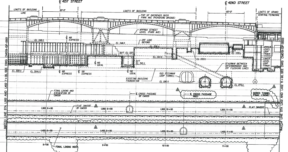
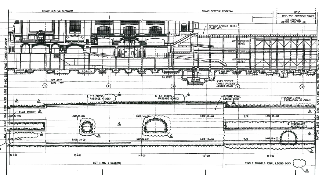
It’s possible to punch south (left) of the Lower Level while respecting every constraint, but not all of them at once. Two constraints are absolute:
- No interference with the 7 train tunnels
- No interference with the 6 train tunnel (labeled “SB local”)
These can be satisfied easily. However, all other constraints, which are serious, require some waivers, or picking and choosing:
- Keeping absolute grades to 4%, forcing the tunnel to go above the 7 and not below it (which requires clearing around 15 m in around 150 m of distance)
- Respecting the Lower Level loop track
- Respecting the disused Steinway Loop tunnel
If the latter two constraints are waivable, then the tunnel needs to clear around 1.5 m, for 6 m of diameter minus 4.5 m between the roof of the 7 tunnel and the floor of the 6 tunnel, in what looks like 40 horizontal m; it’s doable but with centimeters of slack, and may require waiving the 4% grade (though over such a short length it doesn’t matter – what matters is vertical curve radius, and the vertical curves can be built north of the 7 and south of the 6).
Rail Reactivation in Suburbs vs. Rural Areas
On Mastodon, a longtime mutual by the nickname of Pony made a point that regional rail reactivation is a complement to road construction rather than a competitor. The context is that a study by Greenpeace has been making European media about unequal investment between roads and railways (for example, in Germany the ratio going back to 1998 has been 2.11:1), complaining specifically that rail networks have shrunk; in practice, all the shrinkage has been in very low-use rural lines. The issue is that network length isn’t a great measurement, precisely because it misses what makes public transport work; Jon Worth points out that during this era of road investment and rail shrinkage, German rail ridership has grown 40%.
The issue is that rail and road transport scale differently. Rail scales up better, cars scale down better. In low-density places, such as rural environments, trains can exist as money-losing tourist vehicles or transportation for a small, shrinking share of the population. Successful reactivation of lines outside urban areas occurs as these areas urbanize. Pony points this out:
It’s even funnier, lot of the line reopenings, the holy grail of this school of “thought”, is largely enabled by the new roads that have delivered needed demographic and economic changes to make some rail operations viable again, you’re not reopening branchlines against or to compete with new roads, you’re piggybacking on them…
We’re not doing [transit-oriented development] really, partially because the backlog of missing transit options for already existing development, partially because of incompetency, but that’s still mostly urban thing, for the most railway branchline reopenings, they are in more rural places and they are not in spite, competition or anything to road improvements, they directly correlate with them, they are not happening because someone got to their senses and figured they are going to take trains instead, but mostly because people got new economic connections through the roads that there is again enough demand for a train, but to celebrate that as somehow “reducing” and “competing with” road traffic is generally nonsense, they only do it once the road traffic hugely grew compare to the baseline during closure anyway.
This is relevant to the three German regional rail reactivation successes mentioned by Hans-Joachim Zierke as inspiration for some American proposals: the Schönbuchbahn and Ammertalbahn near Stuttgart, and Neumünster-Bad Segeberg near Hamburg.
None of these three lines leads to the main city, which is why they all lay dormant for so long, but once reactivated, they succeeded. Moreover, traffic has kept growing: the Ammertalbahn grew from 5,000 daily riders at reactivation in 1999 to 8,600 in 2019, and has recently been double-tracked and electrified. But this is not meaningfully a rural line. Herrenberg, at one end, is a Stuttgart S-Bahn terminus, with a train every 15 minutes taking 39 minutes to get to Stuttgart Hauptbahnhof and an hourly regional train doing the same trip in 31 minutes. Tübingen, at the other end, is a city, with steady if not stellar growth in both the city and the district. Herrenberg’s district, Böblingen, is adjacent to Stuttgart and has grown with the growth of the city’s economy, which is one of the wealthiest in Germany. This is a suburban orbital line, not a rural line.
The Schönbuchbahn’s history is essentially the same. Ridership grew rapidly in the 2000s until it hit the capacity of a single-track diesel line, leading to electrification in 2019 and double-track to increase frequency to a train every 15 minutes, growing ridership further. But like the Ammertalbahn, this is not rural rail reactivation. One of the Schönbuchbahn’s termini is Böblingen, the town that the district is named after; it’s a rail junction, on the same S-Bahn line that ends at Herrenberg, with additional S-Bahn service in a different direction every half hour, and additional fast regional and intercity service to Stuttgart. The line is for all intents and purposes a branch of the Stuttgart S-Bahn, with a forced transfer at Böblingen.
Finally, Neumünster and Bad Segeberg are both in the orbit of Hamburg, but are not as well connected as Herrenberg and Böblingen are to Stuttgart. Neumünster has two trains per hour to Hamburg, not running on a half-hourly Takt but rather having 43 minutes of offset; Bad Segeberg is on an hourly Takt to Hamburg. The line between them is an orbital, still unelectrified (it’s about to run battery-electric trains): it has ridership, but these are evidently not as intertwined with Hamburg as Böblingen is with Stuttgart, so the line is nowhere near so strong.
The upshot of all of this is that examples of successful rail reactivation should not be taken as evidence that rail can succeed outside major cities. It cannot: at most, it can succeed in places that, despite their protestations to the contrary, are embedded in major metropolitan areas, as those areas grow.
This is important, because much of the green movement in Europe shrugs off investments in urban rail tunnels, preferring to invest in tourist trains into rural areas or bring back night trains. There’s a lot of nostalgia and rural romanticism in a movement that exists largely in major cities and largely among people under the age of 30 (at the climate protest in 2019, the median age looked around 20). The problem is that rural rail doesn’t really work; in regions with no traffic congestion and not enough density for walkability, cars will beat trains to most destinations. Regional reactivation can work if it’s suburban as above – those towns can identify in opposition to the big city but for all intents and purposes they’re like city neighborhoods except at lower density (Böblingen even has a Green mayor).
Instead of trying to reach truly rural areas with rail, climate policy regarding rail should be to grow the cities and their immediate suburbs where rail is viable. The modal split in Berlin is high, and even in Brandenburg it is higher than the Germany-wide average (source, p. 76), due to the large number of Berlin-bound commuters. Densification of rail networks in growing regions is warranted, but this is distinct from trying to extend the mode into truly exurban places, where public transport cannot succeed.
Penn Station 3D Model
As part of our high-speed rail program at Marron, I designed and other people made a 3D model of the train station I referenced in 2015 in what was originally a trollish proposal, upgraded to something more serious. For now there’s still a password: letsredothis. This is a playable level, so have a look around.
The playable 3D model shows what Penn Station could look like if it were rebuilt from the ground up, based on best industry practices. It is deliberately minimalistic: a train station is an interface between the train and the city it serves, and therefore its primary goal is to get passengers between the street or the subway and the platform as efficiently as possible. But minimalism should not be conflated with either architectural plainness (see below on technical limitations) or poor passenger convenience. The open design means that pedestrian circulation for passengers would be dramatically improved over today’s infamously cramped passageways.
Much of the design for this station is inspired by modern European train stations, including Berlin Hauptbahnhof (opened 2006), the under-construction Stuttgart 21 (scheduled to open 2025), and the reconstruction of Utrecht Central (2013-16); Utrecht, in turn, was inspired by the design of Shinagawa in Tokyo.
As we investigate which infrastructure projects are required for a high-speed rail program in the Northeast, we will evaluate the place of this station as well. Besides intangible benefits explained below in background, there are considerable tangible benefits in faster egress from the train to the street.
Moreover, the process that led to this blueprint and model can be reused elsewhere. In particular, as we explain in the section on pedestrian circulation, elements of the platform design should be used for the construction of subway stations on some lines under consideration in New York and other American cities, to minimize both construction costs and wasted time for passengers to navigate underground corridors. In that sense, this model can be viewed not just as a proposal for Penn Station, but also as an appendix to our report on construction costs.
Background
New York Penn Station is unpopular among users, and has been since the current station opened in 1968 (“One entered the city like a God; one scuttles in now like a rat” -Vincent Scully). From time to time, proposals for rebuilding the station along a better or grander design have been floated, usually in connection with a plan for improving the track level below.
Right now, such a track-level improvement is beginning construction, in the form of the Gateway Project and its Hudson Tunnel Project (HTP). The purpose of HTP is to add two new tracks’ worth of rail capacity from New Jersey to Penn Station; currently, there are only two mainline tracks under the Hudson, the North River Tunnels (NRT), with a peak throughput of 24 trains per hour across Amtrak’s intercity trains and New Jersey Transit’s (NJT) commuter trains, and very high crowding levels on the eve of the pandemic; 24 trains per hour is usually the limit of mainline rail, with higher figures only available on more self-contained systems. In contrast, going east of Penn Station, there are four East River Tunnel (ERT) tracks to Long Island and the Northeast Corridor, with a pre-corona peak throughput of not 48 trains per hour but only about 40.
Gateway is a broader project than HTP, including additional elements on both the New Jersey and Manhattan sides. Whereas HTP has recently been funded, with a budget of $14-16 billion, the total projected cost of Gateway is $50 billion, largely unfunded, of which $20 billion comprises improvements and additions to Penn Station, most of which are completely unnecessary.
Those additions include the $7 billion Penn Reconstruction and the $13 billion Penn Expansion. Penn Reconstruction is a laundry list of improvements to the existing Penn Station, including 29 new staircases and escalators from the platforms to the concourses, additional concourse space, total reconstruction of the upper concourse to simplify the layout, and new entrances from the street to the station. It’s not a bad project, but the cost is disproportionate to the benefits. Penn Expansion would build upon it and condemn the block south of the station, the so-called Block 780, to excavate new tracks; it is a complete waste of money even before it has been funded, as scarce planner resources are spent on it.
The 3D model as depicted should be thought of as an alternative form of Penn Reconstruction, for what is likely a similar cost. It bakes in assumptions on service, as detailed below, that assume both commuter and intercity trains run efficiently and in a coordinated manner.
Station description
The station in the model is fully daylit, with no obstruction above the platforms. There are eight wide platforms and 16 tracks, down from 11 platforms and 21 tracks today. The station box is bounded by 7th Avenue, 31st Street, 8th Avenue, and 33rd Street, as today; also as today, the central platforms continue well to the west of 8th Avenue, using the existing Moynihan Train Hall. No expansion of the footprint is required. The existing track 1 (the southernmost) becomes the new track 1A and the existing track 21 becomes the new track 8B.
The removal of three platforms and five tracks and some additional track-level work combine to make the remaining platforms 11.5 meters wide each, compared with a range of 9-10 meters at some comparable high-throughput stations, such as Tokyo.
With wide platforms, the platforms themselves can be part of the station. A persistent difference between American and European train stations is that at American stations, even beloved ones like Grand Central, the station is near where the tracks are, whereas in Europe, the station is where the tracks are. Grand Central has a majestic waiting hall, but the tracks and platforms themselves are in cramped, dank areas with low ceilings and poor lighting. The 3D model, in contrast, integrated the tracks into the station structure: the model includes concessions below most escalator and stair banks, which could offer retail, fast food, or coffee. Ticketing machines can be placed throughout the complex, on the platforms as well as at places along the access corridors that are not needed for rush hour pedestrian circulation. This, more than anything, explains the minimalistic design, with no concourses: concourses are not required when there is direct access between the street and the platforms.
For circulation, there are two walkways, labeled East and West Walkways; these may be thought of as 7⅓th and 7⅔th Avenues, respectively. West End Corridor is kept, as is the circulation space under 33rd Street connecting West End Corridor and points east, currently part of the station concourse. A new north-south corridor called East End Corridor appears between the station and 7th Avenue, with access to the 1/2/3 trains.
What about Madison Square Garden?
Currently, Penn Station is effectively in the basement of Madison Square Garden (MSG) and Two Penn Plaza. Both buildings need to come down to build this vision.
MSG has come under attack recently for competing for space with the train station; going back to the early 2010s, plans for rebuilding Penn Station to have direct sunlight have assumed that MSG should move somewhere else, and this month, City Council voted to extend MSG’s permit by only five years and not the expected 10, in effect creating a five-year clock for a plan to daylight Penn Station. There have been recent plans to move MSG, such as the Vishaan Chakrabarti vision for Penn Station; the 3D model could be viewed as the rail engineering answer to that architecture-centric vision.
Two Penn Plaza is a 150,000 m^2 skyscraper, in a city where developers can build a replacement for $900 million in 2018 prices.
The complete removal of both buildings makes work on Penn Station vastly simpler. The station is replete with columns, obstructing sight lines, taking up space between tracks, and constraining all changes. The 3D model’s blueprint takes care to respect column placement west of 8th Avenue, where the columns are sparser and it’s possible to design tracks around them, but it is not possible to do so between 7th and 8th Avenues. Conversely, with the columns removed, it is not hard to daylight the station.
Station operations
The operating model at this station is based on consistency and simplicity. Every train has a consistent platform to use. Thus, passengers would be able to know their track number months in advance, just as in Japan and much of Europe, train reservations already include the track number at the station. The scramble passengers face at Penn Station today, waiting to see their train’s track number posted minutes in advance and then rushing to the platform, would be eliminated.
Each approach track thus splits into two tracks flanking the same platform. This is the same design used at Stuttgart 21 and Berlin Hauptbahnhof: if a last-minute change in track assignment is needed, it can be guaranteed to face the same platform, limiting passenger confusion. At each platform, numbered south to north as today, the A track is to the south of the B track, but the trains on the two tracks would be serving the same line and coming from and going to the same approach track. This way, a train can enter the A track at a station while the previous train is still departing the B track, which provides higher capacity.
The labels on the signage are by destination:
- Platform 1: eastbound trains from the HTP, eventually going to a through-tunnel to Grand Central
- Platform 2: westbound trains to the HTP, connecting from Grand Central
- Platform 3: eastbound trains from the preexisting North River Tunnels (NRT) to the existing East River Tunnels (ERT) under 32nd Street
- Platform 4: eastbound intercity trains using the NRT and ERT under 32nd Street
- Platform 5: westbound intercity trains using the NRT and ERT under 32nd Street
- Platform 6: westbound trains from the ERT under 32nd Street to the NRT
- Platform 7: eastbound trains to the ERT under 33rd Street and the LIRR, eventually connecting to a through-tunnel from the Hudson Line
- Platform 8: westbound trains from LIRR via the ERT under 33rd Street, eventually going to a through-tunnel to the Hudson Line
Signage labels except for the intercity platforms 4 and 5 state the name of the commuter railway that the trains would go to. Thus, a train from Trenton to Stamford running via the Northeast Corridor and the under-construction Penn Station Access line would use platform 3, and is labeled as Metro-North, as it goes toward Metro-North territory; the same train going back, using platform 6, is labeled as New Jersey Transit, as it goes toward New Jersey.
Such through-running is obligatory for efficient station operations. There are many good reasons to run through, which are described in detail in a forthcoming document by the Effective Transit Alliance. But for one point about efficiency, it takes a train a minimum of 10 minutes to turn at a train station and change direction in the United States, and this is after much optimization (Penn Station’s current users believe they need 18-22 minutes to turn). In contrast, a through-train can unload at even an extremely busy station like Penn in not much more than a minute; the narrow platforms of today’s station could clear a full rush hour train in emergency conditions today in about 3-4 minutes, and the wide platforms of the 3D model could do so in about 1.5 minutes in emergencies and less in regular operations.
Supporting infrastructure assumptions
The assumption for the model is that the HTP is a done deal; it was recently federally funded, in a way that is said to be difficult to repeal in the future in the event of a change in government. The HTP tunnel is slated to open in 2035; the current timetable is that full operations can only begin in 2038 after a three-year closure of NRT infrastructure for long-term repairs, but in fact those repairs can be done in weekend windows—indeed, present-day rail timetables through the NRT assume that one track is out for a 55-hour period each weekend, but investigative reporting has shown that Amtrak takes advantage of this outage only once every three months. If repairs are done every weekend, then it will be possible to refurbish the tunnels by 2035, for full four-track operations in 12 years.
The HTP approach to Penn Station assumes that trains from the tunnel would veer south, eventually to tracks to be excavated out of Block 780 for $13 billion. However, nothing in the current design of the tunnel forces tracks to veer so far south to Penn Expansion. There is room, respecting the support columns west of 8th Avenue, to connect the HTP approach to the new platforms 1 and 2, or for that matter to present-day tracks 1-5.
It is also assumed that Penn Station Access (PSA) is completed; the project’s current timeline is that it will open in 2026, offering Metro-North service from the New Haven Line to Penn Station. As soon as PSA opens, trains should run through to New Jersey, for the higher efficiency mentioned above.
The additional pieces of major infrastructure required for this vision are a tunnel from Penn Station to Grand Central, and an Empire Connection realignment.
The Penn Station-Grand Central connection (from platforms 1 and 2) has been discussed for at least 20 years, but not acted upon, since it would force coordination between New Jersey Transit and Metro-North. Such a connection would offer riders at both systems the choice between either Manhattan station—and the choice would be on the same train, whereas on the LIRR, the same choice offered by East Side Access cuts the frequency to each terminal in half, which has angered Long Island commuters.
Overall, it would be a tunnel of about 2 km without stations. It would require some mining under the corner of Penn 11, the building east of 7th Avenue between 31st and 32nd Street, but only to the same extent that was already done in the 1900s to build the ERT under 32nd Street. Subsequently, the tunnel would nimbly weave between older tunnels, using an aggressive 4% grade with modern electric trainsets (the subway even climbs 5.4% out of a station at Manhattan Bridge, whereas this would descend 4% from a station). The cost should be on the order of hundreds of millions of dollars, not billions—the billions of dollars in per-km cost in New York today are driven by station construction rather than tunnels, and by poor project delivery methods that can be changed to better ones.
The Empire Connection realignment is a shorter tunnel, but in a more constrained environment. Today, Amtrak trains connect between Penn Station and Upstate New York via the existing connection, going in tunnel under Riverside Park until it joins the tracks of the current Hudson Line in Spuyten Duyvil. Plans for electrifying the connection and using it for commuter rail exist but are not yet funded; these should be reactivated, since otherwise there’s nowhere for trains from the 33rd Street ERT to run through to the west.
It is necessary to realign the last few hundred meters of the Empire Connection. The current alignment is single-track and connects to more southerly parts of the station, rather than to the optimal location at the northern end. This is a short tunnel (perhaps 500 meters) without stations, but the need to go under an active railyard complicates construction. That said, this too should cost on the order of hundreds of millions of dollars, not billions.
Finally, platforms 3-6 all feed the same approach tracks on both sides, but in principle they could be separated into two. There are occasional long-term high-cost plans to fully separate out intercity rail tracks from commuter tracks even in New York, with dedicated tunnels all the way. The model does not assume that such plans are actualized, but if they are, then there is room to connect the new high-speed rail approach tunnel to platforms 4 and 5 at both ends.
Overall, the model gives the station just 20 turnouts, down from hundreds today. This is a more radical version of the redesign of Utrecht Station in the 2010s, which removed pass-through tracks, simplified the design, and reduced the number of turnouts from 200 to 70, in order to make the system more reliable; turnouts are failure-prone, and should be installed only when needed based on current or anticipated train movements.
Pedestrian circulation
The station in the model has very high pedestrian throughput. The maximum capacities are 100 passengers/minute on a wide escalator, 49 per minute per meter of staircase width, and 82 per minute per meter of walkway width. A full 12-car commuter train has about 1,800 passengers; the vertical access points—a minimum of seven up escalators, five 2.7 meter wide staircases, and three elevators per platform—can clear these in about 80 seconds. In the imperfect conditions of rush hour service or emergency evacuation, this is doable in about 90 seconds. A 16-car intercity train has fewer passengers, since all passengers are required to have a seat, and thus they can evacuate even faster in emergency conditions.
Not only is the throughput high but also the latency is low. At the current Penn Station, it can take six minutes just to get between a vertical access point and an exit, if the passenger gets off at the wrong part of the platform. In contrast, with the modeled station, the wide platforms make it easier for passengers to choose the right exit, and connect to a street corner or subway entrance within a maximum of about three minutes for able-bodied adults.
This has implications for station design more generally. At the Transit Costs Project, we have repeatedly heard from American interviewees that subway stations have to have full-length mezzanines for the purposes of fire evacuation, based on NFPA 130. In fact, NFPA 130 requires evacuation in four minutes of throughput, and in six minutes when starting from the most remote point on the platform; at a train station where trains are expected to run every 2-2.5 minutes at rush hour and unload most of their passengers in regular service, it is dead letter.
Thus, elements of the platform design can be copied and pasted into subway expansion programs with little change. A subway station could have vertical circulation at both ends of the platform as portrayed at any of the combined staircase and escalator banks, with wider staircases if there’s no need for passengers to walk around them. No mezzanine is required, nor complex passageways: any train up to the size of the largest New York City Subway trains could satisfy the four-minute rule with a 10-meter island platform (albeit barely for 10-car lettered lines).
Technical limitations and architecture
The model is designed around interactivity and playability. This has forced us to make some artistic compromises, compared with what one sees in 3D architectural renderings that are not interactive. To run on an average home machine, the design has had to reduce its polygon count and limit the detail of renderings that are far from the camera position.
For the same reason, the level shows the exterior of Moynihan Station as an anchor, but not the other buildings across from the station at 31st Street, 33rd Street, or 7th Avenue.
In reality, both East and West Walkways would be more architecturally notable than as they are depicted in the level. Our depiction was inspired by walkways above convention centers and airport terminals, but in reality, if this vision is built, then the walkways should be able to support themselves without relying too much on the tracks. Designs with massive columns flanking each elevator are possible, but so are designs with arches, through-arches, or tied arches, the latter two options avoiding all structural dependence on the track level.
Some more architectural elements could be included in an actual design based on this model, which could not be easily modeled in an interactive environment. The platforms certainly must have shelter from the elements, which could be simple roofs over the uncovered parts of the platform, or large glass panels spanning from 31st to 33rd Street, or even a glass dome large enough to enclose the walkways.
Finally, some extra features could be added. For example, there could be more vertical circulation between 7th Avenue and East End Corridor (which is largely a subway access corridor) than just two elevators—there could be stairs and escalators as well. There is also a lot of dead space as the tracks taper from the main of the station to the access tunnels, which could be used for back office space, ticket offices, additional concessions, or even some east-west walkways functioning as 31.5th and 32.5th Streets.
 Pedestrian Observations