Category: New York
Transit-Oriented Suburbs
I did a Patreon poll last month with three options, all about development and transit: CBDs and job concentration in middle-income cities (e.g. auto-oriented Bangkok and Istanbul don’t have transit-oriented Shanghai’s CBD formation), dense auto-oriented city neighborhoods (e.g. North Tel Aviv), and transit-oriented low-density suburbia. This is the winning option.
In every (or almost every) city region, there’s a clear pattern to land use and transportation: the neighborhoods closer to the center have higher population density and lower car use than the ones farther away. Moreover, across city regions, there is such a strong negative correlation between weighted density and auto use that exceptions like Los Angeles are notable. That said, the extent of the dropoff in transit use as one moves outward into suburbia is not the same everywhere, and in particular there are suburbs with high transit use. This post will discuss which urban and transportation policies are likely to lead such suburbs to form, in lieu of the more typical auto-oriented suburbs.
What is a suburb?
Definitions of suburbia differ across regions. Here in Paris, anything outside the city’s 1860 limits is the suburbs. The stereotypical banlieue is in history, urban form, and distance from the center a regular city neighborhood that just happens to be outside the city proper for political reasons. It is hardly more appropriate to call any part of Seine-Saint-Denis a suburb than it is to call Cambridge, Massachusetts a suburb of Boston.
So if Seine-Saint-Denis is not a suburb, what is? When I think of suburbia, my prototype is postwar American white flight suburbs, but stripped of their socioeconomic context. The relevant characteristics are,
- Suburbs developed at a time when mass motorization was widespread. In the US, this means from around 1920 onward in the middle class and slightly later in the working class; in the rest of the developed world, the boundary ranges from the 1920s to the 1960s depending on how late they developed. Note that many stereotypical suburbs were founded earlier, going back even to the 19th century, but grew in the period in question. Brookline is famous for refusing annexation to Boston in 1873, but its fastest development happened between 1910 and 1930, straddling the 1920 limit – and indeed in other respects it’s borderline between a rich suburb and rich urban neighborhood as well.
- Suburbs have low population density, typical of single-family housing. Aulnay-sous-Bois, at 5,100 people per km^2, is too dense, but not by a large margin. Beverly Hills, which has mansions, has 2,300, and Levittown, New York, probably the single best-known prototype of a suburb, has 2,900. The urban typology can mix in apartments, but the headline density can’t be dominated by apartments, even missing middle.
- Suburbs are predominantly residential. They can have distinguished town centers, but as broad regions, they have to have a significant number of commuters working in the city. This rules out low-density central cities like Houston and Dallas (although their individual neighborhoods would qualify as suburbs!). It also rules out Silicon Valley as a region, which represents job sprawl more than residential sprawl.
The three criteria above make no mention of whether the area is included in the central city. Most of Staten Island qualifies as suburban despite being part of New York, but Newark fails all three criteria, and Seine-Saint-Denis and most of Hudson County fail the first two.
Where are suburbs transit-oriented?
I do not know of any place where suburban transit usage is higher than city center transit usage. In theory, this suggests that the best place to look for transit-oriented suburbia is the cities with the highest transit mode shares, such as Tokyo, Singapore, and Hong Kong (or, in Europe, Paris). But in reality, Singapore and Hong Kong don’t have areas meeting the density definition of suburb, and Tokyo has few, mostly located away from its vast commuter rail network. Paris has more true suburbs, but like Tokyo’s, they are not what drives the region’s high rail ridership. All four cities are excellent examples of high-density suburban land use – that is, places that meet my first and third definitions of suburbia but fail the second.
Instead, it’s better to look at smaller, lower-density cities. Stockholm and Zurich are both good models here. Even the central cities are not very dense, at 5,100 and 4,700 people per km^2. Moreover, both are surrounded by large expanses of low-density, mostly postwar suburbia.
Winterthur, Zurich’s largest suburb, is a mix of early 20th century and postwar urban typology, but the other major cities in the canton mostly developed after WW2. At the time, Switzerland was already a very rich country, and car ownership was affordable to the middle class. The story of the Zurich S-Bahn is not one of maintaining mode share through a habit of riding transit, but of running frequent commuter rail to suburbs that did not develop around it from the 1950s to the 70s.
In Stockholm, there is a prominent density gradient as one leaves Central Stockholm. I lived in Roslagstull, at the northern end of Central Stockholm, where the density is 30,000 people per km^2 and the built-up form is the euroblock. Most of the rest of Central Stockholm is similar in urban form and not much less dense. But once one steps outside the city’s old prewar core, density nosedives. City districts to the west and south, like Bromma and Älvsjö, go down to 3,000 people per km^2 or even a little less. A coworker who used to live in Kista described the area as American-style suburban. Beyond these city districts lie the other municipalities, which together form a sizable majority of the county’s population. Of those, a few (Solna, Sundbyberg) are somewhat above the density cutoff, but most are far below it.
In both Zurich and Stockholm, the city is much more transit-oriented than the suburbs. Stockholm’s congestion pricing was a city initiative; the suburbs banded together to oppose it, and eventually forced a compromise in which congestion pricing remained in effect but the revenue would be deeded to urban freeways rather than to public transportation.
And yet, neither city has a big transit use gradient – at least, not so big as Paris, let alone London or New York. Stockholm is expecting 170,000 daily metro trips from its expansion program, which barely touches Central Stockholm. Existing T-bana ridership on the suburban tails is pretty high as well (source, PDF-p. 13), as is ridership on commuter rail, which, too, barely touches Central Stockholm.
The structure of density
In my previous post, I complained that Los Angeles’s density has no structure, and thus public transit ridership is very low and consists predominantly of people too poor to buy a car. The situation in Stockholm and Zurich is the reverse. Density has a clear structure: within each suburb, there is a town center near the commuter rail station.
The histories of Zurich and Stockholm are profoundly different. Each arrived in its structure from a different route. In Zurich, the suburbs come from historic town centers that existed long before cars, often long before industrialization. 20th-century urban sprawl arrived in the form of making these historic villages bigger and bigger until they became proper suburbs. The geography helps rail-oriented suburbanization as well: the ridge-and-valley topography is such that urban sprawl forms ribbons served by commuter rail lines, especially in the southerly direction.
Stockholm’s topography is nothing like Zurich’s. There are water boundaries limiting suburb-to-suburb travel, but the same is true of New York, and yet Long Island, New Jersey, and Westchester are thoroughly auto-oriented. Instead, the structure of density came about because of government planning. Sweden built public housing simultaneously with the Stockholm Metro, so the housing projects were sited near the train stations.
This does not mean that the suburbs of Zurich and Stockholm are actually high-density. Far from it: the housing projects in the Stockholm suburbs are surrounded by a lot of parking and greenery, and the suburbs have extensive single-family housing tracts. However, the density is arranged to grade down from the train station, and there are small clusters of walkable apartment buildings in a small radius around each station. In Zurich the same structure came about with private construction and topography.
To the extent this structure exists elsewhere, it leads to higher low-density transit ridership too, for example in London and the Northeastern United States. Various West Coast American transit bloggers, like Jarrett Walker and Let’s Go LA, keep plugging the West Coast grid over the Northeastern hierarchy of density. But this hierarchy of suburbs that formed around commuter rail to the CBD produces transit ridership that, while awful by Continental European standards, is very good by American ones. Many of the suburbs in question, such as in Westchester, have 15-20% of their commuters choose transit to get to work.
Getting to higher numbers means reinforcing the structure of density and the transit that works in the suburbs, that is, regional rail (or a metro network that goes far out, like the T-bana, if that’s an option). Stations must be surrounded by development rather than parking, and this development should facilitate a somewhat transit-oriented lifestyle, including retail and not just housing. Jobs should be accessible from as many directions as possible, forming CBDs rather than haphazard town centers accessible only by road. Only this way can suburbia be transit-oriented.
Meme Weeding: Los Angeles Density
If you’re the kind of total nerd that looks up tables on Wikipedia for fun, you may notice a peculiarity: the American built-up area with the highest population density is Los Angeles, followed by the Bay Area and New York. This is not what anyone experiences from even a slight familiarity with the two cities. Some people leave it at that and begin to make “well, actually Los Angeles is dense” arguments; this is especially common among supporters of cars and suburbs, like Randall O’Toole, perhaps because they advocate for positions the urbanist mainstream opposes and enjoy the ability to bring up an unintuitive fact. Others instead try to be more analytic about it and understand how Los Angeles’ higher headline density than New York coexists with its actual auto-centric form.
The answer that the urbanist Internet (blogs, then the Census Bureau, then Twitter) standardized on is that the built-up area of New York has some really low-density outer margins, where auto use is high, but the dense core is larger than that of Los Angeles. Here’s a log graph made by longtime Twitter follower Neil Patel:

New York’s 70th percentile of density (shown as 30 on the graph’s y-axis) is far denser than that of the comparison cities. The term the urbanist blogosphere defaulted to is “weighted density,” which is the average density of census tracts weighted by their population rather than area; see original post by the Austin Contrarian, in 2008.
But one problem remains: Los Angeles is by any metric still dense. Neil’s chart above shows its density curve Lorenz-dominating those of Chicago and Washington, both of which have far higher transit usage. Unfortunately, I haven’t seen too much analysis of why. Jarrett Walker talks about Los Angeles’s polycentrism, comparing it with Paris, and boosting it as a positive for public transit. The reality is the opposite, and it’s worth delving more into it to understand why whatever density Los Angeles has fails to make it have even rudimentary public transit.
Yes, Los Angeles is auto-oriented
The “well, actually Los Angeles is not autopia” line faces a sobering fact: Los Angeles has practically no transit ridership. In this section, I’m going to make some comparisons among American metropolitan statistical areas (MSAs); these exclude many suburbs, including the Inland Empire for Los Angeles and Silicon Valley for San Francisco, but Neil’s graph above excludes them as well, because of how the US defines urbanized areas. In the following table, income refers to median income among people driving alone or taking public transit, and all data is from the 2017 American Community Survey (ACS).
| Place | Workers | Drive share | Drive income | Transit share | Transit income |
| US | 152,802,672 | 76.4% | $38,689 | 5% | $37,530 |
| New York | 9,821,147 | 50% | $48,812 | 31% | $44,978 |
| San Francisco | 2,371,803 | 57% | $54,923 | 17.4% | $62,500 |
| Washington | 3,320,895 | 66.4% | $53,390 | 12.8% | $60,420 |
| Chicago | 4,653,591 | 70% | $41,817 | 12.2% | $46,796 |
| Los Angeles | 6,434,177 | 75.4% | $39,627 | 4.8% | $21,153 |
The income numbers are not typos. In San Francisco, Washington, and Chicago, transit users outearn drivers. In New York the incomes are close, and US-wide they are almost even. But in Los Angeles, drivers outearn the few transit users almost 2:1. It’s not because Los Angeles has better transit in poor neighborhoods than in rich ones: this may have been true for a long while, but with the Expo Line open to Santa Monica, the Westside has bare bones coverage just like the rest of the city. Even with the coverage that exists, public transit in Los Angeles is so bad that people only use it if they are desperately poor.
When public transportation is a backstop service for the indigent, ridership doesn’t follow the same trends seen elsewhere. Transit ridership in Los Angeles rises and falls based on fares; new rail extensions, which have led to big gains in ridership in Seattle and Vancouver, are swamped by the impact of fare changes in Los Angeles. Gentrification, which in New York has steadily raised subway usage in hotspots like Williamsburg and which does the same in San Francisco, has instead (slightly) contributed to falling transit usage in Los Angeles (p. 53).
Job density and CBD job share
Los Angeles has high residential density by American standards – lower than in New York counted properly, but comparable to San Francisco, and higher than Chicago and Washington. However, job density tells a completely different story. New York, Chicago, San Francisco, and Washington all have prominent central business districts. Without a consistent definition of the CBD, I am drawing what look like the peak employment density sites from OnTheMap, all as of 2015:
| Place | CBD boundaries | Area | Jobs | MSA share | Density |
| New York | 33rd, 3rd, 60th, 9th | 3.85 | 825,476 | 8.4% | 214,336 |
| San Francisco | Washington, Powell, 5th, Howard, Embarcadero | 1.81 | 224,010 | 9.4% | 123,558 |
| Washington | Rock Creek, P, Mass., 7th, Cons., 14th, H | 3.26 | 240,505 | 7.2% | 73,775 |
| Chicago | River, Congress, Michigan, Randolph, Columbus | 1.61 | 368,910 | 7.9% | 228,998 |
| Los Angeles | US 110, US 101, Alameda, 1st, Main, 7th | 2.11 | 189,767 | 2.9% | 89,937 |
The two main indicators to look for are the rightmost two columns: the percentage of jobs that are in the CBD, and the job density within the CBD. These indicators are highly not robust to changing the CBD’s definition, but expanding the definition moves them in opposite direction. Washington and San Francisco can be boosted to about 400,000 jobs each if the CBD is expanded to include near-CBD job centers such as Gallery Place, L’Enfant Plaza, SoMa, and Civic Center. Manhattan south of 60th has 1.9 million jobs in 22.2 km^2. Even in Chicago, where job density craters outside the Loop, the 9 km^2 bounded by Chicago, Halsted, and Roosevelt have 567,000 jobs. In making the tradeoff between job density and MSA share, I tried to use smaller CBD definitions, maximizing density at the expense of MSA share.
But even with this choice, the unusually low CBD share in Los Angeles is visible. This is what Jarrett and others mean when they say Los Angeles is polycentric: it is less dominated by its central business district than New York, Chicago, Washington, and San Francisco.
However, the comparisons between Los Angeles and Paris are wildly off-base. I am not including Paris in my above table, because INSEE only reports job numbers at the arrondissement level, and the city’s CBD straddles portions of the 1st, 2nd, 8th, and 9th arrondissements. Those four arrondissements total 405,189 jobs in 8.88 km^2, but in practice few of these jobs are in the outer quartiers, so a large majority of these jobs are in the central 4.64 km^2. The overall job density is then comparable to that of the Los Angeles CBD, but the similarity stops there: CBD employment is 7.1% of the total for Ile-de-France. If there is a US city that’s similar to Paris on the two CBD metrics of density and employment share, it’s Washington, not coincidentally the only big American city with a height-limited city center.
Secondary centers
In all of the American cities I’m comparing in this post except New York, the share of the population using public transit to get to work is not much higher than the share working in the CBD, especially if we add in near-CBD job centers served by public transit like Civic Center and L’Enfant Plaza (and all of the Manhattan core outside Midtown). This is not a coincidence. Outside a few distinguished locations with high job density, it’s easy enough to drive, and hard to take the train (if it even exists) except from one or two directions.
American cities are distinguished from European ones in that their non-CBD employment is likely to be in sprawling office parks and not in dense secondary centers. Paris is polycentric in the sense of having multiple actual centers: La Defense is the most conspicuous outside the CBD, but the city is full of smaller, lower-rise clusters: the Latin Quarter, Bercy, the Asian Quarter, Gare du Nord, the Marais. The 3rd, 4th, 5th, 6th, 7th, 10th, and 12th all have around 20,000-25,000 jobs per square kilometer, not much less than the Upper East Side (which has about 120,000 jobs between 60th and 96th Streets).
A polycentric city needs to have multiple actual centers. Does Los Angeles have such centers? Not really. Century City has 33,000 jobs in about 1.1 km^2. Here is the city’s second downtown, with a job density that only matches that of central Parisian neighborhoods that nobody would mistake with the CBD. The UCLA campus has around 15,000 jobs. Downtown Santa Monica has 24,000 in 2 km^2. El Segundo, which Let’s Go LA plugs as a good site for CBD formation, has 52,000 jobs in 5.2 km^2. Downtown Burbank has about 13,000 in 0.6 km^2. The dropoff in commercial development intensity from the primary CBD is steep in Los Angeles.
What Los Angeles has is not polycentric development. Paris is polycentric. New York is fairly polycentric, with the growth of near-CBD clusters like Long Island City, in addition to older ones like Downtown Brooklyn and Downtown Newark. Los Angeles is just weak-centered.
The structure of density
In his original posts about weighted density from 2008, Chris noted not just the overall weighted density of an American urban area but also the ratio of the weighted to standard density. This ratio is highest in New York, but after New York the highest ratios are in other old industrial cities like Boston and Chicago. This ratio is in stronger correlation with the public transit modal share than weighted density. Much of this fact is driven by the fact that Boston, Chicago, and Philadelphia have high-for-America transit usage and Los Angeles doesn’t, but it still suggests that there is something there regarding the structure of density.
In Chicago and Washington, the population density is low, but it follows a certain structure, with higher density in central areas and in distinguished zones near train stations. These structures are not identical. Chicago has fairly uniform density within each city neighborhood, and only sees this structure in the suburbs, which are oriented around commuter rail stations, where people take Metra to the city at rush hour (and drive for all other purposes). In contrast, in Washington commuter rail is barely a footnote, whereas Metro drives transit-oriented development in clusters like Arlington, Alexandria, Silver Spring, and Bethesda. In these islands of density, the transit-oriented lifestyle is at least semi-plausible.
Paris has fairly uniform density within the city, but it has strong TOD structure in the suburbs: high density within walking distance of RER stations, lower density elsewhere. Some RER stations are also surrounded by job clusters oriented toward the train station: La Defense is by far the biggest and best-known, but Cergy, Val d’Europe and Marne la Vallee, Issy, Noisy, and Saint-Denis are all walkable to job centers and not just housing. Within the city there is no obvious structure, but the density is so high and the Metro so ubiquitous that transit serves the secondary nodes well.
In Los Angeles, there is no structure to density. There are some missing middle and mid-rise neighborhoods, but few form contiguous blobs of high density that can be served by a rapid transit line. Koreatown is in a near-tie with Little Osaka for highest population density in the United States outside New York, but immediately to its west, on the Purple Line Extension, lie kilometers of single-family sprawl, and only farther west on Wilshire can one see any density (in contrast, behind Little Osaka on Geary lies continuous density all the way to the Richmond). With the exception of Century City, UCLA, and Santa Monica, the secondary centers don’t lie on any obvious existing or current transit line.
With no coherent structure, Los Angeles is stuck. Its dense areas are too far away from one another and from job centers to be a plausible urban zone where driving is not necessary for a respectable middle-class lifestyle. Buses are far too slow, and trains don’t exist except in a handful of neighborhoods. Worse, because the density is so haphazard, the rail extensions can’t get any ridership. The ridership projection for the Purple Line Extension is an embarrassing 78,000 per weekday for nearly 15 km and $8.2 billion. The construction cost is bad, but in a large, dense city should be offset by high ridership (as it is in London); but it isn’t, so the projected ridership per kilometer is on a par with some New York City Transit buses and the projected cost per rider is so high that it is usually reserved for airport connectors.
The way out
In a smaller, cheaper auto-centric city, like Nashville or Orlando, I would be entirely pessimistic. In Los Angeles there is exactly one way out: fix the urban design, and reinforce it with a strong rail network.
The fact that this solution exists does not mean it is politically easy. In particular, the region needs to get over two hangups, each of which is separately nearly insurmountable. The first is NIMBYism. Los Angeles is so expensive that if it abolishes its zoning code, or passes a TOD ordinance that comes close to it, it could see explosive growth in population, which would be concentrated on the Westside, creating a large zone of high density in which people could ride the trains. However, the Westside is rich and very NIMBY. Metro isn’t even trying to upzone there: the Purple Line Extension has a 3.2-km nonstop segment from Western to La Brea, since the single-family houses in between are too hard to replace with density. Redeveloping the golf courses that hem Century City so that it could grow to a real second downtown is attractive as well, but even the YIMBYs think it’s unrealistic.
The second obstacle is the hesitation about spending large amounts of money all at once. American politicians are risk-averse and treat all spending as risk, and this is true even of politicians who boldly proclaim themselves forward-thinking and progressive. Even when large amounts of money are at stake, their instincts are to spread them across so many competing goals that nothing gets funded properly. The amount of money Los Angeles voters have approved to spend on transportation would build many rapid transit lines, even without big decreases in construction costs, but instead the money is wasted on showcasing bus lanes (this is Metro’s official blog’s excuse for putting bus lanes on Vermont and not rapid transit) or fixing roads or the black hole of Metro operating costs.
But the fact that Los Angeles could be a transit city with drastic changes to its outlook on development and transportation investment priorities does not mean that it is a transit city now. Nor does it mean that the ongoing program of wasting money on low-ridership subway lines is likely to increase transit usage by the required amount. Los Angeles does not have public transportation today in the sense that the term is understood here or in New York or even in Chicago. It should consider itself lucky that it can have transit in the future if it implements politically painful changes, but until it does, it will remain the autopia everyone outside urbanism thinks it is.
Sunnyside Junction, Redux
Seven years ago, I wrote a pair of posts about Sunnyside Yards. The first recommends the construction of a transfer station through Sunnyside Yards, in order to facilitate transfers between Penn Station- and Grand Central-bound trains. The second recommends redeveloping the yards via a deck, creating high-density residential and commercial space on a deck on top of the yard. Recent news, both about an official plan to deck the yards and about leaks that Amazon is likely to move half of its second headquarters (HQ2) to Long Island City, make a Sunnyside Junction so much more urgent.
Here is how service would look:
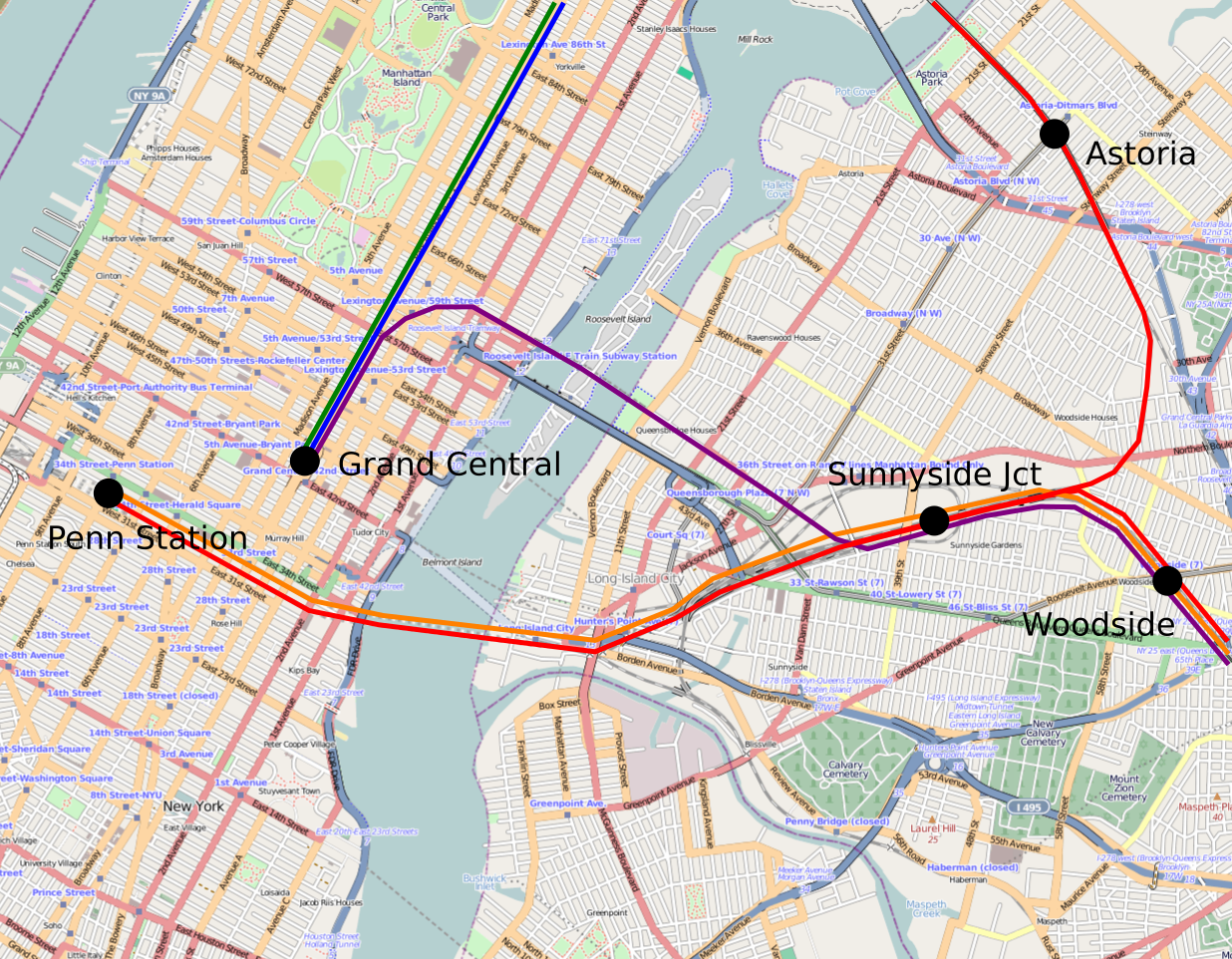
The color scheme is inherited from my regional rail maps (see e.g. here) but for the purposes of this post, all it means is that green and blue correspond to the inner and outer tracks of the Park Avenue, purple is East Side Access, orange corresponds to LIRR trains going to the northern pair of East River Tunnels, and red corresponds to LIRR, Metro-North Penn Station Access, and Amtrak trains going to the southern pair of East River Tunnels. No track infrastructure is assumed except what’s already in service or funded (i.e. ESA and Penn Station Access), and only two infill stations are mapped: Astoria, which would be a strong location for a stop were fares integrated with the subway and frequency high, and Sunnyside Junction.
The infill stations that are not planned
An Astoria station was studied for PSA, but was dropped from consideration for two reasons. First, the location is legitimately constrained due to grades, though a station is still feasible. And second, under the operating assumptions of high fares and low off-peak frequency, few people would use it. It would be like Wakefield and Far Rockaway, two edge-of-city neighborhoods where commuter rail ridership is a footnote compared with slower but cheaper and more frequency subway service.
A Sunnyside Junction station was in contrast never considered. There are unfunded plan for an infill station to the west of the junction, served only by Penn Station-bound trains. Such a station would hit Long Island City’s job center well, but the walk from the platform to the office towers would still be on pedestrian-hostile roads, and if there’s political will to make that area more walkable, the city might as well just redevelop Sunnyside Yards (as already planned).
The reason there was never any plan for a station can be seen by zooming in on the area I drew as a station. It’s a railyard, without streets (yet). At today’s development pattern, nobody would use it as an O&D station, even if fares and schedules were integrated with the subway. The importance of the station is as a transfer point between Grand Central- and Penn Station-bound trains. The planned developments (both HQ2 and independent city plans) makes it more urgent, since the area is relatively far from the subway, but the main purpose of the station is a better transit network, rather than encouraging development.
The main benefit of the station is transfers between the LIRR and Metro-North. While nominally parts of the MTA, the two agencies are run as separate fiefs, both of which resisted an attempt at a merger. The LIRR opposed PSA on the grounds that it had a right to any empty slots in the East River Tunnels (of which there are around 8 per hour at the peak). Governor Cuomo intervened to protect PSA from Long Island’s opposition, but in such an environment, coordinated planning across the two railroads is unlikely, and the governor would not intervene to improve the details of the ESA and PSA projects.
Network improvements
East Side Access means that in a few years, LIRR trains will split between two Manhattan destinations. Conceptually, this is a reverse-branch: trains that run on the same route in the suburbs, such as the LIRR Main Line, would split into separate routes in the city core. In contrast, conventional branching has trains running together in the core and splitting farther out, e.g. to Oyster Bay, Port Jefferson, and Ronkonkoma. Reverse-branching is extremely common in New York on the subway, but is rare elsewhere, and leads to operational problems. London’s Northern line, one of the few examples of reverse-branching on an urban subway outside New York, is limited to 26 trains per hour through its busiest trunk at the peak, and long-term plans to segregate its two city trunks and eliminate reverse-branching would raise this to 36.
To ensure LIRR trains run with maximum efficiency, it’s necessary to prevent reverse-branching. This means that each trunk, such as the Main Line and the Hempstead Branch, should only ever go to one Manhattan terminal. Passengers who wish to go to the other Manhattan terminal should transfer cross-platform. Jamaica is very well-equipped for cross-platform transfers, but it’s at a branch point going to either Manhattan or Downtown Brooklyn, without a good Penn Station/Grand Central transfer. Without a good transfer, passengers would be stuck going to a terminal they may not work near, or else be forced into a long interchange. In London the reason the Northern line is not already segregated is that the branch point in the north, Camden Town, has constrained passageways, so eliminating reverse-branching requires spending money on improving circulation.
Unlike Camden Town, Sunnyside Junction is roomy enough for cross-platform transfers. The tracks should be set up in a way that LIRR trains going to East Side Access should interchange cross-platform with PSA and Port Washington Branch trains (which should go to Penn Station, not ESA), as they do not stop at Jamaica. Penn Station-bound LIRR trains not using the Port Washington Branch, colored orange on the map, should stop at Sunnyside too, but it’s less important to give them a cross-platform transfer.
This assignment would be good not just for LIRR passengers but also for PSA passengers. Unlike on the LIRR, on the New Haven Line, reverse-branching is unavoidable. However, passengers would still benefit from being able to get on a Penn Station-bound train and connecting to Grand Central at Sunnyside. Not least, passengers on the PSA infill stations in the city would have faster access to Grand Central than they have today via long walks or bus connections to the 6 train. But even in the suburbs, the interchange would provide higher effective frequency.
The connection with development
I don’t know to what extent decking Sunnyside Yards could attract Amazon. I wrote an article last year, which died in editing back-and-forth, lamenting that New York was unlikely to be the HQ2 site because there was no regional rail access to any of the plausible sites thanks to low frequency and no through-running. Long Island City’s sole regional rail access today consists of LIRR stations on a reverse-branch that does not even go into Manhattan (or Downtown Brooklyn) and only sees a few trains per day. It has better subway access and excellent airport access, though.
However, since Sunnyside Junction is so useful without any reference to new development, the plans for decking make it so much more urgent. Sunnyside Yards are in the open air today, and there is space for moving tracks and constructing the necessary platforms. The cost is likely to be in the nine figures because New York’s construction costs are high and American mainline rail construction costs are even higher, but it’s still a fraction of what it would take to do all of this under a deck.
Moreover, the yards are not easy to deck. Let’s Go LA discussed the problem of decking in 2014: columns for high-rise construction are optimally placed at intervals that don’t jive well with railyard clearances, and as a result, construction costs are a multiple of what they are on firma. Hudson Yards towers cost around $12,000/square meter to build, whereas non-WTC commercial skyscrapers in the city are $3,000-6,000 on firma. The connection with Sunnyside Junction is that preparing the site for the deck requires extensive reconfiguration of tracks and periodic shutdowns, so it’s most efficient to kill two birds with one stone and bundle the reconfiguration required for the station with that required for the deck.
In the other direction, the station would make the deck more economically feasible. The high construction costs of buildings on top of railyards makes decking unprofitable except in the most desirable areas. Even Hudson Yards, adjacent to Midtown Manhattan on top of a new subway station, is only treading water: the city had to give developers tax breaks to get them to build there. In Downtown Brooklyn, Atlantic Yards lost the developer money. Sunnyside Yards today are surrounded by auto shops, big box retail, and missing middle residential density, none of which screams “market rents are high enough to justify high construction costs.” A train station would at least offer very fast rail access to Midtown.
If the decking goes through despite unfavorable economics, making sure it’s bundled with a train station becomes urgent, then. Such a bundling would reduce the incremental cost of the station, which has substantial benefits for riders even independently of any development it might stimulate in Sunnyside.
Sometimes, Bus Stop Consolidation is Inappropriate
For the most part, the optimal average spacing between bus stops is 400-500 meters. North American transit agencies have standardized on a bus stop every 200-250 meters, so stop consolidation is usually a very good idea. But this is based on a model with specific inputs regarding travel behavior. In some circumstances, travel behavior is different, leading to different inputs, and then the model’s output will suggest a different optimum. In contrast with my and Eric’s proposal for harsh stop consolidation in Brooklyn, I would not recommend stop consolidation on the crosstown buses in Manhattan, and am skeptical of the utility of stop consolidation in Paris. In Vancouver I would recommend stop consolidation, but not on every route, not do we recommend equally sweeping changes on every single Brooklyn route.
The model for the optimal stop spacing
If demand along a line is isotropic, and the benefits of running buses more frequently due to higher in-vehicle speed are negligible, then the following formula holds:

The most important complicating assumption is that if demand is not isotropic, but instead every trip begins or ends at a distinguished location where there is certainly a stop, such as a subway connection, then the formula changes to,

The choice of which factor to use, 2 or 4, is not exogenous to the bus network. If the network encourages transferring, then connection points will become more prominent, making the higher factor more appropriate. Whether the network encourages interchanges depends on separate policies such as fare integration but also on the shape of the network, including bus frequency. Higher average bus speed permits higher frequency, which makes transferring easier. The model does not take the granularity of transfer ease into account, which would require a factor somewhere between 2 and 4 (and, really, additional factors for the impact of higher bus speed on frequency).
After the choice of factor, the most contentious variable is the walk speed and penalty. Models vary on both, and often they vary in directions that reinforce each other rather than canceling out (for example, certain disabilities reduce both walk speed and willingness to walk a minute longer to save a minute on a bus). In Carlos Daganzo’s textbook, the walk speed net of penalty is 1 m/s. For an able-bodied adult, the walk speed can exceed 1.5 m/s; penalties in models range from 1.75 (MTA) to 2 (a Dutch study) to 2.25 (MBTA). The lower end is probably more appropriate, since the penalty includes a wait penalty, and stop consolidation reduces waits even as it lengthens walk time.
Update 10/31: alert reader Colin Parker notes on social media that you can shoehorn the impact of walk time into the model relatively easily. The formula remains the same with one modification: the average trip distance is replaced with

The factor of 2 in the formula comes from computing average wait time; for worst-case wait time, remove the 2 (but then the wait penalty would need to be adjusted, since the wait penalty is partly an uncertainty penalty).
The average distance between buses is proportional to the number of service-hours, or fleet size: it obeys the formula

The factor of 2 in the formula comes from the fact that route-length is measured one-way whereas revenue hours are for a roundtrip.
If we incorporate wait time into the model this way, then the walk and wait penalties used should be higher, since we’re taking them into account; the Dutch study’s factor of 2 is more reasonable. The conclusions below are not really changed – the optima barely increase, and are unchanged even in the cases where stop consolidation is not recommended.
The situation in New York
The average unlinked New York City Transit bus trip is 3.35 km: compare passenger-miles and passenger trips as of 2016. In theory this number is endogenous to the transit network – longer interstations encourage passengers to take the bus more for long trips than for short trips – but in practice the SBS routes, denoted as bus rapid transit in the link, actually have slightly shorter average trip length than the rest. For all intents and purposes, this figure can be regarded as exogenous to stop spacing.
The stop penalty, judging by the difference between local and limited routes, is different for different routes. The range among the routes I have checked looks like 20-40 seconds. However, Eric tells me that in practice the B41, which on paper has a fairly large stop penalty, has little difference in trip times between the local and limited versions. The local-SBS schedule difference is consistent with a stop penalty of about 25 seconds, at least on the B44 and B46.
As a sanity check, in Vancouver the scheduled stop penalty on 4th Avenue is 22 seconds – the 84 makes 19 fewer stops than the 4 between Burrard and UBC and is 7 minutes faster – and the buses generally run on schedule. The actual penalty is a little higher, since the 4 has a lot of pro forma stops on the University Endowment Lands that almost never get any riders (and thus the bus doesn’t stop there). This is consistent with 25 seconds at a stop that the bus actually makes, or even a little more.
Plugging the numbers into the formula yields

if we assume everyone connects to the subway (or otherwise takes the bus to a distinguished stop), or

if we assume perfectly isotropic travel demand. In reality, a large share of bus riders are connecting to the subway, which can be seen in fare revenue, just $1.16 per unlinked bus trip compared with $1.91 per subway trip (linked or unlinked, only one swipe is needed). In Brooklyn, it appears that passengers not connecting to the subway disproportionately go to specific distinguished destinations, such as the hospitals, universities, and shopping centers, or Downtown Brooklyn, making the higher figure more justified. Thus, our proposed stop spacing, excluding the long nonstop segments across the Brooklyn-Battery Tunnel and between borough line and JFK, is 490 meters.
Update 10/31: if we incorporate wait time, then we need to figure out the average distance between buses. This, in turn, depends on network shape. Brooklyn today has 550 km of bus route in each direction, which we propose to cut to 350. With around 600 service hours per hour – more at the peak, less off-peak – we get an average distance between buses of 1,830 meters today or 1,180 under our proposal. Using our proposed network, and a wait and walk penalty of 2, we get

or

Short bus routes imply short stop spacing
Our analysis recommending 490 meter interstations in Brooklyn depends on the average features of New York’s bus network. The same analysis ports to most of the city. But in Manhattan, the situation is different in a key way: the crosstown buses are so short that the average trip length cannot possibly match city average.
Manhattan is not much wider than 3 km. Between First and West End Avenues the distance is 2.8 km. The likely average trip length is more than half the maximum, since the typical use case for the crosstown buses is travel between the Upper East Side and Upper West Side, but the dominant destinations are not at the ends of the line, but close to the middle. With Second Avenue Subway offering an attractive two-seat ride, there is less reason to take the crosstown buses to connect to the 1/2/3 (and indeed, the opening of the new line led to prominent drops in ridership on the M66, M72, M79, M86, and M96); the best subway connection point is now at Lexington Avenue, followed by Central Park West. On a long route, the location of the dominant stop is not too relevant, but on a short one, the average trip length is bounded by the distance between the dominant stop and the end of the line.
If we take the average trip length to be 1.6 km and plug it into the formula, we get

or

A crosstown bus stopping at First, Second, Third, Lex, Madison, Fifth, Central Park West, Columbus, Amsterdam, Broadway, and West End makes 10 stops in 2.8 km, for an average of 280 meters. There isn’t much room for stop consolidation. If the bus continues to Riverside, lengthening the trip to 3 km at the latitude of 96th Street, then it’s possible to drop West End. If the buses running up Third and down Lex are converted to two-way running, presumably on Lex for the subway connections, then Third could be dropped, but this would still leave the interstation at 330 meters, much tighter than anything we’re proposing in Brooklyn.
The only other places where avenues are too closely spaced are poor locations for stop removal. Amsterdam and Broadway are very close, but Amsterdam carries a northbound bus, and if the Columbus/Amsterdam one-way pair is turned into two two-way avenues, then Amsterdam is a better location for the bus than Columbus because it provides better service to the Far West Side. Fifth and Madison are very close as well, but the buses using them, the M1 through M4, are so busy (a total of 32 buses per hour at the peak) that if the two avenues are converted to two-way running then both should host frequent bus trunks. It’s not possible to skip either.
Within Brooklyn, there is one location in which the same issue of short bus routes applies: Coney Island. The B74 and B36 act as short-hop connectors from Coney Island the neighborhood to Coney Island the subway station. The routes we propose replacing them have 7 stops each from the subway connection west, over distances of 2.5 and 2.7 km respectively, for interstations of 360 and 390 meters.
Vancouver supplies two more examples of routes similar to the B74 and B36: the 5 and 6 buses, both connecting the West End with Downtown. The 6 is only 2 km between its western end and the Yaletown SkyTrain station, and the 5 is 2.3 km from the end to the Burrard station and 2.8 km to city center at Granville Street. The average trip length on these buses is necessarily short, which means that stop consolidation is not beneficial, unlike on the main grid routes outside Downtown.
Update 10/31: incorporating wait time into this calculation leads to the same general conclusion. The short routes in question – the Manhattan crosstowns, the B36 and B74, and the 5 and 6 in Vancouver – have high frequency, or in other words short distance between buses. For example, the M96 runs every 4 minutes peak, 6 off-peak, and takes 22-24 minutes one-way, for a total of 6 circulating buses per direction peak (which is 500 meters), or 4 off-peak (which is 750 meters). This yields

A network that discourages transferring should have more stops as well
In Paris the average interstation on buses in the city looks like 300 meters; this is not based on a citywide average but on looking at the few buses for which Wikipedia has data plus a few trunks on the map, which range from 250 to 370 meters between stations.
The short stop spacing in Paris is justified. First of all, the average bus trip in Paris is short: 2.33 km as of 2009 (source, PDF-p. 24). Parisian Metro coverage is so complete that the buses are not useful for long trips – Metro station access time is short enough that the trains overtake the buses on total trip time very quickly.
Second, there is little reason to transfer between buses here, or to transfer between buses and the Metro. The completeness of Metro coverage is such that buses are just not competitive unless they offer a one-seat ride where the Metro doesn’t. Another advantage of buses is that they are wheelchair-accessible, whereas the Metro is the single least accessible major urban rail network in the world, with nothing accessible to wheelchair users except Line 14 and the RER A and B. It goes without saying that people in wheelchairs are not transferring between the bus and the Metro (and even if they could, they’d have hefty transfer penalties). The New York City Subway has poor accessibility, but nearly all of the major stations are accessible, including the main bus transfer points, such as Brooklyn College and the Utica Avenue stop on the 3/4.
With little interchange and a mostly isotropic city density, the correct formula for the optimal bus stop spacing within Paris is

which is close to the midpoint of the range of interstations I have found looking at various routes.
Conclusion
The half-kilometer (or quarter-to-a-third-of-a-mile) rule for bus stop spacing is an empirical guideline. It is meant to describe average behavior in the average city. It is scale-invariant – the density of the city does not matter, only relative density does, and the size of the city only matters insofar as it may affect the average trip length. However, while scale itself does not lead to major changes from the guideline, special circumstances might.
If the geography of the city is such that bus trips are very short, then it’s correct to have closer stop spacing. This is the case for east-west travel in Manhattan. It is also common on buses that offer short-hop connections to the subway from a neighborhood just outside walking range, such as the B36 and B74 in Coney Island and the 5 and 6 in Vancouver’s West End.
Note that even in New York, with its 3.3 km average trip length, stop consolidation is still beneficial and necessary on most routes. North American transit agencies should not use this article as an excuse not to remove extraneous stops. But nor should they stick to a rigid stop spacing come what may; on some routes, encouraging very short trips (often 1.5 km or even less), closely spaced stations are correct, since passengers wouldn’t be riding for long enough for the gains from stop consolidation to accumulate.
The Value of Outside Advice
After I criticized Cuomo’s Genius Challenge earlier this year, I saw some comment, I think on the Manhattan Contrarian, to the effect that even if the winning proposals suck the idea of the contest is still good because the MTA needs fresh advice. The argument is that a sclerotic organization like just about every state or local government agency in the US needs to be shaken up using outside ideas. The American private sector, which is very productive, is a good source of ideas, according to this line.
This notion is unfortunately wrong. Outside advice is useful, but leveraging the success of American business is not possible in transportation. Outsiders need a lot of grounding within the field to be able to contribute (and this includes myself). In some cases the best single source of fresh advice is not even from the outside, but from internal planners who the political appointees ignore.
The tyranny of the org chart
Aaron Renn tells a story from when he worked in management consulting: after years of leading projects advising other firms, he was tasked with improving the managerial efficiency of the firm where he worked. His ideas were ignored, because the organization chart said that he was middle management, and so senior management didn’t have to do what he said. When he consulted for other firms it was not like this, because consultants have titles that deliberately obfuscate the fact that in their own firm they are middle management, and thus senior management considers them peers outside their firm’s org chart and listens.
What’s more, many of the consultants’ ideas come from conversations with lower-level employees. The low- and mid-level workers pitch ideas that their managers ignore because of the tyranny of the org chart, and the consultants then take the better ideas, rebrand them as outside advice, and sell them to the people at the top. Employee resentment toward consultants often hinges on the fact that consultants take credit for ideas they heard from grunt workers.
A lot of transit reforms in the United States have this flavor. TransitCenter relies on best industry practices for its recommendations, but in some cases it learns what these practices are from passed-over planners. When I talked to Zak Accuardi last year about measuring punctuality on urban transit, he explained the concept of excess journey time to me, but then added that he learned from conversations with NYCT planners that this metric exists and is used in London and Singapore.
The bus redesign Eric and I have been working on has some of that, too. We have a lot of our own ideas, coming from independent research, but we’ve talked regularly to some of the mid-level planners for sanity checks. In particular, while we got the idea for a Brooklyn-Battery Tunnel bus route between Red Hook and Lower Manhattan from a railfan, I talked to one of the bus planners at NYCT about the idea and was told that the planners were already thinking in the same direction.
Best practices
When consultant advice is not based on laundering internal ideas to avoid getting stuck in the tyranny of the org chart, it comes instead from best industry practices. What a consultant needs to know is how the successful players in the relevant industry work. This is more than a simple laundry list of practices: there is a range of different options that work (Swiss and Japanese rail practices are not the same), and a dazzling array of local circumstances that can make some options a better fit for a specific client than others.
As it happens, NYCT is led by someone who is familiar with some better practices: Andy Byford, who has experience working in London, Sydney, and Toronto. He can be assumed to be familiar with the best English-speaking practices; Transport for London would not be my first choice for best practices worldwide or even Europe-wide, but it’s better than anything else that speaks English and is far better than anything in the United States.
It’s worth noting that it’s important to understand not just the best practices themselves but how to implement them. I’ve noticed this with various reform ideas that rely on European rail successes: there’s a reasonably deep bench of Americans who understand how some features work in London, but practically none who understand how they work in Paris, Madrid, Stockholm, Munich, Zurich, or Prague.
This is a clear-cut case of where outside advice would be valuable to American transit agencies. However, the snag is that there is no reason to expect the American private sector to be able to dispense any such advice. The bench of multilingual Americans is shallow, and a disproportionate share of those are second-generation immigrants who are heritage speakers of a language but often can’t read technical materials in it. What I know and what I’ve learned about best practices has involved talking to railfans from other countries who speak English who tell me about how Switzerland, Japan, Czechia, etc. work.
Domain knowledge
One of the themes I’ve been harping on since this blog’s early days is that public transit is 19th-century technology, and as such its corporate culture is one of incremental tweaks and not revolutionary changes. In this situation, it’s very difficult to come up with good ideas without very solid grounding in the domain. It’s nothing like tech, where people could invent their own platforms and succeed by first-mover advantage (did Amazon really need to know the bookselling business in the 1990s?).
This does not mean there is no room for new ideas. On the contrary. Old industries like public transit, cars, household appliances, and agriculture are full of innovation. But they are less likely to involve the personal brilliance of a Bill Gates or Jeff Bezos and more likely to involve copying something that works elsewhere, optimizing an existing platform, or tweaking something to be incrementally better.
In particular, the way Cuomo set up the genius challenge set it up for the failure that it turned out to be. The judges had no domain knowledge. They were mostly drawn from the tech world, and could not judge a proposal on its actual merits, only on its perceived merits. The winning ideas have the same relationship to innovation that truthiness has to truth.
How to get the outside advice the MTA needs
The MTA’s sclerosis is not universal within the agency. It most acutely afflicts the top brass, especially the political appointees, who are there to shield the governor from criticism rather than to run public transit properly. The lower-level planners are often much more up to the task. The remaining gaps in MTA effectiveness come from ignorance of best practices elsewhere, in particular in places that don’t speak English.
Were the MTA to ask me how it can adopt outside advice better, I would tell it to ignore gimmicks and definitely not try to look to American business-class saviors. Instead, I’d recommend the following action items:
- Invest in better HR infrastructure to hire better people faster (today the process takes months and discourages people who can obtain private-sector work), and make sure to regularly promote people who have good ideas rather than leaving them to stew in a middle position for 10 years. If it’s impossible to get senior management to listen to underlings better organically, then restore the employee suggestion box, which at least levels mid-level planners’ and line workers’ status.
- Hire a small team to investigate and implement best practices. The team should report to the head of NYCT directly and should preferentially comprise people with extensive rest-of-country and rest-of-world experience, with an aim for a broad coverage of languages spoken, ideally including Spanish, French, German, Japanese, Russian, Korean, and Chinese, most of which are fortunately represented by substantial immigrant communities in the region. The people on this team should interface with transit planners around the world in order to develop new ideas.
- Interface regularly with academics and researchers, such as Bent Flyvbjerg and his work on cost overruns, Carlos Daganzo and his work on modeling optimal transit networks, and David Levinson and his work on travel behavior. Answers to empirical questions like “what is the transfer penalty?” may change over time, and it’s easy for an organization to unwittingly use data that’s a generation out of date.
- Take more planning in-house, in order to develop institutional knowledge. In effect, this would give the MTA an acute problem of having to assimilate a vast quantity of knowledge today, instead of a slightly less acute problem of assimilating knowledge every 10 or 20 years when it discovers it’s fallen another step behind.
Building the institutional infrastructure for good transit is not easy. It’s tempting for Americans to rely on the private sector, through design-build bids, outsourcing design to consultants, and flashy tech challenges, but for all its prowess, the American private sector cannot solve transportation challenges. Higher productivity in transportation can only come from a better public sector. Outside advice that helps the MTA be more efficient is useful insofar as it helps the agency assimilate best practices and generate new ideas, and implement them. But if it aims to supplant public planning, it’s unlikely to succeed; Cuomo’s genius challenge hasn’t.
Rapid Transit on the LIRR
New York City Comptroller Scott Stringer announced a proposal to improve rapid transit in Queens and the Bronx by raising frequency and reducing fares on the in-city commuter rail stations. This has gotten some pushback from Transit Twitter, on the grounds that low fares without low staffing, i.e. getting rid of the conductors, would require excessive subsidies. I feel slightly bad about this, since the comptroller’s office reached out to me and I gave some advice; I did mention staffing reduction but not vociferously enough, whereas I did harp on fare integration and frequent local stops.
Whereas the comptroller’s report goes into why this would be useful (without mentioning staffing, which is a mistake), here I’d like to give more detail of what this means. Of note, I am not assuming any large-scale construction project, such as new tunnels across the Hudson, East Side Access, or even Penn Station Access. The only investment into civil infrastructure that I’m calling for is one flying junction, and the program can be implemented without it, just not with the reliability that I’m aiming at.
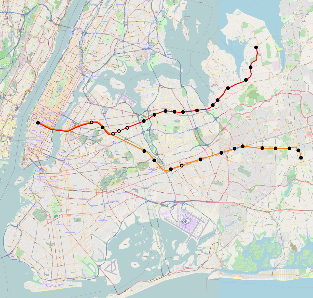
Black dots denote existing stations, gray dots denote infill.
The map includes only the lines that should be part of a Manhattan-bound rapid transit system initially. This excludes the South Shore LIRR lines, not because they’re unimportant (to the contrary), but because connecting them to Manhattan involves new flying junctions at Jamaica Station, built as part of East Side Access without any real concern for coherent service. Shoehorning these lines into the system is still possible (indeed, it is required until ESA opens and probably also until some Brooklyn-Lower Manhattan LIRR tunnel might open), but the scheduling gets more complex. These lines should be a further phase of this system, whereas I am depicting an initial operation.
The Port Washington Branch
On the Port Washington Branch, present-day frequency is 6 trains per hour at the peak, with a complex arrangement of express trains such that most stations have half-hour gaps, and a train every half hour off-peak making all stops. This should be changed to a pattern with a train every 10 minutes all day. If the single-track segment between Great Neck and Port Washington makes this not possible, then every other train should turn at Great Neck. On the schedule today the one-way trip time between Port Washington and Great Neck is 9 minutes, and this is with extensive padding and a throttled acceleration rate (the LIRR’s M7s can accelerate at 0.9 m/s^2 but are derated to 0.45 m/s^2). The technical travel time, not including station dwell time at Great Neck, which is double-track and has double-track approaches, is around 6 minutes without derating, and 6:50 with.
The current travel time from Port Washington to Penn Station is 47 minutes on an all-stop train, which permits six trainsets to comfortably provide 20-minute service; from Great Neck it’s 38 minutes, which permits five sets to provide 10-minute overlay service. Trains must be scheduled, not run on headway management, to have slots through the tunnels to Penn Station (shared with Amtrak under even my high-end proposals for regional rail tunnels), so the short-turns do not complicate scheduling.
With less padding and no derating, the travel time would be reduced to around 41 minutes end-to-end (so five trainsets provide end-to-end service) and 35 to Great Neck (allowing four trainsets to provide this service with some scheduling constraints or five very easily), even with the infill stops. Labor efficiency would be high, because even all-day headways would simplify crew scheduling greatly.
The Hempstead Branch
I proposed a sample schedule for the Hempstead Branch in 2015. Trains would take 41 minutes end to end; with my proposed infill stops, they would instead take 43. Few trains make the trip today, as off-peak Hempstead trains divert to Brooklyn, but of those that do, the trip time today is about 55 minutes.
Today’s frequency is 4 trains per hour at the peak and a train every hour off-peak. Two peak trains run express and do the trip in 48 minutes, worse than an all-stop train would with normal schedule contingency and no derating. As on the Port Washington Branch, I propose a train every 10 minutes all day, allowing ten trainsets to provide service. There is a single track segment between Garden City and Hempstead, but it is shorter than the Great Neck-Port Washington segment, making 10-minute service to the end feasible.
The reason I am proposing an increase in peak frequency on the Hempstead Branch but not the Port Washington Branch has to do with income demographics. The North Shore of Long Island is rich, and even the city neighborhoods on the Port Washington Branch beyond the 7 are upper middle class. There is still demand suppression there coming from high fares and low frequency, but evidently Bayside manages to be one of the busier LIRR stations; the equipment should be able to handle the increased peak ridership from better service.
In contrast, Hempstead is a working-class suburb, with a per capita income of $22,000 as of 2016 (in New York the same figure is $34,000, and in Great Neck it is $39,000). On the way it passes through very rich Garden City ($67,000/person), but Hempstead is a larger and denser town, and most city neighborhoods on the way are lower middle class. Fare integration, even with somewhat higher fares outside the city (which under this regime would also apply to Long Island buses), is likely to lead to ridership explosion even at rush hour, requiring more service.
My more speculative maps, for after East Side Access frees some capacity, even involve going to a train every five minutes, with half the trains going to Hempstead and half to East Garden City along a deactivated but intact branch. With such frequency, people from Forest Hills and points east would switch to the LIRR from the subway, helping relieve the overcrowded E trains. However, to avoid spending money on concrete (or scheduling around the flat junction between these two branches), starting with just Hempstead is fine.
To make this work, one investment into concrete is useful: grade-separating Queens Interlocking, between the Hempstead Branch and the Main Line. The Main Line should be able to run express (with a stop at the branch point at Floral Park) without conflicting with local trains on the Hempstead Branch. As peak traffic on the Main Line is close to saturating a double-track main, this would also facilitate a schedule in which Main Line trains get to use the express tracks through Queens while other lines, including the Hempstead Branch and the South Side Lines, use the local tracks.
What it would take
Providing the service I’m proposing would involve nine or ten trainsets on the Port Washington Branch and ten on the Hempstead Branch, if the trains are sped up. Some of the speedup involves running them at their design acceleration and some involves reducing schedule contingency by improving reliability. The reliability improvements in turn come from reducing conflicts; Amtrak conflicts are unavoidable, but hourly, involving trains that for all their faults are scheduled precisely and can be slotted to avoid delaying the LIRR. The one big-ticket item required is grade-separating Queens Interlocking, which, judging by the more complex Harold Interlocking flyover, is at actual New York costs a low nine-figure project.
Estimating operating costs is hard. On paper, LIRR service costs $10/car-km, but this includes conductors (whose wages and benefits are around $20/train-km, so maybe $2-$2.50/car-km), very low utilization of drivers (who add another $11/train-km), and high fixed costs. A driver-only operation with drivers doing four roundtrips per work day (totaling 6 hours and 40 minutes of driving and turnaround time) would spend $120 per end-to-end on the driver’s wages and benefits, $200 on electricity, essentially nothing on rolling stock procurement since nearly all the extra trips would be off-peak, and only a modicum on extra maintenance. Inducing around 150 riders per trip who would otherwise not have traveled would pay for the extra operating costs.
What it would and wouldn’t do
The most important thing to note is that this system is not going to be a second subway. This isn’t because of the inherent limitations of commuter rail, but because the alignment is not great in the inner part of the city. Penn Station is on the outskirts of Midtown Manhattan, which is why the LIRR is bothering building East Side Access in the first place. Stringer’s report talks about job centers outside Manhattan, but unfortunately, Queens’ single largest, Long Island City, has no through-LIRR station, and no chance of getting one since the Main Line is in a tunnel there. The best that can be done is Sunnyside Junction, which I do denote as an infill location.
Fortunately, Queens does have other job centers. Flushing has about 30,000 workers, Jamaica 16,000, Forest Hills 20,000 (for comparison, Long Island City has 50,000 and JFK 33,000). Sunnyside Yards are an attractive TOD target, and there may be some commercial development there, especially if there is a commuter rail station underneath (which station should be built anyway for operational reasons – it’s not purely development-oriented transit).
And, of course, most jobs remain in Manhattan. A kilometer’s walk from Penn Station gets you to about 400,000 Manhattan jobs. Hempstead and Port Washington are already less than an hour away by train – the difference is that today the train is expensive and doesn’t come frequently except for about two hours a day in each direction. The comptroller’s report errs in neglecting to talk about staffing reductions, but it’s right that running trains more often, making more stops, would make this service a very attractive proposition to a large number of commuters at all hours of day.
How to Design Rail Service to Connect to Buses Better
Usually, integrated transit planning means designing bus networks to feed rail trunks better. Buses are mobile: their routes can move based on long-term changes in the city’s physical and economic layout. Railroads in contrast have high installation costs. Between the relative ease of moving buses and the fact that there’s a hierarchy in which trains are more central than buses, buses normally should be feeding the trains. However, there are some cases in which the opposite happens: that is, cases in which it’s valuable to design rail infrastructure based on expected bus corridors. Moreover, in developed and middle-income countries these situations are getting more rather than less frequent, due to the increasing use of deep tunneling and large station complexes.
In nearly every circumstance, the hierarchy of bus and rail remains as it is; the exceptions (like Ottawa, at least until the light rail subway opens) are so rare as to be notable. What I posit is that in some situations, rail infrastructure should be designed better to allow buses to feed the trains more efficiently. This mostly affects station infrastructure, but there are also reasons to choose routes based on bus feeding.
Major bus corridors
Surface transit likes following major streets. Years ago, I blogged about this here and here. Major streets have two relevant features: they are wide, permitting buses (or streetcars) to run in generous dedicated lanes without having to deal with too much traffic; and they have continuous linear development, suitable for frequent bus stops (about every half kilometer).
These two features are likely to remain important for surface transit for the foreseeable future. The guidelines for good surface transit service depend on empirical parameters like the transfer penalty (in particular, grids are not the universal optimum for bus networks), but major corridors are relatively insensitive to them. The walk penalty can change the optimal bus stop spacing, but not in a way that changes the basic picture of corridor-based planning. Which streets have the most development is subject to change as city economic and social geography evolves, but which streets are the widest doesn’t. What’s more, a train station at a street intersection is likely to cement the cross-street’s value, making adverse future change less likely.
Note that we don’t have to be certain which major streets will host the most important buses in the future. We just need to know that major buses will follow major streets.
The conclusion is that good locations for rail infrastructure are major intersecting streets. On a commuter line, this means stations should ideally be placed at intersections with roads that can carry connecting buses. On a subway line, this means the same at a more local scale.
Stations and accessibility
When possible, train stations should locate at intersections with through-streets, to permit efficient transfers. This also carries over to station exits, an important consideration given the complexity of many recently-built stations in major rich and middle-income cities.
It goes without saying that a Manhattan subway line should have stations with exits at 72nd, 79th, 86th, 96th, etc. streets. Here, Second Avenue Subway does better than the Lexington Avenue Line, whose stations are chosen based on a 9-block stop spacing and miss the intersecting buses.
However, it’s equally important to make sure that the accessible exits are located at major streets as well. One bad example in New York is the Prospect Park B/Q station: it has two exits, one inaccessible on Flatbush Avenue and one accessible on Empire Boulevard. In theory both are major corridors, but Flatbush is far and away the more important ones, one of the busiest surface transit corridors in the city, while Empire competes for east-west buses with Kings County Hospital, the borough’s biggest job center outside Downtown Brooklyn. Eric Goldwyn’s and my Brooklyn bus redesign breaks the B41 bus on Flatbush and loops it and the Washington Avenue routes around the station complex to reach the accessible exit.
The Prospect Park case is one example of an almost-right decision. The full-time, accessible exit is close to Flatbush, but not quite there. Another example is Fields Corner: the eastern end of the platform is 80 meters from Dorchester Avenue, a major throughfare, and 180 meters from Adams Avenue, another major street, which unlike Dot Ave diverges from the direction the Red Line takes on its way south and is a useful feeder bus route.
Commuter rail and feeder buses
The station placement problem appears especially acute on mainline rail. This is not just an American problem: suburban RER stations are built without regard for major crossing roads (see, for example, the RER B airport branch and the RER A Marne-la-Vallee branch, both built in the 1970s). Railroads historically didn’t think much in terms of systemwide integration, but even when they were turned into modern rapid transit, questionable stop locations persisted; the Ashmont branch of the Red Line in Boston was taken over from mainline rail in the 1920s, but Fields Corner was not realigned to have exits at Dot and Adams.
Today, the importance of feeder buses is better-understood, at least by competent metropolitan transportation planners. This means that some stations need to be realigned, and in some places infill stops at major roads are desirable.
This is good for integration not just with buses but also with cars, the preferred station access mode for American commuter rail. The LIRR’s stations are poorly located within the Long Island road network; Patrick O’Hara argues that Hicksville is the second busiest suburban station (after Ronkonkoma) not because it preferentially gets express service on the Main Line, but because it has by far the best north-south access by road, as it has one arterial heading north and two heading south, while most stations miss the north-south arterials entirely.
Instead of through-access by bus (or by car), some stations have bus bays for terminating buses. This is acceptable, provided the headways are such that the entire local bus network can be configured to pulse at the train station. If trains arrive every half hour (or even every 20 minutes), then timed transfers are extremely valuable. In that case, allowing buses to stop at a bay with fast access to the platforms greatly extends the train station’s effective radius. However, this is of far less value on a dense network with multiple parallel lines, or on a railroad so busy that trains arrive every 10 minutes or less, such as the RER A branches or the trunks of the other RER lines.
Within New York, we see this mistake of ignoring local transit in commuter rail planning with Penn Station Access. The project is supposed to add four stations in the Bronx, but there will not be a station at Pelham Parkway, the eastern extension of Fordham Road carrying the city’s busiest bus, the Bx12. This is bad planning: the MTA should be encouraging people to connect between the bus and the future commuter train and site stations accordingly.
Street networks and route choice
On a grid, this principle is on the surface easy: rapid transit routes should follow the most important routes, with stops at cross streets. This is well understood in New York (where proposals for subway extensions generally follow busy bus routes, like Second Avenue, Nostrand, and Utica) and in Vancouver (where the next SkyTrain extension will follow Broadway).
However, there remains one subtlety: sometimes, the grid makes travel in one direction easier than in another. In Manhattan, north-south travel is easier than east-west travel, so in isolation, east-west subways connecting to north-south buses would work better. (In reality, Manhattan’s north-south orientation means north-south subways are indispensable, and once the subways exist, crossing subways should aim to connect to them first and to surface transit second.) In West Los Angeles, there is a multitude of east-west arterials and a paucity of north-south ones, which means that a north-south subway is of great value, connecting not just to the Expo Line and upcoming Wilshire subway but also other east-west arterials carrying major bus routes like Olympic.
Moreover, some cities don’t have intact grids at all. They have haphazard street networks, with some routes suitable for arterial buses and some not. This is less of an issue in mature cities, which may have such street networks but also have older subway lines for newer route to connect to, and more in newer cities, typically in the third world.
The tension is that very wide arterials are easier to build on, using elevated construction or cut-and-cover. If such a technique is feasible, then constructibility should trump connections to buses (especially since such cities are fast-changing, so there is less certainty over what the major future bus routes are). However, if deep boring is required, for examples because the arterials aren’t that wide, or the subway must cross underwater, or merchant opposition to cut-and-cover is too entrenched, then it’s useful to select routes that hit the arterials orthogonally, for the best surface transit connections.
Conclusion
In a working transit city, rail should be the primary mode of travel and buses should be designed to optimally feed the trains. However, this does not mean rail should be planned without regard to the buses. Train stations should be sited based not just on walk sheds and major destinations but also planned bus connections; on an urban rapid transit system, including S-Bahn trunks, this means crossing arterial streets, where buses typically run. Moreover, these stations’ exits should facilitate easy transfers between buses and trains, including for people with disabilities, who face more constrained mobility choices if they require elevator access. In some edge cases, it may even be prudent to select entire route construction priorities based on bus connections.
While choosing rail routes based on bus connections seems to only be a real issue in rare circumstances (such as the West LA street network), bus-dependent station siting is common. Commuter train services in general are bad at placing stations for optimal suburban bus connections, and may require extensive realignment and infill. On urban subways, station placement is important for both accessibility retrofits and new projects. Outside city centers, where dense subway networks can entirely replace surface transit, it’s critical to select station sites based on maximum connectivity to orthogonal surface lines.
Port Authority’s LaGuardia Rail Link Study
Two days ago, Port Authority put out a study about a rail link to LaGuardia, which became Governor Cuomo’s top transit priority a few years ago. The PDF file is bundled with the RFP, but starting on PDF-p. 25 it’s an alternatives analysis and not an RFP. While transit activists including myself have attacked Cuomo’s proposed rail link for its poor alignment choice, the Port Authority study considers many alternatives, including some interesting ones. It also describes the current situation in more detail than I’ve seen elsewhere. I’d like to talk about the alternatives for a rail link, but also summarize some of the important facts buried in the study. Unfortunately, the study also eliminates all the useful options and prefers to advance only Cuomo’s uselessly circuitous alignment.
The current situation
LaGuardia had about 25 million O&D passengers in 2017. They disproportionately go to or from Midtown, but it’s not as overwhelming as I thought based on this density map. Here is a precise breakdown, lumping together both locals (33%) and visitors (67%):

In Manhattan and western Queens “Walking access” means half a mile from a commuter rail stop or from the 7 train; there is no attempt to track walk access to the N or W trains. In Eastern Queens it means half a mile from any subway stop.
About half of the passengers get to or from the airport by taxi, and another 20% are dropped off or picked up in a car. Only 6.2% use public transportation, and another 5.6% use a shared ride such as a hotel shuttle.
Among employees, the situation is different. I expected employees to cluster in western and central Queens, but in fact, based on the same categories used for passengers, the largest group is Queens East beyond subway range:
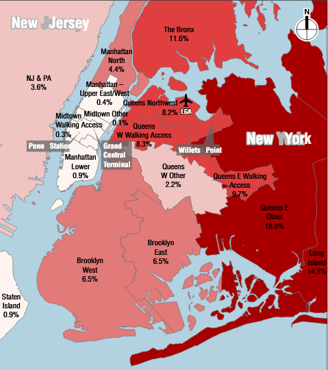
There are 13,000 employees at LaGuardia per Port Authority (compared with about 10,000 per OnTheMap), of whom 40% take transit to work and 57% drive. It goes without saying that the transit options are exceedingly harsh. The connections from Brooklyn require taking a subway through Manhattan (and I don’t think LGA is necessarily important enough to justify a direct bus route from Brooklyn, presumably a merger of the B38 with a Q18/Q47 compromise route to the airport). From Queens beyond subway range they require taking a bus to the subway and then another bus. The implication is that people take transit to the airport out of necessity – that is, poverty – and not because the options are good.
Unfortunately, the implication is also that it’s hard to serve the current employee base by any rail link, even if it’s fare-integrated with the subway (unlike the JFK AirTrain). The origins are too dispersed. The best that can be done is serving one tranche of origins, and letting passengers sort themselves based on commute possibilities.
In some strategic places, a decent two-seat ride can be made available. The M60 bus is not good for passengers, but it is fine for employees since more of them come from Upper Manhattan and the Bronx, and moreover low incomes imply that it’s fine to have a transit : car trip time ratio well in excess of 1 provided it’s not too onerous. Some future rail extensions, not covered in the study, would help with passenger distribution: Triboro RX would help get passengers from the South Bronx, Brooklyn, and parts of Queens to major transfer points at Astoria and Jackson Heights, and Penn Station Access with an Astoria stop would help get eastern Bronx passengers into Astoria with a quick transfer.
The alternatives analyzed
The study mentions a horde of different options for connecting people to the airport, but most only get a few paragraphs followed by an indication that they don’t meet the objectives and therefore should not be considered further. These excluded alignments exist only for i-dotting and t-crossing, such as ferries or whatever Elon Musk is calling his tunnels this year; Port Authority is right to reject them.
The alternatives proposed for further consideration consist of no build, subway extensions, and various air train alignments. Unfortunately, on second pass, the subway extensions are all eliminated, on the same grounds of community impact. This includes the least impactful subway extension, going north on 31st Street and then east on 19th Avenue, avoiding Ditmars (which could host an el).
Instead of a subway extension, the study is recommending an air train. There are many alternatives analyzed: one from Astoria along the Grand Central Parkway, one from Woodside with a connecting to the local M/R trains on the Queens Boulevard Line at Northern Boulevard, one from Jackson Heights, one from Jamaica with a missed connection to the 7, and one from Willets Point as recommended by Cuomo. All but the last are excluded on the same grounds of impact. Any land acquisition appears to be prohibited, no matter how minor.
What went wrong?
The obvious answer to why the study recommends the Willets Point detour is political support. This can be seen in e.g. PDF-p. 150, a table analyzing each of the air train possibilities. One of the criteria is operational concerns. The Jamaica option fails that test because it is so circuitous it would not get passengers between the airport and either Penn Station or Grand Central in thirty minutes. The Willets Point option passes, despite being circuitous as well (albeit less so); it would still not get passengers to Midtown Manhattan in thirty minutes since the 7 is slow, but the study seems to be assuming passengers would take the LIRR, on the half-hourly Port Washington Branch.
This alone suggests political sandbagging. But by itself it doesn’t explain how the study’s assumptions sandbag the options the governor doesn’t favor; after all, there could be many little omissions and judgment calls.
Rather, I propose that the study specifically looked only at nonstop service to the airport. The subway extensions are all proposed as nonstop services from Astoria (either Astoria Boulevard or Ditmars) to the airport, without intermediate stops. Without intermediate stops, the political will to build els above neighborhood streets is diminished, because few people in Astoria have any need to travel to LaGuardia. In contrast, with intermediate stops, the subway extensions would improve coverage within Astoria, serving Steinway and Hazen Streets.
If intermediate stops are desired, then 19th Avenue may not be the best corridor. Ditmars itself is feasible (with some takings), as are 21st and 20th Avenues. Ditmars has the most impact but serves the highest-value location, and can descend to Grand Central Parkway to get to the airport without any tunneling, limiting costs.
Moreover, the impact of els can be reduced by building them on concrete columns rather than all-steel structures. Paris Metro Line 2 opened in 1903, before the First Subway in New York; it has a steel structure on top of concrete columns, and the noise level is low enough that people can have conversations underneath while a train is passing. New Yorkers should be familiar with the reduced noise of concrete structures since the 7 el on top of Queens Boulevard is quiet, but that is an all-concrete structure on a very wide street; Line 2 here follows wide boulevards as well but not so wide as Queens Boulevard, and is moreover a mixture of concrete and steel, and yet manages not to have the screeching noise New Yorkers are familiar with from Astoria, Woodside, and other neighborhoods with els.
Is this study valuable?
Yes and no. Its conclusions should be tossed for their limited scope (nonstop airport access only), questionable assumptions (overreliance on infrequent commuter rail), and political aims (justifying Cuomo’s decision). But some of the underlying analysis, especially of current travel patterns, is useful for the purposes of thinking about systemwide transit expansion. Despite the consideration of an N/W extension, the study does not try to figure out the percentage of travelers whose ultimate origin or destination is near an N/W stop, only near a 7 stop; however, we can make some educated guesses from the map and realize that an N/W extension is of considerable value to passengers.
For employees, the situation is more delicate. The study mentions them but doesn’t try to optimize for them – the aim is to give Cuomo political cover, not to design the best possible public transit for New York. But the dispersal of worker origins means that a single rail link to the airport is unlikely to have much of an effect. Better everywhere-to-everywhere transit is needed. With decent bus connections at Astoria and Jackson Heights, it’s more important to build circumferential transit there (that is, Triboro) than to connect directly to the airport.
A general program of transit expansion would serve both groups. An N/W extension through Astoria with intermediate stops would give the neighborhood better coverage while also connecting the airport with Manhattan destinations, with good transfers to origins on the Upper East and West Sides. Better circumferential transit would then let workers from different parts of the city use the same extension without having to detour through Midtown even if their origins are in the Bronx or Queens.
Can any of this happen? The answer is unambiguously yes. Even in New York, els and at-grade rail is not so expensive. The only real question is whether good transit can happen while the state is governed by a do-nothing administration, headed by a governor who is more interested in a signature project than in improving transportation for his hapless subjects.
Heterogeneity of Preferences
The public transit conversation is full of statements like “passengers don’t like to transfer,” or, in quantified terms, “passengers perceive a minute transferring to be equivalent to 1.75 minutes on a moving vehicle.” But what does this exactly mean? It’s not a statement that literally every passenger has a transfer penalty factor of 1.75. Different passengers behave differently. At best, it’s a statement that the average passenger on the current system has a transfer penalty factor of 1.75, or alternatively that the aggregate behavior of current passengers can be approximated by a model in which everyone has a transfer penalty factor of 1.75. Understanding that different people have different preferences is critical to both the technical and political aspects of transportation planning.
I talked about the heterogeneity of transfer penalties three years ago, and don’t want to rewrite that post. Instead, I want to talk more broadly about this issue, and how it affects various transit reforms. In many cases, bad American transit practices are the result not of agency incompetence (although that happens in droves) but of preferential treatment for specific groups that have markedly different preferences from the average.
Disabilities
The universal symbol of disability is the wheelchair. Based on this standard, every discussion of accessible to people with disabilities centers people in wheelchairs, or alternatively retirees in walkers (who tend to make sure of the same infrastructure for step-free access).
However, disabilities are far broader, and different conditions lead to dramatically different travel preferences. One paper by the CDC estimates that 20% of US adults have chronic pain, and 8% have high-impact chronic pain, limiting their life in some way. People with chronic pain are disproportionately poor, uneducated, and unemployed, which should not be a surprise as chronic pain makes it hard to work or go to school (in contrast, the one unambiguously inborn socioeconomic factor in the study, race, actually goes the other way – whites have somewhat higher chronic pain rates than blacks and Hispanics). Another paper published by BMJ is a meta-analysis, finding that depending on the study 35-51% of the UK population has chronic pain and 10-14% has moderately to severely disabling chronic pain.
I’ve only talked to a handful of people with chronic pain – all of working age – and the best generalization that I can make is that it is impossible to generalize. The conditions vary too much. Some find it more painful to drive than to take transit, some are the opposite. Some have conditions that make it hard for them to walk, some are fine with walking but can’t stand for very long. To the extent the people I’ve talked to have common features, they a) have a strong preference for rail over bus, and b) require a seat and can’t stand on a moving vehicle for very long.
Work status
The best use case for rapid transit is getting people to work in a congested city center at a busy time of day, ideally rush hour. Off-peak ridership is generally cheaper to serve than peak ridership, but this is true for all modes of transportation, and public transit tends to be relatively better at the peak than cars. Per table 2 of the Hub Bound report, as of 2016, 19% of public transit riders entering the Manhattan core do so between 8 and 9 am and 43% do so between 7 and 10 am, whereas the corresponding proportions for drivers are 6% and 18% respectively.
The upshot is that people are more likely to ride public transit if they work a salaried job. This is especially true in the middle class, which can afford to drive, and whose alternative is to work at some suburban office park where car ownership is mandatory. In the working class, the distribution of jobs is less CBD-centric, but the ability to afford a car is more constrained.
The social groups most likely to drive are then neither the working class (which doesn’t own cars anywhere with even semi-reasonable public transit) nor the professional working class, but other social classes. The petite bourgeoisie is the biggest one: small business owners tend to drive, since they earn enough for it, tend to have jobs that either virtually require driving (e.g. plumbers) or involve storefronts that are rarely located at optimal locations for transit, and need to go in and out at various times of day.
Another group that’s disproportionately likely to drive is retirees. They don’t work, so they don’t use transit for its most important role. They take trips to the hospital (which is bundled with issues of disability), which can be served by buses given that hospitals are major job centers and non-work travel destinations, but their other trips tend to be based on decades of socialization that have evolved haphazardly. The urban transit network isn’t likely to be set up for their particular social use cases.
Consensus for whomst?
I bring up small business owners and retirees because these two groups are especially empowered in local politics. When I lived in Sweden, I could vote in the local and regional elections, where I had no idea what the main issues were and who the candidates were; I voted Green based on the party’s national platform, but for all I know it’s not great on Stockholm-specific issues. Figuring out the national politics is not hard even for a newcomer who doesn’t speak the language – there are enough English-language news sources, there’s social media, there are friends and coworkers. But local politics is a mystery, full of insider information that’s never spelled out explicitly.
What this means is that the groups most empowered in local politics – that is, with the highest turnouts, the most ability to influence others in the same constituency, and the greatest ability to make consistent decisions – are ones that have local social networks and have lived in one place for a long time. This privileges older voters over younger voters, and if anything underprivileges people with disabilities, whose ability to form social and political connections is constrained by where they can go. This also privileges people with less mobile jobs – that is, shopkeepers rather than either the professional middle class or the working class.
With their greater local influence, the most empowered groups ensure the transportation that exists is what is good for them: cars. Public transit is an afterthought, so of course there is no systemwide reorganization – that would require politicians to care about it, which interferes with their ability to satisfy the politically strongest classes. But even individual decisions of how to run transit suffer from the same problem when there is no higher political force (such as a strong civil service or a national political force): bus stops are very close together, transfers are discouraged (“we oppose the principle of interchange” said one left-wing group opposed to Jarrett Walker’s bus redesign in Dublin), rail service is viewed more as a construction nuisance than a critical mobility service, etc.
Models for transportation usage take into account the behavior of the average user – at least the average current user, excluding ones discouraged by poor service. However, the political system takes into account the behavior of the average empowered voter. In the case of local politics, this average voter rarely rides public transit. When city political machines run themselves, the result is exactly what you’d think.
Phased Implementation of Bus Redesign
Jarrett has a good post about the new Auckland bus redesign, which he had been involved in when he worked for international consultancy MRCagney, before he opened his own. He mentions one peculiar aspect of Auckland – namely, that it is so divided by water boundaries that different areas of it have independent surface transit networks – that facilitates gradual implementation. In contrast, in a city with a more connected street network, every route affects every other route, so redesign has to be implemented together, without any intermediate phases. He brings up Brooklyn (together with Queens) as one example of such a connected network, and I feel like I need to explain why a phased approach is appropriate there.
But this is not just about Brooklyn. The question of whether to implement changes abruptly or gradually generalizes to every scale, up to and including the type of regime (democratic, militaristic, communist, etc.). The scope of this post concerns bus networks anywhere. The arguments I bring up in favor of a phased approach in Brooklyn should also give correct answers in other cities, regardless of whether they end up recommending gradualism.
Sharp edges
Jarrett brings up one factor influencing whether phased implementation is appropriate: sharp edges between different parts of the city. In New York, the East River has few road crossings and many rail crossings; only one local bus crosses it in Brooklyn, the half-hourly B39, and only four cross it in Queens.
But even edges that look less sharp than the East River or the Hudson can be so stark so as to permit separate planning on their two sides. The Harlem River is one example: many Bronx buses cross it, but their routes in Manhattan are constrained based on which avenue or street the bridge connects to, so there’s not much scope for creative recombination.
Brooklyn itself has few internal sharp edges. The closest thing to a sharp edge is the combination of Greenwood Cemetery and Prospect Park, separating on one side Park Slope and South Brooklyn and on the other side Flatbush and Southern Brooklyn. A few marginal neighborhoods are sharply divided from the rest of the borough, especially Red Hook. But for those neighborhoods, the question of where in the rest of the borough they should connect to depends on the shape of the rest of the system.
That said, it’s plausible to talk about how the new network would look in various neighborhoods, if there are choke points or generally agreed upon spines. Red Hook is an especially good example, since it has a strong connection to Manhattan via the Brooklyn-Battery Tunnel (hence, our proposed tunnel bus to Lower Manhattan). But as the arguments in comments here over Williamsburg show (and as my constant refrain about the north-south Bed-Stuy routes shows), it’s possible to discuss individual neighborhoods even if they’re more strongly connected, as long as it’s clear that it’s in the context of a greater network.
However, in one aspect, Jarrett and the MTA make a mistake: they treat the edge between Brooklyn and Queens as less sharp than it really is. In the north, the Newtown Creek choke point forces buses to all go up to Long Island City along a single bridge. In the center, a few route mergers passing through Bushwick and Ridgewood (especially the B54/Q55 on Myrtle) are reasonable, but fully integrated planning would not create very many connections. It’s possible to design the network for Brooklyn alone and then notate where Queens connections would happen, just as it’s possible to design a Manhattan network and point out that the M60 goes into Queens.
The subtle issue regarding Brooklyn and Queens concerns what happens in the south. At TransitCenter we were asked about connections to Howard Beach, but when I looked, I ran across a subtle geographic divide. The southeastern margin of Brooklyn and Queens is a series of small peninsulas with weak connections between them: Gerritsen Beach, Mill Basin, Bergen Beach, Canarsie, Starrett City, Spring Creek, Howard Beach, Old Howard Beach. When I crayoned a metro network for Lagos, which has the same problem in the west and northwest, I had to assume new metro bridges connecting various neighborhoods. On a surface transit network in a developed country, such bridges are unlikely to happen, forcing buses to use the main through-routes today, like Flatlands and Linden.
Is it good enough today?
The entire reform versus revolution discourse depends on how bad things are today. It’s unavoidable in discussions of socialism and Marxism. Socialists and even some social democrats hold that mid-20th century social reforms (like the New Deal) saved capitalism from itself, by making the working class’s situation less desperate. As a result, there is a contingent of leftists who call themselves accelerationists, who prefer to make things as bad as they can be (for example, by refusing to back the center-left against the far right) hoping that this would accelerate the revolution.
The “is it good enough today?” principle scales down to any level. When it comes to bus networks, it really asks, how much would the optimal route network differ from today’s situation?
The highly radial buses of San Jose today, Houston before Jarrett’s redesign, and Barcelona before Nova Xarxa all differ greatly from the redesigned networks. This encourages abrupt implementation, in two ways. First, the old routes are generally weak, increasing the pressure to get rid of them. And second, the old routes don’t feed the new grid trunk lines well, whereas the grid trunks feed one another. Nova Xarxa (which is a six-year process, retaining many old lines) has seen its phase 1 lines grow in ridership as each subsequent phase was implemented, making the early stages much less useful than the entire system.
In contrast, Brooklyn is firmly in the good enough basket. This does not mean its current network design is objectively good; it isn’t. But it does mean that most of its key trunk lines should survive redesign with at most light modifications. Among the 15 busiest Brooklyn routes today measured by ridership per km, only three see big changes: the B1 (straightened into a Southern Brooklyn grid), the B82 (cut to Kings Highway, its tails on both sides given to the B6), and the B41 (cut north of the B/Q subway connection at Prospect Park). A few more are merged into longer routes, like the B42 and the B60, but maintain their current route, just with through-service elsewhere. Key grid routes like Lafayette, Church, Nostrand, Avenue M, and Myrtle survive almost unchanged.
The Brooklyn redesign is not predominantly about starting from scratch, since the network today already has the characteristics of an imperfect grid. It’s about consolidating weak and weak-ish routes, straightening some buses that are too circuitous, and switching around buses to serve destinations that have grown stronger since the 1970s redesign. The East New York network in particular has a lot of meanders that should be fixed regardless of what happens anywhere else; the rest of the bus and subway network is good enough that people from East New York can then transfer to it even if increasing trunk frequency happens later.
Future changes
Bus redesigns are not immutable, to be done once in a few decades with long periods of stasis in between. Cities change, and the optimal bus network for 2025 may be different from that for 2019 in some situations. In a city where there’s relative stasis in development intensity, traffic, and any rail trunk, an abrupt change makes more sense. Realistically, such a change would come not when the first phase of a gradual implementation would have been done but when the middle or last phases would have. Thus, if the redesign is a long-lasting product it’s easier to wait for the first phase (which in an abrupt implementation is also the last phase) and not change much afterward.
This relates to California Transit Twitter’s biggest criticism of Jarrett’s San Jose redesign: that it does not incorporate the recent BART extension to Warm Springs. Jarrett unveiled his redesign for VTA in the spring of 2017, expecting BART to be extended from Warm Springs to the San Jose Flea Market at Berryessa by the end of the year, as BART had projected. Based on this expectation, he designed the network around an abrupt implementation, to go into effect shortly after trains would start running to Berryessa. Since then, BART has announced delays to the extension, talking about opening it only at the end of 2019. Trusting BART’s early promises of 2017 opening is an understandable error; Jarrett did not cause the BART timetable slip. But the outcome is that the VTA bus redesign is delayed.
The upshot is that in a city with a rapidly-growing rapid transit network, bus redesigns should be done on a continuous basis, tweaked every time a new subway line opens. The Bay Area is not generally such a city, but BART is expanding into San Jose, so in that part of the region, phased implementation with updates every few years is warranted. By the same principle, a city with rapid changes in where people live and work should expect recurrent changes to its surface transit network; this is less relevant to San Jose, since the growth nodes are the CBD (e.g. the upcoming Google building) and the Apple headquarters in Cupertino, but it’s relevant to cities in which residential areas are commercializing, such as San Francisco with SoMa.
New York, of course, has a static subway system, courtesy of extreme construction costs. It also has a relatively static workplace geography. However, in one respect, it is undergoing rapid change: it is gradually making its subway network accessible. When I say that the optimal networks for 2018, 2022, and 2026 are all different, I say this in reference to upcoming subway accessibility upgrades, as well as potential changes (i.e. de-interlining) that would increase subway frequency at the cost of one-seat rides. In Brooklyn, our plan to get rid of the B25 depends on upcoming accessibility upgrades for Broadway Junction, without which the bus should probably stay as an accessible alternative to the A and C trains. Likewise, our plan to retain the B63 comes from plans to only make the outermost R stations accessible but not the ones in Sunset Park or South Slope.
What about Nova Xarxa?
On two out of three metrics, Barcelona’s layout recommends an abrupt approach: it lacks internal sharp edges, and its preexisting network was too radial to be useful. On the third, it does not: it is rapidly expanding its metro network; however, the implementation of Nova Xarxa as far as I can tell has not been timed for the opening of L9/L10. So why is it phased there?
The fact that the early-phase lines of the network have seen further increases in ridership as the rest of the network has come online suggests that, on purely technical criteria, gradual implementation was not the right choice in Barcelona. However, in political reality, Nova Xarxa could not replace the entire radial network. Most bus routes in Barcelona today are still not Nova Xarxa. The system’s characteristic as an overlay that took over old lines that became superfluous forced it to be done in phases.
Conflicting excuses
In comments, people here have warned that a phased implementation can be an excuse to do nothing: put the few things everyone agrees on in the first phase, do that, and then postpone future phases indefinitely. This is a real risk. However, abrupt change has its own risks as well: it can be used as an excuse not to do low-cost or negative-cost things that can be implemented fast, such as merging the two Myrtle routes, redoing the East New York bus network in advance of the L train shutdown, and opening the Red Hook-Lower Manhattan route.
The upshot is that the question of gradualism seems independent from the question of obstructive bureaucrats and apparatchiks. There may well arise a local situation in which one answer to the main question is less vulnerable to political sabotage than the other, but it depends on idiosyncratic factors and is unlikely to be the case in general.
With the political criteria uncertain, the answer to whether network redesign should be done in one go or in stages should depend only on technical criteria. These differ from city to city and from region to region depending on local physical and urban geography. In New York, they suggest a phased implementation would work; elsewhere, they may not.

