Category: Urban Transit
Transit Advocacy and (Lack of) Ideology in New York
I wrote recently about ideology in transit advocacy and in advocacy in general. The gist is that New York lacks any ideological politics, and as a result, transit advocacy either is genuinely non-ideological, or sweeps ideology under the rug; dedicated ideological advocates tend to either be subsumed in this sphere or go to places that don’t really connect with transit as it is and propose increasingly unhinged ideas. The ideological mainstream in the city is not bad, but the lack of choice makes it incapable of delivering results, and the governments at both the city and state levels are exceptionally clientelist, due to the lack of political competition. I’m not optimistic about political competition at the level of advocacy, but it would be useful to try introducing some in order to create more surface area for solutions to come through, and to make it harder for lobbyists to buy interest groups.
Political divides in New York
The political mainstream in New York is broadly left-liberal. New York voters consistently vote for federal politicians who promise to avoid tax cuts on high-income earners and corporations and even increase taxes on this group, and in exchange increase spending on health care, with some high-profile area politicians pushing for nationwide universal health care. They vote for more stringent regulations on businesses, for labor-friendlier administrative actions during major strikes, and for more hawkish solutions to climate change.
And none of that is really visible in state or city politics. Moreover, there isn’t really any political faction that voters can pick to support any of these positions, or to oppose them (except the Republicans, who are well to the right of the median state voter). The Working Families Party exists to cross-endorse Democrats via a different line; there is no fear by a Democrat that if they are too centrist for the district voters will replace them with a WFP representative, or that if they are too left-wing they will replace them with a non-WFP representative. There was a primary bloodbath in 2018, but it came from people running for the State Senate as party Democrats opposed to the Cuomo-endorsed Independent Democratic Conference, which broke from the party to caucus with Republicans.
The political divides that do exist, especially at the city level, break down as machine vs. reform candidates. But even that is not always clear, even as Eric Adams is unambiguously machine. The 2013 Democratic mayoral primary did not feature a clear machine candidate facing a clear reform candidate: Bill de Blasio ran on an ideologically progressive agenda, and implemented one small element of it in universal half-day pre-kindergarten for 3- and 4-year-olds, but he ingratiated himself with the Brooklyn machine, to the point of steering endorsements in the 2021 primary toward Adams, and against the reform candidate, his own appointee Kathryn Garcia.
Political divides and advocacy
The mainstream of political opinion in New York ranges from center to mainline-left. But within that mainstream, there is no ideological competition, not just in politics, but also in advocacy. Transit advocacy, in particular, is not divided into more centrist and more left-wing groups.
The main transit advocacy groups in New York are instead distinguished by focus and praxis, roughly in the following way:
- The Permanent Citizens Advisory Committee to the MTA (PCAC) is on the inside track of advocacy, proposing small changes within the range of opinions on the MTA board.
- Riders Alliance (RA) is on the outside track, focusing on public transit, with praxis that includes rallies, joint proposals with large numbers of general or neighborhood-scale advocacy groups, and some support for lawfare (they are part of the lawsuit against Kathy Hochul’s cancellation of congestion pricing).
- Transportation Alternatives (TransAlt) focuses on street-level changes including pedestrian and bike advocacy, using the same tools of praxis as RA.
- Streetsblog is advocacy-oriented media.
- Straphangers Campaign is subway-focused, and uses reports and media outreach as its praxis, like the Pokey Awards for the slowest bus routes.
- Charlie Komanoff (of the Carbon Tax Center) focuses on producing research that other advocacy groups can use, for example about the benefits of congestion pricing.
The group I’m involved in, the Effective Transit Alliance, is distinguished by doing technical analysis that other groups can use, for example on RA’s Six-Minute Service campaign (statement 1, statement 2), or other-city groups pushing rail electrification; it is in the middle between outside and inside strategies.
Of note, none of these is distinguished by ideology. There is no specifically left-wing transit advocacy group, focusing on issues like supporting the TWU and ATU in disputes with management, getting cops off the subway, and investing in environmental justice initiatives like bus depot electrification to reduce local diesel pollution.
Neither is there a specifically neoliberal transit advocacy group. There are plenty of general advocacy groups with that background, like Abundance New York, but they’re never specific to transit, and much of their agenda, like expansion of renewable power, would not offend ideological socialists. YIMBY as a movement has neoliberal roots, going back to the original New York YIMBY publication, but these days is better viewed as a reform movement fighting the reformers of the last quarter of the 20th century, with the machine adjudicating between the two sides (City of Yes is an Adams proposal; the machine was historically pro-developer).
Instead, all advocacy groups end up arguing using a combination of median-New Yorker ideological language and technocratic proposals (again, Six-Minute Service). Taking sides in labor versus management disputes is viewed as the domain of the unions and managers, not outside groups. RA’s statement on cops on the subway is telling: it uses left-wing NGO language like “people experiencing homelessness,” but of its four policy proposals, only the last, investing in supportive housing for the homeless, is ideologically left-wing, and the first and third, respectively six-minute service and means-tested fare reductions for the poor, would find considerable support in the growing neoliberal community.
The consequences to the extremes
If the mainstream in New York ranges from dead center to center-left, both the general right and the radical left end up on the extremes. These have their own general advocacy groups: the Manhattan Institute (MI) on the right, and the Democratic Socialists of America (DSA) and its allies on the radical left. MI has recently moved to the right on national culture war issues, especially under Reihan Salam as he hired Christopher Rufo, but on local governance issues it’s not at all radical, and highlights center-right concerns with crime and with waste, fraud, and abuse in the public sector. DSA intends to take the most radical left position on issues that is available within the United States.
And both, as organizations, are pretty bad on this issue. MI, in particular, uses SeeThroughNY, the applet for public-sector worker salaries, not for analysis, but for shaming. I’ve had to complain to MI members on Twitter just to get the search function on job titles to work better, and even after they did some UI improvements, it’s harder to find the average salaries and headcounts by position to figure out things like maintenance worker productivity or white-collar overhead rates, than to find the highest-paid workers in a given year and write articles in the New York Post to shame them for racking so much overtime.
Then there is the proposal, I think by Nicole Gelinas, to stop paying subway crew for their commutes. This is not possible under current crew scheduling: train operators and conductors pick their shifts in seniority order, and low-seniority workers have no control over which of the railyards located at the fringes of the city they will have to report to. A business can reasonably expect a worker to relocate if the place the worker reports to will stay the same for the next few years; but if the schedules change every six months and even within this period they send workers to inconsistent railyards, it is not reasonable and the employer must pay for the commute, which in this circumstance is within private-sector norms.
DSA, to the extent it has a dedicated platform on public transit, is for free transit, and failing that, for effectively decriminalizing fare beating. More informed transit advocates, even very left-wing ones, persistently beg DSA to understand that for any given subsidy level, it’s better to increase service than to reduce fares, with exceptions only for places with extremely low ridership, low average rider incomes, and near-zero farebox recovery ratios. In Boston, Michelle Wu was even elected mayor on this agenda; her agenda otherwise is good, but MBTA farebox recovery ratios are sufficient that the revenue loss would bite, and as a result, all the city has been able to fund is some pilot projects on a few bus routes, breaking fare integration in the process since there is no way the subway is going fare-free.
In both cases, what is happening is that the ideological advocacy groups are distinct from the transit advocacy groups, and people are rarely well-respected in both – at most, they can be on the edge in both (like Gelinas). The result is that DSA will come up with ideas that are untethered from the reality of transit, and that every left-wing idea that could work would rapidly be taken up by groups that are not ideologically close to DSA, giving it a neoliberal reputation; symmetrically, this is true of the entire right, including MI.
The limits of the lack of ideology
The lack of ideology is not a good thing. With no ideological competition, voters have no clear way of picking politicians, which results in dynasties and handpicked successors. Lobbyists know who they need to curry favor with, making it cheaper to buy the government than to improve productivity; once it’s cheap to buy the government, the tax system ends up falling on whoever has been worst at buying influence, leading to high levels of distortion even with tax rates that, by Western European standards, are not high.
The quality of government in this situation is not good; corruption parties are not good when they govern entire countries, like the LDP in Japan or Democrazia Cristiana in Cold War Italy, and they’re definitely not good at the subnational level, where there is less media oversight. On education, for example, New York City pays starting teachers with a master’s degree $72,832/year in 2024, which compares with a German range for A13 starting teachers (in most states covering all teachers, in some only academic secondary teachers) of 50,668€/year in Rhineland-Pfalz to 57,288€/year in Bavaria; the PPP rate these days is 1€ = $1.45, so German teachers earn 1-14% more than their New York counterparts, while the average income from work ranges from 5% higher in New York than in Bavaria to 68% higher than Saxony-Anhalt. This stinginess with teacher salaries does not go to a higher teacher-to-student ratios, both New York and Germany averaging about 1:13, or to savings on the education budget, New York spending around twice as much as Germany. The waste is not talked about in the open, and even the concept that teachers deserve a raise, independently of budgetary efficiency, does not exist in city politics; it’s viewed as the sole domain of the unions to demand salary increases, and the idea that people can elect more pro-labor politicians who run on explicit platforms of salary increases is unthinkable.
In transit, I don’t have a good comparison of New York. But I do suspect that the single-party rule of CSU in Bavaria is responsible for the evident corruption levels in the party and the high costs of the urban rail projects that CSU cares about, namely the Munich S-Bahn second trunk line, which is setting Continental European records for its high costs. Likewise, in Italy, the era of DC domination was also called the Tangentopoli, and bribes for contracts were common, raising costs; the destruction of that party system under mani pulite and its replacement with alternation of power between left and right coalitions since has coincided with strong anti-corruption laws and real reductions in costs from the levels of the 1980s.
We haven’t found corruption in New York when researching the Second Avenue Subway case. But we have found extreme levels of intellectual laziness at the top, by political appointees who are under pressure not to innovate rather than to showcase success.
And likewise, at ETA, I’m seeing an advocacy sphere that is constrained by court politics. It’s considered uncouth to say that the governor is a total failure and so are all of her and her predecessor’s political appointees until proven otherwise. There’s no party or faction system that has incentives to find and publicize their failures; as it is, the people trying to replace Adams as mayor are barely even factional, and name recognition is so important that Andrew Cuomo is thinking of making a comeback, perhaps to kill another few tens of thousands of city residents that he missed in 2020. Any advocacy subject to these constraints will fail to break the hierarchy that resists change, and reduce itself to flattering failed leaders in vain hopes that they might one day implement one good idea, take credit for it, and use the credit to legitimize their other failures.
Is there a way out?
I’m pessimistic; there’s a reason I chose not to live in New York despite, effectively, working there. Alternation of parties at the state or even city level is not useful. The Republicans are a permanent minority party in New York, at least in federal votes, and so a Republican who wants to win needs to not just moderate ideologically, which is not enough by itself, but also buy off non-ideological actors, leading to comparable levels of clientelism to those of the Democratic machine.
For example, Mike Bloomberg ran on his own technocratic competence, but lacking a party to work with in City Council, he failed on issues that today are considered core neoliberal priorities, namely housing. Housing permitting in 2002-13, when the city was economically booming, averaged 20,276/year, or around 2.5/1,000 people, rising slightly to 25,222/year, or around 3/1,000, during Bill de Blasio’s eight years; every European country builds more except economic basket cases, and the major cities and metro areas typically build more than the national average. The system of councilmanic privilege, in which City Council defers to the opinions of the member representing the district each proposed development, is a natural outgrowth of the lack of ideological competition, and blocks housing production; the technocrat Bloomberg was less capable of striking deals to build housing than the political hack de Blasio. And Bloomberg is a best-case scenario; George Pataki as governor was not at all a reformer, he just had somewhat different (mostly Long Island) clientelist interests.
David Schleicher proposes state parties as a solution to the system of single-party domination and councilmanic privilege. But in practice, there’s little reason for such parties to thrive. If two New York parties aim for the median state voter, then one will comprise Republicans and the rightmost 20% of Democrats and the other will comprise the remaining Democrats, and Democrats from the former party will be required to defend so many Republican policies for coalitional reasons. There’s no neat separation of state and federal priorities that would permit such Democrats to compartmentalize, and not enough specifically in-state media that would cover them in such a way rather than based on national labels; in practice, then, any such Democrat will be unable to win federal office as a Democrat, and as ambitious Democrats stick with the all-Democratic party, the 62-38 pattern of today will reassert itself.
In the city, two Democratic factions are in theory possible, a centrist one and a leftist one. A left-wing solution is in theory favored by most of the city, which is happy to vote for federal politicians who promise universal health care, free university tuition, universal daycare, or more support for teachers, which more or less exist in Germany with a much less left-wing electorate. In practice, none of these is even semi-seriously attempted city- or statewide, and the machine views its role as, partly, gatekeeping left-wing organizations, which in turn have little competence to implement these, and often get sidetracked with other priorities (like teacher union opposition to phonics, or extracting more money from developers for neighborhood priorities).
Public transit is, in effect, caught in a crossfire of political incompetence. I think advocacy would be better if there were a persistently left-wing advocacy org and a persistently neoliberal one, but in practice, machine domination is such that the socialists and neoliberals often agree on a lot of reforms (for example, Alexandria Ocasio-Cortez has become fairly YIMBY).
But even then, advocacy organizations should be using their outside voice more and avoiding flattering people who don’t deserve it. People in New York know that they are governed by failures. The lack of ideology means that the Republican nearly 40% of the state thinks they are governed by left-wing failures while the Democratic base thinks they are governed by centrist and Republicratic failures, but there’s widespread understanding that the government is inefficient. Advocates do not need to debase themselves in front of people who cost the region millions of dollars every day that they get up in the morning, go to work, and make bad decisions on transit investment and operations. There’s a long line of people who do flattery better than any advocate and will get listened to first by the hierarchy; the advocates’ advantage is not in flattery but in knowing the system better than the political appointees to the point of being able to make good proposals that the hierarchy is too incompetent to come up with or implement on its own.
Mass Transit on Orbital Boulevards
Herbert in comments has been asking me about urban rail on ring roads; Nuremberg has such a road with an active debate about what to do with it. Ring roads are attractive targets for urban rail, since they tend to be wide commercial throughfares. The one in Nuremberg is especially attractive for a tramway, or possibly a medium-capacity metro if one can be built cheaply; this is an artifact of its circumference (18 km) and the city’s size, reminiscent of the Boulevards of the Marshals hosting Paris Tramway Line 3, and the Cologne Gürtel, most of whose length has a tramway as well. Significantly closer-in ring roads, often delineating the medieval or Early Modern walls, are too small for this.

The history of such rings tends to be that they were built based on the extent of the industrial city. Cologne’s was built in the 19th century to connect growing bedroom communities to one another, where they previously only extended along the radial boulevards connecting them to the historic center. The Boulevards of the Marshals delineated the inner end of the Thiers wall from the 1840s; the Périphérique motorway is where the outer end had been. The upshot is that the construction standards are rather modern – for one, the roads are wide. Another upshot is that those roads are often destinations in and of themselves, so that radial rail lines have stops at them; the Métro has stops at every intersection with the Boulevards of the Marshals, generally named after the nearby gate (for example, I lived near Porte de Vincennes, due east along Métro Line 1).
This contrasts with older rings, including one visible on the screenshot above. Those older rings come from premodern city walls, and may not always have enough width to make it easy to build two tram lanes in the center or to do cheap cut-and-cover without disturbing the residences and businesses too much. Even when they do, they’re so close to the center the time savings from a ring at that radius are moderate. Jarrett Walker has long pointed out that people don’t travel in circles, giving the example of the Vienna Ring Road, which has two U-Bahn lines on different sections of it but no continuous ring, as a 5.3 km circle is too small to have viable long relatively linear sections. In Paris, old boulevards closer in than the ring forming Métro Lines 2 and 6 generally have Métro stops but it’s inconsistent, and there’s no coherent circular route to be built.
The modal question – tram or metro – is complicated by special elements of orbital boulevards, which sometimes cancel out, and can work differently in different cities.
In favor of light rail, there’s the issue of speed. Normally, the advantage of subways over tramways is that they’re faster. However, on a circumferential route, the importance of speed is reduced, since people are likely to only travel a relatively short arc, connecting between different radials or from a radial to an off-radial destination. What are more important than speed on such a route are easy transfers and high frequency. Easy transfers could go either way: if the radial routes are underground then it may be possible to construct underground interchanges with short walking, but it isn’t guaranteed, and if there are any difficulties, it’s better to keep it on the surface to shorten the walk time. This has in general been an argument used by pro-tram, anti-subway advocates in Germany, but on routes that rely on multiple transfers, potentially three-legged trips, it is a stronger argument than on a radial line from a suburban housing project to city center.
Frequency is especially delicate. It can be high regardless of mode. Driverless metros can reach 90-second headways or even less, but those are achieved on very busy lines, which need that frequency for throughput more than anything, like Lines 1 and 14 in Paris with their 85-second peak headways. In practice, an orbital tram, especially one in a smaller city than Paris, needs to be prioritizing frequency in order to shorten the trip, not to provide very high throughput, which means that the vehicles could be made smaller than full-size metros, to support frequency in the 3-6 minute range. This could be done at-grade with light rail, or underground with very small-profile metros akin to those used in small Italian cities like Brescia, or even some larger ones like Turin.
In favor of metro, there is the cost issue. The same factors that make speed less important and frequency more important also make it easier to build a metro. If the road is wide enough, which I think the one in Nuremberg is, then cut-and-cover is more feasible, reducing costs. The low required capacity permits intermediate-capacity metros (again, as in Brescia or some smaller French cities), with stations of perhaps 40-50 meters, reducing their construction costs. Nuremberg in particular has had some very low U-Bahn construction costs, so its ability to build an orbital U-Bahn should not be discounted. That said, even at Nuremberg costs – around $100 million/km in 2023 PPPs for U3 extensions – the extra speed provided by such a line, say half an hour to do a full orbit compared with a little less than an hour on a tram, may not be worth it necessarily, whereas such a speedup on a line that passengers may ride for 10 km unlinked would be extremely beneficial.
The MTA Capital Plan Falsifies Subway History
The 2025-29 capital plan is out, and it is not good. There’s an outline of an ETA report to be released soon going over issues like accessibility, rolling stock costs, and the new faregates. But for now, I’d like to just focus on a high-level issue and how it relates to the subway’s history: State of Good Repair. The capital plan has a summary history of past capital plans on PDF-page 8, and it calls the 1990s and 2000s an era of underinvestment and deferred maintenance, the exact opposite of reality. It treats 2017 as a keystone year for system renewal, which it was not; it was, however, the year current MTA chair Janno Lieber was hired as the head of MTA Construction and Development (formerly Capital Construction). In effect, the plan falsifies the history of the system in order to treat the current leadership as saviors, in service of a plan to spend more money than in 2020-24 while having less to show for it, washing it all with the nebulous promise of State of Good Repair.
The history of State of Good Repair
Traditionally, capital investment is conceived as going to expansion. In New York in the first two thirds of the 20th century, this meant new subway and elevated lines, new connections between subway lines, station upgrades to lengthen the platforms, and new transfers between stations that had previously belonged to different operators. Maintenance was treated as an ongoing expense.
The finances of the subway after WW1 were shaky, and from the Depression onward, it never made money again. Of the two private operators, one, the IRT, was in bankruptcy protection during the Depression, while the public operator, the IND, was debt-ridden due to exceptionally high construction costs for that era and overbuilding. This made it attractive to defer maintenance, on the subway as on mainline rail everywhere in the United States. In 1951, bond money was designated for Second Avenue Subway, but then the money was raided for other priorities, including smaller extensions but also capital renewal, such as replacing the almost 50-year-old IRT rolling stock fleet.
In the 1970s, the city’s poor finances meant it couldn’t subsidize operations and maintenance as much as before, and the maintenance deferral led to a systemwide collapse. NYCSubway.org goes over the various elements of it: chunks of equipment and material were falling onto the street from the elevated lines, and onto the tracks from the retaining walls of open cuts; trains had flat wheels and no lubrication, leading to such squeal that the noise was worse than that of Concorde; train doors and lights malfunctioned; derailments and fires were common. By 1981, the mean distance between failures (MDBF) dropped to its lowest ever, 6,640 miles (10,690 km). One third of the system was under emergency 10 mph speed restrictions, and a quarter of the rolling stock had to be kept in reserve to substitute for equipment failures and could not be run in maximum revenue service. The new trains bought for the system, the R44 and R46, used new technology, for example higher top speed for the use on long express sections, but were defective to the point that the lawsuits against the vendors, St. Louis and Pullman respectively, bankrupted them. The origin of the conservatism of rolling stock orders and the pattern that all American rolling stock manufacture is done at transplant factories owned by European, Japanese, or formerly Canadian firms, are both the result of this history.
The State of Good Repair program as we know it dates to the 1980s, when the MTA, starting with the leadership of Richard Ravitch, began to prioritize maintenance and renewal over expansion. This meant five-year capital programs, to reduce the incentives to defer maintenance in a single year, and a lot of openly crying poverty, where leaders both before and after Ravitch would prefer to extoll the system and downplay its shortcomings. There was large spending on capital as a result, but no Second Avenue Subway. Instead, money went to renewal. Rolling stock was more conservative; the R62 was also imported from Japan, since Reagan cut federal aid to mass transit and so the MTA was free from Buy America’s strictures (in contrast, today states prefer to preemptively obey even when they’re not sure they will get federal funding, and even demand in-state plants). Its mean distance between failures was far higher than that of all other rolling stock, and this greater reliability continued into the R62A, R68, and R68A orders; the systemwide mean distance between failures kept climbing throughout the 1980s, 1990s, and 2000s, to a peak of around 180,000 miles, or around 280,000 km, in 2005 and again in 2010-11. The slow restrictions that characterized the system in the 1970s were lifted, and rolling stock availability for maximum service rose.
The construction of Second Avenue Subway beginning in 2007 was not viewed as a rebuke to the SOGR program, but rather as the legacy of its success. Leaders like Lee Sander spoke of growth and new lines, setting the stage for what is now known as IBX and was known in then as Triboro RX. The political discourse in the United States at the time was one of transit revival, due to the then-new decoupling of car driving and oil use from economic growth, and the high fuel prices; this was also around the time American discourse discovered European and Japanese high-speed rail, setting the stage for Proposition 1A approving the construction of California High-Speed Rail in 2008.
The present of State of Good Repair
I’ve repeatedly criticized SOGR as a scheme allowing agency heads to demand money with nothing to show for it. The behavior of current MTA leadership is one such example; it is not the only one – Amtrak did the same under Joe Boardman in the 2000s. But it needs to be made clear that the SOGR program of the 1980s and 90s was an unmitigated success. There was visible improvement in the system due to better maintenance of fixed plant and more prudent capital investments, such as the trainsets bought in the era from the R62 to the R160. The present problems of the SOGR concept come essentially because its success in the 1980s and 90s led agencies to talk about it as the next hot thing, even while going in a rather different direction.
In the 2010s, the subway started facing new problems – but these were not problems of undermaintenance. The MDBF crept down to a little less than 120,000 miles at the bottom, in 2017, and was 125,000 miles in 2023. The oldest trains are the worst, but much of the problem comes from other issues than slow replacement of fixed plant. For example, the ongoing slowdowns on the subway – even in the 2000s it was slower than before the 1970s collapse, and speeds are noticeably lower when I visit than when I lived in the city in 2006-11 – come not from insufficient maintenance, but from tighter flagging rules, which are designed to protect workers on adjacent track, but in fact have coincided with more worker injuries than in 1999, with a particular deterioration in worker safety in the 2010s. Andy Byford’s Save Safe Seconds campaign was the right response to the slowdowns, and helped stop the bleeding.
And yet, the idea of SOGR persists, even though the problem it purported to solve has been solved. The worst offender is Amtrak: in the Obama stimulus, it asked for $10 billion for SOGR on the Northeast Corridor, promising trivial reductions in travel times; Amtrak’s chair at the time, Joe Boardman, was the very one who deferred maintenance in order to make Amtrak look more profitable on paper in the service of the Bush administration’s goal of eventual privatization, replacing David Gunn, who was fired because he refused to do so.
In effect, SOGR is now a byword for “investments that aren’t sexy.” Some of those investments are still solid, like those done in the 1990s. Others are wastes of money; their lack of sexiness makes them ideal for managers who rate themselves by the input of how much money their agencies get rather than by outputs like ridership or service quality, since the lack of visible output disempowers civil society and good government watchdogs.
MTA Construction and Development head Jamie Torres-Springer essentially uses this definition in his defense of the capital plan, saying “We looked very closely at a couple of asset types that haven’t been focused on in the past. And to some people, they’re not the most exciting assets. They’re the ones that ensure that we can provide service. It’s structures and power and station components.”
The MTA’s capital plan is likewise denigrating the agency’s own past, saying, of the era in which MDBF rose by a factor of about nine in the span of 15 years, “Investment lagged again in the 1990s and early 2000s” and “After years of progress in the 1980s, investment fell off, culminating in a ‘Summer of Hell’ in 2017. That year, New York’s subway had one of the worst on-time performance of any major rapid transit systems in the world, with only 65% of weekday trains reaching their destinations on-time.”
The problems of train delays are not about investment or about maintenance. Rather, the train delays were about overly ambitious schedules, compounding with the problems of excessive interlining. Of course, interlining had always been present in the system, but the combination of new trains with better braking and signal timers installed based on the performance of older trains meant that the schedules could not be met without slowdowns; managers, in turn, changed how they measured punctuality from on-time performance to wait assessment, the latter more appropriate for subway lines with high frequency (like New York) and little complexity (unlike New York). MTA President Ronnie Hakim, coming from a legal rather than technical background, also denigrated the idea of speed, viewing it not as an essential feature of public transit but as a source of legal liability.
Non-sexy investment can target this; Byford alleviated some of the slowdowns with Save Safe Seconds. In the future, deinterlining the system, starting from DeKalb Avenue’s scrambling of the B, D, N, and Q, where trains lose two minutes due to schedule padding entirely to protect from cascading delays, is necessary. But this is not SOGR – in fact zero dollars are required in capital spending to deinterline DeKalb. Nor is it invisible – this is a visible change on the subway map, which passengers and good government watchdogs can judge for themselves, trading off fewer one-seat rides for higher speed and reliability.
But neither Lieber nor Torres-Springer seems interested in inexpensive fixes. No: both rate themselves by how much money they get rather than by whether it does any good, hence the denigration of the era in which SOGR was a success. As political appointees, they also have no loyalty to the system and its permanent staff, or even to well-regarded leaders (Byford, again) who do not come from the same political milieu. They fail because they exist to allow incompetent governors like Cuomo and Hochul to control a system they have no business running.
Public Transportation and Gig Workers
An argument about public transportation fares on Bluesky two weeks ago led to the issue of gig workers, and how public transportation can serve their needs. Those are, for the purposes of this post, workers who do service jobs on demand, without fixed hours or a fixed place of work; these include delivery and cleaning workers. App-hailed drivers fall into this category too, but own cars and are by definition driving. When using public transit – and such workers rarely get paid enough to afford a car – they face long, unreliable travel times, usually by bus; their work travel is completely different from that of workers with consistent places of work, which requires special attention that I have not, so far, seen from transit agencies, even ones that do aim at service-sector shift workers.
The primary issue is one of work centralization. Public transit is the most successful when destinations are centralized; it scales up very efficiently because of the importance of frequency, whereas cars are the opposite, scaling up poorly and scaling down well because of the problems with traffic congestion. I went over this previously talking about Los Angeles, and then other American cities plus Paris. High concentration of jobs, more so than residential density (which Los Angeles has in droves), predicts transit usage, at metro area scale.
Job concentration is also fairly classed. In New York, as of 2015, the share of $40,000+/year workers who worked in the Manhattan core was 57%; for under-$40,000/year workers, it was 37%. It is not an enormous difference, but it makes enough of a difference that it makes it more convenient for the middle class to take transit, since it gets to where they want to go. In metro New York, the average income of transit commuters is the same as that of solo drivers; in secondary American transit cities like Chicago, transit commuters actually make more, since transit is so specialized to city center commutes.
Worse, those 37% of under-$40,000/year workers who work in the Manhattan core are ones with regular low-paying jobs in city center, rather than ones doing gig work. The difference is that gig workers work where the middle class lives, rather than where the middle class works (for example, food service workers at office buildings) or where it consumes (for example, mall retail workers). They still generally take transit or bike where that’s available (for example, in Berlin), because they don’t earn enough to afford cars, but their commutes are the ones that public transit is the worst at. They can’t even control where they work and move accordingly, because they by definition do gigs. In theory, it’s possible for apps to match workers to jobs within the right region or along the right line; in practice, the situation today is that the apps can send a worker from Bytom to Gliwice today and a worker from Gliwice to Bytom tomorrow, based on vagaries of regional supply and demand, and the Polish immigrant who complained to me about this with the names of those two specific cities wishes there were a way to match it better, but at least currently, there isn’t.
The upshot is that gig worker travel is, more or less, a subcase of isotropic, everywhere-to-everywhere systems, with no distinguished nodes. This has all of the following implications:
- Travel by rail alone is infeasible – last-mile bus connections are unavoidable, as are uncommon transfers, with three- and at times four-legged trips.
- The bus network has to have the usual features of a modernized, redesigned network, with high all-day frequency and regular transfers – suburb-to-city-center buses alone don’t cut it when the work is rarely in city center, and a focus on rush hour service is useless for workers who mostly travel outside peak hours. This also includes reforms that improve buses in general, regardless of the route taken: proof of payment, bus lanes, stop consolidation, bus shelter, signal priority at intersections.
- For the most part, the buses that take gig workers to work are the same that could take residents of those neighborhoods to work, in the opposite direction. However, in areas with weaker transit than Berlin or New York, much of the middle class drives, making buses within usually lower-density middle-class areas infeasible. In contrast, those buses are still likely to be used by gig workers doing service work in the homes of those drivers.
The last point, in particular, means that one of the more brutal features of bus redesigns – cutting coverage service in order to focus on the more useful routes – can be counterproductive. This is, again, not relevant to large enough cities that their middle classes mostly don’t live in coverage route territory (even Queens doesn’t need this tradeoff, let alone Brooklyn). But in New Haven, for example, Sandy Johnston long pointed out that some of the bus routes just don’t really work, no matter what, because the areas they serve are too low-density, so the only way forward is to prune them.
This more brutal treatment can still be understandable at times. If the route is being straightened rather than eliminated, as we discussed for Sioux City years later, then it provides all workers with faster service – the meanders if anything are to big job centers that are a few hundred meters off the arterial, and gig workers are less likely to be using those meanders than regular service workers. Moreover, if the part being pruned is genuinely low-density, then it may well also have low density of destinations for gig workers. However, if the part being pruned has moderate density, and is just considered low density because the residents are rich enough they never take the bus, then it’s likely to be useful for gig workers, and should when possible be retained, likely with no extra peak service, only base service.
Evidently, routes like that are sometimes understood to have this class of rider, though perhaps not in this language. This is most visible in suburban NIMBYism against buses: a number of middle-class American suburbs oppose the introduction of bus service that may be useful for regular riders, for fear that poor people might use it to get to their areas; in Massachusetts, those suburbs are fine with buses making one stop in the periphery of their town, triggering a paratransit mandate under the state’s interpretation of the Americans with Disabilities Act (in most states it’s within 0.75 miles, but in Massachusetts it’s town-wide), but oppose any further penetration by regular transit.
To be clear, most of the things that would disproportionately benefit gig workers also benefit the network writ large: faster buses with off-board fare collection and (in denser urban areas) bus lanes would make a great difference, and so would shifting service away from the peak. But the network design principles at granular enough a level to discuss pruning marginal routes really do differ, and it’s important to get this right and, at the very least, avoid empowering aggrieved rich people who hire maids and then do local activism to make it harder for their maids to get to their houses.
To be clear on another point, none of these reforms would make traveling to clean a randomly-selected apartment in a residential neighborhood pleasant. But they could, through smoother bus travel time and transfers, replace a 1.5-hour commute with a 1-1.25-hour one, which would make a significant, if not life-altering, improvement in the comfort levels as well as productivity (and thus pay) of gig workers. It mirrors many other egalitarian social interventions, in producing a moderate level of income and quality of life compression, rather than a change in the rank ordering by income.
New York Has Too Few Subway Countdown Clocks
When I was visiting New York in June-July, I was stricken by how hard it was to figure out when the next train would come. Every subway station is equipped with countdown clocks, the A Division (numbered lines) and L trains having older installations than the rest of the B Division (lettered lines). However, the B Division stations that I used did not have many countdown clocks, and I found myself having to walk long distances along hot platforms to figure out which train to take. I counted the number of clocks at a few stations, and asked ETA members to do the same; now back in Berlin, I’ve done some counts here as well, confirming that it’s not just me – New York’s B Division platforms have fewer and harder to find countdown clocks than the standard on the Berlin U- and S-Bahn platforms, even though New York’s more complex subway network requires if anything more clocks as passengers have multiple options. Based on what I’ve seen in Berlin, I recommend that New York install a minimum of four overhead clocks per B Division platform, with the screen going in both directions.
The situation in Berlin
The U-Bahn platforms seem standardized to me. The traditional norm was that stations were built cut-and-cover, right underneath a major street, with an entrance at each end of the central island platform. Nowadays almost all stations have elevators and there are plans for retrofitting the rest, which BVG estimates will be completed in 2028, the date having been pushed later over the years I’ve lived in the city. The elevators always connect two levels, with opposite side doors for the two levels, so that wheelchair users don’t have to turn.
There are, at the stations I use, two overhead countdown clocks for each platform face. Nearly all platforms are islands, and each direction has separate countdown clocks. The clocks display the times on both sides, and are typically located at the quarter points of the station, so that passengers are never more than a quarter of the platform length from a clock, with good sight lines; the platforms are 100-110 meters long.
The S-Bahn is less standardized. A full-length eight-car train is 150 meters is long. The countdown clocks are double-sided and overhead as on the U-Bahn, and each platform face has a separate clock even when the tracks are in the same direction (as at Ostbahnhof), but the number is inconsistent; there are stations with just one, but Friedrichstraße on the North-South Tunnel has three.
The situation in New York
The A Division has overhead countdown clocks, connected to the train control system (automated train supervision, or ATS), installed in the early 2010s; the L has countdown clocks of the same provenance. The number of clocks per station is not fixed, but ranges between two and four per track. The B Division’s train control system let the control center know where trains were but not which train was which – that is, which train on the same track is an A, which is a D, and so on – and therefore the same system was not installed at the time. Years later, a different system was installed, with nicer graphics and a different connection to the control center, which is sometimes less accurate.
This newer system on the B Division has a combination of overhead clocks, often single- rather than double-sided, and floor-mounted clocks facing sideways, toward the tracks rather than toward the front and back of the platforms. The floor-mounted clocks are difficult to read unless I’m standing right there. The platforms are obstructed so it’s hard to tell from a distance where the clock is. Worse, many floor-mounted installations look identical from a distance to the clocks, but instead display advertisements or service changes but no information about the next train.
What’s more, there just aren’t a lot of these clocks. At 2nd Avenue on the F, heading downtown toward Marron, I counted a single clock, but six boards displaying system maps or ads. ETA’s Alex Sramek checked several stations in Lower Manhattan, including Chambers on the A/C/E and on the J/Z, Fulton Street, Cortlandt Street on the R/W, and Broad Street, and found one to three clocks, always a mix of overhead and floor-mounted – and the floor-mounted clocks sometimes would only show the next train and not the subsequent ones, even for platforms serving multiple routes.
There should be more clocks in New York than in Berlin. The platforms are much longer – the A Division platforms are 155 meters, the L and J/Z platforms are 145 meters, the other B Division platforms are 185 meters. The extensive branching means that even while waiting on the platform, regardless of what information is displayed outside the station, it is important to know when each service using the station will come, to plan out which line to take. I made mistakes on trips from Brooklyn to Queens just because I wasn’t sure what to do when transferring at West 4th, where, having just missed the E, I needed to make a decision on whether to wait for a delayed F or try to make the B/D and transfer to the E at 53rd, opted for the latter, and missed the E at 53rd.
If a Berlin U-Bahn station has two double-sided clocks, and a major S-Bahn station has three, then New York should have four per B Division platform. These should be overhead and double-sided – the floor-mounted screens are difficult to see from a distance along the direction relevant to most passengers, and easily confused with ads, ensuring that their utility is marginal.
More American Station Construction Extravaganza
Los Angeles has plans to extend its urban rail network. They’re taking forever, because construction costs are extremely high – and Nick Andert just pointed out one reason: the station caverns are huge. The overage on the proposed northern extension of the K Line, also known as the Crenshaw/LAX Line, is a good deal larger than on Second Avenue Subway, making it the most wasteful station construction that I am aware of. This is driving up the construction cost estimate to, depending on which alignment the K Line is to take as it goes north into West Hollywood, around $1 billion per kilometer.
Nick provides some station footprint diagrams. The K Line’s stations are designed for a maximum train length of three cars, or about 81 meters in total. The stations on the proposed extension, however, start at 124 meters when there is no crossover, or 50% overage, and most are 300 meters with crossovers. In other words, an underground light rail extension with trains less than half the length of New York City Subway trains is proposed to have stations about as long as those on Second Avenue Subway, which are already about twice as long as they need to be by New York standards. (In the low- and medium-cost countries for which I have this information, the overage is not 50%, but ranges between 3% and 17%.)
The 50% overage without crossovers is completely unjustifiable. But the crossovers, which turn the 50% into nearly 300% overage, are equally unjustifiable. It is not normal to build bored tunnel subways with so many crossovers, precisely because it’s expensive to blast caverns for them. Marco gives the example of Milan M4, which, counting the soon-to-open extension, has four crossovers in 15.5 km and 21 stations.
To this I can add that the Copenhagen Metro, built with bored tunnel with blasted caverns for crossover, has on the original line just two underground crossovers; the City Circle Line has only two as well, plus two on the M4 branch. There are more crossovers above ground, where it’s not so expensive to build them, but still less than one per station. This is a system designed for 24/7 operation; crossovers are required to allow trains to run on a single bidirectional track at night to permit maintenance, one track at a time. Without this constraint, even fewer crossovers are needed – only at the ends of the line, which includes the end of each operating segment if the line opens in stages.
If the K Line extension’s split between station and tunnel costs is similar to that of Second Avenue Subway Phase 1, 3:1, then shrinking the stations to the normal overage of a few percent would slash their cost by a factor of close to four, which would cut the line’s cost by more than half. This is what the extravaganza of crossovers is doing to Los Angeles and its ability to build mass transit infrastructure.
Project 2025 and Public Transportation
The Republican Party’s Project 2025, outlining its governing agenda if it wins the election later this year, has been in the news lately, and I’ve wanted to poke around what it has to say about transportation policy, which hasn’t been covered in generalist news, unlike bigger issues. The answer is that, on public transportation at least, it doesn’t say much, and what it does say seems confused. The blogger Libertarian Developmentalism is more positive about it than I am but does point out that it seems to be written by people who don’t use public transit and therefore treat it as an afterthought – not so much as a negative thing to be defunded in favor of cars, but just as not a priority. What I’m seeing in the two pages the 922-page Project 2025 devotes to public transit is that the author of the transportation section, Diana Furchtgott-Roth, clearly read some interesting critiques but then applies them in a way that shows she didn’t really understand them, and in particular, the proposed solutions are completely unrelated to the problems she diagnoses.
What’s not in the report?
Project 2025 is notable not in what it says about public transit, but in what it doesn’t say. As I said in the lede, the 922-page Project 2025 only devotes slightly less than two pages to public transportation, starting from printed page 634. The next slightly more than one page is devoted to railroads, and doesn’t say anything beyond letting safety inspections be more automated with little detail. Additional general points about transportation that also apply to transit can be found on page 621 about grants to states and pp. 623-4 extolling the benefits of public-private partnerships (PPPs, or P3s). To my surprise, the word “Amtrak,” long a Republican privatization target, appears nowhere in the document.
There are no explicit funding cuts proposed. There are complaints that American transit systems need subsidies and that their post-pandemic ridership recovery has not been great. There is one concrete proposal, to stop using a portion of the federal gas tax revenue to pay for public transit, but then it’s not a proposal to use the money to fund roads instead in context of the rest of the transportation section. The current federal formula is that funds to roads and public transit are given in an 80:20 ratio between the two modes, which has long been the subject of complaints among both transit activists and anti-transit activists, and Project 2025 not only doesn’t side with the latter but also doesn’t even mention the formula or the possibility of changing it.
The love for P3s is just bad infrastructure construction; the analysis speaks highly of privatization of risk, which has turned entire parts of the world incapable of building anything. (Libertarian Developmentalism has specific criticism of that point.) But the section stops short of prescribing P3s or other mechanisms of privatization of risk. In this sense, it’s better than what I’ve heard from some apolitical career civil servants at DOT. In contrast, the Penn Station Reconstruction agreement among the agencies using the station explicitly states that the project must use an alternative procurement mechanism such as design-build, construction manager/general contractor, or progressive-design-build (which is what most of the world calls design-build), of which the last is illegal in New York but unfortunately there are attempts to legalize it. This way, Project 2025’s loose support for privatization of planning is significantly better than the actual privatization of planning seen in New York, ensuring it will stay incapable of building infrastructure.
This aspect of saying very little is not general to Project 2025, I don’t think. I picked a randomly-selected page, printed p. 346, which concerns education. There’s a title, “advance school choice policies,” which comprises a few paragraphs, but these clearly state what the party wants, which is to increase funding for school vouchers in Washington D.C., expanding the current program. Above that title is a title “protect parental rights in policy,” which is exclusively about opposing the rights of transgender children not to tell their parents they’re socially transitioning at school.
Okay, so what does Project 2025 say?
The public transit section of the report, as mentioned above, has little prescription, and instead complains about transit ridership. What it says is not even always true, regarding modal comparisons. For one, it gets the statistical definition of public transit in the United States wrong. Here is Project 2025 on how public transit is defined:
New micromobility solutions, ridesharing, and a possible future that includes autonomous vehicles mean that mobility options—particularly in urban areas—can alter the nature of public transit, making it more affordable and flexible for Americans. Unfortunately, DOT now defines public transit only as transit provided by municipal governments. This means that when individuals change their commutes from urban buses to rideshare or electric scooter, the use of public transit decreases. A better definition for public transit (which also would require congressional legislation) would be transit provided for the public rather than transit provided by a public municipality.
Leaving aside that the biggest public-sector transit agencies in the US are not municipal but state-run or occasionally county-run (in Los Angeles), the definition of public transit in federal statistics and funding is exactly what Project 2025 wants. There are private transit operators; the biggest single grouping is privately-operated buses in New Jersey running into Manhattan via the Lincoln Tunnel. These buses count as public transit in census commuting statistics; they have access to publicly-funded transit-only infrastructure including the Lincoln Tunnel’s peak-only Express Bus Lane (XBL) and Port Authority Bus Terminal.
What’s true is that rideshare vehicles aren’t counted as transit, but as taxis. Larger vanshare systems could count as public transit; the flashiest ones, like last decade’s Bridj in Boston and Chariot in San Francisco, were providing public transit privately, but went to great lengths to insist that they were doing something different.
Other complaints include waste, but as with the rest of this section, there isn’t a lot of detail. Project 2025 complains about the Capital Investment Grants (CIG) program, saying it leads to waste, but it treats canceling it as unrealistic and instead says “a new conservative Administration should ensure that each CIG project meets sound economic standards and a rigorous cost-benefit analysis.” In theory, I could read it as a demand that the FTA should demand benefit-cost analyses as a precondition of funding; current federal practices do not do so, and to an extent this can be blamed on changes in the early Obama administration. But the FTA is not even mentioned in this section, nor is there a specific complaint that American transit projects are federally funded based on vibes more than on benefit-cost analysis.
The two main asks as far as transit is concerned are about labor and grants to states.
On labor, the analysis is solid, and I can tell that the Project 2025 authors read some blue state right-wing thinktanks that do interface with the problems of transit agencies. Project 2025 correctly notes that transit worker compensation is driven by high fringe benefits and pensions but not wages; it’s loath to say “wages are well below competitive levels” but it does say “transit agencies have high compensation costs yet are struggling to attract workers.” So far, so good.
And then the prescribed solution, the only specific in the section, is to reinterpret a section of the Urban Mass Transportation Act of 1964 to permit transit agencies to reduce overall compensation, which is currently illegal. As a solution, it is unhinged: transit agencies are having trouble finding qualified hires, so reducing compensation is only going to make these problems worse. It doesn’t follow at all from Project 2025’s own analysis; what would follow is that agencies should shift compensation from benefits to cash pay, but that’s already legal, and at no point does Project 2025 say “we recommend that agencies shift to paying workers in cash and will legally and politically back agencies that do so against labor wishes,” perhaps with a mention that the Conservatives in the United Kingdom gave such support to rail operators to facilitate getting rid of conductors. There’s no mention of the problems of the seniority system. Furchtgott-Roth used to work at the Manhattan Institute, which talks about way more specific issues including backing management against labor during industrial disputes and how one could cut pensions, but this is nowhere in the report.
On grants to states, Project 2025 is on more solid grounds. It proposes on p. 621 that federal funding should be given to states by formula, to distribute as they see fit:
If funding must be federal, it would be more efficient for the U.S. Congress to send transportation grants to each of the 50 states and allow each state to purchase the transportation services that it thinks are best. Such an approach would enable states to prioritize different types of transportation according to the needs of their citizens. States that rely more on automotive transportation, for example, could use their funding to meet those needs.
American transit activists are going to hate this, because, as in Germany and perhaps everywhere else, they disproportionately use the public transit that most people don’t use. On pre-corona numbers, around 40% of transit commuters in the United States live in metropolitan New York, but among the activists, the New York share looks much lower than 40% – it’s lower than that in my social circle of American transit activists, and I lived in New York five years and founded a New York advocacy group. The advocates I know in Texas and Kentucky and Ohio are aware of their states’ problems and want ridership to be higher, but, at the end of the day, American transit ridership is not driven by these states. Texas is especially unfortunate in how, beyond Houston’s original Main Street light rail line, its investments have not been very good. Direct grants to states are likely going to defund such projects in the future, but such projects are invisible in overall US transit usage, unfortunately.
In the core states to US transit usage – New York, New Jersey, California, Massachusetts, Illinois, Washington, Pennsylvania – the outcome of such change would be to replace bad federal-state interactions with bad state politics. But then, to the extent that there’s a theme to the problems of Project 2025 beyond “they aren’t saying much,” it’s that it’s uninterested in solving competent governance problems in blue states, and essentially all of American public transit ridership today is about the poor quality of blue state governance.
What does this mean?
I’ve seen criticism of Project 2025 on left-wing social media (that is, Bluesky and Mastodon) that portrays it as evil. I haven’t read the document except for the transportation section and the aforementioned randomly-selected pair of pages, so I can’t judge fully, but on public transit, I’m not seeing any of this. I’m not seeing any clear defunding calls. I’m seeing a reference to anti-transit advocate Robert Poole, the director of transportation policy at Reason, but only on air traffic control; he’s written voluminously (and shoddily) about public transit, but Furchtgott-Roth isn’t referencing any of that.
What I am seeing is total passivity. Maybe it’s specific to Furchtgott-Roth, who I didn’t hear about before, and who just doesn’t seem to get transportation as an issue despite having served as a political appointee at USDOT. Or maybe, as Libertarian Developmentalism points out, it’s that the sort of people who’d write a Republican Party governing program don’t think about public transit very much and therefore resort to catechisms about reducing the role of the federal government and repealing a labor law that isn’t a binding constraint. Occasionally this can land on a proposal that isn’t uniformly bad, like granting money to states rather than projects; more commonly, it leads to misstating what the federal and state governments consider to be public transit. I’m not seeing anything nefarious here, but I am seeing a lot of ignorance and poor thinking about solutions.
Red Hook-Manhattan Buses
In 2018, Eric’s and my Brooklyn bus redesign proposal included a new route to run between Red Hook and Lower Manhattan using the Brooklyn-Battery Tunnel. This was not our idea; a junior planner we talked to suggested this. Our plan was not adopted, but in the formal process New York City Transit and consultancy Sam Schwartz engaged in, at community meetings riders proposed the same idea, and junior staff seemed to like it but it was still not adopted. Now, a coalition of neighborhood groups and city-wide transit advocacy groups is directly calling for such a bus to be included in the Brooklyn bus redesign, including ETA. My goal in this post is to look at some alignment possibilities, more carefully than we did in the 2018 proposal. On the Manhattan side, it is not too hard to hit Lower Manhattan jobs and subway transfers on a short bus loop, but on the Brooklyn side, the Red Hook street network and its connection to the tunnel force serious compromises.
Current conditions
There are express buses in the tunnel from points much farther out to Lower Manhattan, but they don’t make stops along the way. Red Hook is instead served exclusively within Brooklyn, in three directions: one north along Van Brunt to Downtown Brooklyn, one east along Lorraine to the Smith/9th Street subway station and Park Slope, and one also along Lorraine to Smith/9th but then going north to Downtown Brooklyn. The first two are together the B61 route, in an awkward C-shaped through-route; the third is the B57, which through-runs past Downtown Brooklyn to points northeast along Flushing Avenue.
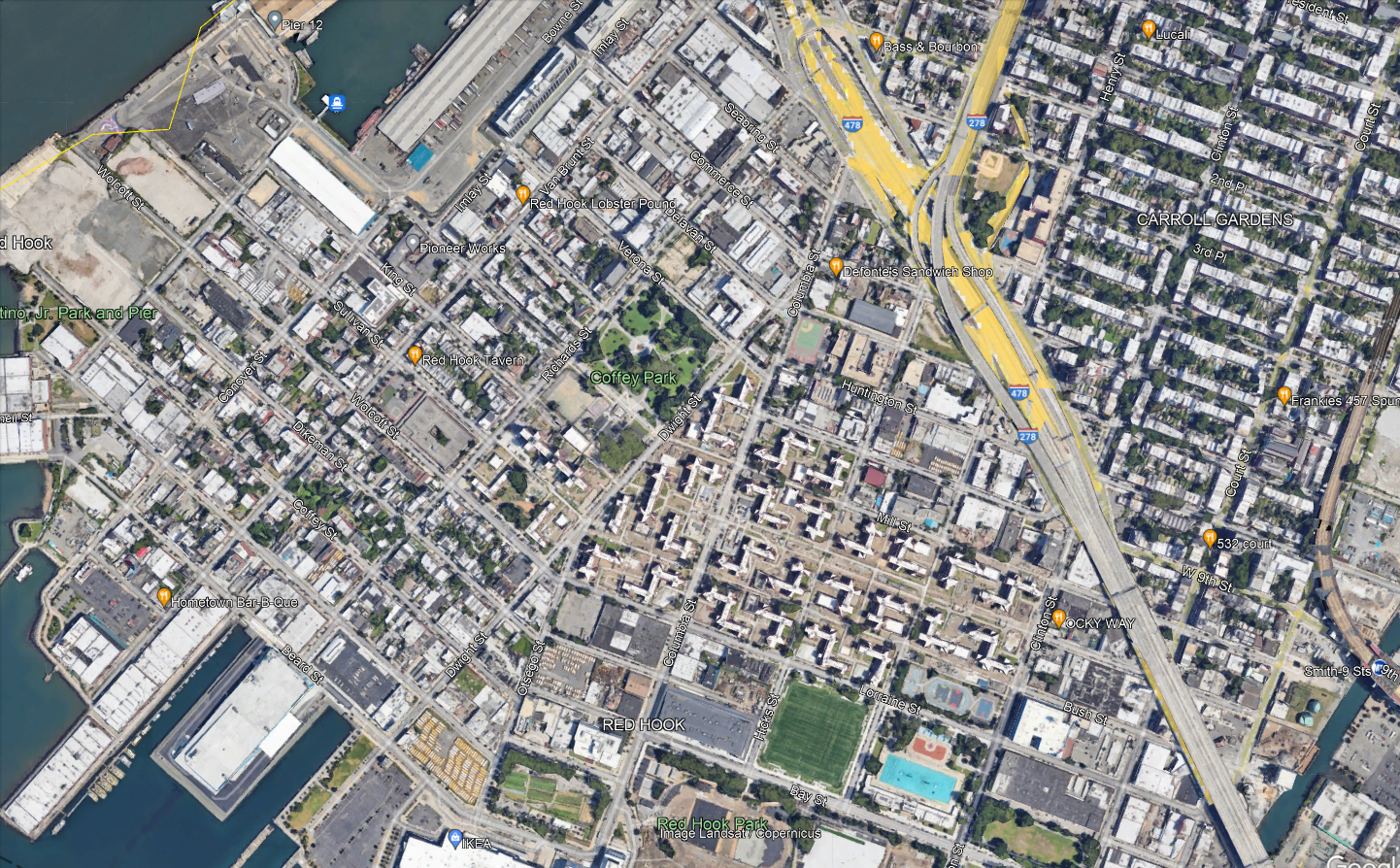
The neighborhood has roughly three major destinations to serve. Visible in the center-bottom of the map are the Red Hook Houses, with a total of 6,000 residents. At the very bottom of the map is Ikea, the main destination for people coming into the neighborhood from elsewhere. Then on the left there is Van Brunt, the local commercial drag.
Per OnTheMap, the entire neighborhood has 6,700 jobs and 5,000 employed residents as of 2019; it is not at all a bedroom community. Ikea is not even one of the main job centers – the biggest are elsewhere, such as the nearby Amazon warehouse. The neighborhood’s residents work about 40% in Manhattan, 40% in Brooklyn, and 20% elsewhere, while the workers are half from Brooklyn with no other origin having much concentration (the second biggest county origin, Queens, is 14%). Only 300 people both live and work in Red Hook, so a transit system connecting the neighborhood to the rest of the city, for both origins and destinations, is vital.
Why the tunnel?
Red Hook’s current bus connections are only with the rest of Brooklyn. This materially slows down travel for the 40% of residents who work in Manhattan and roughly 10% who work in places one accesses via Manhattan, such as the Bronx or Long Island City. The on-street bus connections are slow, and the neighborhood is not well-located relative to the Brooklyn subway network. The B57 only kind of hits Smith/9th southbound, since Smith is one-way northbound and the southbound trip is one block west on Court. Smith/9th itself is not accessible, and is the highest subway station in the system above the local street level as it was built with high clearance below for shipping through the Gowanus Canal.
Let’s look at how fast it is to get to 42nd Street. Via the B57 or B61, it’s about 10 minutes by bus from Ikea to Smith/9th; the B61 runs every 12 minutes and the B57 every 15 or 20, for maximum inconvenience. Then from Smith/9th to Bryant Park, it’s 27 minutes on the F. A bus in the tunnel would get to Fulton Street in 25 minutes and then it’s 12 minutes on the A. In theory, it’s the same trip time from Ikea, and around three minutes faster in relative terms from the Red Hook Houses depending on the route. In practice, being able to connect in Manhattan means having a much wider variety of destinations than just what’s on the F, which doesn’t even get to Lower Manhattan. The benefits for Red Hook-to-rest-of-city commuters would be noticeable.
The Manhattan street section would have variable traffic. On the other hand, the tunnel is less congested than its approaches, and congestion pricing stands to reduce traffic exactly there, as on other roads into the Manhattan core. With no bus stops in the tunnel, the average speed would be reasonable even with a short loop through Lower Manhattan. Diverting ridership from slower buses to Downtown Brooklyn would save revenue-hours, which could then be spent on higher frequency on all remaining routes.
Compromises on the route
The routing within the neighborhood for any bus route using the tunnel cannot be perfect; the neighborhood is not laid out for it. This is seen in how awkward the buses through Red Hook are today, as mentioned above; none of them even goes through the Red Hook Houses, which are the dominant origin. All of the following constraints require creating a single compromise bus route:
- The ridership potential is not there for more than one route. Whatever option is chosen, whether it’s a shuttle as I’m implying in this post or an extension of an existing route that goes deeper into Manhattan (or Brooklyn), that’s the only thing that can run. Even with one route, there may need to be compromises on frequency (by which I mean a bus every 8-10 minutes instead of 6, not 12).
- Van Brunt, Ikea plus the other waterfront jobs, and the Red Hook Houses are not at all collinear.
- The only place to get to the tunnel from Red Hook is the ramp from West 9th or Huntington, and West 9th is one-way west and may need to be converted to two-way. In particular, Van Brunt is too far, and the interface with the tunnel needs to be to and from the Red Hook Houses directly.
In effect, what all of the above implies is that a bus to Manhattan on Van Brunt is not likely to work. Here is one version of what could:

The circles along the path denote control points on Google Maps, and not stops. The western waterfront may have to just not be served; people could walk from Van Brunt across Coffey Park and it would be faster than taking the bus the long way around, down Van Brunt and then along Beard and up Columbia.
At the Manhattan end, the route would either loop just far enough north to hit the Fulton Street subway complex, or through-run. Fulton is necessary because the Wall Street stations are inaccessible, and is generally useful for the connection to World Trade Center. Beyond that, one option is to through-run to the M9, which hits more Manhattan destinations. That said, Manhattan bus speeds are so low that nearly all riders would switch to the subway; M9 frequencies are also low, every 15 minutes off-peak, and when there’s not much traffic this is almost unusably low for Red Hook Houses-Wall Street trips.
Stop Spacing on Crosstown Routes
Two different issues in New York – the bus redesign process and the Interborough Express – are making me think about optimal stop spacing again. I blogged about it in general about buses a few days ago, but crosstown routes present their own special issues, and this is noticeable on rail more than on buses. Circumferential rail routes, in particular, can justify wider stop spacing than radial routes in certain circumstances. This can explain why, over the iterations of Triboro RX leading to the current IBX proposal, the stop spacing has widened: the Third Regional Plan-era effort in the 2000s had a stop every half mile in Brooklyn and Queens, but more recent efforts proposed fewer stops, and the current one if anything has too few and misses a transfer.
Density and isotropy
The tradeoff in stop spacing on both buses and trains is that more stops reduce the amount of walking to the station but increase the in-vehicle trip time for people going through the stop without getting on or off.
Density by itself does not affect this tradeoff. A uniform increase in density along a line equally increases the costs and benefits of changing the stop spacing. However, relative density matters: stop spacing should be tighter in areas with higher density and wider in areas with lower density, both relative to other areas along the same line. This is because higher relative density means passengers are disproportionately likely to have their origin or destination in this area, and disproportionately less likely to be traveling through it, both of which argue in favor of tighter stop spacing, and lower relative density means the opposite.
This then leads to the issue of isotropy. On an isotropic network, relative density is by definition always the same; spikes in relative density make travel less isotropic. As my previous post explains with bus stop spacing formulas, also valid on rail with different parameters, less isotropic density should mean not just that there should be more stops in some places and fewer in others, but also that there should be fewer stops overall. In the simplest case of non-isotropy, assume everyone is traveling to the same distinguished node, which on a rail line can be thought of as city center (let’s say there’s just one central transfer point) and on a bus can be thought of as the connection to the subway. Then, all passengers can be guaranteed to be going to a place with a station, and therefore the cost of widening the stop spacing is halved, since only the origin walk time is increased, not the destination walk time.
Isotropy and circumferential routes
Successful circumferential routes live off of their ability to connect to the rest of the network. Over time, those connection points may grow to become large destinations in their own right – this is the story of how Ikebukuro, Shinjuku, and Shibuya, all at the intersection of the Yamanote Line with radial rail links (JR, private, or subway), became large business districts. But the connections have to come first. If passengers can’t conveniently transfer, then the route has to live off of origin-and-destination traffic just on the line, and then, because it is circumferential and by definition doesn’t go to city center, traffic will be low. This principle is why the G train in New York is so weak: it may connect the two largest non-Manhattan job centers in the region, but that’s still neither Manhattan nor service to the entire city, and with poor transfers, it has to live off of the small number of people living in Williamsburg and Bedford-Stuyvesant working in Long Island City or Downtown Brooklyn.
But the same principle also means that non-transfer stops lose value. This doesn’t mean there shouldn’t be any of them, but it does mean that agencies can afford to be pickier about where to place them. They’re unlikely to be destinations, only origins, and even as origins their value is discounted since some passengers use the circumferential line as the second leg of a three-legged trip, between two radial lines.
The impact on IBX
I used to criticize the decision to build fewer stops on IBX. For example, here, when it was still an RPA proposal in what would later become the Fourth Regional Plan, I outlined several criticisms of the then-Triboro route. I think some of them stand, especially the section on the plan to have the route go into the Bronx and provide local commuter rail service to Coop City. However, on the matter of stop spacing, I must withdraw the criticism.
That said, a station at every connection with a radial rail line remains nonnegotiable. IBX errs in only stopping in East New York at Atlantic Avenue, connecting to the L and the LIRR, with no direct connection to Broadway Junction for the A/C and J. The distance between these two locations is only 350 meters, and it may be awkward to have two stops in short succession, but the meaning of high relative density is exactly that it’s okay to have more closely spaced stops. Alternatively, there could be one stop at a compromise location, with in-system connections at both ends, but then the walk times would be higher, which is less desirable.
Bus Stop Consolidation and Blocks
There are arguments over bus stop spacing in my Discord channel. As the Queens bus redesign process is being finalized, there’s a last round of community input, and as one may expect, community board members amplify the complaints of people who reject any stop consolidation on “they’re taking my stop, I’ll have to walk longer” grounds. I wrote about this in 2018, as Eric and I were releasing our proposed Brooklyn bus redesign, which included fairly aggressive consolidation, to an average interstation of almost 500 meters, up from the current value of about 260. I’d like to revisit this issue in this post, first because of its renewed relevance, and second because there’s a complication that I did not incorporate into my formula before, coming from the fact that the city comprises discrete blocks rather than perfectly isotropic distribution of residents along an avenue.
The formula for bus stop spacing
The tradeoff is that stop consolidation means people have to walk longer to the bus stop but then the bus is faster. In practice, this means the bus is also more frequent by a proportionate amount – the resources required to operate a bus depend on time rather than distance, chiefly the driver’s wage, but also maintenance and fuel, since stops incur acceleration and idling cycles that stress the engines and consume more fuel.
The time penalty of each stop can be modeled as the total of the amount of time the bus needs to pull into the stop, the minimum amount of time it takes to open and close the doors, and the time it takes to pull out. Passenger boardings are not included, because those are assumed to be redistributed to other stops if a stop is deleted. In New York and Vancouver, the difference in schedules between local and limited stop buses in the 2010s was consistent with a penalty of about 25 seconds per stop.
The optimum stop spacing can be expressed with the following formula:

To explain in more detail:
- d is a dimensionless factor indicating how far one must walk, based on the stop spacing; the more isotropic passenger travel is, the lower d is, to a minimum of 2. The specific meaning of d is that if the stop spacing is n, then the average walk is n/d. For example, if there is perfect isotropy, then passengers’ distance from the nearest bus stop is uniformly distributed between 0 and n/2, so the average is n/4, and this needs to be repeated at the destination end, summing to n/2.
- Walk speed and walk penalty take into account that passengers prefer spending time on a moving bus to walking to the bus. In the literature that I’ve seen, the penalty is 2. Usually the literature assumes the walk speed is around 5 km/h, or 1.4 m/s; able-bodied adults without luggage walk faster, especially in New York, but the speed for disabled people is lower, around 1 m/s for the most common cases.
- Stop penalty, as mentioned above, can be taken to be 25 s.
- Average trip length is unlinked; for New York City Transit in 2019, counting NYCT local buses including SBS but not express buses, the average was 3,421 meters.
- Average bus spacing is the headway between buses on the route measured in units of distance, not speed; it’s expressed this way since the resources available can be expressed in how many buses can circulate at a given time, and then the frequency is the product of this figure with speed. In Brooklyn in the 2010s, this average was 1,830 m; our proposed network, pruning weaker routes, cut it to 1,180. The Queens figure as of 2017 appears similar to the Brooklyn figure, maybe 1,860 m. Summing the average trip length and average bus spacing indicates that passengers treat wait time as a worst-case scenario, or, equivalently, that they treat it as an average case but with a wait penalty of 2, which is consistent with estimates in the papers I’ve read.
In the most isotropic case, with d = 2, plugging in the numbers gives,

However, isotropy is more complex than this. For one, if we’re guaranteed that all passengers are connecting to one distinguished stop, say a subway connection point, then consolidating stops will still make them walk longer at the other end, but it will not make them walk any longer at the guaranteed end, since that stop is retained. In that case, we need to set d = 4 (because the average distance to a bus stop if the interstation is n is n/4 and at the other end we’re guaranteed there’s no walk), and the same formula gives,

The Queens bus redesign recognizes this to an extent by setting up what it calls rush routes, designed to get passengers from outlying areas in Eastern Queens to the subway connection points of Flushing and Jamaica; those are supposed to have longer interstations, but in practice this difference has shrunk in more recent revisions.
That said, even then, there’s a complication.
City blocks and isotropy
The models above assume that passengers’ origins are equally distributed along a line. For example, here is Main Street through Kew Gardens Hills, the stretch I am most likely to use a New York bus on:
I always take the bus to connect to Flushing or Jamaica, but within Kew Gardens Hills, the assumption of isotropy means that passengers are equally likely to be getting on the bus at any point along Main Street.
And this assumption does not really work in any city with blocks. In practice, neighborhood residents travel to Main Street via the side streets, which are called avenues, roads, or drives, and numbered awkwardly as seen in the picture above (72nd Avenue, then 72nd Road, then 72nd Drive, then 73rd Avenue, then 75th Avenue…). The density along each of those side streets is fairly consistent, so passengers are equally likely to be originating from any of these streets, for the most part. But they are always going to originate from a side street, and not from a point between them.
The local bus along Main, the Q20, stops every three blocks for the most part, with some interstations of only two blocks. Let’s analyze what happens if the system consolidates from a stop every three blocks, which is 240 meters, to a stop every six, which is 480. Here, we assume isotropy among the side streets, but not continuous isotropy – in other words, we assume passengers all come from a street but are equally likely to be coming from any street.
With that in mind, take a six-block stretch, starting and ending with a stop that isn’t deleted. Let’s call this stretch 0th Street through 6th Street, to avoid having to deal with the weird block numbering in Kew Gardens Hills; we need to investigate the impact of deleting a stop on 3rd Street. With that in mind: passengers originating on 0th and 1st keep going to 0th Street and suffer no additional walk, passengers originating on 5th keep going to 6th and also suffer no additional walk, passengers originating on 2nd and 4th have to walk two blocks instead of one, and passengers originating on 3rd have to walk three blocks instead of zero. The average extra walk is 5/6 of a block. This is actually more than one quarter of the increase in the stop spacing; if there is a distinguished destination at the other end (and there is), then instead of d = 4, we need to use d = 3/(5/6) = 3.6. This shrinks the optimum a bit, but still to 576 m, which is about seven blocks.
The trick here is that if the stop spacing is an even number of blocks, then we can assume continuous isotropy – passengers are equally likely to be in the best circumstance (living on a street with a stop) and in the worst (living on a street midway between stops). If it’s an odd number of blocks, we get a very small bonus from the fact that passengers are not going to live on a street midway between stops, because there isn’t one. The average walk distance, in blocks, with stops every 1, 2, 3, … blocks, is 0, 0.5, 2/3, 1, 1.2, 1.5, 12/7, 2, … Thus, ever so slightly, planners should perhaps favor a stop every five or seven blocks and not every six, in marginal cases. To be clear, the stop spacing on each stretch should be uniform, so if there are 12 blocks between two distinguished destinations, there should be one intermediate stop at the exact midpoint, but, perhaps, if there are 30 blocks with no real internal structure of more or less important streets, a stop should be placed every five and not six blocks, especially if destinations are not too concentrated.
