Category: Good Transit
Serving Metro-North Fordham Station
In the Bronx, the Metro-North Harlem Line runs north-south, west of the 2/5 subway lines on White Plains Road and east of the 4 on Jerome Avenue and the B/D on Grand Concourse. It makes multiple stops, all served rather infrequently, currently about every half hour, with some hourly midday gaps, at premium fare. The north-south bus lines most directly parallel to the line, the Bx15 and Bx41, ranked #20 and #24 respectively in ridership on the New York City Transit system in 2019, though both have lost considerable ground since the pandemic. Overall, there is serious if not extremely high demand for service at those stations. There is already a fair amount of reverse-peak ridership: while those half-hourly frequencies can’t compete with the subway for service to Manhattan, they are the only non-car option for reverse-peak service to White Plains, and Fordham gets additional frequencies as well as some trains to Stamford. A city report from 2011 says that Fordham has 51 inbound passengers and 3,055 outbound ones boarding per weekday on Metro-North. Figuring out how to improve service in the Bronx requires a paradigm shift in how commuter rail is conceived in North America. Fordham’s reverse-peak service is a genuinely hard scheduling question, which we’re having to wrestle with as we’re proposing a (much) faster and smoother set of timetables for Northeast Corridor trains. Together, they make for a nontrivial exercise in tradeoffs on a busy commuter line, in which all options leave something to be desired.
Harlem Line local service
The bulk of demand from Fordham is local service, mostly toward Manhattan. The area is a bedroom community: within 1 km of the station at Park and Fordham there are 35,338 employed residents and only 22,515 jobs as of 2019; the largest destination is Manhattan (12,734 commuters), followed by the Bronx (7,744), then the rest of the city (8,069 across three boroughs), and only then Westchester (2,207), Long Island (1,660), and Connecticut (220). But to an extent, the station’s shed is larger for reverse-commute service, because people can connect from the Bx12 bus, which ranked second in the city behind the M15 in both 2019 and 2022; in contrast, Manhattan-bound commuters are taking the subway if they live well east or west of the station along Fordham. Nonetheless, the dominance of commutes to city destinations means that the most important service is to the rest of the city.
Indeed, the nearest subway stations have high subway ridership. The city report linked in the lede cites ridership of 11,521 on the B/D and another 12,560 on the 4 every weekday, as of 2012; both stations saw declines by 2019. The West Bronx’s hilly terrain makes these stations imperfect substitutes for each other and for the Metro-North station, despite the overlap in the walk sheds – along Fordham, Park is 600 meters from the Concourse and 950 from Jerome. Nonetheless, “roughly the same as either of the Fordham stations on the subway” should be a first-order estimate for the ridership potential; better Metro-North service would provide a much faster option to East Harlem and Grand Central, but conversely require an awkward transfer to get to points south, which predominate among destinations of workers from the area, who tilt working-class and therefore peak in Midtown South and not in the 50s:
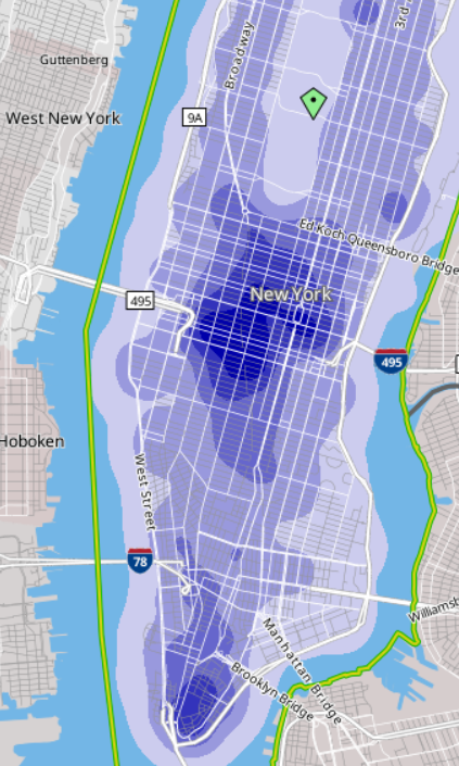
Adding up all the Bronx stations on the line – Wakefield, Woodlawn, Williams Bridge, Botanical Garden, Fordham, Tremont, Melrose – we get 170,049 employed residents (as always, as of 2019), of whom 62,837 work in Manhattan. The line is overall in a subway desert, close to the 4 and B/D but along hills, and not so close to the 2/5 to the east; several tens of thousands of boardings are plausible if service is improved. For comparison, the combination of Westchester, Putnam, and Dutchess Counties has 115,185 Manhattan-bound commuters, split across the Harlem Line, the Hudson Line, and the inner New Haven Line. The Bronx is thus likely to take a majority of Manhattan-bound ridership on the Harlem Line, though not an overwhelming one.
To serve all this latent demand, it is obligatory to run more local service. A minimum service frequency of a train every 10 minutes is required. The current outbound schedule is 20 minutes from Grand Central to Fordham, and about four of those are a slowdown in the Grand Central throat that can be waived (the current speed limit is 10 miles per hour for the last mile; the infrastructure can largely fit trains running three times that fast almost all the way to the bumpers). Lower frequency than this would not really make use of the line’s speed.
Moreover, using the track chart as of 2015 and current (derated) M7 technical performance, the technical trip time is 18 minutes, over which 20 minutes is not too onerously padded; but removing the derating and the four gratuitous minutes crawling into and out of Grand Central, this is about 14 minutes, with some pad. The speed zones can be further increased by using modern values of cant and cant deficiency on curves, but the difference isn’t very large, only 40 seconds, since this is a section with frequent stops. It’s fast, and to reinforce this, even higher frequency may be warranted, a train every 7.5 or 6 or even 5 minutes.
There is room on the tracks for all of this. The issue is that this requires dedicating the local tracks on the Harlem Line in the Bronx to local service, instead of having trains pass the platforms without stopping. This, in turn, requires slowing down some trains from Westchester to make more local stops. Current peak traffic on the Harlem Line is 15 trains per hour, of which 14 run past Mount Vernon West, the current northern limit of the four-track section, and 13 don’t stop in the Bronx at all. The line has three tracks through past Crestwood, and the stations are set up with room for a fourth track, but a full 10 trains per hour, including one that stops in the Bronx, run past Crestwood. In theory it’s possible to run 12 trains per hour to Mount Vernon West making all stops, and 12 trains past it skipping Bronx stops; this slows down the express trains from White Plains, which currently skip seven stops south of White Plains to Mount Vernon West inclusive, but higher speeds in the Bronx, speeding up the Grand Central throat, higher frequency, and lower schedule padding would together lead to improvements in trip times. However, this introduces a new set of problems, for which we need to consider the New Haven Line too.
Harlem Line express service and the New Haven Line
Currently, the New Haven Line runs 20 trains per hour into Grand Central at the peak. This number will go down after Penn Station Access opens in 2027, but not massively; a split of 6-8 trains per hour into Penn Station and 16-18 into Grand Central, with the new service mildly increasing total throughput, is reasonable.
Today, New Haven Line locals stop at Fordham, and nowhere else in the Bronx. This is inherited from the trackage rights agreement between the New York Central and the New York, New Haven and Hartford Railroad, allowing the latter to make only one stop in the Bronx on the former’s territory; it used to be Woodlawn, the branch point, but has been moved to Fordham, which has busier reverse-peak traffic. The two railroads merged in 1969, and all service is currently run by Metro-North, but the practice persists. This is not necessarily stupid: the New Haven locals are long – Stamford is 53 km from Grand Central, 50% farther than White Plains – and a system in which the New Haven trains are more express than the Harlem trains is not by itself stupid, depending on other system constraints. Unfortunately, this setup introduces all manners of constraints into the system:
- Fordham is a local-only station, and thus New Haven locals have to use the local tracks, using awkwardly-placed switches to get between the express and the local tracks. In fact, all stations up to and including Woodlawn are local-only; the first station with platforms on the express tracks is Wakefield, just north of the split between the two lines.
- If there are 12 Harlem Line trains per hour expressing through the Bronx, then the New Haven Line is limited to about 12 trains per hour as well unless the local trains make all the Bronx local stops.
- The Hudson Line has a flat junction with the Harlem Line at Mott Haven Junction, which means that any regular schedule has to have gaps to let Hudson Line trains pass; current peak Hudson Line traffic is 11 trains per hour, but it was 14 before corona.
This leads to a number of different options, each problematic in its own way.
Maximum separation
In this schedule, all Harlem Line trains run local, and all New Haven Line trains run express in the Bronx. This is the easiest to timetable – the junction between the two lines, unlike Mott Haven, is grade-separated. This also requires splitting the Hudson Line between local and express tracks, so delays will still propagate in any situation unless the Hudson Line is moved to the Empire Connection (6-8 trains per hour can stay on the current route); but in a future with Penn Station Access West, building such service, it does allow for neat separation of the routes, and I usually crayon it this way in very high-investment scenarios with multiple through-running tunnels.
But in the near future, it is a massive slowdown for Harlem Line riders who currently have express service from White Plains to Manhattan. The current peak timetable has a 15-minute difference between local and express trains on this section; this figure is padded but not massively so, and conversely, higher speeds on curves increase the express train speed premium.
It also severs the connection between the Bronx and the New Haven Line, unless passengers take east-west buses to the Penn Station Access stations. It is possible to add infill at Wakefield on the New Haven Line: this is north of the junction with the Harlem Line, but barely, so the separation between the lines is short, and a transfer station is feasible. But it wouldn’t be a cross-platform transfer, and so Fordham-Stamford service would still be degraded.
Locals run local
The New Haven Line locals can make local stops in the Bronx. It’s a slowdown of a few minutes for those trains – the current outbound timetable is 18 minutes from Grand Central to Fordham, two minutes faster than on Harlem Line locals while skipping Melrose and Tremont. Overall, it’s a slowdown of around six minutes; the current speed zones are 60 and 75 mph, and while raising the speed limits increases the extent of the slowdown (most of the track geometry is good for 160 km/h), getting new trainsets with better acceleration performance decreases it, and overall it’s likely a wash.
From there, the service pattern follows. New Haven Line locals to Grand Central have little reason to run more frequently than every 10 minutes at peak – the local stations are 30-60 minutes out of Grand Central today, and this is massively padded, but with the timetables Devin produced, fixing the Grand Central throat, New Rochelle would still be 20 minutes out on a local train (stopping at Fordham only as is the case today) and Stamford would be 45 minutes out. What’s more, there will be some local trains to Penn Station starting in three years, boosting the effective frequency to a train every five minutes, with a choice of Manhattan station if express trains can be made to stop at New Rochelle with a timed connection.
Now, if there are six local trains per hour in the Bronx going to Stamford, then the Harlem Line locals only take six trains per hour of their own, and then 12 trains should run express from Wakefield to Harlem. What they do to the north depends. The simplest option is to have all of them make all stops, which costs White Plains 7-8 minutes relative to the express stopping pattern. But if the line can be four-tracked to Crestwood, then half the trains can run local to White Plains and half can run nonstop between Wakefield or Mount Vernon West and White Plains. Two local stations, Scarsdale and Hartsdale, are in two-track territory, but timetabling a local to follow an express when both run every 10 minutes and there are only two local stops’ worth of speed difference is not hard.
The New Haven Line, meanwhile, gets 12 express trains per hour. Those match 12 express Harlem Line trains per hour, and then there’s no more room on the express tracks; Hudson Line trains have to use the local tracks and somehow find slots for the northbound trains to cross both express tracks at-grade.
Status quo
The status quo balances Bronx-Stamford connectivity with speed. Bear in mind, the New Haven Line today has truly massive timetable padding, to the point that making trains make all six stops in the Bronx and not just Fordham would still leave New Rochelle locals faster than they are today if the other speedup treatments were put into place. But the status quo would allow New Rochelle, Larchmont, Rye, and Greenwich to take maximum advantage of the speedup, which is good. The problem with it is that it forces New Haven Line locals to take slots from both the express tracks and the local tracks in the Bronx.
In this situation, the New Haven Line still runs six locals and 12 express trains to Grand Central per hour. The Harlem Line is reduced to six express trains through the Bronx and has to run 12 trains local. Transfers at Wakefield allow people in suburbs south of White Plains to get on a faster train, but this in effect reduces the effective peak-of-peak throughput from the suburbs to Manhattan to just six trains per hour.
Express Fordham station
Rebuilding Fordham as an express station means there’s no longer any need to figure out which trains stop there and which don’t: all would. Then the New Haven Line would run express and the Harlem would either run local or run a mix.
The problem is that Fordham is in a constrained location, where such a rebuild is hard:
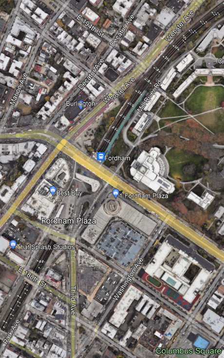
The line is below-grade, with a tunnel from Fordham Road to 189th Street. The platforms are short and narrow, and partly overlap the tunnel. Any conversion has to involve two island platforms north of the tunnel, where there is room but only if the right-of-way is expanded a little, at the expense of some parkland, and possibly a lane of Webster Avenue. The cost would not be pretty, independently of the inability of the MTA to build anything on a reasonable budget.
That said, the timetables on the Northeast Corridor require some infrastructure intervention to smooth things, like grade-separating some junctions for hundreds of millions of dollars each. New Rochelle, which has only a local platform southbound, should almost certainly be rebuilt as a full express stop. So rebuilding Fordham is not out of the question, even if the cost is high (which it is).
In this situation, all New Haven Line trains should use the express tracks. Thus, as in the status quo alternative, the Harlem Line gets six express trains, the other trains having to run local. Potentially, there may be a schedule in which the New Haven Line runs 16 trains to Grand Central and eight to Penn Station, and then the Harlem Line can get eight local and eight express trains; but then the local trains have to be carrying the load well into Westchester, and four-tracking the line to Crestwood is likely obligatory.
The New Haven Line and intercity trains
The above analysis elides one important factor: intercity trains. The current practice in the United States is a three-way separation of urban rail, suburban commuter rail, and intercity rail, with fares designed to discourage riders from taking trains that are not in their sector. However, in much the same way the best industry practice is to charge mode-neutral fares within cities, it is also valuable to charge mode-neutral fares between them. In other words, it’s useful to look at the impact of permitting people with valid commuter rail tickets to take intercity trains, without seat reservations.
To be clear, this means that at rush hour, there are going to be standees on busy commuter routes including Stamford-New York and Trenton-New York. But it’s not necessarily bad. The intercity trip time in our timetables between Stamford and New York is around 29 minutes without high-speed bypasses; the standing time would be less than some subway riders endure today – in the morning rush hour the E train departs Jamaica Center full and takes 34 minutes to get to its first Manhattan stop. And then there’s the issue of capacity: commuter trains on the New Haven Line are eight cars long, intercity trains can be straightforwardly expanded to 16 cars by lengthening the platforms at a very small number of stations.
And if the intercity trains mop up some of the express commuter rail traffic, then the required service on the New Haven Line at rush hour greatly decreases. An intercity train, twice as long as a commuter train (albeit with somewhat fewer seats and less standing space per car), could plausibly displace so much commuter traffic that the peak traffic on the line could be reduced, say to 18 trains per hour from today’s 20. Moreover, the reduction would be disproportionately at longer distance: passengers west of Stamford would not have any replacement intercity train unless they backtracked, but passengers east of Stamford would likely switch. This way, the required New Haven Line traffic shrinks to 12 local trains per hour and six express trains; half the locals run to Penn Station and half to Grand Central, and all express trains run to Grand Central.
In that situation, we can rerun the scenarios for what to do about Fordham; the situation generally improves, since less commuter traffic is required. The maximum separation scenario finally permits actual separation – the Hudson Line would run on the express tracks into Grand Central and have to cross the southbound Harlem Line locals at Mott Haven Junction, with predictable gaps between trains. The locals-run-local scenario gives Harlem Line express trains more wiggle room to slot between New Haven Line express trains. The status quo option lets the Harlem Line run six local trains and 12 express trains, though that likely underserves the Bronx. Converting Fordham to an express stop straightforwardly works with zero, six, or 12 express Harlem Line trains per hour.
Or maybe not. It’s fine to assume that letting passengers get on a train that does Stamford-Penn Station in 29 minutes and New Haven-Penn Station in 57 for the price of a commuter pass is going to remove passengers from the express commuter trains and put them onto longer intercity trains. But by the same token, the massive speed improvements to the other stops could lead to an increase in peak demand. The current trip time to Stamford is 1:12 on a local train; cutting that to 45 minutes means so much faster trips to the suburbs in between that ridership could increase to the point of requiring even more service. I’m not convinced on this – the modal split for peak commutes to Manhattan is already very high (Metro-North claimed 80% in the 2000s), and these suburbs are incredibly NIMBY. But it’s worth considering. At the very least, more local service is easier to add to the timetable than more express service – locals to Grand Central don’t share tracks with intercities at all, and even locals to Penn Station only do on a controllable low-speed section in Queens.
New York-New Haven Trains in an Hour
Devin Wilkins and I are still working on coming up with a coordinated timetable on the Northeast Corridor, north to south. Devin just shared with me the code she was running on both routes from New Haven to New York – to Grand Central and to Penn Station – and, taking into account the quality of the right-of-way and tunnels but not timetable padding and conservative curve speeds – it looks like intercity trains would do it in about an hour. The current code produces around 57 minutes with 7% timetable pad if I’m getting the Penn Station throat and tunnel slowdowns right – but that’s an if; but at this point, I’m confident about the figure of “about an hour” on the current right-of-way.
I bring this up to give updates on how the more accurate coding is changing the timetable compared to previous estimates, but also to talk about what this means for future investment priorities.
First, the curve radii I was assuming in posts I was writing last decade were consistently too optimistic. I wrote three months ago about how even within the highest speed zone in southern Rhode Island, there’s a curve with radius 1,746 meters (1 degree in American parlance), which corresponds to about 215 km/h with aggressive cant and cant deficiency. At this point we’ve found numbers coming straight from Amtrak, Metro-North, and MBTA, letting us cobble together speed zones for the entire system.
But second, conversely, I was being too conservative with how I was setting speed zones. My principle was that the tightest curve on a section sets the entire speed limit; when writing commuter rail timetables, I would usually have each interstation segment be a uniform speed zone, varying from this practice only when the interstation was atypically long and had long straight sections with a tight curve between them. When writing intercity timetables, I’d simplify by having the typical curves on a line set the speed limit and then have a handful of lower speed limits for tighter curves; for example, most curves on the New Haven Line are 873 meters, permitting 153 km/h with aggressive high-speed rail cant and cant deficiency, and 157 km/h with aggressive limits for slower trains, which can run at slightly higher cant deficiency, but those sections are punctuated by some sharper curves with lower limits. Devin, using better code than me, instead lets a train accelerate to higher speed on straight sections and then decelerate as soon as it needs to. Usually such aggressive driving is not preferred, and is used only when recovering from delays – but the timetable is already padded somewhat, so it might as well be padded relative to the fastest technical speed.
The upshot of all of this is that the speed gains from just being able to run at the maximum speed permitted by the right-of-way are massive. The trip time today is 1:37 on the fastest trains between New York and New Haven. Commuter trains take 2:10, making all stops from New Haven to Stamford and then running nonstop between Stamford and Manhattan; in our model, with a top speed of 150 km/h, high-performance regional trains like the FLIRT, Talent 3, or Mireo should do the trip in about 1:15-1:20, and while we didn’t model the current rolling stock, my suspicion is that it should be around six minutes longer. The small difference in trip time is partly because Penn Station’s approach is a few kilometers longer than Grand Central’s and the curves in Queens and on the Hell Gate Bridge are tight.
What this means is that the highest priority should be getting trains down to this speed. In the Swiss electronics-before-concrete schema, the benefits of electronics on the Northeast Corridor are massive; concrete has considerable benefits as well, especially on sections where the current right-of-way constrains not just speed but also reliability and capacity, like New Haven-Kingston, but the benefits of electronics are so large that it’s imperative to make targeted investments to allow for such clean schedules.
Those investments do include concrete, to be clear. But it’s concrete that aims to make the trains flow more smoothly, in support of a repetitive schedule with few variations in train stopping patterns, so that the trains can be timetabled in advance not to conflict. At this point, I believe that grade-separating the interlocking at New Rochelle, popularly called Shell Interlocking and technically called CP 216, is essential and must be prioritized over anything else between the city limits of New York and New Haven Union Station. Currently, there’s very high peak traffic through the interlocking, with a flat junction between trains to Penn Station and trains to Grand Central.
On the electronics side, the timetables must become more regular. There are currently 20 peak trains per hour on the New Haven Line into Grand Central; of those, four go to branches and 16 are on the main line, and among the 16, there are 13 different stopping patterns, on top of the intercity trains. It is not possible to timetable so many different trains on a complex system and be sure that everything is conflict-free, and as a result, delays abound, to which the response is to pad the schedules. But since the padded schedules still have conflicts, there is a ratchet of slowdowns and padding, to the point that a delayed train can recover 20 minutes on less than the entire line. Instead, every train should either be a local train to Stamford or an express train beyond Stamford, and there should only be a single express pattern on the inner line, which today is nonstop between Harlem and Stamford and in the future should include a stop at New Rochelle; this means that, not taking intercity trains into account, the main line should have at most four stopping patterns (local vs. express, and Penn Station vs. Grand Central), and probably just three, since express commuter trains should be going to Grand Central and not Penn Station, as passengers from Stamford to Penn Station can just ride intercity trains.
Also on the electronics side, the way the line is maintained currently is inefficient to an extent measured in orders of magnitude and not factors or percents. Track inspection is manual; Metro-North finally bought a track geometry machine but uses it extremely unproductively, with one report saying it gets one tenth as much work done as intended. Normally these machines can do about a track-mile in an overnight work window, which means the entire four-track line can be regraded and fixed in less than a year of overnights, but they apparently can’t achieve that. Whatever they’re doing isn’t working; the annual spending on track renewal in Connecticut is what Germany spends on once-in-a-generation renewal. The endless renewal work includes a plethora of ever-shifting slow zones, and at no point is the entire system from New York to New Haven clear for trains, even on weekdays. The excessively complex schedule, on tracks that constantly shift due to segment-by-segment daytime repairs, is turning a trip that should be doable on current rolling stock in perhaps 1:23 into one that takes 2:10.
The billions of dollars in the Bipartisan Infrastructure Law that are dedicated to the Northeast Corridor and have not yet been spent can reduce trip times further. But the baseline should be that the bucket of money is a few hundreds of millions smaller and the base case trip time from New York to New Haven is an hour and not 1:37; this is what the system should be compared with.
Security Theater on Metros
In comments, Sarapen asked me about security on urban rail. It’s common in developing Asia to require people to go through metal detectors to get to the platforms; I’ve seen this in Bangkok, she mentions this in the context of Manila, and it’s also the case on Indian metros and Chinese ones. Seung Y. Lee, a BART digital media worker and indispensable commentator on American and Asian metro history who sadly doesn’t blog enough, has an excellent post about it, talking about the use of security as a tool of social control, for example in Hong Kong.
But Sarapen is asking about the need for security to deter terrorism and violence, which do exist in the Philippines.
For this, I naturally went to the country facing terrorism and violence that I know most intimately. I haven’t visited in more than 11 years, and so I’ve never taken the light rail in either Tel Aviv or Jerusalem (which was open on my last visit but I didn’t visit the city then). So I went ahead and asked on my Discord server, and got this:

The person covered up by the two shorter white rectangles also posted a picture of a platform in Tel Aviv, with a vault for bomb disposal:
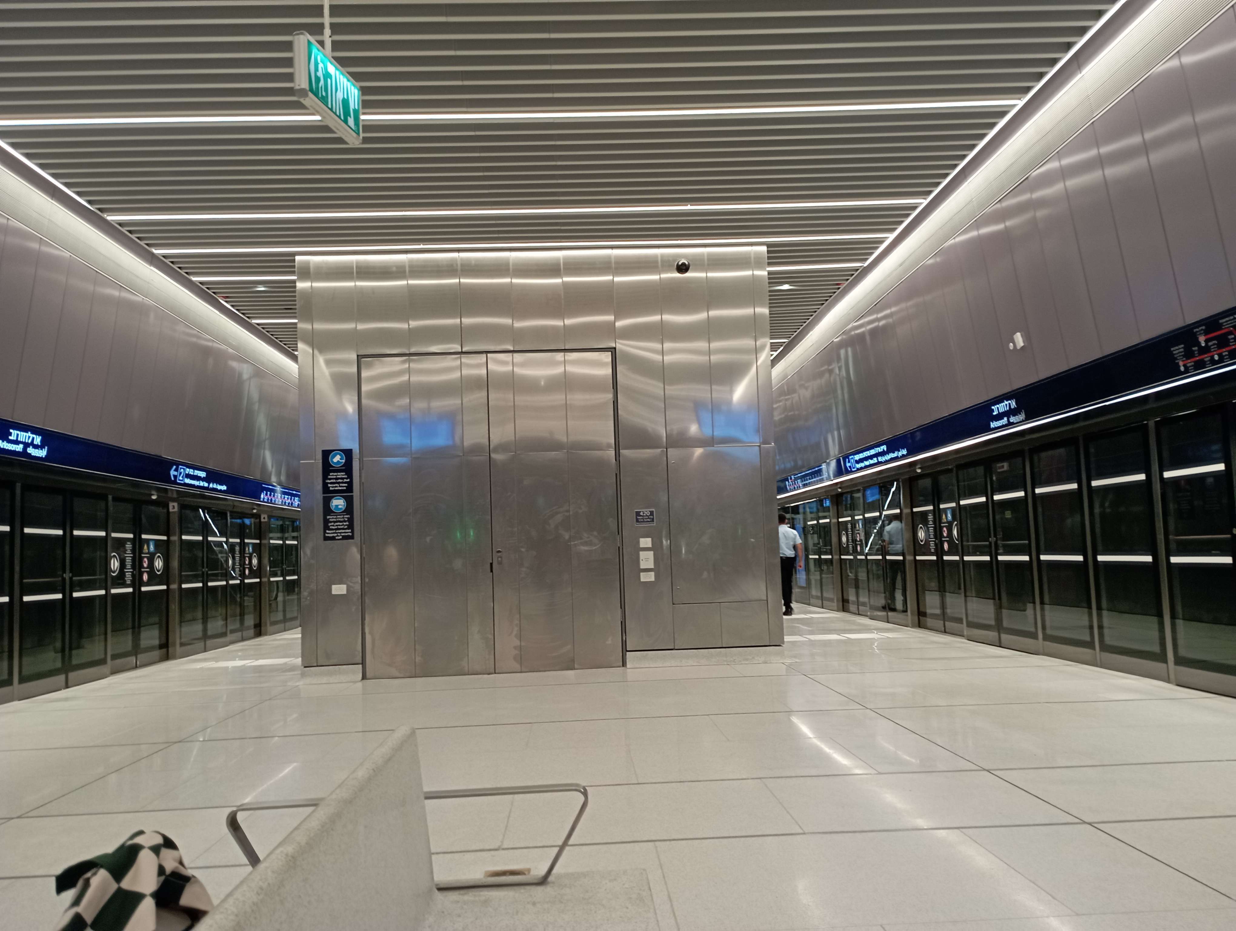
Israel Railways does have security theater – one has to open one’s bags in front of a security guard and go through a metal detector, and this being Israel, there is extensive racial profililng. But the light rail, including the underground portions in Tel Aviv, do not. There’s a lot of visible security presence, including cameras, security personnel, and K-9 units, but no metal detectors. This is in a country that, in the 1990s and early 2000s, underwent a wave of suicide bombings on buses, and still didn’t put metal detectors on them, because it’s infeasible to install such technology on surface transit, and too expensive and frankly not too useful on metros (a security line is an attractive bombing target).
This shouldn’t be too surprising, in a way. Western Europe did not install security theater on trains in response to far-left terrorism in the 1970s and 80s. Israel’s way of building and running public transportation is intended as a pan-European medley, using consultants who have done work in Europe, and with media discourse that looks up to Europe’s urban transportation systems (on other matters Israel looks up to the United States, but Israelis understand American public transportation is not good). If nobody in Europe (or at least Western Europe) does something, it’s unlikely Israel will do it, not on civilian public infrastructure.
Curves in Fast Zones
I wrote nearly five years ago that the lowest-hanging fruit for speeding up trains are in the slowest sections. This remains true, but as I (and Devin Wilkins) turn crayon into a real proposal, it’s clear what the second-lowest hanging fruit is: curves in otherwise fast sections. Fixing such curves sometimes saves more than a minute each, for costs that are not usually onerous.
The reason for this is that curves in fast zones tend to occur on a particular kind of legacy line. The line was built to high standards in mostly flat terrain, and therefore has long straight sections, or sections with atypically gentle curves. Between these sections the curves were fast for the time; in the United States, high standards for the 19th century meant curves of radius 1,746 meters, at which point each 100′ (30.48 meters) of track distance correspond to one degree of change in azimuth; 30.48*180/pi = 1,746.38. For much more information about speed zones, read this post from four weeks ago first; I’m going to mention some terminology from there without further definitions.
These curves are never good enough for high-speed rail. The Tokaido Shinkansen was built with 2,500 meter curves, and requires exceptional superelevation and a moderate degree of tilting (called active suspension) to reach 285 km/h. This lateral acceleration, 2.5 m/s^2, can’t really be achieved on ordinary high-speed rolling stock, and the options for it always incur higher acquisition and operating costs, or buying sole-sourced Japanese technology at much higher prices than are available to Japan Railways. In practice, the highest number that can be acheived with multi-vendor technology is around 2.07 m/s^2, or at lower speed around 2.2; 1,746*2.07 = 3,614.22, which corresponds to 60.12 m/s, or 216 km/h.
If a single such curve appears between two long, straight sections, then the slowdown penalty for it is 23.6 seconds from a top speed of 300 km/h, 35.5 from a top speed of 320 km/h, or 67 seconds from a top speed of 360 km/h. The curve itself is not instantaneous but has a few seconds of cruising at the lower speed, and this adds a few seconds of penalty as well.
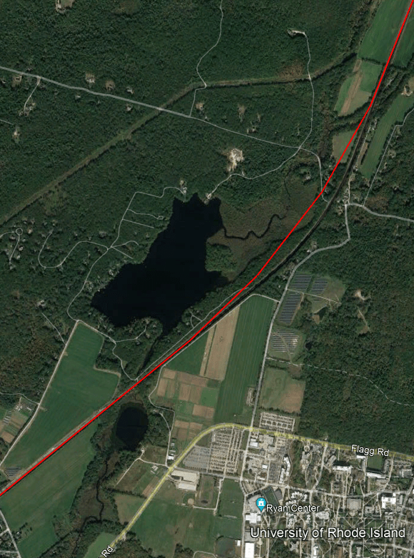
Case in point: the curve between Kingston and Wickford Junction in South County, Rhode Island is such a curve. The red line below denotes a 4 km radius curve, good for a little more than 320 km/h (360 with tilt), deviating from the black line of the existing curve.

The length of the existing curve is about 1.3 km, so to the above penalties, add 6 seconds if the top speed is 300 km/h, 7 if it’s 320, or 8.7 if it’s 360 (in which case the curve needs to be a bit wider unless tilting is used). If it’s not possible to build a wider curve than this, then from a top speed of 360 km/h, the 320 km/h slowdown adds 10 seconds of travel time, including a small penalty for the 1.3 km of the curve and a larger one for acceleration and deceleration; thus, widening the curve from the existing one to 4 km radius actually has a larger effect if the top speed on both sides is intended to be 360 and not 320 km/h.
The inside of this curve is not very developed. This is just about the lowest-density part of the Northeast Corridor. I-95 has four rather than six lanes here. Land acquisition for curve easement is considerably easier than in higher-density sprawl in New Jersey or Connecticut west of New Haven.
The same situation occurs north of Providence, on the Providence Line. There’s a succession of these 1,746 meter curves, sometimes slightly tighter, between Mansfield and Canton. The Canton Viaduct curve is unfixable, but the curves farther to the south are at-grade, with little in the way; there are five or six such curves (the sixth is just south of the viaduct and therefore less relevant) and fixing all of them together would save intercity trains around 1:15.
For context, 1.3 km of at-grade construction in South County with minimal land acquisition should not cost more than $50 million, even with the need to stage construction so that the new alignment can be rapidly connected to the old one during the switchover. Saving more than a minute for $50 million, or even saving 42 seconds for $50 million, is around 1.5 orders of magnitude more cost-effective than the Frederick Douglass Tunnel in Baltimore ($6 billion for 2.5 minutes); there aren’t a lot of places where it’s possible to save so much time at this little cost.
It creates a weird situation in which while the best place to invest in physical infrastructure is near urban stations to allow trains to approach at 50-80 km/h and not 15-25, the next best is to relieve 210 km/h speed zones that should be 300 km/h or more. It’s the curvy sections with long stretches of 120-160 km/h that are usually more difficult to fix.
We Gave a Talk About New York Commuter Rail Modernization
Blair Lorenzo and I gave the talk yesterday, as advertised. The slide deck was much more in her style than in mine – more pictures, fewer words – so it may not be exactly clear what we said.
Beyond the written report itself (now up in web form, not just a PDF), we talked about some low-hanging fruit. What we’re asking for is not a lot of money – the total capital cost of electrification and high platforms everywhere and the surface bottlenecks we talk about like Hunter Junction is around $6 billion, of which $800 million for Portal Bridge need to happen regardless of anything else; Penn Reconstruction is $7 billion and the eminently cancelable Penn Expansion is $17 billion. However, it is a lot of coordination, of different agencies, of capital and operations, and so on. So it’s useful to talk about how to, in a way, fail gracefully – that is, how to propose something that, if it’s reduced to a pilot program, will still be useful.
The absolute wrong thing to do in a pilot program situation is to just do small things all over, like adding a few midday trains. That would achieve little. There is already alternation between hourly and half-hourly commuter trains in most of the New York region; this doesn’t do much when the subway or a subway + suburban bus combination runs every 10-12 minutes (and should be running every six). The same can be said for CityTicket, which incrementally reduces fares on commuter rail within New York City but doesn’t integrate fares with the subway and therefore produces little ridership increase.
Instead, the right thing to do is focus on one strong corridor. We propose this for phase 1, turning New Brunswick-Stamford or New Brunswick-New Rochelle into a through-line running every 10 minutes all day, as soon as Penn Station Access opens. But there are other alternatives that I think fall into the low-hanging fruit category.
One is the junction fixes, like Hunter as mentioned above (estimated at $300 million), or similar-complexity Shell in New Rochelle, which is most likely necessary for any decent intercity rail upgrade on the Northeast Corridor. It costs money, but not a lot of it by the standards of what’s being funded through federal grants, including BIL money for the Northeast Corridor, which is relevant to both Hunter and Shell.
The other is Queens bus redesign. I hope that as our program at Marron grows, we’ll be able to work on a Queens bus redesign that assumes that it’s possible to connect to the LIRR with fare integration and high frequency; buses would not need to all divert to Flushing or Jamaica, but could run straight north-south, leaving the east-west Manhattan-bound traffic to faster, more efficient trains.
Setting Speed Zones
At the Boston meetup two days ago, I was asked about what tools I use to generate timetables, for example for my New York commuter rail posts. The answer is that I use speed zones and then run this code on them – but then the question is how to figure out speed zones. I hope that this sequence of steps will help advocates who are interested in rail modernization.
Generating curve radii
The most difficult element to fix on mainline rail is the right-of-way geometry. Most other things that can restrict a train’s speed can be fixed with more modern maintenance, but right-of-way geometry doesn’t change without physical construction, often in constrained areas – if they weren’t constrained, the curves would have been built wider in the first place.
The best case scenario is that there exist track maps with exact curve radii. I have these for large chunks of the Northeast Corridor, but not all. For example, here is Metro-North (with thanks to The Korot). Curves on such maps are denoted as circles or bumps deviating from a line, with the direction of the circle indicating the direction of the curve’s curvature. On this and other American maps, the radius is listed in degrees, and the cant (see the section below) in inches.
To convert the radius from degrees to more usual units, set one degree to be 1,746 meters, and note that degrees measure curvature and not radius, so a two degree curve has half the radius of a one degree curve. More precisely, the formula is that degrees measure the change in azimuth over 100 feet; 100 feet are 30.48 meters, and converting 30.48 from degrees to radians gives 1,746.37536… meters.
For example, on the Metro-North chart, let’s look at Harrison, New York. It’s on PDF-p. 24 of the chart; Harrison is sandwiched between two curves with opposite orientations, with the platforms on tangent (uncurved) track. The curve just west of Harrison has radius 1° 58′ 30″, which is 884.24069… meters; the curve just east has radius 2° 2′ 15″, which is 857.11674… meters.
Converting curve radii to speeds
The formula for the speed of a train, in SI units, is

I wrote about lateral acceleration, cant, and cant deficiency two and a half years ago. In short, lateral acceleration, in m/s^2, is the centrifugal force coming from the action of the train rounding the curve at speed. For the purposes of the formula, it is measured in the horizontal plane. To reduce the centrifugal force felt by the passengers (for comfort and safety) as well as that felt by the train body (for safety and maintenance costs), the tracks will typically be banked so that the inner rail is lower than the outer rail, which is called cant or superelevation, and is written in units of distance, such as mm or inches.
The speed of a train on canted track is typically higher than the perfect balancing speed, where the force of gravity counteracts that of centrifugal force; thus, on a fast train there is a residual force pointing to the outside of the train, which can be written down as lateral acceleration in the plane of the tracks (in m/s^2), but is more typically written down in the same units as superelevation, representing the additional superelevation required for the speed to perfectly balance, which is called cant deficiency or underbalance.
The conversion rate between cant (or cant deficiency) is the track gauge measured between the middle of the two rails, divided by the gravitational constant (9.8 m/s^2). Track gauge is typically given as inner rail to inner rail; standard gauge is 1,435 mm inner rail to inner rail. The relevant quantity to superelevation calculations is a few cm more; on standard gauge, it’s taken to be about 1,470-1,500 mm, so the conversion rate is 1 m/s^2 = 150 mm of cant or cant deficiency. The two quantities, cant and cant deficiency, are additive.
The American track charts that I have specify the actual cant. However, the values tend to be too conservative. Again with the example of Harrison, the slightly wider western curve has 5″ cant and the slightly tighter eastern curve has 4.125″ cant. Regulations for maximum cant depend on the country and maintenance standards. The absolute maximum cant I am aware of on any standard-gauge railway is 200 mm on the Tokaido and Tohoku Shinkansen. The reasons not to raise cant further include maintenance difficulties and the risk of a train running at lower speed or even stopping on the track. On lines that are not captive to just high-speed trains, the highest cant I am aware of is 180 mm, in Germany, and this is rare; 160 mm is more common. The American limit is 7″, but frequent inspections are required at that point to ensure that the tracks don’t get bent out of shape to produce higher cant; 8″ is a do-not-exceed level, and in practice track irregularities may lead to exceeding it if there isn’t regular track maintenance.
In practice, raising the cant is usually easy – it can be done with a track geometry machine automatically. However, in one case, it is not: that of S-curves, which have exactly the shape implied by the letter S. Our example of Harrison has two reverse curves in close proximity, but is not an S-curve, as there are hundreds of meters of tangent track between the two curves. Other places do have S-curves, and there, the maximum cant must be lowered somewhat; regulations vary on this, but in Europe, the maximum change in cant is 30-55 mm per second depending on the country (there’s a secondary regulation on mm per meter, but on the Northeast Corridor, the binding rule is mm/s, not mm/m). For example, if we take 45 mm/s, and 180 mm of cant, then it takes four seconds to reverse a curve; note that it is four and not eight, because half of the increase in cant, called a superelevation spiral, is within the curve. Harrison’s current curves impose a hard limit of about 150 km/h, at which point the hundreds of meters of tangent track make it trivially easy to have full superelevation. However, other places, most infamously among Northeastern railfans Elizabeth, there is an actual S-curve, forcing lower cant and lower speeds.
Finally, the maximum cant deficiency depends on the track, the train, and the regulations. Traditionally, American regulations limited most passenger trains to 3″ of cant deficiency, which is ridiculously conservative; in the 2000s, a waiver allowing 5″ in some cases was derided as the “magic high-speed rail waiver” because it applied not just to higher-speed tracks but also to lower-speed lines that had through-service to higher-speed tracks. Since then, FRA regulations have changed, and now the practical limit in the US, with extensive testing, is 6″, or 150 mm cant deficiency, at most speeds. European limits tend to be around 130-150 mm; high-speed trains are at the lower end of this range unless they are tilting trains, which nearly all trains are not. Cant deficiency, like cant, requires its own superelevation spiral on S-curves, but the limits are in practice looser than for cant, and in some cases trains can change superelevation abruptly, with no spiral, for example on switches.
The upshot is that in the typical case, the most aggressive assumption should be 180 mm cant, 150 mm cant deficiency, for a lateral acceleration in the horizontal plane of 2.2 m/s^2. Most lines will not have this pair of aggressive assumptions: 180 mm is only viable when it’s guaranteed that trains will not stop on a canted curve, which is a reasonable assumption on a reliable high-speed line and even on a German high-speed line. Moreover, if there is any freight on the line, superelevation must fall drastically: slower trains would be at cant excess, and freight trains have high center of mass (diesel locomotives and double-stacked containers both have higher center of mass than electric passenger trains) and therefore have tight cant excess limits. Aggressive assumptions are viable on the Northeast Corridor and on controllable commuter lines with no or almost no freight, such as the LIRR, but not everywhere else.
Finding curve radii
In some cases, curve radii are spelled out in a chart. In others, they are not, and must be figured out. Our program’s schedule writer, Devin Wilkins, tells me she has just found a track chart for SEPTA, but otherwise, I have no such charts south of New York. There, the dirty, imperfect method of estimating curve radii must be used.
For that, I use Google Earth. Nowadays, Google Earth Pro is free, and comes with a circle tool. In theory, I can fidget with the radius of a circle until I find that it approximates the arc of a curve well. This requires paying special attention to how the drawn curve compares with not just the broad outline of the curve but also the exact arc of each track or even each rail: the drawn curve should be at the same relative position to the rails, such as following one rail of one track, or right in the center of one track, or right between the track centers, and so on.
In cases of uncertainty, it’s also possible to use Google Earth line tools, which state the azimuth of each line. If I can find the exact start and end points of each curve, and the azimuths of the tangents on both side, then I can draw the chord with a line tool, verifying that its azimuth is the exact arithmetic mean of the azimuths of the two tangents; if it is not the mean, then either I made an error (more likely) or the curve is not a perfect circle (possible but less likely). The radius of the curve is approximately the length of the chord times 180/pi divided by change in azimuth; more precisely, the radius is

This method is error-prone, especially for short, sharp curves. Computing the start and end points of the curve will always have errors, and if the change in azimuth is small, then these will lead to large errors. The circle tool method suffers from the same drawback: it’s easier to use it to estimate the radius of a curve with 60 degree change in azimuth than that of one with 10 degree change.
Over time I’ve gotten this method down to the point that my errors from what I later find with track charts such as that of Metro-North are fairly small, and not very biased in the larger-radius direction. But it takes time and practice and ideally you should avoid it for short, sharp curves.
Update 10-28: Ari Ofsevit has a third method, using chord lines.
Other speed limits
Speed limits on intercity trains mostly come from curves. But there are other things to keep in mind, not all of which are fixable:
- Tunnels increase air resistance to the point that unless the tunnels are constructed with large enough radius to have a lot of free air (modern tunnels are, legacy ones aren’t), or unless the trains are pressurized, the speed limit has to be lower just to avoid popping passengers’ ears at entry and exit.
- Switches generally have low speed limits – they have tight curves and no superelevation – making all complex junctions and major stations slow.
- Terminal stations have another set of speed limits coming from the bumper tracks. American limits are very conservative – 10 mph where a ramp down from 40 or 50 km/h is more normal in Europe – but even 50 km/h is not 200 km/h.
- Some pieces of infrastructure are so shoddy that they limit the dynamical axle load of the train, which is derived from both static axle load, which is a function of train mass, and speed. As usual, American limits on this are conservative, assuming high static axle load and fixing a low speed on some very old bridges, instead of permitting lighter trains to run faster. But it is sometimes a real problem.
I’m Giving a Webinar Talk About Penn Station
The model that I’ve been blogging about is going to be the subject of a Zoom webinar, on Thursday 9-28, at 19:00 Berlin time or 13:00 New York time.
The talk will be in conversation with New York Daily News reporter and editor Michael Aronson, who has been very passionate in private conversations with us about improving rail service in the area and criticizing poor project management and high costs. In particular, he may yet save the Gateway Project three years, advancing capacity that much faster.
Specifically, the issue is that the existing tunnels between New Jersey and New York, the North River Tunnels, were heavily damaged in Hurricane Sandy, and require long-term repairs. The preferred alternative is long-term shutdowns of one track at a time, which is not possible until the Gateway tunnel (the Hudson Tunnel Project) is completed and would take a total of three years across both tracks then. The alternative is to do those repairs during weekend shutdowns. It is commonly believed that already there is repair work every weekend, and the timetables through the tunnel are written with the assumption that traffic can fit on a single track every weekend, giving a 55-hour shutdown period once a week. However, Michael found out that over a four-year period ending in 2020, the full shutdown for repairs was only done 13 times, or once every three months, and most of those shutdowns were not for repairing the tunnels themselves; in the following year, no shutdowns were done due to corona, and subsequently, the sluggish pre-corona rate has continued. If the repairs are done every weekend as the timetable permits, then it should be possible to wrap up simultaneously with the completion of the new tunnel, saving those three years of shutdown.
Penn Station 3D Model
As part of our high-speed rail program at Marron, I designed and other people made a 3D model of the train station I referenced in 2015 in what was originally a trollish proposal, upgraded to something more serious. For now there’s still a password: letsredothis. This is a playable level, so have a look around.
The playable 3D model shows what Penn Station could look like if it were rebuilt from the ground up, based on best industry practices. It is deliberately minimalistic: a train station is an interface between the train and the city it serves, and therefore its primary goal is to get passengers between the street or the subway and the platform as efficiently as possible. But minimalism should not be conflated with either architectural plainness (see below on technical limitations) or poor passenger convenience. The open design means that pedestrian circulation for passengers would be dramatically improved over today’s infamously cramped passageways.
Much of the design for this station is inspired by modern European train stations, including Berlin Hauptbahnhof (opened 2006), the under-construction Stuttgart 21 (scheduled to open 2025), and the reconstruction of Utrecht Central (2013-16); Utrecht, in turn, was inspired by the design of Shinagawa in Tokyo.
As we investigate which infrastructure projects are required for a high-speed rail program in the Northeast, we will evaluate the place of this station as well. Besides intangible benefits explained below in background, there are considerable tangible benefits in faster egress from the train to the street.
Moreover, the process that led to this blueprint and model can be reused elsewhere. In particular, as we explain in the section on pedestrian circulation, elements of the platform design should be used for the construction of subway stations on some lines under consideration in New York and other American cities, to minimize both construction costs and wasted time for passengers to navigate underground corridors. In that sense, this model can be viewed not just as a proposal for Penn Station, but also as an appendix to our report on construction costs.
Background
New York Penn Station is unpopular among users, and has been since the current station opened in 1968 (“One entered the city like a God; one scuttles in now like a rat” -Vincent Scully). From time to time, proposals for rebuilding the station along a better or grander design have been floated, usually in connection with a plan for improving the track level below.
Right now, such a track-level improvement is beginning construction, in the form of the Gateway Project and its Hudson Tunnel Project (HTP). The purpose of HTP is to add two new tracks’ worth of rail capacity from New Jersey to Penn Station; currently, there are only two mainline tracks under the Hudson, the North River Tunnels (NRT), with a peak throughput of 24 trains per hour across Amtrak’s intercity trains and New Jersey Transit’s (NJT) commuter trains, and very high crowding levels on the eve of the pandemic; 24 trains per hour is usually the limit of mainline rail, with higher figures only available on more self-contained systems. In contrast, going east of Penn Station, there are four East River Tunnel (ERT) tracks to Long Island and the Northeast Corridor, with a pre-corona peak throughput of not 48 trains per hour but only about 40.
Gateway is a broader project than HTP, including additional elements on both the New Jersey and Manhattan sides. Whereas HTP has recently been funded, with a budget of $14-16 billion, the total projected cost of Gateway is $50 billion, largely unfunded, of which $20 billion comprises improvements and additions to Penn Station, most of which are completely unnecessary.
Those additions include the $7 billion Penn Reconstruction and the $13 billion Penn Expansion. Penn Reconstruction is a laundry list of improvements to the existing Penn Station, including 29 new staircases and escalators from the platforms to the concourses, additional concourse space, total reconstruction of the upper concourse to simplify the layout, and new entrances from the street to the station. It’s not a bad project, but the cost is disproportionate to the benefits. Penn Expansion would build upon it and condemn the block south of the station, the so-called Block 780, to excavate new tracks; it is a complete waste of money even before it has been funded, as scarce planner resources are spent on it.
The 3D model as depicted should be thought of as an alternative form of Penn Reconstruction, for what is likely a similar cost. It bakes in assumptions on service, as detailed below, that assume both commuter and intercity trains run efficiently and in a coordinated manner.
Station description
The station in the model is fully daylit, with no obstruction above the platforms. There are eight wide platforms and 16 tracks, down from 11 platforms and 21 tracks today. The station box is bounded by 7th Avenue, 31st Street, 8th Avenue, and 33rd Street, as today; also as today, the central platforms continue well to the west of 8th Avenue, using the existing Moynihan Train Hall. No expansion of the footprint is required. The existing track 1 (the southernmost) becomes the new track 1A and the existing track 21 becomes the new track 8B.
The removal of three platforms and five tracks and some additional track-level work combine to make the remaining platforms 11.5 meters wide each, compared with a range of 9-10 meters at some comparable high-throughput stations, such as Tokyo.
With wide platforms, the platforms themselves can be part of the station. A persistent difference between American and European train stations is that at American stations, even beloved ones like Grand Central, the station is near where the tracks are, whereas in Europe, the station is where the tracks are. Grand Central has a majestic waiting hall, but the tracks and platforms themselves are in cramped, dank areas with low ceilings and poor lighting. The 3D model, in contrast, integrated the tracks into the station structure: the model includes concessions below most escalator and stair banks, which could offer retail, fast food, or coffee. Ticketing machines can be placed throughout the complex, on the platforms as well as at places along the access corridors that are not needed for rush hour pedestrian circulation. This, more than anything, explains the minimalistic design, with no concourses: concourses are not required when there is direct access between the street and the platforms.
For circulation, there are two walkways, labeled East and West Walkways; these may be thought of as 7⅓th and 7⅔th Avenues, respectively. West End Corridor is kept, as is the circulation space under 33rd Street connecting West End Corridor and points east, currently part of the station concourse. A new north-south corridor called East End Corridor appears between the station and 7th Avenue, with access to the 1/2/3 trains.
What about Madison Square Garden?
Currently, Penn Station is effectively in the basement of Madison Square Garden (MSG) and Two Penn Plaza. Both buildings need to come down to build this vision.
MSG has come under attack recently for competing for space with the train station; going back to the early 2010s, plans for rebuilding Penn Station to have direct sunlight have assumed that MSG should move somewhere else, and this month, City Council voted to extend MSG’s permit by only five years and not the expected 10, in effect creating a five-year clock for a plan to daylight Penn Station. There have been recent plans to move MSG, such as the Vishaan Chakrabarti vision for Penn Station; the 3D model could be viewed as the rail engineering answer to that architecture-centric vision.
Two Penn Plaza is a 150,000 m^2 skyscraper, in a city where developers can build a replacement for $900 million in 2018 prices.
The complete removal of both buildings makes work on Penn Station vastly simpler. The station is replete with columns, obstructing sight lines, taking up space between tracks, and constraining all changes. The 3D model’s blueprint takes care to respect column placement west of 8th Avenue, where the columns are sparser and it’s possible to design tracks around them, but it is not possible to do so between 7th and 8th Avenues. Conversely, with the columns removed, it is not hard to daylight the station.
Station operations
The operating model at this station is based on consistency and simplicity. Every train has a consistent platform to use. Thus, passengers would be able to know their track number months in advance, just as in Japan and much of Europe, train reservations already include the track number at the station. The scramble passengers face at Penn Station today, waiting to see their train’s track number posted minutes in advance and then rushing to the platform, would be eliminated.
Each approach track thus splits into two tracks flanking the same platform. This is the same design used at Stuttgart 21 and Berlin Hauptbahnhof: if a last-minute change in track assignment is needed, it can be guaranteed to face the same platform, limiting passenger confusion. At each platform, numbered south to north as today, the A track is to the south of the B track, but the trains on the two tracks would be serving the same line and coming from and going to the same approach track. This way, a train can enter the A track at a station while the previous train is still departing the B track, which provides higher capacity.
The labels on the signage are by destination:
- Platform 1: eastbound trains from the HTP, eventually going to a through-tunnel to Grand Central
- Platform 2: westbound trains to the HTP, connecting from Grand Central
- Platform 3: eastbound trains from the preexisting North River Tunnels (NRT) to the existing East River Tunnels (ERT) under 32nd Street
- Platform 4: eastbound intercity trains using the NRT and ERT under 32nd Street
- Platform 5: westbound intercity trains using the NRT and ERT under 32nd Street
- Platform 6: westbound trains from the ERT under 32nd Street to the NRT
- Platform 7: eastbound trains to the ERT under 33rd Street and the LIRR, eventually connecting to a through-tunnel from the Hudson Line
- Platform 8: westbound trains from LIRR via the ERT under 33rd Street, eventually going to a through-tunnel to the Hudson Line
Signage labels except for the intercity platforms 4 and 5 state the name of the commuter railway that the trains would go to. Thus, a train from Trenton to Stamford running via the Northeast Corridor and the under-construction Penn Station Access line would use platform 3, and is labeled as Metro-North, as it goes toward Metro-North territory; the same train going back, using platform 6, is labeled as New Jersey Transit, as it goes toward New Jersey.
Such through-running is obligatory for efficient station operations. There are many good reasons to run through, which are described in detail in a forthcoming document by the Effective Transit Alliance. But for one point about efficiency, it takes a train a minimum of 10 minutes to turn at a train station and change direction in the United States, and this is after much optimization (Penn Station’s current users believe they need 18-22 minutes to turn). In contrast, a through-train can unload at even an extremely busy station like Penn in not much more than a minute; the narrow platforms of today’s station could clear a full rush hour train in emergency conditions today in about 3-4 minutes, and the wide platforms of the 3D model could do so in about 1.5 minutes in emergencies and less in regular operations.
Supporting infrastructure assumptions
The assumption for the model is that the HTP is a done deal; it was recently federally funded, in a way that is said to be difficult to repeal in the future in the event of a change in government. The HTP tunnel is slated to open in 2035; the current timetable is that full operations can only begin in 2038 after a three-year closure of NRT infrastructure for long-term repairs, but in fact those repairs can be done in weekend windows—indeed, present-day rail timetables through the NRT assume that one track is out for a 55-hour period each weekend, but investigative reporting has shown that Amtrak takes advantage of this outage only once every three months. If repairs are done every weekend, then it will be possible to refurbish the tunnels by 2035, for full four-track operations in 12 years.
The HTP approach to Penn Station assumes that trains from the tunnel would veer south, eventually to tracks to be excavated out of Block 780 for $13 billion. However, nothing in the current design of the tunnel forces tracks to veer so far south to Penn Expansion. There is room, respecting the support columns west of 8th Avenue, to connect the HTP approach to the new platforms 1 and 2, or for that matter to present-day tracks 1-5.
It is also assumed that Penn Station Access (PSA) is completed; the project’s current timeline is that it will open in 2026, offering Metro-North service from the New Haven Line to Penn Station. As soon as PSA opens, trains should run through to New Jersey, for the higher efficiency mentioned above.
The additional pieces of major infrastructure required for this vision are a tunnel from Penn Station to Grand Central, and an Empire Connection realignment.
The Penn Station-Grand Central connection (from platforms 1 and 2) has been discussed for at least 20 years, but not acted upon, since it would force coordination between New Jersey Transit and Metro-North. Such a connection would offer riders at both systems the choice between either Manhattan station—and the choice would be on the same train, whereas on the LIRR, the same choice offered by East Side Access cuts the frequency to each terminal in half, which has angered Long Island commuters.
Overall, it would be a tunnel of about 2 km without stations. It would require some mining under the corner of Penn 11, the building east of 7th Avenue between 31st and 32nd Street, but only to the same extent that was already done in the 1900s to build the ERT under 32nd Street. Subsequently, the tunnel would nimbly weave between older tunnels, using an aggressive 4% grade with modern electric trainsets (the subway even climbs 5.4% out of a station at Manhattan Bridge, whereas this would descend 4% from a station). The cost should be on the order of hundreds of millions of dollars, not billions—the billions of dollars in per-km cost in New York today are driven by station construction rather than tunnels, and by poor project delivery methods that can be changed to better ones.
The Empire Connection realignment is a shorter tunnel, but in a more constrained environment. Today, Amtrak trains connect between Penn Station and Upstate New York via the existing connection, going in tunnel under Riverside Park until it joins the tracks of the current Hudson Line in Spuyten Duyvil. Plans for electrifying the connection and using it for commuter rail exist but are not yet funded; these should be reactivated, since otherwise there’s nowhere for trains from the 33rd Street ERT to run through to the west.
It is necessary to realign the last few hundred meters of the Empire Connection. The current alignment is single-track and connects to more southerly parts of the station, rather than to the optimal location at the northern end. This is a short tunnel (perhaps 500 meters) without stations, but the need to go under an active railyard complicates construction. That said, this too should cost on the order of hundreds of millions of dollars, not billions.
Finally, platforms 3-6 all feed the same approach tracks on both sides, but in principle they could be separated into two. There are occasional long-term high-cost plans to fully separate out intercity rail tracks from commuter tracks even in New York, with dedicated tunnels all the way. The model does not assume that such plans are actualized, but if they are, then there is room to connect the new high-speed rail approach tunnel to platforms 4 and 5 at both ends.
Overall, the model gives the station just 20 turnouts, down from hundreds today. This is a more radical version of the redesign of Utrecht Station in the 2010s, which removed pass-through tracks, simplified the design, and reduced the number of turnouts from 200 to 70, in order to make the system more reliable; turnouts are failure-prone, and should be installed only when needed based on current or anticipated train movements.
Pedestrian circulation
The station in the model has very high pedestrian throughput. The maximum capacities are 100 passengers/minute on a wide escalator, 49 per minute per meter of staircase width, and 82 per minute per meter of walkway width. A full 12-car commuter train has about 1,800 passengers; the vertical access points—a minimum of seven up escalators, five 2.7 meter wide staircases, and three elevators per platform—can clear these in about 80 seconds. In the imperfect conditions of rush hour service or emergency evacuation, this is doable in about 90 seconds. A 16-car intercity train has fewer passengers, since all passengers are required to have a seat, and thus they can evacuate even faster in emergency conditions.
Not only is the throughput high but also the latency is low. At the current Penn Station, it can take six minutes just to get between a vertical access point and an exit, if the passenger gets off at the wrong part of the platform. In contrast, with the modeled station, the wide platforms make it easier for passengers to choose the right exit, and connect to a street corner or subway entrance within a maximum of about three minutes for able-bodied adults.
This has implications for station design more generally. At the Transit Costs Project, we have repeatedly heard from American interviewees that subway stations have to have full-length mezzanines for the purposes of fire evacuation, based on NFPA 130. In fact, NFPA 130 requires evacuation in four minutes of throughput, and in six minutes when starting from the most remote point on the platform; at a train station where trains are expected to run every 2-2.5 minutes at rush hour and unload most of their passengers in regular service, it is dead letter.
Thus, elements of the platform design can be copied and pasted into subway expansion programs with little change. A subway station could have vertical circulation at both ends of the platform as portrayed at any of the combined staircase and escalator banks, with wider staircases if there’s no need for passengers to walk around them. No mezzanine is required, nor complex passageways: any train up to the size of the largest New York City Subway trains could satisfy the four-minute rule with a 10-meter island platform (albeit barely for 10-car lettered lines).
Technical limitations and architecture
The model is designed around interactivity and playability. This has forced us to make some artistic compromises, compared with what one sees in 3D architectural renderings that are not interactive. To run on an average home machine, the design has had to reduce its polygon count and limit the detail of renderings that are far from the camera position.
For the same reason, the level shows the exterior of Moynihan Station as an anchor, but not the other buildings across from the station at 31st Street, 33rd Street, or 7th Avenue.
In reality, both East and West Walkways would be more architecturally notable than as they are depicted in the level. Our depiction was inspired by walkways above convention centers and airport terminals, but in reality, if this vision is built, then the walkways should be able to support themselves without relying too much on the tracks. Designs with massive columns flanking each elevator are possible, but so are designs with arches, through-arches, or tied arches, the latter two options avoiding all structural dependence on the track level.
Some more architectural elements could be included in an actual design based on this model, which could not be easily modeled in an interactive environment. The platforms certainly must have shelter from the elements, which could be simple roofs over the uncovered parts of the platform, or large glass panels spanning from 31st to 33rd Street, or even a glass dome large enough to enclose the walkways.
Finally, some extra features could be added. For example, there could be more vertical circulation between 7th Avenue and East End Corridor (which is largely a subway access corridor) than just two elevators—there could be stairs and escalators as well. There is also a lot of dead space as the tracks taper from the main of the station to the access tunnels, which could be used for back office space, ticket offices, additional concessions, or even some east-west walkways functioning as 31.5th and 32.5th Streets.
Quick Note: Andy Byford and Through-Running
At an event run by ReThinkNYC, Andy Byford spoke for five minutes in support of through-running at Penn Station. They put out the press release, so I feel it’s fine to reprint it in full here with some comments.
The timing works well for what I’m involved in. The Transportation and Land Use program at Marron is about to release a playable 3D model of a reimagined Penn Station designed around through-running and around maximally efficient passenger egress, with above-ground structures like Madison Square Garden removed; I was hoping for the model to come out in June in time for the debate about whether to extend the Garden’s operating permit, but that debate seems to be going the right way regardless, and the Garden itself is open to moving, for a price. Then, the Effective Transit Alliance is about to release a long report explaining the issue of through-running, why it’s good for New York, and how to implement it.
The bulk of what we’re about to do on this side of the TLU program for the next year is figure out timetable coordination for regional and intercity rail, so showing how everything would fit together should take some time, but the question of feasibility has already been answered; the work is about how to optimize questions like “where do high-speed bypasses go?” or “which curves is it worthwhile to fix?” or “which junctions should be grade-separated?”.
First of all I am honored to be in a conversation with people that I regard as absolutely luminaries in the transit space, people like Prof. [Robert] Paaswell, people like Dr. [Vukan] Vuchic. These are luminaries to me in the field of, not only transport planning, but in the particular area we’re talking about today, namely through-running.
I was very encouraged to hear Assemblymember [Tony] Simone talk about the benefit of avoiding demolishing a beautiful part of New York City, which although I live in D.C. now, is a city that is so dear to my heart. I feel I’m an adopted New Yorker, I love that place and it would break my heart to see beautiful buildings torn down on Eighth and Seventh Aves. when they don’t need to be.
I should say at the get-go, that I’m not speaking on behalf of Amtrak. I’m speaking as a railway professional. I’ve worked in transit now for 34 years. But I just feel this is a golden opportunity — and the assembly member mentioned that — and one of the other speakers also mentioned the benefits of through-running and made reference to what happened in London. London learned that lesson. There are two effectively two cross London railroads.
There’s the Elizabeth Line, which I had the pleasure of opening with Her Majesty the Queen back in 2022, and that’s has been transformative in that where people used to have to jump on the Central Line, had to get off at Paddington and then go down to the Central Line and or down to Lancaster Gate and go through Central London to go to East London to Liverpool St. and then go out the other side, now they don’t have to.
The Central Line has been immediately relieved of pressure and you’ve got a state of the art, very high speed actually, through-service state of the art railway, under the wires. Beautiful stations, air conditioned, which at a stroke has been a game changer for London, connecting not only the key parts of Central London, but also Heathrow Airport, Paddington, Liverpool St., Canary Wharf and the City of London. It is a game changer. People in Frankfurt, people in Amsterdam, people in Paris and dare I say, New York, are probably gnashing their teeth because that was a game changer for London.
Well, I live in the States now, I’m going to be an American hopefully in a few years time and I want to do my bit for the States. So it seems to me that this is a golden opportunity for the U.S. and for New York City to have something similar to the Elizabeth Line, to have something that has that economic regenerative impact in New York.
And the other corridor of course, was Thameslink, that preceded Crossrail, but that’s the north/south corridor. There again, once upon a time you used to rock up in South London and have to get on the Tube you’ll be getting on the Vic Line or you’re getting on the Northern and have to go up to Euston or Kings Cross to go north.
Now, you don’t have to do that and what London has seen is the benefit of that cross-London traffic and that through-running because you’ve got not only the economic benefits of the City but the knock-on effect of north, south, east and west of businesses popping up, of housing being developed and of relief to the existing transport lines.
So I don’t know how this is going to pan out, but what I would say, Sam [Turvey]: is good for you for at least calling the question. This is a golden opportunity. It’s not just about building something that’s more aesthetically pleasing — important as though that is, Penn Station is kind of an embarrassment — but you can’t fix it by just putting in a few light boxes, by just heightening the ceilings, by just widening a few corridors.
If we’re going to do all of that, why not take the opportunity to fix the damn thing once and for all, which is, I’m going to say: get rid of the pillars, which means move MSG, but at the very least, do something with the track configuration to enable through-running.
So that’s it, that’s my pitch. I do stress that’s my personal opinion. I’m not speaking on behalf of Amtrak. I don’t know all the facts. If it was the case that someone asked me to have a look at this, I’ll be honored to do that, but I’m just speaking as a private person who cares about New York City, who cares about the States and who’s seen what good looks like along with people far smarter than me like Prof. Paaswell and Dr. Vuchic. So thank you so much.
Why Does TGV Ridership Overperform Models?
I’ve found some TGV ridership data with which I can check the model I use for high-speed rail ridership projection. The model is trained on Japanese data and has flaws in Japan too, but I’ve wanted to see how well it ports to Europe, where I don’t have as complete a dataset of ridership between pairs of metropolitan areas. Thankfully, I have just found a short Omnil report from 2015 about intercity rail ridership at the Parisian terminals, from which we can extract some information. The TGV overperforms the model substantially; this can be explained with fudge factors, but those fudge factors only work if we assume that the aspects of the TGV that seasoned rail advocates hate don’t matter much.
The model
As a reminder, the model posits that the annual ridership in millions between two metropolitan areas with populations 


The model is very accurate for ridership between Tokyo and other cities on Honshu; it overpredicts inter-island ridership, but becomes correct if we replace the Japanese air/rail modal splits with European ones, where taking the train over five hours is more normal than in Japan. I would expect that in isolation, European ridership should overperform it, because fares here are much lower, about 0.10-0.11€/kilometer compared with about $0.23/kilometer on the Shinkansen. French ridership significantly overperforms, beyond what the fares alone can explain, as we will see.
We will need to modify the model as written above for the French case anyway. TGV ridership relies on direct through-service from Paris to every city in France, including many that are not on the network of dedicated high-speed lines (called LGVs); trains serve those by diverting from the LGVs to classical lines, on which they travel more slowly. Therefore, while we can apply the model as above for connections that entirely use LGVs, like Paris-Lyon or Paris-Marseille, we need to consider the slower speeds for connections that use classical lines. For those, we assume that trains average 220-225 km/h; this is the rough average speed of the express Shinkansen trains as well as that of the TGVs to Lyon and Marseille. Thus, the model, at travel time t, is,

The floor of 500 km, or in this case a trip time of 
TGV ridership
I have never been able to find city-to-city or station-to-station ridership figures in France. The Omnil report is no exception: it reports ridership at the Paris stations and breaks down where people are going by region of France in the geography of 2015, before the merger of some regions.
The total ridership at the Paris stations, including TGVs, low-speed intercity trains, and other regions’ regional trains (TERs) but not Paris-area regional trains (Transilien), is 443,000/day; of those, the TGVs comprise 239,000 and the slow trains 204,000. The four Parisian terminals with TGVs – Gare de Lyon, Gare du Nord, Gare Montparnasse, Gare de l’Est – have 92% of the TGV ridership in the region, while the other 8% are at suburban stations on bypasses around the city, like CDG Airport. Ridership is asymmetric: two-thirds of those 443,000 daily riders don’t live in Ile-de-France, which is what we should expect of a commuter-heavy ridership profile. Within Ile-de-France, 63% of passengers originate or are destined to Paris itself and another 21% for the Petite Couronne suburbs, showcasing destination centralization – Paris is only 17% of regional population and about 33% of regional employment, but 63% of those interregional and intercity trips go there and not to the suburbs.
There is also a breakdown of where passengers are connecting, by region of France or country. Picardie is increasingly an exurb of Paris, to the point that as France was debating the merger of regions in the early 2010s, one proposal was to detach its southernmost department, Oise, and attach it to Ile-de-France; 19% of the non-Francilien passengers originate there and 10% of Franciliens go there, for a ratio of nearly 4:1. More relevantly to high-speed rail, Rhône-Alpes is 9% of both non-Francilien and Francilien ridership, for a ratio of about 2:1, and a total of about 40,000/day, or around 13 million/year. PACA is 5% of non-Francilien and 7% of Francilien ridership, for a ratio of about 1.4:1 and a total of 25,000/day or around 8 million/year.
So we need to evaluate our model against an observed ridership of 13 million between Paris and Rhône-Alpes, and 8 million between Paris and PACA. Both sets of numbers involve multiple city pairs, with fairly long tails: France is a country of small metro areas, the median person living in a metro area of 330,000, whereas half of Japan lives in the metro areas of Tokyo (37 million), Osaka (18 million), and Nagoya (9 million).
French metro areas and the model
France recently changed its definition of metro areas. The old one, the aire urbaine, was similar in definition to the American metropolitan statistical area; the new one, the EU-wide functional area, generally spits out slightly larger numbers, though it still seems tighter than the Japanese definition. The functional area of Paris, comprising Ile-de-France, about half of Oise, and surrounding communes, has 13.2 million people. The new definition splits Nice and Cannes apart, which is good, since both have TGV service to France.
| Metro city | Population | Trip time | Prediction |
| Lyon | 2.29 | 1:58 | 4.586 |
| Grenoble | 0.72 | 3:01 | 0.999 |
| Saint-Etienne | 0.5 | 2:58 | 0.771 |
| Geneva (French part)* | 0.44 | 3:13 | 0.485 |
| Annecy | 0.3 | 3:45 | 0.321 |
| Chambéry | 0.26 | 2:52 | 0.49 |
| Valence | 0.26 | 2:12 | 0.805 |
| Bourg-en-Bresse | 0.14 | 1:50 | 0.49 |
| Marseille | 1.88 | 3:07 | 2.02 |
| Nice | 0.62 | 5:48 | 0.24 |
| Toulon | 0.58 | 4:02 | 0.47 |
| Cannes | 0.39 | 5:18 | 0.199 |
| Avignon | 0.34 | 2:40 | 0.701 |
The Rhône-Alpes metro regions combine to a predicted ridership of 8.95 million; actual ridership is higher by about 50%. The PACA metro regions combine to a prediction of 3.63 million; actual ridership is higher by a factor of maybe 2.2.
Note that the prediction is already based on some optimistic assumptions. The trip time is the best that can be sustained multiple times a day; the issue of frequency is ignored, so the effective trip time on connections from Paris to cities like Annecy with a train every three hours gets no malus, even though the Japanese city pairs that the model is trained on get multiple express trains per hour. This is relevant, because as we examine fudge factors below to rescue the model, we need to keep ignoring or at best minimizing the malus due to poor frequency and lack of trip spontaneity in the ticketing system.
Fudge factors explaining the overperformance
We need to explain why Rhône-Alpes overperforms by 50%, and PACA by more than 100%.
Fares
The average JR East Shinkansen fare revenue in 2020-1 was ¥23.8/passenger-km (source, PDF-p. 50), and has risen little in the last 10 years. The average TGV fare revenue in 2019 was 0.10€/passenger-km (source, pp. 16 and 20) and has likewise little changed in nominal terms. These differ by a factor of 1.6. The elasticity of high-speed ridership with respect to price varies widely by study; the Italian study linked above says -0.37, one Spanish study says -0.59, and Börjesson’s lit review says -0.59 for non-business trips and -0.72 for business trips. A value of -0.5 explains a factor of 1.27 overperformance by itself; a value of -0.6 explains a factor of 1.33.
In fact, Germany, charging similar average intercity rail fares to France, seems to overperform the Shinkansen model too. I have little data here, only line-wide Berlin-Hamburg and Berlin-Munich, both of which look like they overperform by about 20%. This can result from a 30% overperformance mitigated by the issue of lower speed: the modeled prediction is based on trip times, but when trips are shorter than about 2:15, the model stops seeing the impact of slowdowns – Berlin-Hamburg is 1:44 and Berlin-Leipzig is 1:13, where at Shinkansen or TGV speeds they’d be 1:17 and 0:45 respectively.
Metro area size
French metro area definitions, even with the new functional areas, are somewhat tighter than Japanese ones. The functional area of Berlin has 5 million people, but reckoned the Japanese way (1.5% of the age 15+ population commuting to the central city), practically all of Brandenburg would count, a population of 5.7 million in total. This is likely more significant in PACA, where the above-listed metro area are 80% of the total population, than in Rhône-Alpes, where they are 90%. It’s possible even Paris is a bit bigger than 13.2 million – but only a bit, since Ile-de-France and Oise together only have 13.1 million. This factor can scrounge some extra ridership, but probably no more than 10%, maybe a bit more in PACA.
Leisure travel
Provence is renowned for its tourism, which generates extra trips out of Paris beyond what we should expect from population alone. This should disproportionately affect Nice and Cannes; for what it’s worth, I’m seeing seven weekday trains from those cities and Toulon to Paris, I believe all skipping Marseille, and 14 trains from Marseille; if we take ridership as proportional to the offer, this does show some Riviera overperformance relative to Marseille, though not by much.
Of course, the majority of Paris-PACA ridership comprises Provençals, not Franciliens. But perhaps the 1.4:1 ratio of Provençals to Franciliens is atypically low, and the 2:1 ratio in Rhône-Alpes is more normal of capital-province relations; I have no Japanese numbers on this, and would overall expect to see similar asymmetries in both countries, given their similar level of economic capital-centricity. If 2:1 is typical, then the extra leisure ridership from the capital to make it 1.4:1 adds a total of 14%, which is far less than PACA’s overperformance relative to Rhône-Alpes.
Metro area coverage
The PACA cities have multiple stops. The population distribution in the Riviera is linear, and multiple cities with extensive leisure (like Saint-Tropez) are served by the TGV. Marseille likwise has a second stop at Aix-en-Provence, close by car to its northern suburbs to the point that I’ve heard it called Marseille-bis. If we split metro Marseille’s population 2:1 between Marseille and Aix, then the 0.8 exponent in the model produces a 14% increase in ridership. 14% and another 14% from leisure combine to 31%, which explains the majority of the PACA overperformance relative to Rhône-Alpes.
Competition with air in small cities
The TGV competes with cars and planes; domestic buses are almost a non-factor, and were entirely a non-factor in 2015 (they’re called Macron buses because it was Macron, as minister of economics in 2014-6, who passed the reform that allowed them). In Rhône-Alpes, competition is entirely with the car: Lyon is just close enough to Paris that air travel can’t compete; in PACA, competition is mostly with the plane, especially beyond Marseille.
The population distribution in both Rhône-Alpes and PACA may favor the train. The issue is that the secondary cities of Rhône-Alpes are around three hours from Paris, at which point the train is strongly favored but planes normally still exist, as in Marseille. However, those cities are scattered all over the region, and so there is no single airport that could serve them, except Lyon – and if the choice is to take the train for three hour or to drive an hour to Lyon-Saint-Exupéry, then the train can just demolish air competition.
In PACA, the same is true for the secondary cities. Nice has a strong airport with many flights to Paris, buoyed by the leisure market, but Toulon and Avignon don’t; on the eve of corona, Toulon-Hyères had 500,000 passengers a year, most not bound for Paris.
I believe this effect on air-rail competition is more significant in Rhône-Alpes than PACA. However, air competition is overall more significant in PACA than in Rhône-Alpes, and thus it likely effects a similar boost to TGV ridership in both regions, or perhaps is more significant in PACA, explaining the remainder of its overperformance.
Some conclusions
I don’t think the TGV’s overperformance of the model invalidates the model. Most of the overperformance in Rhône-Alpes can be explained by fares alone, and I think the rest can be explained by the modal split versus air being more favorable than in Japan given the small size of Annecy, Saint-Etienne, and so on. Most of the overperformance in PACA relative to Rhône-Alpes can then be explained by leisure travel and the good metro area coverage of the TGV thanks to Aix and the linear population distribution of the Riviera. However, these fudge factors have implications for rail planning in France, Europe, and beyond.
Connections to smaller cities
The modeled prediction is that Lyon and Marseille comprise little more than half the ridership to Paris from their respective regions. Moreover, the overperformance of TGV riderhip relative to the hinkanssen model likely comes disproportionately from smaller cities, due to their lack of good air connections. This underscores the importance of good service not just to million-plus metro areas but also to the tail of metro areas of half a million, give or take. Those metro areas are less important in rich Asia or the US, but are important throughout Europe.
This service to smaller cities can take the characteritic of TGV-style direct connections to Paris on classical lines. In Switzerland, the Netherlands, Austria, and increasingly Germany, service to smaller cities is provided through timed connections at carefully-chosen nodes; the Swiss network particularly excels at this. But the French system’s ridership is such that it not obviously inferior, and is unlikely to be inferior to the German system at all. Thus, a country like Poland or Britain can safely choose between the French and German system, or even mix them.
The issue of frequency
The low frequency of TGV services to smaller cities – trains run every two to three hours, often timed to just miss regional trains – should be visible as a serious malus to ridership. But it isn’t. Perhaps it exists and countermands the effect of lack of air competition to cities the size and distance class of Grenoble – but Grenoble is not Nice, and air competition there even under more favorable scenarios to planes would be second-order.
At the same time, there are markets where the TGV is visibly much weaker. The TGV’s modal split between provincial regions is not good. Because trains from Paris to Marseille don’t stop at Lyon, and trains from Paris to Lyon don’t continue onward to Marseille, the Lyon-Marseille city pair cannot piggyback on strong connections to the capital the way same-side pairs of provincial Japanese cities can. The dedicated Marseille-Lyon trains have an inexplicable six-hour gap, with frequent service on both sides of it, and the Toulon-Lyon trains are even worse. The modal split is evidently weaker – in 2009, nearly everyone drove betwen Lyon and Toulon (the 2023 number in the link are speculation for what if an LGV is built to Nice), even over a rail-friendly distance of about 390 km, averaging around 130-150 km/h.
So while the system that centers direct trains to Paris is not suspect, the lack of frequency on shorter connections between secondary cities is. This could be resolved with buying rolling stock that makes boarding and alighting faster, with two door pairs per car rather than just one; TGV connections not including Paris run local, and since the trains are not optimized for many stops, those connections have low average speed, which in turn discourages SNCF from providing more frequent local connections.
Liberalization
The EU is increasingly forcing national railways to allow on-rail competition. This is an idea imported from the UK, where John Major’s privatization of British Rail split up operations and infratructure, the latter eventually renationlized; in Japan, privatization broke up JNR into regional JR companies, each responsible for both infrastructure and operations as in the pre-nationalization era of rail, and in the US, the breakup of Conrail likewise restored the pre-nationalization status quo. SNCF resists the mandate for competition in increaingly spiteful ways: it makes up excuses why RENFE can’t operate on its network, and where it does operate, it won’t even let its crew use break rooms at French stations. Eurocrats, even more progressive ones, treat SNCF as public enemy #1.
And SNCF’s anti-competitive monopoly on domestic rail travel generates high rail ridership. Italy and Spain have both seen sharp increases in ridership from the competition mandate. But Madrid-Barcelona, offering worse frequency and a more broken market than the domstic TGVs (domestic TGVs are split just between lower-price OuiGo and higher-price InOui brands; Spanish high-speed trains have more classes of train on thinner markets), don’t perform nearly so well. Madrid-Barcelona riderhip in 2019 was 4.4 million; the modeled prediction is 4.1 million for this city pair alone, and 6 million including intermediate trip to Zaragoza. Riderhip ha risen since the introduction of competition in 2020, and media coverage has been laudatory, and at times depreating of France for failing to liberalize – but the 50% growth in ridership cited in most articles still leave the line barely overperforming the high-fare Shinkansen and strongly unerperforming the TGV.
European media should be less credulous of promises of private-sector efficieny and recognize that the TGV’s model of public-sector monopoly, with integration between infraatructure and service (even if this means shoving direct trains to Paris on trunk line rather than building a Swiss integrated timed transfer system), produces better outcomes than competition. Germany has the same model too and, relative to how slow its trains are, has good outcomes too; Switzerland, the undisputed leader of European rail ridership, resists privatization entirely. Private competition did not invent high-speed rail, and where it has been introduced it has so far failed to produce outcomes on a par with what the TGV has with entirely public operations.
 Pedestrian Observations