Category: Urban Transit
Public Transportation and Active Planning
This post is an attempt at explaining the following set of observations concerning government interference and transportation mode choice:
- High auto usage tends to involve government subsidies to motorways and other roads
- Nonetheless, more obtrusive government planning tends to correlate with more public transport and intercity rail
- In places where state planning capacity is weak, transportation evolves in a generally pro-car direction
The main thread tying this all together is that building roads requires a lot of money, but the money does not need to be coordinated. Local districts could pave roads on a low budget and improve incrementally; this is how the US built its road network in the 1910s and 20s, relying predominantly on state and even local planning. In contrast, public transportation requires very good planning. Rapid transit as an infrastructure project is comparable to motorways, with preplanned stopping locations and junctions, and then anything outside dense city cores requires network-wide rail schedule coordination. Good luck doing that with feuding agencies.
I’ve talked a bunch about scale before, and this isn’t exactly about that. Yes, as Adirondacker likes to say in comments, cars are great at getting people to where not a lot of other people want to go. But in cities that don’t make much of an effort to plan transportation, anyone who can get a car will, even for trips to city center, where there are horrific traffic jams. An apter saying is that a developed country is not one where even the poor drive but one where even the rich use public transport.
Right of way and surface transit
The starting point is that on shared right-of-way, cars handily beat any shared vehicle on time. Shared vehicles stop to pick up and drop off passengers, and are just less nimble, especially if they’re full-size buses rather than jitneys. No work needs to be done to ensure that single-occupant vehicles crowd out buses with 20, 40, or even 60 passengers. This happens regardless of the level of investment in roads, which, after all, can be used by buses as well as by cars.
Incremental investment in roads will further help cars more than buses. The reason is that the junctions most likely to be individually grade-separated are the busiest ones, where buses most likely have to stop to pick up and discharge passengers at the side of the road at-grade, whereas cars can go faster using the flyover or duckunder. For example, in New York, the intersection of Fordham Road (carrying the Bx12, currently the city’s busiest bus) and Grand Concourse (carrying the Bx1/2, the city’s sixth and the Bronx’s second busiest route) is grade-separated, but buses have to stop there and therefore cannot have to cross more slowly at-grade.
Within cities, the way out involves giving transit dedicated right of way. This can be done on the surface, but that removes space available for cars. Since cars are faster than public transport in cities that have not yet given transit any priority over private vehicles, they are used by richer people, which means the government needs to be able to tell the local middle class no.
The other option is rapid transit. This can be quite popular it if is seen as modern, which is true in the third world today and was equally true in turn of the century New York. The problem: it’s expensive. The government needs to brandish enough capital at the start for a full line. This is where transit’s scale issue becomes noticeable: while a metro area of 1-2 million will often support a rapid transit line, the cost of a complete line is usually high compared with the ability of the region to pay for it, especially if the state is relatively weak.
The third world’s situation
The bulk of the third world has weak state capacity. Tax revenue is low, perhaps because of political control by wealthy elites, perhaps because of weak ability to monitor the entire economy to ensure compliance with broad taxes.
This does not characterize the entire middle- and low-income world. China has high state capacity, for one, leading to massive visible programs for infrastructure, including the world’s largest high-speed rail network and a slew of huge urban metro networks. In the late 20th century, the four East Asian Tigers all had quite high state capacity (and the democratic institutions of Korea and Taiwan are just fine – the administrative state is not the same as authoritarianism).
In 1999, Paul Barter’s thesis contrasted the transit-oriented character of Tokyo, Seoul, Hong Kong, and Singapore, with the auto-oriented character of Bangkok and Kuala Lumpur, and predicted that Manila, Jakarta, and Surabaya would evolve more like the latter set of cities. Twenty years later, Jakarta finally opened its first metro line, and while it does have a sizable regional rail network, it is severely underbuilt for its size and wealth, which are broadly comparable to the largest Chinese megacities. Manila has a very small metro network, and thanks to extremely high construction costs, its progress in adding more lines is sluggish.
Kuala Lumpur and Bangkok both have very visible auto-centric infrastructure. Malaysia encouraged auto-centric development in order to stimulate its state-owned automakers, and Thailand has kept building ever bigger freeways, some double-deck. More to the point, Thailand has not been able to restrain car use the way China has, nor has it been able to mobilize resources to build a large metro system for Bangkok. However, Indonesia and the Philippines are not Thailand – Jakarta appears to have a smaller freeway network than Bangkok despite being larger, and Manila’s key radial roads are mostly not full freeways but fast arterials.
Planning capacity
Public transportation and roads both form networks. However, the network effects are more important for transit, for any number of reasons:
- Public transportation works better at large scale than small scale, which means that urban transit networks need to preplan connections between different lines to leverage network effects. Freeway networks can keep the circumferential highways at-grade because at least initially they are less likely to be congested, and then built up gradually.
- Public transportation requires some integration of infrastructure, service, and rolling stock, and this is especially true when the national rail network is involved rather than an urban subway without any track connections to the mainline network.
- The biggest advantage of trains over cars is that they use land more efficiently, and this is more important in places with higher land prices and stronger property rights protections. This is especially true when junctions are involved – building transfers between trains does not involve condemning large tracts of land, but building a freeway interchange does.
None of this implies that cars are somehow smaller-government than trains. However, building a transportation network around them does not require as competent a planning department. If decisions are outsourced to local notables who the state empowers to act as kings of little hills in exchange for political support, then cobbling together a road network is not difficult. It helps those local notables too, as they get to show off their expensive cars and chauffeurs.
Trains are more efficient and cleaner than cars, but building them requires a more actively planned infrastructure network. Even if the total public outlay is comparable, some competent organ needs to decide how much to appropriate for which purpose and coordinate different lines – and this organ should ideally be insulated from the corruption typical of the average developing country.
Bronx Bus Redesign
New York is engaging in the process of redesigning its urban bus network borough by borough. The first borough is the Bronx, with an in-house redesign; Queens is ongoing, to be followed by Brooklyn, both outsourced to firms that have already done business with the MTA. The Bronx redesign draft is just out, and it has a lot of good and a great deal of bad.
What does the redesign include?
Like my and Eric Goldwyn’s proposal for Brooklyn, the Bronx redesign is not just a redrawing of lines on a map, but also operational treatments to speed up the buses. New York City Transit recognizes that the buses are slow, and is proposing a program for installing bus lanes on the major streets in the Bronx (p. 13). Plans for all-door boarding are already in motion, to be rolled out after the OMNY tap card is fully operational; this is incompetent, as all-door boarding can be implemented with paper tickets, but at this stage this is a delay of just a few years, probably about 4 years from now.
But the core of the document is the network redesign, explained route by route. The map is available on p. 14; I’d embed it, but due to file format issues I cannot render it as a large .png file, so you will have to look yourselves.
The shape of the network in the core of the Bronx – that is, the South Bronx – seems reasonable. I have just one major complaint: the Bx3 and Bx13 keep running on University Avenue and Ogden Avenue respectively and do not interline, but rather divert west along Washington Bridge to Washington Heights. For all of the strong communal ties between University Heights and Washington Heights, this service can be handled with a high-frequency transfer at the foot of the bridge, which has other east-west buses interlining on it. The subway transfer offered at the Washington Heights end is low-quality, consisting of just the 1 train at the GWB bus station; a University-Ogden route could instead offer people in University Heights a transfer to faster subway lines at Yankee Stadium.
Outside the South Bronx, things are murkier. This is not a damn by faint praise: this is an acknowledgement that, while the core of the Bronx has a straightforward redesign since the arterials form a grid, the margins of the Bronx are more complicated. Overall the redesign seems fairly conservative – Riverdale, Wakefield, and Clasons Point seem unchanged, and only the eastern margin, from Coop City down to Throgs Neck, sees big changes.
The issue of speed
Unfortunately, the biggest speed improvement for buses, stop consolidation, is barely pursued. Here is the draft’s take on stop consolidation:
The spacing of bus stops along a route is an important factor in providing faster and more reliable bus service. Every bus stop is a trade-off between convenience of access to the bus and the speed and reliability of service. New York City buses spend 27 percent of their time crawling or stopped with their doors open and have the shortest average stop distance (805 feet/245 m) of any major city. London, which has the second closest stop spacing of peer cities, has an average distance between stops of 1,000 ft/300 m.
Bus stop spacing for local Bronx routes averages approximately 882 feet/269 meters. This is slightly higher than the New York City average, but still very close together. Close stop spacing directly contributes to slow buses and longer travel times for customers. When a bus stops more frequently along a route, exiting, stopping, and re-entering the flow of traffic, it loses speed, increases the chance of being stopped at a red traffic signal, and adversely affects customers’ travel time. By removing closely-spaced and under-utilized stops throughout the Bronx, we will reduce dwell time by allowing buses to keep moving with the flow of traffic and get customers where they need to go faster.
Based on what I have modeled as well as what I’ve seen in the literature, the optimal bus stop spacing for the Bronx, as in Brooklyn, is around 400-500 meters. However, the route-by-route descriptions reveal very little stop consolidation. For example, on the Bx1 locals, 3 out of 93 stops are to be removed, and on the Bx2, 4 out of 99 stops are to be removed.
With so little stop consolidation, NYCT plans to retain the distinction between local and limited buses, which reduces frequency to either service pattern. The Bx1 and Bx2 run mostly along the same alignment on Grand Concourse, with some branching at the ends. In the midday off-peak, the Bx1 runs limited every 10 minutes, with some 12-minute gaps, and the Bx2 runs local every 9-10 minutes; this isn’t very frequent given how short the typical NYCT bus trip is, and were NYCT to eliminate the local/limited distinction, the two routes could be consolidated to a single bus running every 4-5 minutes all day.
How much frequency is there, anyway?
The draft document says that consolidating routes will allow higher frequency. Unfortunately, it makes it difficult to figure out what higher frequency means. There is a table on p. 17 listing which routes get higher frequency, but no indication of what the frequency is – the reader is expected to look at it route by route. As a service to frustrated New Yorkers, here is a single table with all listed frequencies, weekday midday. All figures are in minutes.
| Route | Headway today | Proposed headway |
| Bx1 | 10 | 10 |
| Bx2 | 9 | 9 |
| Bx3 | 8 | 8 |
| Bx4/4A | 10 | 8 |
| Bx5 | 10 | 10 |
| Bx6 local | 12 | 8 |
| Bx6 SBS | 12 | 12 |
| Bx7 | 10 | 10 |
| Bx8 | 12 | 12 |
| Bx9 | 8 | 8 |
| Bx10 | 10 | 10 |
| Bx11 | 10 | 8 |
| Bx12 local | 12 | 12 |
| Bx12 SBS | 6 | 6 |
| Bx13 | 10 | 8 |
| Bx15 local | 12 | 12 |
| Bx15 limited | 10 | 10 |
| Bx16 | 15 | 15 |
| Bx17 | 12 | 12 |
| Bx18 | 30 | 20 |
| Bx19 | 9 | 9 |
| Bx20 | Peak-only | Peak-only |
| Bx21 | 10 | 10 |
| Bx22 | 12 | 8 |
| Bx23 | 30 | 8 |
| Bx24 | 30 | 30 |
| Bx26 | 15 | 15 |
| Bx27 | 12 | 12 |
| Bx28 | 17 | 8 |
| Bx38 (28 variant) | 17 | discontinued |
| Bx29 | 30 | 30 |
| Bx30 | 15 | 15 |
| Bx31 | 12 | 12 |
| Bx32 | 15 | 15 |
| Bx33 | 20 | 20 |
| Bx34 | 20 | 20 |
| Bx35 | 7 | 7 |
| Bx36 | 10 | 10 |
| Bx39 | 12 | 12 |
| Bx40 | 20 | 8 |
| Bx42 (40 variant) | 20 | cut to a shuttle, 15 |
| Bx41 local | 15 | 15 |
| Bx41 SBS | 10 | 8 |
| Bx46 | 30 | 30 |
A few cases of improving frequency on a trunk are notable, namely on the Bx28/38 and Bx40/42 pairs, but other problem spots remain, led by the Bx1/2 and the local and limited variants on some routes.
The principle of interchange
A transfer-based bus network can mean one of two things. The first, the one usually sold to the public during route redesigns, is a grid of strong routes. This is Nova Xarxa in Barcelona, as well as the core of this draft. Eric’s and my proposal for Brooklyn consists entirely of such a grid, as Brooklyn simply does not have low-density tails like the Bronx, its southern margin having high population density all the way to the boardwalk.
But then there is the second meaning, deployed on networks where trunk routes split into branches. In this formulation, instead of through-service from the branches to the trunk, the branches should be reduced to shuttles with forced transfers to the trunk. Jarrett Walker’s redesign in Dublin, currently frozen due to political opposition (update: Jarrett explains that no, it’s not really frozen, it’s in revision after public comments), has this characteristic. Here’s a schematic:
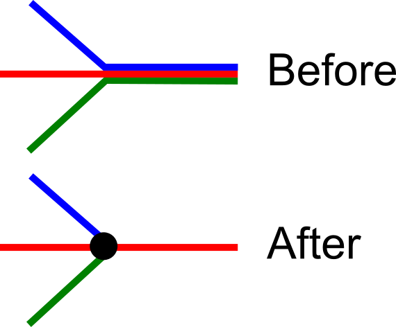
The second meaning of the principle of interchange is dicey. In some cases, it is unavoidable – on trains, in particular, it is possible to design timed cross-platform transfers, and sometimes it’s just not worth it to deal with complex junctions or run diesels under the catenary. On buses, there is some room for this principle, but less than on trains, as a bus is a bus, with no division into different train lengths or diesels vs. electrics. Fundamentally, if it’s feasible to time the transfers at the junctions, then it’s equally possible to dispatch branches of a single route to arrive regularly.
New York’s bus network is already replete with the first kind of interchange, and then the question is where to add more of it on the margins. But the Bronx draft includes some of the second, justified on the grounds of breaking long routes to improve reliability. Thus, for example, there is a proposed 125th Street crosstown route called the M125, which breaks apart the Bx15 and M100. Well, the Bx15 is a 10.7 km route, and the M100 is an 11.7 km route. The Bx15 limited takes 1:15-1:30 end to end, and the M100 takes about 1:30; besides the fact that NYCT should be pushing speedup treatments to cut both figures well below an hour, if routes of this length are unreliable, the agency has some fundamental problems that network redesign won’t fix.
In the East Bronx, the same principle of interchange involves isolating a few low-frequency coverage routes, like the Bx24 and Bx29, and then making passengers from them transfer to the rest of the network. The problem is that transferring is less convenient on less frequent buses than on more frequent ones. The principle of interchange only works at very high frequency – every 8 minutes is not the maximum frequency for this but the minimum, and every 4-6 minutes is better. It would be better to cobble together routes to Country Club and other low-density neighborhoods that can act as tails for other trunk lines or at least run to a transfer point every 6-8 minutes.
Is any of this salvageable?
The answer is yes. The South Bronx grid is largely good. The disentanglement of the Bx36 and Bx40 is particularly commendable: today the two routes zigzag and cross each other twice, whereas under any redesign, they should turn into two parallel lines, one on Tremont and one on 180th and Burnside.
But outside the core grid, the draft is showing deep problems. My semi-informed understanding is that there has been political pressure not to cut too many stops; moreover, there is no guarantee that the plans for bus lanes on the major corridors will come to fruition, and I don’t think the redesign’s service hours budget takes this into account. Without the extra speed provided by stop consolidation or bus lanes, there is not much room to increase frequency to levels that make transfers attractive.
Assume Nordic Costs
I wrote a post last year proposing some more subway lines for New York, provided the region could bring down construction costs. The year before, I talked about regional rail. Here are touched-up maps, with costs based on Nordic levels. To avoid cluttering the map in Manhattan, I’m showing subway and regional rail lines separately.
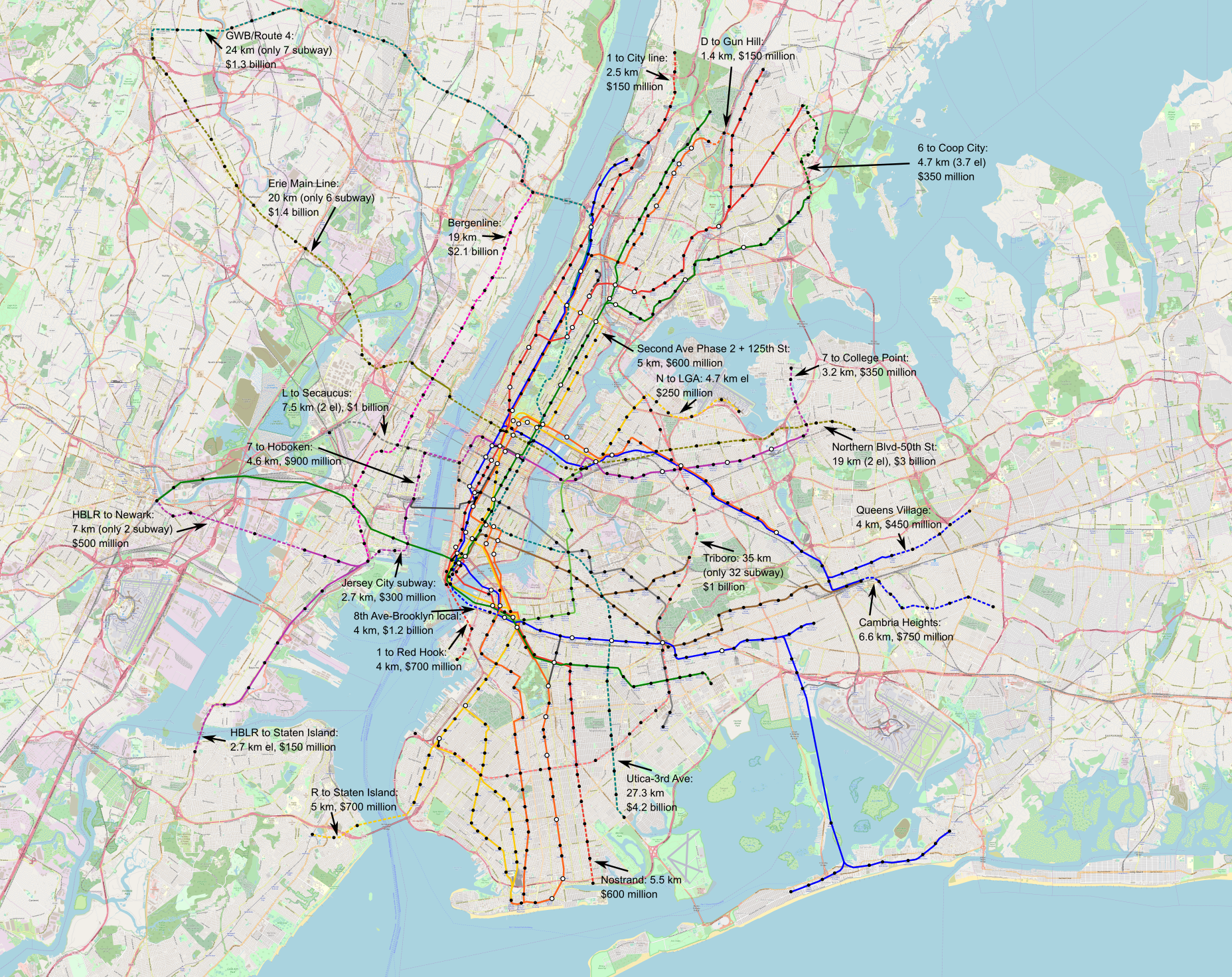

A full-size 52 MB version of the subway map can be found here and a 52 MB version of the regional rail map can be found here.
Subways are set at $110 million per km underground, outside the Manhattan core; in more difficult areas, including underwater they go up to $200-300 million per km, in line with Stockholm Citybanan. Lacking data for els, I set them at $50 million per km, in line with normal subway : el cost ratios. The within-right-of-way parts of Triboro are still set at $20 million per km (errata 5/30: 32 out of 35 km are in a right-of-way and 3 are in a new subway, despite what the map text says, but the costs are still correct).
Overall, the subway map costs $22 billion, and the regional rail one $15 billion, about half as high as the figure I usually quote when asked, which is based on global averages. This excludes the $2 billion for separated intercity rail tracks, which benefit from having no stations save Penn (by the same token, putting the express rather than local lines in the tunnel is a potential cost saving for Crossrail 2). It also excludes small surface projects, such as double-tracking the Northern Branch and West Shore Line, a total of 25 and 30 km respectively, which should be $300-550 million in total, and some junction fixes. There may also be additional infill stations on commuter rail, e.g. at intersection points with new subway extensions; I do not have Nordic costs for them, but in Madrid they cost €9 million each.
The low cost led me to include some lines I would not include elsewhere, and decide marginal cases in favor of subways rather than els. There is probably no need for the tunnel connecting the local tracks of Eighth Avenue and Fulton Street Lines, but at just $1.2 billion, it may be worth it. The line on Northern Boulevard and the Erie Main Line should probably be elevated or in a private right of way the entire way between the Palisades and Paterson, but at an incremental cost of $60 million per km, putting the Secaucus and East Rutherford segments underground can be justified.
In fact, the low cost may justify even further lines into lower-density areas. One or two additional regional rail tunnels may be cost-effective at $300 million per kilometer, separating out branches like Port Washington and Raritan Valley and heading to the airports via new connections. A subway line taking over lanes from the Long Island Expressway may be useful, as might another north-south Manhattan trunk feeding University Avenue (or possibly Third Avenue) in the Bronx and separating out two of the Brighton Line tracks. Even at average costs these lines are absurd unless cars are banned or zoning is abolished, but at low costs they become more interesting.
The Nordic capitals all have extensive urban rail networks for their sizes. So does Madrid: Madrid and Berlin are similar in size and density, but Berlin has 151 km of U-Bahn whereas Madrid has 293 km of metro, and Madrid opened a second Cercanías tunnel in 2008 for around $100 million per km and is planning a third tunnel for next decade (source, PDF-pp. 104-108). Things that are completely ridiculous at American costs – say, any future subway expansion – become more reasonable at average costs; things that are completely ridiculous at average costs likewise become more reasonable at Nordic or Spanish costs.
Informed Voting and the Democratic Deficit
The expression democratic deficit is most commonly used to refer to the European Union and its behind-the-scenes style of lawmaking. I’ve long held it is equally applicable to local politics, especially in the United States. With the EU election taking place later today, I am going to take this opportunity to zoom in one a key aspect: who gets to vote informedly? This is a critical component of the local democratic deficit. After all, there is universal franchise at the local level in modern democracies, same as at the national level, and when election dates coincide the turnout rates coincide as well. EU elections have had low turnout, but this has to be understood as a consequence rather than a cause of the democratic deficit.
This does not exist on the national level anywhere that I know of. In federal states it may not exist on the state level, either: as far as I can tell, Canada and Germany offer voters clear choices on the province/state level, and it’s only in the United States that the democratic deficit exists in the states.
On the EU level, the problem is slowly solving itself, since a highly salient issue is growing, namely, the legitimacy of the EU itself. People can clearly vote for parties that hold that the EU as it currently exists is illegitimate, such as right-populist parties under the ENF umbrella; for parties that offer continuity with the EU as it is, that is Christian-democratic, social-democratic, and liberal parties; and for various reform parties, that is greens and the far left on the left, or whatever remains of the Tories on the right. For what it’s worth, turnout so far has inched up from 2014 levels.
But on the local level, the problem remains as strong as ever. The main consequence is that local elections empower NIMBYs, simply because they have the ability to make an informed choice based on their ideology and other groups lack that power. The interest groups that benefit from housing shortages naturally get more political powers than those that benefit from abundant housing. In transportation, too, transit users tend to be politically weaker than drivers relative to their share of the electorate, but the problem is nowhere near as acute as that of general NIMBYism.
What is informed voting?
Informed voting does not mean voting the right way. A voter may be able to make an informed choice even for an uninformed position; for example, people who think cutting taxes reduces the deficit have an economically uninformed belief, but still count as informed voters if they recognize which parties they can vote for in order to prioritize tax cuts. Informed voting, at least to me, means being able to answer the following questions correctly:
- What are the political issues at stake?
- Which positions on these issues can plausibly be enacted, and how difficult would such enactment be?
- Which organs of state undertake the relevant decisions? Is it the entire legislature, a specific standing committee, the courts, the civil service, etc.?
- Which political groups have which positions on these issues, and how much they’re going to prioritize each issue? Which political groups may not have strong positions but are nonetheless potential allies?
National elections exhibit the most informed voting. For example, in the United States, most voters can identify that the key issues differentiating the Democrats and Republicans are abortion rights, tax rates (especially on higher incomes), and health care, and moreover, the abortion issue is decided through Supreme Court nominations whereas the others are in Congress with the consent of the president. Additional issues like foreign policy, environmental protection, and labor may not be as salient nationwide, but people who care about them usually know which party has what positions, where decisions are made (e.g. foreign policy is decided by the president and appointed advisors, not Congress), and which factions within each party prioritize these issues and which have other priorities.
This does not mean all voters are informed. This does not even mean most swing voters are informed. In the United States it’s a commonplace among partisans that swing voters are exceedingly uninformed. For example, here is Chris Hayes reporting on the 2004 election:
Often, once I would engage undecided voters, they would list concerns, such as the rising cost of health care; but when I would tell them that Kerry had a plan to lower health-care premiums, they would respond in disbelief–not in disbelief that he had a plan, but that the cost of health care was a political issue. It was as if you were telling them that Kerry was promising to extend summer into December.
But the low levels of information among undecided voters, while important on the margins, come from a context in which a large majority of American voters consistently support one party or another, and over the generations the parties have perfected a coalition of interests ensuring each will get about half the vote.
This situation is not US-specific. Israeli voters are highly informed about the relevant issues, led by the control over the Palestinians in the West Bank and the Gaza Strip. They know which parties are prepared to negotiate with the Palestinian Authority, withdraw from the settlements, and recognize an independent Palestinian state, and which will do no such thing, and vote accordingly. Parties for the most part announce in advance which bloc they are to be part of; even parties that would be fine cooperating with either side in order to get money for their special interests, such as the ultra-Orthodox parties, are compelled to announce in advance which side they’ll back (the right), and so far they have not deviated from it. Every single party in Israel’s most recent election had an obvious bloc, left or right; in 2015, every single party did but one, Kulanu, which was a member of the right bloc but at the time pretended to be undecided.
The European democratic deficit
The democratic deficit occurs when it is not possible for a large majority of voters to know in advance what the issues are and how to vote on them.
The European Parliament suffers from a democratic deficit, despite having strong, coherent political parties, because of its tradition of behind-the-scenes government by consensus of EPP and S&D. It is difficult for a voter to know what exactly the difference would be if S&D were somewhat stronger and EPP somewhat weaker. Europe Elects’ latest projection has a tight race for whether ALDE and the parties to its left will have a majority, making ALDE the median party on the left-right scale, or whether they will come just short, making EPP the median. And yet, I have no idea what it would mean, despite the fact that there are important issues, including climate change and immigration, on which there is a cleave between ALDE-and-leftward parties and EPP-and-rightward parties.
I am planning to vote for the Green Party rather than for the Social Democrats, since the Greens here opposed Article 13 whereas the Social Democrats expressed concern but mostly voted for it. But I genuinely do not know whether a stronger G/EFA and weaker S&D would matter much for digital freedom, nor do I know whether behind the scenes a stronger S&D and a weaker EPP would’ve resulted in a different law.
I found myself in a similar situation in the previous (and first) time I was enfranchised, in the Swedish local and regional elections of 2014. Thanks to EU reciprocity laws, I could vote in the local and regional elections but not the coincident national election. I had some knowledge of the salient political issues at the national level from reading the news, looking at slogans on street signs, and browsing party platforms, but had no idea what this would mean within the context of Stockholm County; lacking much of a local social network, I listened to my postdoc advisor’s advice to read the national platforms and vote based on the one I liked most, and voted Green (which, judging by my advisor’s reaction, was not what he would have preferred). Put another way, EU laws let me vote for a mayor and city council whose name I did not even know, but not for the Riksdag, where I had a decent idea of what the difference between the Greens and Social Democrats was.
The extreme right in Europe has ironically improved democracy, because it has given people something to vote against. I may not know how the EU would look different if EPP lost a few percentage points of its vote share and S&D and the Greens gained a few each, but I definitely know how it will look if ENF and parties that aren’t part of ENF but should be, like Hungary’s Fidesz, gain power. When the very existence of a multiracial EU is at stake, it is easier to figure out which parties are firmly committed (G/EFA, S&D, ALDE, and to a large extent EPP) and which aren’t, and on what grounds (GUE/NGL from the left, the Tories from the mainline right, ENF from the extreme right). That the pro-European parties will certainly win a huge majority of the vote among them is less relevant – the point is not to get more votes than ENF but to completely delegitimize ENF, so the margin of defeat counts.
The American democratic deficit
If in Europe the problem is the disconnect between voting for a party at the non-national (or non-state) level and seeing policy results, in the United States local government has no parties at all. Cities of primaries like New York, and cities with nonpartisan elections like San Francisco, make it exceedingly difficult for voters to know which politicians are likely to enact their local ideological agenda.
Knowing what the salient issues are is the easy part in the United States – education, crime, and housing tend to be the main issues across a variety of cities. The hard part is knowing which politicians will take which positions and have which priorities. Occasionally, one-party cities and one-party states have consistent factions, one moderate and more progressive or more conservative, but even then the factional identification is fluid.
David Schleicher has proposed to resolve this problem by forming state parties aiming at capturing about half the voters, on a similar model to that of Canada, where most provincial parties are distinct from federal parties, with ideological cleaves decided by provincial rather than federal voter preferences. Cities like New York and San Francisco would not have informal factions under this system but formal party institutions, one progressive and one moderate with perhaps some cross-party appeal to Republicans, and the parties could even compete in federal Democratic primaries for Congress.
Without parties, collegial institutions can create feudal results. Schleicher gives the example of councilmanic privilege, in which single-party city councils defer on local issues, such as housing, to the member representing the locality in question. Another possibility is standing committees with powerful chairs, as is the case in California today and as was the case in Congress before Newt Gingrich’s Republican Revolution of 1994. Despite widespread support, the YIMBY political priority SB 50 was recently frozen by fiat of one committee chair, Anthony Portantino, who represents a NIMBY suburb of Los Angeles; SB 50 passed two committees by majority vote but needed a pro forma vote from Portantino’s appropriations committee before the final vote in the entire State Senate. At the federal level, powerful postwar committee chairs tended to be Southern Democrats, who blocked civil rights law that enjoyed widespread support in Congress.
Empowerment for whomst?
Without political parties, the people who can make informed voting in local elections – that is, the people who know the salient issues, the reasonable positions, and who will prioritize what – are from specific demographics. They must have very strong social ties within the locality – they may well know the candidates personally, or know people who know them personally. They must have lived in the locality for a long time to have had these ties. There is no way I could have these ties in Berlin – I moved here three months ago, and socialize largely with foreigners.
Even though there is universal vote among citizens (and even among EU citizens here), people who lack these ties may not be able to vote informedly. Thus, their (our) vote may be completely random; in Berlin I have enough of an idea of what the difference between the left-wing parties and CDU is on transportation, but the Green-SPD difference is still subtle and unless I see more in the next few years in advance of the election I’m likely to vote based on other cues, such as which party has a more diverse slate of candidates.
With people like me not really having much political power even when enfranchised, local politics becomes the domain of the specific socioeconomic classes that do have access to information. These are typically retirees and small business owners. If you own a store, you almost certainly know all the little details of your neighborhood because that’s where your clients are located. If you work for a big business, your social network is much wider, as your coworkers are likely to commute from a wide variety of places, so even though your income is similar to that of the shopkeeper you are much weaker in local elections.
With much more power than the rest of the electorate, retirees and the petite bourgeoisie can create a political culture in which their situation is considered more moral than that of the rest – hence the use of the word transient as a pejorative.
The relevance to housing and transportation is that people with mostly local ties tend to be consistently NIMBY. They usually own housing rather than rent – if you live in one place for a long time you benefit from owning more than the average person. They have real local political power, which redevelopment may disrupt by introducing a large cohort of new people into the neighborhood. They have the ability to extort developers into providing community amenities in exchange for getting a building permit. Not for nothing, the vanguard class for YIMBY is working-age people who work for other people and have national social ties rather than local ones.
In transportation, too, the favored classes in local politics with a democratic deficit tend to be pro-car. Part of it is that enfranchised voters drive more than the disenfranchised – in the United States (per census data) and the Netherlands, immigrants drive less and use transit more than natives. Even within the electorate, the groups that have higher turnouts, such as comfortable retirees, drive more than groups that have lower turnouts, such as students. The petite bourgeoisie in particular drives a lot – if you own a store you probably drive to it because your store is on a local main street with a single bus line, whereas salaried workers are likelier to work in city center and take transit. The latter are less empowered in local politics, especially American politics, so their preferences count less than those of people who can show up to meetings during business hours and complain about bus lanes.
Democratic consensus, not democratic deficit
Tories like to use the real problem of democratic deficit at the EU level as well as the local level to argue in favor of strong unitary nations. But there are better democratic mechanisms than voting for a party once every four or five years and letting an internal party hierarchy decide everything in the interim.
Germany and Canada have strong democratic institutions at the state/province level as far as I can tell, Germany through a multiparty system and Canada through provincial parties. Canadian leftists like to complain about Rob Ford and Doug Ford, but the voters of both Toronto and Ontario knew what they were voting for. It’s not like when Donald Trump ran on promises about immigration and trade that he couldn’t keep and then cut corporate taxes.
There are glimpses of real democracy in the largest cities, at least the mayoral level: Rob Ford, Bill de Blasio, Sadiq Khan, Anne Hidalgo. This is not every city of that size class (Chicago has no such institutions), but mayors of large enough cities can at least be familiar to large enough swaths of the electorate that more than just retirees, retail landlords, and small business owners can express an opinion. In smaller cities, it may be completely impossible to have such democracy – too many residents work outside the city, or work in the city alongside suburban commuters.
Forced amalgamations of cities are likely required in the US as well as France, on the model of Britain, Sweden, the Netherlands, or any other European country with postwar municipal consolidation. Below a certain size class, moreover, it is not possible to have a professional full-time legislature; smaller US states have very small districts (New Hampshire has 400 Representatives for 1.3 million people, paid $100 a year each), leading to hobbyist legislators and bills written by lobbyists.
Referendums are an important component of democracy as well, provided precautions are undertaken to ensure they are more like Swiss ones and less like Californian ones. It is appropriate to vote on individual spending packages, such as a high-speed rail project or a subway, by a simple majority; it is not appropriate to vote on part of a project, as California did for high-speed rail, and put the remaining funding sources in a magic asterisk.
Democracy and housing
Even when homeowners are the majority, as in nearly every first-world country, there is no general interest in a housing shortage. Only homeowners in the most expensive and constrained areas as well as homeowners who look down on people who move frequently have this interest. These two groups can win thanks to a sustained democratic deficit on the local level.
This is why higher-level decisionmaking is consistently more YIMBY than local decisionmaking. At the national or even state level, homeowners can easily form a housing cartel and restrict construction – and yet, higher-level decisionmaking, such as in Japan (national) or Canada (provincial) is associated with higher construction rates. At the state level, interest groups like that of NIMBY homeowners have to share power with other interest groups, including middle-class renters, organized labor, and real estate; in California the NIMBYs just scored a win thanks to control of a legislative committee, but a full legislative vote might well go the other way. But at the local level, the NIMBYs have stronger local ties than the rest and can keep outsiders out, and even manipulate local interest groups, offering them scraps of the extortion money from developers in exchange for loyalty.
In accordance with the observation that higher-level decisionmaking yields YIMBYer results, France and Sweden have recently accelerated housing construction in their expensive capitals, both by force of national power. In the 2014 election, party posters on Stockholm pledged to build more housing, and after winning the election, the Social Democrats set a target for national housing production. Local NIMBYs still maintain some power in that housing production in Sweden has come from finding new brownfield sites to redevelop rather than from replacing smaller buildings with bigger ones, but construction rates in the last few years have been high, especially in Stockholm County; The Local describes the overall rental situation in Sweden as “cooling.” In France there has been acceleration in housing production as well, powered by both national and regional concerns, over the objections of rich NIMBY suburbs over social housing mandates.
The United States has continued devolving housing decisions to hyperlocal organs, with predictable results. YIMBYs in California may not have fully theorized this, but they understand the implications enough to focus on getting the state to override local control to permit mid-rise transit-oriented development. Whatever reasoning has led to this, the praxis of state preemption is solid, and activists in the United States should work to weaken local governments until and unless they begin solving their democratic deficit problems.
Positive and Negative Interactions
This is a theoretical post about a practical matter that arises whenever multiple variables interact. Two variables x and y, both correlated positively a dependent variable z, are said to positively interact if when x is larger, the effect of y on z gets larger and vice versa, and to negatively interact if when x is larger, the effect of y on z gets smaller. If z is transit ridership, let alone any of the direct benefits of good transit (good job access, environmental protection, public health, etc.), then it is affected by a slew of variables concerning service provision, infrastructure, and urban design, and they interact in complex ways.
I have not found literature on this interaction, which does not mean that this literature does not exist. The papers I’ve seen about correlates of bus ridership look at it one variable at a time, and yet they are suggestive of positive as well as negative interactions. More broadly, there are interactions between different types of service.
Positive interactions tend to involve network effects. These include the interaction between transit and transit-oriented development, as well as that between different aspects of rail modernization. Whenever there is positive interaction between variables, half-measures tend to flop; some are a reverse 80/20 situation, i.e. 80% of the cost yields 20% of the benefits. In some cases, compromises are impossible without making service useless. In others, some starter service is still viable, but in its presence, the case for expansion becomes especially strong, which can lead to a natural virtuous cycle.
Negative interactions occur when different improvements substitute for one another. One straightforward example is bus stops and frequency: frequency and the quality of bus shelter both impact bus ridership, but have a negative interaction, in that at higher frequency, the inconvenience coming from not having bus shelter is less important. In some cases, negative interactions can even lead to either/or logic, in which, in the presence of one improvement, another may no longer be worth the economic or political cost. In others it’s still useful to pursue multiple improvements, but the negative interaction implies the benefits are not as great as one might assume in isolation, and transit planners and advocates must keep this in mind and not overpromise.
Door-to-door trip times
The door-to-door trip time includes walking distance to and from the station, waiting time, transferring time, and in-vehicle time. Each of these components affects ridership in that longer trips reduce people’s propensity to choose public transport.
There is strong positive interaction between variables affecting the trip time. This is not directly attested in the literature that I know of, but it is a consequence of any ridership model that lumps the different components of trip time into one. If public transportation runs faster, that is if the in-vehicle time is reduced, then the share of the other components of the trip time rises, which means that the importance of frequency for reducing wait time is increased. Thus, speed and frequency have a positive interaction.
However, at the same time, there is a subtle negative interaction between speed and service provision on buses. The reason is that bus operating expenses are largely a linear function of overall service-hours, since costs are dominated by driver wages, and even maintenance is in practice a function of service-hours and not just service-km, since low speeds come from engine-stressing stop-and-go traffic conditions. In this case, increasing the speed of buses automatically means increasing their frequency, as the same resources are plugged into more service-km. In that case, the impact of a further increase in service is actually decreased: by speeding up the buses, the transit agency has reduced the share of the door-to-door trip time that is either in-vehicle or waiting at a stop, and thus further reductions in wait time are less valuable.
In the literature, the fact that investing in one portion of the trip makes its share of the overall trip length smaller and thus reduces the impact of further investments is seen in research into ridership-frequency elasticity. My standard references on this – Lago-Mayworm-McEnroe and Totten-Levinson – cite lit reviews in which the elasticity is far higher when frequency is low than when it is high, about 1 in the lowest-frequency cases and 0.3 in the highest-frequency ones. When frequency is very low, for example hourly, the elasticity is so high that adding service increases ridership proportionally; when frequency is a bus every few minutes, the impact of service increase on ridership is much smaller.
I’ve focused on in-vehicle time and waiting time, but the other two components are sometimes within the control of the transit agency as well, especially on rapid transit. Station design can reduce transfer time by providing clear, short passageways between platforms; it can also reduce access time by including more exits, for example at both ends of the platform rather than just at one end or in the middle. As such design positively interacts with other improvements to speed, it makes sense to bundle investments into more exits and better transfers with programs that add train service and speed up the trains.
Network effects
There is positive interaction between different transit services that work together in a network. In the presence of a north-south line through a city, the case for east-west transportation strengthens, and vice versa. This is not a new insight – Metcalfe’s law predicts usage patterns of communications technologies and social networks. The same effect equally holds for fixed infrastructure such as rail, and explains historical growth patterns. The first intercity steam railway opened in 1830, but the fastest phase of growth of the British rail network, the Railway Mania, occurred in the late 1840s, after main lines such as the London and Birmingham had already been established. 150 years later, the first TGV would start running in 1981, but the network’s biggest spurt of growth in terms of both route-km and passenger numbers occurred in the 1990s.
Using a primitive model in which high-speed rail ridership is proportional to the product of city populations, and insensitive to trip length, the United States’ strongest potential line is naturally the Northeast Corridor, between Boston and Washington. However, direct extensions of the line toward Virginia and points south are extremely strong per the same model and, depending on construction costs, may have even higher return on investment than the initial line, as 180 km of Washington-Richmond construction produce 540 km of New York-Richmond passenger revenue. In some places, the extra link may make all the difference, such as extending New York-Buffalo high-speed rail to Toronto; what looks like a basic starter system may be cost-ineffective without the extra link.
Network effects produce positive interactions not just between different high-speed rail lines, but also between transit services at lower levels. Rail service to a particular suburb has positive interaction with connecting bus service, for which the train station acts as an anchor; in some cases, such as the Zurich model for suburban transit planning, these are so intertwined that they are planned together, with timed transfers.
Network effects do not go on forever. There are diminishing returns – in the case of rail, once the biggest cities have been connected, new lines duplicate service or connect to more marginal nodes. However, this effect points out to a growth curve in which the first application has a long lead time, but the next few additions are much easier to justify. This is frustrating since the initial service is hard to chop into small manageable low-risk pieces and may be canceled entirely, as has happened repeatedly to American high-speed rail lines. And yet, getting over the initial hurdle is necessary as well as worth it once subsequent investments pan out.
Either-or improvements
In the introduction, I gave the example of negative interaction between bus shelter amenities and frequency: it’s good to have shelter as well as shorter waits, but if waits are shorter, the impact of shelter is lessened. There are a number of other negative interactions in transit. While it is good to both increase bus frequency and install shelter at every stop, some negative interactions lead to either-or logic, in which once one improvement is made, others are no longer so useful.
Fare payment systems exhibit negative interactions between various positive features. The way fare payment works in Germany and Switzerland – paper tickets, incentives for monthly passes to reduce transaction costs, proof of payment – is efficient. But the same can be said about the smartcard system in Singapore, EZ-Link. EZ-Link works so rapidly that passengers can board buses fast, which reduces (but does not eliminate) the advantage of proof-of-payment on buses. It also drives transaction costs down to the point of not making a monthly pass imperative, so Singapore has no season passes, and it too works.
Interior circulation displays negative interactions as well. There are different aspects of rolling stock design that optimize for fast boarding and disembarking of passengers, which is of critical importance on the busiest rail lines, even more than interior capacity. Trains so designed have a single level, many doors (four pairs per 20-meter car in Tokyo), interiors designed for ample standing space, and level boarding. Each of these factors interacts negatively with the others, and in cities other than Tokyo, regional trains like this are overkill, so instead designers balance circulation with seated capacity. Berlin has three door pairs per car and seats facing front and back, Zurich has double-deckers with two pairs of triple-wide doors and has been quite tardy in adopting level boarding, Paris has single-level cars with four door pairs and crammed seats obstructing passageways (on the RER B) and bespoke double-deckers with three pairs of triple-wide doors (on the RER A).
Finally, speed treatments on scheduled regional and intercity trains may have negative interactions. The Swiss principle of running trains as fast as necessary implies that once various upgrades have cut a route’s trip time to that required for vigorous network connections – for example, one hour or just a few minutes less between two nodes with timed transfers – further improvements in speed are less valuable. Turning a 1:02 connection into a 56-minute one is far more useful than further turning a 56-minute service into a 50-minute trip. This means that the various programs required to boost speed have negative interactions when straddling the boundary of an even clockface interval, such as just less than an hour, and therefore only the cheapest ones required to make the connections should receive investment.
Conclusion
Good transit advocates should always keep the complexities that affect transportation in mind. Negative interactions between different investments have important implications for activism as well as management, and the same is true for positive interactions.
When variables interact negatively, it is often useful to put a service in the good enough basket and move on. In some cases, further improvements are even cost-ineffective, or require unduly compromising other priorities. Even when such improvements remain useful, the fact that they hit diminishing returns means advocates and planners should be careful not to overpromise. Cutting a two-hour intercity rail trip to an hour is great; cutting a 40-minute trip to a 20-minute one may seem like a game changer, but really isn’t given the importance of access and egress times, so it’s usually better to redeploy resources elsewhere.
Conversely, when variables interact positively, transit service finds itself in an 80% of the cost for 20% of the benefits situation. In such case, compromises are almost always bad, and advocates have to be insistent on getting everything exactly right, or else the system will fail. Sometimes a phased approach can still work, but then subsequent phases become extremely valuable, and it is useful to plan for them in advance; other times, no reasonable intermediate phase exists, and it is on activists to convince governments to spend large quantities of upfront money.
Transportation is a world of tradeoffs, in which benefits are balanced against not just financial costs but also costs in political capital, inconvenience during construction, and even activist energy. Positive and negative interactions have different implications to how people who want to see better public transport should allocate resources; one case encourages insisting on grand plans, another encourages compromise.
The Importance of Radial Urban Rail
Most urban rail networks consist predominantly of radial lines, connecting city center with outlying areas. However, a fair minority attempt a different typology, reminiscent of a grid. This does not work so well in practice, and I want to bring it up in the context of both my current domicile and my previous one, which have non-radial metro systems, for different reasons. The problem with non-radial metro networks is that many trips require multiple transfers, and even single-transfer trips often place the connection far out of the way. The average effective speed in such cases is often lower than that of a slow bike.
Berlin
Berlin’s S-Bahn network is fully radial, consisting of two radial trunks and the Ringbahn. However, its U-Bahn network fails to be radial in three distinct ways. First, the two north-south trunks, U6 and U8, are parallel. Second, the east-west U5 only goes from Alexanderplatz eastward, although an under-construction extension will extend it slightly to the west and connect with U6. And third, the postwar lines were constructed in a Cold War context around a temporary city center.
The problem can be summarized with the following map, in which the green dot is where I live and the three red dots are places I’ve gone to recently:
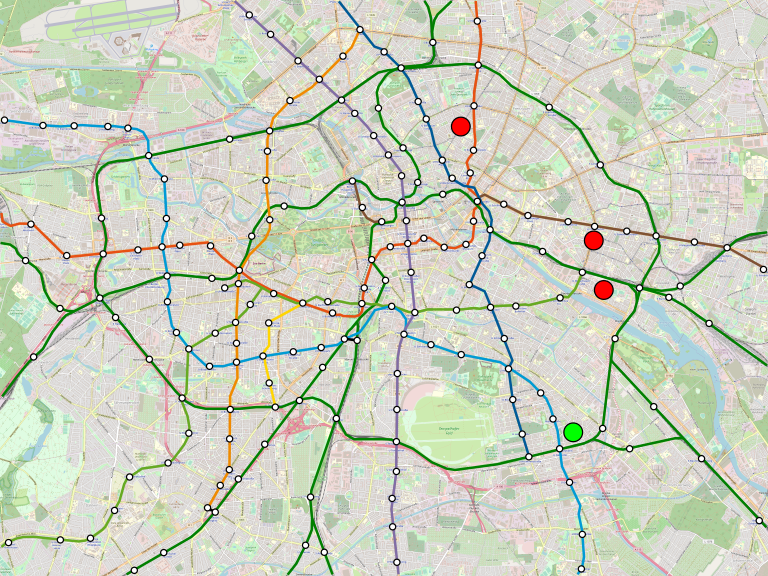
A larger 13 MB image can be seen here.
My trips to the two southern red dots, both gaming events, are not too onerous, using the Ringbahn. But my trip to the northern red dot isn’t so easy; besides being circuitous, the Ringbahn is currently shut down for maintenance for a segment in between. Now, there’s redundancy, I can still get there, but it requires a three-seat ride involving U7, U8, and U2, and what’s more, the U8/U2 transfer at Alexanderplatz is long.
The route U7 takes is a Cold War relic. During the division of Berlin, city center was in East Berlin, forcing West Berlin to build a new city center, currently called City West. East Berlin got the S-Bahn, which West Berliners eventually began to boycott even when it served the West, and West Berlin got nearly the entire U-Bahn, with the exception of just U5 and the eastern parts of U2. U6 and U8 served West Berlin going from the north to the south without stopping in the Walled center. To provide entirely Western routes, West Berlin built two new lines, U7 and U9.
The decisions made about U7 and U9 routing were then about the context of the Wall. U9 is a straight north-south trunk passing through City West, with connections to every West Berlin U-Bahn line with the exception of the low-ridership U4 stub. U7, originally part of the U6 mainline south of their junction, was extended northwest to become a new trunk line, and it too is designed to connect to the U-Bahn network of West Berlin alone rather than to the combined one. Thus, there is a reasonable U7-U1 connection at Möckernbrücke, but instead of continuing due west to connect with U2, U7 detours southwest and only connects with U2 at Bismarck Strasse, too far to the west to be of use for people connecting between the two lines’ eastern legs. In the Cold War, this worked, in the sense that the parts of U2 on the Western side of the Wall are either still convenient with the Bismarck Strasse transfer or very close to U1. In the context of reunification, this doesn’t work so well.
Here is a map of passenger rail traffic by interstation segment:

Note that U9 goes strong throughout its run; while the area it serves is no longer the CBD, it is still a strong high-end retail center, defined around Kurfürstendamm. However, U7’s traffic actually peaks in Neukölln and Kreuzberg and is lower west of the junction with U6 at Mehringdamm. Moreover, coming from Spandau at the other end, U7 loses traffic as it crosses the Ringbahn (as do many lines coming from the west) rather than gaining it. The shift in the center of the city has rendered U7 a mixed radial-circumferential line.
Paris
Like Berlin, Paris has a radial mainline rail network and a more complicated dedicated urban rail system.

The Metro defies easy categorization. It has the characteristics of a grid, with Lines 1, 3, 8, 9, and 10 running east-west, and Lines 4, 5, 7, 12, and 13 running north-south. It also has the characteristics of two overlain radial networks, one consisting of Lines 1, 4, 7, 11, and 14 around Chatelet, and one consisting of Lines 3, 7, 8, 9, 12, 13, and 14 around the Opera and Saint-Lazare. Some support for the latter view is that the weakest lines are M5 and M10, passing respectively too far east and south of city center.
Out of 14 Paris Metro lines, only two can connect to every other line in the network, M4 and M9, and the latter has an unadvertised connection from Saint-Augustin to Saint-Lazare, without which no transfer to M12 or M14 is possible.
This is not quite as dire as it may seem at first glance. So many stations are transfers, and stations are spaced so close together, that even though M1 runs parallel to M3 and M10, nearly all intra muros M1 stations still have two-seat rides to M3 and M10 via a different line.
Nevertheless, some parts of the city are poorly connected as a result. Eastern Paris’s connections to the Left Bank are not good. Some are more circuitous than they need to be, such as between a dorm I stayed at near Porte de Vincennes in 2010 for a conference and the site of the conference itself at Jussieu. Some are three-seat rides. Most involve changing trains at Chatelet, which adds 5-7 minutes to the trip in walking time alone.
In the case of Berlin, explaining how it got this way requires going into Cold War history. In that of Paris, a city with continuous development, this is just a matter of uncoordinated layers of planning. The plan from the 1890s produced M1-6, shaped as a hex symbol inside a circle; the lack of connection between M1 and M3 was not thought a problem then, and the remaining lack of connectivity if one originates in the suburbs was never a planning priority either.
There is another way
Paris may have Europe’s largest rail network, and Berlin may have the fourth largest, but they are in this sense atypical. London’s radial Underground network provides better connectivity, and the radial typology is increasingly dominant as Chinese metro networks follow the Soviet model, which is even more strictly radial than the British one.
The distance between my apartment and the northernmost red dot on the Berlin map is 8 kilometers. I looked at similar 8-kilometer trips within Inner London, picking two different starting points at Brixton and Bromley-by-Bow. Each 8-kilometer trip passing through or near Central London had a viable one- or two-seat ride, with the exception of Brixton-Canary Wharf, which is a three-seat ride with a cross-platform interchange at Stockwell.
There are a lot of defects in the London Underground network, and the two starting points I picked are somewhat cherrypicked to avoid them. Every pair of London Underground main lines intersects with a transfer, except the Metropolitan line and the Charing Cross branch of the Northern line, which have a missed connection at Euston and Euston Square; my two starting points are on neither of these two lines. Moreover, going northwest, there are some suburban missed connections between branches. This is on top of serious problems with capacity coming from the trains’ small size.
However, it’s notable that nobody is reproducing the small profile of the Tube networks. What cities around the world are reproducing is the radial network design, in which most trips within the urban core are reasonably direct. Going forward, Paris may even consider building connections between Metro lines to make its network more radial, for example extending M11 to the west. Berlin, likewise, should look to invest in radial S-Bahn trunks, following the busiest corridors connecting more areas to and beyond Mitte, where it’s already building extensive office space.
Optimization
This post may be of general interest to people looking at optimization as a concept; it’s something I wish I’d understood when I taught calculus for economics. The transportation context is network optimization – there is a contrast between the sort of continuous optimization of stop spacing and the discrete optimization of integrated timed transfers.
Minimum and maximum problems: short background
One of the most fundamental results students learn in first-semester calculus is that minimum and maximum points for a function occur when the derivative is zero – that is, when the graph of the function is flat. In the graph below, compare the three horizontal tangent lines in red with the two non-horizontal ones:
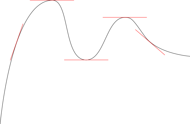
A nonzero derivative – that is, a tangent line slanting up or down – implies that the point is neither a local minimum nor a local maximum, because on one side of the point the value of the function is higher and on the other it is lower. Only when the derivative is zero and the tangent line is flat can we get a local extreme point.
Of course, a local extreme point does not have to be a global one. In the graph above, there are three local extreme points, two local maxima and one local minimum, but only the local maximum on the left is also a global maximum since it is higher than the local maximum on the right, and the local minimum is not a global minimum because the very left edge of the graph dips lower. In real-world optimization problems, the global optimum is one of the local ones, rather than an edge case like the global minimum of the above graph.
First-semester calculus classes love giving simplified min/max problems. This class of problems is really one of two or three serious calc 1 exercises; the other class is graphing a function, and the potential third is some integrals, at universities that teach the basics of integration in calc 1 (like Columbia and unlike UBC, which does so in calc 2). There’s a wealth of functions that are both interesting from a real-world perspective and doable by a first-semester calc student, for example maximizing the volume of some shape with prescribed surface area.
My formulas for stop spacing come from one of these functions. The overall travel time is a function of walking time, which increases as stops get farther apart, and in-vehicle time, which decreases as stops get farther apart. A certain stop spacing produces the minimum overall trip time; this is precisely the global minimum of the travel time function, which is ultimately of the form 
Continuous optimization
The fundamental fact of continuous optimization, one I wish I’d learned in time to teach it to students, is that at the optimum the derivative is zero, and therefore making a small mistake in the value of the optimum is not a big problem.
What does “mistake” mean in this context? It does not mean literally getting the computation wrong. There is no excuse for that. Rather, it means choosing a value that’s slightly suboptimal for ancillary reasons – perhaps small discontinuities in the shape of the network, perhaps political considerations.
Paul Krugman brings this concept up in the context of wages. The theory of efficiency wages asserts that firms often pay workers above the bare minimum required to get any workers at all, in order to get higher-quality workers and incentivize them to work harder. In this theory, the wage level is set to maximize employer productivity net of wages. At the employer’s optimum the derivative of profit is by definition zero, so a small change in wages has little impact to the employer. However, to the workers, any wage increase is good, as their objective function is literally their wage rather than profits. They may engage in industrial action to raise wages, or push for favorable regulations like a high minimum wage, and these will have a limited effect on profits.
In the context of transit, this has the obvious implication to wages – it’s fine to set them somewhat above market rate since the agency will get better workers this way. But there are additional implications to other continuous variables.
With stop spacing specifically, the street network isn’t perfectly continuous. There are more important and less important streets. Getting transit stops to align with major streets is important, even if it forces the stop spacing to be somewhat different from the optimum. The same is true of ensuring that whenever two transit lines intersect, there is a transfer between them. This is the reason my bus redesign for Brooklyn together with Eric Goldwyn involved drawing the map before optimizing route spacing – the difference between 400 and 600 meters between bus stops is not that important. For the same reason, my prescription for Chicago, and generally other American cities with half-mile grids of arterial roads, is a bus stop every 400 meters, to align with the grid distance while still hewing close to the optimum, which is about 500.
When I talked about stop consolidation with a planner at New York City Transit who worked on the Staten Island express bus redesign, the planner explained the philosophy to me: “get rid of every other stop.” In the context of redesigning a single route, this is an excellent idea as well: the process of adding and removing bus stops in New York is not easy, so minimizing the net change by deleting stops at regular intervals so as to space the remaining stops close to the optimum is a good idea.
The world of public transit is full of these tradeoffs with continuous variables. It’s not just wages and interstations. Fares are another continuous variable, involving particular tensions as different political factions have different objective functions, such as revenue, social rate of return, and social rate of return for the working class alone. Frequency is a continuous variable too in isolation. Top speed for a regional train is in effect a continuous variable. All of these have different optimization processes, and in all cases, it’s fine to slightly deviate from the strict optimum to fulfill a different goal.
Discrete optimization
Whereas continuous optimization deals with flat tangent lines, discrete optimization may deal with delicate situations in which small changes have catastrophic consequences. These include connections between different lines, clockface scheduling, and issues of integration between different services in general.
An example that I discussed in the early days of this blog, and again in a position paper I just wrote to some New Hampshire politicians, is the Lowell Line, connecting Boston with Lowell, a distance of 41 km. The line is quite straight, and were it electrified and maintained better, trains could run at 160 km/h between stops with few slowdowns. The current stop spacing is such that the one-way trip time would be just less than half an hour. The issue is that it matters a great deal whether the trip time is 25 or 27 minutes. A 25-minute trip allows a 5-minute turnaround, so that half-hourly service requires just two trainsets. A 27-minute trip with half-hourly service requires three trainsets, each spending 27 minutes carrying passengers and 18 minutes depreciating at the terminal.
A small deterioration in trip time can literally raise costs by 50%. It gets to the point that extending the line another 50 kilometers north to Manchester, New Hampshire improves operations, because the Lowell-Manchester trip time is around 27-28 minutes, so the extension can turn a low-efficiency 27-minute trip into a high-efficiency 55-minute trip, providing half-hourly service with four trainsets.
In theory, frequency is a continuous variable. However, in the range relevant to regional rail, it is discrete, in fractions of an hour. Passengers can memorize a half-hourly schedule: “the inbound train leaves my stop at :10 and :40.” They cannot and will not memorize a schedule with 32-minute frequency, and needing to constantly consult a trip planner will degrade their travel experience significantly. Not even smartphone apps can square this circle. It’s telling that the smartphone revolution of the last decade has not been accompanied with rapid increase in ridership on transit lines without clockface schedules, such as those of the United States – if anything, ridership has grown faster in the clockface world, such as Germany and Switzerland.
Transit networks involving timed connections are another case of discrete optimization in which all parts of the network must work together, and small changes can make the network fall apart. If a train is late by a few minutes and its passengers miss their connection, the short delay turns into a long one for them. As a result, conscientious schedule planners make sure to write timetables with some contingency time to recover from delays; in Switzerland this is 7%, so in practice, out of every 15 minutes, one minute is contingency, typically spent waiting at a major station.
But this gets even more delicate, because different aspects of the transit network impact how reliable the schedule is. If it’s a bus, it matters how much traffic there is on the line. Buses in traffic not reliable enough for tight connections, so optimizing the network means giving buses dedicated lanes wherever there may be traffic congestion. Even though it’s a form of optimization, and even though there’s a measure of difficulty coming from political opposition by drivers, it is necessary to overrule the opposition, unlike in continuous cases such as wages and fares.
Infrastructure planning for rail has the same issues of discrete optimization. It is necessary to design complex junctions to minimize the ability of one late train to delay other trains. This can take the form of flying junctions or reducing interlining; in Switzerland there are also examples of pocket tracks at flat junctions where trains can wait without delaying other trains behind them. Then, the decision of how much to upgrade track speed, and even how many intermediate stations to allow on a line, has to come from the schedule, in similar vein to the Lowell Line’s borderline trip time.
Continuous and discrete optimization
Many variables relevant to transit are in theory continuous, such as trip time, frequency, stop spacing, wages, and fares. However, some of these have discontinuities in practice. Stop spacing on a real-world city street network must respect the hierarchy of more and less important destinations. Frequency and trip times are discrete variables except at the highest intensity of service, perhaps every 7.5 minutes or better; 11-minute frequency is worse to the passenger who has to memorize a difficult schedule than either 10- or 12-minute frequency.
New York supplies a great example showcasing how bad it can be to slavishly hew to some optimal interstation and not consider the street network. The Lexington Avenue Line has a stop every 9 blocks from 33rd Street to 96th, offset with just 8 blocks between 51st and 59th and 10 between 86th and 96th. In particular, on the Upper East Side it skips the 72nd and 79th Street arterials and serves the less important 68th and 77th Streets instead. As a result, east-west buses on the two arterials cross Lexington without a transfer.
Just east of Lex, there is also a great example of optimization on Second Avenue Subway. The stops on Second Avenue are at 72nd, 86th, and 96th, skipping 79th. It turns out that skipping 79th is correct – the optimum for the subway is to the meter the planned stop spacing for the line between 125th and Houston Streets, so it’s okay to have slightly non-uniform stop spacing to make sure to hit the important east-west streets.
Frequency and trip times are subject to the Swiss maxim, run trains as fast as necessary, not as fast as possible. Hitting trip times equal to an integer or half-integer number of hours minus a turnaround time has great value, but small further speedups do not. Passengers still benefit from the speedup, but the other benefits of higher speed to the network, such as better connections and lower crew costs, are no longer present.
The most general rule here is really that continuous optimization tolerates small errors, whereas discrete optimization does not. Therefore, it’s useful to do both kinds of optimization in isolation, and then modify the continuous variable somewhat based on the needs of the discrete one. If you calculate and find that the optimal frequency for your bus or train is once every 16 minutes, you should round it to 15, based on the discrete optimization rule that the frequency should be a divisor of the hour to allow for clockface timetable. If you calculate and find that the optimal bus stop spacing is 45% of the distance between two successive arterial streets, you should round it to 50% so that every arterial gets a bus stop.
Getting continuous optimization right remains important. If the optimal stop spacing is 500 meters and the current one is 200 meters, the network is so far from the local maximum of passenger utility that the derivative is large and stop consolidation has strong enough positive effects to justify overruling any political opposition. However, it is subsequently fine to veer from the optimum based on discrete considerations, including political ones if removing every 1.7th bus stop is harder than removing every other stop. Close to the local maximum or minimum, small changes really are not that important.
Circles
Rail services can be lines or circles. The vast majority are lines, but circles exist, and in cities that have them they play an important niche. Owing to an overreaction, they are simultaneously overused and underused in different parts of the world. However, that some places overuse circles does not mean that circles are bad, nor does it mean that specific operational problems in certain cities are universal.
In particular, what I think of as the ideal urban rapid transit network should feature circles once the network reaches a certain scale, as in the following diagram that I use as my Patreon avatar:
Circles and circumferentials
Circles are transit lines that run in a loop without having a definitive start or end. Circumferentials are lines that go around city center, connecting different branches without passing through the most congested part of the city. In the ideal diagram above, the purple line is both a circle and a circumferential. However, lines can be one without being the other, and in fact examples of lines that are only one of the two outnumber examples of lines that are both.
For example, here is the Paris Metro:
Paris has a circle consisting of Metro Lines 2 and 6, which are operationally lines; people wishing to travel on the arcs through the meeting points at Nation and Etoile must transfer. Farther out, there is an incomplete circle consisting of Tramway Line 3, where the forced transfer between 3a and 3b is Porte de Vincennes. Even farther out there is an under-construction line not depicted on the map, Line 15 of Grand Paris Express, which has a pinch point at its southeast end rather than continuous circular service. All three systems are great example of circumferential lines with very high ridership that are not operationally circles.
Another rich source of circumferential lines that are not circles is cities near bodies of water. In those cities, a circumferential line is likely to be a semicircle rather than a circle. This is responsible for the current state of the Singapore Circle Line, although in the future it will be closed to form a full circle. The G train in New York is a single-sided circumferential line to the east of Manhattan, not linking with anything to the west of Manhattan because of the combination of wide rivers and the political boundaries between New York and New Jersey.
In the opposite direction – circles that are not circumferentials – there are circular lines that don’t neatly orbit city center. The Yamanote Line in Tokyo is one such example: its eastern end is at city center, so it combines the functions of a north-south radial line with those of a north-south circumferential line connecting secondary centers west of Central Tokyo. London’s Circle Line is no longer operationally a circle but was one for generations, and yet it was never a circumferential – it combined the central legs of two east-west radial mainlines, the Metropolitan and District lines.
We can collect this distinction into a table:
| Circle, not circumferential | Circumferential, not a circle | Circumferential circle |
| Yamanote Line Osaka Loop Line Seoul Metro Line 2 London Circle line (until 2009) Madrid Metro Line 12 |
Paris M2/6, T1, T2, T3, future M15 Copenhagen F train New York G train, proposed Triboro London Overground services Chicago proposed Circle Line Singapore Circle line (today) |
Moscow Circle Line, Central Circle Berlin S41/S42 Beijing Subway Line 2, Line 10 Shanghai Metro Line 4 Madrid Metro Line 6 |
Operational concerns: the steam era
In the 19th century, it was very common to build circular lines in London. In the steam era, reversing a train’s direction was difficult, so railways preferred to build circles. This was the impetus for joining the Metropolitan and District lines to form the Circle line. Mainline regional rail services often ran in loops as well: these were as a rule never or almost never complete circles, but instead involved trains leaving one London terminus and then looping around to another terminus.
Another city with a legacy inherited from steam-era train operations is Chicago. The Loop was built to easily reverse the direction of trains heading into city center. At the outer ends they would need to reverse direction the traditional way, but there was no shortage of land for yards there, unlike in the Chicago CBD since named after the Loop.
As soon as multiple-unit control was invented in the 1890s, this advantage of circles evaporated. Subsequently rapid transit lines mostly stopped running as circles unless they were circumferential. London’s Central line, originally pitched as two long east-west lines forming a circle, became a single east-west line, on which trains would reverse direction.
Operational concerns: the modern era
Today, it is routine to reverse the direction of a rapid transit train. The vast majority of rapid transit routes run as lines rather than circles.
If anything, there have been complaints that circles are harder to run service on than lines. However, I believe these concerns are all specific to London, which changed its Circle line from a continuous loop to a spiral in 2009. I have heard concerns about the operations of the Ringbahn here, but as far as I can tell the people who express them are doing so in analogy with what happened in London, and are not basing them on the situation on the ground here. Moreover, there are no plans to make the Yamanote Line run as anything other than the continuous loop it is today.
The situation in London is that the Circle line has always shared tracks with both the Metropolitan and District lines. There has always been extensive branching, in which a delay on one train propagates to the entire network formed by these two mainlines. To this day, Transport for London does not expect the lines in the subsurface network to have the same capacity as the isolated deep tube lines: with moving block signaling it expects 32 trains per hour, compared with 36 on isolated lines.
What’s more, the junctions in London are generally flat. Trains running in opposite directions can conflict at such junctions, which makes the schedules more fragile. Until 2009, London ran the Circle line trains every 7 minutes, which was bound to create conflicts with other lines.
The importance of this London-specific background is that the argument against circles is that they make schedules more fragile. If there is no point on the line where trains are regularly taken out of service, then it is hard to recover from timetable slips, and delays compound throughout the day. However, this is relevant mainly in the context of an extensively-branching system like London’s. Berlin has some of that branching as well, but much less so; one of the sources of reverse-branching on the S-Bahn is a line that should get its own cross-city route anyway, and another is a Cold War relic swerving around West Berlin (S8/85).
The benefits of complete circles
The complete circle of the Yamanote Line or the Ringbahn can be compared with incomplete circles, such as the Oedo Line or the various circumferentials in Paris. From passengers’ perspective, it’s better to have a complete circle, because then they can undertake more trips.
Circumferential lines broadly have two purposes:
- They offer service on strong corridors that are orthogonal to the direction of city center, such as the various boulevards hosting the M2/6 ring as well as the Boulevards des Maréchaux hosting T3.
- They offer connections between two radial lines that may not connect in city center, or may connect so far from the route of the circumferential that transferring via the circumferential is faster.
Both purposes are enhanced when the route is continuous. In the case of Paris, a north-south trip east of Nation is difficult to undertake, as it requires a transfer at Porte de Vincennes. Passengers connecting from just south, on M8 or even on M7, may not save as much time traveling to lines just north, such as M9 or M3, and might end up transferring at the more central stations of Republique or Opera, adding to congestion there.
In contrast, in Berlin the continuous nature of the Ring makes trips across the main transfer points more feasible. Just today I traveled from my new apartment to a gaming event on the Ringbahn across Ostkreuz. At Ostkreuz the trains dwelled longer than the usual, perhaps 2 minutes rather than the usual 30 seconds, which I imagine is a way to keep the schedule. That delay was, all things considered, minor. Had I had to transfer to a new train, I would have almost certainly taken a different combination of trains altogether; the extra waiting time adds up.
Why are circles so uncommon?
The operational concerns of London aside, it’s still uncommon to see complete circles on rapid transit networks. They are the ideal for cities that grow beyond the scale of three or four radial trunks, but there are only a handful of examples. Why is that?
The answer is always some sort of special local concern. If city center is offset to one side of the built-up area, such as in a coastal city, then circumferential lines will be semicircles and not full circles. If there is some dominant transfer point that requires a pinch, then cities prefer to build a pinch into the system, as is the case for Porte de Vincennes on T3 or for some of the lines cobbled together to form the London Overground.
This is similar to the question of missed connections. Public transportation networks must work hard to ensure that whenever two lines meet, they will have a transfer. Nonetheless, missed connections exist in virtually all large rapid transit networks. Some of those are a matter of pure incompetence, but in many, rail networks that developed over generations may end up having one subway line that happens to intersect another far from any station on the older line, and there is little that can be done.
Likewise, it is useful to ensure that circumferential lines be complete circles whenever the city is symmetric enough to warrant circles. Paris, like other big cities with strong transit networks, is good but not perfect, and it is important to call it on the mistakes it makes, in this case building M15 to have a jughandle rather than running as a complete circle.
Stop Spacing and Route Spacing
Six months ago I blogged a model for optimal stop spacing on an urban transit route. These models exist in the published literature, but they assume that the speed benefit of stop consolidation reduces operating costs, which requires introducing new variables for the value of time. My model assumes the higher speed of stop consolidation is plugged into higher frequency, which means only five variables are needed, and only two of them vary substantially between different cities and their networks. The formula is a square root.
In this post, I’m going to extend this formula to optimizing route spacing on a grid.

I’m using mode-neutral language like “vehicle,” but this is really just about buses, because to a good approximation, urban rail networks are never grids. I’m sorry, Mexico City, I know your Metro network does its best to pretend you have an isotropic city, but your three core radial lines are just far busier than the tangential ones.
Optimal stop spacing: a recap
My previous post uses words rather than symbolic language, since there are only five relevant parameters. Here I’m going to use symbols for the variables to make the calculation even somewhat tractable. All units I’m using are base SI units, so speed is expressed in meters per second rather than kilometers per hour, but the dimensional analysis works out so that it’s not necessary to pick units in advance.
- s: stop spacing
- v: walk speed
- p: stop penalty
- d: average distance traveled
- w: walk/wait penalty, expressed as a ratio of perceived walk or wait time to in-vehicle time
- λ: average distance between successive vehicles, or in other words headway in units of distance, not time
The variables v and p are fairly consistent from place to place. The variable w is as well, but may well differ by circumstance, e.g. people with luggage may have a higher walk penalty and a lower wait penalty, and people who are more familiar with the system usually have lower w. The parameter λ is a function of how much service runs on the line, as we will see when we expand to cover route spacing.
A key assumption in this model is that d does not change based on the network. This is a simplification: if s is too low then it will drag down d with it, as people who are discouraged by the slow in-vehicle speed avoid long trips or choose other modes of travel, whereas if s is too high then it will drag d up, as people who have to walk too long to the stop may just walk all the way to their destination if it’s nearby. In Carlos Daganzo’s textbook this situation is resolved by replacing an empirically determined d with the size of the city, assuming travel is isotropic, but the effect is essentially the same as just setting d to be half the length of a square city.
The formula for perceived travel time is

if travel along the line is isotropic, or

if one end of the travel (e.g. the residential end) is isotropic and the other is at a fixed node (e.g. a subway transfer). In either case, in-vehicle time excluding stops is omitted, as it is constant.
The minimum travel time occurs at

if travel is isotropic and

if there is a distinguished node at one end of the trip.
Observe that there is negative interaction between stop consolidation and other aspects of bus modernization. First, higher frequency, as expressed in concentrating service on strong routes, reduces the value of λ and therefore slightly reduces the optimal stop spacing. Second, the model assumes the same penalty w for walking and waiting, but sometimes these two activities have distinct penalties, and then the walk penalty is responsible for the occurrence of w in the denominator in the formula whereas the wait penalty supplies the appearance of w in the numerator. Improving bus stop facilities reduces the wait penalty, pushing the optimal s farther down, even though at the same time it’s cheaper to improve bus stops if there are fewer of them.
The empirically determined values of the five variables in the formula are as follows:
- v is 1.45 m/s in Forde-Daniel, 1.3-1.4 m/s in Bohannon, and 1.38 in TRB Part 4, PDF-p. 16; I take v = 4/3
- p is 25 seconds based on examining the differences in schedules between local and limited buses in New York and Vancouver
- d is 3,360 meters per unlinked trip per the NTD
- w is around 2 for waiting in Fan-Guthrie-Levinson, 2 in general for buses in Teulings-Ossokina-de Groot, PDF-p. 25, 1.75 in the New York MTA’s internal model, 2.25 in the MBTA’s (as mentioned in one of Reinhard Clever’s papers), and a range of 2-3 in Lago-Mayworm-McEnroe; I take w = 2
- λ is single-lane network length (that is, twice the route-length, modulo one-way loops) divided by fleet size in actual use, which is 1,830 meters in Brooklyn today and 1,160 based on what Eric Goldwyn and I recommend
This leads to optimal stop spacing equal to

if travel is isotropic and

if there is a distinguished node. The numbers are slightly lower than in my older post since I’m using a slightly lower walk speed, 1.33 m/s rather than 1.5.
Optimal route spacing: stops at intersection points
Studying route spacing has to incorporate stop spacing for a simple reason: there should be a stop at every intersection between routes, and therefore the route spacing should be an integer multiple of the stop spacing. There are three modifications required to the above formula, of which the first is easy, the second requires defining more parameters but is mathematically still easy, and the third is very hard:
- Passengers need to walk not just along the route to their stop but also from their origin to the route, which increases walk time
- The value of λ may change, since fewer routes imply more vehicles per route and thus denser vehicle spacing, and in particular wait time depends not just on how many stops are on the way but also on the speed net of stops
- Increasing the route and stop spacing in tandem reduces the number of stops involved in waiting for the bus (this is λ again) twice, that is quadratically
The first modification means that instead of traveling an average distance of s/4 to the stop at each end, assuming isotropy, people have to travel a distance of s/4 along the route and also s/4 to the route itself. In the travel time formula, we replace sw/2v with just sw/v with isotropic travel.
To deal with the second modification, we define the following variables, in addition to the ones from the section above on stop spacing:
- f: fleet size in independent vehicles in actual revenue operation (buses or trains, not train cars)
- a: area of the network to be covered by the grid, e.g. a city, metro area, or borough
- u: speed assuming there are no stops along the route
If the area is a, then we can approximate it as a square of side 


Moreover, people wait an additional λw/2u; in the previous section this wait existed as well but was ignored in the formula as it did not depend on s, but here it does, and thus we need to add this wait factor.
We deal with the third modification by replacing λ with 4a/sf in the formula for wait time. If people travel isotropically and do not transfer, the travel time formula is now

The summand d/u is constant but is included for completeness here, in analogy with the no-longer-constant summand 2aw/sfu.
But it’s the last summand that gives the most problems: it turns the optimization problem from extracting a square root to solving a cubic. This is technically possible, but the formula is opaque and does not really help showcase how the parameters affect the final outcome. We need to solve for s:

We can plug in the above values of w, v, d, and p, as well as the following values of the new variables, and use any cubic solver:
- f = 612 buses in Brooklyn, excluding vehicles in turnaround, non-revenue service, etc. (it’s actually slightly lower today, around 600, but our network is a bit more efficient with depot moves)
- a = 180,000,000 m^2 for Brooklyn
- u = 5.3 m/s net of stops, assuming our other proposals, such as bus lanes, are implemented
The cubic formula turns into

for which the positive solution is s = 528 meters.
We can complicate this formula in two ways.
First, we can let go of the assumption of isotropy. If there is a distinguished node at one end, then walk time is halved, as in the formula for stop spacing on a given route. The overall travel time is equal to

and this is optimized when

Plugging the usual values of the parameters, we get

for which the positive solution is s = 719 meters. The ratio between the results with isotropy and a distinguished node is 1.36, close to the square root of 2 that we get in the formula for stop spacing on a predetermined route; the reason is that in the cubic formula the linear term is much larger than the constant term near the root, so the effect of changing the cubic term is much closer to the square root than to the cube root.
The second complication is introducing transfers. Transfers do not change the walk time – the walking time between platforms or curbside waiting areas is small and constant – but introduce additional wait time, which means we need to double both terms that include waits. But if we have transfers we need to restore the assumption of isotropic travel, since for the most part the distinguished nodes for Brooklyn buses involve subway transfers.
In that case, the travel time formula is
which is minimized at the positive root of the cubic
We need to figure out the value of d, which is difficult in this case – the New York bus network discourages bus-to-bus transfers through low frequency and poor bus stop amenities. That the formulas I’m using do not allow for how the shape of the network influences d is a real drawback here. But if we let d be the usual 3,360 meters that it is for unlinked trips, and plug the usual values of the other parameters, we get,

to which the solution is s = 683 meters.
Optimal route spacing: the general case
The above section makes a critical assumption about route spacing and stop spacing: they must be equal, making every stop a transfer. However, this assumption is not strictly necessary. Indeed, if we assume isotropy, and let the route spacing be 860 meters, then it’s better for passengers to double the density of stops to one every 430 meters just from looking at the formula for stop spacing.
In this section, we look at the optimal formulas assuming route spacing is twice or thrice the stop spacing. Then in the next section we will compare everything together.
We keep all the variable names from before, and set s to be the stop spacing, not the route spacing. Instead, we will find formulas for route spacing equal to 2s and 3s and compare their optima with that for the special case in which stop and route spacing are equal.
We need to modify the formula in the previous section in two ways. First, walk time is, in the isotropic case, half the stop spacing plus half the route spacing. And second, the dependence of λ on the shape of the network comes from route spacing rather than stop spacing. If route spacing is 2s, the formula for travel time is

and its minimum is at the positive solution to

We retain the New York- and Brooklyn-oriented variables from the above sections and obtain

The solution is s = 352 meters, i.e. routes are to be spaced 704 meters apart, with one intermediate station on each route between each pair of successive crossing routes.
If we have three interstation segments between two successive routes, then we need to solve the cubic
or

to which the solution is s = 276 meters.
In the above section we also looked at two potential complications: introducing transfers, and introducing non-isotropy. Non-isotropy, expressed as an isotropic origin and a distinguished destination, halves the cubic term; transfers double the wait times and thus double the constant term and the larger of the two summands adding up to the linear term.
If the route spacing is exactly twice the stop spacing, then the non-isotropic formula is

or, using the same parameters as always,

The solution is s = 420 meters, with routes spaced 840 meters apart.
The isotropic cubic with transfers is

and with the usual parameters, again sticking with d = 3,360 even though in practice it is likely to be higher, this is

and then the root is s = 442 meters, with routes spaced 884 meters apart.
We conclude this section with the same formulas assuming the route spacing is not 2s but 3s. The non-isotropic, one-seat ride formula is

or with the usual parameters

of which the positive root is s = 374 meters, with routes spaced 1,123 meters apart,
The transfer-based isotropic formula is,

or

The positive root is s = 340 meters, with routes spaced 1,021 meters apart.
What’s the best route spacing?
We have optimums based on assumptions about the interaction between stop and route spacing, but so far we have not compared these assumptions with each other. In this section, we do. For each scenario – isotropic, transfer-free travel; a distinguished node along transfer-free travel; and isotropic travel with a transfer – we look at the optimal values of route spacing equal to one, two, or three times the stop spacing.
In the table below, the walk and wait times are without penalty; but the penalty is applied to them when summed with in-vehicle time.
| Scenario | Component | Route spacing = s | Route spacing = 2s | Route spacing = 3s |
| Isotropy; 1-seat ride | Optimal s | 528 | 352 | 276 |
| Walk time | 396 | 396 | 414 | |
| Wait time | 262.954 | 216.997 | 198.394 | |
| In-vehicle time | 793.053 | 872.599 | 938.31 | |
| Total time | 2110.962 | 2098.593 | 2163.097 | |
| Distinguished node; 1-seat ride | Optimal s | 719 | 420 | 374 |
| Walk time | 269.625 | 236.25 | 280.5 | |
| Wait time | 182.811 | 173.812 | 133.965 | |
| In-vehicle time | 750.791 | 833.962 | 858.561 | |
| Total time | 1655.663 | 1654.086 | 1687.49 | |
| Isotropy; 2-seat ride | Optimal s | 683 | 442 | 340 |
| Walk time | 512.25 | 497.25 | 510 | |
| Wait time | 388.05 | 326.378 | 302.432 | |
| In-vehicle time | 756.949 | 824.008 | 881.021 | |
| Total time | 2557.549 | 2471.263 | 2505.885 |
The table implies that in all scenarios it’s optimal to have two interstations between parallel routes, though if there’s a distinguished node the difference with having just one interstation between parallel routes is very small. The three-interstation option is never optimal, but is also never far from the optimum, only half a minute to a minute worse.
But please interpret the table with caution, especially the two-seat ride section. The total time for a 3.36-kilometer trip without applying the walk or wait penalty is about 28 minutes regardless of whether the route to stop spacing ratio is 1, 2, or 3. This is still faster than walking, but not by much, and riders may well be so discouraged as to walk the entire way. If the trip is much shorter than 3.36 kilometers or the rider’s particular disutility of walking is much lower than 2 then transit will not be competitive with walking. In turn, a network set up with the stop spacing implied by the above formulas will only get transfer trips if they’re much longer, which should raise the optimal interstation somewhat. If d = 6,000 then in the transfer scenario the optimum if stop and route spacing are equal is 711 meters and that if route spacing is twice as high as stop spacing is 470 meters, and the latter option is noticeable faster.
How does our bus redesign compare with the theory?
We drew our redesigned map with full knowledge of how to optimize stop spacing on a single route, but we didn’t look at route spacing optimization. Of course, the assumption of regular route spacing is less realistic than that of regular stop spacing, as some areas have higher demand, or more distinguished arterials. But we can still discuss the average route spacing in our plan, by comparing our proposed route-length with Brooklyn’s land area.
With a 356-kilometer network in a borough of 180 km^2, effective route spacing is 1,010 meters. This is a little longer than I expected; in Southern Brooklyn the north-south and east-west routes we propose are spaced around 800-850 meters apart, and in Bed-Stuy the east-west routes tighten to 600 meters as they’re all radial toward Downtown Brooklyn and quite busy. The reason the answer is 1,010 meters is that there are margins of the borough with no service (like Floyd Bennett Field) or grid interruptions due to parks (such as Prospect Park) or already-good subway service (South Brooklyn).
The stop spacing we use is 480 meters, excluding nonstop freeway segments in the Brooklyn-Battery Tunnel and toward JFK. In the Southern Brooklyn grid, we’re pretty close to a regular spacing of two interstations between parallel routes. In the Bed-Stuy grid, the north-south routes have a stop per crossing route since the east-west routes are so densely placed, and the east-west routes have one, two, or three interstations between crossing routes, but the average is two.
To the extent the optimization formulas tell us anything, it’s that we should consider adding a few more routes. Target additions include another north-south Bed-Stuy route, an east-west route in South Brooklyn restoring the discontinued B71, and a north-south route through Southern Brooklyn on 16th Avenue. Altogether this would add around 20 km to our network. Beyond that, additional routes would duplicate subway routes, which my analysis above excludes even when they form a coherent grid with the buses.
Rules of thumb for your city
If your city has streets that form a coherent grid, then you can design a bus grid without too many constraints. By constraints I mean street networks that interrupt the grid so often so as to force you to use particular streets at particular spacing, for example the Bronx or Queens. Constraints in a way make planning easier, by reducing the search space; I contend Brooklyn is the hardest of the four main boroughs to redesign precisely because it has the fewest constraints in its grids and yet its grid is just interrupted enough that it cannot be treated as tabula rasa.
In general, you probably want buses spaced around 800 meters to a kilometer apart. While the value of d will differ between cities, the optimum route spacing isn’t that sensitive to it. If d rises to as high as 10,000, the optimal s in the scenario with transfers is 753 meters if route spacing equals stop spacing and 511 meters if it equals twice stop spacing, compared with 683 and 442 meters respectively with d = 3,360; the one-interstation-per-parallel-route scenario becomes better than the two-interstation scenario, but the difference is half a minute, compared with a minute and a half in favor of two interstations with d = 3,360.
In practice I don’t know of any city whose grid is so unconstrained and so isotropic that you can seriously debate 700, 800, 900, 1,000, etc. meters between routes. At that resolution you’re always constrained by arterial spacing, which in American cities tends to be 800 because it’s half a mile and in Canada is irregular (de facto close to a mile) due to constant grid interruptions on intermediate would-be arterials in both Toronto and Vancouver. In this range of arterial spacing, you want exactly two interstations between parallel routes; if you want more or fewer then you should have a very good reason, such as a major destination such as a hospital located at an awkward offset.
Something that does matter very much is fleet size relative to the area served – the quantity a/f. If you aren’t running much service, then you need wider route spacing just to avoid reducing frequency to unusable levels. If instead of f = 612 we use f = 200, then the optimum with one interstation per parallel routes with the transfer scenario is s = 1087, with two it’s s = 676, with three it’s s = 508, and with four it’s s = 414, and among these three is best and even four is a few seconds faster than two. In that case route spacing of about a kilometer and a half, which may be a mile in American arterials, is fully justified.
Conversely, if buses are faster, that is if u is higher, then the optimal interstations fall in all cases. This is because the impact of u comes from its effect on wait times, so faster buses mean that it’s less important to reduce λ.
The effects of a/f and u relate again to the negative interactions between various components of bus reform. Running more service means it’s justifiable to have more closely-spaced routes, since pruning routes to increase frequency from 10 to 5 minutes is much less valuable than pruning them to increase frequency from 30 to 15 minutes. Likewise, running faster service means wait times fall, again reducing the need to prune routes.
If you’re tasked with designing bus routes, then make sure to use correct values for a, f, u, and d for your city, as they are likely to be very different from those of New York. The formulas are more intricate when optimizing route spacing and it’s useful to play with them until you get comfortable with them on an intuitive level, but ultimately they do give reasonable answers for how to design a bus network.
How Ambitious is Mayor de Blasio’s Bus Plan?
You have to give Bill de Blasio credit: when someone else forces his hand, he will immediately claim that he was on the more popular-seeming side all along. After other people brought up the idea of a bus turnaround, starting with shadow agencies like TransitCenter and continuing with his frontrunning successor Corey Johnson, the mayor released an action plan called Better Buses. The plan has a bold goal: to speed up buses to 16 km/h using stop consolidation and aggressive enforcement of bus priority. And yet, elements of the plan leave a bad taste in my mouth.
Bus speeds
The Better Buses plan asserts that the current average bus speed in New York is 8 miles per hour, and with the proposed treatments it will rise to 10. Unfortunately, the bus speed in New York is lower. The average according to the NTD is 7.05 miles per hour, or 11.35 km/h. This includes the Select Bus Service routes, whose average speed is actually a hair less than the New York City Transit average, since most of them are in more congested parts of the city. The source the report uses for the bus speed is an online feed that isn’t reliable; when I asked one of the bus planners while working on the Brooklyn route redesign, I was told the best source to use was the printed schedules, and those agree with the slower figures.
In Brooklyn, the average bus speed based on the schedules is around 11 km/h. But the starting point for the speed treatment Eric Goldwyn and I recommended is actually somewhat lower, around 10.8 km/h, for two reasons: first, the busiest routes already have faster limited-stop overlays, and second, the redesign process itself reduces the average speed by pruning higher-speed lightly-used routes such as the B39 over the Williamsburg Bridge.
The second reason is not a general fact of bus redesigns. In Barcelona, Nova Xarxa increased bus speeds by removing radial routes from the congested historic center of the city. However, in Brooklyn, the redesign marginally slows down the buses. While it does remove some service from the congested Downtown Brooklyn area, most of the pruning in is outlying areas, like the industrial nooks and crannies of Greenpoint and Williamsburg. Without having drawn maps, I would guess the effect in Queens should be marginal in either direction, for essentially the same set of reasons as in Brooklyn, but in the Bronx it should slow down the buses by pruning coverage routes in auto-oriented margins like Country Club.
With all of the treatments Eric and I are proposing, the speed we are comfortable promising if our redesign is implemented as planned is 15 km/h and not 16 km/h.
How does the plan compare with the speaker’s?
City Council Speaker Johnson’s own plan for city control of NYCT proposes a bus turnaround as well. Let us summarize the differences between the two plans:
| Aspect | Johnson’s plan | De Blasio’s plan |
| Route redesign | Yes | Yes |
| Bus shelters | Yes | Probably |
| Stop consolidation | Not mentioned | Yes |
| Bus lanes | 48 km installed per year | 16-24 km installed per year |
| Bus lanes vs. cars | Parking removal if needed | Not mentioned |
| Physically separated bus lanes | Yes | 3 km pilot |
| Median bus lanes | Probably | Maybe |
| Signal priority | 1000 intersections equipped per year | 300 intersections equipped per year |
For the most part, the mayor’s plan is less ambitious. The question of bus lanes is the most concerning. What Eric and I think the Brooklyn bus network should look like is about 350 km. Even excluding routes that already have bus lanes (like Utica) or that have so little congestion they don’t need bus lanes (like the Coney Island east-west route), this is about 300 km. Citywide this should be on the order of 1,000 km. At the speaker’s pace this is already too slow, taking about 20 years, but at the mayor’s, it will take multiple generations.
The plan does bring up median lanes positively, which I appreciate: pp. 10-11 talk about center-running lanes in the context of the Bx6, which has boarding islands similar to those I have observed on Odengatan in Stockholm and Boulevard Montparnasse in Paris. Moreover, it suggests physically separated lanes, although the picture shown for the Bx6 involves a more obtrusive structure than the small raised curbs of Paris, Stockholm, and other European cities where I’ve seen such separation. Unfortunately, the list of tools on pp. 14-15 assumes bus lanes remain in or near the curb, talking about strategies for curb management.
The omission of Nostrand
The mayor’s plan has a long list of examples of bus lane installation. These include some delicate cases, like Church Avenue. However, the most difficult, Nostrand, is entirely omitted.
Nostrand Avenue carries the B44, the second busiest bus in the borough and fifth in the city. The street is only 24 meters wide and therefore runs one-way southbound north of Farragut Avenue, just north of the crossing with Flatbush Avenue and Brooklyn College. Northbound buses go on New York Avenue if they’re local or on Rogers if they’re SBS, each separated from Nostrand by about 250 meters. The argument for the split is that different demographics ride local and SBS buses, and they come from different sides of Nostrand. The subway is on Nostrand and so is the commerce. And yet, parking is more important to the city than a two-way bus lane on the street to permit riders to access the main throughfare of the area most efficiently.
Moreover, even the bus lanes that the plan does discuss leave a lot to be desired. The second most important street in Brooklyn to equip with high-quality physically separated bus lanes, after Nostrand, is Church, like Nostrand a 24-meter street where something has to give. The plan trumpets its commitment to transit priority, and yet on Church it includes a short segment with curb lanes partly shared with delivery trucks using curb management. Limiting merchant complaints is more important to the mayor than making sure people can ride buses that are reliably faster than a fast walk.
Can the city deliver?
Probably not.
The mayor has recurrently prioritized the needs of people who are used to complaining at public meetings, who are typically more settled in the city, with a house and a car. New York may have a majority of its households car-free, but to many of them car ownership remains aspirational and so does home ownership, to the point that the transit-oriented lifestyle remains a marker of either poverty or youth, to be replaced with the suburban auto-oriented lifestyle as one achieves middle-class status. Even as there is cultural change and this mentality is increasingly not true, the city’s political system keeps a process that guarantees that millions of daily transit users must listen to drivers who complain that they have to park a block away.
The plan has an ambitious number: 16 km/h. But when it comes to actually implementing it, it dithers. Its examples of bus lanes are half-measures. There’s no indication that the city is willing to overrule merchants who think they have a God-given right to the street that their transit-riding customers do not. Without this, bus lanes will remain an unenforced joke, and the vaunted speed improvements will be localized to too small a share of bus route-km to truly matter.
The most optimistic take on Better Buses is that the mayor is signaling that he’s a complete nonentity when it comes to bus improvement, rather than an active obstacle. But more likely, the signal is that the mayor has heard that there are political and technical efforts to improve bus service in the city and he wants to pretend to participate in them while doing nothing.
