Category: Urban Transit
Sometimes, Bus Stop Consolidation is Inappropriate
For the most part, the optimal average spacing between bus stops is 400-500 meters. North American transit agencies have standardized on a bus stop every 200-250 meters, so stop consolidation is usually a very good idea. But this is based on a model with specific inputs regarding travel behavior. In some circumstances, travel behavior is different, leading to different inputs, and then the model’s output will suggest a different optimum. In contrast with my and Eric’s proposal for harsh stop consolidation in Brooklyn, I would not recommend stop consolidation on the crosstown buses in Manhattan, and am skeptical of the utility of stop consolidation in Paris. In Vancouver I would recommend stop consolidation, but not on every route, not do we recommend equally sweeping changes on every single Brooklyn route.
The model for the optimal stop spacing
If demand along a line is isotropic, and the benefits of running buses more frequently due to higher in-vehicle speed are negligible, then the following formula holds:

The most important complicating assumption is that if demand is not isotropic, but instead every trip begins or ends at a distinguished location where there is certainly a stop, such as a subway connection, then the formula changes to,

The choice of which factor to use, 2 or 4, is not exogenous to the bus network. If the network encourages transferring, then connection points will become more prominent, making the higher factor more appropriate. Whether the network encourages interchanges depends on separate policies such as fare integration but also on the shape of the network, including bus frequency. Higher average bus speed permits higher frequency, which makes transferring easier. The model does not take the granularity of transfer ease into account, which would require a factor somewhere between 2 and 4 (and, really, additional factors for the impact of higher bus speed on frequency).
After the choice of factor, the most contentious variable is the walk speed and penalty. Models vary on both, and often they vary in directions that reinforce each other rather than canceling out (for example, certain disabilities reduce both walk speed and willingness to walk a minute longer to save a minute on a bus). In Carlos Daganzo’s textbook, the walk speed net of penalty is 1 m/s. For an able-bodied adult, the walk speed can exceed 1.5 m/s; penalties in models range from 1.75 (MTA) to 2 (a Dutch study) to 2.25 (MBTA). The lower end is probably more appropriate, since the penalty includes a wait penalty, and stop consolidation reduces waits even as it lengthens walk time.
Update 10/31: alert reader Colin Parker notes on social media that you can shoehorn the impact of walk time into the model relatively easily. The formula remains the same with one modification: the average trip distance is replaced with

The factor of 2 in the formula comes from computing average wait time; for worst-case wait time, remove the 2 (but then the wait penalty would need to be adjusted, since the wait penalty is partly an uncertainty penalty).
The average distance between buses is proportional to the number of service-hours, or fleet size: it obeys the formula

The factor of 2 in the formula comes from the fact that route-length is measured one-way whereas revenue hours are for a roundtrip.
If we incorporate wait time into the model this way, then the walk and wait penalties used should be higher, since we’re taking them into account; the Dutch study’s factor of 2 is more reasonable. The conclusions below are not really changed – the optima barely increase, and are unchanged even in the cases where stop consolidation is not recommended.
The situation in New York
The average unlinked New York City Transit bus trip is 3.35 km: compare passenger-miles and passenger trips as of 2016. In theory this number is endogenous to the transit network – longer interstations encourage passengers to take the bus more for long trips than for short trips – but in practice the SBS routes, denoted as bus rapid transit in the link, actually have slightly shorter average trip length than the rest. For all intents and purposes, this figure can be regarded as exogenous to stop spacing.
The stop penalty, judging by the difference between local and limited routes, is different for different routes. The range among the routes I have checked looks like 20-40 seconds. However, Eric tells me that in practice the B41, which on paper has a fairly large stop penalty, has little difference in trip times between the local and limited versions. The local-SBS schedule difference is consistent with a stop penalty of about 25 seconds, at least on the B44 and B46.
As a sanity check, in Vancouver the scheduled stop penalty on 4th Avenue is 22 seconds – the 84 makes 19 fewer stops than the 4 between Burrard and UBC and is 7 minutes faster – and the buses generally run on schedule. The actual penalty is a little higher, since the 4 has a lot of pro forma stops on the University Endowment Lands that almost never get any riders (and thus the bus doesn’t stop there). This is consistent with 25 seconds at a stop that the bus actually makes, or even a little more.
Plugging the numbers into the formula yields

if we assume everyone connects to the subway (or otherwise takes the bus to a distinguished stop), or

if we assume perfectly isotropic travel demand. In reality, a large share of bus riders are connecting to the subway, which can be seen in fare revenue, just $1.16 per unlinked bus trip compared with $1.91 per subway trip (linked or unlinked, only one swipe is needed). In Brooklyn, it appears that passengers not connecting to the subway disproportionately go to specific distinguished destinations, such as the hospitals, universities, and shopping centers, or Downtown Brooklyn, making the higher figure more justified. Thus, our proposed stop spacing, excluding the long nonstop segments across the Brooklyn-Battery Tunnel and between borough line and JFK, is 490 meters.
Update 10/31: if we incorporate wait time, then we need to figure out the average distance between buses. This, in turn, depends on network shape. Brooklyn today has 550 km of bus route in each direction, which we propose to cut to 350. With around 600 service hours per hour – more at the peak, less off-peak – we get an average distance between buses of 1,830 meters today or 1,180 under our proposal. Using our proposed network, and a wait and walk penalty of 2, we get

or

Short bus routes imply short stop spacing
Our analysis recommending 490 meter interstations in Brooklyn depends on the average features of New York’s bus network. The same analysis ports to most of the city. But in Manhattan, the situation is different in a key way: the crosstown buses are so short that the average trip length cannot possibly match city average.
Manhattan is not much wider than 3 km. Between First and West End Avenues the distance is 2.8 km. The likely average trip length is more than half the maximum, since the typical use case for the crosstown buses is travel between the Upper East Side and Upper West Side, but the dominant destinations are not at the ends of the line, but close to the middle. With Second Avenue Subway offering an attractive two-seat ride, there is less reason to take the crosstown buses to connect to the 1/2/3 (and indeed, the opening of the new line led to prominent drops in ridership on the M66, M72, M79, M86, and M96); the best subway connection point is now at Lexington Avenue, followed by Central Park West. On a long route, the location of the dominant stop is not too relevant, but on a short one, the average trip length is bounded by the distance between the dominant stop and the end of the line.
If we take the average trip length to be 1.6 km and plug it into the formula, we get

or

A crosstown bus stopping at First, Second, Third, Lex, Madison, Fifth, Central Park West, Columbus, Amsterdam, Broadway, and West End makes 10 stops in 2.8 km, for an average of 280 meters. There isn’t much room for stop consolidation. If the bus continues to Riverside, lengthening the trip to 3 km at the latitude of 96th Street, then it’s possible to drop West End. If the buses running up Third and down Lex are converted to two-way running, presumably on Lex for the subway connections, then Third could be dropped, but this would still leave the interstation at 330 meters, much tighter than anything we’re proposing in Brooklyn.
The only other places where avenues are too closely spaced are poor locations for stop removal. Amsterdam and Broadway are very close, but Amsterdam carries a northbound bus, and if the Columbus/Amsterdam one-way pair is turned into two two-way avenues, then Amsterdam is a better location for the bus than Columbus because it provides better service to the Far West Side. Fifth and Madison are very close as well, but the buses using them, the M1 through M4, are so busy (a total of 32 buses per hour at the peak) that if the two avenues are converted to two-way running then both should host frequent bus trunks. It’s not possible to skip either.
Within Brooklyn, there is one location in which the same issue of short bus routes applies: Coney Island. The B74 and B36 act as short-hop connectors from Coney Island the neighborhood to Coney Island the subway station. The routes we propose replacing them have 7 stops each from the subway connection west, over distances of 2.5 and 2.7 km respectively, for interstations of 360 and 390 meters.
Vancouver supplies two more examples of routes similar to the B74 and B36: the 5 and 6 buses, both connecting the West End with Downtown. The 6 is only 2 km between its western end and the Yaletown SkyTrain station, and the 5 is 2.3 km from the end to the Burrard station and 2.8 km to city center at Granville Street. The average trip length on these buses is necessarily short, which means that stop consolidation is not beneficial, unlike on the main grid routes outside Downtown.
Update 10/31: incorporating wait time into this calculation leads to the same general conclusion. The short routes in question – the Manhattan crosstowns, the B36 and B74, and the 5 and 6 in Vancouver – have high frequency, or in other words short distance between buses. For example, the M96 runs every 4 minutes peak, 6 off-peak, and takes 22-24 minutes one-way, for a total of 6 circulating buses per direction peak (which is 500 meters), or 4 off-peak (which is 750 meters). This yields

A network that discourages transferring should have more stops as well
In Paris the average interstation on buses in the city looks like 300 meters; this is not based on a citywide average but on looking at the few buses for which Wikipedia has data plus a few trunks on the map, which range from 250 to 370 meters between stations.
The short stop spacing in Paris is justified. First of all, the average bus trip in Paris is short: 2.33 km as of 2009 (source, PDF-p. 24). Parisian Metro coverage is so complete that the buses are not useful for long trips – Metro station access time is short enough that the trains overtake the buses on total trip time very quickly.
Second, there is little reason to transfer between buses here, or to transfer between buses and the Metro. The completeness of Metro coverage is such that buses are just not competitive unless they offer a one-seat ride where the Metro doesn’t. Another advantage of buses is that they are wheelchair-accessible, whereas the Metro is the single least accessible major urban rail network in the world, with nothing accessible to wheelchair users except Line 14 and the RER A and B. It goes without saying that people in wheelchairs are not transferring between the bus and the Metro (and even if they could, they’d have hefty transfer penalties). The New York City Subway has poor accessibility, but nearly all of the major stations are accessible, including the main bus transfer points, such as Brooklyn College and the Utica Avenue stop on the 3/4.
With little interchange and a mostly isotropic city density, the correct formula for the optimal bus stop spacing within Paris is

which is close to the midpoint of the range of interstations I have found looking at various routes.
Conclusion
The half-kilometer (or quarter-to-a-third-of-a-mile) rule for bus stop spacing is an empirical guideline. It is meant to describe average behavior in the average city. It is scale-invariant – the density of the city does not matter, only relative density does, and the size of the city only matters insofar as it may affect the average trip length. However, while scale itself does not lead to major changes from the guideline, special circumstances might.
If the geography of the city is such that bus trips are very short, then it’s correct to have closer stop spacing. This is the case for east-west travel in Manhattan. It is also common on buses that offer short-hop connections to the subway from a neighborhood just outside walking range, such as the B36 and B74 in Coney Island and the 5 and 6 in Vancouver’s West End.
Note that even in New York, with its 3.3 km average trip length, stop consolidation is still beneficial and necessary on most routes. North American transit agencies should not use this article as an excuse not to remove extraneous stops. But nor should they stick to a rigid stop spacing come what may; on some routes, encouraging very short trips (often 1.5 km or even less), closely spaced stations are correct, since passengers wouldn’t be riding for long enough for the gains from stop consolidation to accumulate.
How Transit and Green Tech Make Economic Geography More Local
The theme of winners and losers has been on my mind for the last few months, due to the politics of the Brooklyn bus redesign. In a rich country, practically every social or political decisions is win-lose, even if the winners greatly outnumber the losers. It’s possible to guarantee a soft landing to some of the losers, but sometime even the soft landing is disruptive, and it’s crucial that backers of social change be honest with themselves and with the public about this. Overall, a shift from an auto-oriented society to a transit-oriented one and from dirty energy to clean energy is positive and must be pursued everywhere, but it does have downsides. In short, it changes economic geography in ways that make certain regions (like Detroit or the Gulf Cooperation Council states) redundant; it reorients economies toward more local consumption, so oil, gas, and heavy industry jobs would not be replaced with similar manufacturing or mining clusters but with slightly more work everywhere else in the world.
Dirty production is exportable
The United States has the dirtiest economy among the large developed countries, so it’s convenient to look at average American behavior to see where the money that is spent on polluting products goes.
Nationally, about 15.9% of consumer spending is on transportation. The vast majority of that is on cars, 93.1% (that is, 14.7% of total consumer spending). The actual purchase of the car is 42% of transportation spending, or 6.7% of household spending. This goes to an industry that, while including local dealerships (for both new and used cars), mostly consists of auto plants, making cars in suburban Detroit or in low-wage Southern states and exporting them nationwide.
In addition to this 6% of consumer spending on cars, there’s fuel. Around 3% of American household spending is on fuel for cars. Overall US oil consumption in 2017 was 7.28 billion barrels, which at $52/barrel is 5% of household spending; the difference between 5 and 3 consists of oil consumed not by households. This is a total of about 2% of American GDP, which includes, in addition to household spending, capital goods and government purchases. This tranche of the American economy, too, is not local, but rather goes to the oil industry domestically (such as to Texas or Alaska) or internationally (such as to Alberta or Saudi Arabia).
Historically, when coal was more economically significant, it was exportable too. Money flowed from consumers, such as in New York and London, to producers in the Lackawanna Valley or Northeast England; today, it still flows to remaining mines, such as in Wyoming.
The same is true of much of the supply chain for carbon-intensive products. Heavy industry in general has very high carbon content for its economic value, which explains how the Soviet Union had high greenhouse gas emissions even with low car usage (15.7 metric tons per capita in the late 1980s) – it had heavy industry just as the capital bloc did, but lagged in relatively low-carbon consumer goods and services. The economic geography of steel, cement, and other dirty products is again concentrated in industrial areas. In the US, Pittsburgh is famous for its historical steel production, and in general heavy manufacturing clusters in the Midwestern parts of the Rust Belt and in transplants in specific Southern sites.
All of these production zones support local economies. The top executives may well live elsewhere – for example, David Koch lives in New York and Charles Koch in Wichita (whose economy is based on airplane manufacturing and agriculture, neither of which the Kochs are involved in). But the working managers live in city regions dedicated to servicing the industry, the way office workers in the oil industry tend to live in Houston or Calgary, and of course the line workers live near the plants and mines.
Clean alternatives are more local
The direct alternatives to oil, gas, and cars are renewable energy and public transportation. These, too, have some components that can be made centrally and exported, such as solar panel and rolling stock manufacturing. However, these components are a small fraction of total spending.
How small? Let’s look at New York City Transit. Its operating costs are about $9.1 billion a year as of 2016, counting both the subway and buses. Nearly all of this is wages, salaries, and benefits: $7.3 billion, compared with only $500 million for materials and supplies. This specifically excludes vehicle purchases, which in American transit accounting are lumped as capital costs. The total NYCT fleet is about 6,400 subway cars, which cost around $2.3 million each and last 40+ years, and 5,700 buses, which cost around $500,000 each and last 12 years, for a total depreciation charge of around $600 million a year combined.
Compare this with cars: New York has about 2 million registered cars, but at the same average car ownership rate as the rest of the US, 845 per 1,000 people, it would have 7.3 million cars. These 5.3 million extra cars would cost $36,500 each today, and last around 20 years, for a total annual depreciation charge of $9.7 billion.
Put another way, total spending on vehicles at NYCT is one sixteenth what it would take to raise the city’s car ownership rate to match the national average. Even lumping in materials and supplies that are not equipment, such as spare parts and fuel for buses, the total, $1.1 billion, is one ninth as high as buying New Yorkers cars so that they can behave like Americans outside the city, and that’s without counting the cost of fuel. In particular, there is no hope of maintaining auto plant employment by retraining auto workers to make trains, as Michael Moore proposed in 2009.
The vast majority of transit spending is then local: bus and train operations, maintenance, and local management. The same is true of capital spending, which goes to local workers, contractors, and consultants, and even when it is outsourced to international firms, the bulk of the value of the contract does not accrue to Dragados or Parsons Brinckerhoff.
Clean energy is similarly local. Solar panels can be manufactured centrally, but installing them on rooftops is done locally. Moreover, the elimination of carbon emissions coming from buildings has to come not just from cleaner electricity but also from reducing electricity consumption through passive solar construction. Retrofitting houses to be more energy-efficient is a labor-intensive task comprising local builders sealing gaps in the walls, windows, and ceilings.
Low-carbon economic production can be exported, but not necessarily from Detroit
A global shift away from greenhouse gas emissions does not mean just replacing cars and oil with transit and solar power. Transit is cheaper to operate than cars: in metro New York, 80.5% of personal transportation expenditure is still on cars, and the rest is (as in the rest of the country) partly on air travel and not transit fare, whereas work trip mode shares in the metropolitan statistical area are 56% car, 31% transit. With its relatively high (for North America) transit usage, metro New York has the lowest share of household spending going to transportation, just 11.4%. This missing consumption goes elsewhere. Where does it go?
The answer is low-carbon industries. Consuming less oil, steel, and concrete means not just consuming more local labor for making buildings more efficient and running public transit, but also shifting consumption to less carbon-intensive industries. This low-carbon consumption includes local purchases, for example going out to eat, or hiring a babysitter to look after the kids, neither of which involves any carbon emissions. But it also includes some goods that can be made centrally. What are they, and can they be made in the same areas that make cars and steel or drill for oil and gas?
The answer is no. First, in supply regions like the Athabascan Basin, Dammam, and the North Slope of Alaksa, there’s no real infrastructure for any economic production other than oil production. The infrastructure (in the case of North America) and the institutions (in the case of the Persian Gulf) are not suited for any kind of manufacturing. Second, in real cities geared around a single industry, like Detroit or Houston, there are still lingering problems with workforce quality, business culture, infrastructure, and other necessities for economic diversification.
Take the tech industry as an example. The industry itself is very low-carbon, in the sense that software is practically zero-carbon and even hardware has low carbon content relative to its market value. Some individual tech products are dirty, such as Uber, but the industry overall is clean. A high carbon tax is likely to lead to a consumption shift toward tech. And tech as an industry has little to look for in Detroit and Houston. Austin has booming tech employment, but Houston does not, despite having an extensive engineering sector courtesy of the oil industry as well as NASA. The business culture in the space industry (which is wedded to military contracting) is alien to that of tech and vice versa; the way workers are interviewed, hired, and promoted is completely different. I doubt the engineers oil and auto industries are any more amenable to career change to software.
On the level of line workers rather than engineers, the situation is even worse. A manufacturing worker in heavy industry can retrain to work in light industry, or in a non-exportable industry like construction, but light industry has little need for the massive factories that churn out cars and steel. And non-manufacturing exports like tech don’t employ armies of manufacturing workers.
In Germany the situation is better, in that Munich and Stuttgart may have little software, but they do have less dirty manufacturing in addition to their auto industries. It’s likely that if global demand for cars shifts to a global demand for trains then Munich will likely keep thriving – it’s the home of not just BMW and Man but also Siemens. However, the institutions and worker training that have turned southern Germany into an economically diverse powerhouse have not really replicated outside Germany. Ultimately, in a decarbonizing world, southern Germany will be the winner among many heavy industrial regions, most of which won’t do so well.
There’s no alternative to shrinkage in some cities
A shift away from fossil fuel and cars toward green energy and public transit does not have to be harsh. It can aim to give individual workers in those industries a relatively soft landing. However, two snags remain, and are unavoidable.
The first is that some line workers have deliberately chosen poor working conditions in exchange for high wages; the linked example is about oil rig workers in Alaska, but the same issue occurs in some unionized manufacturing and services, for example electricians get high wages but all suffer hearing loss by their 50s. It’s possible to retrain workers and find them work that’s at the same place on the average person’s indifference curve between pay and work conditions, but since those workers evidently chose higher-pay, more dangerous jobs, their personal preference is likely to weight money more than work conditions and thus they’re likely to be unhappy with any alternative.
The second and more important snag is the effect of retraining on entire regions. Areas that specialize to oil, gas, cars, and to some extent other heavy industry today are going to suffer economic decline, as the rest of the world shifts its consumption to either local goods (such as transit operations) or different economic sectors that have no reason to locate in these areas (such as software).
Nobody will be sad to see Saudi Arabia crash except people who are directly paid by its government. But the leaders of Texas and Michigan are not Mohammad bin Salman; nonetheless, it is necessary to proceed with decarbonization. It’s not really possible to guarantee the communities a soft landing. Governments all over the world have wasted vast amounts of money trying and failing to diversify from one sector (e.g. oil in the GCC states) or attract an industry in vogue (e.g. tech anywhere in the world). If engineering in Detroit and Houston can’t diversify on its own, there’s nothing the government can do to improve it, and thus these city regions are destined to become much smaller than they are today.
This is bound to have knock-on regional effects. Entire regions don’t die quietly. Firms specializing in professional services to the relevant industries (such as Halliburton) will have to retool. Small business owners who’ve dedicated their lives to selling food or insurance or hardware to Houstonians and suburban Detroit white flighters will need to leave, just as their counterparts in now-dead mining towns or in Detroit proper did. Some will succeed elsewhere, just as many people in New Orleans who were displaced by Katrina found success in Houston. But not all will. And it’s not possible to guarantee all of them a soft landing, because it’s not possible to guarantee that every new small business will succeed.
All policy, even very good policy, has human costs. There are ways to reduce these costs, through worker retraining and expansion of alternative employment (such as retrofitting older houses to be more energy-efficient). But there is no way to eliminate these costs. Some people who are comfortable today will be made precarious by any serious decarbonization program; put another way, these people’s entire livelihood depends on continuing to destroy the planet, and most of them are not executives at oil and gas companies. It does not mean that decarbonization should be abandoned or even that it should be pursued more hesitantly; but it does mean climate activists, including transit activists, have to be honest about how it affects people in and around polluting industries.
Quick Note: What We Can Learn from Russian Construction Costs
There is relatively scant information in English about construction costs in Russia and China. Frustratingly, even Metro Report, which does have some information about China, has only a handful of Russian examples with their costs stated; from perusing the articles Wikipedia links to, even Russian originals rarely state the costs of subway extensions.
Fortunately, Metro Report does have an article mentioning general costs. Be warned: the costs quoted below are somewhat higher than the specific figures I’ve found for individual projects.
Tunnels, including stations and depots, cost an average of 10bn to 15bn roubles per route-km to build, with construction of an extension lasting five to six years. Cut-and-cover methods can save 2bn to 5bn roubles and up to three to four years. Additional savings could be made by using double-track bored tunnels, which first appeared in 2014-15 in St Petersburg, along with top-down station construction. At some stations in Moscow, platform arrangements are being introduced with a platform on each side of a single track so that boarding and alighting passengers do not use the same platform; this leads to a 15% to 30% saving on the overall construction cost.
The PPP conversion rate is about US$1 = 24 rubles as of 2016-7. So the overall cost quoted is supposedly around $400-600 million per km, which is very high for a European country, and overlaps the American range (though the $500 million/km American subways tend not to be in city centers). In practice, the two specific lines cited in the article are cheaper, at $310 million/km for the Line 3 extension in Saint Petersburg (which is partly underwater) and $185 million/km for the Line 2 extension in Nizhny Novgorod; but both extensions have wide stop spacing even by Russian standards, and deep underground, stations dominate construction costs.
Look more carefully at the quoted paragraph. Using side platforms rather than island platforms is stated to reduce costs by 15-30% – presumably overall costs, not just station costs. This is because the caverns are simpler, especially if the stations are built cut-and-cover. Cut-and-cover overall is supposed to save 20-30% of the cost, taking the 10-15 billion figure as correct and not the lower figures of the Saint Petersburg and Nizhny Novgorod lines mentioned in the piece. If the lower figures are right, the saving is around half the cost, making cut-and-cover cost about the same as above-ground construction (an above-ground Line 1 extension is projected to cost $130 million/km).
I saw a different source, in French, make the same claim that cut-and-cover is about as expensive as elevated construction; I can’t find the reference anymore, but interested readers can Google “ciel couvert” and see if they can find the article. This was very much not the case in 1900-4, when New York was spending (in today’s money) around $39 million/km on the subway’s underground portions and $9 million/km on its elevated portions, but then again New York built els to be cheap and noisy, and it’s plausible that quieter concrete structures would cost more.
Another plausible explanation is that cut-and-cover has gotten relatively cheaper over time due to mechanization of street digging. New York and Paris built their subways with hand tools in the 1900s. Deep boring is more mechanized, but was already somewhat mechanized at the turn of the century, so it’s not surprising if the cost trajectory in the last 120 years has been more favorable to cut-and-cover. As it is, London’s early Tube lines didn’t cost more than the cut-and-cover lines of New York or Paris, nor did they cost more in the 1930s; the cost differential is thus a recent phenomenon.
Finally, on a more political point, it’s worth comparing Russia with other countries that used to be in the Soviet bloc, since they have broadly comparable incomes today and learned to build subways from the same place (i.e. the Moscow Metro and the Soviet triangle). Overall, Russian costs seem somewhat higher than in the rest of Eastern Europe: comparable to costs in Poland or a little higher, somewhat lower than Hungary (M4 was around $500 million/km), much higher than Bulgaria and Romania. Does EU membership and the package of reforms required for accession mean lower construction costs? It’s not guaranteed, but it looks like the parts of former communist Europe that joined the EU are doing better. Upper middle-income wages with good institutions can produce good results, just as the never-communist parts of Europe with comparable incomes, like Greece and Italy, have pretty low costs.
How to Design Rail Service to Connect to Buses Better
Usually, integrated transit planning means designing bus networks to feed rail trunks better. Buses are mobile: their routes can move based on long-term changes in the city’s physical and economic layout. Railroads in contrast have high installation costs. Between the relative ease of moving buses and the fact that there’s a hierarchy in which trains are more central than buses, buses normally should be feeding the trains. However, there are some cases in which the opposite happens: that is, cases in which it’s valuable to design rail infrastructure based on expected bus corridors. Moreover, in developed and middle-income countries these situations are getting more rather than less frequent, due to the increasing use of deep tunneling and large station complexes.
In nearly every circumstance, the hierarchy of bus and rail remains as it is; the exceptions (like Ottawa, at least until the light rail subway opens) are so rare as to be notable. What I posit is that in some situations, rail infrastructure should be designed better to allow buses to feed the trains more efficiently. This mostly affects station infrastructure, but there are also reasons to choose routes based on bus feeding.
Major bus corridors
Surface transit likes following major streets. Years ago, I blogged about this here and here. Major streets have two relevant features: they are wide, permitting buses (or streetcars) to run in generous dedicated lanes without having to deal with too much traffic; and they have continuous linear development, suitable for frequent bus stops (about every half kilometer).
These two features are likely to remain important for surface transit for the foreseeable future. The guidelines for good surface transit service depend on empirical parameters like the transfer penalty (in particular, grids are not the universal optimum for bus networks), but major corridors are relatively insensitive to them. The walk penalty can change the optimal bus stop spacing, but not in a way that changes the basic picture of corridor-based planning. Which streets have the most development is subject to change as city economic and social geography evolves, but which streets are the widest doesn’t. What’s more, a train station at a street intersection is likely to cement the cross-street’s value, making adverse future change less likely.
Note that we don’t have to be certain which major streets will host the most important buses in the future. We just need to know that major buses will follow major streets.
The conclusion is that good locations for rail infrastructure are major intersecting streets. On a commuter line, this means stations should ideally be placed at intersections with roads that can carry connecting buses. On a subway line, this means the same at a more local scale.
Stations and accessibility
When possible, train stations should locate at intersections with through-streets, to permit efficient transfers. This also carries over to station exits, an important consideration given the complexity of many recently-built stations in major rich and middle-income cities.
It goes without saying that a Manhattan subway line should have stations with exits at 72nd, 79th, 86th, 96th, etc. streets. Here, Second Avenue Subway does better than the Lexington Avenue Line, whose stations are chosen based on a 9-block stop spacing and miss the intersecting buses.
However, it’s equally important to make sure that the accessible exits are located at major streets as well. One bad example in New York is the Prospect Park B/Q station: it has two exits, one inaccessible on Flatbush Avenue and one accessible on Empire Boulevard. In theory both are major corridors, but Flatbush is far and away the more important ones, one of the busiest surface transit corridors in the city, while Empire competes for east-west buses with Kings County Hospital, the borough’s biggest job center outside Downtown Brooklyn. Eric Goldwyn’s and my Brooklyn bus redesign breaks the B41 bus on Flatbush and loops it and the Washington Avenue routes around the station complex to reach the accessible exit.
The Prospect Park case is one example of an almost-right decision. The full-time, accessible exit is close to Flatbush, but not quite there. Another example is Fields Corner: the eastern end of the platform is 80 meters from Dorchester Avenue, a major throughfare, and 180 meters from Adams Avenue, another major street, which unlike Dot Ave diverges from the direction the Red Line takes on its way south and is a useful feeder bus route.
Commuter rail and feeder buses
The station placement problem appears especially acute on mainline rail. This is not just an American problem: suburban RER stations are built without regard for major crossing roads (see, for example, the RER B airport branch and the RER A Marne-la-Vallee branch, both built in the 1970s). Railroads historically didn’t think much in terms of systemwide integration, but even when they were turned into modern rapid transit, questionable stop locations persisted; the Ashmont branch of the Red Line in Boston was taken over from mainline rail in the 1920s, but Fields Corner was not realigned to have exits at Dot and Adams.
Today, the importance of feeder buses is better-understood, at least by competent metropolitan transportation planners. This means that some stations need to be realigned, and in some places infill stops at major roads are desirable.
This is good for integration not just with buses but also with cars, the preferred station access mode for American commuter rail. The LIRR’s stations are poorly located within the Long Island road network; Patrick O’Hara argues that Hicksville is the second busiest suburban station (after Ronkonkoma) not because it preferentially gets express service on the Main Line, but because it has by far the best north-south access by road, as it has one arterial heading north and two heading south, while most stations miss the north-south arterials entirely.
Instead of through-access by bus (or by car), some stations have bus bays for terminating buses. This is acceptable, provided the headways are such that the entire local bus network can be configured to pulse at the train station. If trains arrive every half hour (or even every 20 minutes), then timed transfers are extremely valuable. In that case, allowing buses to stop at a bay with fast access to the platforms greatly extends the train station’s effective radius. However, this is of far less value on a dense network with multiple parallel lines, or on a railroad so busy that trains arrive every 10 minutes or less, such as the RER A branches or the trunks of the other RER lines.
Within New York, we see this mistake of ignoring local transit in commuter rail planning with Penn Station Access. The project is supposed to add four stations in the Bronx, but there will not be a station at Pelham Parkway, the eastern extension of Fordham Road carrying the city’s busiest bus, the Bx12. This is bad planning: the MTA should be encouraging people to connect between the bus and the future commuter train and site stations accordingly.
Street networks and route choice
On a grid, this principle is on the surface easy: rapid transit routes should follow the most important routes, with stops at cross streets. This is well understood in New York (where proposals for subway extensions generally follow busy bus routes, like Second Avenue, Nostrand, and Utica) and in Vancouver (where the next SkyTrain extension will follow Broadway).
However, there remains one subtlety: sometimes, the grid makes travel in one direction easier than in another. In Manhattan, north-south travel is easier than east-west travel, so in isolation, east-west subways connecting to north-south buses would work better. (In reality, Manhattan’s north-south orientation means north-south subways are indispensable, and once the subways exist, crossing subways should aim to connect to them first and to surface transit second.) In West Los Angeles, there is a multitude of east-west arterials and a paucity of north-south ones, which means that a north-south subway is of great value, connecting not just to the Expo Line and upcoming Wilshire subway but also other east-west arterials carrying major bus routes like Olympic.
Moreover, some cities don’t have intact grids at all. They have haphazard street networks, with some routes suitable for arterial buses and some not. This is less of an issue in mature cities, which may have such street networks but also have older subway lines for newer route to connect to, and more in newer cities, typically in the third world.
The tension is that very wide arterials are easier to build on, using elevated construction or cut-and-cover. If such a technique is feasible, then constructibility should trump connections to buses (especially since such cities are fast-changing, so there is less certainty over what the major future bus routes are). However, if deep boring is required, for examples because the arterials aren’t that wide, or the subway must cross underwater, or merchant opposition to cut-and-cover is too entrenched, then it’s useful to select routes that hit the arterials orthogonally, for the best surface transit connections.
Conclusion
In a working transit city, rail should be the primary mode of travel and buses should be designed to optimally feed the trains. However, this does not mean rail should be planned without regard to the buses. Train stations should be sited based not just on walk sheds and major destinations but also planned bus connections; on an urban rapid transit system, including S-Bahn trunks, this means crossing arterial streets, where buses typically run. Moreover, these stations’ exits should facilitate easy transfers between buses and trains, including for people with disabilities, who face more constrained mobility choices if they require elevator access. In some edge cases, it may even be prudent to select entire route construction priorities based on bus connections.
While choosing rail routes based on bus connections seems to only be a real issue in rare circumstances (such as the West LA street network), bus-dependent station siting is common. Commuter train services in general are bad at placing stations for optimal suburban bus connections, and may require extensive realignment and infill. On urban subways, station placement is important for both accessibility retrofits and new projects. Outside city centers, where dense subway networks can entirely replace surface transit, it’s critical to select station sites based on maximum connectivity to orthogonal surface lines.
Port Authority’s LaGuardia Rail Link Study
Two days ago, Port Authority put out a study about a rail link to LaGuardia, which became Governor Cuomo’s top transit priority a few years ago. The PDF file is bundled with the RFP, but starting on PDF-p. 25 it’s an alternatives analysis and not an RFP. While transit activists including myself have attacked Cuomo’s proposed rail link for its poor alignment choice, the Port Authority study considers many alternatives, including some interesting ones. It also describes the current situation in more detail than I’ve seen elsewhere. I’d like to talk about the alternatives for a rail link, but also summarize some of the important facts buried in the study. Unfortunately, the study also eliminates all the useful options and prefers to advance only Cuomo’s uselessly circuitous alignment.
The current situation
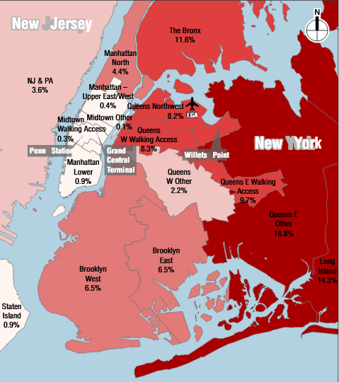
LaGuardia had about 25 million O&D passengers in 2017. They disproportionately go to or from Midtown, but it’s not as overwhelming as I thought based on this density map. Here is a precise breakdown, lumping together both locals (33%) and visitors (67%):

In Manhattan and western Queens “Walking access” means half a mile from a commuter rail stop or from the 7 train; there is no attempt to track walk access to the N or W trains. In Eastern Queens it means half a mile from any subway stop.
About half of the passengers get to or from the airport by taxi, and another 20% are dropped off or picked up in a car. Only 6.2% use public transportation, and another 5.6% use a shared ride such as a hotel shuttle.
Among employees, the situation is different. I expected employees to cluster in western and central Queens, but in fact, based on the same categories used for passengers, the largest group is Queens East beyond subway range:
There are 13,000 employees at LaGuardia per Port Authority (compared with about 10,000 per OnTheMap), of whom 40% take transit to work and 57% drive. It goes without saying that the transit options are exceedingly harsh. The connections from Brooklyn require taking a subway through Manhattan (and I don’t think LGA is necessarily important enough to justify a direct bus route from Brooklyn, presumably a merger of the B38 with a Q18/Q47 compromise route to the airport). From Queens beyond subway range they require taking a bus to the subway and then another bus. The implication is that people take transit to the airport out of necessity – that is, poverty – and not because the options are good.
Unfortunately, the implication is also that it’s hard to serve the current employee base by any rail link, even if it’s fare-integrated with the subway (unlike the JFK AirTrain). The origins are too dispersed. The best that can be done is serving one tranche of origins, and letting passengers sort themselves based on commute possibilities.
In some strategic places, a decent two-seat ride can be made available. The M60 bus is not good for passengers, but it is fine for employees since more of them come from Upper Manhattan and the Bronx, and moreover low incomes imply that it’s fine to have a transit : car trip time ratio well in excess of 1 provided it’s not too onerous. Some future rail extensions, not covered in the study, would help with passenger distribution: Triboro RX would help get passengers from the South Bronx, Brooklyn, and parts of Queens to major transfer points at Astoria and Jackson Heights, and Penn Station Access with an Astoria stop would help get eastern Bronx passengers into Astoria with a quick transfer.
The alternatives analyzed
The study mentions a horde of different options for connecting people to the airport, but most only get a few paragraphs followed by an indication that they don’t meet the objectives and therefore should not be considered further. These excluded alignments exist only for i-dotting and t-crossing, such as ferries or whatever Elon Musk is calling his tunnels this year; Port Authority is right to reject them.
The alternatives proposed for further consideration consist of no build, subway extensions, and various air train alignments. Unfortunately, on second pass, the subway extensions are all eliminated, on the same grounds of community impact. This includes the least impactful subway extension, going north on 31st Street and then east on 19th Avenue, avoiding Ditmars (which could host an el).
Instead of a subway extension, the study is recommending an air train. There are many alternatives analyzed: one from Astoria along the Grand Central Parkway, one from Woodside with a connecting to the local M/R trains on the Queens Boulevard Line at Northern Boulevard, one from Jackson Heights, one from Jamaica with a missed connection to the 7, and one from Willets Point as recommended by Cuomo. All but the last are excluded on the same grounds of impact. Any land acquisition appears to be prohibited, no matter how minor.
What went wrong?
The obvious answer to why the study recommends the Willets Point detour is political support. This can be seen in e.g. PDF-p. 150, a table analyzing each of the air train possibilities. One of the criteria is operational concerns. The Jamaica option fails that test because it is so circuitous it would not get passengers between the airport and either Penn Station or Grand Central in thirty minutes. The Willets Point option passes, despite being circuitous as well (albeit less so); it would still not get passengers to Midtown Manhattan in thirty minutes since the 7 is slow, but the study seems to be assuming passengers would take the LIRR, on the half-hourly Port Washington Branch.
This alone suggests political sandbagging. But by itself it doesn’t explain how the study’s assumptions sandbag the options the governor doesn’t favor; after all, there could be many little omissions and judgment calls.
Rather, I propose that the study specifically looked only at nonstop service to the airport. The subway extensions are all proposed as nonstop services from Astoria (either Astoria Boulevard or Ditmars) to the airport, without intermediate stops. Without intermediate stops, the political will to build els above neighborhood streets is diminished, because few people in Astoria have any need to travel to LaGuardia. In contrast, with intermediate stops, the subway extensions would improve coverage within Astoria, serving Steinway and Hazen Streets.
If intermediate stops are desired, then 19th Avenue may not be the best corridor. Ditmars itself is feasible (with some takings), as are 21st and 20th Avenues. Ditmars has the most impact but serves the highest-value location, and can descend to Grand Central Parkway to get to the airport without any tunneling, limiting costs.
Moreover, the impact of els can be reduced by building them on concrete columns rather than all-steel structures. Paris Metro Line 2 opened in 1903, before the First Subway in New York; it has a steel structure on top of concrete columns, and the noise level is low enough that people can have conversations underneath while a train is passing. New Yorkers should be familiar with the reduced noise of concrete structures since the 7 el on top of Queens Boulevard is quiet, but that is an all-concrete structure on a very wide street; Line 2 here follows wide boulevards as well but not so wide as Queens Boulevard, and is moreover a mixture of concrete and steel, and yet manages not to have the screeching noise New Yorkers are familiar with from Astoria, Woodside, and other neighborhoods with els.
Is this study valuable?
Yes and no. Its conclusions should be tossed for their limited scope (nonstop airport access only), questionable assumptions (overreliance on infrequent commuter rail), and political aims (justifying Cuomo’s decision). But some of the underlying analysis, especially of current travel patterns, is useful for the purposes of thinking about systemwide transit expansion. Despite the consideration of an N/W extension, the study does not try to figure out the percentage of travelers whose ultimate origin or destination is near an N/W stop, only near a 7 stop; however, we can make some educated guesses from the map and realize that an N/W extension is of considerable value to passengers.
For employees, the situation is more delicate. The study mentions them but doesn’t try to optimize for them – the aim is to give Cuomo political cover, not to design the best possible public transit for New York. But the dispersal of worker origins means that a single rail link to the airport is unlikely to have much of an effect. Better everywhere-to-everywhere transit is needed. With decent bus connections at Astoria and Jackson Heights, it’s more important to build circumferential transit there (that is, Triboro) than to connect directly to the airport.
A general program of transit expansion would serve both groups. An N/W extension through Astoria with intermediate stops would give the neighborhood better coverage while also connecting the airport with Manhattan destinations, with good transfers to origins on the Upper East and West Sides. Better circumferential transit would then let workers from different parts of the city use the same extension without having to detour through Midtown even if their origins are in the Bronx or Queens.
Can any of this happen? The answer is unambiguously yes. Even in New York, els and at-grade rail is not so expensive. The only real question is whether good transit can happen while the state is governed by a do-nothing administration, headed by a governor who is more interested in a signature project than in improving transportation for his hapless subjects.
Heterogeneity of Preferences
The public transit conversation is full of statements like “passengers don’t like to transfer,” or, in quantified terms, “passengers perceive a minute transferring to be equivalent to 1.75 minutes on a moving vehicle.” But what does this exactly mean? It’s not a statement that literally every passenger has a transfer penalty factor of 1.75. Different passengers behave differently. At best, it’s a statement that the average passenger on the current system has a transfer penalty factor of 1.75, or alternatively that the aggregate behavior of current passengers can be approximated by a model in which everyone has a transfer penalty factor of 1.75. Understanding that different people have different preferences is critical to both the technical and political aspects of transportation planning.
I talked about the heterogeneity of transfer penalties three years ago, and don’t want to rewrite that post. Instead, I want to talk more broadly about this issue, and how it affects various transit reforms. In many cases, bad American transit practices are the result not of agency incompetence (although that happens in droves) but of preferential treatment for specific groups that have markedly different preferences from the average.
Disabilities
The universal symbol of disability is the wheelchair. Based on this standard, every discussion of accessible to people with disabilities centers people in wheelchairs, or alternatively retirees in walkers (who tend to make sure of the same infrastructure for step-free access).
However, disabilities are far broader, and different conditions lead to dramatically different travel preferences. One paper by the CDC estimates that 20% of US adults have chronic pain, and 8% have high-impact chronic pain, limiting their life in some way. People with chronic pain are disproportionately poor, uneducated, and unemployed, which should not be a surprise as chronic pain makes it hard to work or go to school (in contrast, the one unambiguously inborn socioeconomic factor in the study, race, actually goes the other way – whites have somewhat higher chronic pain rates than blacks and Hispanics). Another paper published by BMJ is a meta-analysis, finding that depending on the study 35-51% of the UK population has chronic pain and 10-14% has moderately to severely disabling chronic pain.
I’ve only talked to a handful of people with chronic pain – all of working age – and the best generalization that I can make is that it is impossible to generalize. The conditions vary too much. Some find it more painful to drive than to take transit, some are the opposite. Some have conditions that make it hard for them to walk, some are fine with walking but can’t stand for very long. To the extent the people I’ve talked to have common features, they a) have a strong preference for rail over bus, and b) require a seat and can’t stand on a moving vehicle for very long.
Work status
The best use case for rapid transit is getting people to work in a congested city center at a busy time of day, ideally rush hour. Off-peak ridership is generally cheaper to serve than peak ridership, but this is true for all modes of transportation, and public transit tends to be relatively better at the peak than cars. Per table 2 of the Hub Bound report, as of 2016, 19% of public transit riders entering the Manhattan core do so between 8 and 9 am and 43% do so between 7 and 10 am, whereas the corresponding proportions for drivers are 6% and 18% respectively.
The upshot is that people are more likely to ride public transit if they work a salaried job. This is especially true in the middle class, which can afford to drive, and whose alternative is to work at some suburban office park where car ownership is mandatory. In the working class, the distribution of jobs is less CBD-centric, but the ability to afford a car is more constrained.
The social groups most likely to drive are then neither the working class (which doesn’t own cars anywhere with even semi-reasonable public transit) nor the professional working class, but other social classes. The petite bourgeoisie is the biggest one: small business owners tend to drive, since they earn enough for it, tend to have jobs that either virtually require driving (e.g. plumbers) or involve storefronts that are rarely located at optimal locations for transit, and need to go in and out at various times of day.
Another group that’s disproportionately likely to drive is retirees. They don’t work, so they don’t use transit for its most important role. They take trips to the hospital (which is bundled with issues of disability), which can be served by buses given that hospitals are major job centers and non-work travel destinations, but their other trips tend to be based on decades of socialization that have evolved haphazardly. The urban transit network isn’t likely to be set up for their particular social use cases.
Consensus for whomst?
I bring up small business owners and retirees because these two groups are especially empowered in local politics. When I lived in Sweden, I could vote in the local and regional elections, where I had no idea what the main issues were and who the candidates were; I voted Green based on the party’s national platform, but for all I know it’s not great on Stockholm-specific issues. Figuring out the national politics is not hard even for a newcomer who doesn’t speak the language – there are enough English-language news sources, there’s social media, there are friends and coworkers. But local politics is a mystery, full of insider information that’s never spelled out explicitly.
What this means is that the groups most empowered in local politics – that is, with the highest turnouts, the most ability to influence others in the same constituency, and the greatest ability to make consistent decisions – are ones that have local social networks and have lived in one place for a long time. This privileges older voters over younger voters, and if anything underprivileges people with disabilities, whose ability to form social and political connections is constrained by where they can go. This also privileges people with less mobile jobs – that is, shopkeepers rather than either the professional middle class or the working class.
With their greater local influence, the most empowered groups ensure the transportation that exists is what is good for them: cars. Public transit is an afterthought, so of course there is no systemwide reorganization – that would require politicians to care about it, which interferes with their ability to satisfy the politically strongest classes. But even individual decisions of how to run transit suffer from the same problem when there is no higher political force (such as a strong civil service or a national political force): bus stops are very close together, transfers are discouraged (“we oppose the principle of interchange” said one left-wing group opposed to Jarrett Walker’s bus redesign in Dublin), rail service is viewed more as a construction nuisance than a critical mobility service, etc.
Models for transportation usage take into account the behavior of the average user – at least the average current user, excluding ones discouraged by poor service. However, the political system takes into account the behavior of the average empowered voter. In the case of local politics, this average voter rarely rides public transit. When city political machines run themselves, the result is exactly what you’d think.
Transit Versus Other Transportation Alternatives
Where is private rapid transit? Private companies built the London Underground, the els in New York, the Chicago L, the first line of the Tokyo subway. Construction costs are up since then, but so are ridership (in the second half of 1905, London’s Central line carried 23 million people; today, its annual ridership is 289 million, a sixfold increase) and people’s ability to afford higher fares. In most cities transportation works as an interconnected complex system with little room for a private upstart, but this is not universal. In particular, in San Francisco, a subway under Geary wouldn’t need to interface much with BART or Muni. So how come none of the tech companies in California, which have invested in many different kinds of transportation and haven’t shied from reinventing the wheel, seems interested?
Only in the last week, talking to people at the ecomodernism conference I discussed last post, did I fully understand the answer. It’s sobering: investing in transit isn’t going to let a private company dominate the world. The companies that operate trains around the world by contract, like the MTR and Veolia, make money, but much of that is government subsidies for which they have to compete on level field, and even then their margins are low by the standards of Airbnb, let alone older tech firms like Facebook and Google. With good cost control it’s possible to get a positive return on investment, but it’s on the order of 3%*, which is not what a venture capital fund is looking for. It’s looking for ten different ideas, of which eight will flop, one will tread water, and one will make a windfall. Committing billions upfront to something for low returns with extensive regulatory risk is not really on its radar.
Instead of transit, the business world, by which I mean the constellation of VC, tech, tech media, business media, and new investors, is looking at things that can start small. Uber paved the way, making dirty travel by taxi much easier; more recently, companies have imitated the model for green transportation, first dockless bikes and now e-scooters. A tech press that in 2014 was replete with “Uber, but for ___” turned to dockless by 2017 and scooters this year.
The reaction of most of my green transportation Twitter feed to the newer trends is positive. To the extent people express skepticism, it’s almost always rooted in a leftist disdain for private businesses. The only other criticism I’ve heard, from Eric Goldwyn, is that transportation revolutions require dedicated right-of-way, such as car-dominated roads, grade-separated rapid transit, BRT lanes, separate bike lanes, or the extensive corrals of docked bikes. But even this line recognizes the synergy between dockless bikes or scooters and public transit.
However, synergy does not imply similarity. That rail networks can use bikes to extend their station access radii outside urban cores does not imply that transit is like other green transportation, and certainly does not imply that bikes (let alone scooters) are a substitute for transit. They work at completely different scales.
Transit works at a large scale. I know of a small handful of transit cities below 2 million people, like Karlsruhe, Geneva, and Strasbourg, none of which has the per capita rail ridership of Paris. In the 2 million area, transit cities exist, but rely on total systemwide integration, sometimes (e.g. in Zurich) extending to the open national railway network. There exist some edge cases where a single line can be profitable, like Geary in San Francisco, but the single line is not massively profitable. A 3% return is great for a government that sets its own regulations and can borrow at sovereign rates; for a private business facing regulatory risk, this return is too low to bother with.
Everything else works at a small scale. Cars are self-evidently like that: they’re great at getting people to places where few people want to go or at times when few people travel. At midnight, taxis will handily beat the RER on travel time. At midday, they are slower than a delayed Washington Metro train or a local New York City Subway line. The startup costs are low, too: grading and paving a two-lane road supporting 70-80 km/h (less in rough terrain) is cheap. It will have grade crossings, but outside urban areas, stop signs and road hierarchies are good enough.
However, this is equally true of bikes and scooters. This isn’t as obvious as with cars, since bikes are too slow to work in rural areas less dense than Holland. But the same speed limitation ensures bikes are only useful in relatively small cities. The Netherlands is somewhat unique in having compact cities with sharp boundaries, and even there, people mostly use bikes when they can live close to work (the average urban bike speed is 12.4 km/h). At intercity scale, the train and car dominate.
Bikes clearly scale up to dense cities; Amsterdam’s urban typology is mid-rise, dense enough for the purposes of this question. Scooters most likely are the same – their speeds and total amount of space consumed are similar to those of bikes. Their scaling problem is about distance more than capacity. 12.4 km/h is too slow. Buses in New York are almost as fast, and the average bus trip in the city is 3.5 km, with riders typically using the bus to transfer to the subway.
The problem with the American and Chinese business world’s convergence on dockless bikes and scooters as the next big thing is then that, like New York buses, their main use case is to extend a faster mode of transportation, that is, the train. Without the train, they are not worth much. Ofo is realizing this as it pulls out of the US, Israel, and Australia, focusing on its core market of large Chinese cities and only maintaining an international foothold in a few transit cities like Paris and Singapore.
In contrast, the train without the dockless bike or scooter works quite well. Paris had a perfectly functional transit system in 2017, before dockless came in, and even in 2006, before Velib. This means that the train needs to come first in a city that wishes to reduce its car use and shift trips to eco-friendly modes of transportation. Private businesses won’t build it, unless it’s to extend a preexisting system that they already own (as is the case for the private railroads in Japan).
There is no alternative to a functioning state. To a functioning state, a few billion dollars or euros for a metro line is a serious expense, but one that it can take if the ridership projections are adequate. To a functioning state, VCs that talk about changing the world through scooters are a nuisance to be ignored. The scooters can play a role and the regulations on them shouldn’t be too onerous, but their role is secondary, and the predominant effort in planning should go to fixed routes.
*Assume $2 billion to tunnel under Geary from Union Square to the VA Hospital. This is a little more than $200 million per km, which is normal for a developed country that’s not the United States; figure that better cost control than the average cancels out with abnormally high market wages in San Francisco. Operating costs cluster in the $4-7/car-km; BART is at $5.36 as of 2016 with long cars, and a driverless operation could do somewhat better, so figure 150-meter trains at $30/train-km, or $300 for a one-way run. At 18 base tph, 30 peak tph, annual operating costs are in the $80-90 million/year range. Bus ridership on and parallel to Geary is 110,000/weekday today; without making any assumptions on development, 250,000/weekday, or 75 million/year, is reasonable. Muni is full of transfers, so getting clean revenue/trip data is hard, but the subway in New York charges around $2 per trip, and the Richmond District could probably function without free transfers to Muni without taking too much of a hit to revenue, making $150 million/year in revenue reasonable. (150,000,000-90,000,000)/2,000,000,000 = 3%.
Phased Implementation of Bus Redesign
Jarrett has a good post about the new Auckland bus redesign, which he had been involved in when he worked for international consultancy MRCagney, before he opened his own. He mentions one peculiar aspect of Auckland – namely, that it is so divided by water boundaries that different areas of it have independent surface transit networks – that facilitates gradual implementation. In contrast, in a city with a more connected street network, every route affects every other route, so redesign has to be implemented together, without any intermediate phases. He brings up Brooklyn (together with Queens) as one example of such a connected network, and I feel like I need to explain why a phased approach is appropriate there.
But this is not just about Brooklyn. The question of whether to implement changes abruptly or gradually generalizes to every scale, up to and including the type of regime (democratic, militaristic, communist, etc.). The scope of this post concerns bus networks anywhere. The arguments I bring up in favor of a phased approach in Brooklyn should also give correct answers in other cities, regardless of whether they end up recommending gradualism.
Sharp edges
Jarrett brings up one factor influencing whether phased implementation is appropriate: sharp edges between different parts of the city. In New York, the East River has few road crossings and many rail crossings; only one local bus crosses it in Brooklyn, the half-hourly B39, and only four cross it in Queens.
But even edges that look less sharp than the East River or the Hudson can be so stark so as to permit separate planning on their two sides. The Harlem River is one example: many Bronx buses cross it, but their routes in Manhattan are constrained based on which avenue or street the bridge connects to, so there’s not much scope for creative recombination.
Brooklyn itself has few internal sharp edges. The closest thing to a sharp edge is the combination of Greenwood Cemetery and Prospect Park, separating on one side Park Slope and South Brooklyn and on the other side Flatbush and Southern Brooklyn. A few marginal neighborhoods are sharply divided from the rest of the borough, especially Red Hook. But for those neighborhoods, the question of where in the rest of the borough they should connect to depends on the shape of the rest of the system.
That said, it’s plausible to talk about how the new network would look in various neighborhoods, if there are choke points or generally agreed upon spines. Red Hook is an especially good example, since it has a strong connection to Manhattan via the Brooklyn-Battery Tunnel (hence, our proposed tunnel bus to Lower Manhattan). But as the arguments in comments here over Williamsburg show (and as my constant refrain about the north-south Bed-Stuy routes shows), it’s possible to discuss individual neighborhoods even if they’re more strongly connected, as long as it’s clear that it’s in the context of a greater network.
However, in one aspect, Jarrett and the MTA make a mistake: they treat the edge between Brooklyn and Queens as less sharp than it really is. In the north, the Newtown Creek choke point forces buses to all go up to Long Island City along a single bridge. In the center, a few route mergers passing through Bushwick and Ridgewood (especially the B54/Q55 on Myrtle) are reasonable, but fully integrated planning would not create very many connections. It’s possible to design the network for Brooklyn alone and then notate where Queens connections would happen, just as it’s possible to design a Manhattan network and point out that the M60 goes into Queens.
The subtle issue regarding Brooklyn and Queens concerns what happens in the south. At TransitCenter we were asked about connections to Howard Beach, but when I looked, I ran across a subtle geographic divide. The southeastern margin of Brooklyn and Queens is a series of small peninsulas with weak connections between them: Gerritsen Beach, Mill Basin, Bergen Beach, Canarsie, Starrett City, Spring Creek, Howard Beach, Old Howard Beach. When I crayoned a metro network for Lagos, which has the same problem in the west and northwest, I had to assume new metro bridges connecting various neighborhoods. On a surface transit network in a developed country, such bridges are unlikely to happen, forcing buses to use the main through-routes today, like Flatlands and Linden.
Is it good enough today?
The entire reform versus revolution discourse depends on how bad things are today. It’s unavoidable in discussions of socialism and Marxism. Socialists and even some social democrats hold that mid-20th century social reforms (like the New Deal) saved capitalism from itself, by making the working class’s situation less desperate. As a result, there is a contingent of leftists who call themselves accelerationists, who prefer to make things as bad as they can be (for example, by refusing to back the center-left against the far right) hoping that this would accelerate the revolution.
The “is it good enough today?” principle scales down to any level. When it comes to bus networks, it really asks, how much would the optimal route network differ from today’s situation?
The highly radial buses of San Jose today, Houston before Jarrett’s redesign, and Barcelona before Nova Xarxa all differ greatly from the redesigned networks. This encourages abrupt implementation, in two ways. First, the old routes are generally weak, increasing the pressure to get rid of them. And second, the old routes don’t feed the new grid trunk lines well, whereas the grid trunks feed one another. Nova Xarxa (which is a six-year process, retaining many old lines) has seen its phase 1 lines grow in ridership as each subsequent phase was implemented, making the early stages much less useful than the entire system.
In contrast, Brooklyn is firmly in the good enough basket. This does not mean its current network design is objectively good; it isn’t. But it does mean that most of its key trunk lines should survive redesign with at most light modifications. Among the 15 busiest Brooklyn routes today measured by ridership per km, only three see big changes: the B1 (straightened into a Southern Brooklyn grid), the B82 (cut to Kings Highway, its tails on both sides given to the B6), and the B41 (cut north of the B/Q subway connection at Prospect Park). A few more are merged into longer routes, like the B42 and the B60, but maintain their current route, just with through-service elsewhere. Key grid routes like Lafayette, Church, Nostrand, Avenue M, and Myrtle survive almost unchanged.
The Brooklyn redesign is not predominantly about starting from scratch, since the network today already has the characteristics of an imperfect grid. It’s about consolidating weak and weak-ish routes, straightening some buses that are too circuitous, and switching around buses to serve destinations that have grown stronger since the 1970s redesign. The East New York network in particular has a lot of meanders that should be fixed regardless of what happens anywhere else; the rest of the bus and subway network is good enough that people from East New York can then transfer to it even if increasing trunk frequency happens later.
Future changes
Bus redesigns are not immutable, to be done once in a few decades with long periods of stasis in between. Cities change, and the optimal bus network for 2025 may be different from that for 2019 in some situations. In a city where there’s relative stasis in development intensity, traffic, and any rail trunk, an abrupt change makes more sense. Realistically, such a change would come not when the first phase of a gradual implementation would have been done but when the middle or last phases would have. Thus, if the redesign is a long-lasting product it’s easier to wait for the first phase (which in an abrupt implementation is also the last phase) and not change much afterward.
This relates to California Transit Twitter’s biggest criticism of Jarrett’s San Jose redesign: that it does not incorporate the recent BART extension to Warm Springs. Jarrett unveiled his redesign for VTA in the spring of 2017, expecting BART to be extended from Warm Springs to the San Jose Flea Market at Berryessa by the end of the year, as BART had projected. Based on this expectation, he designed the network around an abrupt implementation, to go into effect shortly after trains would start running to Berryessa. Since then, BART has announced delays to the extension, talking about opening it only at the end of 2019. Trusting BART’s early promises of 2017 opening is an understandable error; Jarrett did not cause the BART timetable slip. But the outcome is that the VTA bus redesign is delayed.
The upshot is that in a city with a rapidly-growing rapid transit network, bus redesigns should be done on a continuous basis, tweaked every time a new subway line opens. The Bay Area is not generally such a city, but BART is expanding into San Jose, so in that part of the region, phased implementation with updates every few years is warranted. By the same principle, a city with rapid changes in where people live and work should expect recurrent changes to its surface transit network; this is less relevant to San Jose, since the growth nodes are the CBD (e.g. the upcoming Google building) and the Apple headquarters in Cupertino, but it’s relevant to cities in which residential areas are commercializing, such as San Francisco with SoMa.
New York, of course, has a static subway system, courtesy of extreme construction costs. It also has a relatively static workplace geography. However, in one respect, it is undergoing rapid change: it is gradually making its subway network accessible. When I say that the optimal networks for 2018, 2022, and 2026 are all different, I say this in reference to upcoming subway accessibility upgrades, as well as potential changes (i.e. de-interlining) that would increase subway frequency at the cost of one-seat rides. In Brooklyn, our plan to get rid of the B25 depends on upcoming accessibility upgrades for Broadway Junction, without which the bus should probably stay as an accessible alternative to the A and C trains. Likewise, our plan to retain the B63 comes from plans to only make the outermost R stations accessible but not the ones in Sunset Park or South Slope.
What about Nova Xarxa?
On two out of three metrics, Barcelona’s layout recommends an abrupt approach: it lacks internal sharp edges, and its preexisting network was too radial to be useful. On the third, it does not: it is rapidly expanding its metro network; however, the implementation of Nova Xarxa as far as I can tell has not been timed for the opening of L9/L10. So why is it phased there?
The fact that the early-phase lines of the network have seen further increases in ridership as the rest of the network has come online suggests that, on purely technical criteria, gradual implementation was not the right choice in Barcelona. However, in political reality, Nova Xarxa could not replace the entire radial network. Most bus routes in Barcelona today are still not Nova Xarxa. The system’s characteristic as an overlay that took over old lines that became superfluous forced it to be done in phases.
Conflicting excuses
In comments, people here have warned that a phased implementation can be an excuse to do nothing: put the few things everyone agrees on in the first phase, do that, and then postpone future phases indefinitely. This is a real risk. However, abrupt change has its own risks as well: it can be used as an excuse not to do low-cost or negative-cost things that can be implemented fast, such as merging the two Myrtle routes, redoing the East New York bus network in advance of the L train shutdown, and opening the Red Hook-Lower Manhattan route.
The upshot is that the question of gradualism seems independent from the question of obstructive bureaucrats and apparatchiks. There may well arise a local situation in which one answer to the main question is less vulnerable to political sabotage than the other, but it depends on idiosyncratic factors and is unlikely to be the case in general.
With the political criteria uncertain, the answer to whether network redesign should be done in one go or in stages should depend only on technical criteria. These differ from city to city and from region to region depending on local physical and urban geography. In New York, they suggest a phased implementation would work; elsewhere, they may not.
Brooklyn Bus Redesign Version 1.2
About two weeks ago, Eric Goldwyn and I unveiled our Brooklyn bus redesign. It consolidates the borough from 550 route-km to about 350, and cuts the number of stops along the surviving lines from 1580 to 706; the increase in speed coming from stop consolidation and other treatments (i.e. bus lanes and prepayment) and the route consolidation together permit doubling the frequency with the same resources available today, guaranteeing that each bus route have at worst 6-minute frequency between 6 am and 10 pm. The first version we released was 1.0, and the version I blogged was 1.1. In this post I’d like to introduce changes as well as explain why we made certain decisions that have been criticized in comments here and elsewhere.
Version 1.2
V1.2 differs from v1.1 in just two ways. First, it was pointed out to me that we made a mistake in the map: the route we proposed for the B6 to take across the structure of the Brighton Line of the subway, at Avenue H, was not in fact a street crossing. At Avenue H the structure goes from trenched to the north to elevated in the south, and as a result the street does not go through. We fixed this error by restoring the present-day route, and also slightly changing the route of the B11 to follow what must be a high-quality bus lane.
And second, months ago, in arguments with former MTA planner Allan Rosen (who comments on blogs by the name BrooklynBus and has his own proposed redesign), there came the question of the route of the B9. Allan was supportive of the idea of running the B9 on Veterans Avenue, taking over what is now a B41 branch, rather than going to Kings Plaza as it does today, legacy of an era when Kings Plaza was a more important shopping destination. I also asked about straightening the route, which currently goes on a combination of Avenues L and M; Avenue M provides a straighter route connecting to the important destinations (the eastern end of the route, and the main drag in Midwood at Avenue M). Allan explained that no, a reroute to Avenue M is not feasible, as east of the heart of Midwood it’s a narrower residential street, forcing the bus to use the wider Avenue L. The only reason the straighter Avenue M route appeared on v1.0 and v1.1 is that I forgot to change it; after we went public with the map, he reminded us.
There are some associated changes to the stop spacing to accommodate the new routes (or, rather, the retention of old routes that we were wrong to try to change before), but overall there is practically no impact on overall trip times. The B9 is a few hundred meters longer than in v1.0 and v1.1, but the cost in on the order of 20 service-hours per weekday, which by itself is a lot lower than my uncertainty in the underlying numbers (which is about 100 hours).
Service-hours vs. fleet requirement
When putting together the redesign, we aimed at one cost metric: service-hours. This is the correct metric for variable bus operating costs, as they are dominated by the driver’s wage (which is hourly, not per km) and to a lesser extent maintenance costs (which are partly distance-based and partly time-based, as the frequent acceleration cycles common to slow bus traffic stress the engine). The MTA costs buses by distance and not time, which is not a bad approximation when all buses are about equally fast, but generates wrong results when the subject of the discussion is speeding up the buses, as we propose.
But there’s one more metric we did not consider: fleet requirement. Our redesign actually saves money there, which should not be a surprise, as it has more off-peak service, which implies less service at the peak. Our 10,000-hour schedule requires a fleet of 1,007 buses, which compares with 1,129 today excluding the MTA Bus-operated B100 and B103 (which look like they require about 40 vehicles between them). Our proposed v1.2 schedule has 7.5% fewer service-hours than today – not because we propose a cut but because we expect future additions and politicized slowdowns to add hours – but 14% fewer buses. The smaller fleet is to be used more intensively and somewhat more efficiently thanks to the removal of short, infrequent routes.
Since the goal is to keep the redesign roughly cost-neutral, it’s likely that overall service-hour figures will rise: higher operating costs will be balanced by slightly lower capital costs, as the MTA will need to procure slightly fewer buses and not need to expand depots for them as much. In 2008-11, the MTA spent $500,000 per bus on procurement; in 2014, this was the cost per standard bus (which is the vast majority of the MTA Bus and NYCT fleet), while articulated buses were $750,000. This is a premium of about 50% over London bus costs.
Overall the fleet requirement looks like a small proportion of the cost. A $500,000 bus, say $600,000 at today’s higher prices, operates for 12 years, and requires a team of about five drivers, each earning around $140,000 a year with benefits. This is just about market wage – San Francisco and Boston, which pay about the same, have trouble finding and retaining drivers; high bus driver wages should be viewed as similar to high wages for oil rig workers, compensating for poor work conditions. Excluding the costs of depot enlargement, the overall exchange rate seems to be about one bus = 40-45 daily service-minutes. At best, our redesign can squeeze maybe 100 extra daily hours out of better fleet utilization.
The Williamsburg issue
As Eric and I have always emphasized in our communications, our redesign is necessarily win-lose – it’s just that there’s overall much more winning than losing. This is true across neighborhoods as well as within neighborhoods. The diciest case is that of Williamsburg, where we are proposing to consolidate a number of routes into 1.5 north-south trunk lines: one is a continuation of the B44 running up Bedford, and the other goes up Graham and thence either Manhattan Avenue (connecting to the G) or McGuinness (a straighter route on a wider street). This guts service to South Williamsburg, especially west of the BQE, where the only remaining stops are the Marcy Avenue J/M/Z subway stop and another stop on Broadway at Bedford.
It’s not an optimal situation. However, it’s a necessary cut, for a number of reasons:
- The existing north-south lines in Williamsburg are for the most part quite weak. The average weekday ridership per route-km in Brooklyn is about 1,100. The Williamsburg routes are at 945 (B43), 613 (B62), 414 (B67), 358 (B48), 225 (B24), and 152 (B32). The strongest two run along the routes that we are retaining for north-south service, but the rest are so weak that consolidation is required; for the same reason, we are replacing the B48 and B69 (which is at 453) in Clinton Hill with a compromise route on Washington.
- The Williamsburg routes are not just weak but also wasteful, measured in ridership per service-hour. Borough average is 55, and the overall strong routes cluster in the 60s, with high ridership balanced by high service. The top three routes are the B74 (98), B1 (82), and B36 (70), serving short-hop trips in Southern Brooklyn. Among the Williamsburg, only the B43 (49) holds up; the B62 (42), B67 (39), B32 (35), B24 (35), and B48 (32) are weak, the last three all falling in the borough’s bottom six.
- The main north-south route in South Williamsburg west of the BQE is Bedford. Unfortunately, a continuous route up Bedford misses the all-important connection to the subway at Marcy. The B62 resolves this issue by detouring to serve Marcy, which slows down through-riders.
- Williamsburg streets are narrow. Even Bedford is only 18 meters wide, comparable to a Manhattan street. Bus speeds are unlikely to be high in such a situation, and bus lanes are guaranteed to be contentious due to the removal of on-street parking and loading access.
- The eastern margins of Williamsburg and Greenpoint are awkwardly just too far away for some people to walk to the subway (Meeker Avenue’s easternmost residential area, at Van Dam, is 960 meters from the nearest bus stop in our plan and 1,370 from the G train), but just close enough that most people will still walk rather than take a bus unless the bus is extremely frequent. Without the travel intensity found in Coney Island and at Kingsborough Community College, there is no hope for the travel volumes justifying very high frequency on the routes there, especially the B1. A frequency-ridership spiral is unavoidable, helping explain the poor performance of the B24 and B48.
The only possible compromise is to keep the B44’s current route on Lee, which in our plan we slightly straightened to reach the Marcy subway station faster. Keeping the northbound direction on Bedford, which serves South Williamsburg more centrally than Lee, is out of the question: south of Flushing Avenue, Nostrand is unambiguously more important, and the northern tail of the B44 is too weak to be allowed to drive the placement of the entire route. The cost of restoring the Lee/Taylor bus stop is small, around 12 daily service-hours, and this can be incorporated into the next version. However, it still only serves the area peripherally, and slows through-riders by around 1.5 minutes each way.
Brooklyn-Queens connections
People have told us that interborough connections are the new hot thing, to replace the borough-by-borough bus planning that currently exists. We are not depicting any on our map beyond what currently exists: one route to JFK, the aforementioned north-south Williamsburg route to Long Island City, and a bunch of east-west routes through Bed-Stuy terminating slightly east of the borough line. We are willing to be convinced otherwise, but so far it seems like adding more connections is difficult, for several unrelated reasons.
Hard boundaries
The Brooklyn-Queens border may not be as stark as the East River or the Harlem River, but it is nonetheless mostly hard. East of the Greenpoint/LIC border, the border follows a polluted industrial creek; the B24 crosses it twice and is very weak, and there’s no good route until the cluster of Grand, Metropolitan, and Flushing around Ridgewood. Metropolitan and Grand do go through, and we indicate them on our map. Flushing doesn’t; there’s no good route in Queens to connect it to except maybe a hybrid of the Q18 and Q47 to LaGuardia, and even that is uncertain.
Beyond Ridgewood, there is another hard boundary consisting of several cemeteries. The B13 goes through today, but is a weak route (473 riders/km, 38/hour) and should be cut to just a north-south subway feeder. To the immediate south of the cemeteries, several Queens buses go through to key connection points in Brooklyn. Only the southernmost zone, around Howard Beach, has weak connections.
Queens is not Brooklyn
Brooklyn is relatively uniformly dense, making a grid with uniformly high frequency tenable. Queens is not. East Elmhurst is several times denser than Queens Village. Central and Eastern Queens have a street hierarchy, in which the list of which streets get bus routes is preordained: Lefferts, Jamaica, Union Turnpike, Main, etc.; it’s not the relatively flat grid hierarchy that characterizes most of Brooklyn. There are multiple town centers to serve, with too sparse a rail network for buses to work purely as a rail feeder. The LIRR has so many stations that there are two distinct optimal maps, one assuming fare and schedule integration with commuter rail and one assuming today’s lack of integration.
What this means is that maybe a uniform 6-minute frequency is not right for Queens. Maybe the larger geographic size of Queens, with longer bus routes, permits slightly lower frequency, say every 8 minutes at the base (maybe even every 10). Combining routes is not always the right approach in this situation; there are going to be frequency-based seams.
Depot locations
There are some potential combinations of Brooklyn and Queens bus routes, most obviously on Avenue, which hosts the B54 and Q55. The B12 could even be combined with the Q56 and Q24 as branches. The Q58, an extremely strong circumferential, could be combined with the B38, the busiest Brooklyn route near its terminus. The problem is that the break points today tend to be very close to bus depots, and often they’re major destinations in their own right, such as the subway connection point at Broadway Junction or at Myrtle/Wyckhoff.
The B54/Q55 combination seems relatively easy, but the rest are more strained. At East New York Depot especially the loss of the easy pullout is unlikely to justify cutting the transfer to the few through-riders.
The City Line problem
At TransitCenter, we were asked specifically about the southernmost part of the Brooklyn/Queens border, covering City Line and Spring Creek on the Brooklyn side and Lindenwood and Howard Beach on the Queens side. The bus network there today is glaring in its gaps: there is no east-west connection south of the Q7 (the B15 looks like a connection on a map, but runs nonstop from Brooklyn to JFK). The street network itself is poorly connected, but even the existing connection at Linden doesn’t host local buses.
And yet, there’s not much room for serious improvements. The B15 could make a stop just over the border on the Queens side, but its route to the airport takes it through a highway with nowhere to stop; a BRT lane with some stops at north-south arteries like Woodhaven might be possible, but would not be a pleasant place to transfer at.
Worse, going on Linden and then southeast toward Howard Beach raises a difficult question: where does such a route go on the Brooklyn side? There are too many options: Gateway Center, New Lots on the 3, Euclid on the A/C. Reverse-branching is out of the question. Of those, probably the best is New Lots – Euclid serves a subway line that Howard Beach can get to more easily without the bus, and Gateway will always be too circuitous compared with driving on the Belt Parkway.
Tweaks vs. redesign
There are tweaks that improve Brooklyn-Queens connectivity, like merging the two Myrtle routes, giving the Brooklyn-JFK route dedicated lanes to facilitate a stop at Woodhaven, and changing the Metropolitan and Grand routes slightly to improve intra-Williamsburg east-west service (already depicted on our map). However, this is not the same as a redesign. In some parts of Brooklyn our proposal is a tweak, for example the east-west routes in Bed-Stuy, but in Southern Brooklyn and East New York we are rationalizing nearly everything into a grid, and in Bushwick and Canarsie we are proposing extensive changes.
Additional routes?
Based on the shape of our proposal, there are a few potential additions. One involves a 16th Avenue north-south route, possibly veering east to follow Cortelyou and Beverly. Another involves an Ocean Parkway bus to Church. A third involves extending the B17 up through Bed-Stuy to provide a second interpolating route between Nostrand and Malcolm X, which is available today (as the B15 and B43) but not on our map. A fourth involves going up Smith Street between Red Hook and Downtown Brooklyn until the subway stops in South Brooklyn are made wheelchair-accessible.
However, all of those add a hefty number of service-hours. Whether they’re tenable depends on how strictly NYC DOT implements our recommendations for dedicated lanes on every bus route. If no bus routes are added on top of the ones that exist today, v1.2 requires 11,050 revenue-hours and 1108 buses. This is still more or less achievable with current resources (it requires about a 1-1.5% increase in costs), but there is no room for any additional routes, or for restoring the B25. And that’s without taking into account compromises on bus stop spacing and bus route reliability.
In contrast, things are rosier if the reliability improvements we prescribe are implemented, and if every bus that needs a dedicated lane (i.e. nearly all of them) gets it even if motorists complain. There’s room in the budget for additional service. The above bus routes, excluding B25 restoration, total about 30 km including some possible tie-ins elsewhere in the system, creating nearly 800 new service-hours, bringing the system to the same place it is today, maybe just 1% short given additional efficiency and fleet savings.
And if higher ridership brings in more revenue for the same expense, there should be room for more service increases. The network in v1.2 could support maximum 5-minute peak headways on all routes for 210 more hours, which should not be hard to accommodate even with more routes. Going down to 4-minute peak headways requires another 370 hours, and going to 5-minute off-peak headways requires another 890.
To do all of this, another 1,300 hours or so are needed net of efficiency gains. To keep the subsidy per rider constant, this requires a 12% gain in overall linked trips, which isn’t outlandish (it would still leave Brooklyn with less bus ridership than at the 2002 peak). Making such expansion cost-neutral is harder: a linked trip nets about $2 in revenue, and this expansion would cost about $95 million annually, and then the required growth in ridership, 47.5 million, is 25% over Brooklyn’s unlinked bus ridership. It still looks achievable but very ambitious, relying on a positive frequency-ridership spiral.
Will this happen?
Some variant of a bus redesign will definitely happen. It’s in vogue in the US right now, and the MTA is taking this as an excuse to rationalize its bus service, which has accumulated a lot of oddities and historical artifacts that no longer make much sense.
The question is, will a good redesign happen? That I don’t know. I believe our redesign is good. The conversations I’ve had with bus planners at the MTA have been positive and suggest to me that, barring political interference, they are likely to come up with good redesigns as well, sharing the same overall characteristics as ours. We are working from the same set of best practices, for the most part.
But then the political question looms large. Physically separated bus lanes and signal priority require the city to give a damn about bus riders. Stop consolidation requires the MTA to stick to a long interstation even if minority of people who are hurt by it (e.g. by having high walk penalties and low wait penalties) complain. All of this requires political appointees at DOT and the MTA to consciously think how they can provide better public transit to the city they serve. Will they deliver?
Our Brooklyn Bus Redesign
Eric Goldwyn and I spent about six months working on a Brooklyn bus redesign. I mentioned some aspects of it before here, on social media, and in blog comments, but not the overall shape. Eric and I gave a pair of presentations about our plan, one two days ago at the MTA in front of senior MTA planners and NYC DOT people and one today at TransitCenter in front of activists and mid-level MTA planners. We have a still-unreleased writeup explaining everything we’re doing with references to both public reports from various cities and peer-reviewed literature. Here I’m going to condense the 8,000-word writeup into a blog post length, going over the main points, including of course the proposed map.
The map, in brief
The depicted version is 1.1. You can see a lower-resolution version 1.0 on Streetsblog, albeit with a different color code (the map we made for the presentation, reproduced on Streetsblog, uses red for the highest-frequency routes and blue for the lowest-frequency ones whereas the Google Earth version linked above is the opposite). It has 353 route-km, down from about 550 today, not including Grand and Metropolitan Avenues, which are Queens bus routes, shown on the map for completeness’s sake, without stopping pattern.
Some tails are cut due to low ridership or duplication of rail:
- The B25 on Fulton goes.
- The B37 on Third Avenue is consolidated into the B63 on Fifth.
- The B45 and B65 are merged into one compromise route.
- The B15 is cut east of the Long-Term Parking JFK AirTrain station (where service is free); ideally it would be cut east of City Line with passengers taking the subway to the AirTrain (as was the case in version 1.0), but I do not expect Port Authority to integrate AirTrain fares with the subway.
- The B41 is cut north of Parkside Avenue, at the transfer to the B/Q.
- Instead of two routes in Bed-Stuy between Nostrand (i.e. B44) and Malcolm X (i.e. B46), today’s B15 and B43, there’s just one route.
- The B57 segment on Court and Smith Streets in South Brooklyn goes, as the subway serves the area in several directions.
- The B39 over the Williamsburg Bridge goes.
- The B32 and B62, providing north-south service through Williamsburg up to Long Island City, are merged into one compromise route.
- The East New York bus network is circuitous (buses go to Gateway Center the long way around) and is straightened here.
- In version 1.0, the B26 on Halsey was cut west of Franklin with a forced transfer to the subway, but the short distance to Downtown Brooklyn argues in favor of continuing to at least Flatbush.
Overall, this is a cut from 54 routes (including the separately-managed MTA Bus routes B100 and B103) to 37. The smaller network is far more frequent. The minimum frequency is,
- Every 6 minutes between 6 am and 10 pm every day.
- Every 10 minutes between 5 and 6 am and between 10 pm and midnight.
- Every 30 minutes between midnight and 5 am; every 20 minutes with timed transfers to the subway is aspirational, but the subway doesn’t run reliably on a timetable overnight for such a system to be viable. The 30-minute night network could potentially involve mini-pulses in Downtown Brooklyn and smaller hubs (like East New York and Bay Ridge).
Routes depicted in red on the Google Maps link, or in blue on the map in the Streetsblog link, have exactly the minimum frequency. Routes depicted in green have higher frequency at the peak; routes depicted in blue on Google Maps or red on Streetsblog have higher frequency peak and off-peak. Higher frequency than the minimum is depicted as “Utica [2/4]” (buses on Utica run every 2 minutes peak, 4 off-peak) or “Avenue U [5/6]” (buses on Avenue U run every 5 minutes peak, 6 off-peak). Peak means 7-9 am and 5-7 pm on weekdays, in both directions; the morning peak is a little earlier and the afternoon peak a little later than the subway peak, but as buses are still mostly subway feeders, an earlier morning peak and a later afternoon peak are justifiable.
Speedup treatments
Pruning the network is not the only or even most important part of bus reform. Buses have to be sped up to be useful for people except as last-resort transit. In interviews about unrelated topics, people have volunteered to me that they do not take trips they used to take due to the degradation in bus speed and reliability. New York City Transit bus ridership peaked in 2002; the fare hike in 2003 led to a small dip in ridership that the mid-2000s oil crisis didn’t quite erase, and then in the recession and subsequent recovery bus ridership crashed. In Manhattan it’s 30% below the 2007 level; in Brooklyn it’s 20% below the 2007 level, with buses extending the subway or letting people connect to a better line (like the B41 and B35) particularly hit.
The current average speed in Brooklyn is about 11 km/h. Excluding limited-stop buses, it’s 10.8. We’re proposing to increase it to 15, even though the redesign is pruning buses in faster areas more than in slower ones. This is using four speedup treatments.
Prepayment
Today, New York prefers to treat off-board fare collection as a special product available only on select buses (i.e. SBS). This should be changed to citywide prepayment, with all-door boarding. German-speaking cities do it; so does San Francisco. Data from San Francisco and from the TRB (PDF-p. 20) suggests a gain of about 2.5-3 seconds per passenger boarding, counting both boarding and alighting time. At Brooklyn’s bus ridership level, this suggests a saving of around 400-450 revenue-hours, or about 4% of total service-hours. This is not a big change, but it helps stabilize the schedule by slowing down the mechanism by which buses bunch.
How to get passengers to pay if not on-board remains an open question; there are several approaches. The Zurich model involves placing a ticket-vending machine (TVM) at every bus stop. While New York severely pays for TVMs on SBS (the RPA says $75,000 per stop), an ATM costs $3,000, so installing the required infrastructure need not cost a lot. But more commonly, passengers can board freely if they have transfers or unlimited monthlies and pay the driver (potentially after the bus has begun moving) otherwise.
Of note, the bus drivers are particularly interested in prepayment. Eric and I explained the issue in a CityLab article a few months back: the drivers are worried about being assaulted by riders who don’t want to pay.
Stop consolidation
About 60% of the time saving in our plan relative to current practices comes from stop consolidation. I discussed the issue here, and our forthcoming report has references to many studies in the literature optimizing stop spacing for minimum door-to-door travel time. With each deleted stop saving 20-30 seconds (say 25 seconds on average), our proposed stop consolidation, from an average of 220 meters to 490 excluding long tails (i.e. the B15’s long nonstop segment toward JFK) saves around a minute per km, cutting travel time from 5.5 minutes per km to 4.5.
Conceptually, stop spacing should be longer when trips are longer, or when relative density is less uniform. New York City Transit bus trips are short, as many are subway extenders, but relative density is extremely spiky, as a large number of people get off at a few dominant stops at the subway connection points. If the on/off density on a route is uniform, then lengthening the stop spacing means passengers have to walk longer at both ends; but if passengers are guaranteed a connection at one end (because of transfer points with the subway or other buses) then they only have to walk longer at the other end. Based on this principle, Utica and Nostrand get particularly long stop spacing. Conversely, routes with extremely short trips, like the Mermaid route inherited from the B74, have shorter stop spacing.
To improve network legibility, we have tried as far as possible to have buses stop on consistent streets. For example, south of Fulton Street (where it’s awkwardly between Nostrand and Franklin), Bedford Avenue gets a stop on every intersecting bus, including east-west routes but also the diagonal B41.
Every bus stop should have shelter. In Central Florida, North Florida, and London, this costs $10,000 per stop, give or take. Our 707-stop plan (700 in version 1.0) would cost $14 million at this cost. Even at Santa Ana’s higher cost of $35,000, it’s $50 million. NIMBYs who oppose stop consolidation argue that having many stops is necessary for people with disabilities, but people with disabilities would benefit from benches and shelter, without needing to stand for 15 minutes waiting for bunched buses.
Bus lanes
Every bus in an area with congestion should get dedicated lanes. SBS implementations so far, imperfect as they are, have saved around 30 seconds per km in traffic. Physically-separated median lanes should do better; the MTA and NYCDOT have so far avoided them on the theory that local and limited bus routes should coexist on the same route and limiteds should pass locals, but in reality, a single stopping pattern is better, and then there are no drawbacks to physical separation.
On wide streets, this is not a problem. On narrow ones, it is. The real headache is Nostrand, about 25 meters wide building to building, enough for just four lanes. The correct thing to do is a moving lane and a bus lane in each direction, with merchants told to park on side streets. If parking is unavoidable, then a contraflow bus lane, with parking on one side, is also feasible, but less safe for pedestrians (Boulevard Saint-Michel has this configuration and has to remind pedestrians crossing the street to look left).
Two-way buses are essential whenever streets are widely separated, as on avenues, in Brooklyn as well as Manhattan. Nostrand is just more important than Rogers and New York Avenue, where northbound B44s go today; today’s configuration forces east-west buses to make too many stops (the B35 limited makes 4 stops in a kilometer).
Signal priority
Buses should get priority at intersections and not just on the street. The studies we’ve seen find a 4-7% gain, bus only on individual bus routes, not gridded networks. In our proposed trip times we are not assuming any speedup from signal priority, just better timekeeping as more delayed buses get priority to stabilize the schedule. This is a counter-bunching mechanism more than a straight speedup.
A process, not an immutable product
Jarrett Walker’s bus network redesigns tend to come as complete products, changed rapidly from radial low-frequency networks. What we’re proposing is a longer process. Nova Xarxa began implementation in 2012 and is wrapping up now, installing a few routes at a time by cannibalizing parallel routes. The map we’re showing is what we estimate would be a good fit for 2022-3. Beyond that, more subway stops are going to be wheelchair-accessible, making it easier to prune more subway-parallel buses (like the B63).
Gradual implementation means starting from the easier parts of the network. East New York’s current network is so circuitous that straightening it should not be too controversial. Our proposed redesign there is also better at connecting to the 2, 3, 4, and 5 trains and not just the L, which should prove valuable during the L shutdown. In Southern Brooklyn, we are proposing more service, but this could be paired with stop consolidation. Central Brooklyn and Bed-Stuy require the most street redesigns and the most robust frequency network-wide (as they are already transfer-based grids, and nobody transfers at 12-15 minute off-peak frequency) and could be done later; the B25 itself should probably not be eliminated until Broadway Junction is made accessible on the A and C lines.
We are not even wedded to the map as a proposal for 2022. Some variations are always possible, as already seen in the differences between versions 1.0 and 1.1. The biggest addition we can think of is adding a second north-south route through Bed-Stuy: the existing one would be moved from Marcus Garvey to Throop (hitting the subway better), while the B17 could be extended up Troy and Lewis.
Overall, Brooklyn has 10,800 service-hours today. Our redesign uses just 10,000, with a 1% gain in efficiency from location relative to bus depots on top of that. There is room for service increases, or restoration of marginal routes required for political reasons, or slowdowns imposed by political unwillingness to install bus lanes.
Win-lose
In a modern developed country, it’s rare to find win-win situations. The US is blessed with these in transit (i.e. it’s so inefficient at construction it might as well be third-world), but not in urban bus networks. Stop consolidation is a net benefit to the average user of the route, but a few people would still see longer trips, e.g. those living at the exact midpoint between two widely-spaced stops. Route consolidation (as in Ocean Hill) is the same thing.
There are sociopolitical groups that would win out: labor would see higher ridership, reducing the pressure to cut jobs; regular commuters (who generally have low transfer penalties) would see faster trips; people with disabilities that make it difficult for them to stand (as is true of some people with chronic pain) would be able to sit at bus stops and wouldn’t need to sit for long. In contrast, small business owners would sometimes lose the ability to park in front of their stores, and occasional users who usually drive would see longer perceived trips because of stiff transfer penalties.
This is equally true on the level of neighborhoods. Southern Brooklyn generally gains, and Borough Park in general gains an extra north-south route (though this is canceled out by high transfer and access penalty among Haredis: in Israel they just won’t walk longer to better service). East New York sees much more direct routes. Flatbush and East Flatbush don’t see much change in network structure but do gain off-peak frequency. Red Hook gains a direct connection to Manhattan. But then Bed-Stuy loses north-south routes, South Brooklyn’s buses are completely gutted, and Williamsburg loses north-south routes.
A political system based on citywide (or nationwide) ideological groups could find the will to build the network we’re proposing or something like it. Could a system based on local representation, treating retirees and small business owners as a vanguard class, deliver the same? We will see in the next year or two.
