Category: Urban Transit
Corey Johnson’s Report on City Control of the Subway
Yesterday, New York City Council speaker and frontrunner in the 2021 mayoral race Corey Johnson released a document outlining his plan to seek city control of the subway and buses. In addition to the governance questions involved in splitting the state-run MTA between a city-owned urban transit agency and state- or suburb-owned commuter rail, it talks about what Johnson intends to do to improve public transit, befitting a mayor in full control of subway and bus operations. There are a lot of excellent ideas there, but also some not so good ones and some that require further work or further analysis to be made good.
Governance
Johnson proposes to spin the urban parts of the MTA into a new agency, called BAT, or Big Apple Transit. The rump-MTA will remain in control of suburban operations and keep MTA Capital Construction (p. 35), and there will be a shared headquarters. Some cooperation will remain, such as contributions toward cheaper in-city commuter rail fares, but there is no call for fully integrated fares and schedules: the recommendation “all trains and buses in the city will cost the same and transfers will be free” does not appear anywhere in the document.
Johnson also proposes that the BAT board will be required to live in the city and use transit regularly. There is a serious problem today with senior managers and board members driving everywhere, and the requirement is intended to end this practice. Cynically, I might suggest that this requirement sounds reasonable in 2019 but would have been unthinkable until the 2000s and remains so in other American cities, even though it would be far more useful there and then; the off-peak frequency-ridership spiral is nowhere nearly as bad in New York as it is in Washington or Boston.
One strong suggestion in this section involves appointing a mobility czar (p. 36), in charge of the NYC Department of Transportation as well as BAT. Given the importance of the subway, this czar would be in effect the new minister of transportation for the city, appointed by the mayor.
Ultimately, this section tends toward the weaker side, because of a problem visible elsewhere in the report: all of the recommendations are based on internal analysis, with little to no knowledge of global best practices. Berlin has city-controlled transit in full fare union with Deutsche Bahn-run mainline rail, but there has been no attempt to learn how this could be implemented in New York. The only person in New York who I’ve seen display any interest in this example is Streetsblog’s David Meyer, who asked me how DB and Berlin’s BVG share revenue under the common umbrella of the Berlin Transport Association (or VBB); I did not know and although I’ve reached out to a local source with questions, I could not get the answer by his filing deadline.
Finance and costs
This is by far the weakest section in the proposal. The MTA funds itself in large part by debt; Johnson highlights the problem of mounting debt service, but his recommendations are weak. He does not tell New Yorkers the hard truth that if they can’t afford service today then they can’t afford it at debt maturity either. He talks about the need to “address debt” but refrains from offering anything that might inconvenience a taxpayer, a rider, or an employee (pp. 42-43), and offers a melange of narrow funding sources that are designed for maximum economic distortion and minimum visible inconvenience.
In fact, he calls transit fares regressive (pp. 59, 61) and complains about century-long fare increases: real fares have risen by a factor of 2.1 since 1913 – but American GDP per capita has risen by a factor of 7.7, and operating costs have mostly risen in line with incomes.
He brings up ways to reduce costs. In operations these involve negotiations with the unions; even though the report mentions that drivers get paid half-time for hours they’re not working between the morning and afternoon peaks (“swing shift,” p. 48), it does not recommend increasing off-peak service in order to provide more mobility at low marginal cost. There is no mention of two-person crews on the subway or of the low train operator efficiency compared with peer cities – New York City Transit train operators average 556 revenue hours per year, Berlin U-Bahn operators average 829.
In capital construction the recommendations are a mixed bag of good and bad, taken from a not-great RPA report from a year ago. Like the RPA, Johnson recommends using more design-build, in flagrant violation of one of the rules set by global cost reduction leader Madrid. However, to his credit, Johnson zooms in on real problems with procurement and conflict resolution, including change orders (pp. 50-51), and mentions the problem of red tape as discussed in Brian Rosenthal’s article from the end of 2017. He suggests requiring that contractors qualify to bid, which is a pretty way of saying that contractors with a history of shoddy work should be blacklisted; I have heard the qualify-to-bid suggestion from some sporadic inside sources for years, alongside complaints that New York’s current bid-to-qualify system encourages either poor work or red tape discouraging good contractors. Unfortunately, there is no talk of awarding bids based on a combination of technical score and cost, rather than just cost.
Overall the talk of cost is better than what I’ve seen from other politicians, who either say nothing or use high costs as an excuse to do nothing. But it has a long way to go before it can become a blueprint for reducing subway construction costs, especially given the other things Johnson proposes elsewhere in the document.
Accessibility
Another mixed part of the document is the chapter about accessibility for people with disabilities. Johnson recounts the lack of elevators at most subway stations and the poor state of the bus network, featuring drivers who are often hostile to people in wheelchairs. However, while his analysis is solid, his recommendations aren’t.
First of all, he says nothing of the cost of installing elevators on the subway. An MTA press release from last year states the cost of making five stations accessible as $200 million, of $40 million per station. This figure contrasts with that of Madrid, where a non-transfer station costs about €5 million to equip with elevators, and a transfer station costs about €5 million per line served (source, PDF-pp. 11-12). In Berlin, which is not a cheap city for subway construction, the figure is even lower: about €2 million per line served, with a single elevator costing just €800,000.
And second, his proposal for finding money for station accessibility involves using the zoning code, forcing developers to pay for such upgrades. While this works in neighborhoods with ample redevelopment, not all city neighborhoods are desirable for developers right now, and there, money will have to come from elsewhere. For a document that stresses the importance of equality in planning, its proposals for how to scrounge funds can be remarkably inequitable.
That said, in a later section, Johnson does call for installing bus shelters (p. 74). A paper referenced in a TransitCenter report he references, by Yingling Fan, Andrew Guthrie, and David Levinson, finds that the presence of shelter, a bench, and real-time arrival information has a large effect on passengers’ perceived wait times: in the absence of all three amenities, passengers perceive wait time as 2-2.5 times as long as it actually is, rising to a factor of almost 3 for 10-minute waits among women in unsafe areas, but in the presence of all three, the factor drops to around 1.3, and only 1.6 for long waits for women in unsafe areas. Unfortunately, as this aspect is discussed in the bus improvement section, there is no discussion of the positive effect shelter has on people with disabilities that do not require the use of a wheelchair, such as chronic pain conditions.
I do appreciate that the speaker highlights the importance of accessibility and driver training – drivers often don’t even know how to operate a wheelchair lift (p. 63). But the solutions need to involve more than trying to find developers with enough of a profit margin to extract for elevators. Bus stops need shelter, benches, and ideally raised curbs, like the median Berlin tramway stations. And subway stations need elevators, and they need them at acceptable cost.
Bus improvements
By far this is the strongest part of the report. Johnson notes that bus ridership is falling, and recommends SBS as a low-cost solution. He does not stop at just making a skeletal light rail-like map of bus routes to be upgraded, unlike the Bloomberg and de Blasio administrations: he proposes sweeping citywide improvements. The call for bus shelter appears in this section as well.
But the speaker goes beyond calling for bus shelters. He wants to accelerate the installation of bus lanes to at least 48 km (i.e. 30 miles) every year, with camera enforcement and physically-separated median lanes. The effect of such a program would be substantial. As far as I can tell, with large error bars caused by large ranges of elasticity estimates in the literature, the benefits in Eric Goldwyn’s and my bus redesign break down as 30% stop consolidation (less than its 60% share of bus speedup since it does involve making people walk longer), 30% bus lanes, 30% network redesign, 10% off-board fare collection.
There is no mention of stop consolidation in the paper, but there is mention of route redesign, which Johnson wishes to implement in full by 2025. The MTA is in support of the redesign process, and allowing for integrated planning between NYCDOT and the MTA would improve the mutual support between bus schedules and the physical shape of the city’s major streets.
Moreover, the report calls for transit signal priority, installed at the rate of at least 1,000 intersections per year. This is very aggressive: even at the average block spacing along avenues, about 80 meters, this is 80 kilometers per year, and at that of streets, it rises to 200+ km. Within a few years, every intersection in the city would get TSP. The effects would be substantial, and the only reason Eric’s and my proposal does not list them is that they are hard to quantify. In fact, this may be the first time an entire grid would be equipped with TSP; some research may be required to decide how to prioritize bus/bus conflicts at major junctions, based on transportation research as well as control theory, since conditional TSP is the only way to truly eliminate bus bunching.
Reinforcing the point about dedicated lanes, the study calls for clawing back the space given to private parking and delivery. It explicitly calls for setting up truck routes and delivery zones in a later section (pp. 86-87); right now, the biggest complaint about bus lanes comes from loss of parking and the establishment of delivery zones in lieu of letting trucks stop anywhere on a block, and it is reassuring to see Johnson commit to prioritizing public transit users.
Livable streets
This is another strong section, proposing pedestrian plazas all over the city, an expansion of bike lanes to the tune of 80 km (50 miles) a year with an eye toward creating a connected citywide bike lane network, and more bike share.
If I have any criticism here, it’s that it isn’t really about city control of the MTA. The bus improvements section has the obvious tie-in to the fact that the buses are run by the MTA, and getting the MTA and NYCDOT on the same page would be useful. With bikes, I don’t quite understand the connection, beyond the fact that both are transportation.
That said, the actual targets seem solid. Disconnected bike lane networks are not really useful. I would never bike on the current network in New York; I do not have a death wish. I wasn’t even willing to bike in Paris. Berlin is looking more enticing, and if I moved to Amsterdam I might well get a bike.
Conclusion
The sections regarding costs require a lot of work. Overall, I get the impression that Johnson based his recommendations on what he’s seen in the local press, so the suggestions are internal to the city or occasionally domestic; the only international comparisons come from the RPA report or from Eric’s and my invocation of Barcelona’s bus redesign. This works for such questions as how to apportion the MTA’s debt service or how to redesign the bus network, but not so much for questions involving subway capital construction.
New York has a large number of fluent Spanish speakers. It should have no problem learning what Spanish engineers know about construction costs, and the same is true for other communities that are well-represented in the cities, such as Korean-, Russian-, Chinese-, Brazilian-, and Polish-New Yorkers. Moreover, in most big cities that don’t send large communities to New York, such as those of Northern Europe, planners speak English. Johnson should not shy from using the expertise of people outside New York, ideally outside the United States, to get subway construction costs under control.
The speaker’s plan is still a very good first step. The proposed surface improvements to buses, bikes, and street allocation are all solid, and should be the city’s consensus for how to move forward. What’s needed is something to tie all of this together with a plan to move forward for what remains the city’s most important transportation network: the subway.
Frequency-Ridership Spirals
I was reticent to post about this topic; I polled it on Patreon in December and it got just under 50% while the two topics I did blog, difficult urban geography and cross-platform transfers, got 64% and 50% respectively. However, between how close the vote was and the conversation about the current state of the subway in New York, I felt obligated to explain what’s been going on. The short version is that practically the entire change in subway ridership in New York over the last generation or two has come from the off-peak, and the way American cities set their frequency guidelines off-peak amplify small changes in demand, so that a minor setback can lead to collapse and a minor boost can lead to boom.
The good news is that by setting frequency to be high even if it does not look like ridership justifies it, cities can generate a virtuous cycle on the upswing and avoid a vicious one on the downswing. However, it requires the discipline to run good service even in bad times, when bean counters and budget cutters insist on retrenchment. The Chainsaw Al school of management looks appealing in recessions or when ridership is falling, and this is precisely when people who run transit agencies must resist the urge to cut frequency to levels that lead to a positive feedback loop wrecking the system.
Ridership-frequency elasticity
The key to the frequency-ridership spiral is that cutting frequency on transit makes it less useful to passengers, since door-to-door trip times are longer and less reliable. The size of this effect can be measured as the elasticity of ridership with respect to service: if increasing service provision by 1% is demonstrated to raise ridership by e%, we say that the elasticity is e.
Fortunately, this question is fundamental enough to transit that there is extensive published literature on the subject:
- In a classical TRB paper, Armando Lago, Patrick Mayworm, and Matthew McEnroe look at data from several American cities as well as one British one, disaggregating elasticity by frequency, mode (bus or commuter rail), and period (peak or off-peak). The aggregate average value is e = 0.44 for buses and e = 0.5 for commuter rail, but when frequency is better than every 10 minutes, e = 0.22 on average.
- Todd Litman of the advocacy organization VTPI has a summary mostly about fare elasticity but also service elasticity, suggesting e is in the 0.5-0.7 range in the short term and in the 0.7-1.1 range in the long term.
- A paper by Joe Totten and David Levinson includes its own lit review of several studies, including the two above, finding a range of 0.3 to 1.1 across a number of papers, with the lower figures associated with urban service and the higher ones with low-frequency suburban service. The paper’s own research, focusing on transit in Minneapolis, finds that on weekdays, e = 0.39.
One factor that I have unfortunately not seen in the papers I have read is trip length. Frequency is more important for short trips than long ones. This is significant, since when the headway is shorter relative to in-vehicle trip time we should expect lower elasticity with respect to the headway. Waiting 10 minutes rather than 5 minutes for an hour-long trip is not much of an imposition; waiting 30 minutes rather than 15 for the same trip is a greater imposition, as is waiting 10 minutes rather than 5 for a 20-minute trip.
In New York, the average unlinked subway trip is 13.5 minutes long, so the difference between 10 and 5 minutes is very large. Lago-Mayworm-McEnroe cite research saying passengers’ disutility for out-of-vehicle time is 2-3 times as large as for in-vehicle time; the MTA’s own ridership screen states that this penalty is 1.75, the MBTA’s states that it is 2.25, and a study by Coen Teulings, Ioulina Ossokina, and Henri de Groot says that it is 2 in the Netherlands. Figuring that this penalty is 2, the worst-case scenario for off-peak weekday wait time in New York, 10 minutes, has passengers spending more perceived time waiting for the train than riding it, and even in the average case, 10/2 = 5 minutes, it is close. In that case, higher values of e are defensible. Lago-Mayworm-McEnroe have less data about in-vehicle time elasticity and do not attempt to aggregate in- and out-of-vehicle time. But adding everything together is consistent with e = 0.8 relative to speed averaged over the total wait and in-vehicle time, and then e is maybe 0.4 relative to frequency.
The impact of service cuts
If the elasticity of ridership relative to frequency is 0.4, then cutting service by 1% means cutting ridership by 0.4%. If half the operating costs are covered by fares, then revenue drops by 0.2% of total operating expenses, so the 1% cut only saves 0.8% of the total subsidy. Achieving a 1% cut in operating costs net of fare revenue thus requires a 1.25% cut in service, which reduces ridership by 0.5%.
This may not sound too bad, but that’s because the above analysis does not incorporate fixed costs. Rail comes equipped with fixed costs for maintenance, station staffing, rolling stock, and administration, regardless of how much service the agency runs. Lisa Schweitzer uses this fact to defend Los Angeles’s MTA from my charge of high operating costs: she notes that Los Angeles runs much less service than my comparison cases in the US and Europe and thus average cost per train-km is higher even without undue inefficiency. In contrast, bus costs are dominated by driver wages, which are not fixed.
New York does not keep a headcount of transit employees in a searchable format – the Manhattan Institute’s See Through New York applet helps somewhat but is designed around shaming workers who make a lot of money through overtime rather than around figuring out how many people work (say) maintenance. But Chicago does, and we can use its numbers to estimate the fixed and variable costs of running the L.
The CTA has somewhat more than 10,000 workers, split fairly evenly between bus and rail. The rail workers include about 800 working for the director of maintenance, working on the rolling stock, which needs regular servicing and inspections regardless of how often it’s run; 550 working for facilities maintenance; (say) 400 out of 800 workers in administrative capacity like communications, general counsel, purchasing, and the chief engineer’s office; 600 workers in power and way maintenance; nearly 1,000 customer service agents; and 450 workers in flagging, switching, and the control towers. Only 500 workers drive trains, called rapid transit operators or extra board, and there may charitably be another 200 clerks, managers, and work train operators whose jobs can be cut if there is a service cut. A service cut would only affect 15% of the workers, maybe 20% if some rolling stock maintenance work can be cut.
In New York the corresponding percentage is somewhat higher than 15% since trains have conductors. Train operators and conductors together are about 13% of the NYCT headcount, so maybe 20% of subway employees, or 25% with some extra avoidable maintenance work.
What this means is that achieving a 2% cut in subsidy through reducing service requires a service cut of much more than 2%. If only 25% of workers are affected then, even without any frequency-ridership elasticity, the agency needs to cut service by 8% to cut operating costs by 2%.
The Uber effect
The combination of elasticity and fixed costs means that rail ridership responds wildly to small shocks to ridership. For a start, if the agency cuts service by 1%, then operating costs fall by 0.25%. Ridership falls by 0.4%, and thus revenue also falls by 0.4%, which is 0.2% of total operating costs. Thus operating costs net of revenue only fall by 0.05%. The only saving grace is that this is 0.05% of total operating costs; since by assumption fare revenue covers half of operating costs, this saves a full 0.1% of the public subsidy.
Read the above paragraph again: taking fixed costs and elasticity into account, cutting service by 1% only reduces the public subsidy to rail service by 0.1%. A 2% cut in subsidy in a recession requires a brutal 20% cut in service, cutting ridership by 8%. And this only works because New York overstaffs its trains by a factor of 2, so that it’s plausible that 25% of employees can be furloughed in a service cut; using Chicago numbers this proportion is at most 20%, in which case revenue falls one-to-one with operating costs and there is no way to reduce the public subsidy to rail operations through service cuts.
Of course, this has a positive side: a large increase in service only requires a modest increase in the public subsidy. Moreover, if trains have the operating costs of Chicago, which are near the low end in the developed world, then the combined impact of fixed costs and elasticity is such that the public subsidy to rapid transit does not depend on frequency, and thus the agency could costlessly increase service.
This is relevant to the Uber effect – namely, the research arguing that the introduction of ride-hailing apps, i.e. Uber and Lyft, reduces transit ridership. I was skeptical of Bruce Schaller’s study to that effect since it came out two years ago, since the observed reduction in transit ridership in New York in 2016 was a large multiple of the increase in total taxi and ride-hailing traffic once one concentrated on the off-peak and weekends, when the latter rose the most.
But if small shocks to ridership are magnified by the frequency-ridership spiral, then the discrepancy is accounted for. If a shock cuts ridership by 1%, which could be slower trains, service disruptions due to maintenance, or the Uber effect, then revenue falls 1% and the subsidy has to rise 1% to compensate. To cover the subsidy through service cuts requires a 10% cut in service, further cutting ridership by 4%.
Off-peak service guidelines
The above analysis is sobering enough. However, it assumes that service cuts and increases are uniformly distributed throughout the day. This is not the actual case for American transit agency practice, which is to concentrate both cuts and increases in the off-peak.
Unfortunately, cuts in off-peak service rather than at rush hour do not touch semi-fixed labor costs. The number of employees required to run service is governed by the peak, so running a lot of peak service without off-peak service leads to awkward shift scheduling and poor crew utilization. Higher ratios of peak to base frequency correlate with lower total service-hours per train driver: in addition to the examples I cite in a post from 2016, I have data for Berlin, where the U-Bahn’s peak-to-base ratio is close to 1, and there are 829 annual service-hours per driver.
I discussed the fact that the marginal cost of adding peak service is several times that of adding off-peak service in a post from last year. However, even if we take rolling stock acquisition as a given, perhaps funded by a separate capital plan, marginal crew costs are noticeably higher at the peak than off-peak.
In New York, the rule is that off-peak subway frequency is set so that at the most crowded point of each route, the average train will be filled to 125% seated capacity; before the round of service cuts in 2010 this was set at 100%, so the service cut amounted to reducing frequency by 20%. The only backstop to a vicious cycle is that the minimum frequency on weekdays is set at 10 minutes; on weekends I have heard both 10 and 12 minutes as the minimum, and late at night there is a uniform 20-minute frequency regardless of crowding.
Peak frequency is governed by peak crowding levels as well, but much higher crowding than 125% is permitted. However, the busiest lines are more crowded than the guidelines and run as frequently as there is capacity for more trains, so there is no feedback loop there between ridership and service.
The saving grace is that revenue is less sensitive to off-peak ridership, since passengers who get monthly passes for their rush hour trips ride for free off-peak. However, this factor requires there to be substantial enough season pass discounts so that even rush hour-only riders would use them. Berlin, where U-Bahn tickets cost €2.25 apiece in bundles of 4 and monthly passes cost €81, is such a city: 18 roundtrips per month are enough to justify a monthly. New York is not: with a pay-per-ride bonus a single ride costs $2.62 whereas a 30-day pass costs $121, so 23.1 roundtrips per month are required, so the breakeven point requires a roundtrip every weekday and every other weekend.
New York subway ridership evolution
The subway’s crisis in the 1970s reduced ridership to less than 1 billion, a level not seen since 1918. This was on the heels of a steady reduction in ridership over the 1950s and 60s, caused by suburbanization. In 1991, ridership was down to 930 million, but the subsequent increase in reliability and fall in crime led to a 24-year rally to a peak of 1,760 million in 2015.
Throughout this period, there was no increase in peak crowding. On the contrary. Look at the 1989 Hub Bound Report: total subway ridership entering Manhattan south of 60th Street between 7 and 10 am averaged about 1 million, down from 1.1 million in 1971 – and per the 2016 report, the 2015 peak was only 922,000. Between 1989 and 2015, NYCT actually opened a new route into Manhattan, connecting the 63rd Street Tunnel to the Queens Boulevard Line; moreover, a preexisting route, the Manhattan Bridge, had been reduced from four tracks to two in 1986 and went back to four tracks in 2004.
Nor was there much of an increase in mode share. The metropolitan statistical area’s transit mode share for work trips rose from 27% in 2000 to 30% in 2010. In the city proper it rose from 52% in 1990 to 57% in 2016. No: more than 100% of the increase in New York subway ridership between 1991 and 2015 was outside the peak commute hours, and nearly 100% of it involved non-work trips. These trips are especially affected by the frequency-ridership spiral, since frequency is lower then, and thus a mild positive shock coming from better maintenance, a lower crime rate, and perhaps other factors translated to a doubling in total ridership, and a tripling of off-peak ridership. Conversely, today, a very small negative shock is magnified to a minor crisis, even if ridership remains well above the levels of the 1990s.
The way out
Managers like peak trains. Peak trains are full, so there’s no perception of wasting service on people who don’t use it. Managers also like peak trains because they themselves are likelier to ride them: they work normal business hours, and are rich enough to afford cars. That current NYCT head Andy Byford does not own a car and uses the city’s transit network to get around scandalizes some of the longstanding senior managers, who don’t use their own system. Thus, the instinct of the typical manager is to save money by pinching pennies on off-peak service.
In contrast, the best practice is to run more service where possible. In Berlin, nearly all U-Bahn trains run every 5 minutes flat; a few lines get 4-minute peak service, and a few outer ends and branches only get half-service, a train every 10 minutes. At such high frequency, the frequency-ridership spiral is less relevant: an increase to a train every 4 minutes would require increasing service by 25%, raising costs by around 5% (Berlin’s one-person crews are comparable to Chicago’s, not New York’s), but not result in a significant increase in ridership as the shorter headway is such a minute proportion of total travel time. However, New York’s 10-minute off-peak frequency is so low that there is room to significantly increase ridership purely by running more service.
In 2015 I criticized the frequency guidelines in New York on the grounds of branching: a complexly branched system must run interlined services at the same frequency, even if one branch of a trunk line is somewhat busier than the other. However, the frequency-ridership spiral adds another reason to discard the current frequency guidelines. All branches in New York should run at worst every 6 minutes during the daytime, yielding 3-minute frequency on most trunks, and the schedules should be designed to avoid conflicts at junctions; non-branching trunk lines, that is the 1, 6, 7, and L trains, should run more frequently, ideally no more than every 4 minutes, the lower figure than in Berlin following from the fact that the 1 and 6 trains are both local and mostly serve short trips.
Moreover, the frequency should be fixed by a repeating schedule, which should be clockface at least on the A train, where the outer branches would only get 12-minute frequency. If ridership increases by a little, trains should be a little more crowded, and if it decreases by a little, they should be a little less crowded. Some revision of schedules based on demand may be warranted but only in the long run, never in the short run. Ideally the system should aim at 5-minute frequency on every route, but as the N, R, and W share tracks, this would require some deinterlining in order to move more service to Second Avenue.
This increase in frequency is not possible if politicians and senior managers respond to every problem by cutting service while dragging their feet about increasing service when ridership increases. It requires proactive leadership, interested in increasing public transit usage rather than in avoiding scandal. But the actual monetary expense required for such frequency is not large, since large increases in frequency, especially in the off-peak, mostly pay for themselves through extra ridership. The initial outlay required to turn the vicious cycle into a virtuous one is not large; all that is required is interest from the people in charge of American transit systems.
The British Way of Building Rapid Transit
By a more than 2-1 vote among my Patreon backers, the third installment in my series about national traditions of building urban rail is the British one, following the American and Soviet ones. While rapid transit in Britain outside London is even smaller than in the US outside New York, the British tradition is influential globally for two reasons: first, Britain invented the railway as well as urban rapid transit, and second, Britain had a vast empire much of which still looks up to it as a cultural and scientific metropole.
Nonetheless, despite the fact that all rapid transit traditions technically descend from London’s, it is worthwhile talking about the British way. What London built inspired and continues to inspire other cities, but many, mainly in the United States, Japan, and Continental Europe, diverged early, forming distinct tradition. As I noted in the post about the Soviet bloc, Moscow was heavily influenced by British engineering, and its own tradition has evolved separately but began as a more orderly way of reproducing the London Underground’s structure in the 1930s.
In taxonomy, this is called a paraphyletic group. Monophyly means a taxon descending from a single ancestor, for example mammals; paraphyly means a taxon descending from a single ancestor excluding certain monophyletic subgroups, for example reptiles, which exclude mammals and birds, both of which descend from the same common ancestor.
The invention of rapid transit
Like most other things Britain became known for, like constitutional government and colonialism, rapid transit evolved gradually in London. Technically, the first railway in London, 1836’s London and Greenwich, meets the definition of urban rapid transit, as trains made some local stops, ran every 20 minutes, and were grade-separated, running on brick arches. However, it is at best an ancestor of what we think of as rapid transit, since it lacked the really frequent stops of the Underground or the New York els.
The first proper rapid transit line in London, the Metropolitan line, opened in 1863. It, too, lacked some features that are standard on nearly all rapid transit systems today: most importantly, it was not self-contained, but rather had some through-service with intercity rail, and was even built dual-gauge to allow through-service with the Great Western Railway, which at the time had broad gauge. Trains ran every 10 minutes, using steam locomotives; to limit the extent of smoke in the tunnels, the line was not fully underground but had a long trench between King’s Cross and Farringdon.
The Met line and the second Underground line, 1868’s District line, were both built cut-and-cover. However, whereas Met line construction went smoothly, the District line had to carve a right-of-way, as the city did not have adequate wide streets for serving the proposed route. The areas served, Kensington and Chelsea, were even then a tony neighborhood with expensive real estate, and the construction costs exploded due to land acquisition. In today’s terms the Met line cost about $32 million per kilometer and the District $90 million, a record that among the historical lines I know of remained unbroken until New York built the Independent Subway System in the 1930s.
The Met and District met to form a circle, and in general, London loved building circular lines. In addition to what would be called the Circle line until a revision last decade, there were two circles farther out, called the Middle Circle and Outer Circle. These were run by mainline railroads; there was still no legal distinction between the two urban railroads and the mainlines, and through-service and even some freight service continued on the Met well into the 20th century, which the company used as an excuse to delay its merger with the other Underground companies.
Even electric rapid transit took time to take shape. After the bad experience with the District line, there was no more cut-and-cover in Central London. The next line to open, 1890’s Northern line, required the invention of deep boring and electric traction; it was not the first rail line to use electricity, but was the first excluding streetcars. However, while the line looked like a normal self-contained rapid transit line, it was pulled by electric locomotives; electric multiple units only came a few years later, starting haphazardly in Liverpool in 1893 (each car required separate controls) and in the more conventional way on the Chicago L in 1897.
Spontaneous order and radial network design
Among the inventions that came out of London was the radial network design. Unlike the physical inventions like underground rail and electric traction, this was not a deliberate choice. It evolved through spontaneous order, owing to the privately-funded nature of British railways. A British railway had to obtain the approval of Parliament to begin construction, which approval would also permit compulsory purchase of land along the way, but funding was entirely private. An early proposal for an underground railway, an 1860s route running what would later become the Charing Cross branch of the Northern line, was approved but could not secure funding and thus was not built.
The upshot is that with private planning, only the strongest lines were built. The strongest travel demand was to the center of London, and thus the lines were all radial, serving either the City of London or the West End. There was no circumferential service. While there were many circles and loops, these were conceived as reverse-branches allowing some railroads to access multiple Central London terminals, or as ways to join two radials like the Met and District without having to go through the difficult process of turning a train underground in a world in which all trains had to be pulled by locomotives.
The same preponderance of radial lines can be seen in other privately-planned contexts. Today, the best-known example is the matatu network of Nairobi. It is informal transit, but has been painstakingly mapped by urbanists, and the network is entirely radial, with all lines serving city center, where the jobs requiring commuting are.
Despite the private planning, London has only a handful of missed connections between lines: it has eight, but only one, between the Met line and the Charing Cross branch of the Northern line, is a true miss between two lines – the other seven are between parallel outer branches or between two lines that intersect a few times in close succession but only have one transfer (namely, the Bakerloo and Met). This is not because private planners build connections spontaneously – Parliament occasionally demanded some minor route changes, including interchange stations at intersections.
The role of regional rail
Like rapid transit, regional rail evolved in London in a haphazard fashion. The London and Greenwich was a mainline railway and the Met line had some mainline through-service, and even the deep-level tube lines are compatible enough with mainline rail that there is some track-sharing, namely between the Bakerloo line and the Watford DC line. The trench between King’s Cross and Farringon was widened to four tracks and turned into a north-south through-route in the 1870s but then abandoned in the 1920s and only reactivated in the 1980s as Thameslink.
The upshot is that London ended with the bones of a regional rail network but no actual service. The ideal was self-contained Underground lines, so even when connections suggested themselves they were not pursued. For example, the original proposal for an underground line between Euston and Charing Cross involved some through-service to the railways at both ends, but when the line was finally built as the Charing Cross branch of the Northern line it was not connected to the mainline and only took over minor branches in suburban North London.
While British planners did eventually plan for through-service – plans for Crossrail date to World War Two or just afterward – by then London was not innovating but rather imitating. By the war, Berlin had already had two S-Bahn through-lines, Munich was planning one, and Tokyo had three. The modern design for Crossrail is best compared with the RER A, in a city London has treated as its primary competitor for a long time now.
Exporting London’s network design
Moscow was heavily influenced by London early on. Later on, Singapore and Hong Kong both drew on British engineering expertise. London’s status as the first city to build rapid transit may have influenced Moscow, but by the 1920s New York had surpassed it in city size as well as urban rail ridership. Moscow’s drawing on London was as I understand it accidental – the chief engineer happened to have London connections – but in Singapore, Hong Kong, Australia, and so on the relationship is colonial, with extensive cultural cringe.
In all of these non-British cities, the British design as exported was cleaner. What I mean is, the systems have a radial structure like London, but the radii are cleaner in that two lines will generally cross just once, especially in Moscow; it’s not like London, where the Central line is always north of the District line, meeting once in a tangent at Bank and Monument, or where the Victoria line and Northern line cross twice.
Another cleaner aspect is the transfer experience. Singapore and Hong Kong both make extensive use of cross-platform transfers between otherwise perpendicular lines; London only does sporadically, on the Victoria line.
A third aspect is uniformly wide interstations. London’s average interstation is about 1.25 km, which is what I think of as the standard because it is very close to the average in Tokyo and Mexico City as well, and at the time I started tracking this statistic in the late 2000s, the Chinese systems were still small. Moscow’s average is 1.7 km, and Singapore’s is similar. Hong Kong is actually divergent there: the MTR mixes core urban lines averaging about the same as in London with the more widely-spaced historically mainline East and West Rail lines and the airport express.
The relative paucity of circumferential rail is hard to judge in the export cases. Moscow came up with the idea for the Circle Line natively; there is an urban legend that it was accidentally invented by Stalin when he left a coffee cup on the map and it stained it in the shape of a circle. Hong Kong doesn’t have much circumferential rail, but its geography is uniquely bad for such service, even more so than New York’s. Singapore does have a Circle Line, but it’s one of the two worst-designed parts of the MRT, with a reverse-branch (the other one is the self-intersecting, connection-missing Downtown Line).
At the same time, it’s worth viewing which aspects British-influenced systems are getting rid of when designing cleaner version of the Underground. The most important is regional rail. Singapore has none: it has a legacy narrow-gauge rail line to Malaysia, but has never made an effort to take control of it and develop it as an urban regional rail line.
Another negative aspect exported by London is the preponderance of deep boring. I made the same complaint when discussing the Soviet bloc: while London is poor in wide arterials that a cut-and-cover subway could go underneath, Moscow is rich in them, and the same is true of Singapore.
Does this work?
London invented rapid transit as we know it, but it did so gradually and with many seams. In some sense, asking if this works is like asking if rapid transit as a technology works, for which the answer is that it is a resounding success. But when it comes to the details, it’s often the case that London has accidental successes as well as accidental mistakes.
In particular, the fact that London almost invented regional rail is a source of endless frustration and extensive retro-crayon. The Met line is almost a 19th-century Crossrail, the Widened Lines are almost a 19th-century Thameslink, and so on. Instead, as time went on the trend has been toward more self-contained lines, which is good for reliability but not when there are self-contained slow tracks of mainlines to hook into, as is planned for Crossrail and as has sporadically been the case for the Watford DC line.
The British focus on radial systems has generally been good. To the extent London has underused metro lines, it’s not because they are poorly-routed as some of the lines in Paris are, but because they serve areas that have many urban rail lines and not a lot of population density; London is not a dense city, going back to the Victorian era, when it standardized on the rowhouse as the respectable urban housing form rather than the mid-rise apartment of Continental Europe or New York.
To the credit of British-influenced planning, Singapore has managed to fit a circumferential line into its system with good connections, just with an awkward reverse-branch. London’s own circumferential transit, that is the Overground, misses a large number of Underground connections due to its separate origin in freight bypasses and mainline rail reverse-branches, where Parliament saw no point in requiring interchange stations the way it did on the Tube. However, the cleaner version seen in Singapore only misses connections involving the Downtown Line, not the Circle Line.
What is perhaps the worst problem with the British style of design is the construction cost. The Northern line was not expensive – in today’s terms it cost around $35 million per km, give or take. However, after WW2 a gap opened between the cost of cut-and-cover and bored metros. The Milan method for cut-and-cover built a subway for around $45 million per km a few years before London bored the Victoria Line for $110 million. Britain exported its more expensive method, which must be treated as one factor behind high construction costs in Singapore, Hong Kong, Australia, and New Zealand; in New Zealand the regional rail tunnel is expensive even as electrifying the system was not.
In the future, cities that wish to build urban rail would be wise to learn from the network design pioneered by London. Urban rail should serve city centers, with transfers – and as in the subsequent refinements of cities that adapted London’s methods to their own needs, there should be some circumferential transit as well. But if mainlines are available, it would be wise to use them and run trains through on the local tracks where available. Moreover, it would be unwise to conduct deep boring under wide streets; elevated or cut-and-cover construction is well-suited for such avenues, causing some street disruption but producing considerable less expensive lines.
Where Line 2 Should Go Depends on Where Line 1 Goes
A city that is building a rapid transit network piecemeal has to decide on priorities. There are tools for deciding where to build the first line, such as looking at the surface transit network and seeing what the busiest corridor is. These are relatively well-understood. In this post I’d like to focus on where to build the second line, because that question depends not only on the usual factors for where to build transit, but also on how the first line is expected to change the network. This is relevant not only to cities that are building a new rapid transit system, but also to cities that have such a network and are adding new lines one at a time: the usual tools can straightforwardly suggest where to build one line, but figuring out where to build a second line requires some additional work.
A toy model
Consider the following city, with its five busiest buses, labeled A-E from busiest to fifth busiest:

Let’s stipulate that there’s a wealth of arterial roads radiating in the right directions, and no motorways entering city center, so the exceptions to the rule that trains should go where the busiest buses are don’t apply. Let’s also stipulate that the other buses in the city don’t affect the internal ranking of the first five much – so if there are a bunch of north-south buses close to route C not depicted on the map, they’re not busy enough to make it busier than route A.
Clearly, based on the A > B > C > D > E ranking, the top priority for a first rapid transit line is A. Not only is it the busiest bus but also it is parallel to the second busiest.
But the second priority is not B, but C. The reason is that a rapid transit line on A captures east-west traffic, and then from the eastern and western neighborhoods people on route B are likely to walk south or ride a circumferential bus to get to the train. In the presence of a subway underneath the arterial carrying route A, the strongest bus corridor will almost certainly become C, and thus planners should aim to build a subway there as their second line, and begin design even before the first subway opens.
Fourth Avenue in Vancouver
Vancouver already has a rapid transit system, with three SkyTrain lines. However, the issue of the second line crops up when looking at remaining bus corridors and future subway plans. The strongest bus route is by far Broadway, which had higher ridership than the buses that became the Millennium and Canada Lines even when those lines were planned. The Millennium Line was only built first because it was easier, as it is elevated through the suburbs, and the Canada Line because Richmond demanded a SkyTrain connection.
Fortunately, Broadway is finally getting a subway, running from the Millennium Line’s current terminus at VCC-Clark to Arbutus, halfway toward the corridor’s natural end at UBC. The question is, what next? The second busiest bus corridor in Vancouver is Fourth Avenue, where the combined ridership of the 4, 44, and 84 buses and the part of the 7 that is on Fourth exceeds that of any corridor except Broadway; only Hastings, hosting the 95 and 160, comes close.
And yet, it is obviously wrong to plan any subway on Fourth Avenue. Fourth is half a kilometer away from Broadway; the 44 and 84 are relief for the 99 on Broadway. TransLink understands it and therefore there are no plans to do anything on Fourth – the next priority is extending the Expo Line farther out into Surrey or Langley, with the exact route to be determined based on political considerations.
Regional rail and subways in New York
In New York, two commonly-proposed subway extensions, down Nostrand and Utica, are closely parallel. The fact that they are so close to each other means that if one is built, the case for the other weakens. But these two corridors are so strong it is likely that if one is built, the second remains a very high priority. The only subway priority that is plausibly lower than the first of the two and higher than the second, regardless of which of Utica and Nostrand is built first, is a 125th Street crosstown extension of Second Avenue Subway.
But a more serious example of one future line weakening another occurs for regional rail. The top priority for regional rail in New York is four-tracking the tunnels to Penn Station under the Hudson; based on this priority, organizations that look beyond the next gubernatorial or congressional election have come up with farther-reaching proposals. Here, for example, is the map from the RPA’s Fourth Regional Plan:
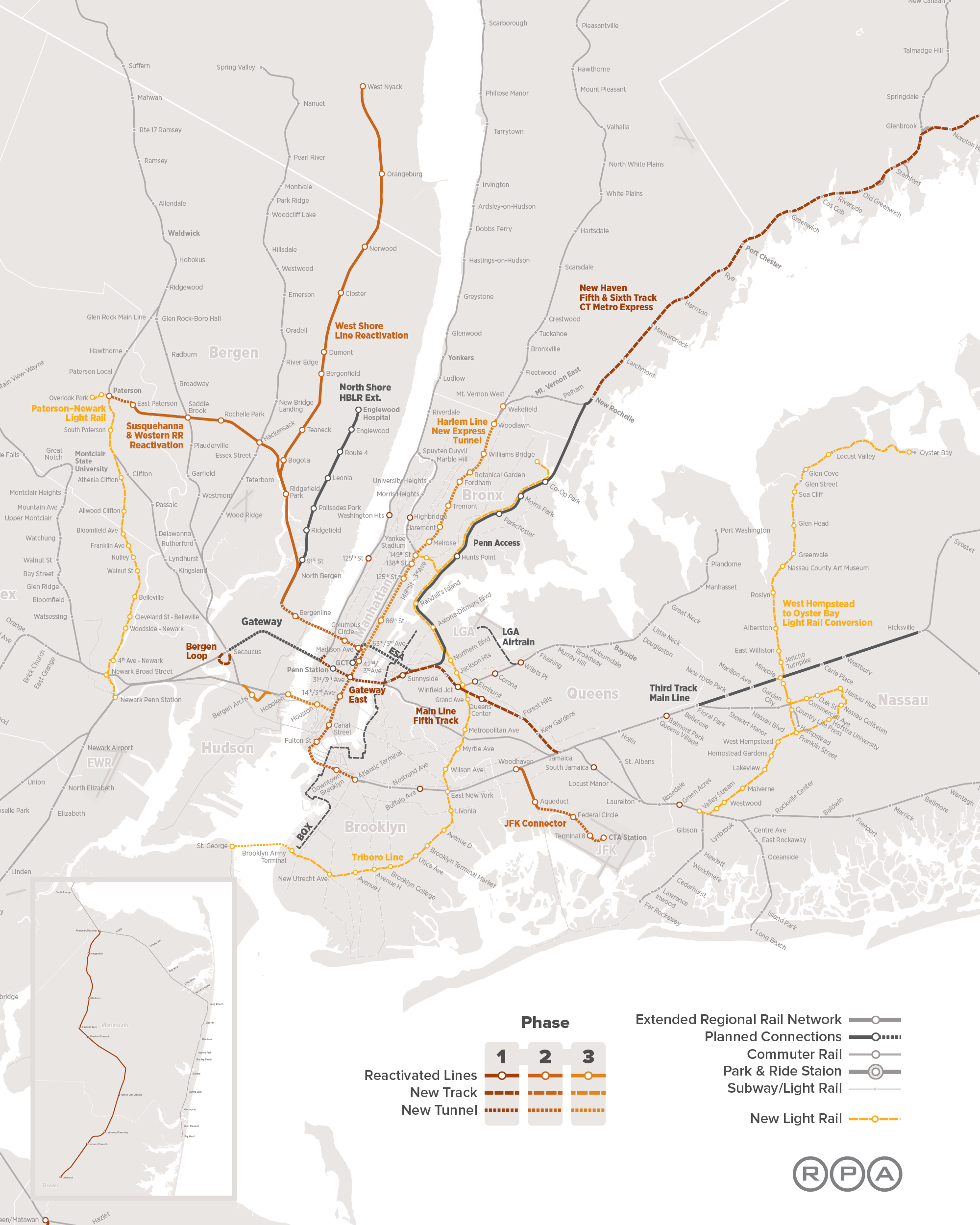
In addition to four-tracking the North River Tunnels under the aegis of the Gateway project, the RPA calls for two additional two-track tunnels under the Hudson, in phases 2 and 3 of its proposal. Both are to feed Midtown: the phase 2 tunnel is to connect regional rail lines to be reactivated with Columbus Circle, Grand Central, and other destinations in the city, and the phase 3 tunnel is to then carry the same line out of the city and back into New Jersey via Hoboken and the existing commuter lines serving southern and southwestern suburbs.
The logic, as I understand it, is that Midtown is the core of the New York region, and so it is the most important to connect there. I don’t know if this is what the RPA was thinking, but I asked at an IRUM meeting in 2010 why all plans involve connections to Midtown rather than Lower Manhattan and was told Lower Manhattan was not as important a business district.
The toy model has one fixed city center and varying outlying areas, the opposite of the situation here. Here, my criticism is of plans that serve the dominant city center while ignoring the second most important center. The total number of jobs in Midtown is 800,000 whereas Lower Manhattan has 250,000 – but Lower Manhattan is more compact, so a single station at Fulton with several exits can plausibly serve the entire area, whereas Midtown has areas that are too far from both Penn Station and Grand Central. The next pair of tracks should serve Midtown, but the pair after them should serve Lower Manhattan, to ensure good coverage to both business districts.
The Soviet Bloc Way of Building Rapid Transit
Based on positive feedback from Patreon backers, I am expanding my post about the American way of building rapid transit into a series covering various national traditions. The Soviet bloc’s tradition is the most globally widespread, as Soviet advisors trained engineers in the USSR’s entire sphere of influence, ranging from just east of the Iron Curtain to North Korea. It is especially fascinating as it evolved independently of Western and Japanese metro-building traditions, from its origins in Moscow in the 1930s.
Like the American tradition, the Soviet tradition has aspects that are worth emulating and ones that are not. But it’s useful to understand where the design aspects come from. It’s especially interesting as Moscow has influences from London, so comparing where the Russians did better and where they did worse is a good case study of adapting a foreign idea to a different national context. Similarly, China imported Russian ideas of how to build metro networks while making considerable adaptations of its own, and I hope to cover China more fully in a future post, discussing there too how the tradition changed in the transmission.
Technical characteristics
The Soviet way is characterized by four major features:
Wide station spacing: the average interstations on the systems in question are all long. Moscow’s is 1.7 km, and for the most part cities in the former USSR with metros have similar interstations; in this table, length is in the row labeled 1 and number of stations in the row labeled 3. This is also true of the metro systems in China and North Korea, but in the Eastern European satellite states it’s less true, with Prague and the newer lines in Budapest averaging not much more than 1 km between stations.
Very little branching: Soviet lines do not branch, with a small handful of exceptions. Moscow’s only branching line, Line 4, is unique in multiple ways, as it was redesigned with American influence after Nikita Khrushchev’s visit to the United States. Eastern European satellite state metros do not branch, either, in contrast with contemporary postwar Western European networks like those of Stockholm and Milan. China has more branching, albeit less than Western and Japanese systems of comparable scope.
Radial network design: what I call the Soviet triangle, while not really a Soviet invention (it has antecedents in Boston and London), became a rigid system of network design in the communist bloc. Subway lines all run as rough diameters through the disk of the built-up area, and meet in the center in a triangle rather than in a three-way intersection in order to spread the load. Moscow adds a single circular line to the mix for circumferential travel, subsequently refined by a second and soon a third ring. Here, China diverges significantly, in that Beijing has grid elements like parallel lines.
Deep boring: Soviet and Soviet-influenced metro networks run deep underground. Traditionally, there was limited above-ground construction, for reasons of civil defense; in Moscow, only Line 4 is shallow, again due to American influence.
London’s long shadow
The decision to deep-bore the Moscow Metro was undertaken in the 1920s and 30s, long before the Cold War and the militarization of Soviet society. It even predates the turn to autarky under Stalin; as Branko Milanovic notes, the USSR spent most of the 1920s trying to obtain foreign loans to rebuild after the Revolution, and only when foreign capital was not forthcoming did it turn to autarky. The NKVD arrested the British advisors, conducted show trials, and deported them for espionage in 1933; the basic technical characteristics were already set then.
In London, the reason for deep boring is that the city has one street wide and straight enough for a cut-and-cover subway, Euston Road hosting the Metropolitan line. In Moscow, such streets are abundant. British planners were exporting both the idea of constructing wide throughfares based on modernist planning principles and that of deep-boring metro lines, an invention based on the context of a city that lacks such throughfares.
The network design bears similarity to what London would have liked to be. London is not as cleanly radial as Moscow, but it clearly tries to be radial, unlike New York or Paris. In general, it’s best to think of the early Moscow Metro as like early-20th century London Underground lines but cleaner – stations spaced farther apart, more regular radial structure, none of the little quirks that London’s had to build around like the Piccadilly line’s since-closed Aldwych branch.
Transit and socialism
The Soviet method of building metros may have originated in British planning, but its implementation throughout the 20th century was under socialist states, in which there was extensive central planning of the entire economy. Decisions regarding who got to live in the cities, where factories were to be sited, what goods were to be produced, and which sectors each city would specialize in were undertaken by the state.
There are several consequences of this political situation. First, by definition all urban development was social housing and all of it was TOD. Housing projects were placed regularly in ever-expanding rings around city center, where all the jobs were. There was no redevelopment, and thus density actually increased going out, while industrial jobs stayed within central cities even though in the capitalist bloc they suburbanized early, as factories are land-intensive.
Of note, some of this central planning also existed under social democracy: Sweden built the Million Program housing in Stockholm County on top of metro stations, creating a structure of density enabling high transit ridership.
But a second aspect is unique to proper communism: there were virtually no cars. Socialist central planning prioritized capital goods over consumer goods, and the dearth of the latter was well-known in the Cold War. At the same time, modernist city planning built very large roads. With no cars to induce people to fight for livable streets nor anything like the Western and Japanese New Left, urban design remained what today we can recognize as extremely car-oriented, before there were any cars. Major Eastern European cities are thus strongly bifurcated, between ones where a centrally planned metro has ensured very high per capita ridership, like Prague, Budapest, and Moscow (and also Bratislava, with trams), and ones where as soon as communism fell and people could buy cars the tramway network’s ridership cratered, like Tallinn, Riga, and I believe Vilnius.
The third and last aspect is that with extensive central planning, the seams that are visible in cities with a history of competition between different transit operators are generally absent. The incompatible gauges of Tokyo and the missed connections of New York (mostly built by the public-sector IND in competition with the private-sector IRT and BMT) do not exist in Moscow; Moscow does have missed connections between metro lines, but not many, and those are an awkward legacy of long interstations.
Of note, the autocratic aspects of socialism do not come into play in Soviet metro design. One would think that the Stalinist state would be able to engage in projects that in democracies are often unpopular due to NIMBYism, such as cut-and-cover subways, but the USSR did not pursue them. China does build elevated metro lines outside city centers, but evidently its plans to extend the Shanghai Maglev Train ran into local NIMBYism. People complained that the separation between the tracks and adjacent buildings was much less than in the German Transrapid standards; the Chinese state’s credibility on environmental matters is so low that people also trafficked in specious concerns about radiation poisoning.
The role of regional rail
The European socialist states all inherited the infrastructure of middle-income countries with extensive proto-industry – in particular, mainline rail. Russia had even completed the Trans-Siberian Railway before WW1. The bigger cities inherited large legacy commuter rail networks, where they operate commuter EMUs.
But while there are many regional trains in the European part of the former Soviet bloc, they are not S-Bahns. There was and still is no through-service, or frequent off-peak service. Connections between the metro and mainline rail were weak: only in 2016 did Moscow start using a circular legacy railway as its second urban rail ring.
The situation is changing, and just as Moscow inaugurated the Central Circle, so is it planning to begin through-service on radial commuter rail, called the Moscow Central Diameters. However, this is early 21st century planning, based on Western European rapid transit traditions.
Does this work?
In the larger cities, the answer is unambiguously yes: they have high transit ridership even when the population is wealthy enough to afford cars. The smaller cities are more auto-oriented, but that’s hardly the fault of Soviet metro planning when these cities don’t have metro networks to begin with; the fault there concerns urban planning more than anything.
Three aspects of Soviet metro planning deserve especial positive mention. The clean radial structure best approximates how single-core cities work, and Moscow and the cities it inspired deserve credit for not wasting money on low-ridership tangential lines, unlike Mexico City or (at smaller scale) Paris. It’s not too surprising that the Soviet triangle in particular exists outside the Soviet bloc, if not as regularly as in Eastern Europe.
The second positive aspect is the use of headway management in Moscow. With no branching and high frequency, Moscow Metro lines do not need to run on a timetable. Instead, they run on pure headway management: clocks at every station count the time elapsed since the last train arrived, and drivers speed up or slow down depending on what these clocks show relative to the scheduled headway between trains. At the peak, some lines run 39 trains per hour, the highest frequency I am aware of on lines that are not driverless (driverless metro technology is capable of 48 trains per hour, at least in theory, and runs 42 in practice on M14 in Paris).
The third and last is the importance of central planning. All public transportation in a metro region should be planned by a single organ, which should also interface with housing planners to ensure there is ample TOD. If anything, one of the bigger failures of Soviet metro planning is that it did not take this concept all the way, neither integrating metros with regional rail nor building a finger plan.
In contrast with these three positive aspects, station design is lacking. As frequent commenter and Patreon supporter Alexander Rapp noted in comments, there are some cross-platform transfers in Moscow; however, the initial three lines do not have such transfers, and instead the transfers became congested early, creating the impetus for the Circle Line. The deep-bored stations are expensive: Line 4 was built cut-and-cover to save money, not out of some cultural cringe toward New York, and today Russia is looking at cut-and-cover stations as a way to reduce construction costs.
Moreover, the wide interstations are too clean. The Underground has long interstations outside Central London and short ones within Central London, facilitating interchanges; while London has eight missed connections, these result from seams on lines running alongside each other or on branches, and only one pair of trunks has no transfer at all, the Metropolitan line and the Charing Cross half of the Northern line. In contrast, the relentlessly long interstations in Moscow lead to more misses.
Cross-Platform Transfers
I did a complex Patreon poll about series to write about. In the poll about options for transit network design the winning entry was difficult urban geography, covered here and here; the runner-up was cross-platform transfers.
Subway users have usually had the experience of connecting at a central station so labyrinthine they either were lost or had to walk long distances just to get to their onward train. Parisians know to avoid Chatelet and New Yorkers know to avoid Times Square. It’s not just an issue for big cities: every metro system I remember using with more than one line has such stations, such as T-Centralen in Stockholm, Waterfront in Vancouver, and Dhoby Ghaut in Singapore. To prevent such connections from deterring passengers, some cities have invested in cross-platform interchanges, which permit people to transfer with so little hassle that in some ridership models, such as New York’s, they are treated as zero-penalty, or equivalent to not having to transfer at all.
Unfortunately, improving the transfer experience is never as easy as decreeing that all interchanges be cross-platform. While these connections are always better for passengers than the alternative, they are not always feasible, and even when feasible, they are sometimes too expensive.
Cross-platform transfer to wherest?
Consider the following two-line subway interchange:

A cross-platform transfer involves constructing the station in the center so that the north-south and east-west lines have platforms stacked one on top of the other, with each east-west track facing a north-south track at the same platform. The problem: do eastbound trains pair up with northbound ones and westbound trains with southbound ones, or the other way around?
In some cases, there is an easy answer. If two rail lines heading in the same general direction happen to cross, then this provides a natural pairing. For example, the Atlantic Branch and Main Line of the LIRR meet at Jamaica Station, where the cross-platform transfer pairs westbound with westbound trains and eastbound with eastbound trains. In Vienna, this situation occurs where U4 and U6 intersect: there is a clear inbound direction on both lines and a clear outbound lines, so inbound pairs with inbound and outbound with outbound.
However, in most cases, the transfer is within city center, and there is no obvious pairing. In that case, there are two options.
Near-cross platform transfer
Some transfers are nearly cross-platform. That is to say, they have trains on two levels, with easy vertical circulation letting people connect between all four directions. In Berlin, there is such a transfer at Mehringdamm between U6 and U7 – and in the evening, when trains come every 10 minutes, they are scheduled to offer a four-way timed interchange, waiting for connecting passengers even across a level change.
Multi-station transfer complex
Singapore, Stockholm, and Hong Kong all offer cross-platform transfers in multiple directions by interweaving two lines for two or three consecutive stations. The three-station variant is as in the following diagram:

At the two outer transfer stations, the cross-platform connections are wrong-way relative to the shared trunk corridor: eastbound pairs with northbound, westbound pairs with southbound. At the middle station, connections are right-way: eastbound pairs with southbound, westbound pairs with northbound.
Of note, the shared trunk has four tracks and no track sharing between the two different subways. I’ve proposed this for the North-South Rail Link. The reason three stations are needed for this and not two is that with only two stations, passengers would have to backtrack in one pairing. Nonetheless, backtracking is common: Stockholm has three stations for the transfer between the Green and Red Lines but only the northern one is set up for wrong-way transfers, so passengers connecting wrong-way in the south have to backtrack, and Singapore has two stations between the East-West and North-South Lines, since one of the pairings, west-to-south, is uncommon as the North-South Line extends just one station south of the transfer.
Why are they not more widespread?
The inconvenience of Parisian transfers is a general fact, and not just at Chatelet. Two lines that meet usually meet at right angles, and the platforms form a right angle rather than a plus sign, so passengers have to be at one end of the train to have easy access to the connecting platforms. The reason for this is that Paris built the Metro cut-and-cover, and there was no space to reorient lines to have cross-platform transfers.
In contrast, both Stockholm and Singapore had more flexibility to work with. Singapore deep-bored the MRT for reasons of civil defense, contributing to its recent high construction costs; the tradeoff is that deep boring does permit more flexibility underneath narrow streets, which all streets are compared with the footprint of a cross-platform interchange. Stockholm used a mixture of construction methods, but the four-track trunk carrying the Green and Red Lines is above-ground in the Old City but was built with a sunk caisson at T-Centralen.
In London, similarly, there are cross-platform transfers, involving the Victoria line. It was built in the 1960s around older infrastructure, but at a few spots in Central London, the tubes were built close enough to old lines to permit cross-platform interchange in one direction (northbound-to-northbound, southbound-to-southbound). In contrast, the surface network, constrained by land availability, does not feature easy interchanges.
While deep boring makes cross-platform transfers easier, either can exist without the other. If I understand this correctly, U6 was built cut-and-cover. There were even weaves on the IND in New York, but they were expensive. Moreover, when two lines are built under a wide street with two branching streets, rather than on something like a grid (or even Paris’s street network, which is gridded at key places like where M4 runs under Sevastopol), cut-and-cover construction can produce a cross-platform transfer. Conversely, such transfers do not exist in all-bored Moscow and are rare in London.
The importance of planning coordination
Ultimately, cross-platform transfers boil down to coordinated planning. Some cities can’t build them even with coordination – Paris is a good example – but absent coordination, they will not appear no matter how good the geography is. Stockholm, Berlin, Vienna, Singapore, and Hong Kong are all examples of centrally planned metro networks, without the haphazard additions of New York (which was centrally planned on three separate occasions) or London (where the early lines were built privately).
Even with coordination, it is not guaranteed cross-platform transfers will appear, as in Moscow. Planners must know in advance which lines they will build, but they must also care enough about providing a convenient transfer experience. This was not obvious when Moscow began building its metro, and regrettably is still not obvious today, even though the benefits are considerable. But planners should have the foresight to design these transfers when possible in order to reduce passenger trip times; ultimately it is unlikely to cost more than providing the same improvements in trip times through faster trains.
Public Transit is Greener Than It Seems
The main way to judge how good public transportation is for the environment is to measure how many car trips it displaces. But in reality, it’s better, and I’d like to explain why. As a warning, this is a theoretical rather than empirical post. My main empirical evidence for it is that European car usage is lower relative to American levels than one might expect given public transit mode shares; in a way, it’s an explanation for why this is the case.
While the explanation relies on changes in land use, it is not purely a story of zoning. The population density in much of my example case of auto-oriented density – Southern California – is well below the maximum permitted by zoning, thanks to the lack of good transit alternatives. Thus, even keeping zoning regimes mostly as they are, public transportation has an impact on land use and therefore on car pollution.
Transit always displaces the longest car commutes
In an auto-oriented city, the limiting factor to the metro area’s density is car traffic. Adding density with cars alone leads to extra congestion. Devin Bunten’s paper entitled Is the Rent Too High? finds that, assuming no changes in travel behavior (including no change in the option of public transit), zoning abolition would actually reduce American welfare by 6%, even while increasing GDP by 6%, because of much worse congestion; optimal upzoning would increase GDP by 2.1% and welfare by 1.4%, which figures are lower than in the Hsieh-Moretti model.
The upshot is that if there is no public transportation, people live at low density just because the alternative is the traffic jams of dense car-oriented cities; Los Angeles is the most familiar American example, but middle-income examples like Bangkok are denser and worse for it. Low density means people travel longer to reach their jobs, by car, increasing total vehicle travel.
In the presence of mass transit, people don’t have to sprawl so far out. Los Angeles’s “drive until you qualify” mentality is such that, if there were room for a million transit users in the inner parts of the region, then no matter which exact group of million people from the five-county area started taking transit, ultimately the shuffle would be such that there would be a million fewer people driving in from Antelope Valley, Victor Valley, and the Inland Empire.
The model
Consider a city that comprises concentric rings, as in the following diagram:
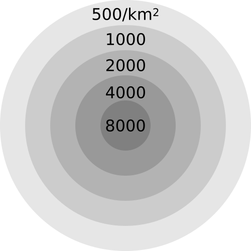
The average density of the city region is 1,660 people per square kilometer, and the weighted density is about 3,400; both figures are typical for the denser American Sunbelt cities, like Los Angeles, San Diego, Miami, and Las Vegas (see table as of 2000 here).
Let us assume that the amount of v-km per inhabitant within each concentric circle is proportional to the outer radius of the circle, so people in the outermost ring drive 5 times as long as those in the inner circle. For concrete numbers, let us assume these figures are 5,000, 10,000, 15,000, 20,000, and 25,000 v-km per year; they average about 13,550 v-km/capita, which is somewhat less than the US average, just below 16,000 per FRED. Note that the outermost ring has 10.8% of the city’s population and 20% of its v-km.
If the modeled density is close to optimal for congestion management given the current state of public transit, then adding transit means subtracting people from the outer ring, not from the inner rings. Say the city builds rapid transit reaching the inner two rings, allowing these areas to densify by exactly 22.5%, which is the ratio of the outer ring’s population to the inner two’s total’s. The total non-auto mode share will rise by 10.8 percentage points, divided between public transit and walking because people in dense, walkable neighborhoods have the option of non-motorized transport; but v-km and the attending greenhouse gas emissions will fall 20%.
If the city keeps growing, the situation is even more extreme. We can add a sixth ring, on the same model, with a density of 250 people per km^2, 30,000 annual v-km per capita, and population equal to 6.6% of the total of the five existing rings or 6.2% of the six-ring total. This 6.6% increase in population raises v-km by 14.7%; in contrast, a transit system capable of supporting this population increase would show an increase of 6.2 points in the non-auto mode share even while avoiding a 14.7% increase in car traffic.
European car usage
We can obtain total v-km per capita by country from a table of traffic accident fatalities: the OECD reports numbers per capita and per v-km, so if we go to PDF-p. 60 of its report, divide the per-capita figure by the per-v-km figure, and multiply by a scaling factor of 10,000, we get v-km per capita. In the US, this figure is just short of 16,000, just as in the FRED graph. The US’s transit mode share for work trips is 5%, so this is about as close as possible to a purely auto-oriented country.
In the Western European countries for which there’s data, including France and Germany, the figure is just short of 10,000. This is close to INSEE’s figure of 756 billion passenger-km in 2016, the difference accounted for by the fact that sometimes multiple people ride in the same car.
The reason people here travel 40% less by car than in the US is not that they instead travel the same distance by public transit. INSEE reports 132 billion passenger-km in buses, trams, and trains excluding TGVs in 2016, and this includes a fair amount of intercity bus and rail travel (9 billion p-km on intercity rail as of 2010 per p. 53 here). Overall, the French modal split is 70% car, 15% transit, 6.7% walk, 4.3% work from home, 4% bike and motorcycle. The American one is 85% car, 5% transit, 2.7% walk, 5.2% work from home. Even relative to the volume of car commuters, the Americans drive 40% further than the French.
Much of my understanding of how provincial France works comes from the Riviera. The Riviera is not the best representative: Alpes-Maritimes is among the richest departments outside Ile-de-France, is among the most conservative, and near-ties Toulouse’s Haute-Garonne and Strasbourg’s Bas-Rhin for third highest provincial transit mode share (13%, behind Rhone’s 23% and Bouches-du-Rhone’s 14%). But it’s a good representative nonetheless of a major provincial city region. There, the coastal towns as well as some interior ones are filled with sprawl, even going up the mountains. There is density in Monaco and Nice, and public transit ridership mostly consists primarily of people who live in Nice and secondarily of people who commute to Monaco. It’s the tramway, the buses, and the general walkability that permit Nice to be what it is, coexisting alongside the offices parks of Sophia-Antipolis and the low-density sprawl up the mountains.
What about zoning?
Devin’s paper is about the economic cost of zoning. Even with the assumption of no change in built form or in transportation modal choice, it does find welfare gains from upzoning, saying that high-demand areas would gain 10-15% in population. This implies that realizing the full environmental gains from public transit requires upzoning areas near stations, to permit the inner two rings in my model city to gain residents who would have otherwise populated a sixth ring.
And yet, the appropriate zoning to some extent already exists. California abolished single-family zoning in 2016 and 2017: accessory dwelling units, or ADUs, are permitted anywhere that residential development is permitted, and homeowners are free to build ADUs in their backyards or carve out ADUs out of their existing buildings. Moreover, in select zones, cities have encouraged transit-oriented development through upzoning or relaxing parking minimums: San Francisco’s TDM process abolished parking minimums anywhere that buildings with at least 10 apartments are permitted, and San Diego slashed parking minimums in an attempt to encourage TOD in North Park along the University Avenue corridor.
The results of TDM in San Francisco are still unclear – the program passed too recently. The same is true of ADUs – existing homeowners react slowly, and new developers may build more two-family houses and fewer single-family houses, but new tract housing would go in the exurbs, not in the coastal cities. But in San Diego the results are clear: developers build more parking than the required minimum at University and 30th, because the public transit option there is a north-south bus that comes every 15 minutes and an east-west bus that comes every 10, which is not actually enough to persuade people who can afford a car not to drive one.
Conclusion
It is difficult to build TOD without public transport. The urban middle class of the 21st century expects travel convenience, which can come in the form of a large rapid transit network or in that of cars and freeways. Thus, even when development sites are available, even in expensive cities, developers sometimes build less than they are allowed to, or insist on more parking than is required, if alternative transportation is inadequate.
The upshot is that adding the layer of transit is likely to stimulate development in the affected urban neighborhoods. The people who would live in this development would not otherwise drive to the outer margin of the city to save on rent, but they would still drive, displacing people would then drive further. The exact details of the churn matter less than the net impact, which is that absent urban transit, cities end up sprawling farther out, forcing people to drive ever-longer distances to work and to other destinations.
A city that succeeds in replacing half of its car trips by public transit, such as Paris, will end up replacing far more than just half of its vehicle-km by transit. Even if the trains are densest within the city core, as is the case even in Paris and other cities with expansive regional rail, the net impact of the transit network is reduction in car travel in the outer parts of the built-up area, where distances are the longest. Planetoscope’s figures for car travel and average distance in Ile-de-France point to a total of just 2,900 v-km/capita in this region – less than one third the national average, and barely one half the national average per car commuter.
The benefit of transit thus goes well beyond the people who use it. The car trips it displaces, even if indirectly, are the ones that cause the worst problems – congestion, pollution, car accidents, greenhouse gas emissions – because they are the longest. Building urban rapid transit can have twice the direct mitigating effect on the harms of car travel as might appear based purely on counting mode choice. With twice the apparent positive environmental impact, mass transit must become a higher priority: nearly every new rapid transit line that’s judged as good must be a top priority for public investment, and many projects that appear marginal must be reevaluated and constructed as planned.
Difficult Urban Geography Part 2: Hilly Topography
This is the second and last part of a series about difficult urban geography for public transit, following a Patreon poll. Part 1 covers narrow streets.
A few years ago, Sandy Johnston remarked that Jerusalem had the least gridded street network he ever saw, and this complicates any surface transit planning there. At the time he was familiar with New England already, but Jerusalem seemed different.
Here are street maps of West Jerusalem and Boston, at the same scale:

Boston has some gridded sub-areas, like Back Bay, but Downtown Boston is as messy as Jerusalem, and on the level of arterial streets, even the rest of the city isn’t too different. The real issue affecting Jerusalem is the hilly topography. Once one gets out of the core of West Jerusalem, the city turns into a mess of hills with internal street networks and poor connectivity between them. Boston maintains a coherent structure of arterial streets that host buses and tramways, with a cobweb structure that feeds the subway efficiently; in Jerusalem, there is little chance of that.
Surface vs. rapid transit
Rapid transit is mostly insensitive to hills. A subway can be built across hills, partly underground, partly elevated. This is the case in Upper Manhattan, where the 1 train runs in a mix of cut-and-cover subway, elevated structures, and mined deep-level tunnel.
Even if the hills slope down into the natural arterial, this is not such a problem. Train stations can incorporate escalator access and have exits at different elevations. New York manages this in the same neighborhood where the 1 runs, in Washington Heights, on the A train. Monaco, on a sloping hill, manages the same at its train station, which is located underground, using elevator access from multiple neighborhoods at different altitudes.
The deep mining required for such construction doesn’t even raise costs that much. If it’s possible to secure horizontal access to the station site, construction becomes easier. Moreover, running elevated through the valleys, as the 1 does in Manhattan Valley and Inwood, cuts costs rather than increasing them.
Evidently, the hilliness of Rome has not prevented the city from building a subway. Line C’s construction costs were very high, but not because of topography but because of millennia-old archeology, which is not really a question of the street network.
Since rapid transit is not affected as much by hills as surface transit, a city with hilly topography should be biased toward rapid transit and against surface transit. This does not mean every flat city should be content with surface transit and every steep city should build subways and els, but it does mean that the population and density thresholds for rapid transit are smaller in hillier cities.
Pod development
Some cities are very hilly, but this does not affect their street networks. San Francisco is famous for this: north of Market, in neighborhoods like Telegraph Hill and Russian Hill, the street grid continues mostly uninterrupted, and the result is famously steep streets. In these cities, transit network planning need not pay much attention to the topography: the only concession that need be made is that agencies should preferentially electrify and run trolleybuses, which have better hill-climbing performance than diesel buses – as San Francisco Muni in fact has, retaining trolleybuses rather than replacing them with diesels as nearly all other American cities have.
The more interesting and difficult case is when the street network respects the hills. It can naturally turn the city’s street layout into that of multiple distinct pods, each surrounding a different hill. This is popular in Jerusalem, especially the settlements within East Jerusalem, but also in some of the newer parts of West Jerusalem. There is not much connectivity between these different pods: there may be a single arterial road with the rest of the city, as is the case for the settlements of Pisgat Ze’ev, Ramot, and Ramat Shlomo.
This kind of pod development is popular in a lot of auto-oriented suburbia. The cul-de-sac is a defining feature of many an American suburb. However, in Jerusalem we see it happen even in the context of a dense city: Jerusalem proper has a density of 7,200 people per square kilometer, and all the settlements in question are within the jurisdiction of the city. It comes out of a combination of modernist central planning (Israeli neighborhoods and cities are designed top-down, rather than expanding piecemeal as in North America or France) and the hilly terrain.
Transit planning for such a city is a chore. In theory, choke points are good for transit, because they have high intensity of travel, where dedicated lanes can make buses very efficient. In practice, choke points work for transit only when there are coherent corridors on both sides for the buses to feed. For example, on a wide river spanned by few bridges, buses can run on the bridges, and then continue on the arterials feeding them on either side. Pod development, in contrast, has no coherent arterials within each pod, just collector roads feeding the main drag. Buses can still run on these streets, but there is no structure to the density that encourages them to serve particular locations and not others.
One solution is a type of transit that is overused in flatter cities: the direct express bus, or open BRT. This bus runs local within each pod and then continues on the arterial, making few stops; it could run as open BRT if the arterial has enough development to justify such service, or as a nonstop express service if it is a full freeway. This form of transit developed for both low-density American suburbia and Israeli pod development towns (where this is buttressed by the tendency of the ultra-Orthodox to travel in large families, in which case transfer penalties are much higher, encouraging low-frequency direct service).
Another solution is to go in the air. Gondola lifts are seeing increasing use in extremely hilly cities, where surface transit must wend its way through switchbacks. Medellin’s Metrocable has a vertical rise of 400 meters. Even in cities that are less steep, gondolas could be a solution if arterial roads are simply not available. In the Arab neighborhoods of East Jerusalem, arterials are rarely available, and gondolas bridging ravines could be of use. Gondolas could also be useful for neighborhoods that are only connected by arterial in a radial rather than circumferential direction – they could again bridge ravines to connect peripheral neighborhoods to one another rather than just to the center.
When Transit Serves the Poor Better Than the Rich
In major transit cities, rich areas have better access to public transportation than poor areas – in fact, what makes them valuable is precisely the easy access to high-paying jobs. Even in cities with bad transit, this is often the case: the transit systems of cities with mode shares in the 10-15% area, like Boston and Chicago, tend to be good at serving city center and little else, and city center workers tend to be richer because professional work tends to cluster whereas low-skill work tends to disperse.
However, there are exceptions to this rule. One, the French Riviera, occurs in a city region with a transit mode share of 13%, comparable to that of American city regions where transit commuters outearn solo drivers. Two more cities are would-be exceptions, for opposite reasons: Providence has no public transit to speak of, but if it invested in creating a transit network, the natural corridors would serve the poor better than the rich; and Vancouver currently has better SkyTrain service in working-class areas than in richer ones, but its current investment is in middle-class areas, and moreover its extensive transit-oriented development has been middle-class as well.
Moreover, all three cities have patterns that generalize. The situation in the Riviera arises because of the classed nature of work there, and generalizes to other places with extensive tourism. That in Providence arises because of the city’s industrial history, and may generalize to other deindustrialized small cities with underutilized legacy rail networks. In Vancouver, part of this situation is because easy rail corridors were more readily available in poorer areas for an essentially random reason, but another part is extensive transit-oriented development concentrating working-class jobs near train stations.
The Riviera: the casinos are walkable, the tech jobs aren’t
Before I go any further, I’d like to stress something important: my observation of the Riviera is largely based on qualitative observations. I don’t know of INSEE data comparable to the Census Bureau’s Means of Transportation to Work by Selected Characteristics table, which could allow me to test the theory that transit ridership in the Riviera skews poor. All I am going by is what I have seen riding trains and occasionally buses as well as what I know of the distribution of jobs.
What I’ve seen is that transit use in the Riviera skews working class. Middle-class Parisians sometimes drive and sometimes take the trains. In contrast, the rich people who I’ve met in the Riviera have as far as I can tell never set foot on the TER. This is despite the fact that the TER is competitive with driving on the area’s main arterial road, the Moyenne Corniche, and is even competitive with the A8 freeway over short distances because the A8 has difficult access time to the relevant exits. Not for nothing, train stations in rich areas have very little ridership: per SNCF’s ridership data, stations in rich areas like Cap d’Ail and Cap Martin-Roquebrune have around 60,000 boardings plus alightings per year, so around 100 weekday boardings, whereas in working- and lower-middle-class Menton the annual total is 1.4 million, or around 2,300 weekday boardings.
The train stations, too, signal poverty. They’re not neglected, but what I’ve seen of them reminded me of working-class suburbs of Paris like Boissy much more than middle-class ones like Bures-sur-Yvette. I was even warned off of spending too much time near Nice’s train station by people echoing local middle-class prejudices. The buses look even poorer: the main east-west bus on the Moyenne Corniche is full of migrant workers.
A key clue for what is happening can be found when selecting a destination station at the fare machines in Menton. As far as I remember, the first option given is not Nice, but Monaco. SNCF’s data table doesn’t include ridership for Monaco, but Wikipedia claims 5.5 million a year without citation, and SNCF’s own blurb claims more than 6 million. Either figure is narrowly behind Nice’s 6.9 million for second in the Riviera and well ahead of third-place Cannes’s 3.2 million – and Nice also has some intercity traffic.
While Monaco’s residents are rich, its commuters are not. There are no corporate jobs in Monaco, because its tax haven status does not extend to corporations with substantial sales outside the city-state, only to local businesses like restaurants and stores. The commuters work low-pay service jobs at hotels and casinos, which they access by train, or perhaps on foot if they live in Beausoleil, as many a domestic service worker in Monaco does.
In contrast, the mass of middle-class jobs cluster in a purpose-built edge city in Antibes, called Sophia-Antipolis. While Antibes itself has a decent transit mode share for residents (10.5%, cf. Menton’s 14.8% and Nice’s 25.4%), and its train station gets 1.6 million annual boardings and alightings, the edge city is unwalkable and far from the train. There’s some traffic in the Riviera, but not enough that middle-class people, who can afford cars, clamor for transit alternatives to their suburban jobs.
The main lesson here is that while the jobs most likely to cluster are usually middle-class city center jobs, working-class tourism jobs cluster as well in regions that have plenty of them. Tourism in the Riviera is the most intense in Monaco specifically and in other coastal cities generally, which encourages travel along the linear corridor, where rail shines. It’s usually hard to see, because for the most part the top tourist destinations are enormous like London, Paris, and New York, but in specialized tourist regions the separation is clearer.
Already we see some evidence of this in Las Vegas, where working-class jobs cluster along the Strip. The city has a monorail, serving the hotels and casinos rather than city center. Were it interested in improving public transportation, it could build an elevated railroad on the Strip itself for better service.
Orlando is another potential example. I named it as a specific example of a region that would be difficult to retrofit for public transit earlier this year, but Disney World remains a major clustering of working-class jobs as well as some middle-class leisure travel. The problem there is that Disney World is far from the train and, unlike the Riviera, does not lie on any line with other potential ridership draws; nonetheless, a train connecting the Orlando CBD, the airport, and Disney World could get some traffic.
Finally, picturesque mountain resorts that happen to lie near rail could see working-class travel on the train to their tourism jobs. Many of these resorts are where they are specifically because a legacy rail trunk happened to be there and the railroad developed the area to generate demand for its services; this is the case for Jasper, Lake Louise, and Banff, all on the Alberta side of the Continental Divide. Aspen is not on a railroad, but is on a road where buses carry working-class commuters displaced by the town’s high housing costs.
Providence: once upon a time, there were factories near the railroad
When I lived in Providence seven years ago, I discussed transit improvements with local urbanists who I met through Greater City: Providence. We talked about improvements to both bus and rail; we had little appetite for the proposed city center streetcar, which has since been downgraded to a proposed frequent bus, and instead talked about improvements to the busiest buses as well as rail service along the main spine of the Northeast Corridor.
The improvements to the busiest buses were already under discussion by the state, including signal priority on key routes and investment in queue jump lanes and shelter amenities. The two routes that were by far the state’s busiest, the 99 on North Main and 11 on Broad, were permanently combined to a single through-running service branded as the R bus, for rapid, with limited-stop service. These routes serve very poor parts of the built-up area, including Pawtucket on the 99 and South Providence on the 11. This is a consequence of the fact that transit in Rhode Island is so bad that only the poor use it, and thus the preexisting busy routes serve poor areas; the best physical bus infrastructure is a bus tunnel to College Hill, the richest neighborhood in the city, but ridership there is weak and therefore the routes were never high priorities for further investment.
The improvements to rail never went beyond blogging; we didn’t have the pull of Boston’s TransitMatters, which itself is better at proposing small improvements than big ones that go up against political obstruction. What we called for was frequent local rail within the urban area: Peter Brassard wrote up the initial proposal, and I added some refinements. The Northeast Corridor, where the service would run, is primarily an intercity rail corridor, but there is room for four tracks in the right-of-way, and while there is freight traffic, it runs at the same approximate speed of a local passenger train.
As we discussed this proposal, Greater City’s Jef Nickerson noted something: what the train would do if implemented is produce better transit service in working-class areas than in more comfortable ones. Unlike the situation with the buses, this was not an intentional process. We would like Rhode Island to improve rail service using an existing right-of-way, which happens to serve Central Falls, Pawtucket, Olneyville, Hartford, Cranston, and Warwick, and miss the East Side and the middle-class suburbs. We realized that the city and inner-suburbs like Pawtucket are poorer than the proper suburbs, but that the train would serve Olneyville but not the East Side seemed like a coincidence.
But is it really a coincidence? Providence developed from east to west. The city was initially founded on the western side of what is now the East Side, sloping down to the river. What is now Downcity was only the second part of the city to develop. It became the center of the city because, as the Northeast Corridor was constructed, it was not possible to provide through-service via the hilly historic core of the city, only via the flatter areas that are now Downcity. A tunnel across College Hill opened in 1908, but by then the city’s basic urban geography was set: the university and port jobs on the East Side, industrial jobs to the west near the rail mainline.
The industrial jobs are long gone now. New England was the first part of America to industrialize and the first to deindustrialize, the mills moving to lower-wage Southern states already in the middle of the 20th century. In very large cities, declining industrial jobs can be replaced with urban renewal serving the middle class: the West India Docks became Canary Wharf, the freight railyards of Gare de Lyon became Bercy, the industrial Manhattan and Brooklyn waterfronts became sites for condos with nice views. In Providence-size cities, no such urban renewal is possible: there is no large mass of middle-class people clamoring to live or work in Olneyville, so the neighborhood became impoverished.
While factories may seem like attractive targets for transit commuting, they’re so clustered, in reality they have not been walkable ever since electrification made open-plan single-story factories viable. Factories are land-intensive and have been since around the 1910s. Moreover, whereas hotels and retail have a reason to locate in walkable areas for their consumption amenities – tourists like walking around the city – factories do not, and if anything depress an area’s desirability through noise and pollution. Working industrial districts are not attractive for transit, but post-industrial ones are, even if they are not gentrified the way so much of London, Paris, and New York have.
A large number of cities share Providence’s history as a medium-size post-industrial city. Nearly every English city except London qualifies, as do the cities of the American Northeast and Midwest below the size class of Boston and Philadelphia. Moreover, all of these cities have undergone extensive middle-class flight, with the racial dimension of white flight in the US but even without it in Britain; thus, the relatively dense neighborhoods, where transit service is more viable, are disproportionately poor. However, the feasibility of mainline rail service to post-industrial neighborhoods is uneven, and depends on local idiosyncrasies.
One positive example I’m more familiar with that’s a lot like Providence is in New Haven. Its best potential local rail route, the Farmington Canal Trail, serves lower middle-class areas like Hamden, and fortunately parallels the busiest bus route, the D-Dixwell. While Hamden is not poor, such service would still lead to the inversion we discussed for Providence, since the rich live in thoroughly auto-oriented suburbs or within walking distance of Yale. The main drawbacks are that it would require replacing an active trail with rail service, and that either street running or brief tunneling would be needed in the final few hundred meters in Downtown New Haven.
Vancouver: easy corridors and TOD for the working class
With a modal share of 21%, Vancouver is in a somewhat higher class of transit quality than the Riviera, Boston, or Chicago. However, it remains a far cry from the numbers beginning with a 3, 4, and 5 seen in New York and in European and Asian transit cities. As with the Riviera, I am somewhat speculating from my own observations, lacking a table that clearly states transit usage by socioeconomic class. However, two factors make me believe that transit in Vancouver serves the working class better than it does the middle class.
The first factor is the corridors served by SkyTrain. The first to be built, the Expo Line, runs in a preexisting interurban right-of-way, with minor greenfield elevated and underground construction; even the downtown tunnel is repurposed from a disused mainline rail branch. It passes through a mixture of working-class and lower middle-class neighborhoods on its way to Surrey, which is working-class and very negatively stereotyped. The second, the Millennium Line, branches east, to lower middle-class suburbs, running on a greenfield el. The third, the Canada Line, is a partially tunneled, partially elevated route through the middle-class West Side to working-class Richmond. Only the fourth line to be built, the Evergreen extension of the Millennium Line, finally serves a comfortable area, as will the next line, the Broadway extension of the Millennium Line deeper into the West Side.
The second factor is the job distribution within Metro Vancouver. Usually, we see concentration of professional jobs in city centers and dispersal of working-class jobs among many stores. In the Riviera this relationship between job concentration and income is only inverted because the working-class jobs are disproportionately in tourism while the professional ones are in an edge city. In Vancouver I don’t believe there is any such inversion, but there is leveling: jobs of either type are concentrated in transit-rich areas. This leveling is the result of extensive commercial transit-oriented development, most notably Metrotown, which has many office jobs on top of Canada’s third largest shopping mall.
The first factor is idiosyncratic. The easy corridors happened to serve poorer areas, on a line from East Vancouver to Surrey. The rich live in North Vancouver, which has a ferry and doesn’t have enough population density for a SkyTrain tunnel; on the West Side, which is separated from downtown by False Creek and was thus late to get a rail connection; and in Port Moody and Coquitlam, which were only connected to SkyTrain recently via the Evergreen extension.
The second factor is more systemic. While American and European cities rarely have big urban shopping malls, Canadian cities are full of them. The Metropolis at Metrotown has 27 million annual visitors, not far behind the 37 million of the Forum des Halles, at the center of a metro area five times the size of Metro Vancouver – and the Metropolis has more than twice the total commercial floor area. In this, Canada is similar to Israel and Singapore, which like Canada have harsh climates, only hot instead of cold. Moreover, Vancouver has encouraged this centralization through TOD: Burnaby built Metrotown from scratch in the 1980s, simultaneously with the Expo Line.
It is difficult to engage in concerted residential TOD for the working class, since it requires extensive housing subsidies. Vancouver’s residential TOD near SkyTrain stations is thoroughly middle-class. However, concerted commercial TOD is easier: hospitals, universities, and shopping centers all employ armies of unskilled workers (the first two also employing many professional ones), the first two while satisfying general social goals for health care and education provision and the last while making the owners a profit on the open market.
Moreover, Vancouver’s TOD within downtown, too, has made it easier to provide transit service for the working and lower middle classes. Where constraints on office towers lead to high office rents, only the most critical jobs are in city centers, and those are typically high-end ones; in the US, it’s common for big corporations to site their top jobs in the center of New York or Chicago or another large city but outsource lower-end office jobs to cheaper cities. In Vancouver, as elsewhere in Canada, extensive downtown commercialization means that even semi-skilled office jobs like tech support can stay in the center rather than at suburban office parks.
Conclusion
Based on my own observations, I believe the Riviera provides better public transportation for the working class than for the middle class, and to some extent so does Vancouver. Providence provides uniformly poor transit service, but its lowest-hanging fruit are in working-class urban neighborhoods.
The reasons vary, but the unifying theme is that, in the Riviera and Vancouver, there is none of the typical big-city pattern in which the rich work in walkable city centers more than the poor (e.g. in New York). In Vancouver it’s the result of commercial TOD as well as a Canadian culture of urban shopping centers; in the Riviera it’s the result of unique dependence on tourism. In Providence the situation is not about job concentration but about residential concentration: lower-income neighborhoods are likelier to arise near rail because historically that’s where industry arose, and all that remains is for Providence to actually run local passenger trains on the mainline.
It is not possible to replicate culture. If your city does not have the tourism dependence of Monaco, or the shopping mall culture of Vancouver, or the post-industrial history of Providence, there’s little it can do to encourage better urban geography for working-class transit use. At best, can build up more office space in the center, as Vancouver did, and hope that this encourages firms to locate their entire operations there rather than splitting them between a high-end head office and lower-end outlying ones. Fortunately, there exist many cities that do have the special factors of the Riviera, Vancouver, or Providence. In such cities, transit planners should make note of how they can use existing urban geography to help improve transit service for the population that most depends on it.
The Red-Blue Connector and the Importance of Connectivity
The Boston rapid transit network has the shape of the hex symbol, #. In Downtown Boston, the two north-south legs are the Green Line on the west and the Orange Line on the east, and the two east-west legs are the Red Line on the south and the Blue Line on the north. The Orange and Green Lines meet farther north, but the Red and Blue Lines do not. The main impact of this gap in systemwide connectivity is that it’s really hard to get between areas only served by the Blue Line, i.e. East Boston, and ones only served by the Red Line, i.e. Cambridge, Dorchester, and Quincy. However, there is a second impact: people who do transfer between the Red and Blue Lines overload one central transfer point at Park Street, where the Red and Green Lines meet. This way, the weak connectivity of the Boston rapid transit network creates crowding at the center even though none of the individual lines is particularly crowded in the center. The topic of this post is then how crowding at transfer points can result from poor systemwide connectivity.
The current situation in Boston
Connecting between the Blue and Red Lines requires a three-seat ride, with a single-stop leg on either the Orange or Green Line. In practice, passengers mostly use the Green Line, because the Orange Line has longer transfer corridors.
Travel volumes between East Boston and Cambridge are small. Only 1,800 people commute from East Boston, Winthrop, and the parts of Revere near the Blue Line to Cambridge, and only 500 commute in the other direction. I don’t have data on non-work travel, but anecdotally, none of the scores of Cantabrigians I know travels to the Blue Line’s service area except the airport, and to the airport they drive or take the Silver Line, and moreover, only two people moved from Cambridge or Somerville to the area, a couple that subsequently left the region for Bellingham. Travel volumes between East Boston and the southern legs of the Red Line are barely larger: 1,200 from East Boston to Dorchester, Mattapan, and Quincy, 1,600 in the other direction, most likely not taking public transit since cars are a good option using the Big Dig.
Nonetheless, this small travel volume, together with connections between East Boston and South Station or Dorchester, is funneled through Park Street. According to the 2014 Blue Book, which relies in 2012 data, transfer volumes at Park Street are 29,000 in each direction (PDF-p. 16), ahead of the Red/Orange connection at Downtown Crossing, where 25,000 people transfer in each direction every weekday. Riders connecting between the Blue and Red Lines are a noticeable proportion of this volume – the East Boston-Cambridge connection, where I believe the transit mode share is high, is around 8% of the total, and then the East Boston-Dorchester connection would add a few more percentage points.
Why Soviet triangles exist
In a number of metro networks, especially ones built in the communist bloc, there are three lines meeting in a triangle, without a central transfer point. This is almost true of the first three subway lines in Boston, omitting the Red Line: they meet in a triangle, but the Green and Orange Lines do not cross, whereas in true Soviet triangles lines meet and cross.
The reason for this typology rather than for the less common one in which all three lines meet at one station, as in Stockholm, is that it spreads transfer loads. Stockholm’s transfer point, T-Centralen, has 184,000 daily boardings (source, PDF-p. 13), almost as many as Times Square, which is served by 14 inbound tracks to T-Centralen’s 5 and is in a city with 5.6 million weekday trips to Stockholm’s 1.1 million. Urban transit networks should avoid such situations, which lead to central crowding that is very difficult to alleviate. Adding pedestrian circulation is always possible, but is more expensive at a multilevel central station than at a simple two-line crossing.
The triangle is just a convenient way of building three lines. As the number of lines grows beyond three, more connectivity is needed. Moscow’s fourth line, Line 5, is a circle, constructed explicitly to decongest the central transfer station between the first three lines. More commonly, additional lines are radials, especially in cities with water constraints that make circles difficult, like Boston and New York; but those should meet all the older radii, ideally away from existing transfer stations in order to reduce congestion. When they miss connections, either by crossing without interchange or by not crossing at all, they instead funnel more cross-city traffic through the existing transfer points, increasing ridership without increasing the capacity required to absorb it.
The way out
The situation is usually hard to fix. It’s much harder to fix missed connections, or parallel lines that diverge in both directions, than to connect two parallel lines when one of these lines terminates in city center, which Boston’s Blue Line does. The one saving grace is that cities with many missed connections, led by New York and Tokyo, also have very expansive networks with so many transfer points that individual interchanges do not become overloaded.
In large cities that do have problems with overcrowded transfer points, including London and Paris, the solution is to keep building out the network with many connections. London tries to weaken the network by reducing transfer opportunities: thus, Crossrail has no connection to Oxford Circus, the single busiest non-mainline Underground station, in order to prevent it from becoming any more crowded, and the Battersea extension of the Northern line deliberately misses a connection to the Victoria line. Paris has a better solution – it invests in circumferential transit, in the form of Metro Line 15 ringing the city at close distance, as well as extensions to Tramway Line 3, just inside city limits.
While the solution always involves investing more in the transit network, its precise nature depends on the city’s peculiar geography. In Paris, a compact city on a narrow river, adding more circles is an option, as is adding more RER lines so that people would be able to avoid difficult Metro-to-RER transfers. In London, the population density is too low and the construction costs are too high for a greenfield circle; the existing circle, the Overground, is cobbled together from freight bypasses and is replete with missed radial Underground connections. Thus, the solution in London has to come from radials that offer alternatives to the congestion of the Victoria line.
In Boston, a much smaller city, the Red-Blue Connector is easier since the Red and Blue Lines almost touch. It only takes about 600 meters of cut-and-cover tunnel under a wide road to continue the Blue Line beyond its current terminus in Downtown Boston and meet the Red Line at Charles-MGH; to first order, it should cost not much more than $100 million. The transfer would not be easy, since the Red Line is elevated there and the Blue Line would be underground, but it would still be better than the three-seat ride involving the Green Line. A competent state government with interest in improving transportation connectivity for its residents – that is, a government that is nothing like the one Massachusetts has – would fix this problem within a few years. Boston is fortunate in not needing painful deep tunneling under a medieval city center like London or hundreds of kilometers of inner suburban tunneling like Paris – it only needs to kick out the political bums, unfortunately a much harder task.

