Category: New York
Assume Nordic Costs
I wrote a post last year proposing some more subway lines for New York, provided the region could bring down construction costs. The year before, I talked about regional rail. Here are touched-up maps, with costs based on Nordic levels. To avoid cluttering the map in Manhattan, I’m showing subway and regional rail lines separately.
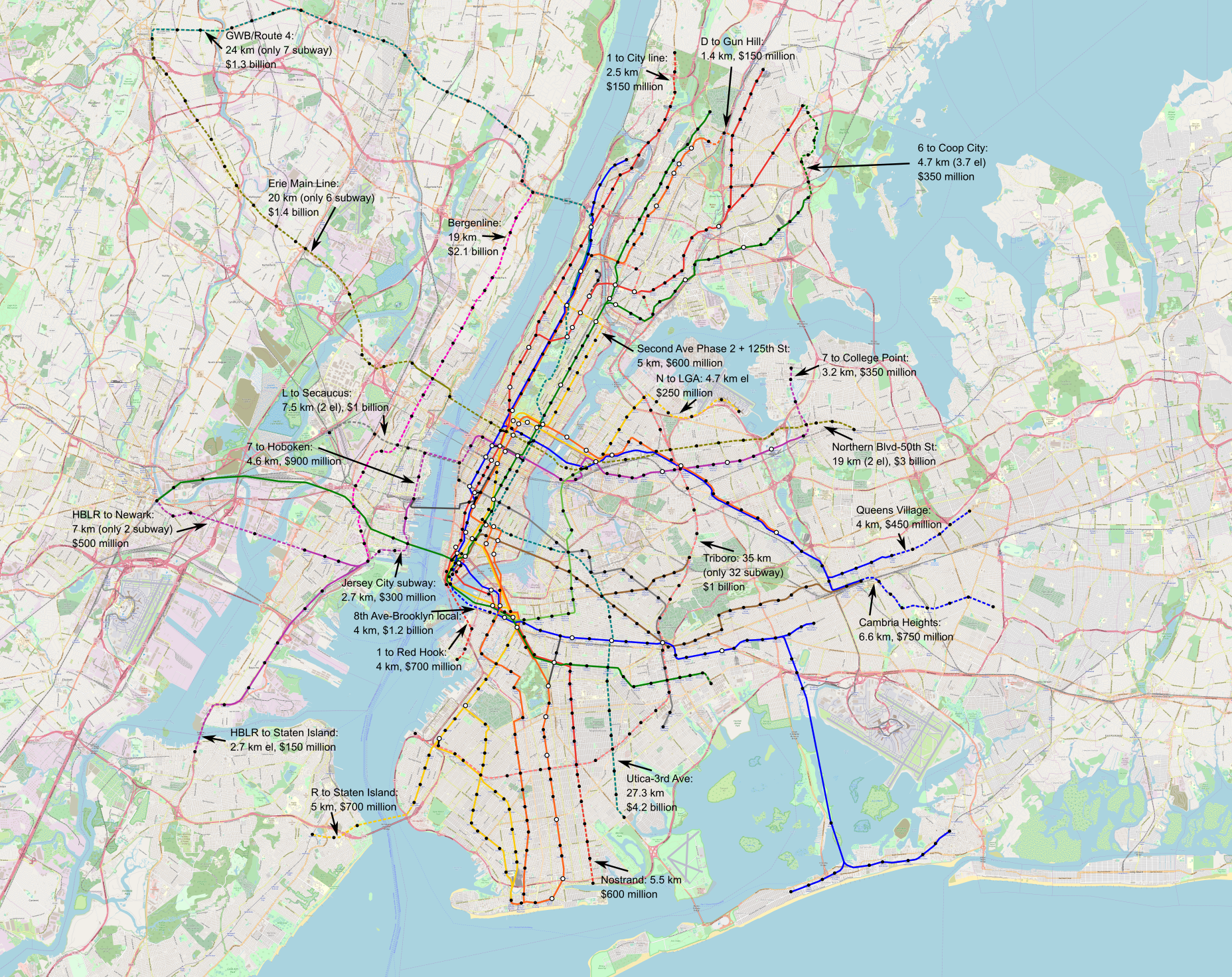

A full-size 52 MB version of the subway map can be found here and a 52 MB version of the regional rail map can be found here.
Subways are set at $110 million per km underground, outside the Manhattan core; in more difficult areas, including underwater they go up to $200-300 million per km, in line with Stockholm Citybanan. Lacking data for els, I set them at $50 million per km, in line with normal subway : el cost ratios. The within-right-of-way parts of Triboro are still set at $20 million per km (errata 5/30: 32 out of 35 km are in a right-of-way and 3 are in a new subway, despite what the map text says, but the costs are still correct).
Overall, the subway map costs $22 billion, and the regional rail one $15 billion, about half as high as the figure I usually quote when asked, which is based on global averages. This excludes the $2 billion for separated intercity rail tracks, which benefit from having no stations save Penn (by the same token, putting the express rather than local lines in the tunnel is a potential cost saving for Crossrail 2). It also excludes small surface projects, such as double-tracking the Northern Branch and West Shore Line, a total of 25 and 30 km respectively, which should be $300-550 million in total, and some junction fixes. There may also be additional infill stations on commuter rail, e.g. at intersection points with new subway extensions; I do not have Nordic costs for them, but in Madrid they cost €9 million each.
The low cost led me to include some lines I would not include elsewhere, and decide marginal cases in favor of subways rather than els. There is probably no need for the tunnel connecting the local tracks of Eighth Avenue and Fulton Street Lines, but at just $1.2 billion, it may be worth it. The line on Northern Boulevard and the Erie Main Line should probably be elevated or in a private right of way the entire way between the Palisades and Paterson, but at an incremental cost of $60 million per km, putting the Secaucus and East Rutherford segments underground can be justified.
In fact, the low cost may justify even further lines into lower-density areas. One or two additional regional rail tunnels may be cost-effective at $300 million per kilometer, separating out branches like Port Washington and Raritan Valley and heading to the airports via new connections. A subway line taking over lanes from the Long Island Expressway may be useful, as might another north-south Manhattan trunk feeding University Avenue (or possibly Third Avenue) in the Bronx and separating out two of the Brighton Line tracks. Even at average costs these lines are absurd unless cars are banned or zoning is abolished, but at low costs they become more interesting.
The Nordic capitals all have extensive urban rail networks for their sizes. So does Madrid: Madrid and Berlin are similar in size and density, but Berlin has 151 km of U-Bahn whereas Madrid has 293 km of metro, and Madrid opened a second Cercanías tunnel in 2008 for around $100 million per km and is planning a third tunnel for next decade (source, PDF-pp. 104-108). Things that are completely ridiculous at American costs – say, any future subway expansion – become more reasonable at average costs; things that are completely ridiculous at average costs likewise become more reasonable at Nordic or Spanish costs.
Stop Spacing and Route Spacing
Six months ago I blogged a model for optimal stop spacing on an urban transit route. These models exist in the published literature, but they assume that the speed benefit of stop consolidation reduces operating costs, which requires introducing new variables for the value of time. My model assumes the higher speed of stop consolidation is plugged into higher frequency, which means only five variables are needed, and only two of them vary substantially between different cities and their networks. The formula is a square root.
In this post, I’m going to extend this formula to optimizing route spacing on a grid.

I’m using mode-neutral language like “vehicle,” but this is really just about buses, because to a good approximation, urban rail networks are never grids. I’m sorry, Mexico City, I know your Metro network does its best to pretend you have an isotropic city, but your three core radial lines are just far busier than the tangential ones.
Optimal stop spacing: a recap
My previous post uses words rather than symbolic language, since there are only five relevant parameters. Here I’m going to use symbols for the variables to make the calculation even somewhat tractable. All units I’m using are base SI units, so speed is expressed in meters per second rather than kilometers per hour, but the dimensional analysis works out so that it’s not necessary to pick units in advance.
- s: stop spacing
- v: walk speed
- p: stop penalty
- d: average distance traveled
- w: walk/wait penalty, expressed as a ratio of perceived walk or wait time to in-vehicle time
- λ: average distance between successive vehicles, or in other words headway in units of distance, not time
The variables v and p are fairly consistent from place to place. The variable w is as well, but may well differ by circumstance, e.g. people with luggage may have a higher walk penalty and a lower wait penalty, and people who are more familiar with the system usually have lower w. The parameter λ is a function of how much service runs on the line, as we will see when we expand to cover route spacing.
A key assumption in this model is that d does not change based on the network. This is a simplification: if s is too low then it will drag down d with it, as people who are discouraged by the slow in-vehicle speed avoid long trips or choose other modes of travel, whereas if s is too high then it will drag d up, as people who have to walk too long to the stop may just walk all the way to their destination if it’s nearby. In Carlos Daganzo’s textbook this situation is resolved by replacing an empirically determined d with the size of the city, assuming travel is isotropic, but the effect is essentially the same as just setting d to be half the length of a square city.
The formula for perceived travel time is

if travel along the line is isotropic, or

if one end of the travel (e.g. the residential end) is isotropic and the other is at a fixed node (e.g. a subway transfer). In either case, in-vehicle time excluding stops is omitted, as it is constant.
The minimum travel time occurs at

if travel is isotropic and

if there is a distinguished node at one end of the trip.
Observe that there is negative interaction between stop consolidation and other aspects of bus modernization. First, higher frequency, as expressed in concentrating service on strong routes, reduces the value of λ and therefore slightly reduces the optimal stop spacing. Second, the model assumes the same penalty w for walking and waiting, but sometimes these two activities have distinct penalties, and then the walk penalty is responsible for the occurrence of w in the denominator in the formula whereas the wait penalty supplies the appearance of w in the numerator. Improving bus stop facilities reduces the wait penalty, pushing the optimal s farther down, even though at the same time it’s cheaper to improve bus stops if there are fewer of them.
The empirically determined values of the five variables in the formula are as follows:
- v is 1.45 m/s in Forde-Daniel, 1.3-1.4 m/s in Bohannon, and 1.38 in TRB Part 4, PDF-p. 16; I take v = 4/3
- p is 25 seconds based on examining the differences in schedules between local and limited buses in New York and Vancouver
- d is 3,360 meters per unlinked trip per the NTD
- w is around 2 for waiting in Fan-Guthrie-Levinson, 2 in general for buses in Teulings-Ossokina-de Groot, PDF-p. 25, 1.75 in the New York MTA’s internal model, 2.25 in the MBTA’s (as mentioned in one of Reinhard Clever’s papers), and a range of 2-3 in Lago-Mayworm-McEnroe; I take w = 2
- λ is single-lane network length (that is, twice the route-length, modulo one-way loops) divided by fleet size in actual use, which is 1,830 meters in Brooklyn today and 1,160 based on what Eric Goldwyn and I recommend
This leads to optimal stop spacing equal to

if travel is isotropic and

if there is a distinguished node. The numbers are slightly lower than in my older post since I’m using a slightly lower walk speed, 1.33 m/s rather than 1.5.
Optimal route spacing: stops at intersection points
Studying route spacing has to incorporate stop spacing for a simple reason: there should be a stop at every intersection between routes, and therefore the route spacing should be an integer multiple of the stop spacing. There are three modifications required to the above formula, of which the first is easy, the second requires defining more parameters but is mathematically still easy, and the third is very hard:
- Passengers need to walk not just along the route to their stop but also from their origin to the route, which increases walk time
- The value of λ may change, since fewer routes imply more vehicles per route and thus denser vehicle spacing, and in particular wait time depends not just on how many stops are on the way but also on the speed net of stops
- Increasing the route and stop spacing in tandem reduces the number of stops involved in waiting for the bus (this is λ again) twice, that is quadratically
The first modification means that instead of traveling an average distance of s/4 to the stop at each end, assuming isotropy, people have to travel a distance of s/4 along the route and also s/4 to the route itself. In the travel time formula, we replace sw/2v with just sw/v with isotropic travel.
To deal with the second modification, we define the following variables, in addition to the ones from the section above on stop spacing:
- f: fleet size in independent vehicles in actual revenue operation (buses or trains, not train cars)
- a: area of the network to be covered by the grid, e.g. a city, metro area, or borough
- u: speed assuming there are no stops along the route
If the area is a, then we can approximate it as a square of side 


Moreover, people wait an additional λw/2u; in the previous section this wait existed as well but was ignored in the formula as it did not depend on s, but here it does, and thus we need to add this wait factor.
We deal with the third modification by replacing λ with 4a/sf in the formula for wait time. If people travel isotropically and do not transfer, the travel time formula is now

The summand d/u is constant but is included for completeness here, in analogy with the no-longer-constant summand 2aw/sfu.
But it’s the last summand that gives the most problems: it turns the optimization problem from extracting a square root to solving a cubic. This is technically possible, but the formula is opaque and does not really help showcase how the parameters affect the final outcome. We need to solve for s:

We can plug in the above values of w, v, d, and p, as well as the following values of the new variables, and use any cubic solver:
- f = 612 buses in Brooklyn, excluding vehicles in turnaround, non-revenue service, etc. (it’s actually slightly lower today, around 600, but our network is a bit more efficient with depot moves)
- a = 180,000,000 m^2 for Brooklyn
- u = 5.3 m/s net of stops, assuming our other proposals, such as bus lanes, are implemented
The cubic formula turns into

for which the positive solution is s = 528 meters.
We can complicate this formula in two ways.
First, we can let go of the assumption of isotropy. If there is a distinguished node at one end, then walk time is halved, as in the formula for stop spacing on a given route. The overall travel time is equal to

and this is optimized when

Plugging the usual values of the parameters, we get

for which the positive solution is s = 719 meters. The ratio between the results with isotropy and a distinguished node is 1.36, close to the square root of 2 that we get in the formula for stop spacing on a predetermined route; the reason is that in the cubic formula the linear term is much larger than the constant term near the root, so the effect of changing the cubic term is much closer to the square root than to the cube root.
The second complication is introducing transfers. Transfers do not change the walk time – the walking time between platforms or curbside waiting areas is small and constant – but introduce additional wait time, which means we need to double both terms that include waits. But if we have transfers we need to restore the assumption of isotropic travel, since for the most part the distinguished nodes for Brooklyn buses involve subway transfers.
In that case, the travel time formula is

which is minimized at the positive root of the cubic

We need to figure out the value of d, which is difficult in this case – the New York bus network discourages bus-to-bus transfers through low frequency and poor bus stop amenities. That the formulas I’m using do not allow for how the shape of the network influences d is a real drawback here. But if we let d be the usual 3,360 meters that it is for unlinked trips, and plug the usual values of the other parameters, we get,

to which the solution is s = 683 meters.
Optimal route spacing: the general case
The above section makes a critical assumption about route spacing and stop spacing: they must be equal, making every stop a transfer. However, this assumption is not strictly necessary. Indeed, if we assume isotropy, and let the route spacing be 860 meters, then it’s better for passengers to double the density of stops to one every 430 meters just from looking at the formula for stop spacing.
In this section, we look at the optimal formulas assuming route spacing is twice or thrice the stop spacing. Then in the next section we will compare everything together.
We keep all the variable names from before, and set s to be the stop spacing, not the route spacing. Instead, we will find formulas for route spacing equal to 2s and 3s and compare their optima with that for the special case in which stop and route spacing are equal.
We need to modify the formula in the previous section in two ways. First, walk time is, in the isotropic case, half the stop spacing plus half the route spacing. And second, the dependence of λ on the shape of the network comes from route spacing rather than stop spacing. If route spacing is 2s, the formula for travel time is

and its minimum is at the positive solution to

We retain the New York- and Brooklyn-oriented variables from the above sections and obtain

The solution is s = 352 meters, i.e. routes are to be spaced 704 meters apart, with one intermediate station on each route between each pair of successive crossing routes.
If we have three interstation segments between two successive routes, then we need to solve the cubic

or

to which the solution is s = 276 meters.
In the above section we also looked at two potential complications: introducing transfers, and introducing non-isotropy. Non-isotropy, expressed as an isotropic origin and a distinguished destination, halves the cubic term; transfers double the wait times and thus double the constant term and the larger of the two summands adding up to the linear term.
If the route spacing is exactly twice the stop spacing, then the non-isotropic formula is

or, using the same parameters as always,

The solution is s = 420 meters, with routes spaced 840 meters apart.
The isotropic cubic with transfers is

and with the usual parameters, again sticking with d = 3,360 even though in practice it is likely to be higher, this is

and then the root is s = 442 meters, with routes spaced 884 meters apart.
We conclude this section with the same formulas assuming the route spacing is not 2s but 3s. The non-isotropic, one-seat ride formula is

or with the usual parameters

of which the positive root is s = 374 meters, with routes spaced 1,123 meters apart,
The transfer-based isotropic formula is,

or

The positive root is s = 340 meters, with routes spaced 1,021 meters apart.
What’s the best route spacing?
We have optimums based on assumptions about the interaction between stop and route spacing, but so far we have not compared these assumptions with each other. In this section, we do. For each scenario – isotropic, transfer-free travel; a distinguished node along transfer-free travel; and isotropic travel with a transfer – we look at the optimal values of route spacing equal to one, two, or three times the stop spacing.
In the table below, the walk and wait times are without penalty; but the penalty is applied to them when summed with in-vehicle time.
| Scenario | Component | Route spacing = s | Route spacing = 2s | Route spacing = 3s |
| Isotropy; 1-seat ride | Optimal s | 528 | 352 | 276 |
| Walk time | 396 | 396 | 414 | |
| Wait time | 262.954 | 216.997 | 198.394 | |
| In-vehicle time | 793.053 | 872.599 | 938.31 | |
| Total time | 2110.962 | 2098.593 | 2163.097 | |
| Distinguished node; 1-seat ride | Optimal s | 719 | 420 | 374 |
| Walk time | 269.625 | 236.25 | 280.5 | |
| Wait time | 182.811 | 173.812 | 133.965 | |
| In-vehicle time | 750.791 | 833.962 | 858.561 | |
| Total time | 1655.663 | 1654.086 | 1687.49 | |
| Isotropy; 2-seat ride | Optimal s | 683 | 442 | 340 |
| Walk time | 512.25 | 497.25 | 510 | |
| Wait time | 388.05 | 326.378 | 302.432 | |
| In-vehicle time | 756.949 | 824.008 | 881.021 | |
| Total time | 2557.549 | 2471.263 | 2505.885 |
The table implies that in all scenarios it’s optimal to have two interstations between parallel routes, though if there’s a distinguished node the difference with having just one interstation between parallel routes is very small. The three-interstation option is never optimal, but is also never far from the optimum, only half a minute to a minute worse.
But please interpret the table with caution, especially the two-seat ride section. The total time for a 3.36-kilometer trip without applying the walk or wait penalty is about 28 minutes regardless of whether the route to stop spacing ratio is 1, 2, or 3. This is still faster than walking, but not by much, and riders may well be so discouraged as to walk the entire way. If the trip is much shorter than 3.36 kilometers or the rider’s particular disutility of walking is much lower than 2 then transit will not be competitive with walking. In turn, a network set up with the stop spacing implied by the above formulas will only get transfer trips if they’re much longer, which should raise the optimal interstation somewhat. If d = 6,000 then in the transfer scenario the optimum if stop and route spacing are equal is 711 meters and that if route spacing is twice as high as stop spacing is 470 meters, and the latter option is noticeable faster.
How does our bus redesign compare with the theory?
We drew our redesigned map with full knowledge of how to optimize stop spacing on a single route, but we didn’t look at route spacing optimization. Of course, the assumption of regular route spacing is less realistic than that of regular stop spacing, as some areas have higher demand, or more distinguished arterials. But we can still discuss the average route spacing in our plan, by comparing our proposed route-length with Brooklyn’s land area.
With a 356-kilometer network in a borough of 180 km^2, effective route spacing is 1,010 meters. This is a little longer than I expected; in Southern Brooklyn the north-south and east-west routes we propose are spaced around 800-850 meters apart, and in Bed-Stuy the east-west routes tighten to 600 meters as they’re all radial toward Downtown Brooklyn and quite busy. The reason the answer is 1,010 meters is that there are margins of the borough with no service (like Floyd Bennett Field) or grid interruptions due to parks (such as Prospect Park) or already-good subway service (South Brooklyn).
The stop spacing we use is 480 meters, excluding nonstop freeway segments in the Brooklyn-Battery Tunnel and toward JFK. In the Southern Brooklyn grid, we’re pretty close to a regular spacing of two interstations between parallel routes. In the Bed-Stuy grid, the north-south routes have a stop per crossing route since the east-west routes are so densely placed, and the east-west routes have one, two, or three interstations between crossing routes, but the average is two.
To the extent the optimization formulas tell us anything, it’s that we should consider adding a few more routes. Target additions include another north-south Bed-Stuy route, an east-west route in South Brooklyn restoring the discontinued B71, and a north-south route through Southern Brooklyn on 16th Avenue. Altogether this would add around 20 km to our network. Beyond that, additional routes would duplicate subway routes, which my analysis above excludes even when they form a coherent grid with the buses.
Rules of thumb for your city
If your city has streets that form a coherent grid, then you can design a bus grid without too many constraints. By constraints I mean street networks that interrupt the grid so often so as to force you to use particular streets at particular spacing, for example the Bronx or Queens. Constraints in a way make planning easier, by reducing the search space; I contend Brooklyn is the hardest of the four main boroughs to redesign precisely because it has the fewest constraints in its grids and yet its grid is just interrupted enough that it cannot be treated as tabula rasa.
In general, you probably want buses spaced around 800 meters to a kilometer apart. While the value of d will differ between cities, the optimum route spacing isn’t that sensitive to it. If d rises to as high as 10,000, the optimal s in the scenario with transfers is 753 meters if route spacing equals stop spacing and 511 meters if it equals twice stop spacing, compared with 683 and 442 meters respectively with d = 3,360; the one-interstation-per-parallel-route scenario becomes better than the two-interstation scenario, but the difference is half a minute, compared with a minute and a half in favor of two interstations with d = 3,360.
In practice I don’t know of any city whose grid is so unconstrained and so isotropic that you can seriously debate 700, 800, 900, 1,000, etc. meters between routes. At that resolution you’re always constrained by arterial spacing, which in American cities tends to be 800 because it’s half a mile and in Canada is irregular (de facto close to a mile) due to constant grid interruptions on intermediate would-be arterials in both Toronto and Vancouver. In this range of arterial spacing, you want exactly two interstations between parallel routes; if you want more or fewer then you should have a very good reason, such as a major destination such as a hospital located at an awkward offset.
Something that does matter very much is fleet size relative to the area served – the quantity a/f. If you aren’t running much service, then you need wider route spacing just to avoid reducing frequency to unusable levels. If instead of f = 612 we use f = 200, then the optimum with one interstation per parallel routes with the transfer scenario is s = 1087, with two it’s s = 676, with three it’s s = 508, and with four it’s s = 414, and among these three is best and even four is a few seconds faster than two. In that case route spacing of about a kilometer and a half, which may be a mile in American arterials, is fully justified.
Conversely, if buses are faster, that is if u is higher, then the optimal interstations fall in all cases. This is because the impact of u comes from its effect on wait times, so faster buses mean that it’s less important to reduce λ.
The effects of a/f and u relate again to the negative interactions between various components of bus reform. Running more service means it’s justifiable to have more closely-spaced routes, since pruning routes to increase frequency from 10 to 5 minutes is much less valuable than pruning them to increase frequency from 30 to 15 minutes. Likewise, running faster service means wait times fall, again reducing the need to prune routes.
If you’re tasked with designing bus routes, then make sure to use correct values for a, f, u, and d for your city, as they are likely to be very different from those of New York. The formulas are more intricate when optimizing route spacing and it’s useful to play with them until you get comfortable with them on an intuitive level, but ultimately they do give reasonable answers for how to design a bus network.
How Ambitious is Mayor de Blasio’s Bus Plan?
You have to give Bill de Blasio credit: when someone else forces his hand, he will immediately claim that he was on the more popular-seeming side all along. After other people brought up the idea of a bus turnaround, starting with shadow agencies like TransitCenter and continuing with his frontrunning successor Corey Johnson, the mayor released an action plan called Better Buses. The plan has a bold goal: to speed up buses to 16 km/h using stop consolidation and aggressive enforcement of bus priority. And yet, elements of the plan leave a bad taste in my mouth.
Bus speeds
The Better Buses plan asserts that the current average bus speed in New York is 8 miles per hour, and with the proposed treatments it will rise to 10. Unfortunately, the bus speed in New York is lower. The average according to the NTD is 7.05 miles per hour, or 11.35 km/h. This includes the Select Bus Service routes, whose average speed is actually a hair less than the New York City Transit average, since most of them are in more congested parts of the city. The source the report uses for the bus speed is an online feed that isn’t reliable; when I asked one of the bus planners while working on the Brooklyn route redesign, I was told the best source to use was the printed schedules, and those agree with the slower figures.
In Brooklyn, the average bus speed based on the schedules is around 11 km/h. But the starting point for the speed treatment Eric Goldwyn and I recommended is actually somewhat lower, around 10.8 km/h, for two reasons: first, the busiest routes already have faster limited-stop overlays, and second, the redesign process itself reduces the average speed by pruning higher-speed lightly-used routes such as the B39 over the Williamsburg Bridge.
The second reason is not a general fact of bus redesigns. In Barcelona, Nova Xarxa increased bus speeds by removing radial routes from the congested historic center of the city. However, in Brooklyn, the redesign marginally slows down the buses. While it does remove some service from the congested Downtown Brooklyn area, most of the pruning in is outlying areas, like the industrial nooks and crannies of Greenpoint and Williamsburg. Without having drawn maps, I would guess the effect in Queens should be marginal in either direction, for essentially the same set of reasons as in Brooklyn, but in the Bronx it should slow down the buses by pruning coverage routes in auto-oriented margins like Country Club.
With all of the treatments Eric and I are proposing, the speed we are comfortable promising if our redesign is implemented as planned is 15 km/h and not 16 km/h.
How does the plan compare with the speaker’s?
City Council Speaker Johnson’s own plan for city control of NYCT proposes a bus turnaround as well. Let us summarize the differences between the two plans:
| Aspect | Johnson’s plan | De Blasio’s plan |
| Route redesign | Yes | Yes |
| Bus shelters | Yes | Probably |
| Stop consolidation | Not mentioned | Yes |
| Bus lanes | 48 km installed per year | 16-24 km installed per year |
| Bus lanes vs. cars | Parking removal if needed | Not mentioned |
| Physically separated bus lanes | Yes | 3 km pilot |
| Median bus lanes | Probably | Maybe |
| Signal priority | 1000 intersections equipped per year | 300 intersections equipped per year |
For the most part, the mayor’s plan is less ambitious. The question of bus lanes is the most concerning. What Eric and I think the Brooklyn bus network should look like is about 350 km. Even excluding routes that already have bus lanes (like Utica) or that have so little congestion they don’t need bus lanes (like the Coney Island east-west route), this is about 300 km. Citywide this should be on the order of 1,000 km. At the speaker’s pace this is already too slow, taking about 20 years, but at the mayor’s, it will take multiple generations.
The plan does bring up median lanes positively, which I appreciate: pp. 10-11 talk about center-running lanes in the context of the Bx6, which has boarding islands similar to those I have observed on Odengatan in Stockholm and Boulevard Montparnasse in Paris. Moreover, it suggests physically separated lanes, although the picture shown for the Bx6 involves a more obtrusive structure than the small raised curbs of Paris, Stockholm, and other European cities where I’ve seen such separation. Unfortunately, the list of tools on pp. 14-15 assumes bus lanes remain in or near the curb, talking about strategies for curb management.
The omission of Nostrand
The mayor’s plan has a long list of examples of bus lane installation. These include some delicate cases, like Church Avenue. However, the most difficult, Nostrand, is entirely omitted.
Nostrand Avenue carries the B44, the second busiest bus in the borough and fifth in the city. The street is only 24 meters wide and therefore runs one-way southbound north of Farragut Avenue, just north of the crossing with Flatbush Avenue and Brooklyn College. Northbound buses go on New York Avenue if they’re local or on Rogers if they’re SBS, each separated from Nostrand by about 250 meters. The argument for the split is that different demographics ride local and SBS buses, and they come from different sides of Nostrand. The subway is on Nostrand and so is the commerce. And yet, parking is more important to the city than a two-way bus lane on the street to permit riders to access the main throughfare of the area most efficiently.
Moreover, even the bus lanes that the plan does discuss leave a lot to be desired. The second most important street in Brooklyn to equip with high-quality physically separated bus lanes, after Nostrand, is Church, like Nostrand a 24-meter street where something has to give. The plan trumpets its commitment to transit priority, and yet on Church it includes a short segment with curb lanes partly shared with delivery trucks using curb management. Limiting merchant complaints is more important to the mayor than making sure people can ride buses that are reliably faster than a fast walk.
Can the city deliver?
Probably not.
The mayor has recurrently prioritized the needs of people who are used to complaining at public meetings, who are typically more settled in the city, with a house and a car. New York may have a majority of its households car-free, but to many of them car ownership remains aspirational and so does home ownership, to the point that the transit-oriented lifestyle remains a marker of either poverty or youth, to be replaced with the suburban auto-oriented lifestyle as one achieves middle-class status. Even as there is cultural change and this mentality is increasingly not true, the city’s political system keeps a process that guarantees that millions of daily transit users must listen to drivers who complain that they have to park a block away.
The plan has an ambitious number: 16 km/h. But when it comes to actually implementing it, it dithers. Its examples of bus lanes are half-measures. There’s no indication that the city is willing to overrule merchants who think they have a God-given right to the street that their transit-riding customers do not. Without this, bus lanes will remain an unenforced joke, and the vaunted speed improvements will be localized to too small a share of bus route-km to truly matter.
The most optimistic take on Better Buses is that the mayor is signaling that he’s a complete nonentity when it comes to bus improvement, rather than an active obstacle. But more likely, the signal is that the mayor has heard that there are political and technical efforts to improve bus service in the city and he wants to pretend to participate in them while doing nothing.
Little Things That Matter: Bus Shelter
Many years ago, probably even before I started this blog, I visited family in Hamden, a suburb of New Haven. I took the bus from Union Station. When it was time to go back to New York, I timed myself to get to the bus that would make my train, but it rained really hard and there was no shelter. The time passed and as the bus didn’t come, I sought refuge from the rain under a ceiling overhang at a store just behind the bus stop, in full view of the road. A few minutes later, the bus went through the station at full speed, not even slowing down to see if anyone wanted to get on, and to get to my train I had to hitchhike, getting a ride from people who saw that I was a carless New Yorker.
Fast forward to 2018. My Brooklyn bus redesign plan with Eric Goldwyn calls for installing shelter everywhere, which I gather is a long-term plan for New York but one that the city outsourced to a private advertising firm, with little public oversight over how fast the process is to take. When I asked about the possibility of reducing costs by consolidating stops I was told there is no money for shelter, period. It was not a big priority for us in the plan so we didn’t have costs off-hand, but afterward I went to check and found just how cheap this is.
Streetsblog lists some costs in peripheral American cities, finding a range of $6,000-12,000 per stop for shelter. Here‘s an example from Florida for $10,000 including a bench. In Providence I asked and was told “$10,000-20,000.” In Southern California a recent installation cost $33,000 apiece. I can’t find European costs for new installation, but in London replacing an existing shelter with a new one is £5,700, or $8,000.
So let’s say the costs are even somewhat on the high American side, $15,000. What are the benefits?
I’ve found one paper on the subject, by Yingling Fan, Andrew Guthrie, and David Levinson, entitled Perception of Waiting Time at Transit Stops and Stations. The key graph is reproduced below:
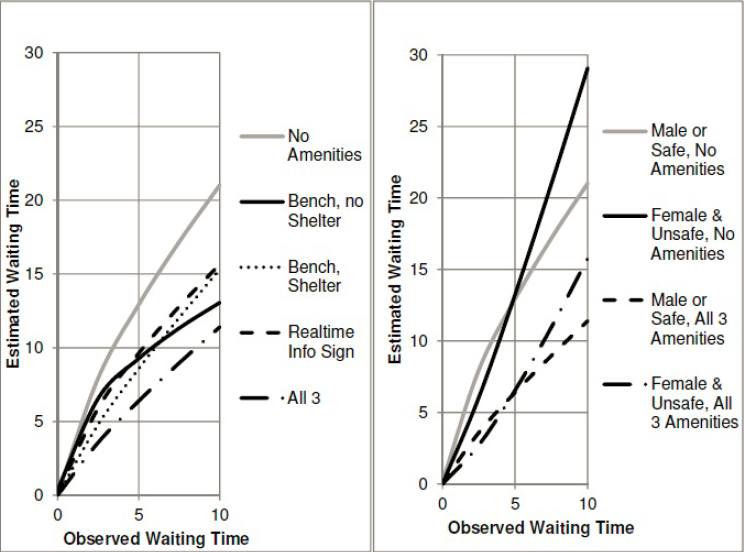
The gender breakdown comes from the fact that in unsafe neighborhoods, women perceive waits as even longer than the usual penalty, whereas in safe ones there is no difference between women and men.
The upshot is that if the wait time is 10 minutes, then passengers at a stop with a bench and shelter perceive the wait as 15 minutes, and if there’s also real-time information then this shrinks to 11 minutes. If there are no amenities, then passengers perceive a 15-minute wait when they’ve waited just 6.5 minutes and an 11-minute wait when they’ve waited just 4. In other words, to estimate the impact of shelter we can look at the impact of reducing waits from 10 minutes to 6.5, and if there’s also real-time info then it’s like reducing waits to 4 minutes.
If the wait is 5 minutes then the impact is similar. With bench and shelter the perceived wait is 8.5 minutes, equivalent to a 3-minute wait without any amenities; with real-time information, the perceived wait is 6.5 minutes, equivalent to a 2-minute wait without amenities. There is some scale-dependence, but not too much, so we can model the impact of shelter as equivalent to that of increasing frequency from every 10 minutes to every 6.5 minutes (without real-time displays) or every 4 minutes (with real-time displays).
I have some lit review of ridership-frequency elasticity here. On frequent buses it is about 0.4, but this is based on the assumption that frequency is 7.5-12 minutes, not 4-6 minutes. At the low end this is perhaps just 0.3, the lowest found in the literature I’ve seen. To avoid too much extrapolation, let’s take the elasticity to be 0.3. Fan-Guthrie-Levinson suggests shelter alone is equivalent to a 50-66% increase in frequency, say 60%; thus, it should raise ridership by 15%. With real-time info, make this increase 30%.
What I think of as the upper limit to acceptable cost of capital construction for rail is $40,000-50,000 per weekday rider; this is based on what makes activists in Paris groan and not on first principles. But we can try to derive an equivalent figure for buses. On the one hand, we should not accept such high costs for bus projects, since buses have higher operating expenses than rail. But this is not relevant to shelter, since it doesn’t increase bus expenses (which are mostly driver labor) and can fund its ongoing maintenance from ads. On the other hand, a $40,000/rider rail project costs somewhat more per new rider – there’s usually some cannibalization from buses and other trains.
But taking $40,000/rider as a given, it follows that a bus stop should be provided with shelter if it has at least ($15,000/$40,000)/0.15 = 2.5 weekday boardings. If the shelter installation includes real-time info then the denominator grows to 0.3 and the result falls to 1.25 weekday boardings.
In New York, there are 13,000 bus stops, so on average there are around 180 boardings per stop. Even in Rhode Island, where apparently the standard is that a bus stop gets shelter at 50 boardings (and thus there is very little shelter because apparently it’s more important to brand a downtown trunk as a frequent bus), there are 45,000 weekday riders and 3,000 stops, so at 15 riders per stop it should be fine too put up shelter everywhere.
The only type of stop where I can see an exception to this rule is alighting-only stops. If a route is only used in a peak direction, for example toward city center or away from city center, then the outbound stops may be consistently less used to the point of not justifying shelter. But even that notion is suspicious, as American cities with low transit usage tend to have weak centers and a lot of job and retail sprawl. It’s likely that a large majority of bus stops in Rhode Island and all stops within Providence proper pass the 2.5 boardings rule, and it’s almost guaranteed that all pass the 1.25 boardings rule. And that’s even before consolidating stops, which should be done to improve bus speed either way.
At least based on the estimates I’ve found, installing bus shelter everywhere is a low-hanging fruit in cities where this is not already done. In the situation of New York, this is equivalent to spending around $550 per new weekday rider on transit – maybe somewhat more if the busier stops already have shelter, but not too much more (and actually less if there’s stop consolidation, which there should be). Even in that of Providence, the spending is equivalent to about $6,600 per rider without stop consolidation, or maybe $3,000 with, which is much better than anything the state will be able to come up with through the usual channels of capital expansion.
If it’s not done, the only reason for it is that transit agencies just don’t care. They think of buses as a mode of transportation of last resort, with a punishing user experience. Cities, states, and transit agencies can to a large extent decide what they have money for, and letting people sit and not get drenched is just not a high priority, hence the “we don’t have money” excuse. The bosses don’t use the buses they’re managing and think of shelter as a luxury they can’t afford, never mind what published transportation research on this question says.
Shut Down the Brooklyn-Queens Expressway
New York’s high construction costs are not just a problem for public transit. Roads exhibit the exact same problem. Case in point: replacing 2.5 km of the deteriorating Brooklyn-Queens Expressway (BQE) in Brooklyn Heights is slated to cost $3-4 billion, take 6-8 years, and require temporarily closing the pedestrian promenade supported on top of the highway. This is not even a tunnel – some local NIMBYs have proposed one in order to reduce the impact of construction, but the cost would then be even higher. No: the projected cost, around $1.5 billion per kilometer, is for an above-ground highway replacement.

The section in question is between the Brooklyn-Battery Tunnel and the Brooklyn Bridge; the Promenade is the northern half of this section.
Is it worth it?
No.
There exist infrastructure projects that are worth it even at elevated cost. Second Avenue Subway Phase 1 cost $4.6 billion where it should have cost $700 million, but the expected ridership was very high, 200,000 per day, and so far ridership is on track to meet projections: the three new stations had a total of 138,000 boardings and alightings between them in 2017, and the revamped 63rd Street station went up by another 8,000. The BQE replacement is not such a project. Current traffic on the highway is stated as 153,000 vehicles per day, so on a per-vehicle basis it’s similar to Second Avenue Subway’s per-rider projection, around $23,000. But cars are not transit and cities need to understand that.
The construction of a subway creates noise and traffic disruption, but once the subway is up, all of that is done. Even elevated trains cause limited problems if built properly from materials that minimize noise – the trains on the viaducts on the Paris Metro are less noisy than the cars on the street below. There are operating costs involved with subways, but fixed costs are so dominant that even in New York a busy line like Second Avenue Subway should be at worst revenue-neutral net of costs; for reference, in Vancouver the projection for the Broadway subway extension’s operating costs is well below the revenue from the projected extra ridership.
Cars are not like that. They are noisy and polluting, and greenwashing them with a handful of expensive electric cars won’t change that. There are benefits to automobility, but the health hazards cancel out a lot of that. The Stern Review estimates the cost of unmitigated climate change at 20% of global GDP (e.g. PDF-p. 38), which in current terms approaches $500 per metric ton of CO2. The US has almost the same emissions intensity per dollar of production as the rest of the world; the negative impact of cars coming from climate change alone is comparable to the total private cost of transportation in the US, including buying the car, maintenance, fuel, etc. Now add car accidents, noise, and local air pollution.
In a region where cars are an absolute lifeline, there’s a case for building connections. The costs are low since grading a road for medium speed with level crossings is not expensive. In cities, the situation is different. Drivers will grumble if the BQE is removed. They will not lose access to critical services.
Is anyone proposing removing the BQE?
Yes, there are some proposals to that effect, but they’re so far only made haltingly. Council Speaker and 2021 mayoral frontrunner Corey Johnson’s report on municipal control of the subway includes the following line: “Before spending $4 billion to reconstruct a 1.5 mile stretch of highway, the City should study alternatives to the reconstruction of this Robert Moses-era six lane road, including the removal of the BQE in its entirety.” The halting part here is that to study does not mean to enact; Johnson himself opposes repurposing car lanes for bus service in his own district.
City Comptroller Scott Stringer, who has relied on a lot of the information I have brought up in this space in his reports, proposes to keep the BQE but only allow access to trucks. Bloomberg’s transportation commissioner Janette Sadik-Khan agrees with the idea and even pitches it as a brave alternative to the car. In other words, per the comptroller and former commissioner, billions of dollars are to be spent on the reconstruction of a somewhat narrower structure for 14,000 trucks per day. Stringer’s report even says that the comparable urban freeways that have been removed did not allow trucks in, which is incorrect for the Embarcadero Freeway in San Francisco and for the Voie Georges Pompidou in Paris (look for “camions” here). In reality, if closing the BQE means adding just 14,000 vehicles to surface streets, then it’s an almost unmitigated success of road dieting, since it means much less pollution and noise.
The Regional Plan Association proposes its usual quarter-measures as well, sold under the guise of “reimagining.” It does not mention closure at all – it proposes rebuilding the structure with four lanes, down from the current six, and even dares to cite the closure in Paris as precedent. Everything in its analysis points out to the benefits of full closure and yet the RPA feels too institutional to propose that. Presumably if the RPA had opined on lynchings in the midcentury American South it would have proposed a plan to cut total lynchings by 25% and if it had opined on Fourth Republic-era colonialism in Algeria it would have proposed to cut the incidence of torture by a third while referencing the positive precedent of British decolonization in India.
What should replace the BQE?
The BQE should be removed all the way from the Brooklyn-Battery Tunnel to the Williamsburg Bridge. Its curves in Downtown Brooklyn with the loops to the Brooklyn and Manhattan Bridges consume valuable real estate, and farther east they divide neighborhoods. The new Navy Yard developments are disconnected from the rest of Brooklyn because of the BQE.
Going east through Fort Greene, the BQE is flanked on both sides by Park Avenue. Buildings face the street, though many of the lots are empty or low-value. Thus, the surface streets have to stay. Selling what is now Park Avenue as parcels for residential and commercial development and mapping a street on the BQE’s 30-meter footprint is probably not viable. Instead, most of the footprint of the expressway should be parceled into lots and sold, converting Park Avenue into a one-way pair with streets about 12-15 meters in width each. East-west buses will continue running on Flushing and Myrtle, and north-south buses should probably not make stops at Park.
In contrast, going south through South Brooklyn, buildings do not face the abutting surface street, Hicks. They present blank walls, as if it was midblock. This is a prime opportunity to narrow the street as if the highway has never been there, creating an avenue perhaps 20 or 30 meters in width. The wider figure is more appropriate if there are plans for bus lanes and bike lanes; otherwise, if buses stay on Columbia, 20 is better.
In South Williamsburg, the road is nearly block-wide. The neighborhood is pro-development due to high birthrates among the Haredi population. Thus the footprint of the freeway must be used for private housing development. The area next to the Marcy Avenue subway station on the J/M/Z is especially desirable for the non-Haredi population, due to the proximity to Manhattan jobs. The city should retain an avenue-width roadway for Williamsburg Bridge access from the south, but beyond that it should restore the blocks of the neighborhood as they were before the BQE was built.
Heal, don’t placemake
If there’s a common thread to the various proposals by local politicians and shadow agencies (that is, the RPA), it’s an attempt at placemaking, defined to be any project that they can point to and say “I built that!”. A BQE rebuilt slightly narrower, or restricted to trucks, achieves that goal, with some greenwashing for what remains a waste of billions of dollars for motorist convenience.
But the same can be said of a park, as in one architect’s proposal for the BQE. I can see a case for this in Brooklyn Heights, where the Promenade is an important neighborhood destination, but elsewhere, the case is extraordinarily weak. In South Brooklyn, the most important benefit of removing the BQE is easier pedestrian access to the waterfront; recreation space should go there. Fort Greene and the Navy Yard are both rich in parks; BQE removal makes the large parks on both sides of the motorway easier to access. And Williamsburg is hungry for private development, whether near the subway for Manhattan workers or elsewhere for Haredi families.
Thirty years from now, nobody is going to walk on the remade street grid of South Williamsburg or the narrowed Hicks Street and wonder which politician set this up. But people may well notice the lower rents – and they may well notice them within a few years of the deconstruction of the road and the sale of the land for housing development. Ultimately city residents do notice if things are improving or deteriorating. It’s on the city to nudge infrastructure development in the direction of less pollution and fewer boondoggles.
Prudence Theater
The phrase security theater refers to the elaborate selling of airport security to the public through humiliating spectacle, like making people take off their shoes, with no safety value whatsoever. By the same token, prudence theater is the same kind of ritual of humiliating people, often workers, in the name of not wasting money. Managers who engage in prudence theater will refuse pay hikes and lose the best employees in the process, institute hiring freezes at understaffed departments and wonder why things aren’t working, and refuse long-term investments that look big even if they have limited risk and high returns. This approach is endemic to authoritarian managers who do not understand the business they are running – such as a number of do-nothing political leaders who make decisions regarding public transit.
I’ve talked a bunch about this issue in the context of capital investment, for example Massachusetts’ Charlie Baker, California’s Gavin Newsom, New Jersey’s Chris Christie, and New York‘s Andrew Cuomo, using phrases such as “Chainsaw Al” and “do-nothing.” But here I want to talk specifically about operations, because there is an insidious kind of prudence theater there: the hiring freeze. The MBTA and MTA both have hiring freezes, though thankfully New York is a little more flexible about it.
Both New York and Boston have very high operating costs, for both subways and buses. They have extensive overstaffing in general, but that does not extend to overstaffing at every department. On the contrary, some departments are understaffed. Adam Rahbee told me a year and a half ago that subway operations planning in New York was short on workers, in contrast to the overstaffed department he saw in London. Of course London on average has much lower costs than New York, but individual departments can still be short on manpower even in otherwise-overstaffed cities. If anything, leaving one department understaffed can cause inefficiencies at adjacent departments, making them in effect overstaffed relative to the amount of service they can offer.
Bus dispatching
Buses require active supervision by a centralized control center that helps drivers stay on schedule. New York currently has 20 dispatchers but is planning an increase to 59, in tandem with using new technology. Boston has 5 at any given time, and needs to staff up to 15, which involves increasing hiring to about 40 full-time workers and doing minor rearrangement of office space to give them a place to work. With too few dispatchers, drivers end up going off-schedule, leading to familiar bunching, wasting hundreds of bus drivers’ work in order to save money on a few tens of supervisors.
I went over the issue of bus bunching in a post from last summer, but for the benefit of non-technical readers, here is a diagram that explains in essence what the problem of chaos is:

The marble on top of the curve is unlikely to stay where it is for a long time, because any small disturbance will send it sliding down one side or the other. Moreover, it’s impossible to predict in advance which direction the marble will land in, because a disturbance too small to see will compound to a big one over time.
Chaotic systems like this are ubiquitous: weather is a chaotic system, which is why it’s not possible to predict it for more than about two weeks in advance – small changes compound in unexpected directions. Unfortunately, bus service is a chaotic system too. For the bus to be on schedule is an unstable equilibrium. If the bus runs just a little behind, then it will have to pick up more passengers on its way, as passengers who would have just missed the bus will instead just make it. Those extra passengers will take some extra time to board, putting the bus even further behind, until the bus behind it finally catches it and the two buses leapfrog each other in a platoon.
There are ways to mitigate this problem, including dedicated bus lanes and off-board fare collection. But they do not eliminate it – they merely slow it down, increasing the time it takes for a bus to bunch.
The connection between dispatching and chaotic bus schedules may not be apparent, but it is real. The transportation engineering academic community has had to deal with the question of how to keep buses on schedule; here, here, and here are three recent examples. The only real way to keep buses on schedule is through active control – that is, dispatching. A dispatcher can tell a driver that the bus is too far ahead and needs to slow down, or that it is behind and the driver should attempt to speed up. If the traffic light system is designed for it, the dispatcher can also make sure a delayed bus will get more green lights to get back on track, a technology called conditional signal priority, or CSP. This contrasts with unconditional transit signal priority, or TSP, which speeds up buses but does not preferentially keep them evenly spaced to prevent bunching.
Moreover, some of the people who have done academic work on this topic have gone on to work in the transit industry, whether for the MBTA (such as David Maltzan and Joshua Fabian) or for thinktanks or private companies (such as Chris Pangilinan). Specific strategies to keep the buses on track include CSP giving delayed buses more green lights, holding buses at the terminal so that they leave evenly spaced, and in some cases even holding at mid-route control points. Left to their own devices, buses will bunch, requiring constant correction by a competent dispatching department with all the tools of better data for detection of where bunching may occur as well as control over the city’s streetlights.
Managers’ point view vs. passengers’ point of view
When I talk to transit riders about their experiences, I universally hear complaints. The question is just a matter of what they complain about. In suburban Paris people complain plenty about the RER, talking about crowding and about how the system isn’t as frequent or reliable as the Metro. These are real issues and indicate what Ile-de-France Mobilités should be focusing its attention on.
Americans in cities with public transit talk about bunching. In New York I’ve routinely sighted platoons of two buses even on very short routes, where such problems should never occur, like the 3 kilometer long M86. A regular rail user who talked to me a few months ago mentioned three-bus platoons in Brooklyn on a route that has a nominal frequency of about 10 minutes.
From the perspective of the transit operator or the taxpayer, if buses are scheduled to arrive every ten minutes, that’s an expenditure of six buses per hour. From that of the rider, if the buses in fact come in platoons of two due to bunching, then the effective frequency is 20 minutes, and most likely the bus they ride on will be the more crowded one as well. What looks like a service improvement to managers who never take the system they’re running may offer no relief to the customers on the ground.
I wish my mockery of transit managers who don’t use their own system were facetious, but it’s not. In New York, some of the more senior managers look at NYCT chief Andy Byford askance for not owning a car and instead using the subway to get to places. Planner job postings at North American transit agencies routinely require a driver’s license and say that driving around the city is part of the job. Ignorant of both the science of chaos and the situation on the ground, the managers and politicians miss low-hanging fruits while waxing poetic about the need to save money.
Is anything being done?
In New York there are some positive signs, such as the increase in the number of dispatchers. The warm reception Eric Goldwyn and I got from some specific people at the MTA is a good sign as well. The problem remains political obstruction by a governor and mayor who don’t know or care to know about good practices. Cuomo’s constant sidelining of Byford has turned into a spectacle among New York transit journalists.
In Boston, the answer is entirely negative. Last week’s draft of the Focus40 plan, released by the MBTA’s Fiscal Management and Control Board (FMCB), unfortunately entirely omits dispatching and operational supervision from its scope. It includes a variety of investments for the future, some of which are welcome, such as the Red-Blue Connector. But it reduces the issue of bus timetable keeping to a brief note in the customer experience section that mentions “Computer Aided Dispatch / Automatic Vehicle Location technology.” Good data is not a bad thing, but it is not everything. Warm bodies are required to act on this data.
Thus prudence theater continues. Massachusetts will talk about reform before revenue and about spending money wisely, but it is run by people with little knowledge of public transportation and no interest in acquiring said knowledge. Its approach to very real issues of high costs is to cut, even when there are parts of the system that are underfunded and undermanned. Staffing up to 15 dispatchers at a time, raising the headcount to about 40 full-time workers, would have the same effect on ridership as literally hundreds of bus drivers through better control. Will the administration listen? As usual, I hope for the best but have learned to expect the worst.
Battery-Electric Buses: New Flyer
Two months ago, after my article about battery-electric buses appeared in CityLab, New Flyer reached out to me for an interview. Already in one of the interviews I’d done for the article, I heard second-hand that New Flyer was more reasonable than Proterra and BYD and was aware of the problem of battery drain in cold weather. I spoke to the company’s director of sustainable transportation, the mechanical engineer David Warren, and this confirmed what I’d been told.
Most incredibly, I learned at the interview that the headline figures used in the US for electric bus performance explicitly exclude heating needs. The tests are done at the Altoona site and only look at electricity consumption for propulsion, not heating. New Flyer says that it is aware of this issue and has tried not to overpromise, but evidently Proterra and BYD both overpromise, and regardless of what any vendor says, American cities have bought into the hype. In Duluth this was only resolved with fuel-fired heaters; the buses only use electricity for propulsion, which is not the majority of their energy consumption in winter.
Warren and I discussed New York specifically, as it has a trial there on the M42. The heater there puts out 22 kW of energy at the peak, but on the day we discussed, January 29th, when the air temperature was about -7*, actual consumption was on average about 10 kW. Electricity consumption split as 40% heating, 20% propulsion, and 40% other things, such as the kneeling system for easier boarding.
The battery can last many roundtrips on the M42, specifically a very slow route. Electric vehicles tend to do much better then fuel-powered ones at low speed in city traffic, because of regenerative braking and higher efficiency. When I discussed the Proterra trial with MVTA, I was told specifically that the buses did really well on days when the temperature was above freezing, since the battery barely drained while the bus was sitting in rush hour Downtown Minneapolis traffic. This pattern is really a more extreme version of one that may be familiar to people who have compared fuel economy ratings for hybrid and conventional cars: hybrids are more fuel-efficient in city driving than on the highway, the opposite of a non-hybrid, because their electric acceleration and deceleration cycles allow them some of that regeneration.
The current system is called OppCharge (“opportunity charging”), and currently requires the bus to spend 6 minutes out of every hour idling for recharge; the Xcelsior presentation shows a bus with a raised pantograph at a charging station, and I wonder whether it can be extended to an appropriate length of wire to enable in-motion charging.
The New Flyer examples I have seen are in large cities – New York and Vancouver. New York’s system for opportunity charging does not require an attendant; Vancouver’s may or may not, but either way the charging is at a bus depot, where the logistics are simpler. In contrast, in Albuquerque the need for midday charging was a deal breaker. When I talked to someone who knew the situation of Albuquerque’s BRT line, ART, I was told that the BYD midday charge system would require an attendant as well as room for a charging depot. Perhaps an alternative system could get rid of the attendant, but the land for a bus that at the end of the day isn’t that busy has nontrivial cost even in Albuquerque.
Even with opportunity charging, batteries remain hefty. Warren said that they weigh nearly 4 tons per standard-length bus; the XE40 weighs 14 metric tons, compared with 11.3 for the older diesel XD40 platform. Specifically on a short, high-ridership density like the M42 and many other New York buses, there is likely to be a case for installing trolleywire and using in-motion charging. In-motion charging doesn’t work well with grids, since it is ideally suited to when several branches interline to a long trunk route that can be electrified, but ultimately it’s a bus network with ridership density comparable to that of some big American light rail networks like Portland’s.
*In case it’s unclear to irregular readers, I exclusively use metric units unless I mention otherwise, so this is -7 Celsius and not -7 Fahrenheit; the latter temperature would presumably drain the battery a lot faster.
The Boundary Between the Transit City and Auto-Oriented Suburbia
Public transportation use is higher in cities than in suburbs. Cities with stronger transit networks have larger transit-rich, auto-hostile cores, and some have good transit in lower-density suburbs, but ultimately the transit city has a limited radius, beyond which automobiles dominate. Successful examples of suburban transit, like Zurich, just keep the city-suburb gradient shallower than in other transit cities.
The most fascinating aspect of this is the boundary between the transit-oriented city and the auto-oriented suburbs. Uniquely in the metro area, the boundary region has good access by car as well as by transit, making it ideal for uses that want to interface with both modes of transportation. This specifically includes bus stations, stadiums, and big box retail, as well as more sporadic meeting points between urban and suburban residents.
Where the boundary is
Because the boundary zone is defined by good transit as well as highway access, it may not be the literal boundary as defined by modal split, car ownership, or any other metric of transportation usage. It can be the outer end of some rail line extending into the suburbs, and in that case it may be a salient into auto-oriented territory. There are a number of examples in the United States, where the postwar rapid transit projects have not been accompanied by much transit-oriented development, and thus their outer stations are in low-density suburbs where transit service functions as expensive S-Bahns. BART and most of the Washington Metro are like this, as are the suburban lines of the Boston subway.
For example, here is Newton Centre, on the Green Line D branch:
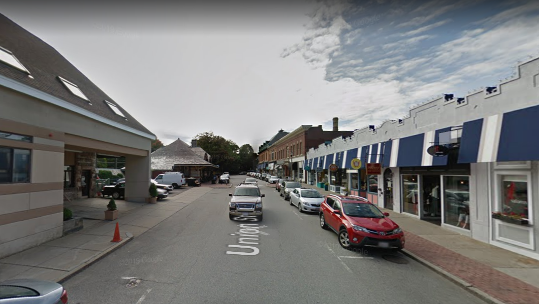
The light rail station is just to the left (south) of the street. This is a walkable suburban street with a train that comes pretty frequently all day, and yet the dominant mode of transportation here is clearly cars, as one can see in the parking lot to the left. Transit usage here is similar to the metro area’s average – Newton averages 11.9%, the Boston metro area 13.4% – but this says more about the rest of metro Boston than about Newton Centre. Nonetheless, such a location is convenient to access from the city if one lives near the Green Line, and is also reasonable convenient by car, as it is just 4 km from the freeway, and the majority of the distance is along the fast arterial that is Route 9.
The importance of highway access also works in reverse. In cities with strong transit networks and weak motorway network, there may be a freeway salient into the city, creating a zone that is car-friendlier than the rest. If it also has ample parking, which it usually does, then it will end up creating a boundary within an area that is on most metrics transit-oriented.
In London, the urban renewal zones around Stratford and Canary Wharf are examples – the city is unusually poor in freeway infrastructure, but two of the few radial motorways hit these two business districts. Here is Stratford:

The built-up density is high, and Stratford is one of the busiest Underground stations. But the roads are big for the city they’re in and there are large surface parking lots all over.
I’m deliberately including two examples with very different urban layouts and actual transit usage levels to hammer home the point that the boundary is defined merely by the existence of supportive infrastructure for both cars and public transit.
Can the entire city be friendly to both cars and public transit?
No.
There are several reasons for this. The first and most fundamental is that public transit is only successful if it can leverage scale. The adage frequency is freedom comes from this fact, but the same can be said about related issues of span, reach, and network effects. This is why frequency-ridership spirals are so dangerous – a small cut in service can lead to a much greater reduction in ridership.
The second reason is that drivers prefer a different urban layout from transit users, cyclists, and pedestrians. Cars are space-intensive on the road as well as on the parking lot, but can achieve high average speed if there’s no traffic, so they end up preferring spread-out development. Public and active transport are space-efficient but involve a lot of slow walking, so they prefer dense development at distinguished nodes with train stations, featuring strong commercial city centers with high job concentration. The boundary zone I speak of must be underlain by a strong enough transit network in the city core that people will fill the trains at all hours of day.
Concretely, neither the example of Newton nor that of Stratford can work citywide. Newton cannot work citywide because if every residential metro station is a parking lot, then nobody will ride the trains off-peak, and the city will de facto be exclusively auto-oriented as a result. Two years ago I compared the proportion of boardings at suburban stations that occur in the morning peak in New York (67% LIRR, 69% Metro-North) and Paris (46% on the SNCF network). Well, I would later find data for the Washington Metro, which has high off-peak frequency like the RER but low-density parking lot stations like the LIRR and Metro-North, and the proportion of riders in the morning peak is much closer to that of the LIRR than to that of the RER.
Likewise, Stratford can’t work citywide, because most of the city is not a reclaimed railyard with enormous space for all manners of new development. Building the expansive motorway network that would allow cars to rapidly reach every part of the city would normally require extensive neighborhood demolitions; American cities only managed to do so because to the road builders, destroying working-class (and often black) neighborhoods was a feature rather than a bug. Building a new city with ample road infrastructure is possible without this history, but then one gets Houston, hardly an example of good transit accessibility.
Land use at the boundary
The boundary zone’s unique accessibility by both cars and transit makes it ideally suited for land use that really wants both. Such land use has to have the following features:
- It needs to have a large regional draw, or else distinct neighborhood centers, some transit-oriented and some car-oriented, can do better.
- It needs to specifically benefit from good highway access, for example for deliveries, but also from good transit access.
- It is not so high-value that city center’s better transit access in multiple directions trumps access by transit in one direction and by cars in another.
Sporadic meetings satisfy all three criteria. For one personal example, in 2013 I visited New York and participated in a LARP taking place in a camp somewhere in Massachusetts, accessible only by car; I traveled with friends in the suburbs and we arranged that they would pick me up at Southeast, the northern end of the Metro-North Harlem Line’s electrification, so chosen because of its excellent multidirectional freeway access.
I bring up LARPing because it’s such a small community that it has to draw regionwide – in the case of the one I went to, participants came from all over Eastern New England and even beyond – and thus, anywhere with lower transit usage than New York, must appeal primarily to the driver, not the transit user. Nerdy conventions in general tend to either be enormous, like Comic-Con, or take place in cheap suburban edge city hotels, with meetings for carpools arranged at choice suburban train stations.
More common uses that like the boundary zones include major stadiums and big box retail. Stadiums appeal to a broad section of the population with little differentiation between city residents and suburbanites. They have to have good transit access even in auto-oriented American cities for reasons of capacity, but they also have to have good auto access for the use of drivers; stadiums are land-intensive enough that they can’t locate in city center at all, with its omnidirectional transit access, so instead they must be at the boundary zone. Thus Stratford hosts the London Stadium, the Stade de France is in Saint-Denis with good motorway as well as RER access, and Yankee Stadium is tucked at a corner of the Bronx with two subway lines and good expressway infrastructure.
Big box retail is more complicated – for one, its draw is so local that even a small city can support several Walmarts, Carrefours, and Aldis (Walmart is weak in big cities, but the big European retailers aren’t). Nonetheless, boundary zone stores exist: the big supermarket I’m most familiar with in Boston, Star Market at Porter, is on top of a subway station but also has a large parking lot, while the supermarket I shop at here in Berlin, Kaufland, is a two-story big box next to the Gesundbrunnen U- and S-Bahn station, with the ground floor devoted to parking.
I suspect the reason big box retail likes the boundary zone is that while it is local, there are extensive mixed areas rich in both drivers and non-drivers, where a big store must appeal to both in order to succeed. The Gesundbrunnen area is one of the city’s densest, but car ownership in Berlin is still higher than in Paris or New York. The same is true of the area around Porter Square in Cambridge and Somerville, albeit at lower density and with lower transit usage, so Star Market puts its parking on the surface rather than in a structure.
Bus station siting
The most interesting land use that prefers the boundary zone, and the origin of this post, is the intercity bus station. Here is Herbert in comments:
Can you do a post on the contradictory demands for the site of the main intercity bus station?
On the one hand, it is desirable that it is within easy reach from the highway. On the other hand it should be as close to downtown as possible and also easily reachable by public transit. And last but not least there should of possible be one interchange station for every city for connecting passengers.
It’s almost impossible to find a site that goes all requirements. Berlin ZOB certainly doesn’t…
Whereas train stations have obvious preferred sites – the central business district – bus stations have to balance centrality with highway access. In Paris, this is Gallieni. This station is just outside the city at the end of Metro Line 3, where the Boulevard Peripherique meets the A3 autoroute, which connects to further motorways with good access to the north, south, and east. Like Stade de France, Gallieni is a salient of the auto-oriented suburbs almost into city limits, in inner suburbs with high public transit usage.
In New York, there are a few sites that would work fine, but each points in a different direction, making interchange difficult. Port Authority is excellent for buses going to New Jersey and points west and south, and curbside buses tend to pick up in that general area as well, often near Hudson Yards; this is facilitated by a unique situation in which the Lincoln Tunnel has a dedicated inbound bus lane in the morning peak, which many area transit activists wish existed in both directions all day. Buses to Boston could depart from Yankee Stadium, which also benefits from being just beyond the outer end of subway express service, so that travel speeds to Manhattan are faster. However, in practice they depart from the same curbside location on the Far West Side as the buses to Philadelphia and Washington, frustrating riders who see their bus spend an hour in city traffic.
The situation of New York is unusual in that it is located next to two wide rivers with few crossings, and thus does not have a proper orbital motorway with a location like Gallieni. But New York is not unique in having difficult bus station siting choices. London has the same problem: for one, the M25 orbital is so far out of the city; and perhaps more importantly, British buses are priced cheaper than trains in order to control crowding levels on trains to London, and thus dumping bus passengers on a regional train to Central London would be strictly worse than just letting them ride the train the entire way for a reasonable fare.
Construction Costs: Metro Accessibility
It is much harder to find estimates of construction costs for elevator access to metro stations than to find estimates for the costs of new tunnels. Accessibility isn’t as flashy, so it does not get reported in the international trade press. If you’re a humble blogger who has no idea what the Japanese phrases for “elevator,” “wheelchair accessibility,” and “construction costs” are, you have no way of figuring out how much it cost Tokyo to get its legacy subway network to be about 80-90% accessible. Thankfully, there are enough European cities where I do know those phrases that I do have a list. It comprises just eight cities, two in the US and six in Europe, and in at least one case (Milan) I don’t fully trust the numbers.
New York:the current capital plan spends $740 million on 19 stations, and a single elevator is $10 million if I understand Curbed correctly. The headline figure is $39 million per station.
Boston: MBTA head of systemwide accessibility, Laura Brelsford, told me that Symphony is a $25 million, 4 elevator project, and that Copley and Arlington were in the $30-40 million range each. I can’t find a link, unfortunately.
London: here is a source saying a £76 million fund would make 12 stations step-free, but I don’t know which stations. This source states a higher figure, £200 million for 13 stations, which in PPP terms is about $22 million per station. The lower figure is only $9 million per station.
Paris: nothing is accessible except M14 and the RER and there are no plans to make anything accessible, but a disability rights organization estimates the cost of making all 303 Metro stations accessible at €4-6 billion. Subtracting M14-only stations this is also about $22 million per station at the midpoint.
Madrid: a 2016-20 plan breaks down costs per station. They’re about €5 million per station per line it serves (so a 3-line transfer is €15 million), and a single elevator is €1.5 million. The relevant numbers are on PDF-pp. 12-17. This document used to exist in English too but the URL broke and the Web Archive doesn’t have it. Lumping all remaining stations together, few of which are transfers, gives €531.9 million for 93 stations, or $7.5 million per station.
Berlin: follow the link from my tweetstorm. The U-Bahn is about to complete step-free access by 2020. The cost is €800,000 per elevator, €2 million per station, or $2.6 million per station.
Barcelona: I have three separate sets of numbers, and am placing the city on this list with the lower two. Here is a source describing the installation of elevators at 14 stations for €26.8 million. Here is a source describing a single station on a different line to be made accessible for €2.1 million. In contrast, a document describing the plan for universal accessibility states the cost up to 2009 at €390.97 million euros (PDF-p. 87) for 73 stations (PDF-p. 83). The first two sources average to $2.5 million per station, but the third one, covering more stations, including complex transfer points, averages $7 million per station in what I imagine are in 2009 prices.
Milan: this article seems to be saying that elevator installation at 21 stations is budgeted at €24.5 million, all on Lines 1 and 2, which are shallow cut-and-cover lines built under narrow medieval streets. I’m not sure whether all of these are elevators, though – the Milan Metro site says that it has elevators at some stations and stairlifts at others. This totals $1.5 million per station.
The low construction cost of elevator accessibility in Berlin is notable since the city’s tunneling costs are not so low. I am still trying to talk to local transit officials about this, but my surface understanding is that fewer elevators are needed per station. The city uses island platforms rather than side platforms and has shallow subsurface stations with access from raised street medians, so a single elevator covers the entire station.
That said, Paris and New York both have extensive cut-and-cover construction under very wide streets, much like Berlin. A multiple of 2 over Berlin costs is to be expected as they have side platforms, and thus all station infrastructure needs to be doubled. However, Paris’s costs are (apparently) higher than Berlin’s by a factor of 9 and New York’s by a factor of 15. Paris is not a high-cost city when it comes to tunneling, and it’s possible that the activists just estimated it based on London costs, or that the government made up a high number in order to sandbag the calls for step-free accessibility.
Corey Johnson’s Report on City Control of the Subway
Yesterday, New York City Council speaker and frontrunner in the 2021 mayoral race Corey Johnson released a document outlining his plan to seek city control of the subway and buses. In addition to the governance questions involved in splitting the state-run MTA between a city-owned urban transit agency and state- or suburb-owned commuter rail, it talks about what Johnson intends to do to improve public transit, befitting a mayor in full control of subway and bus operations. There are a lot of excellent ideas there, but also some not so good ones and some that require further work or further analysis to be made good.
Governance
Johnson proposes to spin the urban parts of the MTA into a new agency, called BAT, or Big Apple Transit. The rump-MTA will remain in control of suburban operations and keep MTA Capital Construction (p. 35), and there will be a shared headquarters. Some cooperation will remain, such as contributions toward cheaper in-city commuter rail fares, but there is no call for fully integrated fares and schedules: the recommendation “all trains and buses in the city will cost the same and transfers will be free” does not appear anywhere in the document.
Johnson also proposes that the BAT board will be required to live in the city and use transit regularly. There is a serious problem today with senior managers and board members driving everywhere, and the requirement is intended to end this practice. Cynically, I might suggest that this requirement sounds reasonable in 2019 but would have been unthinkable until the 2000s and remains so in other American cities, even though it would be far more useful there and then; the off-peak frequency-ridership spiral is nowhere nearly as bad in New York as it is in Washington or Boston.
One strong suggestion in this section involves appointing a mobility czar (p. 36), in charge of the NYC Department of Transportation as well as BAT. Given the importance of the subway, this czar would be in effect the new minister of transportation for the city, appointed by the mayor.
Ultimately, this section tends toward the weaker side, because of a problem visible elsewhere in the report: all of the recommendations are based on internal analysis, with little to no knowledge of global best practices. Berlin has city-controlled transit in full fare union with Deutsche Bahn-run mainline rail, but there has been no attempt to learn how this could be implemented in New York. The only person in New York who I’ve seen display any interest in this example is Streetsblog’s David Meyer, who asked me how DB and Berlin’s BVG share revenue under the common umbrella of the Berlin Transport Association (or VBB); I did not know and although I’ve reached out to a local source with questions, I could not get the answer by his filing deadline.
Finance and costs
This is by far the weakest section in the proposal. The MTA funds itself in large part by debt; Johnson highlights the problem of mounting debt service, but his recommendations are weak. He does not tell New Yorkers the hard truth that if they can’t afford service today then they can’t afford it at debt maturity either. He talks about the need to “address debt” but refrains from offering anything that might inconvenience a taxpayer, a rider, or an employee (pp. 42-43), and offers a melange of narrow funding sources that are designed for maximum economic distortion and minimum visible inconvenience.
In fact, he calls transit fares regressive (pp. 59, 61) and complains about century-long fare increases: real fares have risen by a factor of 2.1 since 1913 – but American GDP per capita has risen by a factor of 7.7, and operating costs have mostly risen in line with incomes.
He brings up ways to reduce costs. In operations these involve negotiations with the unions; even though the report mentions that drivers get paid half-time for hours they’re not working between the morning and afternoon peaks (“swing shift,” p. 48), it does not recommend increasing off-peak service in order to provide more mobility at low marginal cost. There is no mention of two-person crews on the subway or of the low train operator efficiency compared with peer cities – New York City Transit train operators average 556 revenue hours per year, Berlin U-Bahn operators average 829.
In capital construction the recommendations are a mixed bag of good and bad, taken from a not-great RPA report from a year ago. Like the RPA, Johnson recommends using more design-build, in flagrant violation of one of the rules set by global cost reduction leader Madrid. However, to his credit, Johnson zooms in on real problems with procurement and conflict resolution, including change orders (pp. 50-51), and mentions the problem of red tape as discussed in Brian Rosenthal’s article from the end of 2017. He suggests requiring that contractors qualify to bid, which is a pretty way of saying that contractors with a history of shoddy work should be blacklisted; I have heard the qualify-to-bid suggestion from some sporadic inside sources for years, alongside complaints that New York’s current bid-to-qualify system encourages either poor work or red tape discouraging good contractors. Unfortunately, there is no talk of awarding bids based on a combination of technical score and cost, rather than just cost.
Overall the talk of cost is better than what I’ve seen from other politicians, who either say nothing or use high costs as an excuse to do nothing. But it has a long way to go before it can become a blueprint for reducing subway construction costs, especially given the other things Johnson proposes elsewhere in the document.
Accessibility
Another mixed part of the document is the chapter about accessibility for people with disabilities. Johnson recounts the lack of elevators at most subway stations and the poor state of the bus network, featuring drivers who are often hostile to people in wheelchairs. However, while his analysis is solid, his recommendations aren’t.
First of all, he says nothing of the cost of installing elevators on the subway. An MTA press release from last year states the cost of making five stations accessible as $200 million, of $40 million per station. This figure contrasts with that of Madrid, where a non-transfer station costs about €5 million to equip with elevators, and a transfer station costs about €5 million per line served (source, PDF-pp. 11-12). In Berlin, which is not a cheap city for subway construction, the figure is even lower: about €2 million per line served, with a single elevator costing just €800,000.
And second, his proposal for finding money for station accessibility involves using the zoning code, forcing developers to pay for such upgrades. While this works in neighborhoods with ample redevelopment, not all city neighborhoods are desirable for developers right now, and there, money will have to come from elsewhere. For a document that stresses the importance of equality in planning, its proposals for how to scrounge funds can be remarkably inequitable.
That said, in a later section, Johnson does call for installing bus shelters (p. 74). A paper referenced in a TransitCenter report he references, by Yingling Fan, Andrew Guthrie, and David Levinson, finds that the presence of shelter, a bench, and real-time arrival information has a large effect on passengers’ perceived wait times: in the absence of all three amenities, passengers perceive wait time as 2-2.5 times as long as it actually is, rising to a factor of almost 3 for 10-minute waits among women in unsafe areas, but in the presence of all three, the factor drops to around 1.3, and only 1.6 for long waits for women in unsafe areas. Unfortunately, as this aspect is discussed in the bus improvement section, there is no discussion of the positive effect shelter has on people with disabilities that do not require the use of a wheelchair, such as chronic pain conditions.
I do appreciate that the speaker highlights the importance of accessibility and driver training – drivers often don’t even know how to operate a wheelchair lift (p. 63). But the solutions need to involve more than trying to find developers with enough of a profit margin to extract for elevators. Bus stops need shelter, benches, and ideally raised curbs, like the median Berlin tramway stations. And subway stations need elevators, and they need them at acceptable cost.
Bus improvements
By far this is the strongest part of the report. Johnson notes that bus ridership is falling, and recommends SBS as a low-cost solution. He does not stop at just making a skeletal light rail-like map of bus routes to be upgraded, unlike the Bloomberg and de Blasio administrations: he proposes sweeping citywide improvements. The call for bus shelter appears in this section as well.
But the speaker goes beyond calling for bus shelters. He wants to accelerate the installation of bus lanes to at least 48 km (i.e. 30 miles) every year, with camera enforcement and physically-separated median lanes. The effect of such a program would be substantial. As far as I can tell, with large error bars caused by large ranges of elasticity estimates in the literature, the benefits in Eric Goldwyn’s and my bus redesign break down as 30% stop consolidation (less than its 60% share of bus speedup since it does involve making people walk longer), 30% bus lanes, 30% network redesign, 10% off-board fare collection.
There is no mention of stop consolidation in the paper, but there is mention of route redesign, which Johnson wishes to implement in full by 2025. The MTA is in support of the redesign process, and allowing for integrated planning between NYCDOT and the MTA would improve the mutual support between bus schedules and the physical shape of the city’s major streets.
Moreover, the report calls for transit signal priority, installed at the rate of at least 1,000 intersections per year. This is very aggressive: even at the average block spacing along avenues, about 80 meters, this is 80 kilometers per year, and at that of streets, it rises to 200+ km. Within a few years, every intersection in the city would get TSP. The effects would be substantial, and the only reason Eric’s and my proposal does not list them is that they are hard to quantify. In fact, this may be the first time an entire grid would be equipped with TSP; some research may be required to decide how to prioritize bus/bus conflicts at major junctions, based on transportation research as well as control theory, since conditional TSP is the only way to truly eliminate bus bunching.
Reinforcing the point about dedicated lanes, the study calls for clawing back the space given to private parking and delivery. It explicitly calls for setting up truck routes and delivery zones in a later section (pp. 86-87); right now, the biggest complaint about bus lanes comes from loss of parking and the establishment of delivery zones in lieu of letting trucks stop anywhere on a block, and it is reassuring to see Johnson commit to prioritizing public transit users.
Livable streets
This is another strong section, proposing pedestrian plazas all over the city, an expansion of bike lanes to the tune of 80 km (50 miles) a year with an eye toward creating a connected citywide bike lane network, and more bike share.
If I have any criticism here, it’s that it isn’t really about city control of the MTA. The bus improvements section has the obvious tie-in to the fact that the buses are run by the MTA, and getting the MTA and NYCDOT on the same page would be useful. With bikes, I don’t quite understand the connection, beyond the fact that both are transportation.
That said, the actual targets seem solid. Disconnected bike lane networks are not really useful. I would never bike on the current network in New York; I do not have a death wish. I wasn’t even willing to bike in Paris. Berlin is looking more enticing, and if I moved to Amsterdam I might well get a bike.
Conclusion
The sections regarding costs require a lot of work. Overall, I get the impression that Johnson based his recommendations on what he’s seen in the local press, so the suggestions are internal to the city or occasionally domestic; the only international comparisons come from the RPA report or from Eric’s and my invocation of Barcelona’s bus redesign. This works for such questions as how to apportion the MTA’s debt service or how to redesign the bus network, but not so much for questions involving subway capital construction.
New York has a large number of fluent Spanish speakers. It should have no problem learning what Spanish engineers know about construction costs, and the same is true for other communities that are well-represented in the cities, such as Korean-, Russian-, Chinese-, Brazilian-, and Polish-New Yorkers. Moreover, in most big cities that don’t send large communities to New York, such as those of Northern Europe, planners speak English. Johnson should not shy from using the expertise of people outside New York, ideally outside the United States, to get subway construction costs under control.
The speaker’s plan is still a very good first step. The proposed surface improvements to buses, bikes, and street allocation are all solid, and should be the city’s consensus for how to move forward. What’s needed is something to tie all of this together with a plan to move forward for what remains the city’s most important transportation network: the subway.